Wednesday, February 4, 2009
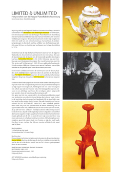
Starting of a new academical year of design theory and research with an investigation theme like Unique versus Serial could not have been better. Chosing from a wide variety of design objects exhibited in “Limited/Unlimited, 100 years of Dutch design presented us with the unique opportunity to get an inside in the position of the designer during the last 100 years in the Netherlands. A characteristic of Dutch design is the coexistence of these unique objects alongside serial production, concept alongside industrial reproduction. “Goed in vorm“, 100 years of design in the Netherlands: by Mienke Simon Thomas (curator of decorative art and design at the Boymans Van Beuningen Rotterdam) was acquired by the library and provide us with a lot of interesting background insight.
The question was simple. Choose an object and find out what the position of the designer was in relation to our theme Unique versus Serial .


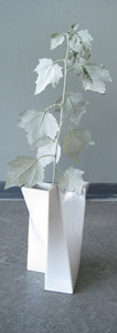
research: Samuel Schellink /vaas: Jan van der Vaart /research: Corné Gabriels
All those choices resulted in a colourful collection of investigations into the object’s background and the motives of their creators. Available in downloadedable pdf the students present: “Martin Visser, designer or collector“, “Starting with Anton Kurver’s Mailbox“, “Bruno Ninhaber, Stay Limited To Be Unlimited“, “Wim Gilles Dru Kettle“, “Wim Crouwel The Objective Functionalist“, “Adolf Le Comte, A Unique Mocca Set“, “Corné Gabriels, Not Your Average Fashion“, “Marcel Wanders, Knotted Design“, “Jacob Jongert, An Artistic Individualist“, “Limited-Unlimited, The Haque Plateel/Rozenburg“, “Jurgen Bey, A Narritive Structure“, “Jan van der Vaart, A Vase Is For Flowers“.
At the same time VIVID design galery presented a show of “Art Design“. A new phenomena that underlined the intriguing autonomous position of Dutch designers and design, making an on the spot discussion posible about art and design, commercial versus cultural or concept and functionalism. linked article Herald Tribune: Whatever ‘design-art’ is, it’s thriving ©2008
Thursday, January 22, 2009
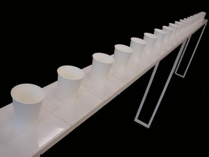
I don’t know why but in my mind, the most strong image of ‘design’ is industrial or product design. For this reason, I had interviewed a friend who has studied industrial design. I liked one of her project which is named tea tablefor 88 persons. She had to make a product with 2 boxes of tiles. She felt the tile seems like pottery saucer so decided to make tea table with them. She made 2m long white tea tabel with tiles and each pieces of tiles have one cup.

2boxes of tiles were 88pieces, so it is named tea table for 88 persons. I really like it’s simple and beautiful shape. It was nice time to me to have an affinity for industrial design which add beauty and convenience on products.
Thursday, January 22, 2009

The first idea Paul and Elke had, for making an exchange tool, was a contraption that forced Paul’s legs into a manly stand, Paul usually has a rather feminine stand. After receiving some criticism by the teacher, they came with another plan; to combine two lists composed of stereotype feminine and masculine household objects, suggested by members of the class. They plan to make a glass baseball bat and a handbag which could be used as a lipstick that holds a razor blade. Paul and Elke say they are quite handy, so the rest will probably follow soon.
Thursday, January 22, 2009
Many objects are designed to be perceived as clearly male or female (think of Gilette and Venus razors for example), whereas more essential ones (kitchen appliances, electronic media, tables and beds) are made „unisex“. But when we look at the same essential objects made for children: suddenly it’s all either pink or blue!
Why this sudden change in attitude?
Why – in a world supposedly freed from gender oppression – are boys and girls being subconciously made to feel so different from one another by media and toy companies?
Is it because this makes it easier for companies to supply new products, because they don‘t have to create innovative design and can just stick to typical army- and flower-pattern? Useful as it may be to manufacturers, I doubt it‘s good for children‘s self-image and leads to much teasing in schools that could be avoided by parents paying more attention to a less stereotyped environment for their children.
Would a little girl‘s gender identity be damaged if she used a neutral or (heaven forbid) blue notebook instead of a pink one?

P.S.: a bit of ha ha
Wednesday, January 21, 2009

Wouldn’t it be nice to have an opinion machine. In witch you could exchange your opinion for that of someone else.
But how would you make such a thing work?
You could categorize into subjects, such as politics, weither, celebrities etc. But you would end up with an endless amount of subjects.
Or you could leave it up to the opinion exchangers to bring the context themselves.
This to me sounded excellent. You could start out the day absolutely hating the way your hair looks. And end up the day singing your heart out – because you are the best singer in the world.
Wednesday, January 7, 2009
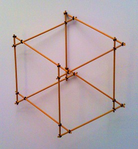
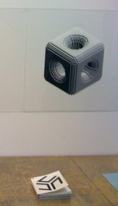
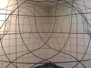
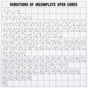
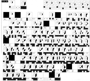
With a speech by Simon den Hartog, former director of The Gerrit Rietveld Academie, a small retrospect exhibit on the work of Jan Slothouber was openened at the “van Abbemuseum” in Eindhoven NL. An intimate group of affectionado’s and family bridged the gap of almost 50 years, when Jan Slothouber together with Willem Graatsma started his fascinating journey into the world of the cube. The Centre of Cubic Constructions represented a highlight in this extraordinary focussed research, culminating in the 1970 representation at the Venice Biennale.
Seemlessly scanning the architectoral space occupied by art and design, the exhibit –designed by Erik Slothouber and curated by Diana Franssen– clearly presented an extraordinary focussed spectrum of work


Some weeks later we revisitted this exhibit with a student research team of the FoundationYears C group. Exploring the cubic constructions we found direct relations between the work of Slothouber and the minimal art of Sol LeWitt. The choice for a simple universal and modular form makes it posible to built a grammar for an entire body of work in which all the steps in the process can become interesting in their own right. “in which even the concept can become as interesting as the final product” (Sol Lewitt, cat Sonsbeek 71).
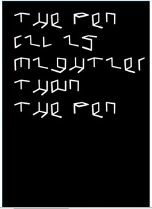
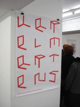
The specific context of typedesign addressed in our workshop presented striking relation between their works and those of more contemporary designers like Radim Pesko and the Swiss designers Dimitri Bruni & Manuel Krebs of Norm


More research was conducted to explore related content or workapproach of other designers like, Bram de Does, Karl Nawrot, Na Kim (website) and Ji Lee.
This was part I of the C_group research.
All researches linked in this posting can be downloaded in A4 format and are also available as hard copy research prints at the ResearchFolders available at the academy library
By Henk Groenendijk
/ Categories: architecture, art, exhibitions, graphic design, product design, type design Tags: Bram de Does, cubic, Jan Slothouber, Ji Lee, Kaba, Karl Nawrot, Na Kim, Norm, Radim Pesko, Sol LeWitt
No Comments
Wednesday, November 19, 2008
Matali Crasset’s work is striking in two ways: it is both very gentle in its approach, and very consequent in its execution and its striving to reach a futuristic, harmonious living environment. She claims that her aim is not to create an object ( ‘the object isn’t the central focus of the creative process…’ ) but more to investigate situations that can be molded to fit the individual needs and preferences of the end-consumers.

Her imagination often takes her to areas that explore the influence of light, everyday rituals, habits and objects. She frequently works for (and with) children, which is relevant to her interest in throwing off all the preconceptions we as a society have of our living space in order to create new ways of playing with how we deal with these basic human needs.
In a playful way she incorporates natural shapes into her environments as well, giving us such experiments as an instant hanging garden space, tree-hangers and root furniture.
However, despite distinctly considering natural forms, her designs such as those resembling glass or plastic organic forms all remain strangely clinically separated from their natural environment. Also, since most of her work is focused on our living experience inside houses, it would be interesting to see what she comes up with about the possibilities of living in an interplay with the outside world. Instead of creating a bubble full of fake organic shapes for us to live in, she could also try to merge the real organic outside with indoor living to achieve a balance of both (Namba Parks Osaka)

posting by Jane Mumford
Tuesday, November 18, 2008
Come to My Place is an exhibition of eight designers from different countries of the world in the Westerhuis Gallery in the Westerstraat. They were given an empty space and were asked to make this space feel like a home. Creating this space, they were only allowed to use materials from local shops and building markets, and on the other hand using their self-designed furniture.
The main essence of this exhibition is the way in which people try to define their individuality, by using both international designs and designs from shops around the corner.


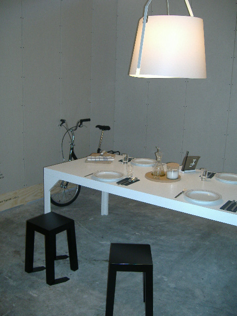
The Come to My Place exhibition starts with a room designed by Miguel Vieira Baptista from Lissabon. He wanted to create a kitchen, because the kitchen is a place that is characterized by the city or location in which it is used. He sends wine to the exhibition space every week so people can have a drink and feel home. A striking design in this space are the black chairs with shadows of three of its poles attached to it on the floor.
After that you can have a look in the space of Ovo from Sao Paulo
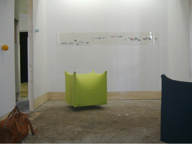
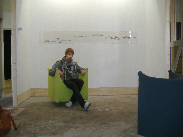
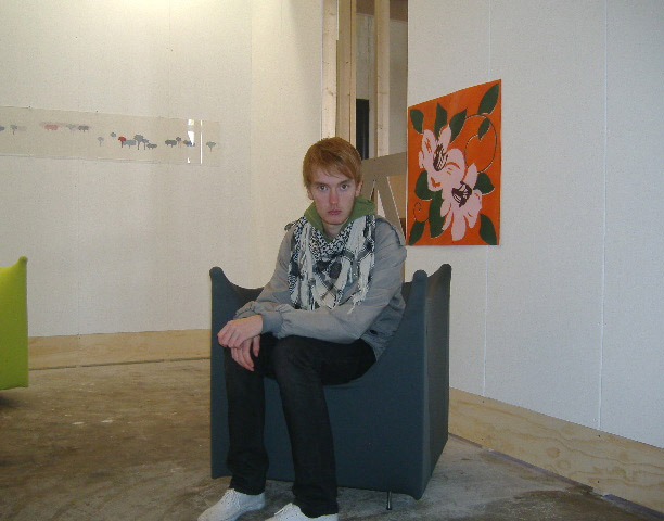
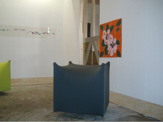
In this exhibition you expect quite stereotype rooms, but the people from Ovo tried to avoid this by making a symbolic place that they recognize as theirs through unfamiliarity like using the green and black chairs.
Today it’s not the tradition and custom, but the designers who guide us in expressing who we are.


These two were the rooms with the best designs. As you can see they were not typical Portugese or Brazillian, but these days there is a sheer of limitless supply of designed objects for the interior and the local traditions have got a diminishing influence on the individuals.
posting by Poul Brouwer
Tuesday, November 18, 2008
Three events that sound alike. This was the first thing that came to my mind as I entered the COME TO MY PLACE exhibition at the Westerhuis gallery.
Come to my place. In short; a project involving 8 designers / groups from different parts of the world. They were asked to create a sense of home in small living spaces, using their designs and products from their own country. Each participant had a space to fill.
The idea behind Come to my Place is todays global culture; how does it affect the insides of our homes? Local traditions are not a big influence anymore. International designers give us the supplys we need to give our home a “personal” touch these days. However there are still small details in houses around the world from which you can tell where you are… I think the designers wanted to fill these spaces with a balance between local and global designs.

I was attracted by the installation in the room of Miguel Vieira Baptista titled; ‘my kitchen in amsterdam for 45 days’.
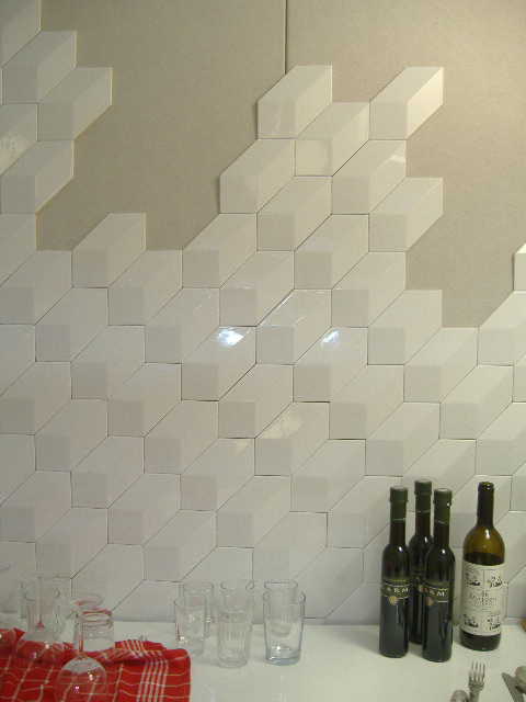
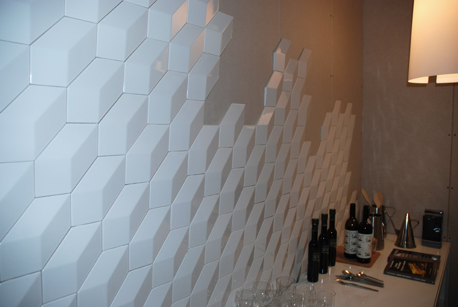
Coming from Portugal, his theme was a kitchen filled with “traditional Portugese tablewear” and modern designs. His concept was that visitors of the gallery could actually sit down and use the kitchen there, which i think is not a very realistic idea in a gallery. About the design itself, I found out that the objects i liked the most were not his work but just objects selected by him, like the black stools and the tiles by Viuva Lamego (see photos). The “3d cube tiles” are a original, simple and useable product that I would like to have in my kitchen. Its funny that a normal thing as kitchen tiles can become modern by just a small change.
posting by Boaz Mout. for more photo’s of the event
Saturday, May 24, 2008
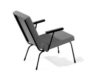
 This chair came with my roommate. It is the object in my home upon which people compliment me the most and every time they do I have to tell them it is not mine. We call it the ‘Rietveld’ even though it is not designed by Gerrit, but by Wim Rietveld (1924-1985). For Dutch design company Gispen he designed furniture for ‘the ordinary interior’. The Nederland Architectuurinstituut (NAI) keeps the historic archive of Gispen.
The chair is named ‘fauteuil 1407’. In 1954, Wim Rietveld received a golden medal for this design at the 10th Trienalle in Milan. On designws.com, a designblog of Rotterdam Gallery VIVID, you can find more information on Wim Rietveld and Dutch design.
Saturday, May 24, 2008
 I present as an object from my daily life, this stupid ashtray shaped like lungs. Actually I don’t smoke and I never use this item but i’m really attached to it, even though I have it only for a short time. I got it as a part of my furnished accomodation when I moved in amsterdam, september 2007. It really reflects my state of mind about life and serious problems. Taking big matters with humour is definitely my behaviour in protecting myself from it and I think it is also typically a belgian thing to laugh about dramatic events and make them absurd. As I’m really attached to my country, this object helps me to stay “belgian” in daily life.
I would say! Amazing how a “stupid” design joke can tell that much…
http://www.humours.net/blague-belge/blague-belge.htm / http://www.notobacco.org/
Saturday, May 24, 2008
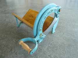
 “Use me, use me!” The tool screamed at me, when I first saw it in the second hand shop. I thought it was a French device for cutting cheese or meat and, although I never missed a cheese or meat cutter before, I convinced myself that I couldn’t do without it. Later I found out that it’s a Danish bread cutter, designed by the royal Raadvad, which celebrates it’s 250th anniversary this year. The company holds three main pillars: functionality, quality and design, and they are all represented in my “brødskærere”.
Although I have never cut anything with it yet, it still holds the longing for being used. And it is this longing that I like so much.
For information about the history of Raadvad: (For people who don’t speak Danish, you can translate this site with the following website
For the logo’s of other royal brands
Friday, May 23, 2008
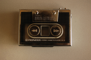
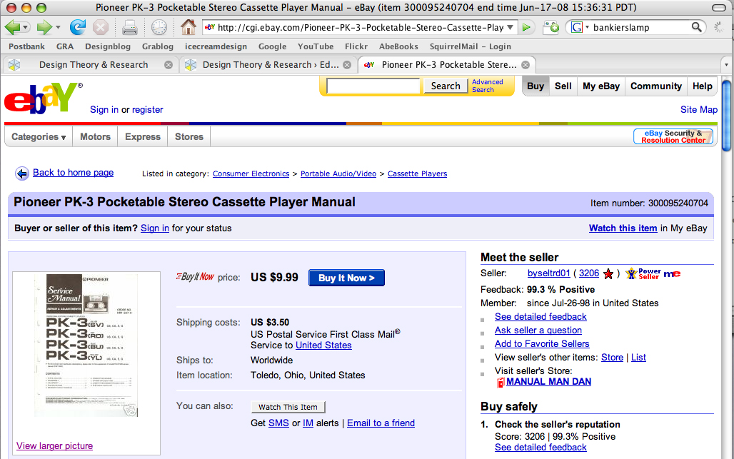
 The object I’ve chosen to do research about is my pioneer stereo cassette player pk-3, or more clear, my old school 1984 Walkman. What drew my attention is that it has a chic design, but somehow also a retro 80’s look. Especially because of the silver colored straight framing combined with the raster. This raster has been used plenty of times for the cover artwork of 80’s records (For example Blondie’s Eat to the Beat). Basically I like this object because of the nostalgic value. If I would go on a long ride to somewhere with my dad, he would just give me this walkman and I would be quiet.
The slick design appeared to me when I was way older.

Thursday, May 22, 2008
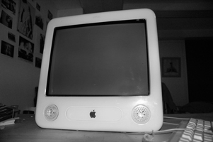
 I grew up in a family where, coming to computers, Macintosh was the only option. When I moved to Amsterdam I bought my first computer, an eMac. It functioned, for at least four years, as the center of my house. In a more abstract way, because of all the things he allowed me to do, but also in a more literal sense, because of his enormous size.
When I started the Rietveld Academy I decided I needed a laptop. A Macbook entered the house, but I felt I couldn’t say goodbye to my old eMac. So despite his size, I decided to keep him as a sound system.
Sometimes I wonder how it is possible I grew so attached to my eMac. Is it his form? Is it the world of associations that can be found in the design of this computer made by Jonathan Ive From eggs and eyes to old timers and single-engine airplanes; From record players, hairdryers, pocket calculators and televisions from the sixties to Braun and Dieter Rams.
See a glimpse of the myth in this movie of the introduction of the first Macintosh in 1984
Thursday, May 22, 2008
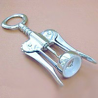
 Possibly the first time I ever regarded an object as a piece of design was the first time I laid eyes upon my parent’s corkscrew. The object of this childhood admiration was – and still is – the classic double lever corkscrew. In fact it’s such a classic you probably have one laying in your kitchen as well. Though corkscrews have been around since the 18th century, it wasn’t until Italian designer Dominick Rosati patented his “cork extractor” that we would come to associate this object with the human figure, the object became pretty on itself and as a functional kitchen appliance more enjoyable and easy to use. An evergreen in design if ever there was one.
Rosati´s patent: http://z.about.com/d/inventors/1/0/h/B/corkscrew4.gif
History of the double lever corkscrew: http://www.bullworks.net/virtual/double/double.htm
Thursday, May 22, 2008
 Living in a new country rent apartment which is filled with things that are not mine, I started really looking at the things that where really my own. I did not have a home on my own before and did not have kitchen objects at all.
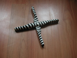
My really nicely designed propeller trivet was my first kitchen object. Fore me it is a symbol of me growing up and having to buy these things that I never thought of. They where just always there in my mothers kitchen.
Cork trivet / jakobwagner / scandenavian design / tips for moving overseas
Thursday, May 22, 2008

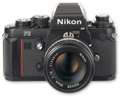
 I have several cameras in my collection. I guess the Nikon F3 is the camera I use when I know what I want to shoot. I never use it just for snapshots. It is too heavy to carry around with me and it is too much work processing the images if I don’t specifically want to use the benefits of shooting on film. I mostly use it for shooting people and for street photography.
I never push the button except if I get that feeling in my stomach, which tells me that this will be a good picture. I guess it’s the preciseness and the functionality of the camera that makes it my favorite. And I like the fact that the basic design of this camera, like most cameras, comes from functionality and not from making something which has good looks. Still I keep it proudly presented on my shelf as a decorative object when I don’t use it. So I guess “Functionality can take a form of beauty” as is a motto of it’s designer Giorgetto Giugiaro…
interview with Giugiaro / http://www.media.italdesign.it/
