Skip to Content Skip to Search Go to Top Navigation Go to Side Menu


"architecture" Category


first impressions


Saturday, October 30, 2010

[comment by Aisha Fouad]

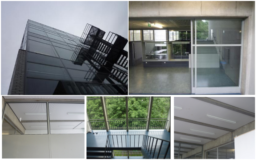
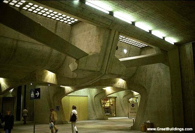
What really struck me of the Rietveld buildings I first saw is the way of arranging views from inside the building. Rietveld buildings have a certain lightness, a perfect balance of open and closed. Somehow they blend in with the environment and the surroundings, even though the Rietveld buildings are modern, concrete and often built with straight lines.

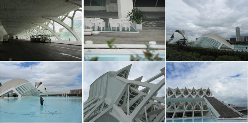
The Calatrava building I saw in Valencia was the Palau de les Arts Reine Sofia. Me and a classmate decide to walk in stead of taking the bus, and we were excited at first when we discovered the building from a distance. It became more and more impressive when we approached it. Then, standing at the foot of the building, I felt disappointment. The greatness did not work for me. The building made me insecure, like a monster that was asleep but could wake up any minute and eat me. It did not fit in with the surrounding park I think, or even in Spain. I wish I could have gone inside to experience the building and the views from the inside. Then I could double check my thoughts of the building and the surroundings, maybe I would understand it then.

I prefer Rietveld over Calatrava, I like the modesty that Rietveld radiates in his architecture (intended or unintended). Almost as if the open space within and around the building is the main subject, and not the beams and concrete walls. Calatrava's buildings seem more bombastic to me, almost an arrogant show off of what can be done in architecture. The building I saw was impressive but it did not fit in the environment at all. I felt as if it was designed first and then placed randomly in the city. Opposed to Rietveld, I did not feel or understand Calatrava's intentions with this building.

Rietveld grey and Mediterranean blue


Saturday, October 30, 2010

[comment by Lyubov Matyunina]

In our life we often compare different meanings and objects. Peoples, animals, jobs, close, building – everything becomes a point of comparison. If we look at 2 buildings, what do we see? Many differences and some similar things. Let’s compare The Rietveld Academy and Calatrava's City of Art and Sciences on 4 points: Age, Function, Design and Practical use.

Age

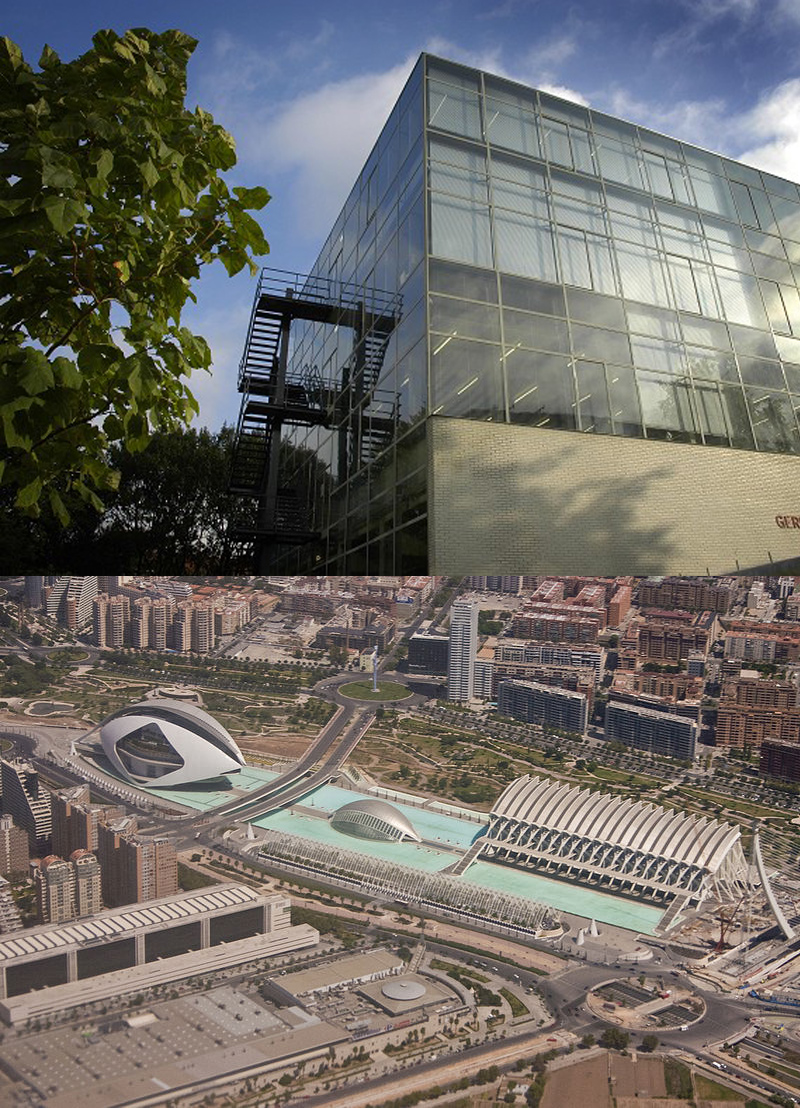
The Rietveld Academie consists of two buildings: The main building was designed by Gerrit Rietveld between 1950 and 1963 and was finished in 1966. The new wing, designed by Benthem Crouwel Architects and built in 2003, is used by the fine arts departments. In our comparison, we will compare the main building, designed by Gerrit Rietveld.

The City of Arts and Sciences designed by Santiago Calatrava and Félix Candela, the project underwent the first stages of construction in July, 1996 and the finished "city" was inaugurated April 16, 1998 with the opening of L'Hemisfèric. The last great component of the City of the Arts and the Sciences, El Palau de les Arts Reina Sofía, was presented at October 9, 2005, Valencia's Community Day.

As we can see, Rietveld is older then Calatrava by 30 years. But both of their buildings looked modern for the time in which they were built. Actually, Calatrava City of Art & Sciences still looks modern and futuristic, while Rietveld design start to be popular and today we can see buildings inspired by Gerrit Rietveld.

(more…)

creating a performance


Saturday, October 30, 2010

[comment by Julia Estevao]

Calatrava /surrealistische sfeer
dit komt door de stilte, het water, de witte kleur van het ontwerp zelf in contrast met de donkere omgeving (bomen bijv.)en grijzige lucht, (grove, grootse) vormen, (grote) formaat. het doet denken aan een verlaten pretpark.
de mannen die het water schoonmaken, lijken een performance te geven; heel rustig lopen ze heen en weer.


Rietveld /
het enige door Gerrit Rietveld ontworpen gebouw, dat ik met eigen ogen heb gezien is de Gerrit Rietveld Academie.
wat me daaraan opgevallen is zijn de verschillende materialen; puur, grof en fijn, passend bij elkaar en lijnen, smal en breed. Fijn en eleganter, door de materialen en vormen. Het geheel oogt strak en simpel en is heel erg open. Ruimte om te creëren.

Een gevoel van openheid.

Santiago Calatrava


Tuesday, October 19, 2010

Santiago Calatrava is a unique architect. He is not only an architect, but also an engineer and sculptor. Because of this he has, next to architectural knowledge, also knowledge of constructions, mechanics and technical details. He is able to find boundaries of constructions.  At that point, the most special constructions can appear.

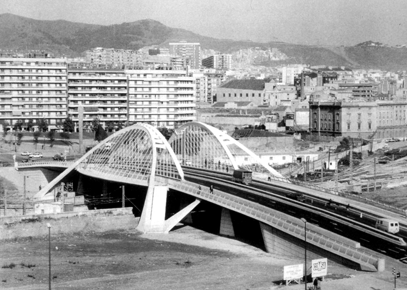
Bach de Roda Bridge
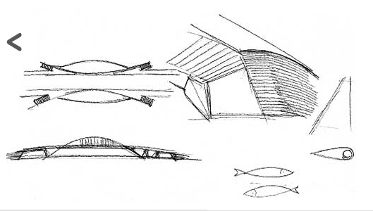
One of the designs that made Calatrava famous was the Bach de Roda Bridge in Barcelona. The human body inspires this bridge. This is something that Calatrava does often. He relates constructions to the human body. He makes model drawings of human bodies to study forms and relates these drawings to his design. After this he looks as an engineer at his drawing and tries to figure out how to it can be made.

The bridge has a total length of 128 metres. He combined powerful concrete supports, monolithic granite columns and a steel arch structure, which grows lighter as it rises. It shows that Calatrava made a hierarchy in materials and forms, chosen in relation to their distance from the ground.

The special thing about this structure is that there are two independent sets of arches and each is capable of carrying its own section of the bridge. Unlike steel bridges that have been built before, there is no structure above the roadway itself. Stability in the bridge is gained from the sloping outside arches, which have an extreme wide base at their ends. The bridge serves both pedestrians and automobiles and gives access to a beautiful park. He also made balconies, allowing pedestrians to stop along the bridge to enjoy the view.

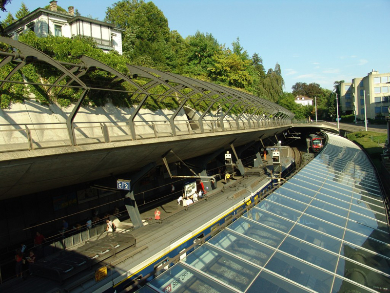
His older work (like the Zurich railway station 1983-84) is often site related. He considers the surroundings. The reason that this bridge had to be built was to revitalize two poor areas of Barcelona. The city –at that time in 1992– was chosen to host the Olympic games  and the bridge was one the first stages of improvement reconnecting a large part of the city with the sea. With this he proved that peripheral urban areas could be regenerated by such a symbolic intervention.

Swimming pool
His early work was also very experimental and innovative in the field of technique and materials.  This floating swimming pool is a good example. It is made of plastic and hangs on 24 strings. The form is invented by a combination making models and mathematical calculations. The concept was to take a bath in naked space.

Ernsting’s warehouse [1983-85]
Another project that is innovative in technique, are the folding doors in Ernsting’s Warehouse in Germany. Here he also made some form study’s of the human body. As you can see the folding doors are inspired by the human eye. He decided to cover the structure with untreated aluminium, a typical industrial and light material. They are 13 by 5 metres and the aluminium ribs rise to form a arch that curves inside, creating a overhanging. The form became an experiment in kinetics.

The way Santiago Calatrava explores new forms by combining technique is unique and with this he creates his own recognizable style.

>THE >PRACTICE >OF >MOVEMENT


Friday, October 8, 2010

Have you ever wondered if there is something in common between offices in

New York, desert tribes and living spaces of Amsterdam?
In order to find out the answer for this question I went to the Rietvedl’s library.
When I was looking for a book I was keeping in mind two key-words : “focused” and “imagination”.
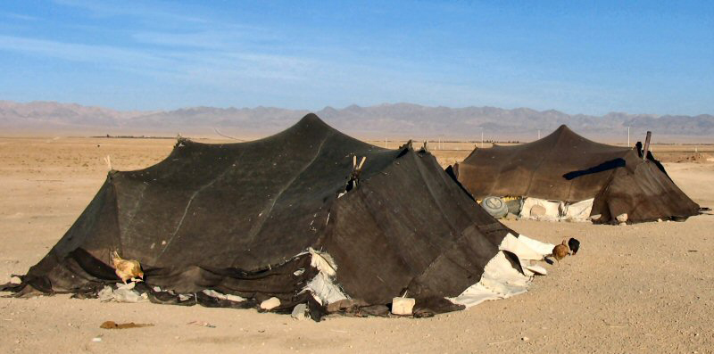
I had an incredible finding – a book about nomadic design and architecture. It tells that in today’s dynamic and global world more and more people are departing from the settled family houses tradition, where all the things are heavily rooted in a single place and don’t change for generations.
In order to keep in synch with the pace of changes people gravitate towards more agile and lightweight lifestyle that eventually unfolds into it’s own new ecosystem.
This phenomena is known as “nomadic lifestyle” and it has been around for ages ever since the first nomad tribes roamed from place to place.http://www.nomadicarchitecture.com

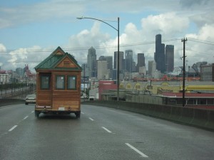
Over decades people in western societies have experienced the world and their private lives as static with respect to their spatial and social coordinates. In the view of globalised and virtualised societies this felt security vanishes resulting in behaviour that falls back into strategies long assumed buried in the past: nomadism…One of the later stages of nomadism, called nomadic pastoralism. The concept of nomadic pastoralism celebrates its resurrection in industrialised nations in various forms, i.e. In management practices, social organization, or the composition of information. An example of nomadism in social organisation is the growing movement of RV lifestyle (RV = recreational vehicle), where people are interested in travelling and camping rather than living in one location.
"Nomadic Information in Social Environments".Frank Nack and Simon Jones HCS,  University of Amsterdam.

nomadic arch

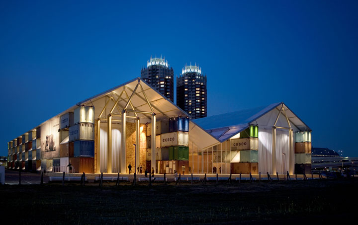
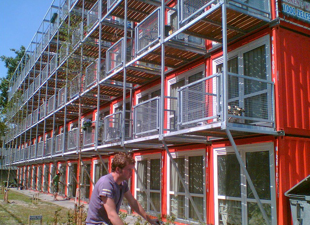
Nomadic lifestyle develops it’s way in architecture and design starting from poorest neighbourhoods with homeless people all the way up to the yappy residential areas.
This design was inspired by utility of nomad life and has absorbed it’s plasticity to transform and adapt to the environment. It’s not trying to stand against something, it just follows the trend making any change easy and keeping it in human scale.
As proponents of the nomadic design say “We’ll share with you what we know about the process of going from work-at-home to work-anywhere-you-damn-well-please.”
http://www.knowmads.nl/

They call themselves “Technomads”.Technomads make use of work arrangements in which they enjoy limited flexibility in working location and hours, such as e-commuting, ework, telework, or telecommuting.
The main aspect is that the daily commute to a central place of work is replaced by telecommunication links. Many work from home,while others utilize mobile telecommunications technology to work from coffee shops or myriad other locations.

There are two core aspects of nomadism, namely mobility and individualism.
All nomadic design, architecture and lifestyle are about these very two words.Being inspired by this idea I’ve traveled to many places in Amsterdam from refugee areas to student campings and the downtown.
Here are a few moments:

If you want to read about how nomadic design develops itself in New York, try “New York. Nomadic design.” by Ronald Christ/Dennis Dollens.

Rietveld > lib. cat. no: 772.9 chr 1

Shield and Shelter


Thursday, July 15, 2010


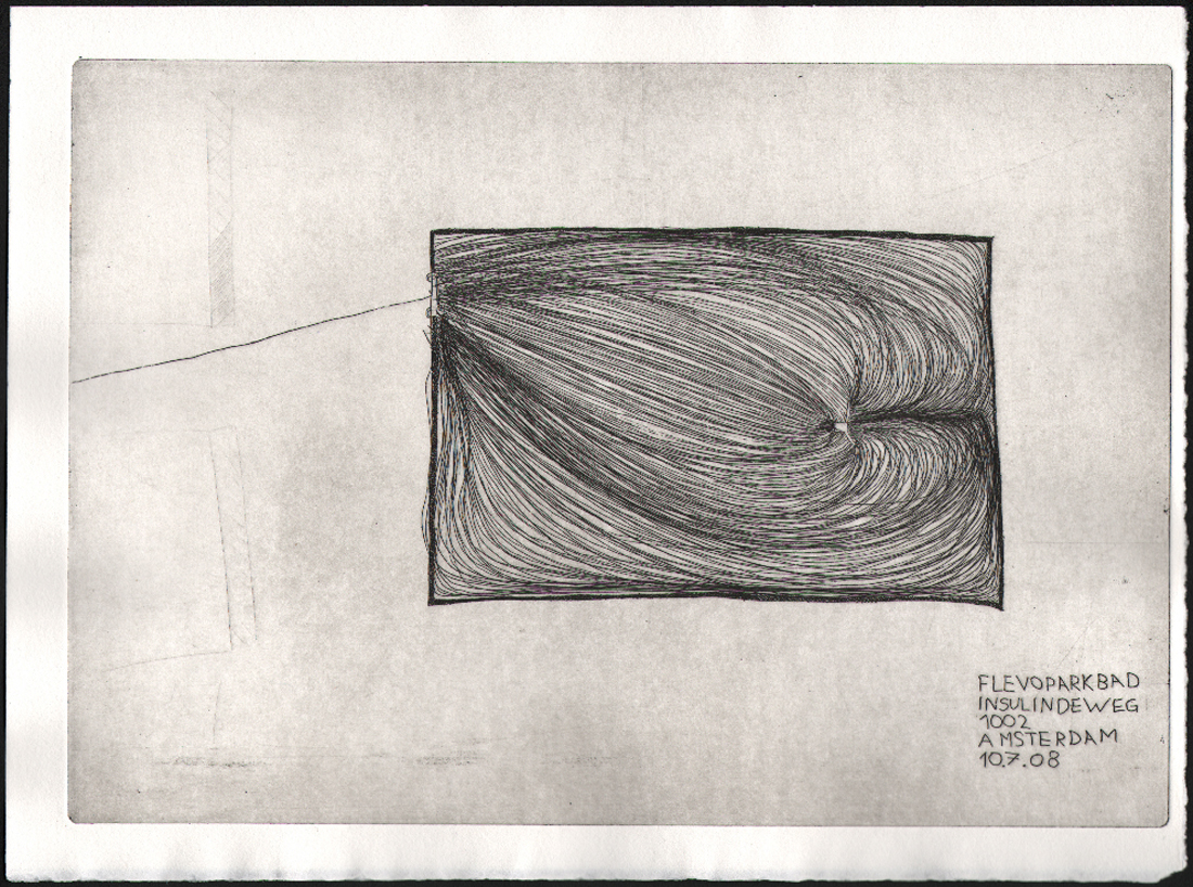
enclosureflevoparkbath-etching

intuitive fear spaces


Architectorial anxiety.
Can I design a space that uses my experience of fear to design the perfect safe zone? How can I shape a space which gives one freedom and privacy but which is not enclosed?

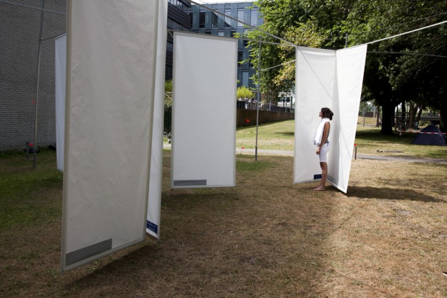
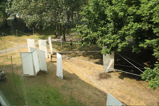
Shields and Shelter is a design for the grounds of the public bath – Flevoparkbad [link] – in Amsterdam. For the Rietveld graduation exhibition 2010, I realized a 1:1 detail of my design on the lawn behind the Rietveld Academy.

Kristin_Mauer1

above : a 1:1 detail of my Flevoparkbad design on the lawn behind the Rietveld Academy.


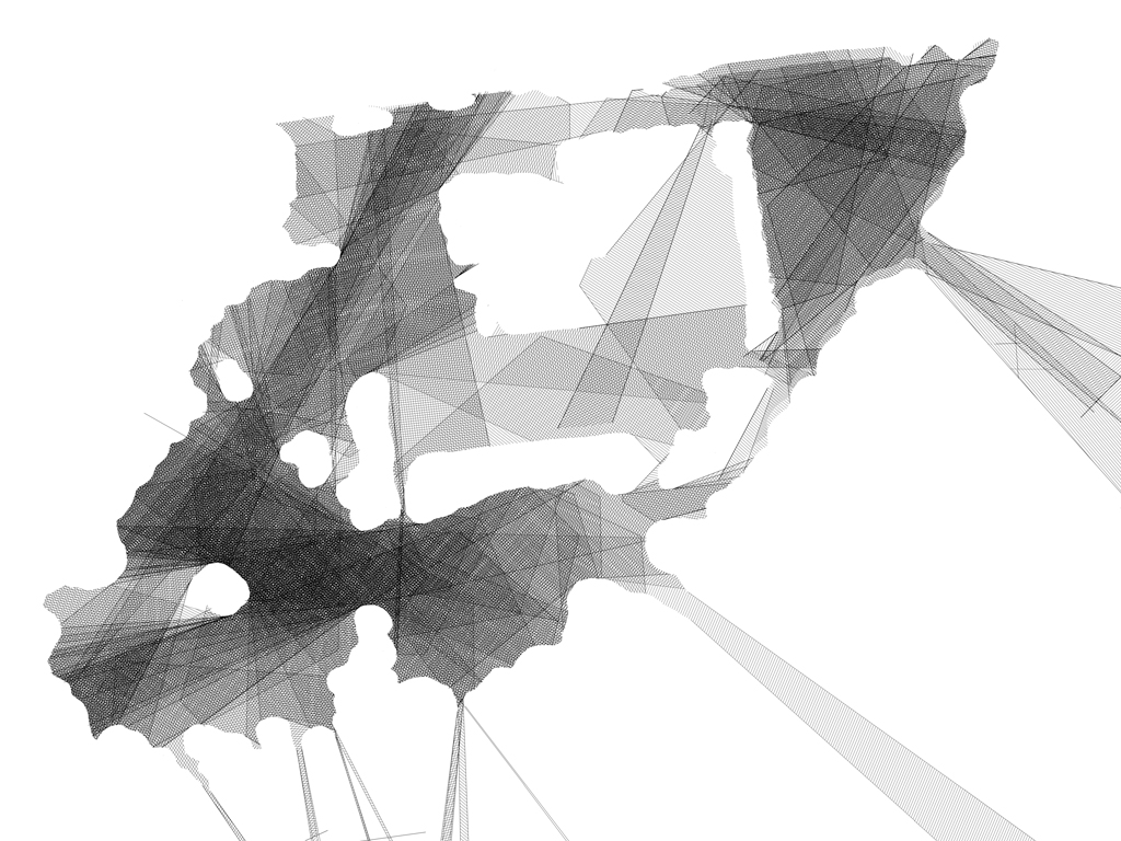
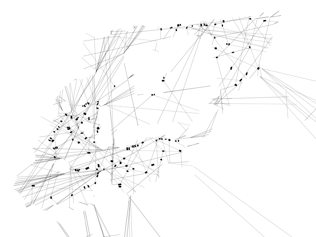
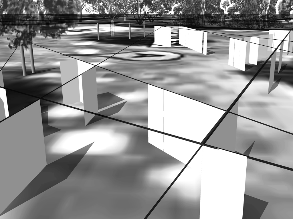
In Shields and Shelter I applied step by step the guidelines that I have developed to achieve safe and comfortable zones using my own fear experiences. These guidelines involve architectural concepts like shielding and view, shadow and light, flexibility versus rigidity. The perfect safe zone to me is a flexible space which gives one freedom and privacy but which is not enclosed. As basis for the design drawings I used an aerial photo from Google Earth of Flevoparkbad. From each towel, I constructed lines of sight from 120° angle views. Through shading these 120° triangles a map emerges with different degrees of surveillance. The darker the area, the more views. At the darkest areas the view must be blocked. Therefore I developed shields, which can be slided along rails that follow the lines of sight. This allows the bathers to adjust their exposure to others according to their own wishes.

kristin_slide8

kristin_slide7kristin_slide16
IMG_4897

tracing the 'feel' zones and the emotion lines and reproducing them in a real situation.


From the jury rapport : Kristin Maurer’s installation outside is a whole new interpretation of space. Space can be created by shadows as well as materials. This is what struck our jury-members. Next to this the technical realization of the work is stunning and therefore our members of the jury wanted to celebrate this piece of work.


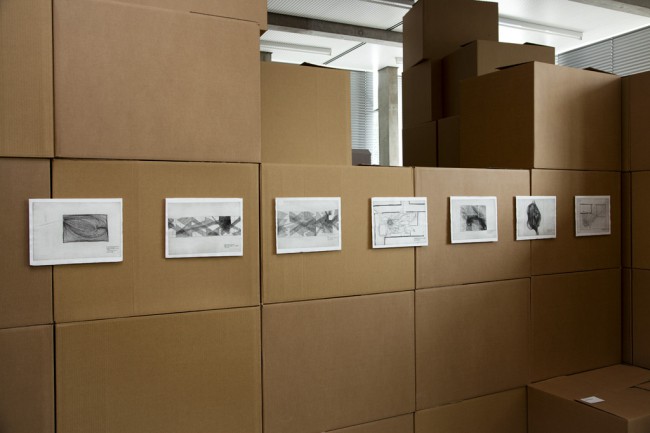
etchings at graduation show Kristin_Mauer3

ICE-etching

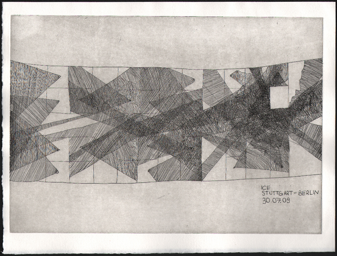
The etchings in the thesis, presented as part of the graduation show, are ground plans of remembered fear spaces. A scheme of lines of sight in train, Kristin Maurer, 2009 [etching]


Pdf-icon Download thesis: Architectural anxiety. the perfect safe zone
 

Idealistic intentions


Friday, May 7, 2010

Idealistic intentions

All over the world idealistic ideas about ecological, peaceful communities and city’s rise up with the intention to create a new world and to design a new society and mentality that would chance the world. Nature supporting architecture, religious like rituals, education, economic and social structures are developed to amplify the realization of this new and “better” world. In every such project that was developed until now, cultures come together in a fusion of art, education, rituals and tradition. It is clear that a lot of people have the desire of a new structured, new spiritual and in every aspect more organic and ecological world. One that gives us the peace of mind that we will not use up our energy sources, that we will not exterminate our nature and therefor importantly to most humans ourselves! Every kind of media is trying to inform us to be aware for the need of change throughout the hole world. To raise the question of awareness, in what way do we go on manipulating the world, in what way can we change our living conditions. It is even a big inspiration for the art world, television series that create science fiction out of it, writhers, designers, architects etc…

Utopia’s

Some reactions to all of this have bin the design and building of Utopia’s. Still up until today non of these “Utopia” projects seem to really succeed. It is an interesting question to why these projects fail time after time and still why so many projects are rising up. It is a question that I will give my own perspective on. I will take two cities as an example for the experiment for the improvement of a better quality of live.

Auroville

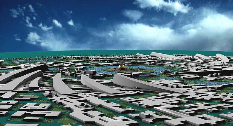
“Auroville wants to be a universal township where men and women of all countries are able to live in peace and progressive harmony above all creeds, all politics and all nationalities. The purpose of Auroville is to realize human unity”. In there philosophy they try to wave cultures and societies together with traditional and modern lifestyles. In that way Auroville has become a playground in many area’s such as architecture. Not only does Auroville have an interesting architecture it has it’s own economical structure, a research area for renewable energy and recyclable energy and elements, it’s own social structures and developed education.
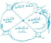
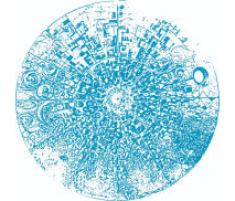
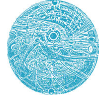
The sketch of Auroville ‘1965’ begun with Mirra Alfassa (who was collectively called “The Mother”) she laid down the basic concept for the town. Here first sketches are called “The Galaxy” in witch she tries to lay down all the important activity areas that would fulfill the vision of making it a universal township.  It was to be a city that would totally intergrade and be submissive to nature. Then in 1970 Mirra Alfassa asked Roger Anger to begin with the design of the center “Matrimandir” the hart of Auroville. This is the most and very important  building of Auroville. It is called the “soul of the city” and is situated in a large open space much like an arena called “Peace”. Inside the building there are 4 pedestals that all belong to a wind-region North-East-South-West and symbolize characters. And also a mediation hall, this contains the largest glass globe in the world. Above it is a hole in the roof so that the sunlight shine’s s straight line into the globe by daylight. Witch gives it a extraordinary glow and light spectacle.
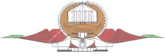

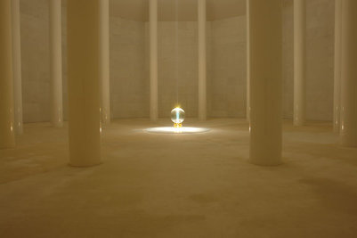
Every building has a symbolic meaning. The city exists out of 4 zones (cultural, international, industrial, residential) and a green belt. The movement of the city became to be intergraded in the nature it was build in. Around it other communities came into existence. Thus a kind of double city gradually developed. Auroville starts weaving into a structure of it’s evolution and become one pattern. The city has relied on the possibilities that nature trees and plants gave room for to build, and because of that a very natural shape became to be, almost tornado like, if it was made and shaped by nature itself.

This all came to be in the order of a charter of rules that where developed to the being of the City. Some of the architectural rules:

  1. Not to Harm nature or its existing habitants in the build of the city
  2. Eco Friendly Architecture
  3. Climate responsive architecture
  4. Architecture integration with natural surroundings

The following link is to the architectural aspect of Auroville: http://www.auroville.org/thecity/architecture.htm

Chandrigarh

Here I want to make a bridge to Chandrigarh another city that was build in India. This city came to existence because in 1947 Punjab was divided into a Pakistani and Indian part the new Indian state therefor needed a new capital city. The architect is Le Cobustier who also created the Modular formula and his own charter’s of rules for architectural constructions.

Some of Le Cobusier values:

  1. Architecture that has a moving relation with light, shadow and space.
  2. Provide of cheap and high quality buildings
  3. To contribute to a more comfortable and easy lifestyle
  4. To connect people by the use of elements and natural senses

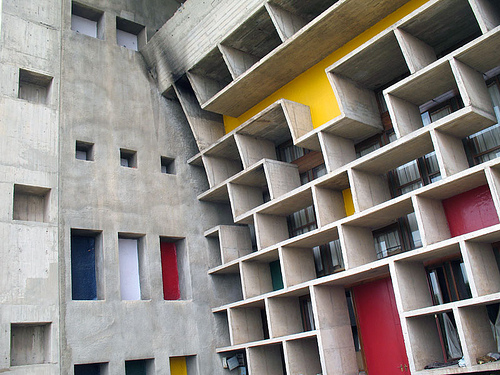
These formula’s had everything to do with the natural elements.Le Corbusier had an aversion for industrial like cities, he thought it led to crowing, dirtiness and lack of moral landscape. He tried to intergrade a way of architecture that suggest and encourage people to have a certain lifestyle. He was also very concerned with the human body responding to its architecture. Also the feel and touch of materials and shapes, color, space, sounds, light where all even as important. The city Chandigarh pronounces itself as a city where modernization coexists with nature’s preservation. Tree and plants are as much a part of the construction plans as the buildings an the roads. And he city is surrounded by a green belt.

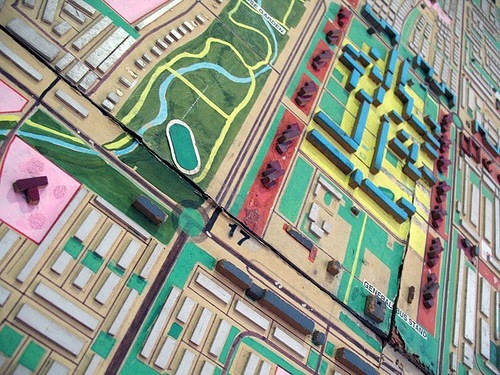
The most important and symbolic monument is an metal 85 feet hight open hand that rotates in the direction of the wind and carries out the message of peace and unity “open to give and open to receive”. Much like the symbolic meaning of the centre building “Matrimandir” in Auroville. Also Chandrigarh is divided into different area’s witch are self-sufficient neighborhoods, that are linked to each other by roads and path networks. The zones are numbered from 1 to 47, with the exception of 13 (since it is considered unlucky). The shape of the city is much like a patchwork blanked. It is clear that the city, roads and networks are organized and designed for practical use and comfort.
Failure and Succes

Both cities show in some way’s a lot of resemblance to each other but are also very opposite to each other in a lot of way’s. Both city are divided in sectors that have there own function, witch is also very important to both city’s is the richness of nature. In both city’s the architecture is build with a very friendly approach to the human body and environment. And both cities contain symbolic elements. But where Auroville wants to be a total new economic, ecological and self sufficient city and break loos of commercial and mass production companies, Chandigarh has companies like Mc Donalds etc… The mentality and philosophy differs in a economical, spiritual and educational way. Auroville tries to contribute to a solution for our problems of pollution of our environment, our energy sources and the quality of our mental and physical health. Chandrigarh tries to have a quality of living environment but does not in the hole try to change the use of economical and commercial consumers with the outcome of a more nurturing use of our environment. Still Auroville has not provide a solution and is now surviving on neighbor-villages. If you look at the world as a symbiotic organism it is clear that one can not survive without the other, everything is linked to each other. Even within the smallest organic cels and atoms there is linkage to everything around us. We humans have designed and created a world full of problems that are totally linked and symbiotic to each other. If we take one of them away the survival of function as we created it is in danger. In order for a concept like Auroville to work there has to be a chain reaction throughout the hole world to maintain that symbiotic relationship that we have with the world in order to survive.

It is very clear now in the scientific world, the spiritual world, the business and economic world, that a change and chain reaction like that is very necessary for our survival. Money became digital and lost its value and creditability. Banks are falling, oil one of our biggest sources of energy is running out. There is a big hole in the ozone-lear that damages our  bio culturals. We have to find a way to make a solution possible. And finding this way is very inspirational for designers all over the world!
Repetition creates silence


Tuesday, March 2, 2010

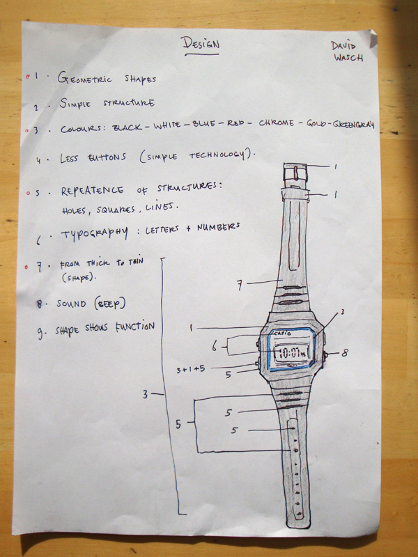
The Casio F-91w is a watch that intrigued me in the first place because of his simple structure. It’s not heavy, easy to wear and no unnecessary elements. The watch explains itself. With this I mean that the shape shows the function, which is something many designers don’t do anymore these days. Other aspects that I like are the geometric shapes, colours and the simplicity of the sound and buttons.

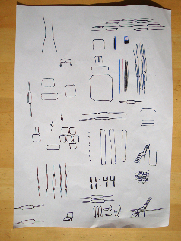
The longer you look at the watch, the more you will find out that the square with cut edges is repeated many times in different ways like a form stretched to the edges at the end of the watch. The designer did not only repeat this square, he also repeated other elements like lines and typography.

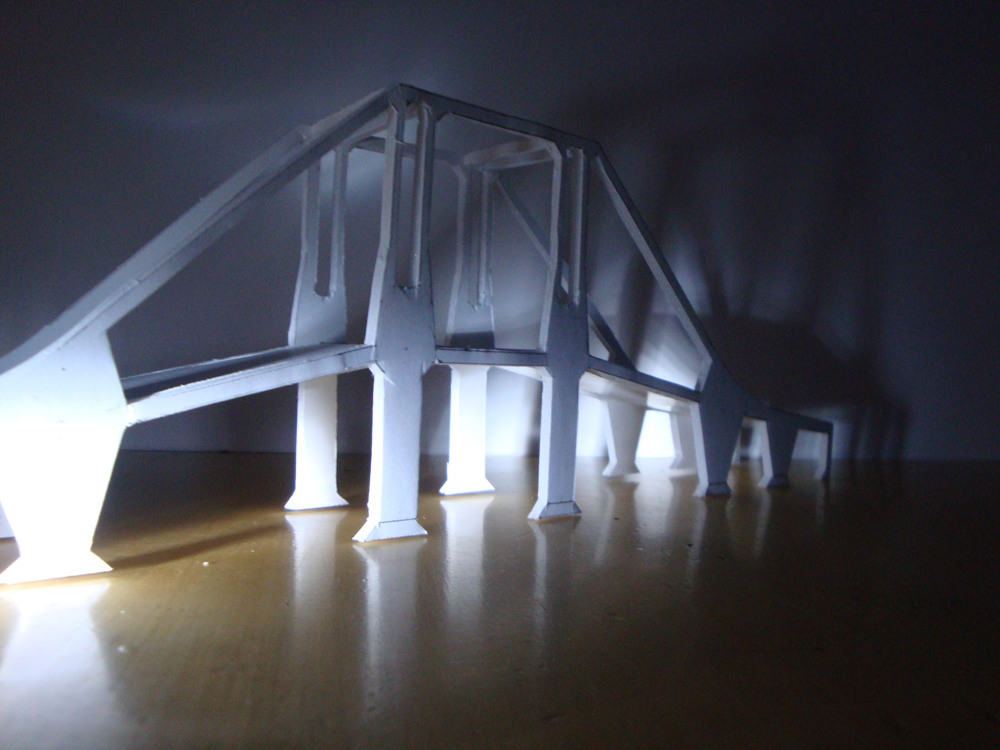
Since this watch turned out for me to be mainly about repetition. I chose to use this aspect in my next design, which turned out to be a bridge for bycicles.

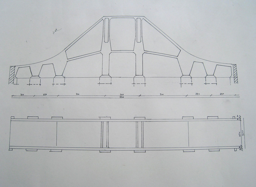
In the technical drawing you can see more clearly how I repeated the geometric forms as much as possible. For the bridge I also chose to use the form of the bracelet from thick to thin into the pilars of the upper-middle side of the bridge.

interacting elements in El Lissitzky’s Proun period


Wednesday, February 10, 2010

What fascinated me in the exposition is how El Lissitzky redesigned Malevich’s opera, Victory over the Sun.

Victory over the Sun was a futurist opera premiered in 1913. The costume and set design was done by the Russian artist Kazimir Malevich. The futurist opera couldn’t succeed as the suprematist techniques were pretty new. The audience reacted negatively and violently to the performance.

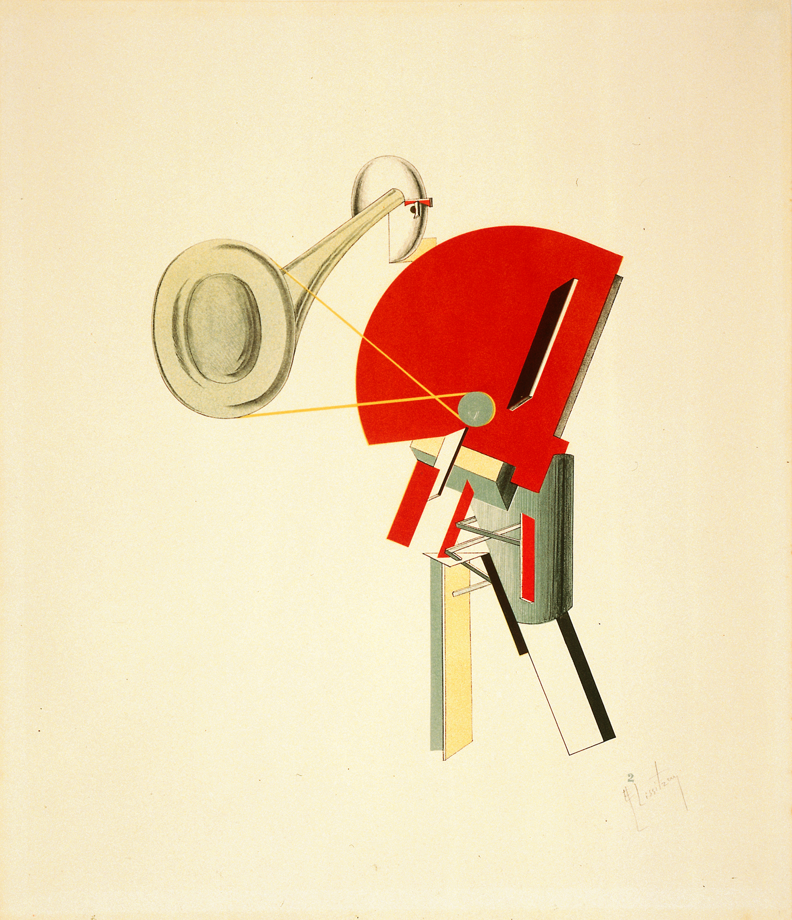
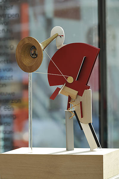
What happened afterwards is that following the Russian revolution, El Lissitzky worked with Malevitch for a new version of the opera as an electro-mechanical show. Lissitzky transformed Malevich’s black and red squares into figures constructed of transparent prisms and metallic rods, bending and receding in space. He created a typography specially for the libretto. Most importantly, he transformed the old costumes into new robotic figurines/figures.

The new version of Victory over the Sun was closer to El Lissitzky’s Proun principles, where his work was more focused on the interaction of his architectural, graphic and typographic experiments, transforming sounds to architecture, words to costumes, or drawings to characters. This made me realize that he is not only a painter, but a graphic artist and an architectural designer, and a designer of furniture’s, books and posters.

This is the proof that architecture and design are not just about constructing buildings or visuals, but also about how to create a coherent whole with a story, connecting different elements like the space, decors, visuals or texts.

Then maybe design is an activity one can apply to any kind of system. Architecture is a principle for making relational systems that can improve the totality of an artwork.

Proun. Street Celebration Design, 1921, Lissitzky


Wednesday, February 3, 2010

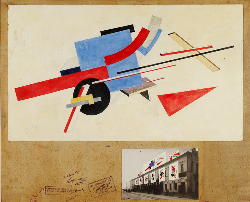
In this work you see influences of Design, Fine arts, Architecture and Graphic design.
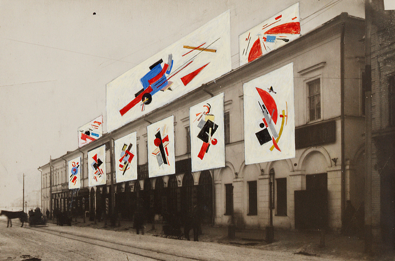
A nice thing of this work is that the upper drawing can stand on his own, and therefore can be divided in Fine arts. What Lissitzky is doing in the painted photo below, can be compared with design. Almost all his work contains influences of Design, Fine arts, Architecture and Graphic design. For myself I see it back the most in this one.
I really like the composition and colour distribution and how Lissitzky combines the 2D/3D perspective, which makes the drawing much more architectural.
I think the later work of Kandinsky is in some way comparable. I’m talking about elements of composition, colour distribution wise and form contrasts.
What’s fascinating actually is that for example in these paintings ( K1, L1, K2, L2 ) the triangles, (half) circles, stripes and composition have so much in common. While the ideas of their work are so different. Kandinsky combines painting with music, which Lissitzky does with architecture.

What I appreciate is the modern way of exposing his work. I like the way he puts his drawing and his street-exhibition in one frame on the cardboard. And the fact that he paints on the photo. The street celebration design reminds me a bit of graffiti in legal manners. In Graffiti you have multiple meanings of doing it. Some do it for the adrenaline-kick, some for the group or competition feeling, some to show their design skills and others for  political statements or propaganda. This last example is what I see in a part of Lissitzky’s work.

I think it’s interesting to see how he uses his propaganda work in other work but then he integrates his in his autonomous work (proun. street celebration design).

All in all I think it’s a great work and a unique style. I really admire that Lissitzky makes so many different things, and still keeps it in one theme

No objectiveness


Tuesday, December 8, 2009

Browsing through the library for the last time, I thought it was time for a different approach. So instead of searching, looking, considering for at least half an hour or maybe even longer, I just run into the library and get the first big book I see. Without even wondering if it is about art or design (well, ofcourse I know it is about art, but there is a story to tell you know), I borrow it. Once outside the library I see the book is about the work of Tadao Ando. My conclusion is that you can not be objective or random towards anything. The reason for this conclusion is that when I tried to borrow a random book from the library, I still get back with a book about a person whose work I really like. This book about this person. I knew it before, but through this project I am more certain about it, no one can ever be objective. That can turn out to be pretty good, but also pretty bad.

Make your own library


Thursday, November 26, 2009

The second book I choose is about the architecture from library’s and museums. Because my tags were “library” “arranging” “industrial” it isn’t a really big surprise that the book I find now is quite similar to the other one. But the most important difference is the fact that this book is about the architecture of the buildings.

It is a really interesting book because you will find out more from well known buildings and also discover some new. Off course the architecture is really important for the atmosphere in library’s and museums.

The reason that makes this book interesting for me is that they show every detail of the buildings. I like the fact that you can find maps, models, etc. In some way it almost looks like a hobby book, for self-made architecture. But to make one of the buildings myself, is not gonna work I guess…

Publik Library Amsterdam: 718.4
Bauten der Kultur: “Museen und Bibliotheken”

Design for Revolution


Thursday, November 12, 2009

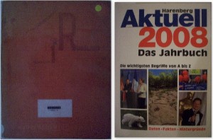
When i was checking the books at the library, i saw a book about the topic that i’m really interested in, Soviet Architecture. I checked it and yes it was the book that i am looking for. Then i looked for other books to find some images to  support my topic, i couldn’t find though. Suddenly i saw a boow, looking old and having old, dark red just jacket. Yes! It was about Russia Architecture. The best thing about it is the just jacket. It is just like Soviet public architeture or Soviet mentality. A book need to covered and there it is, nothing more ( i love “the Raven btw). One barely reads the name of the book, there is nothing on it to make you buy it (if you were in the book store). No colorful letters, no information about what it contains. One can find it, only if he/she needs it. Which is what i did. Which is why this dust jacket is a perfect match for this topic.

On the left side you see the book i choosed and on the right side there is a book from BRD – Germany (to compare)

718.8 lis 1

Between denim


Wednesday, November 4, 2009

The white spot in the middle of the book immediately grabbed my attention. It’s the only element you see on the book. The rest is covered with denim. Strange actually because the book contains information about the Japanese architecture. And denim is typical ´West´. But for me strange is not that negative, I think it is quite interesting.

Actually I don’t know anything about Japanese architecture. But I was thinking about it, because the last two years I learnt a lot about the Japanese environment. I wondered if you could see the Japanese flora and fauna back into their architecture (which it does).

While flipping the pages you only see black and white photographs which show the simplicity of their architecture. It shows a lot of buildings with interesting spaces, lines and basic elements. I really recognize ‘Japan’ in it.

It’s a squared book fit in one color which I like. Not too big, not to small and it really wanted to tell me something about buildings created with natural elements of Japan.

09769
7/3.3

Shoin

Shoin

Game called S, M, L, XL


Wednesday, November 4, 2009

I entered the library with the intention of taking the first book that catches my eye, even it is based on pure visual, superficial attraction.
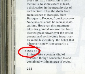
The book that I noticed first was standing right next to me and I instantly decided to take it because it brought me back to my past. It was a massive book called S, M, L, XL by architect Rem Koolhaas in collaboration  with designer Bruce Mau. I was 13 years old when I  held it in my hands for the first time and I was playing with it by choosing words and sentences from it randomly, translating them into my own language and retyping them in my big book of quotes. Today, 6 years after I played this game again and picked with my finger, with my eyes closed. The word was DISORDER.

-KOOL- 2a

Experimental interview


Thursday, October 15, 2009

What is the connection between Experimental Jetset, Johannes Schwartz and Herman Verkerk?
Besides the fact that they are all based in Amsterdam, that they can speak Dutch, they all like to create beautiful and witty designs or images, they like to question their practice, they like to experiment and they actually teamed up together several times, another crucial connection appeared recently: the three of them are going to participate to a collective interview project…

After discovering more about their work, it became obvious that there was something interesting to investigate about their collaboration. What make several people or entities meet and work together? Are they alike or on the contrary, are they so different that they complement each other…?

For that reason, we interviewed them using the same process:

>> AN INTERVIEW IN A SUITCASE
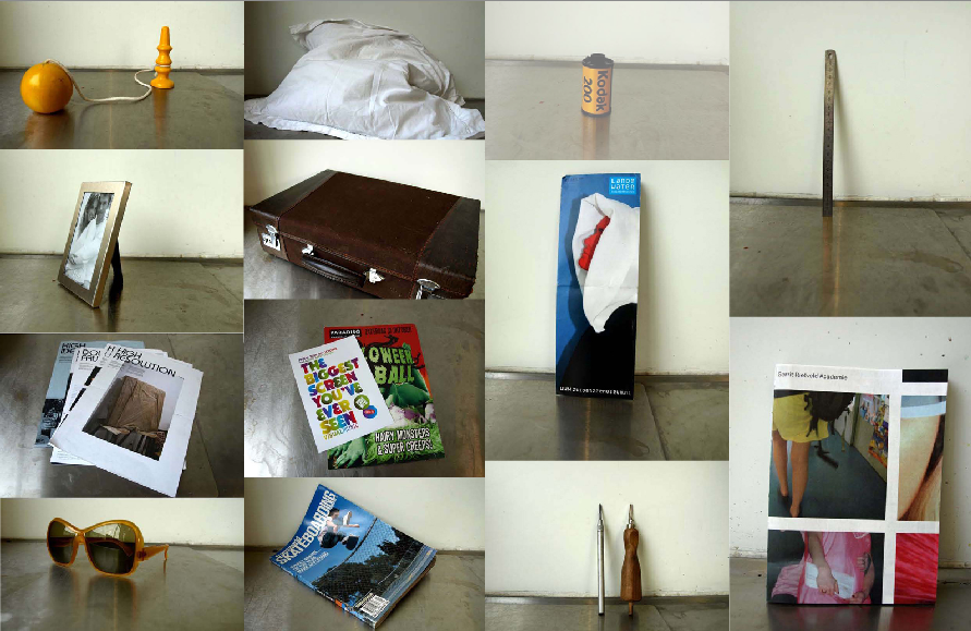
We visited Johannes Schwartz, Experimental Jetset and Herman Verkerk, carrying with us this suitcase. Inside the suitcase, many different objects. Each interviewee was invited to open the suitcase, to browse through it and to freely react to the objects they found in it.

The results were surprising, exciting and very interesting. But when it comes to decide what brought the three of them together and where they meet… you are left free to listen to the interviews and to make up your own mind!

Experimental Jetset, Johannes Schwartz or Herman Verkerk

Adolf Loos Versus:


Thursday, October 15, 2009

A lot of “rules” were written for architecture. Not always have they been followed up and also a lot of times they have been discussed by other “writers (philosophers)” / architects.

Adolf Loos was one of these architects who were more philosopher than architect. Even though the whole world listened to what he had to say, his rules were not followed by everyone and not as strict as he had hoped for. This is due to the fact that there were more of these men that had their ideas about architecture. Besides the Ornament & Crime essay there were serveral others like the “Raumplan”, “the Plan Libre” and peoples individual ideas.

Today we don’t design according to a “manual” written by one architect. There are thousands of manuals that inspire us. It’s about what we want ourselves.

on_”Ornament_&_Crime”


Log in
subscribe