Typography is the expression by which we communicate in our written language. My focus for this text is experimental type in our modern time. To understand the current state and the future of typography, I believe its important to look at the development of type through history.
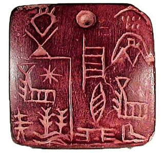
Typography has a long history of development and in European history we can trace it back as far as 40 000 years, where cave paintings and other forms of expressions (such as decorated bones and crafted tools) has been found in Cromagnon, France. The Homo sapiens living in this period came to Europe from Africa and the Middle East, about 100 000 years ago. Other historical founds also include Petroglyphs, which is a group name for carvings on cave walls and surfaces alike. These carvings has been found around 12 000 B.C and is believed to be the ancestors of the modern typographical system, based on the Pictogram and Ideogram.
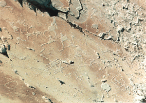
Petroglyphs found in Val de Fontanalbe, France.
Pictograms were used to illustrate and depict the chosen object, for example an ox. This kind of communication is still used to today in some countries, for example in the chinese language. After some time, the system developed, a circle which normally would represent the sun could also have the meaning of a day. The result of this development is called the Ideogram. This means that the context of the signs had relevance to the individual signs, as the circle changed meaning depending on the content of all signs combined. An extra sign could also be added to one of the individual signs to point out the exact meaning, this is then called a determinative. Another important development was the invention of the phonogram. Through the phonograms the humans could now also communicate by writing the sound of the spoken word. The shift from the Ideogram to Phonogram happened around 3000 B.C.
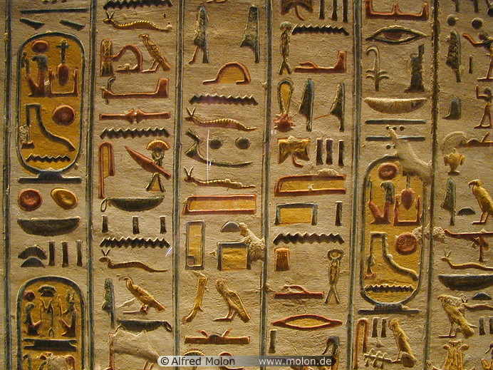
Around 3500 B.C, the Sumerians settled down by the rivers Eufrat and Tigris in Iraq. They also developed a unique written language which is called Cuneiform script. This written language was made by using a shaped object which was then pushed down in wet clay. When the clay dried, the document became intact. This kind of writing was widely used in Asia, Assyria and Persia. By the same period, around the area of the Nile, the egyptians developed an important way of communication. These scriptures were called the hieroglyphs, it was also built on the Ideogram but had different and more diverse signs for sounds and letters. The hieroglyphs were also divided into eight major categories.
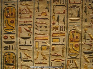
Egyptian Hieroglyphs.
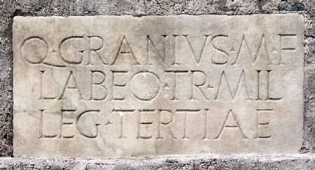
Around 1000 B.C, a new written language was invented, called the Phoenician alphabet. This written language is the root for many languages, among them Hebrew and Syrian, as well as the Etruscan language which in return later on developed into Latin. The Latin alphabet was used by Greek settlers, who colonized the islands outside of Italy’s shores. The earliest find of the Greek alphabet was made in 730 B.C, on the island Ischia. The development of the Greek language continued as the Romans gained power in Italy. The Phoenician language was read from right to left, but as the Romans developed the Latin language, they shifted the way the text was read to left to right. The way the letters were standing was also shifted as this happened. It was also around this time that the Romans developed characters from the Phoenician language into the Latin characters we know as Alpha, Beta, Omega, Gamma, and so on. Serifs were for the first time invented during this time as well, first used in inscriptions on walls using a hammer and a spike, as they could be read more clearly this way.
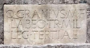
Example of roman inscriptions.
The Romans continued to develop their written language, as the Unical script and the Half Unical script was invented around 500 A.D. The Unical script was based on two lines, creating only capital letters, the Half Unical script was based on four lines, creating the opportunity for lower case letters as well. This development later led to the Gothic styled scripts found in Germany around 1100 A.D, developed versions of this script type was later made in France and Italy. This later developed type later came to England through Belgium. This period of development is usually called the humanistic handwriting, and was dominant from 1300 A.C to around 1460 B.C. In 1439 the first European movable printing press was made by Johannes Gutenberg, which allowed high quality printing for typefaces. This printing technique quickly spread through Europe and during this period and following on, specific typefaces started to be created in more diverse styles. Claude Garamond (1490 – 1561) was one of the first to produce typefaces independently.
There was a high development of typefaces during this period and by the 19th century, the highest peak was considered to have been reached. Some even considered that the highest point of typographical development had been reached already by the 17th century. Although typography continued to develop as Napoleon was interested in Egypt by this time, and he had several excavations and expeditions ordered. The interest for the Egyptian hieroglyphs were high during this time and people started to loose interest in their roman type heritage. Inspired by the findings in Egypt, type designers came up with a new invention in the modern written language, the sans-serif. All previous modern writing had been serif typefaces, but by 1816 the first sans-serif typeface was created by William Caslon IV, the typeface called Egyptian. The sans-serif typefaces also became more popular along with the industrial revolution, as companies could communicate their advertisements more clearly with help of the bold letters. Typography continued to develop during the 19th and 20th century, creating several influential and modern typefaces.
Example text of William Caslon IV’s typeface Egyptian from 1816.
However, since the development of typography had been so great by the 20th century, modern designers as well as fine artists started to seek for new ways to use type. Francis Picabia, a Dada artist in the beginning of the 20th century, is one of first to experiment with typography. As the Dada artists influenced the typographical approach, designers started to take serious notice to this approach as well. Herbert Bayer and Joost Schmidt were two Bauhaus designers who stopped using the roman letters as a basis for their typographical designs. Instead their language became more futuristic, with focus on the circle and the line. An example of this can be found in Herbert Bayer’s typeface Universal, from 1925.
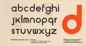
Herbert Bayers Universal, from 1925.
Bayer also had controversial ideas regarding the sizes of the alphabet. His point of view was that only the lower case letters were needed, as the letters are pronounced the same way when we read them, regardless if it is capital or not. This influenced Bauhaus directly, as they started to only design lower case letters. This came to be called the functionalism movement with focus on freedom from tradition, geometric clarity, simplifying the typographical elements and the use of primal colours. At this point designers were well aware of the direct influence that typography could have, and with the functionalism they attempted to communicate in the clearest way possible, avoiding ornaments and other subjective expressions within the typography. This lead to a language which would communicate very strongly and direct with the viewer, the most famous example being Helvetica, designed in 1957 by Max Miedinger and Eduard Hoffmann.
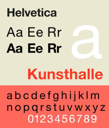
Helvetica, designed in 1957 by Max Miedinger and Eduard Hoffmann.
During this time the so called Grid system was invented, which created a new way to approach type. The Grid system is a line based system which allows for typography and other elements such as photography or illustration to be arranged in a symmetrical or asymmetrical order. This movement is close to the functionalist movement, but involved mainly swiss designers, the so called ‘International typographic style’.
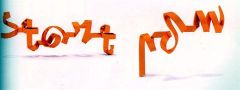
Another important change happened as technology advanced and computers were invented. As computers with programs allowed anyone to fairly easily play with type in a much more free way, typography was no longer restricted to designers and professionals. As typography became digitalized, there was no longer a need to cut the type in a traditional way. This meant that the profession that earlier demanded a lot of handwork and precision, could be executed quickly by the means of modern technology. David Carson, among others, is famous for his experimental approach in the beginning of the 1990’s. He treated type in a new original way, and among other things invented the style that we today call ‘Grunge’.
Neville Brody and Jon Wozencroft is the name of two designers who also was involved in modern experimental type, and in 1991 they founded the Fuse magazine together. Fuse has since then been a platform for new and innovative ways to approach typography, and since its start it has been a controversial magazine which questions the modern language and its usage. A platform such a Fuse is important, as they encourage both discussion as well as practical input for the further development of type design. It is clear that expression within type is returning, since the most legible and clear typefaces already have been made during the 20th century. We are now in the beginning of the 21st century, and the way we are communicating and sharing information is developing quickly.
Looking back at history it is evident that innovations and experiments relevant to the times has always been present. As in other art forms, previous developments sparks new responses. The type of today is as earlier mentioned used more freely. One might consider if typography still is as important as it used to be, or if it is only the typefaces that has lost their relevance themselves. As we become more informed and aware of our past, we become more aware of the choices we make today. And if the importance of expression in type has increased today, can really type from the 15th or even the 19th century express the thoughts or feelings of today?
Typographers today can make their own decisions when it comes to using type, they can disregard from renaissance inventions, or functionalism from the 20th century. But we are always limited to our own inventions, wherefore I believe experimentation should always be encouraged. Though I can not predict the future, some even believe that the written language will die out, as technology will allow more sufficient ways to communicate. It is hard to say in what direction our language will develop in the future, and the role of the typographer. But having an open discussion and room for experimentation is an important step to keep up with the rapid changes of today.


