Skip to Content Skip to Search Go to Top Navigation Go to Side Menu


"type design" Category


Objectiefied Bits


Friday, January 30, 2009

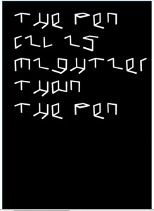
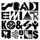
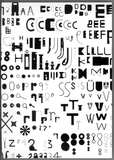
Maybe you find it puzzling that this posting about Helvetica and Wim Crouwel starts with an image of Paul Elliman’s “Bits” Alphabet.

Extremes can sometimes meet when you least expect it, and this fascinates me. It became apparent again during the investigation by the FoundationYear C group, into Gary Hustwitt’s Movie “Helvetica” and our consequently visit to the Wim Crouwel exhibit last month at the “van Abbemuseum”.

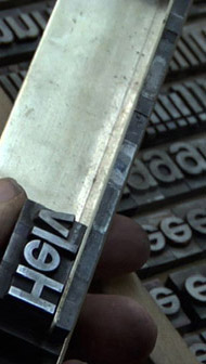
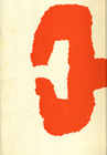
left: Bits by Paul Elliman, right: Objectified by Build (click images for blog info)

“Bits” was developed by Paul Elliman in the mid 90ties and published in the 15th (Cities) issue of Fuse’s conceptual Font Box. quote: “Language moves between us and the world on patterns of repetition and variation, and a mimetic example of this might be something like an alphabet”
Later, in 2004, it was included in the Cooper-Hewitt Design Triennial N.Y. which made “concept type” part of the established design world.

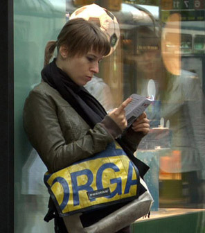
Gary Hustwitt’s new documentary “Objectified” takes design, and as a matter of fact “Bits” too, one step further by making it popular in the same way as he did with “Helvetica”.

Modernist thinking, or even constructivist-, lays at the base of the “Helvetica” concept and the work of Wim Crouwel, as this first movie on typography has him stated. As a true Dutch graphic design icon Wim Crouwel illustrated this through work, presented at the library exhibition of the van Abbemuseum, celebrating his 70th birthday. A small but beautiful display of catalogues and posters made for both this and the Stedelijk Museum in Amsterdam.


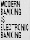
pages by Crouwel versus pages by Jan van Toorn from publication “Het Debat”

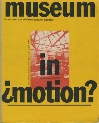
Extremes met in person when Crouwel and Jan van Toorn celebrated their life long controversy with a recurrence of their famous 1970 debate. Functionalism versus engagement. Jan van Toorn succeeded Crouwel as a designer at this museum under the directorate of Jean Leering to manifest in an inspiring cooperation what that leads to in terms of exhibition concepts and graphic design (“Museum in Motion” at the library). Jean Leering also closely work together with Jan Slothouber (read part 1 of C group’s research) at the TU-Delft where the published several internal essay’s on the philosophical and social consequences of design.


80/20/100 © Nijhof&Lee booksellers – Laurenz Brunner, final exam poster

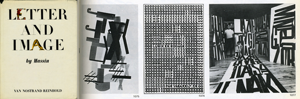
More research was conducted to explore related content or work approach of other designers like, Laurenz Brunner’s “Akkurat”, his successful contemporary remake of Helvetica, Experimental Jetset convicted users of Helvetica, the cooperation “8020100” between Vivid Gallery in Rotterdam and Nijhof&Lee Bookstore in Amsterdam. Context was created by turning the focus on Adriaan Frutiger, designer of Helvetica’s conscientious alternative “Univers”. To further explore the relation to language and image we further focused our investigating efforts on the visual legacy of Charles & Ray Eames, the “El Hema” exhibition/store and Massin‘s timeless publication “Letter and Image“.

With the inclusion of Belgian artist Guy Rombouts the full circle of our focus on type design was completed. The investigation into his visual language concept “AZart” will be presented soon in a separated part 3 C_group posting. This was part II of the C_group research
All researches linked in this posting can be downloaded in A4 format and are also available as hard copy research prints at the ResearchFolders available at the academy library

The Alphabet of Spaces


Friday, January 16, 2009

Isn’t that a great name Merel Woudwijk. You know i am wondering about Merel, because she got an idea to make her own alphabet.  An alphabet  that no one can understand. Very abstract and powerful alphabet. She call it “The alphabet of spaces”.

Why these abstraction, because of the inspiration of artist Sol Lewitt and her conceptually idea spread away in her mind to make such alphabets. There were more than 100 prints in woodcraving, some prints in silkscreen, 32 prints in etchings, and 42 prints in lithograph full with care and patient. She choose the basiccolor black for her alphabet, because it gives her good results and comments

posting by Raz Barsati

Where’s the goddamn book?’


Saturday, January 10, 2009

Charlie hasn’t been very lucky at finding the information she needs to write for the Rietveld’s DesignBlog. Before, she wrote something about Typography artist Bram de Does. She told me all about her search to find the information she needed, which was all in one book ‘The Kaba Ornament’. Totally fixated on that one book, she searched the Gerrit Rietveld library, the Rijksacademie Library and even the Amsterdam Public Library, to find nothing but a video on de Does. Now Charlie has to write something for the blog again, which involves a handmade book from Rietveld students. But this book too proved hard to find.

Five days before the deadline of the Bram de Does piece, she found the publisher of the book, who shared a number of useful anecdotes with her. Let’s hope she’ll be successful in finding the handmade book as well.

link to ilovetypography.com

posted by Jesse Muller

The cube as a representation of a democratic art form


Wednesday, January 7, 2009

With a speech by Simon den Hartog, former director of The Gerrit Rietveld Academie, a small retrospect exhibit on the work of Jan Slothouber was openened at the “van Abbemuseum” in Eindhoven NL. An intimate group of affectionado’s and family bridged the gap of almost 50 years, when Jan Slothouber together with Willem Graatsma started his fascinating journey into the world of the cube. The Centre of Cubic Constructions represented a highlight in this extraordinary focussed research, culminating in the 1970 representation at the Venice Biennale.
Seemlessly scanning the architectoral space occupied by art and design, the exhibit –designed by Erik Slothouber and curated by Diana Franssen– clearly presented an extraordinary focussed spectrum of work

Some weeks later we revisitted this exhibit with a student research team of the FoundationYears C group. Exploring the cubic constructions we found direct relations between the work of Slothouber and the minimal art of Sol LeWitt. The choice for a simple universal and modular form makes it posible to built a grammar for an entire body of work in which all the steps in the process can become interesting in their own right. “in which even the concept can become as interesting as the final product” (Sol Lewitt, cat Sonsbeek 71).

The specific context of typedesign addressed in our workshop presented striking relation between their works and those of more contemporary designers like Radim Pesko and the Swiss designers Dimitri Bruni & Manuel Krebs of Norm

More research was conducted to explore related content or workapproach of other designers like, Bram de Does, Karl Nawrot, Na Kim (website) and Ji Lee.
This was part I of the C_group research.

All researches linked in this posting can be downloaded in A4 format and are also available as hard copy research prints at the ResearchFolders available at the academy library

Disobeying for the sake of disobedience


Tuesday, November 18, 2008

Ji Lee (pleaseenjoy.com) is a Korean born New York based designer and initiator of urban interventions. He grew up in Sao Paolo and later moved to New York where he studied at Parsons school of Design. He is now working as creative director for Google, a freelance designer and a design teacher at Parsons school of design. Some of his most well known works are “the Univers Revolved”(universrevolved.com), “Abstractor”(abstractor.tv) and “the Bubble Project”. (thebubbleproject.com)

Ji lee´s contribution to Experimenta design is “the bubble project”(ABC World News). It is a project that he’s been working on since 2002. He initiated it in New York where he printed 50.000 talk-bubble stickers and placed out on top of commercial ads allover New York City, leaving it open for people of the city to fill in their own words. The project has continued to grow ever since.
The idea of the bubbles originally comes from the Situationists (Situationist International), a small assembly of artists and politicians active in the early 60´s. Their main intention was to create disobeying people. In 1968 they made bubbles and stacked them on commercials. They didn’t like the way big companies took advantage of creative people to sell their products so they turned it around and used these commercial images to support their own messages.

Ji Lee is questioning the way our cities are overrun with commercials and our limited possibility to express ourselves in the urban space. Many of the graffiti tags we see on the streets are also a reaction on this but most of the tags we see in the cities are also commercials for artists and crews and the conversations going on in the graffiti world are most of the time only readable for the initiated. By using the Situationists means and turning the commercials into public conversations he encourages all people to communicate their own thoughts without writing anything himself. He is basically giving the word to the people of the city.

posting by Chandra Sen

D group /Type Design, from Experimental to Corporate


Tuesday, April 22, 2008

Helvetica is a feature-length independent film by Gary Hewitt, about typography, graphic design and global visual culture. It looks at the proliferation of one typeface (which is celebrating its 50th birthday this year) as part of a larger conversation about the way type affects our lives. (http://www.helveticafilm.com/) Helvetica introduces type as more than common. A specialized design discipline.

helvetica movie image1helvetica movie image2

A lecture by Henk Groenendijk on experiments in type design, related to ‘developping cultural and economical progress in the 1950-’70, gave more insight in the context that proved so fertile for Helvetica’s rise to stardom.

Indiana Number-paintingLogo’s from fiftiesSandberg Experimenta TypograficaModern Banking

Time and space is a given phenomenon in education at the Rietveld Academie, where things constantly present themselves in past and contemporary creative projects. As an almost casual gesture, some 2nd year students from the graphic design department dropped by to present their recent type designs in progress.

Student type design

Finally research material was edited down to A4 sized guided tours into selected subjects. All subjects presented in this list are also available as hard copy research prints at the ResearchFolders available at the Rietveld library.

As usual we selected subjects with a direct connection to the context of the presented material in this classbloc. In this case Helvetica the Movie” and its content, was researched through subjects like the Corporate Alphabet, Wim Crouwel, Laurenz Brunner, Experimental Jetset, Norm type design and their publication “TheThing” or Letterpress.

The lecture gave a much broader perspective from which researches like de Stijl fonts, Buro Destruct, Zaph Dingbats, the Univers Font, Systemfonts, Swiss Style/Modernisme, Guy Rombout‘s AZart and Edward Fella were initiated. Widening the discussion towards the Helvetica subject by adding links to the actuality, some more subjects were added, Jonathan Barnbrook. Richard Niessen, Type Radio, Emigre‘s Zuzana Licko, Jonathan Puckey‘s Type Tool, the mysterious typebased posters of Michel Schuurman and ultimately the concept of Dead Type by Hansjakob Fehr

Nov 1st 2007 : Design Researches Available for all Foundation Year Students. > Hard Copy / Soft Copy


Saturday, November 10, 2007

Design Researches available for everybody.

Poeme2_web_final Hard copy prints of all researches from 2005 – 2009 are on file in the Library folders Vol#1-12. You can study them anytime during opening hours [Openingstijden: maandag t/m vrijdag van 11.00 tot 17.00 uur]. For example you could check out this beautiful research on Amedee Ozenfant in the context of “Le Corbusier Art and Architecture”. for more see X

Fransje Killaars Soft copies are available on line as jpeg’s or pdfs. You can download these pdfs and enjoy the content and its hyperlinked guided tour. Here is an example of such a tour into the work of “Fransje Killaars”. see for more X

Screen shot 2013-06-30 at 11.02.08 PM


Log in
subscribe