Skip to Content Skip to Search Go to Top Navigation Go to Side Menu


a visual study of the Young-Helmholtz color theory


Thursday, November 29, 2012

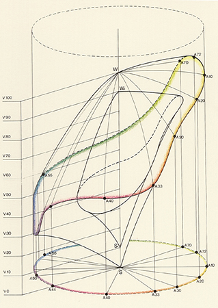
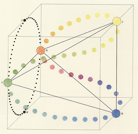
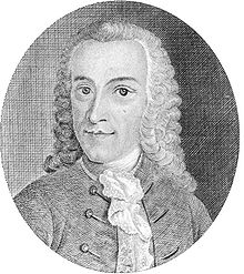
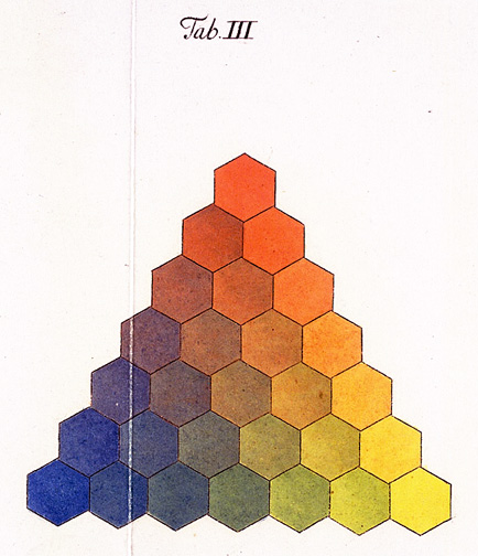
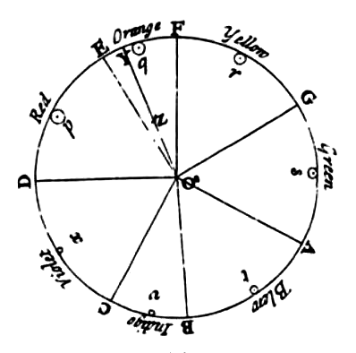
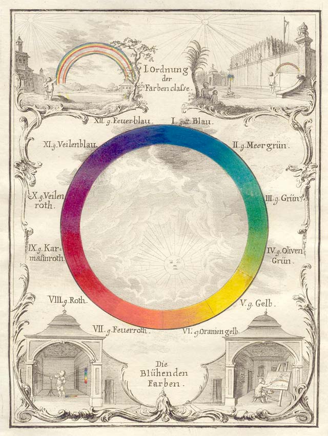
Hermann von Helmholtz was a German physician who contributed greatly to different areas of science. In 1851 he made a color system that looked like this:

This color system illustrates how color is perceived by the human eye. The system is based on a previous study made by Thomas Young in 1802, the color system has therefore been named the “Young-Helmholtz theory”. Young’s study states that there exist 3 different types of photoreceptor cells in the eyes’ retina, who are each sensitive to a certain range of light.

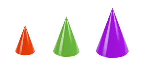
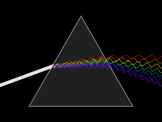
Helmholtz then went a step further by assigning different colors to the wave lengths that the photoreceptor cells were capable of detecting. Short wave length, Red. Middle wave length, Green. Long wave length, Violet. If a color between the primary wave lengths is seen, the different cells will react to create a mixture that will create this color. For example, if yellow is seen, both the photoreceptor cells receiving red and green will mix to create this signal. The diagram underneath illustrates this. (1 red, 2 green, 3 violet.)

Colored light is additive, which means the more color is mixed, the closer one will come to white. This is why white is centered in the Young-Helmholz color system. The lengths represent the amount of color eventually needed to get white.

All in all this color system concluded that us humans are trichromatics, which means that we have, as mentioned before, 3 different cells in our eyes that can catch different wave lengths of colored light. So if you are missing one type of these cells, you are colorblind. This information eventually led to developing a color blindness test that is still used today, called PIPIC.

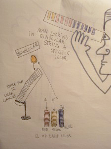
Being new to painting, and especially mixing colors, I was amazed that the three cells in our eyes mix the color that you see for you (and much faster and more accurate than anyone would ever be able to do by hand!)

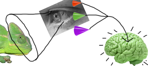
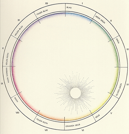
Hoping to maybe understand how my eyes got so good at mixing color, I wanted to visualize this unconscious mixing trick that they apparently do. I learned from my color system that the mix of colors, which happens in the eye, is a mix of three colors; red, green and violet.

The three colors are divided into wavelengths, this is how the three different cone cells absorb them. Red, short wavelength. Green, middle wave length. Violet, long wavelength.

When we look at different colored things, our cone cells do the mix and our brain sees the  color. cool.


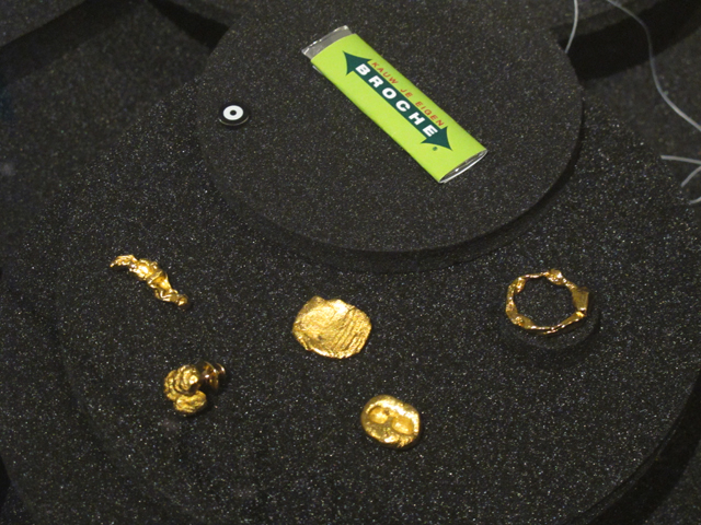
I therefore thought that I might have to put one monochrome item into focus, too boil the mixing process down to the core. I first thought I might make the cones the color of what they saw, to show how they, when mixed, visualized this color. I tried this with a cucumber and the 3rd floor of the rietveld building.


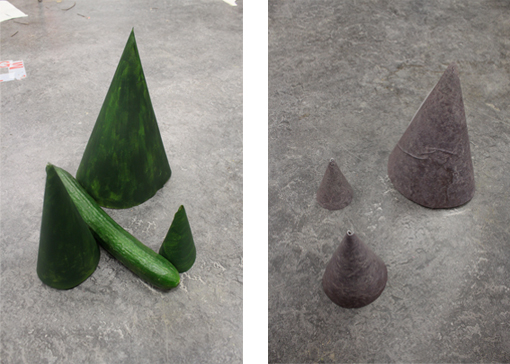
But it was simply to easy and felt repetitive showing the same color twice. colors are also such an ambiguous and individual experience, so giving the mixed color away this clearly was no fun.

I wanted to show how the eye really works on this almost incomprehensible subconscious level. The cucumber could stay, but the cones needed color!


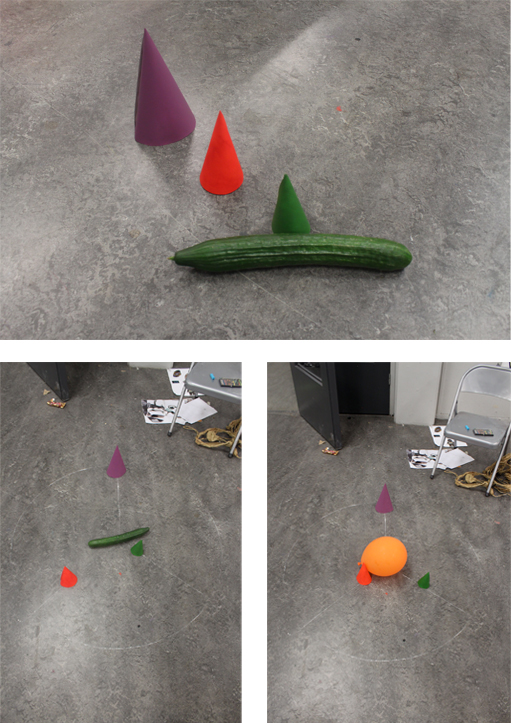
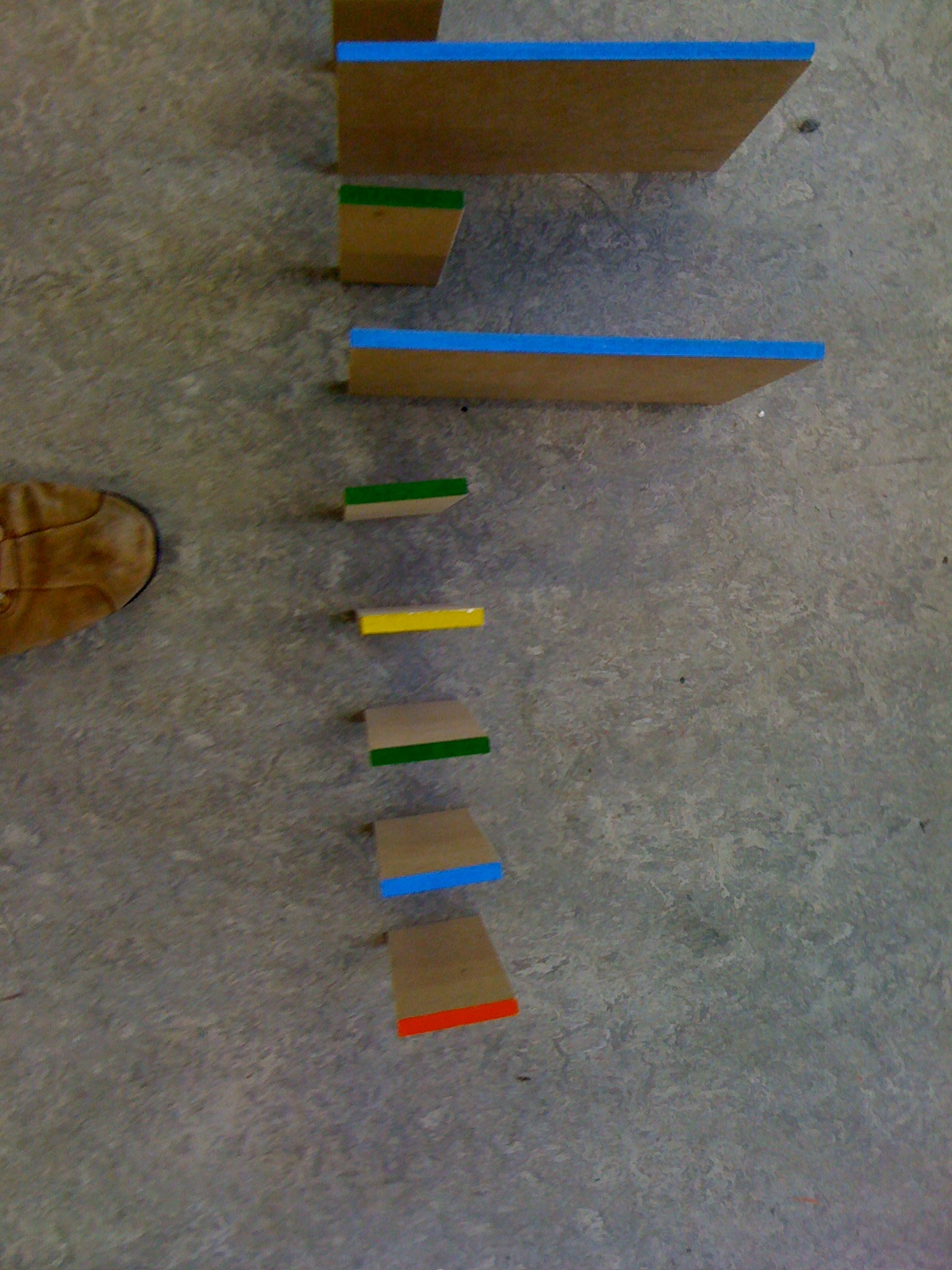
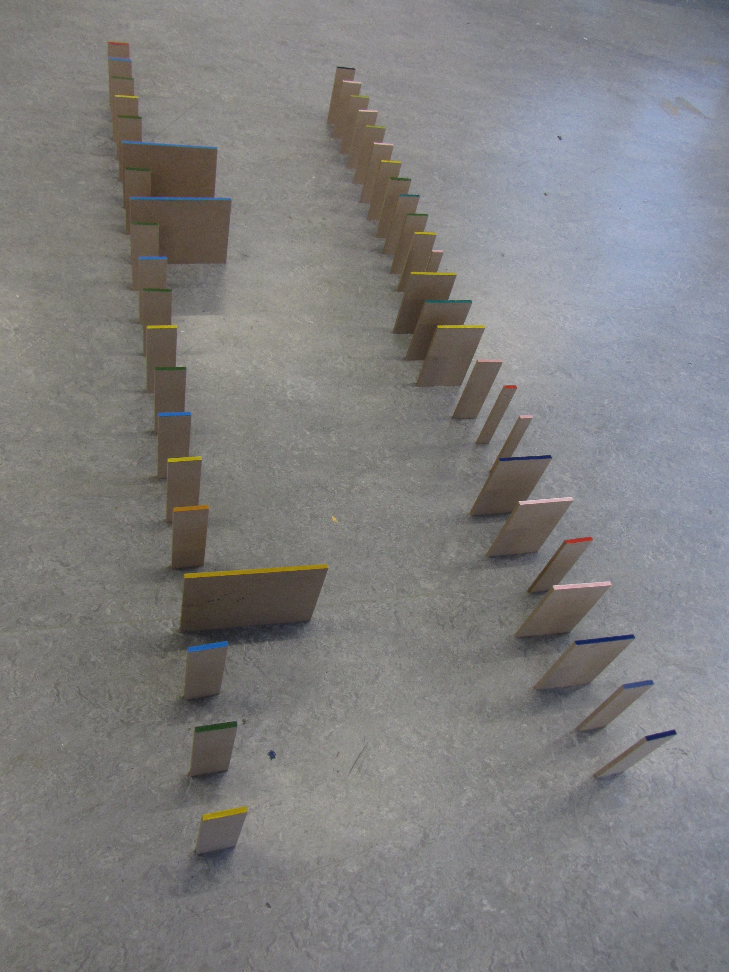
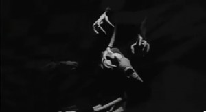
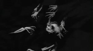
I decided to draw a chalk circle (vision is ephemeral), with the object in focus centered. From the center I drew three lines, one for each colored cone. The lines are the same length and represent the amount of that specific color needed in order to achieve the mixed color of the object in focus. The closer they are to the object centered, the more is needed.

So far so good, But a cucumber does not just lie on the floor, a balloon might, but it still seemed too random. A cucumber is found in the supermarket or in your fridge and the balloon, maybe at a kids party. But drawing chalk circles at albert heijn or amongst 30 six year old kids on a sugar high also seemed random.

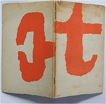
Chalk is an outdoor thing and so is color, luckily. So I went out in my surroundings and documented, with photos, the different objects i saw. I eventually made a book with all my outdoor color observations.

Click here to view it!

It starts with a green dust bin and then travels around helmholtz color system going to a yellow car and so on, until we reach another dust din, but this time blue. The circle has been completed. At the very end of the booklet we see a white cup, white being a mix of all the colors deserved a special place, so there you go white.


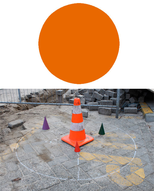
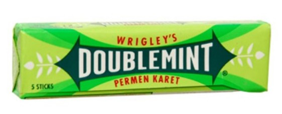
I am very glad i finally got out of my apartment and ended up working outside, because colors outside, or in public, as communication, is a big part of my color system. The colorblindness test that the Young-Helmholtz theory helped develop, makes sure pilots aren’t color blind, so they know what the light signals on the airstrip are trying to say to them. likewise this also goes on in our everyday public; traffic signals, which bin to throw the right trash in and where the best offers are in dirk. which is why i choose orange to be my screen printed color, featured as a signal cone in the book, because it communicates so nicely. thank you orange.

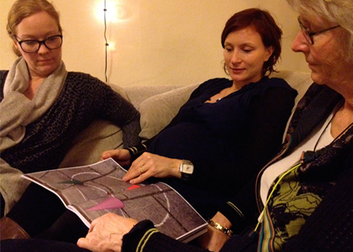
i brought my book home with me for the holidays, my family liked it.

Color Harmony?


Wednesday, November 28, 2012

Up to the 1960’s, existing color systems were based on experiments performed in a dark room.

Another method was used to create the Coloroid System. The perception of colors happened by observing colors in compositions within a wide view-field, resembling a more real life situation.

Coloroid is a three-dimensional color space which is related to the CIE color measurement system using its characteristics; hue(A), saturation (T) and luminosity (V). Nowadays we all use these characteristics in Photoshop to make changes in light-intensity, brightness etc.

Unique to the Coloroid system is it’s aesthetic value, due to a model based on observation conditions resembling real life. Research also included color preference, biophysical and psychological effects and colors used in different art and architectural periods.  Based on results involving nearly 80,000 people, rules were formed and named the Color Harmony.

With these rules designer software has been developed to create harmonious color groups. 

For me it’s difficult to accept the aesthetic value of this system, as I believe Color Harmony to be subjective. Also this database is created over a period of 50 years with results resembling this time period. Is this the color harmony of the past? Will we have changed our mass Color Harmony- maybe created a love for clashing colors or is Color Harmony the base on which every eye at any time period feels comfortable?

As a start to the research of the aesthetic value, I tried to download some designer software based on the coloroid system. Unfortunately the software is being sold for 199 dollars and as I am not a download for free expert, I gave up the software.

I found more articles on research being held based on the coloroid system and discovered architecture to be a returning subject.

The coloroid system is based on tests resembling a real life situation, how can this system be translated back into the real world?

For example: a paper about color in rural architecture and landscape in Poland.  The village is an example of change in architecture over the last 100 years. Color is not longer related to function. New materials are used creating a great diversity in building style, scale and proportion, which resulted in a visual chaos. Only the visual chaos, as the author is describing, is subjective; as I do not agree on the (digital) correction he shows in his paper.

Websites created with software based on the coloroid system are products produced for the mass. Just as architecture is a product produced for the mass. I ask myself, what does my surroundings look like, is it harmonious to me?


Over a week’s time I take photographs of street views, buildings, my surroundings. I make a collage of the pictures to get an overall view of my personal color harmony.

Only, these buildings are designed by architects. They have already chosen the harmony for the people. They might have based it on the surroundings or decided to create something standing out. So my selection of the surroundings is still based on some other person’s harmony.

The only way to create my harmony is to change the colors, choose the colors, and even mix the colors by my own hand to be completely harmonious to me.

How do I choose the colors? How do I choose the color composition?

I use the collage as a base to make different color combinations, they will be silkscreen printed on a large roll of paper, all connected. The result is a color line where you can find your harmony, going forward and backwards on the roll.

A idea of what the paper roll will look like in the nearby future. Online version under construction.


A while ago I found this online version of a Chinese handscroll, a panoramic view of the surroundings. Translating this ancient roll back to this our digital age is a amazing connection. So after the screen printing is done, I’m going to create an online-digital-version of my color-line, so we can either manually or digitally scroll to find our harmony.

Cause aren’t we all looking for harmony?

That’s why the silkscreen printed color circle has an intense blue color, the color of twilight. The time of the day where I believe all to be harmonious, where I reflect upon my day, my surroundings-


A Planetary Color System


Wednesday, November 28, 2012

French painter and sculptor Michel Albert-Vanel, specialist in color and symbolic representation of color, presented his  Planetary Color System in 1983.  Making relation to the color system by Eswald Hering,  Vanel accepted  six psychological primary colors assembled by antagonistic pairs: black and white, red and green, yellow and blue which mixed result in 64 combinations.

Vanel focuses onto the effects of the color sensations and says that colors are not abstract concepts but real sensations, not experienced in isolation but in groups. There are no isolated colors as one color is necessarily related to the other ones and their sensation also depends on surrounding, lighting, texture, size.

There are three new parameters introduced: chromatism (the conventional scales of hue, brightness and saturation of a single color), contrast (three scales to describe mixtures of colors; for hue, brightness and saturation) and material (three scales – from active to passive, from transparency to opacity, from matte to glossy).

The planetary color system is represented by planets appearing as the primary colors, orbited by many small moons as secondary colors. Using planets as a representation makes it possible to move into multidimensional universe of color combinations and to always go further in the smoothness, into the galactic dust.

The term planet in this color system, is used only as a visual representation, as a sphere. There is no real connection to the planets in our universe. Though this use is arbitrary, my experience is that we all make this connection in our mind. As we experience colors, according to Albert, in groups, in relation to each other, I thought about the relation we, human beings, create with each others too. How do we see each others? Do we see us in color? Do we have colors? Maybe sometimes.

There is an expression: “after she saw it, it became dark in front of her eyes”, or another one: “when we are in love, we see everything pink”.

What can be the meaning of the pink color and possible source of the term ”pink love”: see this link..
or other interesting links about the color meaning, and this ‘pdf’ about color and energy.


The  energy or frequency a person emits has a color, though it is not visible to everyone or we have to remind ourselves we can see it, learn it again. The energies, therefore, created between people, in mutual interaction, get mixed just as they do in this color theory: into the scale, darker, lighter, under the influence of a few factors.


The starting point is a human body, for me a representation of a planet. It is a micro-cosmos, a representation of the macro-cosmos. As the planet interacts to another one, color to color, body to body, a new experience happens. Red, blue, yellow and green are primary colors used by Albert. I used them too. Since it was, and it is for now, impossible to capture the colors the body emits, I wanted them to be visible, produced by the body, out of the body, from the body. Four persons and their bodies created a fountain, a galaxy of colors, as explosion of colors. It becomes an experience documented in a form of one photograph. My wish is to remake it in the form of performance or video, where this creation, motion would be directly visible, we would see it happening.
Color has a strong connotation for me. I experience it in a synaesthetic way (look). Green and blue are cold, red and yellow warm. Also they carry more levels when I use them. This time I needed to create just one color out of these. If I mix them, I get brown, and this time, for me, there is no brown in the galaxy. It had to be deep, attractive, also dangerous, clear and not, sublime. Deep violet. The color of the galactic dust. Created out of warm and cold, red and blue. The color in between the planets.

Colors do talk; Albert-Vanel says that through the tarot he made in relation to his system.
Ask, observe.. and see.. is another phenomenon discovered by the Russian electrician Semion Kirlian, we can capture the energy of the body which radiate it. For more information about that follow this link to… photography and the “Aura”

Thank you for the colors..

Distinguishing Colors


Wednesday, November 28, 2012

Tobias Mayer [1723 – 1762] was a self-taught mathematician. In 1758 he invents the so called “Colour Triangle” which is a color-system based on his research of how many colors the eye is capable of distinguishing. He took red (R), yellow (Y) and blue (B) as the three basic colors, more specific: cinnabar, massicot and azurite.
He started using a system called “The-Twelve-Part-Rule” to find the colors distinguish by the eye. He assumed that twelve was the perfect amount of parts from the three colors to mix. For this system he made this formula: R4Y4B4 and in this formula he would change the amount of the three colors by always ending up with the result of twelve parts in all. In the end it led him to 91 different colors that where distinguishable for the eye. Afterwards he applied black (K) and white (W) to create light and dark in his 91 colors. With black and white he would use up to 4 parts of either black or white, but still with the limit of 12 parts in all, formula: R3Y2B3K4 (or W4). This led him to 819 different colors that the eye was capable of distinguishing.

As shown on the attached picture no.1 The Colour Triangle by Tobias Mayer is, at least for me, not showing more than 66 small triangles with 33 different colors and 303 small white triangles, which is not really concur with explained results of his calculations. So I must admit that I don’t really agree that these colors shown in the Colour-Triangle are the colors the eye is capable to distinguishing, because that is exactly what I can’t do with at least 336 of the triangles. His Colour Triangle was not published, but in 1775 G. C. Lichtenberg made a replication of the Colour Triangle which is a triangle with 28 different colors taken out of the research by Tobias Mayer shown at the second picture.

MY INTERPRETATION AND FINAL PROJECT

What I found both interesting and important was to solve the mystery about the 786 missing colors in his color system and especially the missing GREEN.

*

By the way; in my silkscreen print I made the circle a typical grass-green color. I chose that color to highlight which color I really missed in his system although it makes sense considdering how Mayer calculated and mixed his 819 different colors.

*

First I was thinking to actually mix all colors by using his mathematical system. But soon I found out it was too comprehensive to work as mathematical as he did with exact amount of paint in 819 different mixes of colors.

If he really did it I give him credit for that!

*

Next idea was to make the spectator experience the colors and experiment with them by mixing the colors themselves.

My first thought of the final result was to make an binocular where you could put inside 12 round plexiglass-circles in either the color blue, red or yellow and then try to distinguish the different color-result by looking through this binocular.

Unfortunately
the plexiglass was way too thick and strong in color
so it was not possible to mix the colors through them.

*

Then I tried to do it with transperant paper on a light table. It worked out really good. It was much easier to mix the colors and it worked out with his mathematic system. The result where really strong and captured the spectator to keep adding more papers to the light table continue making different combinations.

*

I ended up using a projector to make it even stronger.

Next to it the transparent paper in red, yellow and blue was placed.

And then it was up to the spectator to make different results of which colors it was possible to get in that method of finding colors distinguishing for the eye….

The various try outs I present here are a remake of the real hands-on presentation.

By trying these different ways of mixing the colors I really got confirmed that it is absolutely strange that Tobias Mayer didn’t end up with a green or at least greenish color in his system. There came up green nuances and green color, but somehow he couldn’t distinguish them from other colors.

I was happy to get the possibility to mix the colors my self and let others do the same. Also just to enjoy the beautiful end result of what was projected on the wall!

*

You Name It!


Tuesday, November 27, 2012


ISCC-NBS-System is a color system that has given colors more efficient names. Inter-Society Color Council (ISCC) and National Bureau of Standards (NBS), an American government agency, first proposed the color system in 1932. Its initial purpose was to name the individual blocks of the Munsell Color System, which classifies colors by hue, value and chroma.


Moreover, just like how Munsell Color System (on which it is based) works, the colors of ISCC-NBS-System are determined under the condition of average daylight and normal viewing. However, instead of naming the colors by symbols, ISCC-NBS-System identifies the colors with the general and understandable terms so that everyone can use it without difficulties and confusion.

ISCC-NBS-System opens up a simpler way to name colors that does not confuse people with symbols and numbers. Actually, it is the most familiar way people name the colors and it is how we were taught to describe the colors. People simply name the colors by the basic colors that they are already familiar with and if more accuracy needed, they add adjectives in front to describe the darkness, brightness and etc. The system was close to what everyone has accustomed to name colors, except it organizes the language.


It's a good example of a diagram of ISCC-NBS-System, unfortunately only in Japanese, but you can still get an idea how it is structured

ISCC-NBS-System’s basic hues are red, orange, yellow, green, blue, violet, purple, pink, brown and olive. These colors have intermediate categories so that the names indicate the combination in colors, for instance, reddish orange and yellowish green. Finally, these categories are subdivided into 267 categories. Appropriate modifiers are added before the hue names: vivid, brilliant, strong, deep, light, dark and pale, although not all hue names have modifiers. As a result, the color should be called something like dark reddish gray.

According to ISCC-NBS-System, the name of the color is decided upon the viewer’s choice. It will be orange if the one sees it as orange even though it is red to the others. The names reflect how the viewers see the colors. The colors may be called differently depends on the viewer’s physical conditions, their educational or cultural backgrounds and any other facts that can limit their judgment. For instance, when I went to buy my school uniform in America, I first learned that khaki was not the color that I used to think of, which was close to dark green. My khaki uniform was light brown instead, what I used to call beige. South Korea and the US have given different names to the one color. The name of khaki was no longer important, what mattered was that I could describe the color.


My school uniform of Notre Dame Academy and its khaki skirt of which I had trouble describing the color

The given names under ISCC-NBS-System’s rules show the one’s characteristics. The decision on naming the color is made personally and objectively so it naturally shows one’s personality and background. I have a problem differentiating violet, purple and pink. They become even more uncertain when the adjectives are added. When the colors get darker or brighter, they lose their vividness and it is hard to decide to call them with specific names. To me, violet is close to dark pink and dark violet is hard to distinguish from dark purple.


Get the Flash Player to see this content.


The short movie that I made shows the color that confuses me the most, which is the mixture of violet, purple and pink, with different color names based on ISCC-NBS-System rules. It is 54 seconds long and shows 18 different names, one by one, every 3 seconds followed by the blinks. It is one loop so the names continuously change. The names describe one particular color, which is the color of the background. The viewers can come up with different colors for those names if the color is not shown because it was my personal decision to choose that color for those names. On the other hand, the color tricks the eyes as if they are different colors because of the blinks, but in fact, the only change in the movie is the text. The text contains all possible combinations among these three colors.


Left, the movie playing in loop, Right, the silk screened color. I have to say that the colors look completely different in picture, on computer screen and when you see them yourself

As a last step, the class, as a group, experienced the silk screen. I tried to print the color in the movie without looking at the color I already chose in the movie. However, the silk screened color turned out to be completely different than the one from the movie. It was much brighter and more vivid than the color on the screen. It was interesting to experience impossibility of duplicating the color and possibility of creating limitless colors with one name because it can be conceived differently depending on who names it.


To find expression


Tuesday, November 27, 2012


What are colours and where do they come from?


Isaac Newton


Isaac Newton was born in 1642 in England and was amongst others a physicist and mathematician. He began exploring what colours were and where they came from in his twenties. With the help of a prism that he put in front of a ray of sunlight Newton could project a rainbow spectrum. To be certain that it was not the glas colouring the light he then added a 2nd prism into the path of the spectrum to see wether the colours would change.

This led him to the understanding that light alone is responsible for colour. He discovered that colours are light of different wavelengths and that white light is a mix of all colours in the rainbow spectrum.


He also invented the colour wheel by taking the colours refracted from the prism and placed them in a circle based on the mathematical calculations of their wavelengths. This made the primary colours to be arranged opposite their complementary colours, for example yellow opposite violet. This made the complementary colours enchant the opposing colour through optical contrast.

The circular diagram became the model for many colour systems and his research was the beginning of what we know of light today.


My interpretation of the project was to get a better understanding of light and also therefore the lack of light. I wanted to have an experience only for me instead of doing a work that would tell something to others. So I decided to do an experiment where I would instead of using the light use the lack of light and try my living as a blind person for a day.

How I came to this conclusion is because of Isaac Newton and his thirst for knowledge. I could not stop thinking about how he had been in his room, doing experiments. If everyone would do that, what would happen then? What would I like to try, to find out?

When I decided this is what I want to do, I tried on a scarf to cover my eyes with, found a long enough stick to walk with and then when it was time I took the items and used them to partly disable- partly help me. My work ended up being me walking blind to school, sitting in the classroom on presentation day and just listening to everyone, taking pictures of everything with my camera and finding my way to the toilet, which was the hardest part. After class my friend Susanna led me to an empty room where she filmed me talking and also when I took my blindfold off. The film I will show you is the part when I take the blindfold off. It was a very hurtful experience for the first couple of minutes.

Hurtful in the way that you could not focus on anything other than yourself and the pain. At the same time you appreciate what you have so much more. To be in a state where you are robbed of something, of one of your senses, is an awakening as much as it is a new beginning. My day as a blind person was a day of anger, chock, surprises, frustration and appreciation.

Get the Flash Player to see this content.

I think that my way of working with this project was very fruitful for me and also opened my eyes for a new way of thinking. I have realised that my works do not need to be telling for anyone else other than me. If they do it is just an bonus. I also liked the exploring of my emotions in regard to what I am doing and also try to just “be” in the state you put yourself in and to experience it fully. It can also be a product of importance.

The Silkscreen print I did was Blood red and it relates to my project in the sense that they

both were an act of me corresponding with myself mostly. The day we got the assignment of the Silkscreen print I decided I would do the colour of menstruation blood.

I really liked this assignment and the fact that we had a long time to work on it. The fact that we got to discuss our works also adds as talking is a just as important part as working, a lot of the time. If you are afraid to say something I think often it is because you are afraid that what you are doing is wrong. What you need to know is that nothing is wrong instead what you are doing is right, and that your friend that is doing the exact opposite of you is also right. When you speak up you get a chance to grow and see your work in a new light and maybe then the work can also better from it.


Attempted colour system project


Tuesday, November 27, 2012

This is a text about how I made a project translating colours into tunes and tunes into a sculpture. My process; how I went from colour wheel to sculpture:


Ignaz Schiffermüller was an entomologist – someone who works with the part of nature that works with the scientific study of insects.
He wanted to make a wheel where the colours instead of Newton’s system (which related the area of each colour to wavelength, and the sizes of the colour compartments varied) had the same size of segment. He assumed that there is a knowable natural order to colour, one that would confirm the relationship among all forms of knowledge and he wanted to create a system that showed the links between the understanding of colour in different fields – natural history (and classification), natural philosophy, and artisan practice.


The colour wheel, he published in 1772, have as well twelve colours, including the three primaries, the secondaries formed by their combination, and six tertiary colours. Each colour has 12 x 3 colours, so the system is in all 432 different colours. Within each species are shades, a bright or pale state and a dark or deep state, as well as the original. He chose blue, his first color, to demonstrate this part of his system. The series, labeled A through M, shows the range of colors from bluish white through blue-black.


Schiffermüller for example wished to make the colour wheel nuanced, so it would express the logical connections between musical and chromatic harmonies: In music, especially classical music, chromatic harmonies means a twelve system musical scale with twelve pitches, each a semitone above or below another:

Because Schiffermüllers intention was that the music and the colours should have a logical connection, I decided in this project to translate the colours into tunes. I did it by taken Schiffermüllers colour wheel and compare it whith a chromatic wheel. Blue therefor became C and so on.

I chose two different songs for comparing: One by Justin Beeber and one by J.S. Bach; I started out with the tunes, tranlated the tunes into letters and then I used my system to translate the letters into colours:


I started out by painting squares in a line of watercolour for each song. I wanted to take it a step further not ending up with a small paper of colourlines. It was to close to an A4 paper of tunes, like the tunes I tranlated into colours. I wanted to create another visual outcome, which you like music – you listen to and not read on a paper – could be in, walk in it or around it, but make it a very different experience than listening to the two music pieces.

Here is the translation from tunes of Justin Bieber into colours:

The one the left is the beginning of both songs(J.S.B to the left):


A colour sculpture was an idea in which I could have all these aspects included. But something was missing: The  rhythm of the music! I started cutting out pieces of MDF, which sizes related to each other by size. The biggest piece was the whole note, the half of this note a half note, half of that size a quater note, half the size of a quater note a eight note and so on. Here you see two whole notes and seven quater notes translated into pieces of wood:


It became a sculpture, which you can not just read, but you are able to walk a round it. The Justin Bieber part of the sculpture, has primary colours and is very easy to look at while the Bach part has a lot of secondary and tertiary colours.

It’s not the meaning that the work is about music. It is first of all a study of translating from one media into another and ends up being a sculpture which two part defers from each other in shape and colour field. The MDF pieces I cut out according to the length of to tunes to give a feeling of the differences three-dimensional instead of two-dimensional. Though both two parts of the sculpture has the same look, the colour scales and transition of size gives a different felling. The Justin Bieber song has a very sharp look because there are almost no secondary colours and also the sizes of the wood pieces have a less softer look than Johan Sebastian Bach.


This sculpture is not made as a model, but I would love to make it in a larger scale so one could walk around inside it. Then I would have painted the colours on the surfaces on the sides instead of the top. Standing in one of the ends of the sculpture the colours would look more compressed the more you looked to the opposite end of the sculpture.

Stedelijk Design Show 2012 /Future Highlights


Tuesday, November 27, 2012

17 Rietveld's Foundation Year students visited the "Stedelijk Collection Higlights /Design" in the newly opened Stedelijk Museum. Marveling at some masterpieces of Interbellum design or surprised –a little further– by the Scandinavian design some of us know so well from our grandparents homes, we arrived at the last part of this "Depot Salon" wondering what a 2012 selection of Design could be.
Researching contemporary design we composed the "2012 Supplementary" which we present in this post. From the exhibit "Stedelijk Collection Higlights /Design" we all selected a personal best and made it the focus of the researches published as part of the project "Design-in-the-Stedelijk"


‘Houses that were never built’


Monday, November 26, 2012

Big surface, loads of items, colors, shapes, sizes, functions of the works. I could choose any of them, but the one which attract my attention, was a ‘thing- simple, white colored, hidden in the corner of the Scandinavian design room. I wasn’t sure what the thing is. It wasn’t a painting, it wasn’t an installation or a 3-dimensional glazed porcelain. As I found later, on the artist’s website, it is one of the  ‘ A B S T R A C T  M O D U L A R  P I E C E S ’


Let’s say something about the artist. It is Rut Bryk, born in 1916 died 1999, married to Tapio Wirkkala whose work is also in the exhibition. She is primarily known for her ceramic art works. On her website we can read: ‘The works of her first figurative phase are wall pieces depicting still life’s, architectural motifs, mythological themes, plants and birds’.  I have to say that I’d rather find them naive, the colors which are used there as well as the forms.


But even in those ‘naive’ works like in The Lion, we can notice the style that she’s developed later in the  works, that I was so impressed by.

Soon after that peroid we can notice, some change in Bryk’s works, in the late 60’. ‘She began to produce large architectural ceramic wall pieces composed of numerous differently shaped and coloured modules’. The White Mountain, the work I found in the Stedelijk, was made in 1977.  The modular works, had similar shape and form, but the game of colors gives us a feeling that each of them is telling you a different story. When I was checking her works for this research I realized that those simple mosaic-like works, will open up only with time. The more time you spend with them, the more you understand and appreciate them.

Viewing her works, suddenly I had the ‘Lego idea’ in my mind (just her ‘Lego style’ contains only white blocks). Don’t you believe that the structure of her works and the Lego picture look alike?

right: phase 16 LEGO 'Archtecture series' Farnsworth house designed by Mies van de Rohe between 1945-51 / left: City (Oy Arabia Ab, 1957) This work was on show at the Milan triennial of 1960 and it was given the American Institute of Decorators Award in 1962. The piece consists of hundreds of tiles and cubes of different size and colour.[x]


But from other hand, don’t you have a feeling that she is bringing the spirit of constructivism in her works? Or maybe the character of the modern architecture? This can be the point, because Rut Bryk, was dreaming of becoming an architect, she was even accepted at the Helsinki University of Technology. But finally she ended up studying graphic design. She expressed her sorrow and disappointed about this in her diary: ‘The biggest wish of my life was not realized. All the beautiful houses that I had built were only castles in the air…

I find her modular-works as big architecture scale models, or maybe urban structures, interpreted by female nicety. They all look so delicate. It’s very interesting that you can compare the works to massive architectural structures.

Another idea which popped-up in my mind, while I was comparing her initial works with those huge wall porcelain structures, was the motto Mies van der Rohe used to believe in: ‘Less is more’. In my opinion it is a proper comment on her art pieces. The more ‘minimalistic‘ her works were becoming,  the richer they were. Thinking about Mies, I Googled his works and thought that we could again make some comparison:


And this is how I actually see the Bryk’s works;

Graphic design, ceramic skills and the plan of becoming an architect, which never came true- became EVERYTHING for her. Those three elements decided about her life, works, life decisions. She could let her dreams live free in her works. I’m very happy that I’ve chosen this piece of work. The simple and minimalistic white, 3D structure gave me a chance to make so many interpretations of it. And this is what I like the best about art the freedom of finding my own way to understand the work.

Wieki Somers invites your fantasy – Listen to your eyes.


Monday, November 26, 2012

“A porcelain pig’s skull is a teapot. The tea cosy is made of rat’s fur. Imagine that bourgeois ritual moment, when tea is ready with several people already gathered around the small table. And than the furry animal skull lands. A delicious shock, a clash of contradictory thoughts. Horror and delight, celebration and menace. And while your friends silently wonder what kind of tea this might be and how it will taste, there is a moment in which the tasty and the unsavory, harm and delight, can no longer be distinguished.”


The High Tea Pot, designed by Wieki Somers in 2003, is presented in the Stedelijk Museum along with the story above. This storytelling is an important element in Somer’s design [x]. She has her own studio since 2003, and can be considered as a part of the second generation of Dutch designers who gained international reputation. Whereas the previous generation was focused mainly on the conceptual ideas, this new movement revalues the aesthetic element. Her works always contain a narrative element. She doesn’t like objects which are completely finished, to smooth, to ‘design-like’. Because, as she states; “in that case you can’t continue the story, you can’t get your fantasy going and can’t put anything of your own in it”. That is the reason why she attempts to design her products in such a way that the user can dream away. Like a story in a book can have an open ending.

She works on intuition, according to the question she wants to rise. She sees a story in her surroundings, designs a piece, and again creates a story. She makes people create their own stories. And so did I. My story started as soon as I saw this piece the first time. So therefore I have decided to make my research a visual story rather than merely factual text. I will guide you along my own associative journey.

Listen to your eyes.


I got a memory flash of a room I’ve been in. A medieval castle in Vianden, Luxembourg. It was autumn, windy and I must have been eight years old. The smell was humid, and came from the old wet bricks through the flaked off plaster on the walls. The candlelight was dimmed, as so was the sound of the thousands of feet which once walked the tiled floor. The large robust wooden table in the middle of the room was apparently meant to display how the previous kings of this castle had their rich meals. Therefore the table had an overload of fake food. Stuffed wild game lay on the stable. Glassy eyes of swines stared lifeless. Meat of the surrounding forest took their position of being decoration seriously. Some sporadic fake apples painted in a gold cover.

A display of luxury, covered in a thin layer of grey dust, the dust of the stories happened here.


It reminded me of other displays of dead animals, especially these two pieces I saw when visiting the Verbeke Foundation in Antwerp. It shows a typing dead hare. The dead animal is turned into a machine by a human hand. Think of words as ephemeral, fragile, organic, rattail.  Wieki Somers does the same, she turns it into a pig’s skull an object of use, with a functional purpose.


When talking about dead animals, roadkills popped up in my mind. How damaged and used their bodies lie ruffled up at the side of the road. With their wet fur stuck together in the dirt they look gaunt..


Then, think of fur as a luxurious product. Think of the ‘bourgeois ritual of having high teas’. The ability to afford luxurious products. Arrogance and superiority of wealth. To place ourselves above others, above animal living, degrade them to a decorative coat.


As I got deeper into the matter, and after I had associations relating to the Hight Tea Pot itself (the material), I thought of a spherical scenery in which it could fit. Sinister, wicked, fairy-tales with a dark twist. Images from movies as the Adams family, Tim Burton’s Vincent Price, and Lemony’s Snicket appeared.


As I sunk in these atmospheres I discovered a fascination I have for this High Tea Pot. Both the materials that Wieki Somers used are ‘cold’, by that I mean the deadness of the animals. But these remaining of different animals become alive again when the hot tea is poured in the pot. Then the skull heats up, the rat fur is warm and touchable. You feel the heat from the inside, like a breathing organism. And so, I stumbled upon Victorian post-mortem photo’s. These photographs portray recently deceased people. Sometimes the person seems deep asleep, or arranged to appear more lifelike, or even together with alive family members. These photographs contain the same weird mix of death and live, cold and warmth.


As a last note I would like to conclude that the High Tea Pot is a narrative object, and creates a room around it. The invitation to make your own stories, was resulting in this path for me. And whereas the starting point for every story is the design object every time, the paths can lead up to total different stories, so therefore there exist a lot of different endings.

KLOK


Monday, November 26, 2012

When I went to Stedelijk, I walked around design room and I was amazed from many interesting things I saw at one place and I had once again an opportunity to have a look at Gerrit Rietveld works, which I haven’t seen for a while. But by coming back to Jan Eisenloeffel’s Clock, I can honestly tell that after I left the museum, his artwork was still in my head.

The very first time I saw it, I thought “wow”, and than my friend asked me to come to see another thing, some posters, which I don’t even remember right now anymore. The funny thing is, that I think the clock chose me to make a research about it, because it was so extraordinary and unusual that I just could not get out of my head anymore.


It is very important to know some more information about the artist if you want to know more about his works, so here is some information.

John Wigboldus (Jan) Eisenloeffel was born in Amsterdam in 1876. He was dutch goldsmith, interior designer, jewelery designer, illustrator, silversmith, ceramicist, bookbinding designer, glazier and director of academy. He was educated at the State Normal School for Tick Education in Amsterdam and taught in Russia in 1898 working with enamel and niello. He got the highest award for his clocks with enamel decoration. Anyone who had known Jan Eisenloeffel at the beginning of his career could not have suspected that the same man would make this clock 25 years later. Eisenloeffel began as a reformer committed to ridding the decorative arts of excessive embellishment, pomposity, and the use of precious materials. In practice this meant that he designed simple, honestly constructed products for daily use, including tableware, vases, and lamps in silver and copper, produced in small editions.

While I was collecting information about Jan Eisenloeffel and his artwork, I found a few of these early clocks designed by him. In my opinion in the beginning of his career he was designing more “clean”, and minimalistic things. Here are some pictures of the clocks he made around 1903-1905.


However, around 1908 Eisenloeffel became disenchanted with the possibilities of producing well-made, affordable items for a large public and turned almost exclusively to designing costly one-off pieces. This clock, made especially for the international exposition of modern industrial and decorative arts in Paris in 1925, is an example of this later approach. He wanted to demonstrate that craftsmanship was not a thing of the past. Whereas his tableware was conspicuous in its simplicity, this monumental clock is decorated with a complex scheme of symbols associated with time, such as the signs of the zodiac, and on either side and above the clock face the text is “Geniet den dag, left als de vogelen des hemels en als de lelien des velds”. Which means “Take therefore no thought for the morrow, live like the fowls of the air and as the lilies of the field” [Mathew 6 25-34]. The stepped construction reminds Aztec temples, and the multicolored enamel work was inspired by examples Eisenloeffel had seen in Tsarist Russia and also his inspiration came from Aztec architecture, Chinese motifs, and Celtic letters. Ironically, the dazzling decorative border of this demonstratively ornamented clock bears an engraved inscription derived from the New Testament.


I really found this clock interesting, because it is so detailed and kind of graphic style, that it is not enough to have a look for a second. I was watching this clock for a while and I realized that it asks for even more attention to see all small things and ornaments on it, so I came back even one more time just to get some more ideas and feel the stronger connection. After a while you can see there is some animals on the pattern – swan, dog, cow and a bird, as much as I could see. I am not sure if those things are connected with a clock or not, but I think the only thing which is the same for everyone, doesn’t matter you are human or animal, is time. So, perhaps Eisenloeffel wanted to express that thing, that time for everybody is the same.
Personally I prefer later Eisenloeffel’s style, because he is expressing himself or at least trying to experiment with different materials. He started to use enamel and he did it really succesfully.


Also, I realized that this clock reminds me of my grandmother’s old clock, which has almost the same form, just without ornaments. When I was spending summer in her place, every night, once in an hour I could hear the sound of the clock, for example, if it was midnight, I could hear 12 times of the clock churning, it was so annoying all the time. To get a better view how annoying that was I attached video where you can hear the clock striking eleven times.

Eleven am/pm

But despite this bad experience, I like every single thing in this Eisenloeffel’s clock – color, form, pattern. It is different clock than we are normally used to see.


Miniatures by Sheila Hicks


Sunday, November 25, 2012


(born Hastings, Nebraska, 1934.) Painter, Textile/Fiber/Weaver, Artist.
 
 
At the Stedelijk Design exhibition my attention was quickly drawn to the textile area were a lot of gripping works was exhibited. Most of the items appeared very autonomous and were presented as art displayed in frames, on glass tables or hanging down from the ceiling. Probably the smallest section of pieces (size A4) made of colorful weaved threads caught my attention – they were made by the American artist Sheila Hicks.
It is hard to say what it actually was that dragged me into her small and actually very simply and straightforward made artworks. I had the feeling of looking at a continues (paintless) painting with numerous layers. I was sure that something interesting had to be hidden behind those threads and probably made by a person with a lot of experiences and an interesting background.
The Stedelijk has written an appealing text on the wall about textile as art and how the industrial movement has influenced the textile scene and how the old stereotype that textile work was women’s work has changed through the time.

Sheila’s woven textile pieces are attractive because I neither could categorize the style or the period. Something in them looked familiar but at the same time like something I had never seen before, I consider it like a hybrid of different cultures and nationalities, emphasizing the use of different materials. The way it was presented was also interesting, in small frames, side by side. Very organized and strict but the threads stood out very randomly in a way. I really wonder why Sheila Hicks made these small miniatures and to understand that my research is based on her biography and her history.


Sheila Hicks is educated in Fine Arts at Yale University. She started as a painter and turned her carrier into weaving and working with fibers – from 2 dimensional work to 3 dimensional work. Her miniatures (the ones in the Stedelijk) reflect her past as a painter as you can translate them to weaved paintings. These are works she has done through her whole career, besides that she is well known for her big weaved sculptural installations and wall decorations.


In her studytime one of her professors was Josef Albers, the Bauhaus master who had settled in The United States because of the pressure of the Nazis regime. Albers was the director of the Department of Design and transplanted some of Bauhaus ideals to Yale University that is reflected in a lot of Sheilas earlier work for instance the patterns, her choice of colors and the geometry and abstraction just like the classic impression of Bauhaus.

With Josef Albers [x], Sheila worked in a kind of color laboratory, and did extensive research on materials, plastics, paper, wire and plaster, that could also be one of the resons why she often weave different objects into her work. Since the 1960’s, Sheila trained in the modernistic Bauhaus tradition, as a unique way of mixing autonomous art with the traditional craft of weaving. In an interview she says: “However, when I was at Yale I had exposure to art history. I took ‘Art of Latin America,’ with Dr. George Kubler, and I chose to write about textiles because he had given a lecture showing beautiful old Peruvian mummy bundles.’’ Those textiles, she recounts, made a strong impression on her. She realized she needed to find out how they were made — not just how they looked. “At that point, Albers — Josef Albers — saw me struggling in my painting booth on improvised looms that were not looms; they were just painting stretchers that I used to tie yarns into tension, and he said he would take me home and introduce me to his wife.’’ His wife was Anni Albers [x], who is perhaps the most well-known textile artist from the 20th century. Anni Albers was a former bauhaus student and helped Sheila with a lot of work in the beginning of her carreer. I believe that her past as a painter and her influence from Anni Albers/ Bauhaus tradition could have caused Sheila Hicks  – through her whole carrier – to continually make these small, straight forward, minis/miniatures beside her other work (3 dimensional). Notwithstanding that, Hicks played an important role in the transformation of textile art during the 1960’s. Textile artists changed the dialogue and understanding of textiles as sculptural pieces in addition to two dimensional works.

The story tells that Sheila is always carrying a loom – and every time she has a moment she starts weaving. As written above I find a lot of her miniatures look very ethnic, and that is probably because she has traveled a lot through her live. In the late 50s Sheila went to Chile, Mexico, India and Morocco and worked with different Local Artist. There she was inspired [x] by their weaving techniques, color theory and architecture.


To understand and try to experiment myself (right image above). I found this old loom and tried to weave a miniature my self and totally understood why you can get addicted to weaving. In a way it is very meditative and when you first get a grip on it – it is very uncomplicated and just a pleasure to do.

I also found this book at the Library of the Stedelijk:


A book of Irma Boom called ”Weawing as a methopor” with her collection of her miniatures. The book displays over fifty of Sheilas woven textile pieces
Not that this research should be about Irma Boom, the maker of the book (graphic Design) But she need also a cadeau. The book is amazing beautiful, and present all Hicks miniatures in a very nice way. All the pieces are presented in a beautiful layout – a nice red line through the book (e.g.colours) so you almost feel like looking in someone’s sketch book. The Book stand out very personal. I can only recommend you to go to the library of Stedeljk and check it out and have a look in all the other books. A new book was recently published on her textile installation at the Mint Museum’s Atrium [x]

Sheila Hics miniature is a constantly sidework through her life. I would translate it to weaved diary paintings. It is impressing!!


chewing gum became a jewellery


Saturday, November 24, 2012

I went to the design highlght exhibition of the Stedelijk Museum, there was a lot of design. For example, chairs, textiles, jewellery, lamps, graphics, books etc. Suddenly one small piece of jewellery made me stare for a while. It was Ted Noten’s work which was “Chew your own brooch” 1998. For me his work was visually intriguing compared to the others. Particularly as I’m interested myself in making different things. For instance, clothes that I don’t usually wear. I even collect recycled things in order to rework them. So it reminds me of my interests and that is the reason I’ve chosen his work.

Ted Noten is one of the most influential Dutch jewellery designers working in the Netherlands today [x]. He is known his solid acrylic handbags and a little mouse necklace and brooch which I’ve seen it. When I saw this brooch (chew your own brooch) I thought that it just represented a chewing gum. Unexpectedly, after I research his work, it wasn’t that what I expected. According to him “ I got fascinated by the stains on the streets made by chewing gum that has been spat out. People either look for holes in the pavement to get rid off their gum, or they approach a building and spit it out on the steps before entering. These are places where the density of stains clearly thickens. It made me consider the relevance of such observations to my work as a jewellery maker”.


I was quite impressed and shocked, how he was inspired by stains on the streets made by chewing gum and I simply thought that ideas are always close to your environment as he observed by street. Basically, the process is that he provided you with a piece [X] of gum and then you start out with a thin strip of chewing gum; you chew it into a ball and then the process of shaping and re-shaping starts until it ends.

X] would be delivered to you by post. It’s fantastic to see how the designs become a brooch and each has its own personality of the chewer. This project connects the designer’s role and the role given to the audience.

What is the chewing gum? Basically, Chewing gum is a type of gum made of chicle, a natural latex product, or synthetic rubber known as polyisobutylene. Most chewing gums are considered polymers and they have different types of tasty but after a certain time the tasty always disappears and than you rid off it from your mouth. In my perspective, the chewing gum reminds me of the disposable society and relationship situations. For example, when we need it we spend time with it and after when it no longer necessary we unsparingly abandon it. I was curious Ted Noten thinks the same way with those chewing gums. I read an article about him, which described Ted Noten’s design act as a critique on contemporary life and on the history of jewellery, as well as on the wider context of product design. An interesting part of his work is to challenge convention.

When I looked up other work which he is known for, acrylic cast featuring a little mouse, it reminds me of one of English conceptual artists Damien Hirst. He became famous with a series of artworks in which he presents dead animals. Actually I’ve seen his work in Tate modern in London.

He displayed “The Physical Impossibility of Death in the Mind of Someone Living,” a 14-foot-long glass tank with a shark preserved in formaldehyde. Also he made “spin paintings” created on a spinning circular surface, which are randomly colored circles created by his assistants. It was a slightly different approach compare to Ted Noten. Hirst’s work investigates and challenges our contemporary belief systems. Even if they differ in  approach I found that Damien Hirst and Ted Noten are interacting with the audiences and both their work has a strong symbolic statement in it.

Beautiful Booklets


Friday, November 23, 2012

Willem Sandberg (1897-1984) was the man who made the Stedelijk Museum in Amsterdam what it is today. During his time as director the Stedelijk Museum became one of the most important museums of Modern Art. But not everyone noticed that right away. Sandberg got a lot of criticism during his years as a director. Besides director he is also a typographer, designer and many more things. At the moment a few of his works are shown in the Stedelijk Museum. For example his series of booklets called “Experimenta Typographica”. Later in this blog I will explain more about this piece, but in order to understand that the life of Sandberg must first be explained.

Sandberg was born in Amersfoort, the Netherlands in 1897. He grew up in a wealthy family and his dad wanted him to study law. Sandberg however did not, and so he went to an art academy, the Rijksacademie in Amsterdam. He only studied there for a year because he didn’t find the teachers very inspiring. After this he did several things like visiting different countries, getting married, getting a daughter, taking a course Marxism, getting divorced, studying psychology and getting married again (to someone else). But his most important experiences during those years were the days he worked at a pressroom in Herrliberg. After this he became a graphic designer when he got back in Amsterdam in 1928. In 1936 he got a job as a deputy director of the Stedelijk Museum and started to design posters and catalogues for it.
But then the Second World War came. It was a difficult time for all and so there wasn’t much happening at the museum. Sandberg got involved in several illegal activities such as making fake identity cards. With some help he was able to make cards that looked like they were real. However, with the documents of the registration service it was possible to discover that the cards were in fact fake. A group of artists, including Sandberg, decided to set the register on fire to avoid this. This happened on the 27 of March in 1943. They succeeded to set the place on fire but all the artists were caught en killed later. Except for Sandberg, who was told in time by his wife that the Nazis were coming to search their house for him. Sandberg had to go into hiding for the rest of the wartime

                                                      .

These years were very difficult for him. He had lost all his friends, he was isolated, he had nothing to do and he had to be careful at all times. To prevent himself from going crazy he started to make booklets. In these booklets were illustrations, notes and thoughts. He wrote sentences down that inspired him. It was the only thing that could help him getting through these dark times. Making these booklets isn’t as easy as it seams. Because of the war he had almost no materials to work with. He had to be very creative to keep on producing so he used everything he could get his hands on. He used materials like old newspapers and cardboard, but also cigarette papers. Around this time he started to rip papers in order to create letters, this is a technique he also used in his later work, like the catalogues for the Stedelijk Museum.
He called the series booklets Experimenta Typographica of which some pages are now shown in the Stedelijk Museum. Unfortunately they’re showed behind glass, so there is no opportunity to flip through them. This is reasonable since the booklets are very valuable but it creates a distance between the work and the audience. So it becomes harder for the audience to get the feeling of these booklets. Therefore I advice you: go to the library and ask for the reproduction of the booklets. Only then you’re able to get inspired by it yourself. It’s beautiful how he creates so much with so little materials and a lot of time. This body of work explains why Willem Sandberg is such a remarkable figure. The work shows his creativity and attitude. It sets an example for every artist and shows how to create much with little in difficult times.


Look fantastic


Tuesday, November 20, 2012


The sun is the closest star to planet Earth and both the sun and the stars have been worshiped and represented by humans in various ways for centuries. In Greek mythology Helios was the God of the Sun, the charioteer who drove the Sun across the sky each day. He was a kind god and depicted with a shining aureole. His weakness was his own fire because sometimes it could burn him. Just like the sun.
In 1964 Dieter Rams, Reinhold Weiss, and Dietrich Lubbs designed the Braun Cosmolux HUV 1 sun lamp. Anodised aluminium, enameled steel and plastic combined in a streamline design that could give you an opportunity to attain a glow somewhat different to the one of Helios. With the Cosmolux HUV 1 you could sun bake at anytime without having to go outside in the sun. In western culture tanned skin was used to be associated with the sun-exposed manual labour of the lower-class but has been considered more attractive and healthier since the middle of the 20th century.

The 1960ties was also a period where package holidays to Spain and Italy with flight, transfer and accommodation included, were gaining popularity. In that perspective the Cosmolux HUV 1 could be used to maintain the tan after the holiday or maybe to tan the whole family who could not afford to go on holiday? Advertisements for sun lamps by other brands shows how the whole family including small children are happy while tanning in their home. I would have liked to see some documentation of how one looks like after using the Cosmolux HUV 1, but unfortunately I did not succeed to find any and I don’t dare to try myself.

My own experience with a similar product goes back to my childhood where the mother of one of my friends, had installed a sun bed in her bedroom. We were 3 kids, just managing to squeeze together under the lamp, each with dark goggles covering our eyes.  After 20 minutes or so we would come out all looking more stained than tanned due to the squeezed positions we had been laying in. Only this one time were we allowed to use the sun bed, but I remember the mother looking very tanned for the whole winter.

The year 1964 was also the year that the movie star George Hamilton starred in the movie “Your Cheatin’ Heart”. Whether he has been using the Cosmolux HUV 1 or not is not clear – however he has until today been a representative of the very tanned look. A look that seems to fade in present times as it becomes more and more clear that extreme sunbathing has unhealthy side effects such as skin cancer.

An article published in the “International Journal of Primatology” in 2009: “Facial Skin Coloration Affects Perceived Health of Human Faces” investigate the role of overall skin colour, in determining perceptions of health in Caucasian face photographs. Arguing that redder and yellower skin now has a healthier appearance nowadays in contemporary western culture.  These preferences are linked with higher levels of red oxygenated blood in the skin associated with aerobic fitness and healthy lifestyle and the extreme tanning has changed to be a symbol of not taking care of yourself.

The original function of the sunlamps was far from the George Hamilton and the western world beauty ideals. Going back to the 1890ties the Nobel Prize winning  Faeroese doctor Niels Finsen was investigating what benefit the sun really gave and the effect of light on the skin. He created the first device, an ultraviolet lamp, to generate technically synthesized sunlight resulting in the treatment of patients suffering from a Lupus Vulagaris, a special type of skin tuberculosis. He founded the Finsensinstituttet 1896 at the Rigshospitalet in Copenhagen, Denmark which today hosts the department for cancer research.  Somewhat ironic in the context of it’ s later development and use of UV – lamps.

So the idea of Cosmulux HUV 1 originated from a medical product and was changed in to a household product. Going through the list of Braun designs is also like going through a journey of memories of different lifestyle in the last century.

Today a Cosmulux HUV 1 is for sale on Ebay with bidding starting at US $ 149,99..

anyone?


The Epitome of Art Deco


Monday, November 19, 2012


The Nord Express was a poster designed by Adolphe Mouron Cassandre in 1927 promoting the railway line that ran between Paris and St Petersburg. Although the Nord Express rail line was already thirty years old by the time A.M.Cassandre’s poster was printed, the creation of this glamorous advertisement did not just re-promote the long existing rail line, but expressed and symbolised the excitement, glamor and extravaganse of the art-deco age in which the creator A.M.Cassandre was living.

Adolphe Marie Mouron Cassandre was born in the Ukraine on the 24th of January 1901. As a young man he traveled to Paris where he studied art at Beaux- art. He was extremely talented and shortly after graduating from Art school he was taken in by a printing company and set to work creating his first advertisements posters. Unsatisfied he, along with several other print makers, soon went on to create their own printing company Alliance Graphique. Here Cassandre really shone. He was accredited with creating innovative new graphic techniques, which drew inspiration from contemporary art movements including surrealism, cubism and above all Art Deco. 

"Sur la portes de la lumiere" text by Blaisse Cendras /Bifur typeface /Poster for "Chemin du Fer Nord"

The Nord Express, which hangs in the Stadelijk museum in Amsterdam, was a celebration of the age in which Cassandre was living. In its portrayal it brought style and glamour once again to rail travel. Passengers were not just stepping into any mode of transport, they were entering one that was new and thrilling. It was adventurous, a chance to escape to go to places never before dreamed of by the every day man and woman. The composition of the poster was vital to the impression, and Cassandre, influenced by the likes of Pablo Picaso and Max Ernst, handled and executed this very simply. The track is at eye level giving the impression of the train towering over the viewer, perhaps echoing the designs of groundbreaking high-rise buildings that belonged to the same art deco age. As a viewer you get the sense of the giant locomotive speeding towards you, it is frightening and yet thrilling at the same time, the vivid, vibrant. Colours jump out of the poster giving the image a somehow realistic and exciting feel, echoing the artists genius. Cassandra was well known for his inovative portrayal of moving vehicles and there is no better example of this than in the Nord Express. Sharply angled non-parallel lines disappearing into the distance gives the illusion of great speed, viewers could imagine them selves travelling across countries in only a matter of hours, journeys that may previously have taken weeks. Another version of the Nord Express also hangs in the Stadelijk, it is in my opinion no where near as emotive or as well laid out as the one I have focused on. Cassandre carried on producing posters until the world war two, during which he joined the French Army. Although he carried on producing posters after the war, even dabbling in theatre and costume design, his passion was never the same as it had been in the golden years of the 20’s and 30’s and after struggling with depression he committed suicide in 1968. His most famous works include amongst others the Yves-saint Laurent logo and the ingenious new typeface Peignot.

How ever much of a genius A M Cassandre is, much of the posters appeal for me is the style and the time it was done in makes this poster stand out. It was designed during a time of great hope and prosperity. After the great war people began once again to rebuild there lives which would become bigger and better, more accomplished. Art Deco is the embodiment of these ideals. It promotes the eclectic form associated with elegance, style and modernism. It takes its inspiration from mathematics and geometry, perhaps a representative of people trying to rebuild for a better future. It is this that is so evocative not just in the Nord express but also in many of A M Cassandre’s works, they demonstrate a great feeling of hope, excitement even glamour. People of the time really had a vision of how the future might look like, it was a time of huge invention of enterprise. Art Deco was representative of elegance, functionality and modernity all of which are embodied by A M Cassandre’s Nord Express.


Another version of the Nord Express poster which hangs opposite the original in the Stedelijk museum;


A bunch.


Monday, November 19, 2012

For this research I have chosen a brooch made by Manfred Nisslmüller [x] which is currently being shown in the design exhibition at the Stedelijk Museum, and is a part of their own collection.

Here you can see it on the Stedelijk webside.

Manfred Nisslmüller studied goldsmithing but his work is maybe better suited under the category of visual art than design. Jewelry is still the main focus of his work but now he looks at it from a different view. He investigates and raises questions about the media but wearability is not one of his main considerations. For example, in this work below he uses graphite to make a brooch, ring and a bracelet. But since it is made out of this unusual material the items are way too heavy to be worn.

Let’s turn back to the brooch. What I see at first is not only a brooch like the title suggests, but a bunch of brooches. It is like looking into my own jewelry box at home, all in a mess. A fusion too complicated to untangle before going out so instead of wearing it I let it lie there for ages just to tangle up even more.
But I like the idea of wearing all of your brooches at once. Why only chose one? It seems only to occur to me to wear one piece at a time or at least only a few but never the whole pile. Am I just bragging if I wear my whole collection at once? Is it the same to actually wear the collection tidily placed side by side like an award winning officer or wear it randomly twisted together like trash in the wind. How does the value of a piece of jewelry change by it’s contact with other pieces?

I really like this question of value. This brooch is a mixture of various brooches, cheap junk you could find in a 1 euro shop along with precious metals with natural stones. Somehow, when they get mixed up in a pile like that the value becomes unimportant and not visible. I like the idea of these jewelry becoming equal and becoming one. Their value is equally divided. But does this brooch have less value than one of the fancier brooches incorporated in it, if worn on its own? Is less more or is more less?

Perhaps, in the end the effect is exactly the same.
Jewelry is something made to decorate, to adorn. That is a fact closely examined by Nisslmuller in his work. He investigates the role of jewelry and the word jewelry on it’s own. He has been dancing on the line between jewelry design and visual arts throughout his whole career, constantly becoming more conceptual as he continues to question the media of jewelry making and wearability becomes less and less important.
To him the looks of jewelry, their beauty or ugliness, doesn’t matter that much. The purpose is always the same and it is always accomplished. To him a piece of jewelry can be an object, a situation or a feeling but they all obey the same basic rules – they all adorn.

In 1984 he presented these two suggestions for pieces of jewelry that I really like:

A) Spray both ears with fluorescent lacquer and whistle a melody in intervals.

B) One hears the word “BROOCH” repeated softly from a cassette recorder worn concealed on the body.

As you can see from these two examples his definition of jewelry is very broad. I think he really brings us back to the core of this ancient tradition and keeps on investigating it and questioning it into the infinite.

Manfred Nisslmuller was born in the year 1940 in Wien where he still lives and works. He published a book about his ideas about jewelry called “Uber (und) Schmuck” In which I got my main information about his works and thoughts. This book along with a couple of other books and newspaper articles on Manfred and his work can be found at the Stedelijk Museum library.

Here you can see their website [Stedelijk Museum Amsterdam].


Log in
subscribe