Skip to Content Skip to Search Go to Top Navigation Go to Side Menu


Double Tea Pot, Francesca and Richard Mascitti-Lindh


Monday, November 19, 2012

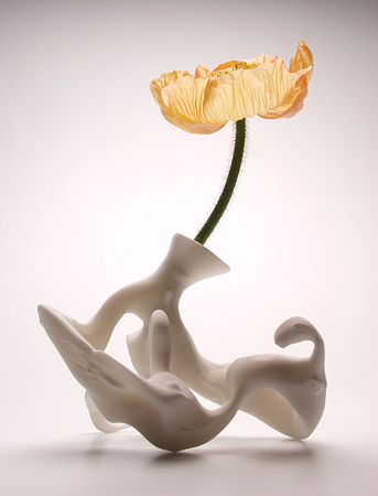
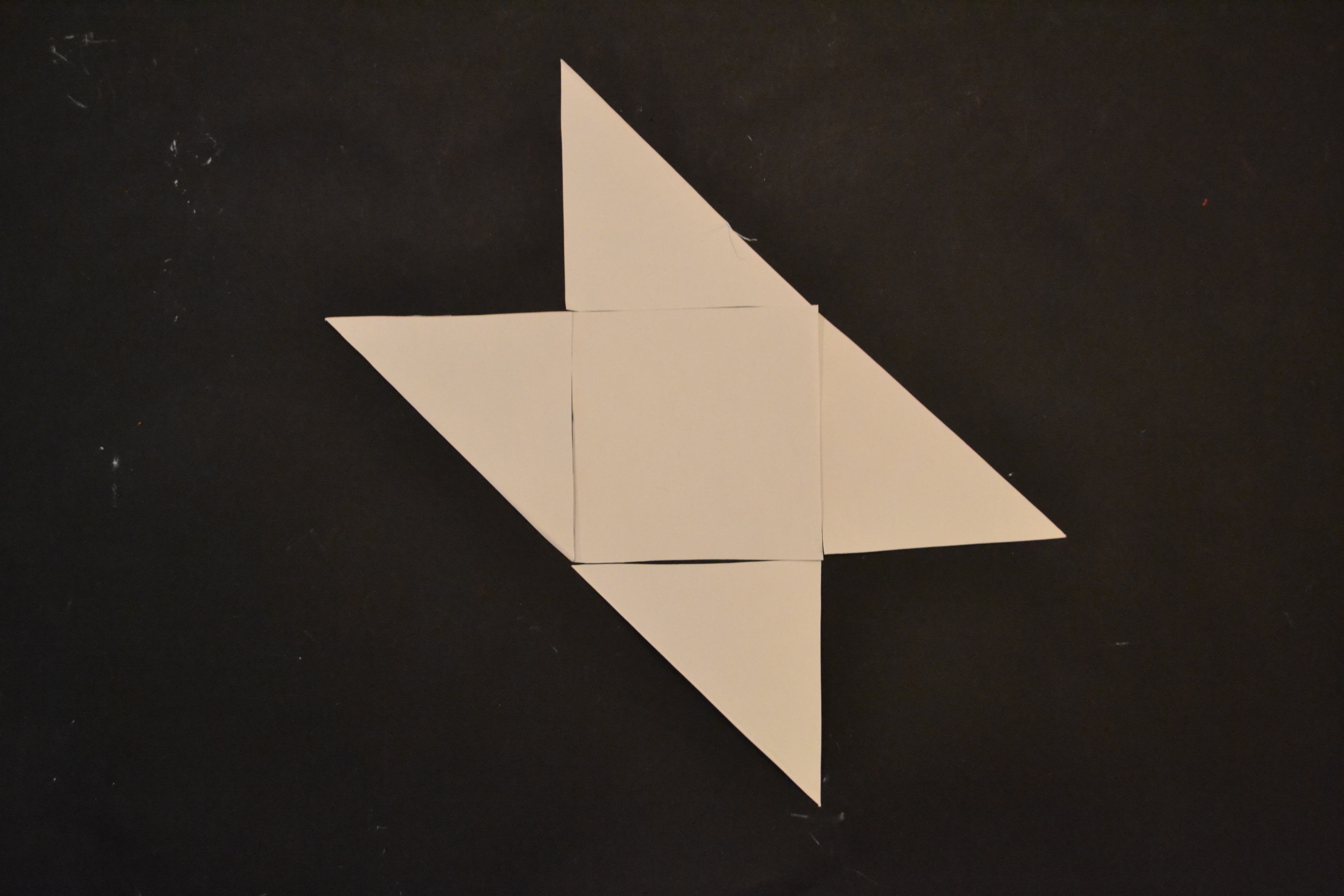
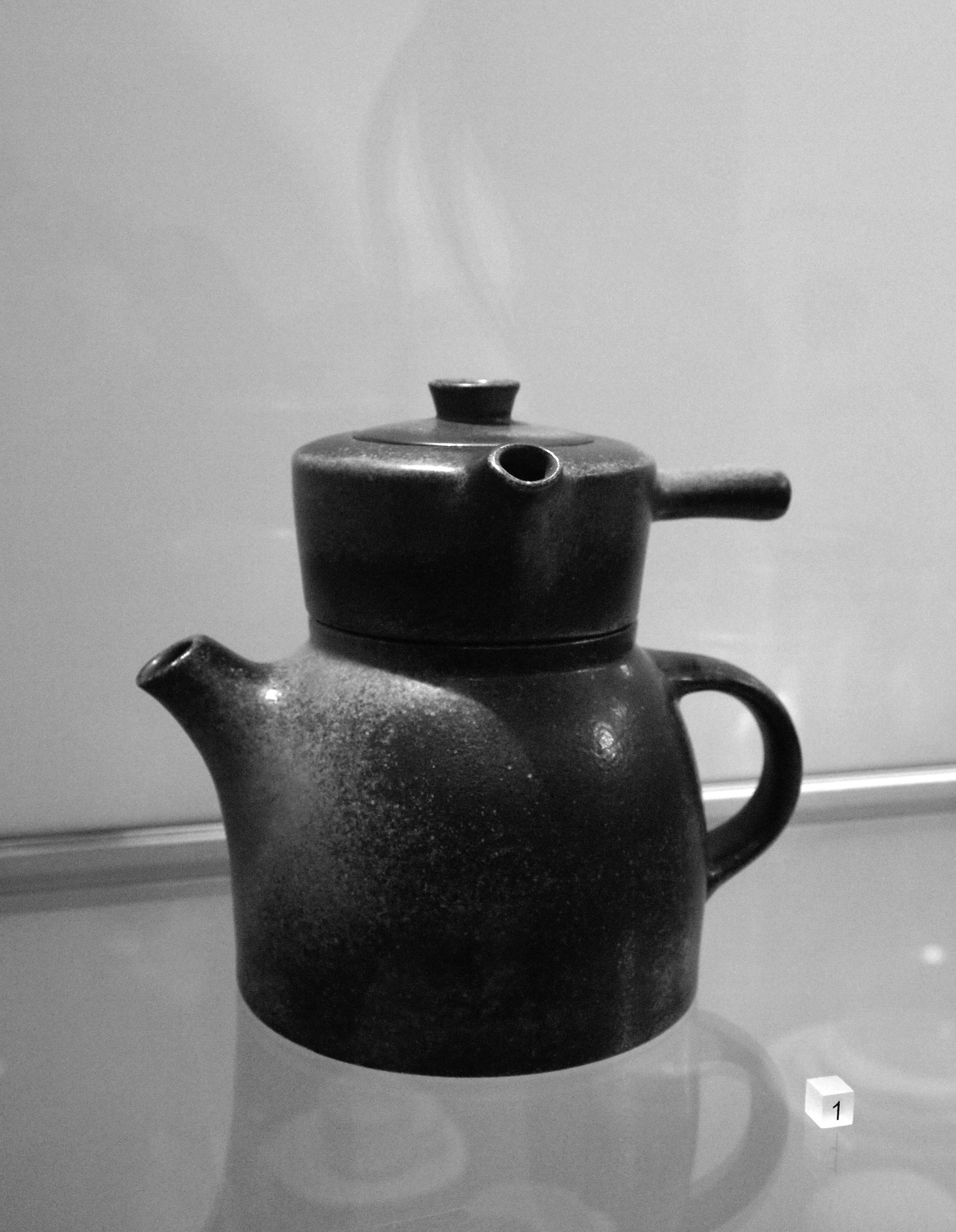
This double teapot in ceramic was designed by Francesca Mascitti-Lindh and Richard Lindh in 1956 in Abruzzes (center of Italia). The Abruzzes is a region in the center of Italy surrounded by mountains.The people there developed a famous art of ceramics, and majolica, which is nowadays exhibited in important museums as the British Museum at Hermitage. Because of the context of isolation created by the mountains during the last centuries, the Abruzzese developed an original and expressive works on metal, ceramics, stone, wood, leather using antic or ethnically patterns. One of the best Italian craftsmen in those materials are still settled there, and many designers from abroad come to work with them.
Francesca Mascitti-Lindh and Richard Lindh, respectively born in 1931 and 1929 in Helsinki, designed this piece in 1956, and made it in Abruzzes, in the Italian cradle of ceramic.
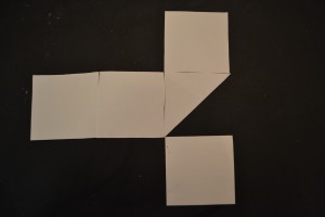
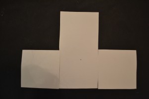
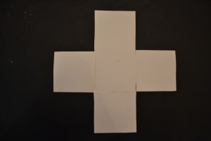
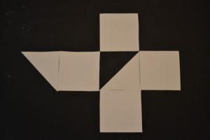
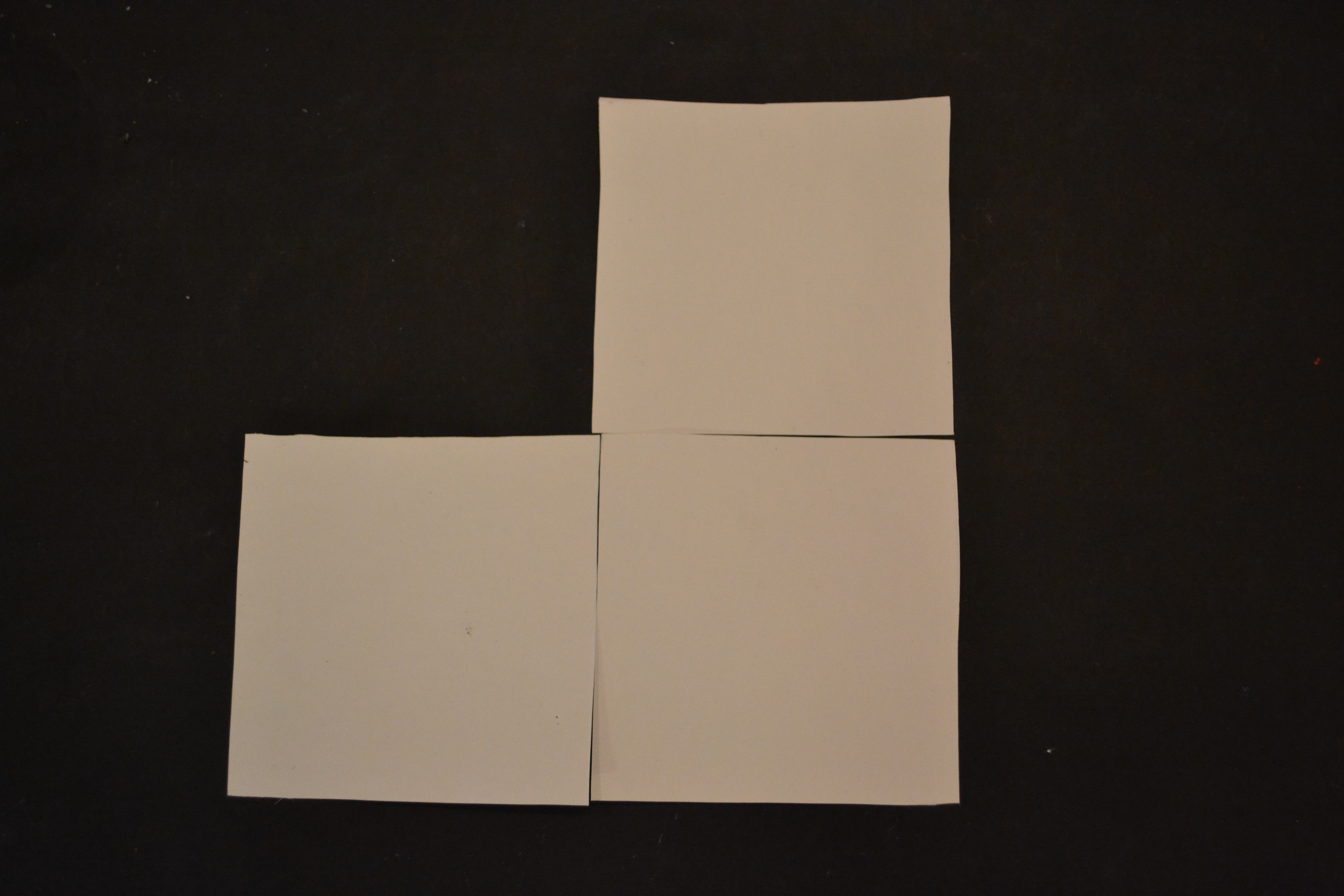
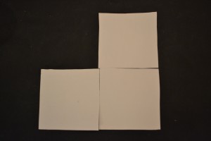
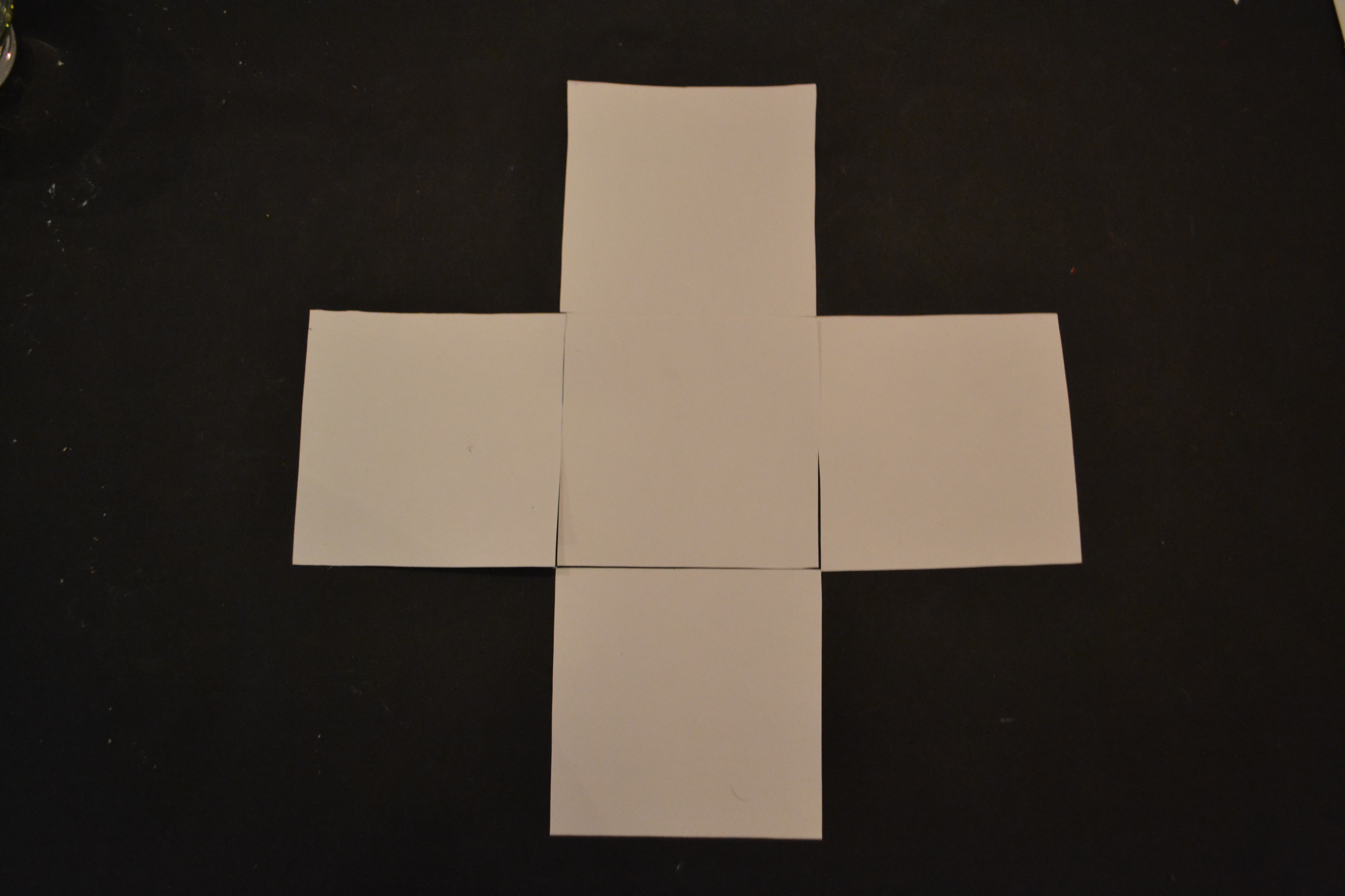
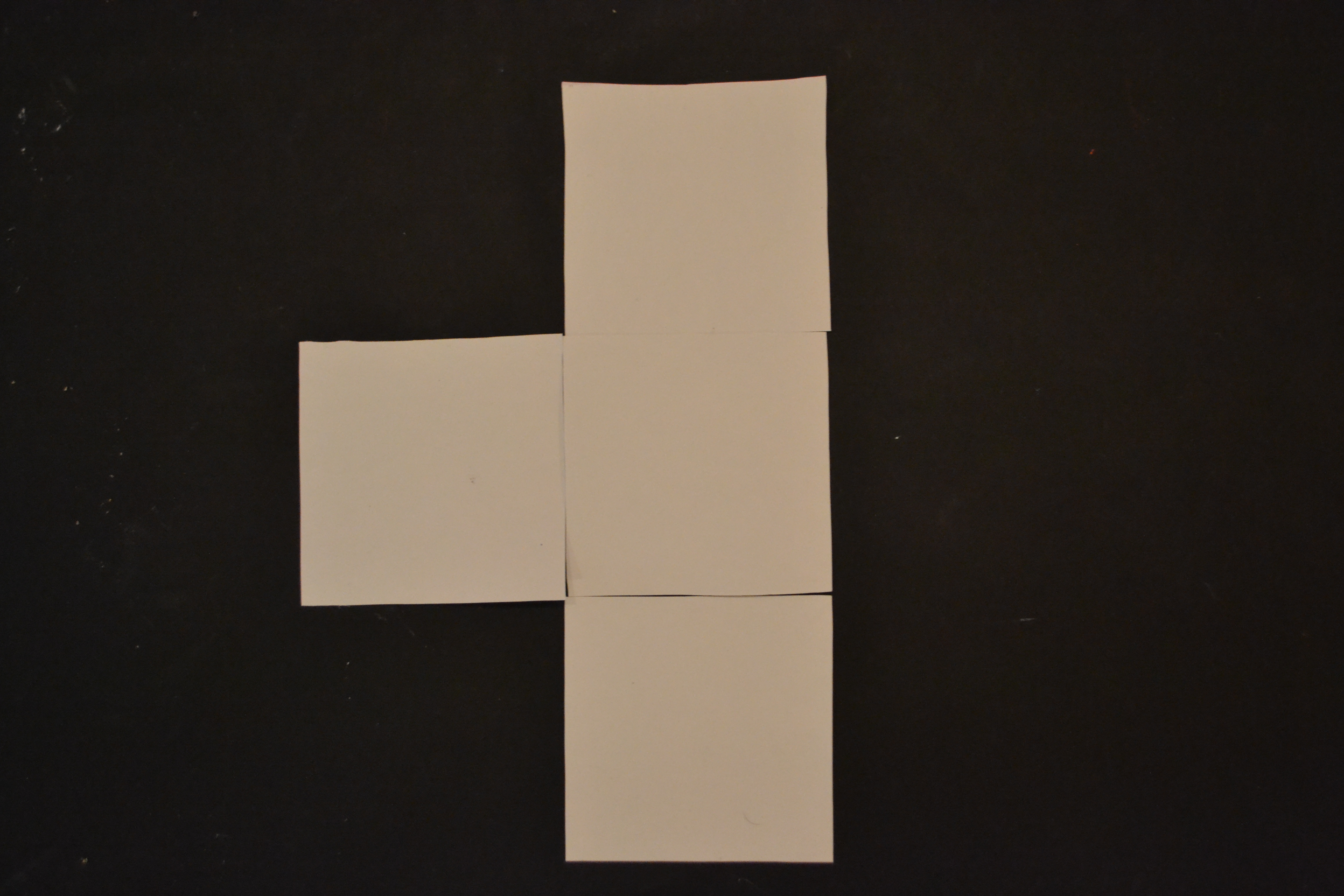
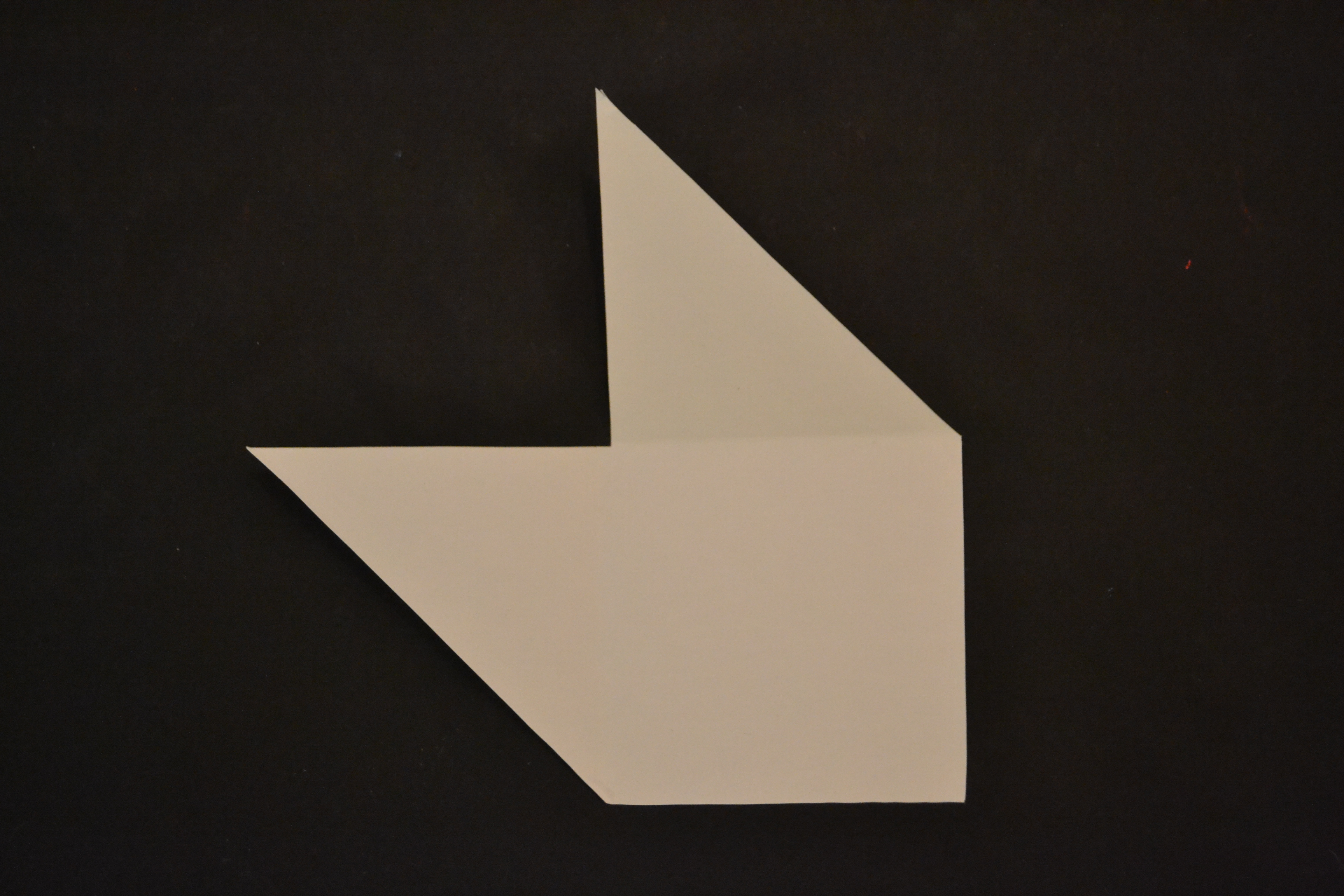
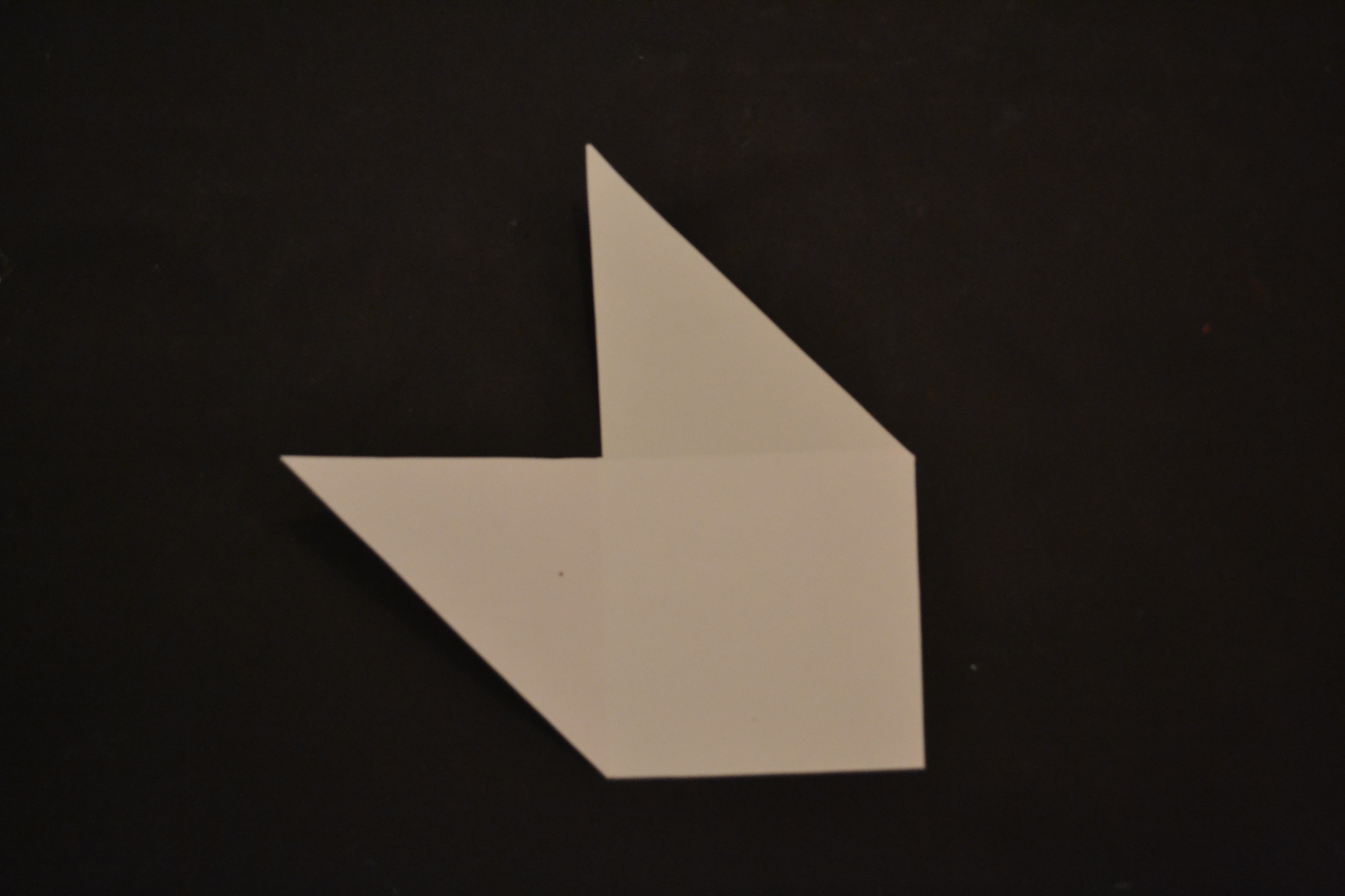
This double teapot has two handles, two different ways to serve tea. One parallel to the body, the other one perpendicular to the body. It is an useful object, adaptable and involving many possibilities. More than a double object, i call it a couple object. To my mind, Francesca Mascitti-Lindh and Richard Lindh choose to put the most important point of the design on the handles, which relate to the hand, the work of hand, related to craftsmen as a tribute to those who made design. From this design emanates nobility and humility. This double teapot calls for a wood table, and not a glass support as used in the Stedelijk exhibition. Its made to honor man’s ability, and what i admire is that the design concept is not taking anything away from its nature and singular shape.


About some days, in America

winter 1967 Los Angeles

R. Brautigan drags feet alone in Los Angeles, sees ugly pot on a window sill, lonely and ugly, takes it back to flat, under coat. the smell of cats pee in the pot. cats living with dying dirty woman. he puts double tea pot on his wood floor, floor spotted with alcohol rounds.  he wrote on it at 3 a.m :

i go to bed in Los Angeles thinking
about you.
pissing a few moments ago
i looked down at penis affectionately.

knowing it has been inside
you twice today make me feel beautiful.


after sleep, he send it in Japanese paper gift to a woman in New York.


1981 – 15 January, West 53rd Street, New York morning.
boiling water thrown on the ice scratching the red Ferrari windshield.

Since 1987 – 8p.m, until now.


Finding any serious information about this work has been as a joke, even in Stedelijk museum, this piece is even not registered in the catalog of the museum’s collection, although it is actually exhibited.
for its inadequate character it deserved to tell about some
family troubles.

Wouter Dam – Unexpected way of working


Monday, November 19, 2012

Organic but still fixed, Simple but far from boring. Soft curved and sharp edges. The not expected material for this fragile form. Not as visible as it should be, standing low and unfortunately not visible from different sides. You would not place this object directly in the design section of the Stedelijk Museum but after research I could surely place it better in its context. After telling people which object I chose a lot of them didn’t remember the piece. A pity because it’s beautiful but also logical because of his hidden position. I couldn’t say directly why I was touched by this object but after some thinking I noticed it refers to my interest for curved forms, layers, shadows, inside and outside and the material clay.

When I started my research. I directly found out that Wouter Dam was a student at the Gerrit Rietveld from 1975 till 1980 what made me directly more motivated and interested for this research. Accompanied and guided by Jan van der Vaart, an influential ceramist for the Netherlands  famous for the new design of the famous tulip vase., Wouter Dam explored shape and volume which he would continue during his career. Unfortunately there is not much more written about this time in the Rietveld Academy. From 1985 onward he was able to make enough money to live from selling his work, allowing him to spend more time in perfecting his technique. His early work gives an impression what his later work will look like. After his first phase of still recognizable vases, the vases started more breaking the symmetry but still suggest a latent ability to contain. In phases of 5 years you see a clearly development, every step is logical coming out of the one before.

Wouter Dam concentrate at the space the works take over. He doesn’t decorate his objects but focus on the form of his ceramics. He begins his abstracts sculptures on the wheel, although you don’t see this in the first glance. First he makes 10 to 12 cylinders which he then cuts open and join together in another way. Sometimes it’s a technical challenge, to make sure that it is perfect but still an example of hand-crafted workmanship. It is hard to stay close to your original creative idea and produce it. Sometimes he put more time in making the correct supports to make it than the actual sculpture itself, but critical for good results. Another technical challenge is finding the perfect stage of hardness to assemble the sculpture from the clay rings.
The colors of his works are soft and sensual chosen to enhance the shape. The colors are slightly added in different layers to find the perfect suiting color for the form and do the most for the light and shade. In his previous periods he uses only one color for his forms but now he sometimes add a little bit of another color too but only support the already existing lines.

What was also interesting for me were the different connections and impressions people made after seeing his work. Some describe it as a forms inflated by air like a sail filled with wind who billow and swell. Others refer it to human forms, feminine forms, popped cocoons or wooden boats crashing in the waves. There isn’t a direct mention. He strives for a vague memory of a real thing, just a hint. There has to be enough room for the viewer to let his imagination run free. That is for me a good reason to explain why this object fits the design section of the Stedelijk Museum. I can see this object refer a vague memory of vases. Vases of his older work but also vases of other artists. Modern times give you more the opportunity to think bigger and extremer than round vases. By putting this object in the design section you give a hint of the period we live in.

His work is mainly bought by collectors and museums sold in private art galleries for all over the world and he is notable popular in Tokyo. I can’t wait for his next steps in progress they don’t look big but for me it is an interesting thing. So I hope to visit on of his galleries soon.

A vieuw on modern design


Sunday, November 18, 2012

Marcel Wanders and his airborne snotty vase

Scanned from the microscopic specks blown out when humans sneeze, hugely enlarged, and then produced using SLS rapid prototyping technology (dimensions 15x15x15 cm).
This is the description of the airborne snotty vase designed by Marcel Wanders. When I was looking around in the design exhibition of Stedelijk Museum Amsterdam I felt directly connected to its color, shape texture and the energy of the piece. How is that? What attracts me so much with the piece?
I started a research on Marcel Wanders to understand more about his perspective on design and his extraordinary new vision on what the function is of design. Especially his vision is what interests me so much. As a student he was already discussing the ”function” and set-up of design. His view on design is ”a designer should not apply to one’s costumer”. According to Marcel Wanders it is the other way around. He works towards his designs and says it is up to the designers to carry out their vision to this world.
Other students and teachers at that time found his statement/vision not in any way realistic. Still Marcel Wanders was pursuing his dream which made him a autonomous thinker within designs.

”Products can change function, the core is design”

This work (snotty vase) has a autonomous design. The function is not what made the piece, its the concept. The airborne snotty vase is a perfect example of his vision on designs. He shows that he can design according to his vision instead of a method. This points out that Marcel Wanders is able to execute his dreamy perspective on art and design.

For me this piece could also be used differently then only a vase. It could be worn as a piece of jewelery, a pen holder, it could even be a model for a bigger sculpture work. The endless possibility’s of the piece leave a gesture for the observer as well. When I saw the piece at Stedelijk Museum Amsterdam I didn’t think it was a vase. For me it was a free form giving me the possibility to analyze what his vision is about and to give it multiple functions.
Because of this free interpretation the piece shows it could be a solution to have a broader perspective on design and art. It gives new information about the mind of the designer and the need of people to see more then only a constructed piece.
For me this is an important statement. By this way of working and thinking, one creates more interest, personality, and life in art and design.

Observing Marcel Wanders work I can see the need to create one’s own vision, and working with new techniques and materials. This is also what I try to do in my work. When I was learning the craftsmanship of jewelery I applied this new material experiments as well. Working with 3D printed elements and polyurethane to create a new movement within the traditional jewelery scene. Exclusive and provocative designs made my work change the perspective on traditional jewelery. By doing this I have shown my need for change, and my interest in the future.

Another important thing shown in the present time is that we have the ability to design on an another level. Intuition and concept capturs a bigger role in the design process. Craftsmanship occupies another purpose in the piece. Still craftsmanship is important to indicate the value you give to the piece and to reach a certain personality. The possibility to design on another level is what we could use to give more meaning to the piece and to make designs more collaborative with the future perspective of the world.

Marcel Wanders shows in his work this future perspective and combine’s it with craftsmanship. He understands that perfection is not most important anymore. Maybe it is even a small mistake which makes a work personal.

Designs can be made perfectly, everything will be calculated and mistakes are seen before the making has begun this is because of our modern industrial and digital world. It is time to look for other values then perfection. Values you find in a layer which weren’t touched before Marcel Wanders gave his input in design. And this might be a layer we can expand more to keep moving forward and to take more out of modern life with its endless possibility’s.

Paul Schuitema


Sunday, November 18, 2012
When I presented the designer I selected to write about to my teacher, and mentioned the fact that it was difficult to find information about him even at the libraries, he asked me to think of what made me chose Paul Schuitema and not one other of his contemporaries like Moholy-Nagy or Piet Zwart.
Actually the answer is quite simple. When I first entered the exhibition I was very impressed of how the museum chose to present his work, as if it was a work in progress in his studio. The presentation consisted of repetition, cuts, different papers, drawings, different tryouts, and sketches, all very obsessive and concentrated, almost like a mechanical machine.


Of course, all of this made sense immediately as I read that he lived in the time of industrialization and mass production after World War 1 and was inspired and worked with the ideas of the Russian constructivism, the Dutch DeStijl, German Bauhaus and “New Objectivity”. But still, first I was a bit startled. I tried to look for something else because I thought, like my teacher also said, that photography is as such an autonomous medium so in not very many cases it can be seen and understood as design. Than I understood that he uses images as “Applied or Useful Photography” – cutting and organizing them with pieces of text, creating a sort of collage for posters and advertisements – using the techniques and aesthetics of Graphic Design.

I knew he had links with the Bauhaus and the “New Objectivity” movement and I found the names of the other better known designers of his time, but there was nothing mentioned about Paul Schuitema. Finally, after reading about all the theories from Weimar, I found some scanned pages from the english vesion of the book “Visual Organizer”.

Soon I discovered that he was not only a graphic designer, but also a furniture designer, a photographer, and a typographer. He studied Drawing and Figurative painting at the Academie voor  Beeldende Kunsten in Rotterdam. He was a member of Kurt Schwitters’ “Circle of New Designers”. In 1931 he designed the poster for an exhibition at the Stedelijk Museum (which displays names such as  Moholy-Nagy, Herbert Beyer, Karl Teige. Lajos Kassak, Jan Tschichold, Piet Zwart, Cesar Domela and himself) and yet despite the seeming fact that in his time he was a well known advertisement designer, today people seem to have forgotten him.


       Exhibition Poster       Berkel  Berkel


In the early ‘20s he had to perform building-jobs to support himself. This is the moment when he got in contact with the working class. This was soon to be a big influence upon his works. Berkel is mentioned as being the first who gave Schuitema the opportunity to work on graphic design. And here comes the moment when the photographs he uses becomes as important as typography in advertising a product. At first he worked with professional photographers, but because of their ‘artistic’ approach they couldn’t catch the simplicity of the subject as Schuitema wanted it, so he had to learn to use the camera, and all the techniques included, so he could get rid of the decoration and aesthetics and created his own photography.

“If you become more of an expert yourself, and if you are also creative, your work will only get better” Schuitema once said.


  Photography


His contemporaries understood his wish to abandon any form of decoration in his prints, and saw his works becoming as sober and direct as he himself. Schuitema used the spatial effect of text by printing one on top of the other (only san-serif’s), simplicity, asymmetry and contrast such as horizontals, verticals, and diagonals, juxtaposed. Applying narrow, bold, small or big letters, mostly red, black, white, and sometimes blue, colors he managed to create dynamic covers. In relation to this process his images are not only illustrations or symbols or decorations, which accompany texts, but represent an organically linked body of work.

“You sought automatically for unity of text and image. This is also the reason why you printed the letters on the photo, then you got at least one optical occurrence. A red text on a black and white photo, a black text on a red picture.”

Grayson Perry – Strangely Familiar


Sunday, November 18, 2012


I had walked around the design exhibition of the New Stedelijk for about an hour, when, after rows and rows of Swedish cutleries, german engineering and dutch design homes, my eyes fell on a piece of pottery by an English artist. His name was Grayson Perry and the work was Strangely Familiar, a ceramic vase acquired by the museum in 2000, contrasting quite a bit from the otherwise dutiful and rather dull exhibition. The vase show blue human figures engaged in sadomasochistic sex over a background of British suburbia. A sentence is written upon it: ‘DADDY DON’T HIT ME, MUMMY STOP HIM...’


A few years back I studied archeology at the university of Stockholm, and for me the most inspiring part of the studies was antique art. The evolution of art in the early centuries of history, in Sumeria, Egypt and Greece is a favorite subject of mine. When I see the pottery of this contemporary artist I recall the faces of Achilles and Ajax, playing a game of dice on the black-figure pottery of 6th century BC Greek painter and potter Exekias I saw at the Vatican Museums in Vatican City. Grayson Perry pays heed to this tradition and the images on Strangely Familiar remind me of the bacchanals, and is not far from the courting of young boys, often shown in both black- and red figure pottery painting. His splashing text, as recited above, also goes back to the way Greek painters wrote text on their pottery.

Perry discovered early on that he was of a masochistic nature and at the same time a transvestite, which reflects in a lot of his work. His earlier works where in film, but as the medium failed him he found it more interesting and effective to use ceramics, tapestry, metal-works and other applied art forms. Here the beauty and usefulness of the work hid the underlying layer, which sometimes would be sexual or violent, but always and more importantly a vehicle for criticism; comments on social injustices and hypocrisies. Here I find the explanation of why we find Grayson Perry, the artist, in the design exhibit of the Stedelijk. He is surely an artist, and a well-read one at that, but his works are in the field of applied arts. They are essentially meant to be used and useful, in the same way Greek artist made vases that were commissioned by the wealthy families.

Although this is an interesting distinction, that in fact places Strangely Familiar directly in my path, I don’t think that Perry’s vases will ever be used as such. I believe they are works of art in their own right, and the reason we find them alongside teapots, telephones, Bauhaus and De Stijl is a question of definition, and Perry’s choice to work in traditionally applied art forms.

At the same time it is argued that art and design has moved closer to each other in later years, and that they in some cases are indistinguishable. An artist can easily work as a designer, while a designer successfully creates or uses art in his projects. That this is a later development I realized in the halls of the design exhibit, where the visitor moves through rooms chronologically and thematically ordered to show works of great design. As the rooms become more contemporary, I feel there is a certain shift, from usefulness and immediately perceived function towards less obvious designs, that are more autonomous. It is in this last room I find Strangely Familiar.

I am drawn to it, at first by the likeness to a dear subject of mine, the Greek vases, but then I am intrigued by the subject matter of the vase itself. At this moment I haven’t heard of this artist, but the work speaks volumes about him. When I later read about him in the library, I learn of his life as a cross-dresser, artist and art historian. He has practically become a hold house-name in England, and apart from his own work, he writes books about art and curates shows for museums. In 2002, the Stedelijk held a solo exhibition for him, which in turn made him a Turner Prize-winner the year after. He accepted the prize while in his cross dressing-persona Claire.


Further reading and video:
"The Thomb of the Unknown Craftsman"; Grayson Perry in the British Museum until 26 February 2012
http://www.channel4.com/programmes/in-the-best-possible-taste-grayson-perry/4od

http://www.youtube.com/watch?v=YefKf8To9Po


Ted Noten’s jewelry piece “A split before imploding”


Sunday, November 18, 2012

Ted Noten (born in 1956) is a Dutch jewellery designer and conceptual artist. His is known for his work of making acrylic handbags containing various symbolic items like stuffed mouse, guns, and fishes.

I choose Ted Noten design, “A split before imploding ” which is one of 6 “jewelry bags” together called “limited edition” from 2007, from. “A split before imploding” is a 30-kilo trolley bag made out of solid acrylic and carries only one item, a trapped perfume bottle (named Flower bomb) made by two fashion designers Viktor and Rolf.

Ted Noten wants to deconstruct our preconceptions of jewelry and wanted to show how jewelry also can be implemented, without connecting it physical to the body. Ted Noten tells us that the trolley bag is a statement of “status and showing off” ….“The Fashion and jewelry worlds are absurd this bag’s 30 kilos -it would be ridiculous to carry”. The artist Marjan Boot also comments that the piece has a commentary toward predominant rise of wealth and the fear of robbery an it being in a trolley bag, tells something about the increased safety in airports and the fear for terror.

I find Ted Noten’s “A split before imploding” interesting because of the visual design itself and the concept of the perfume bottle. This aesthetic of sealed beauty locked-in forever by impervious walls, tells a story about an idea of perfect beauty never to be introduced to the spotted and imperfect world.

Limited edition

The trolley bag is accompany by 5 others jewelry bag in the series Limited edition. They all bear the same “inaccessible” construction of an item being behind a thick layer of acrylic. (a gun, fish etc.)

In Ted Noten’s work you often find some form of rebelliousness when it comes to him and his costumes. I find in his work “Pig bracelet” he made a golden bracelet with a small pig figure wearing a necklace. Giving the nature of this, being jewelry and highly expensive. one must assume that his costumers must have a reasonably good income. Having this in mind and seeing a pig wearing a necklace could indicate an ironic commentary toward his buyers as “rich greedy old woman” who are looking for beauty in all the wrong places.

I would refer this statement also with the trolley. People buying a 30-kilo jewelry trolley with no practical means, could tell a story about the absurdity Ted Noten is trying to reveal.

It seems that Ted Noten is often trying to bring forward the ugliness of mankind and then beautifully wrapping it in cellophane. You can see it in several of his works,  like “Be nice to her, buy her a ring” a project in which clients to the red light district could buy a ring for 2.50 to give to a prostitutes and then hopefully a more respectable relationship between client and prostitute could be established.
This is also seen in “limited edition” where one of the jewelry bags is a real gun inserted in acrylic and the cast like a schoolbag.
This lethal gun represents the dark side of mankind’s destructive behavior and selfish power. But when covered in clear acrylic it distances itself from the lethal projection and becomes a symbol of raw power.

His solid acrylic bag resembles a work I did a couple of years ago. I made out of 500 kg ballistic gel, 2 square boxes containing a flower and a number of bullets shoot in from the side.

In my ballistic gel art piece. I’m trying to show the true competition that takes place during human conception. This is the competition for life. More the over 100.000 sperm fight for their ability to live on, but only one is allowed in, to fertilizer the egg.

The gel is a tissue that to some extends resembles the soft environment that this conception is surrender of, but the gel creates an unbreakable and time free zone where nothing is allowed in.

Also in Ted Noten’s work where this perfume bottles is captured in time and out of reach for anybody outside the hard visible box. I see him as an artist trying to tell a story of his surroundings either if it’s a mouse with a pearl necklace (Turbo princess 1995) or a giant bottle of perfume locked in acrylic. There is always of story about how we human most live with ugliness and beauty side by side.

The weird thing at my grandmas house


Wednesday, November 14, 2012

I remember when I was little, sitting at my grandmothers desk and looking at this funny looking thing.
Ingo Maurer has always been her favorite lamp designer and I really loved looking trough his collection cataloges together with my grandmother , talking about the lamps. But particular bibibi I never really understud.I just couldn‘t make up my mind rather I found it ugly or funny or what exactly the reason was why she bought this lamp in the first place.
Ingo Maurer has so many beautiful designed lamps ( http://www.ingo-maurer.com/products/ )why did she not get the „Zettelz“ lamp or the „comicExplosion“?
Writing about it now makes me start to realize how often I thought about „bibibi“ and how it is still irritating to see the lamp standing on that table. It really is weird , because normally you just get used to certain things standing around in your home ,they melt in with their surrounding and you start to not notice them anymore.
For some reason though after standing on the exact same table for over 15 years this lamp still jumps aggressively into my eyes , almost like a living pet that wants your attention when you come home and wants to say hi and play with me . So for me „bibibi“ really turned into a living bird and gives me a lot. Certainly I still can‘t say I love the design or think it looks pretty and I would never think about getting it for my own apartment. But it makes me happy every time I see it somewhere because it reminds me of my grandmother.So enough personal talk now something about the Lamp and the Designer:
“Bibibi” is a tableligth that reminds the viewer of the appearance of a chicken. The lamp shade is stylistically the body of the bird. It is carried by plastic orange bird legs. A metal wire is extending in the height and at the end of it is a feather attached, which may be the head of the bird. Bibibibi is the tableland made ??by Ingo Maurer definitely pulls the intension of the viewer on it. Ingo Maurer himself is the son of a fisherman and grew up on the island Reichenau in Lake of Constance with four siblings. After an apprenticeship as typesetter, he studied graphic design in Munich, Germany. 1960 Maurer left Germany for the USA, where he worked in New York and San Francisco as a freelance graphic designer. In 1963, he moved back to Germany, and founded Design M, a company developing and manufacturing lamps after his own designs. The company was later renamed to „Ingo Maurer GmbH“. One of his first designs, «Bulb» (1966) has been included in the design collection of the Museum of Modern Art in 1966.
1984 he presented the low-voltage wire system YaYaHo, consisting of two horizontally fixed metal ropes and a series of adjustable lighting elements with halogen bulbs, which became an instant success. Maurer was asked to create special YaYaHo installations for the exhibition „Luminaries je pens a vous“ at Centre Georges Pompadour in Paris, the Villa Medici in Rome, and the Institute Francis d‘Architecture in Paris.
In 1989 Foundation Cartier pour l‘Art Contemporary (Cartier Foundation for Contemporary Art) in Jouy-en-Josas near Paris organized the exhibition „Ingo Maurer: Lumière Hasard Réflexion“. (Ingo Maurer: Light Chance Reflection). For this exhibition, for the first time Maurer created lighting objects and installation which were not meant for serial production.
Since 1989, his design and objects have been presented in a series of exhibitions, including the Stedelijk Museum in Amsterdam (1993). In 2002 the Vitra Design Museum organized Ingo Maurer – Light – Reaching for the Moon, a traveling exhibition with several shows in Europe and in Japan. In 2007 the Cooper Hewitt Museum Cooper-Hewitt National Design Museum in New York presented the exhibition Provoking Magic: Lighting of Ingo Maurer.
Ingo Maurer created many objects using LEDs, the first being the lighting object Bellissima Brutta in 1996. In 2001 he presented a table lamp with LEDs with the name EL.E.Dee. Since 2006, he is also experimenting with organic light-emitting diode (Organic LEDs), presenting two objects in 2006, and a table lamp as limited edition.
Beside the design of lamps for serial production, Ingo Maurer creates and plans light installation for public or private spaces. In Munich, he created light installation at Westfriedhof subway station (1998) and the renovation and lighting concept for Munich Freiheit subway station, to be opened in December 2009. For Issey Miyake he realized an installation for a fashion show in Paris (1999). In 2006 he created lighting objects and installations for the interior of the Atomium the Brussels.
Among his best-known designs are the winged bulb Lucellino (1992), Porca Miseria! (1994),[1] a suspension lamp made with porcelain shards. Since the early 1980s, Maurer works with a team of younger designers and developers.
2011, the redesign for the underground area of the U-Bahn public transport station Marienplatz in Munich, Germany, was awarded to Ingo Maurer together with Allmann Sattler Wappner, with its design placing emphasis on a lighting design that alludes to the Chinese I Ching.

http://www.ingo-maurer.com/products

Poster No. 524 The Deconstruction of the Contemporary Poster


Sunday, November 11, 2012

For three months, Rianne Petter and René Put (teacher at Graphic Design) collected posters hung throughout the city of Amsterdam, a total of 523 different posters. They carefully studied and deconstructed this collection according to their most important features, researched certain elements such as text, image, color and composition, isolated and then reconstructed them to create new images. Poster No.524 makes clear how a creative research process works, and is designed so that more generalized meanings about posters and visual culture are made visible. Jeroen Boomgaard and Jouke Kleerebezem’s texts both deepen and contextualize Petter and Put’s individualistic approach, while at the same time exploring the historical meaning of posters in public space (including a history of poster design since 1900) [x]

The book > Poster No. 524 < presents their researches, revealing how a creative process unfolds, how art operates in public spaces and how one goes about creating a visual identity.

Material related to the project will be on display at the Rietveld library from Monday Nov. 26th till Dec. 5th /2012. The project was developed at the Research Group Art and Public Space at the Gerrit Rietveld Academie and the book is published by Valiz. They pursued this research with the support of a grant from Fonds BKVB.

Jonathan Puckey en (de grafische) Tool


Monday, November 5, 2012


Links, foto bewerkt met Q*bertify. Rechts, originele foto van de band “Tool”.


Jonathan Puckey is een vormgever gevestigd in Amsterdam. Jonathan maakt deel uit van Studio Moniker, en draagt bij aan Conditional Design. Conditional Design is een samenwerking als ook een manifest waarin zij onder andere stellen: “We search for unexpected but correlative, emergent patterns”. Veel van het werk dat zij produceren is hiertoe te herleiden, het laten ontstaan van patronen uit gestelde regels. De systemen die zij creëren gaan uit van procesmatige ontwikkelingen zonder gefixeerde eindresultaten. Vanuit een gecreëerde setting kan een patroon oneindig doorgaan en veranderen. De regels die zij opstellen zoeken naar de mogelijkheden om informatie te visualiseren en het oog te behagen. Een voorbeeld hiervan is de site van het SNS Reaal Fonds, waarbij zij de uitgaven van dit fonds omzette in metaballs.

Een terrein waarin Jonathan werkt en onderzoek doet zijn tools. Dit zijn tools in de brede zin, van computersoftware om foto’s te bewerken tot gereedschappen om lettertypes te ontwerpen. Naast dat Jonathan deze tools gebruikt in zijn werk heeft Jonathan samen met Jürg Lehni het platform Scriptographer.org opgericht. Dit project, dat tegenwoordig verder gaat op Paperjs.org, probeert als een platform voor het ontwikkelen van nieuwe tools te fungeren. Over het ontwikkelen en gebruiken van tools nam ik van Jonathan het onderstaande interview af.


Zijn (type) tools een recent fenomeen, hoe ben jij begonnen met creëren van tools?

Ik weet zelf niet hoe lang het al gebruikt wordt. Zelf programmeerde ik eerst generatief, waarbij na op de knop gedrukt te hebben ik als maker geen invloed meer had. ik Als ontwerper schrijf je de code die vervolgens volgens een bepaald patroon een vorm of de vormtaal genereert. Op de Rietveld Academie ben ik het programmeren als de basis voor het vormen van gereedschap gaan zien, waar je mee aan het werk kan gaan. Hierdoor ontstaat een tweeledig maakproces waarbij je eerst de tool ontwerpt, waarna je met de tool verder kan ontwerpen. Je hebt hierdoor twee momenten van invloed.

Als jij zelf een tool maakt en deze vervolgens gebruikt, waar ligt dan het zwaartepunt van de creativiteit?

Dit is een combinatie, meestal ben ik tijdens het programmeren ook aan het gebruiken. Door tijdens het programmeren features te maken kan ik vervolgens de tool verbeteren.

In hoeverre heeft de gebruiker werkelijk invloed op het functioneren van de tool, als de voorwaarde al gegeven zijn?

Dat is per tool zeer verschillend, sommige tools zijn al helemaal af als je ze hebt gemaakt. Het werk wat je ermee doet uit nog wel wat je wil uiten, maar de tool wel de overhand heeft in het vormen van de uitkomst. Bij sommige tools is dit echter nog erg open, de gene die werkt met de tool heeft dan een sterkere invloed op het eindresultaat, zelfs sterker dan de ontwikkelaar van de tool. Dit is altijd een balans, de gereedschappen waar niets aan toe te voegen is door de gebruiker zijn dan ook de gereedschappen die ik niet weg geef, als de gebruiker weinig invloed heeft is het delen minder van belang.

Wat is voor jou het criterium waar een goede tool aan moet voldoen?

Dit is erg afhankelijk van de gebruiker waarvoor de tool bedoeld is. Persoonlijk test ik de tool altijd uit door me af te vragen: hoe lang kan ik er mee werken, kan ik hier nog weken mee vooruit? Als dit het geval is, dan is het een goede tool, want dan heb ik het blijkbaar niet meteen door. Een goed gereedschap is ook iets waar je heel lelijke dingen mee kan maken. Waar het aan jou is om de juiste input te leveren, zodat het er toe doet hoe jij de tool gebruikt.
De tool moet sprekend zijn, op het moment dat de tool niet spreekt betekent dit dat het idee nog te vaag is. Dat het idee nog niet genoeg gereduceerd is tot zijn essentie.

Heb je voorbeelden van tools welke je als mislukt ziet?

Een tool waar ik veel tijd in heb gestopt maar nog nooit iets mee heb gemaakt is Ribbon Folder. Ik was gefascineerd door het idee dingen te kunnen vouwen. Meer specifiek; hoe je als je iets vouwt, vervolgens die gevouwen hoek kan uitrekenen? Als je een lijn maakt door punten te plaatsten met de hand, zit in de vorm van de hoeken die ontstaan een bepaalde logica. Door op een lijn te drukken kan je op verschillende punten meerder vouwen creëren. Dit heeft me veel tijd gekost, maar toen ik klaar was deed het me eigenlijk niks. Het eindresultaat nodigde me echter niet meer uit er iets mee te gaan doen.

Ribbon Folder

Worden jou tools ook door anderen bewerkt, heb je hiervan voorbeelden?

Wat was de motivatie om de tools gratis aan te bieden op Scriptographer.org en paperjs.org?

Voor Jürg Lehni was de rede om Scriptographer.org te starten om de discussie over gereedschappen te beginnen. Hij wilde hiermee de vraag stellen waarom we allemaal dezelfde software gebruiken, bijna iedereen gebruikt Adobe software. Scriptographer.org confronteert de gesloten mentaliteit van Adobe met een ander perspectief. Daarnaast was er de pragmatische reden dat Jürg deze tools al bedacht voor zijn werk.

Zijn er zaken die als inspiratie fungeren voor het vormen van tools?

Van nature hebben wij (Studio Moniker) een natuurlijke fascinatie voor techniek, waar we allemaal mee bezig zijn. Als ontwerpers zijn we dan ook nooit bezig om afgewerkte eindproducten te ontwerpen. Bij het ontwerpen van bijvoorbeeld een poster heeft het onze interesse om een systeem te ontwikkelen waardoor de poster uit zichzelf gaat groeien, hierdoor ontstaan organische processen die niet volledig te controleren zijn. Met een gereedschap controleer je in zekere zin nog meer. Maar door te beginnen met limiteren door het stellen van een omgeving, kan je vervolgens binnen deze omgeving volledig vrij ontwerpen. Hierdoor voorkom je dat je gaat emuleren, je doet nooit alsof je principes hebt hebt bedacht die je moet vasthouden of imiteren, de ontwikkelde software werkt als het goed is uit zichzelf.

Door regels te stellen is in het eindproduct voor iedereen het spoor te herkennen in het eindproduct.

Het meest optimaal is als die zoektocht zicht in het eindproduct zichtbaar aanwezig is. Zoals bijvoorbeeld in het Delauney Raster. Het Delauney Raster vormt beelden om tot backtographics, waarbij het gebruik maakt van het Delauney Triangulatie (http://nl.wikipedia.org/wiki/Delaunay-triangulatie). Er is al veel gedaan met Delauney Triangulatie in wiskundige software etc. Normaal word de punten-set waaruit de driehoeken ontstaan gegenereerd, ik heb uitgeprobeerd of ik dit handmatig kan controleren. Ik vroeg me of; of ik kan doorhebben hoe de driehoeken zich vormen? Dit bleek te werken, waaruit het idee ontstond om hier inzichtelijke software voor te programmeren.
Ik had het gevoel dat hierin iets zat, door eerst te doen en achter te rationaliseren ontstaan interessant vormen.

Delauney Raster

Heeft het maken van tools een belangrijke plek gekregen?

Met name webdesigners zitten dicht bij de sourcecode, dichter dan andere ontwerpers. De overgang naar digitaal heeft veel veranderd, met name webdesigners blijven vaak binnen het domein van de machinale software. Veel van de programma’s simuleren dan ook wat daarvoor kwam. Het is raar om te blijven steken bij dezelfde programma’s. Vroeger konden fysieke gereedschappen makkelijk worden aangepast. De schroevendraaier die mensen vroeger hadden, ontbreekt nu af en toe. Door platforms te vormen kan meer richting gegeven worden.
Ik vind daarnaast dat de mens een belangrijke plek in het proces moet behouden. Veel programmeurs vinden echter dat de computer zelf creatief is. Deze creativiteit is echt alsof, de ‘randomness’ van een computer zorgt ervoor dat de posters die een computer genereert alle zo random zijn waardoor de verschillen generiek worden. Wij zijn echter op zoek naar waardevolle verschillen, die betekenis uitdrukken. De input van de ontwerper zorgt uiteindelijk voor de betekenisvolle uitkomsten.

Typographic Matchmaking in the City and how it gave me an interest in the meaning of type design.


Sunday, November 4, 2012


First I would like to start with an introduction of the project. The typographic matchmaking in the city project, launched by the Khatt Foundation, focuses on typography’s use(d) in place-making within an urban context. It will investigate the way that typography can fuse with urban design to create public spaces with an unique sense of place. Places that attract people because they are pleasurable, involve social encounters and immersion in the sights, sounds and atmosphere of the space.

Trying to bring back the traditional use of typography in the city, five teams of fifteen Arab and fifteen Dutch designers collaborated on creating new bilingual typefaces formed for 3-dimensional/architectural applications. The end results of the projects are five new bilingual typefaces, inspired by both Latin and Arabic script traditions. These typefaces will be applied as poetic narratives in the form of participatory public art, into the public spaces of two cities: Dubai and Amsterdam.

Each team took their inspiration for their typefaces from different sources. Their inspiration, process, brainstorming sessions, early sketches and prototypes are carefully documented [x]. It gives an insight into the thought behind typeface design. A big and complicated challenge in this project –of course– was to create the same visual language and aesthetically corresponding letters (type/font) for two scripts that are structurally very different. One of the five projects is the Kashida. In this project for example, they took inspiration for their typeface from broken pieces of tagliatelle. Kashida became a completely 3-D font, that is, in its result still noticeably coming from the tagliatelle. Here is a program to use Kahshida for your own personal text.
These typefaces are meant to stand out, in contrast to street signs for example, that affect us unconsciously. Eventually, the main goal is to have these typefaces to become part of public space and perhaps even to help create or improve public space.

So far about “matchmaking in the city”. What was more interesting for me, was the fact that for some people typography is a serious and genuine interest, even a passion. For me that is hard to understand. I think typography is something you either love or hate, or to be more subtle, like or don’t like. I can’t “kind of like” the subject, however I can try to get interested, but I will never fall in love with the amazing world of helvetica, verdana and Kashida.

Where did it come from? The urge to design something that has already been designed and been used in currentform for ages; our alphabet, simply how we now it, and once was decided how to write it.
Our alphabet, as we know it know developed from pictographs, that are dated before the 27th century BC, to hieroglyphs, known as the Egyptian writing, to the Phoenicians alphabet (1050 BC), which is first to be composed exclusively of letters and is the earliest alphabet that is directly related to our alphabet now. From this alphabet, the Greek alphabet derived, which in its turn evaluated to the alphabet we use nowadays.

So to make a distinction between the alphabet and typography: An alphabet is a standard set of  letters (basic written symbols or graphemes) which is used to write one or more languages based on the general principle that the letters represent phonemes (basic significant sounds) of the spoken language.”  and “Typography is the art and technique of arranging type in order to make language visible”

There actually is a great distinction to make, and that is, that typography is something that is supposed to be designed, it is design. The alphabet is like the entity of typography.
Typography is about arrangement and appearance. This arrangement involves the combination of point size, line length, line spacing, defining the spaces between groups and pairs of letters.

Why do we feel so eager to arrange and to come back to my previous question; why do we want to design something that is, in itself already a design? What can there be designed out of something that already has specific rules to be followed, in order to be understood? Well, apparently, quite a lot. In fact typography is a way to say something in a text that is already saying something.
Typography gives a text a double meaning and can create awareness on itself. With a type font you can force someone to read, or experience a text in a specific way.

With this conclusion I would like to look back at the Typographic Matchmaking in the City project. A project based on trying to design an experience, rather than a type font. By reading a text in Kashida in the context of, for example, an urban environment, could give you, in a way, a certain experience of the space. A harmony or connection between languages and their role in society creates a consciousness of a multicultural space where everyone can feel welcome.

Because of doing this research I was forced to create an interest, not only for the subject I was given, but also for typography in general. I couldn’t have imagined how important a good designed type font can be and what it can evoke. How much time and energy it takes to design one and most important how it connects to way more than only just “saying something” with letters.
Still typography is something I was not made for, as well as typing with Kashida can only interest me for not more than the sentence: Hi, this is a type font.” surprisingly, over all, that was what I enjoyed the most.


Variations of the Incomplete Cubes 2D, Sol Lewitt


Friday, November 2, 2012

Sol LeWitt  „ Incomplete Open Cubes“:

In the 1960s, Sol LeWitt began to investigate the cube, one of the most basic geometric forms.

He started with the question: If you take an open cube and systematically subtract its parts, how many variations are possible? LeWitt identified a series of 122 unique open cubes with three edges (the minimum number needed to suggest three dimensions) to elven edges.


Qui?


Thursday, November 1, 2012

Pierre Di Sciullo, Pierre Di Sciullo, de eerste opdracht voor mezelf was zijn naam uit te kunnen spreken. Ondertussen ben ik zijn naam in zoveel verschillende artikelen, documenten, websites en filmmaterialen tegen gekomen, opdracht een is gelukt. Wat heeft deze man een hoop informatie en werk.

Pierre werd in Parijs geboren omstreeks 1961. Hij verliet na 3 maanden de Parijse kunst academie, er werd van hem verwacht om met bestaande karakters te werken, en hij was er zeker van dat hij daar geen plezier uit kon halen. Toen hij de leeftijd van 23 bereikte is hij begonnen met zijn zelf gepubliceerde magazine Qui? Resiste. Via dit medium experimenteerde hij met typografie en design.  Momenteel heeft hij al 13 publicaties, onder andere te zien op zijn website. In 1995 ontving hij een award ‘Prix-Charles-Nypels’ voor zijn typografische onderzoeken.

Een ander opvallend deel van Sciullo is dat hij deel heeft genomen aan de pitches voor de nieuwe huisstijl van het Stedelijk Museum in 2008. Samen met vijf andere ontwerpers hebben zij ‘gestreden’ om de nieuwe vertegenwoordiger daarvan te zijn. Uiteindelijk na lang beraad is de jury bestaande uit Gijs van Tuyl(directeur destijds), Paul Hefting (een publicist over grafische vormgeving, Hendrik Driessen (directeur van museum De Pont), Dingeman Kuilman (directeur Premsela), Petra Blaisse (vormgeefster bij het interieur-exterieur bureau Inside Outside) en Hester Wolters (voormalig eindredacteur van Vormberichten) met de conlussie gekomen dat Pierre di Sciullo het best aan de eisen voldeed. Het was belangrijk dat de huisstijl een allesomvattende samenhang had, en dat niet alleen de affiches maar ook de wegwijzing, het briefpapier, de website en desnoods het toiletpapier in DE stijl zouden zijn. Ook werd er veel naar het verleden en de ex ontwerpers, om het zo maar te noemen, gekeken. Sandberg speelde daar een enorme rol in. In de tijd dat hij directeur was (van 1945 tot 1963) heeft hij ook de rol van grafisch ontwerper tot zich genomen. Op een speelse, natuurlijke en zoals hij zelf zei: ‘menselijke’ manier ontwierp hij de huisstijl. Het was belangrijk voor hem dat er persoonlijkheid en gevoel in het werk zatten. In 1956 ontwikkelde hij de zogenoemde ‘5 gouden regels voor een affiche’ die als volgt gingen:

1. Een affiche moet vrolijk zijn, tenzij men medelijden wil opwekken.

2. In elk affiche moet rood zitten

3. een affiche moet op een of andere wijze de nadruk beschouwing uitlokken. Anders beklemd de indruk niet

4. ontwerper en opdrachtgever dragen een verantwoordelijkheid ten opzichte van het stadsbeeld en de gemeenschap. Het affiche moet namelijk niet alleen het stadsbeeld verlevendigen, het moet ook menselijk zijn.

5. een affiche moet dus een kunstwerk zijn.

”Aan de letters en de kleur konden mensen al zien dat het van het Stedelijk kwam.” Wie ook niet uit het plaatje kan ontsnappen is Crouwel. Zoals hij zelf zegt in een interview probeerde hij zich af te zetten van ‘het natuurmens’ Willem Sandberg, ook omdat hij erg tegen hem opkeek. Hierdoor heeft hij zijn geconstrueerde, systematische en functionalistische stijl gecreëerd. Alles ging volgens een stramien en op elk affiche maakte hij een bepaald beeldmerk voor de betreffende kunstenaar volgens DAT schema.


Ik merk dat er ontzettend word gekeken naar deze twee mannen tijdens het oordeel over de zoektocht naar de nieuwe ontwerper. En dat Di Sciullo behoorlijk voldoet aan deze eisen. Totaal op zijn eigen manier en filosofie weet hij het beeld van Crouwel en Sandberg in het nu te plaatsen en bijna te blenden tot een. Toch heeft de nieuwe directrice van het Stedelijk besloten om niet verder in zee te gaan met Di Sciullo. Na ongeveer een jaar werk aan deze huisstijl, uren werk, besluit Ann Goldstein dit alles over de boeg te gooien. Met een onbekende som is Di Sciullo afgekocht. Het is bekend dat Goldstein niet heel uitgesproken is over haar beslissingen en (door een jury voorgeselecteerden) tentoonstellingen, dus over het ontslag had ze verder, zoals verwacht, geen specifieke toelichting. Wel had ze het volgende te zeggen; Mijn beslissing voor een nieuwe huisstijl is heel gebruikelijk voor nieuwe directeuren. Di Sciullo’s voorstel was niet mijn richting en het kwam erg vroeg. Ik wist dat ik die beslissing snel moest nemen. Ook uit respect voor hem. We zijn nu nog bezig met de huisstijl voor de langere termijn.’ Sciullo zou het Stedelijk dus niet voor langere tijd van een huisstijl kunnen voorzien, en waarschijnlijk, vooral gezien vanaf Goldstein’s voorliefde voor minimalisme, was dat het ook niet. Een hele hopen vragen blijven onbeantwoord. Hoe? en Waarom? Sciullo heeft mij overtuigt van zijn kunnen en zijn inzichten voor deze opdracht, wat mij betreft kan het nieuwe ontwerp daar niet tegen op.


Research of Kaba ornaments


Wednesday, October 31, 2012

Research of Kaba ornaments 


A choice is always a limitation.


Wednesday, October 31, 2012


Guy Rombouts


Guy Rombouts (Geel, 1949) is een Belgisch beeldend kunstenaar.

Hij is opgeleid als drukker en heeft in de drukkerij van zijn familie en voor het Nieuwsblad van Geel gewerkt, tot hij in 1975 voor het kunstenaarschap koos. Sinds de jaren ‘70 werkte hij aan alternatieve communicatiesystemen. Zijn fascinatie met taal en letters leidde in 1983 tot het Drieletterwoordenboek.
Sinds 1986 werkte hij samen met Monica Droste (1958-1998), met wie hij ook trouwde. Samen met haar ontwikkelde hij het Azart-alfabet, met letters die een vorm in een lijn, een kleur en een geluid combineren. Op basis hiervan maakten zij een aantal, meest drie-dimensionale, kunstwerken. Het eerste werk waarmee zij bekendheid kregen buiten de kunstwereld, was het ontwerpen van de Letterbruggen (1994) op het Java-eiland te Amsterdam.
Ook na de dood van zijn echtgenote maakte hij werken, waarin het Azart-alfabet wordt gebruikt, zoals de Lettertuin (hersteld in 2006), bestaande uit betonnen “letters” in Burcht (Zwijndrecht) bij de Schelde.
Er bevinden zich enkele werken van Rombouts in het Museum van Hedendaagse Kunst Antwerpen (M HKA).


Azart alfabet

“Monica vond de naam Rombouts niet universeel genoeg. In een oude Franse tekst was ik het woord Azart tegengekomen. Dat woord kan verwijzen naar het alfabet en – via het Franse hasard – naar de arbitraire relatie van taal en werkelijkheid. Daar konden we beiden mee leven.” 

— Guy Rombouts

azart alfabet


A choice is always a limitation.


Read the rest of this entry »

THE ALPHABET OF GROUP A


Wednesday, October 31, 2012

The Alphabet of Group A

The main language we speak in group A is English and mostly the communicating language on this earth, but there’s of course many other languages.

In Group A we have Arubiano, Danish, Dutch, French, German, Spanish and South Koreean Nationalitys.

The students name below are in alphabet form that makes it easier and faster to search for the name you attempt to search.
Last name to first name in alphabet form from A to Z

Last name

  1. Arco Johanna
  2. Arnardottir Maria
  3. Barlinckhoff Anne
  4. Chuard Nicolas
  5. Dinther Jessy van
  6. Galama Jorik
  7. Goldbech Rikke
  8. Jang Aram
  9. Kuijl Thi-Lien
  10. Liimatainen Mira
  11. Nagler Floor
  12. Oduber Natasha
  13. Peterson Chelsea
  14. Ryliskyte Agne
  15. Schraven Mari
  16. Sjoerd Schunselaar
  17. Sjøberg Jakob
  18. Vasquez Callo Rodrigo
  19. Westbom Weflo Anton
  20. Zürrer Selina

First name to last name in alphabet form from A to Z
First name
  1. Agne Ryliskyte
  2. Anne Barlinckhoff
  3. Anton Westbom Weflo
  4. Aram Jang
  5. Chelsea Peterson
  6. Floor Nagler
  7. Jakob Sjøberg
  8. Jessy van Dinther
  9. Johanna Arco
  10. Jorik Galama
  11. Mari Schraven
  12. Maria Arnardottir
  13. Mira liimatainen
  14. Natasha Oduber
  15. Nicolas Chuard
  16. Rikke Goldbech
  17. Rodrigo Vasquez Callo
  18. Selina Zürrer
  19. Sjoerd Schunselaar
  20. Thi-Lien Kuijl

Karl Nawrot and the charm of infinity


Wednesday, October 31, 2012
Lÿon typeface, designed with Radim Pesko


Karl Nawrot, also known as Walter Warton, is a French graphic designer and illustrator who lives and works in Seoul. He first studied illustration in Lyon, France and in 2008 finished a Master’s Degree in graphic design at The Werkplaats Typography in Arnhem, The Netherlands. Through his design studio Voidwreck Nawrot has been working on a variety of projects from designs of typefaces to illustrations and more experimental work. He has also been teaching drawing at the Rietveld Academy and has worked as a curator for graphic design exhibitions.

Nawrot’s designs explore basic shapes and patterns taking them very far into abstraction and playing with the different possibilities. Many works show a true fascination for infinity and repetition. In an interview for gallery 12mail he said that his inspiration was “the drawings that I trace in the morning when a part of myself is still asleep.” His work is often very drawing based yet he has also developed his very own style in working in more experimental way. He creates his own tools which can be anything from ink stamps to circular record templates and geometrical stencils. He uses these tools and devices to investigate and explore the possibilities of shapes and patterns and to make type experiments.

Read the rest of this entry »

[kh]


Wednesday, October 31, 2012

Slavs and Tatars

Slavs and Tatars was born in 2006, devoted to the polemics and intimacies between the east side of the Berlin wall  and the west side of the Great wall of China,  in easy words ‘’Eurasia’’. The  group explores time relations between  Slavs, Caucasians and Central Asians, groups that belong those lands.

The beforehand mentioned collective has mainly language , architecture, politics, mystical stuff, etc… as the main focuses of their researches, practices and magazines,  but is possibly through the multiplicity of languages  around  Eurasia by which  Slavs and Tatars build connections between disparate subjects as new ideologies ,old histories and  some  places, is by this way that some cultural affinities and geographical identities arise from unexpected  places and  never minded sources . Its is by their great interest in language by which their work take place in the public space, trough institutions or media, to the public sphere.

Slavs and Tatars interest in Eurasia  because its relevant role politically, culturally and spiritually , It  position belonging two continents make  languages there played a big role in a practical, historical and sometimes  sacred way, (they point to some old  an recent mystical protests which are reflected in the changes of affinities and differences until nowadays).

Khhhhhhhhhh

In this edition  Slavs and Tatars seeks for  the changes of language ,across Eurasia ,from a close and personal  perspective, but at the same time understanding it  from a discreet distance. Their phrase  ’’ Times are changing , consequently the scales we use change ‘’ takes a real meaning with the idea of substitution which examines, rethink and self-discover  the role of mysticism in social revolutions, metaphysics of protest. It is under the name of ‘’ Khhhhhhh’’ by which they try to show these changes.

x, ? , ?  or  ? ,  all these belong  [Kh]”  but with almost different graphemes, sounds, roots and roles. We can considerer [kh] as a linguistic totem  who plays different iterations in different  languages across Eurasia, To begin I think is important to understand the phonetics of [kh], it begins in the  vocal tract , in a rasp over the throat ,is at this friction  where [kh] ends and other letters begin.

It is remarkable the role that [Kh] has in different languages, I can describe like an example the Persian word for house— (khaneh)— begins with [kh],  while other persian words also related to ‘’shelter/house ‘’  has the the [kh] like a beginning or beside it, okhraniat (to protect), kholia (care), khibarka (hovel) … khlev (cowshed [Kh] followed by [l], produces an entirely different meaning to a [kh] followed by [r]. Changing the [l] of the Russian  (khlam, junk), into an p [r: junk is sublimated and becomes (khram, shrine).

In some historical points languages get richer. New words brought by foreigners, neologisms forged by common parlance, among many others, It is at this point that [Kh] suffer certain transformations and get the acquisition of new multiple meanings. Certainly some ideas and stories from foreign lands bring new symbols, whose with the time becomes in letters , those  will have an  inherent correspondence between the sound—or shape—of itself (the letter )and its meaning, One example could be the eight letter of the Hebrew ”?” (chet), which in other languages becomes in almost  different symbols and letters, as examplesi can show:   Syriac «, Arabic ?  and Berber ?,  Greek Eta H, Latin H, Cyrillic ?, the remarkable part of this is that these letters are always regarding at some point to their real background, Hebrew ?  (chet),  like in the Hebrew these are positioned in the 8th position of its respective  alphabet.

serpentine (click over serpentine)

At this last point I would like me to show 2 names of interesting importance in the changes of languages across Eurasia, especially in the early 20th century, Velimir Khlebnikov  whose work connects cultural roots and linguistic ramifications, he did experiments with consonants ,nouns, and definitions spelled out in a simplest form, there  are some of its 1920s essays who mark a clear line  between what we considerer old readers and new, his work was classified as hermetic, incomprehensible:

The sun’s rays in the dark eye
of an ox
and on the wing of a blue fly,
like a wedding’s line dance
that streaked past above him.

And Rudolph Steiner, who searched  for a language of thought. He was looking for the process ‘’from the figure to the thought/ form ‘’, and how our bodies will be able to make a real union with one or another kind of being, something similar to this last statement could be turning the reading normal book into a manual and lately into an artist book, according to him it will lead to a ‘’high level of spiritual insight’’.

“Style, however, requires continuity of thought. Anyone setting out to write an essay and to write in style ought already to have his last sentence within the first. He should in fact pay even more attention to the last than to the first. And while he is writing his second sentence, he should have in mind the last but one. Only when he comes to the middle of his essay can he allow himself to concentrate on one sentence alone. If an author has a true feeling for style in prose, he will have the whole essay before him as he writes.”


Log in
subscribe