Skip to Content Skip to Search Go to Top Navigation Go to Side Menu


"photography" Category


Fascinating confusion


Tuesday, April 10, 2012

After a long walk on the frozen canals of Amsterdam we arrived at “Fashion and Foam”, where the hot stove welcomed us. We took a seat on the stove to warm our selves. When my toes ware thawed and my fingers not purple anymore I discovered something interesting, two life-size pictures of a man. On the left picture the man is dressed in a long black coat with a cowl and a long black cloth draped on the floor. The only visible thing of this man is his long black beard and his right hand. The right picture is exactly the same positioned the only difference is the color of the clothing. In this picture the man is wearing grey. The same tint grey as the curtain on the background. Both pictures are printed on fabric that hangs from the sealing and lays draped on the floor. Because of this it looks like the two men are really standing in this room.


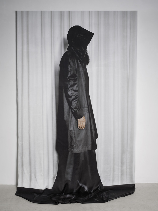
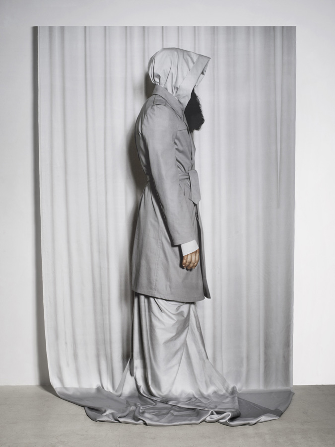
 I found that fascinating, artists who play with what you see, mysterious and exciting because the men looked so real, and still so unreachable. This made me very curious about who the artists were and what else they would make.

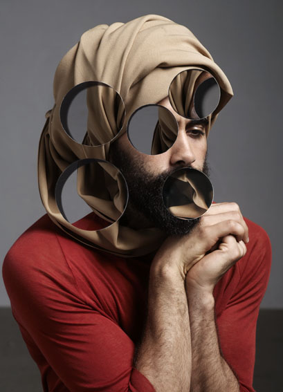
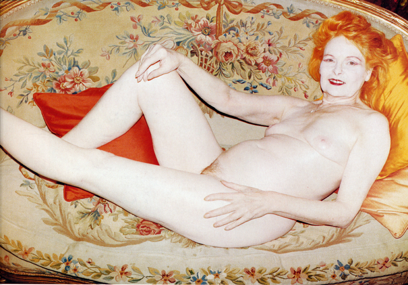
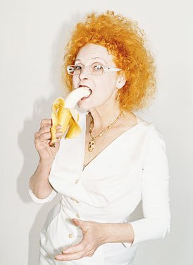
After a second wintry hike I arrived at home. After a cup of very hot chocolate I decided to google these two mysterious artists thoroughly. I was curious if their work was still in relation with the Gerrit Rietveld Academy. The result of this search session was an enormous amount of surrealistic photo-series containing a lot of optical illusions. Every picture the duo makes asks the viewer lots of questions. Is this photoshopped or is it reality? Is this 3D or flat? How does the face of the person on the picture look like? Is this old or newly made? Is it art or fashion? And these questions don’t stop, they keep coming when you’re looking at their work. I began to wonder who these artists really are and where they get their inspirations from.

Carmen Freudenthal was born in 1965 in Utrecht. Form 1983 till 1988 she studied Photography at the Gerrit Rietveld Academy. She lives in Amsterdam, as well ass her colleague Elle Verhagen. Elle Verhagen was born in 1962 in Gemert, and also studied from 1983 till 1988 at the Gerrit Rietveld Academy, instead of photography she did Fashion, but she was always very interested in photography. They started working together after their graduation, and are still doing that up till this moment. Their work combines fine art photography with fashion, surreal imagery with brutal reality.

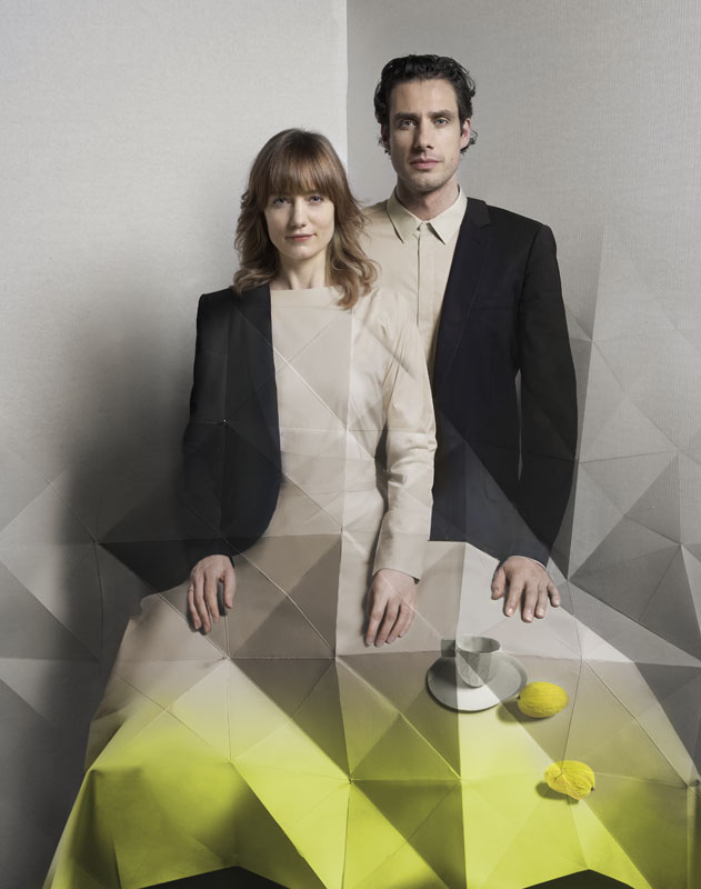
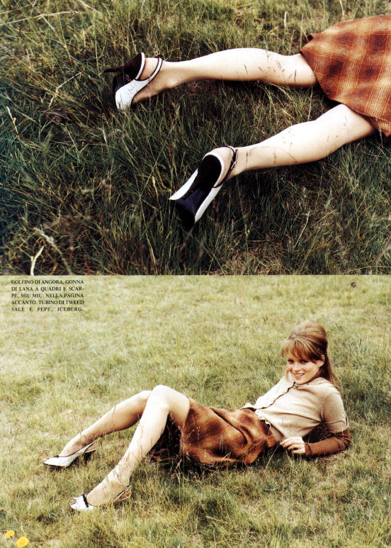
Often, their inspiration comes from fashion. Elle collects clothing she likes and finds interesting because of its shape or texture., while Carmen lets her fantasy go free towards connecting in formal language. Their models are not selected by their beauty, the only important thing is; they should be uncommon! Sometimes the photo shoots are taking a few days, because the pictures have to be perfect. But after these shoots the duo is not finished yet. They adapt their work to three-dimensional collages, which transform into spatial sculptures with a surrealistic touch. Elle; ”For us everything that happens after the photo shoot is at least as important. After that we can start cutting, pasting and creating. We transform!” mostly their works becomes tree-dimensional, sometimes it stays flat. They work with Photoshop but mix that often with other techniques, this often creates these optical illusions because you do not understand anymore what you see.


But photo series is not the only thing Carmen and Elle make. They have also done different installations and short films. Their most recent short film is; “dear Mr/Mrs” and was made for ArtEZ fashion masters.

DEAR MR/MRS

This film raises question, is intriguing and quite confusing. The main person in this short film is Ray van Haaren. His face is not really manly, pretty feminine so to say. He is wearing a wig, make up and sometimes a dress, this makes you wonder if you are looking at a man or a lady. Carmen and Elle are very good in creating this confusion, but they don’t go to far. Their work stays subtle. I think that is very special and recurrent in their work.

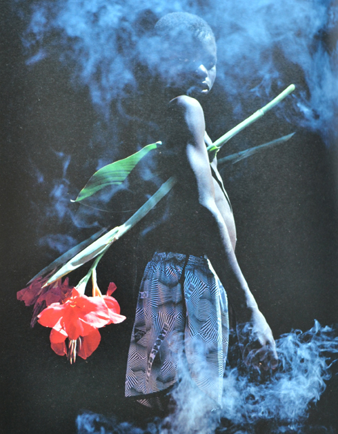
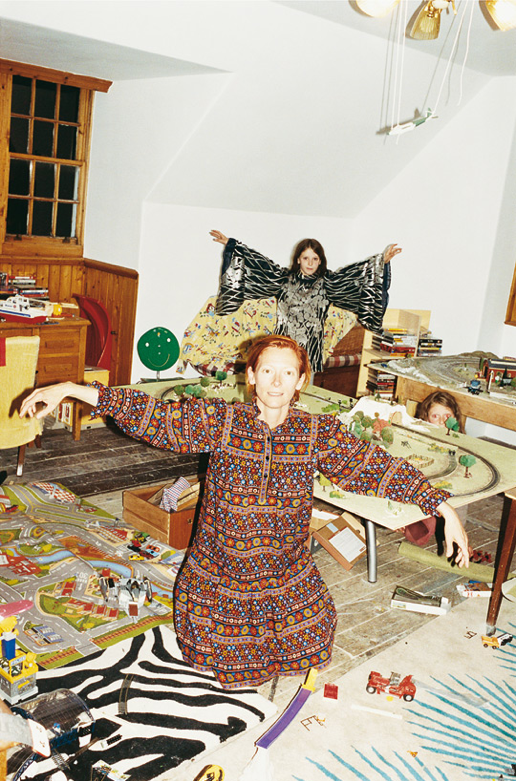
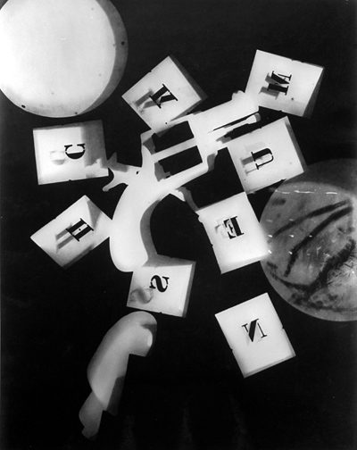
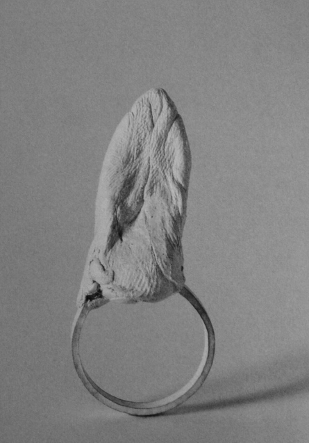
In collaboration with fashion designers, performers and other artists they create various different works. But is it still very recognizable because of their typical humorist approximation of the daily life and their unmistakable own style. This makes quite clear on which academy Elle and Carmen had studied. An academy which stands for the freedom in development of your own approach.  The Gerrit Rietveld Academy aims to support talented young people. The academy want students to create independently, so that they can grow and develop their individual style. the enormous amount of different cultures that study at the academy creates a Gathering of  cultural aspects in art as well. This is something which you can very clearly see in the work of Freudenthal and Verhagen. look for example at this work ;

A lot of different people with different skin colors and different kinds of clothing, some look a bit folkloric. some are afraid of the “ghosts” and others dance with them. I think these kind of works can only be created by artist who studied on an academy with many cultures and such a freedom as the Rietveld Academie. Typical aspects that are very visible in the works of Elle and Carmen. I think these aspects of the academy are really good, and now already after studying for one year at it myself I can tell that I have learned and developed so much because of them.

Viviane Sassen: “I just love the black skin of people”.


Sunday, April 8, 2012

Viviane Sassen photographs people. But she doesn’t consider her photographs as portraits. Her models are more composition than persons. They are never photographed in close-up: it is always a total or semi total scene in which they figure. She almost uses her models as sculptures. Bodies always have a very sculptural aspect. She underlines that with very contrasted pictures. The faces of Sassen’s character’s are often no more than suggestions. They are surfaces and contours, black holes that contrast sharply with the bright, colorful surroundings. She uses a technique that could be called “the revered Clair-obscur”. While Rembrandt and Caravaggio used the light of a candle or their characters to emerge from dark decors, Sassen drapes a veil across the face. A tree, the edge of a roof, bystanders of whom only the legs are visible – they suggest eyes, mouth and nose with the echo of their presence.

Sassen makes 3 kinds of photographs: recumbent figures, lying with their head turned away from the viewer; intertwined bodies; and “Mystified portrait”: individuals who cannot be identified as such, who avert the camera’s gaze, who have a plant or a shadow of a plant where you expect a smile or a frown.

Between the age of 2 and 5 Sassen lived in a village in Kenya. It was a world of skinned goats’ head on market stalls, morning dew on the red earth, and sweet soft drinks in glass bottles and the smell of burnt charcoal. Her father worked in a hospital, and she herself played with the young patients from the polio clinic next door to their house. For a child of that age, who has not yet made the distinction between I and the other, the identification is complete.

She left Africa quite young and only came back there with a camera in 2001. During this in-between period, she flirted with the profession of fashion designer and became acquainted with photography. She sucked up the work of Araki, Nan Goldin, Thomas Ruff, Andres Serrano and Wolfgang Tillmans. Besides her autonomous work, she worked on assignment for progressive fashion labels like Miu Miu, Viktor & Rolf, Diesel, So, Adidas and Stella McCartney.

It is tempting to give an autobiographical interpretation to the images of her African’s work. But that would be too easy, opening the doors to accusations of navel-gazing and narcissism. “I’m attempting to recreate the images of my youth”, she says. But because of a lack of precisely determined locations these images have a universal charge, transcending personal ups and downs. And there’s a particular, political meaning behind them.


(more…)

In command of the army of light and shade


Thursday, January 19, 2012

Photography is the art, science and practice of creating durable images by recording light or other electromagnetic radiation, either electronically by means of an image sensor chemically by means of a light-sensitive material such as photographic film. Typically, a lens is used to focus the light reflected or emitted from objects into a real image on the light-sensitive surface inside a camera during a timed exposure.

When the lights are on behind a big black blanket it looks like a dusty night sky. It’s basically impossible to capture this effect, but still worth trying. The morning comes through the speakers, signaling that it’s time to move. As this decision kicks in, the doorbell rings, the body moves through darkness, stumbling down the stairs and landing with a bump! Opening the door, letting in the light, and a man with his sign. The man enters and the light comes on in the main room. He has a proposal concerning the future source of light, and one must agree to it.


In physics, a photon is an elementary particle, the quantum of light and all other forms of electromagnetic radiation, and the force carrier for the electromagnetic force. The effects of this force are easily observable at both the microscopic and macroscopic level, because the photon has no rest mass; this allows for interactions at long distances. Like all elementary particles, photons are currently best explained by quantum mechanics and will exhibit wave-particle duality, exhibiting properties of both waves and particles. For example, a single photon may be refracted by a lens or exhibit wave interference with itself, but also act as a particle giving a definite result when its position is measured.

The themes of the book can best be described with this written collage of close ups and full scale images, since the content of it isn’t words but images. The Israeli photographer Adi Nes was born in 1966 in Kiryat Gat, studied in Jerusalem and is now living in Tel-Aviv. His cultural background may evoke religious associations, and his works are also filled with references to iconic Christian imagery of especially Caravaggio. This can be seen in the clearly staged compositions of the photos and in the use of light and shade that create a high contrast, an effect known in painting as chiaroscuro. Furthermore he is very interested in depicting masculine stereotypes and situations, and does so in photographic series of prisoners or soldiers.

The command places a vertical band against a richly textured atmosphere. But here the creamy yellow vertical band separates two elaborately textured zones of colour. God’s initial Command “Let there be light” led to a sequence of creative acts of division: first darkness from light.

For 24 hours, to raise awareness, we are blacking out Wikipedia.


this post is part of he subjective library project "Unopened Book"
the book can be found at the Rietveld library : catalog no : -ne-2

Drag


Wednesday, January 18, 2012

The book contains a colorful set of images, as well as interviews with drag-queens, drag-kings, gender-benders and just awesome-looking people in their best.

The photos try to capture the real essence of the people in their everyday surroundings and environment. Most of the pictures are taken inside of their apartments, while they are dressing up – putting on their make-up, trying on their costumes. It also contains a series of nudes. The beauty of the photos lies in the fact that none of them are manipulated. What you see is what you get. There is no formula, no restrictions – only the apartment walls, where the pictures are taken, but which leave a great deal of freedom to the people, as the camera observes their everyday routine.

The interviews try to show how fascinating and crazy the lifestyle is that they are really living. In a very immediate and personal way, stripped of every artifice. They give us an image of true meaning of the mentality of the men/women, who like to dress up as an opposite sex member.

Most of the drags have developed several characters for themselves, throughout the years. With those different characters they are also trying out multiple lifestyles. They are also giving some advice on becoming a drag yourself (You should start with picking a name with a sexual slant to it).


The photographer captured the people from the circles he moves around in himself, which makes the images and the interviews extra intimate and open. It is truly possible to peak inside of that totally different universe. Here the photographer not only plays the role of the professional observer but is also personally involved in their lives. He succeeded on capturing all that joy and all of those sufferings. The involvement leads to extraordinary images – they are fascinating, than again touching. They show all the glitter and vanity, but there is also a great deal of vulnerability and fragility.

Photographers attitude and ethics has lead to images, which involve us but also force us to maintain a certain distance. Despite the often intimate images, which are shown, nowhere do we experience an invasion of the privacy of those portrayed. The viewer experiences respectful involvement and a bit of shock.

It is an eclectic approach, trying to show the true lifestyle of the people, whom we all have heard about, but then really know so few about. The book involves you to the magical world of people, who like to go extreme with their appearance. Doing that for just the fun of it and also for the name of entertaining. Their everyday life is all about standing out, competing with each other on different stages and situations and then again staying true to their own beliefs and dreams. It is a mixture of so many things, which lead us to a whole other level of seeing the world and the people around us.


this post is part of he subjective library project "Unopened Book"
the book can be found at the Rietveld library : catalog no : 793.6-cher-1

Photos without legs


Saturday, November 26, 2011

Gaspar Felix Tournachon was the first man who took to the sky with a camera and a balloon around 1855. Since then there have been remarkable advances in aerial photography such as the use of kites and even pigeons. The idea: let’s make photos from the sky. But the simplest of ideas can evolve to have great consequences and impact on design, science, war, life and perceiving our world.

France unidentified photographer

The first Photos taken from the sky were regarded as art. Later the combination of revolutionary technologies were used for map making and surveying. Aerial photography became, like many other advances in technology, big in times of war. During the First World War photos were taken from the sky for mapping and scouting areas of battle. The leap of technical improvements made by the army where appreciated in the scientific world. Scientists were now using aerial photography to develop concepts and ways of thinking. Another contribution to science was the possibility to minizalise field research. However, one problem applied itself: conclusions needed to be drawn from a complex play of lines, surfaces and (black and white)  tones. Therefore the interpretation of aerial footage demanded a great deal of knowledge and experience.

(more…)

Colouring Interiors


Thursday, November 24, 2011


There is no spectacular reason why I chose this Wendingen magazine. I haven’t had the luck to know anyone who owns such furniture or designed their home according to the Amsterdam School. But maybe because I know so little about the Amsterdam School and the Stijl I became curious in it’s influence on present design, art and architecture. Additionally, how do we people living in the 21st century look at the ideologies of the artists like Piet Kramer, Gerrit Rietveld and W. M. Dudok? Also, what do we think of the photographs of interiors that were designed by these designers?


The first thing I thought of when I saw the photographs is that I wouldn’t want my house to consist of only primary colors with the black, white and gray colour combination. I generally find their houses too impersonal and geometrical because of the lack of spontaneity and absurdity.
The Schröder-Rietveld House, however, I find exceedingly playful because of the ability to turn an open space into separate private rooms. Also, the practicality of the house is simple, sincere and has its particular charm.

The main reason why I liked this ‘Wendingen’ magazine was because of the numerous black/white photographs. My focus also drew to the captions underneath the photographs as they tried to describe the colors of the furniture, which you could not see or even guess.

For some years ago I liked to find old , black & white pictures of random rooms. I would use colored pencils to color these, for example, living rooms or dining rooms in. I would attempt to make the color combinations expressive, intense and sometimes clashing so they become livelier.

I like to work with themes such as nostalgia: focus on the beauty as on the absurdity of it. The furniture in the ‘Wendingen’ issue have a touch of nostalgia now, which I do not believe that someone like Rietveld or Kramer would have wanted their designs to turn into. This is simply bound to happen, so the interesting part to it now is what to do with these photos in the Wendingen issue?

There were several photographs of Piet Kramer‘s work in the issue, which I genuinely like, and who is now one of the known key figures of the Amsterdam School. I did a bit of investigation on him to see what else he has made, how his style developed and who he worked with etc. This I considered to share on the blog but I did not desire to simply focus on him but specifically on the work shown in the issue. I wanted to rediscover the style of the Amsterdam School and turn these practical and geometrical methods into something bourgeois and decorative and work against their ideology, without offending them.


(more…)

photomontgraphms


Monday, November 14, 2011

German graphic designer, typographer and photographer, Anton Stankowski truly made a mark on photographic history. As a student Anton, as well as some other students of the Folkwang School of Design, used the janitor’s basement as a darkroom, for diverse photographic experiments. Whether they were exposing light on to the film or the paper, making photomontages or, photograms. After finishing his education he kept taking photographs using the medium as an objective way of documenting thoughts and later as a specific working method.

Having never done photograms, I- the researcher, used this opportunity to go to the darkroom and use similar materials as Anton Stankowski did at one time to remake one of his photograms using only certain amount of light to portray nails onto the light sensitive paper. By doing this part of the research I got a deeper understanding of photograms, and realized overall how much you can play with lighting in photography itself. Here is the result of my remake:

Early in the process of developing my negatives I saw that some pictures seemed to have had some unusual light exposed on them by mistake leaving some pictures cut into half with different lighting on each half. When developing one of these photos on to paper I moved my hand under the light while the film was being projected on to the paper causing less light to reach that specific part of the picture. In spite of these clumsy mistakes this image is a favorite from the experiments. This series of unfortunate events having such a good ending made me think about how much of Anton’s work in the darkroom, especially as a student, was a coincident that lead to something interesting and how much of it went as planned and still had the same outcome as he wanted.

Going through Anton Stankowski’s photographic collection I noticed that they are nearly never showing faces of people. In his self-portraits a face can be seen, but even then it is ether blurred or moved. Another noticeable theme from his collection is how often he photographed street life (more often than not from his balconies – or at least with a view looking down on his subjects).  Therefor when taking pictures to develop and include in the research I tried to have these two notes in mind.

Stankowski was one of the first to make so called typographic photomontages, though definitely, taking his inspirations from his teacher Max Burchartz. Using these typographic photomontages in advertisements while working for an advertisement agency in Zurich he quickly became the pioneer of Swiss Constructivist commercial graphics.


The fine line between art and commercial photography


Monday, November 14, 2011

Juergen Teller is seen as one of the most influencing fashion photographers of this time. For the past twenty years his work has been featured in leading magazines. He has had exhibitions in museums and galleries. He has done campaigns for the worlds biggest fashion brands, and has worked with top models as well as with celebrities.
He is perfectly capable of combining the world of fine art and the world of commercial photography. And he walks an extremely fine line between these two.

We recognize his pictures by the random and untidy context in which he places and photographs his models, and also himself. His pictures seem negligent snapshots rather then constructed fashion photos. And therefore, according to a lot of people, rather art than advertisement.

Looking at Tellers oeuvre (so far) it is extremely difficult to draw this line between fine art and commercial photography. Teller himself refuses to separate the commercial fashion pictures and his most autobiographical non commissioned work. He tries to combine his commercial commissions with his personal work, even though it is very difficult to find the right balance. “This is something I struggle with and think about a lot. I need the commercial commissions to support my family and me and to finance my personal work. I prefer being able to do my own work with as little boundaries as possible, for example the pressure of selling the pictures. But the commissions I get are not unpleasant at all. I meet inspiring people and get to visit places I would never visit. Above all that I see everything I do as my work, commission or no commission. The division is not so clear actually.” Teller is very autonomous in his ideas. With his raw, sometimes autobiographical style he is able to push the levels of commercialism.

When I was researching Tellers history there were a few things I found remarkable. I will point these out in order to underline my perspective in this research.

First is his strong attitude, which influences his ideas. He is persistent on achieving what he has in mind and will not easily let anything get in the wayof it. He doesn’t care what other people think about his work, and is convinced by his own style.

When he got the commission to photograph jewelry for a catalog of the auction house Phillips de Pury, Teller at first thought of using supermodels. This choice would have made sense. But he thought about these young girls, who are not so much interested in jewelry than for example his mother is. Therefore he decided to shoot all the pictures for the catalog with his family.

He doesn’t try to create something that isn’t there. He anticipates on movement, time and place and therefore manages to capture extraordinary moments.  When he worked with Tilda Swinton to make a fashion-editorial he found it difficult to get her out of her role as a mother. Instead of forcing her, he decided to let the kids join in the picture.

Second is his willful, creative mind and his perspective on beauty. Teller has a remarkable preference in his subjects and models. This unique perspective has a lot to do with his frustration about the fashion industry, which I will explain further in the third point. We see a gradual tilt in his preference in subjects and models. He explains: “In the past I always thought I had to photograph people that I really liked or that inspired me. I thought it was the only way to shoot good photographs. But when I made my book “Go-Sees”, in which I photographed girls who introduced themselves as a photo model, I learned to concentrate and photograph people which wouldn’t interest me at first sight”.

(The book ‘Go-Sees’, mentioned in the quote above, marked a turning point in Tellers career. The following video embarks upon this point and……., well, it speaks for itself. Juergen Teller on his Go-Sees series)

The models Teller favored have always been different from other photographers. In his early career he noticed Kate Moss. She was short and quirky, fairly strange compared to the supermodels of that time.

As time passed by Tellers popularity grew, he got more commissions and editorials. His preference for models tilted from younger girls to older women. This is closely related to the third point which is his attitude towards the fashion industry.
Most fashion photography is done by gay people finding women sexy, which is sort of not sexy at all, at least to a heterosexual man. She’s so retouched, so airbrushed, without any human response at all, and, well, you don’t really want to fuck a doll. I just turn the page. It doesn’t really interest me very much. My work has nothing to do with that. I just really like women, and I like men, and I like children, and I like eating, and I like doing everything. It’s something real. I’m for the individual human being, not some plastic figure some gay guy thought out. That’s valid for something, but it’s not my cup of tea.”

He takes a clear viewpoint compared to the average fashion photographer. He is determined about capturing the moment as it is, and therefore he never retouches his photos. About this Teller says: “I’m interested in the person I photograph. The world is so beautiful as it is, there’s so much going on which is sort of interesting. It’s just so crazy, so why do I have to put some retouching on it? It’s just pointless to me.” Already in his early career Tellers work was completely different to the general fashion photography. He gave them raw photos and dared to show the ugly side of things. He visualizes the imperfection of what’s real.

While doing a commission for Vivienne Westwood he decided to photograph Westwood herself instead of the model that was present. Every other photographer would have frowned upon this situation, choosing a sixty year old woman with sagging breasts over a skinny, soft girl.

It takes a lot of courage to make this conscious choice to go against the grain. He dares to seek the controversy; he dares to make fun of the objectifying fashion industry. He remains true to his own aesthetic. He explores the relationship between the photographer and his subject and pushes it into new territory. The line between fine art and commercial photography will remain thin, if not invisible. Teller does commercial commissions, he has an eye for the brand and it’s customer. But his work is so specific, that he dares to make it for an extremely small target group. If they don’t like it, they don’t like it. He has found a smart way of combining his individual creativity with commercial commissions. This hits the core of his work and his success.  “I just want to do what I want to do”.

Unterwegs mit Juergen Teller [x][x]

scrapbook sayings


Friday, September 16, 2011

Sadly many people are under the impression that scrapbooks are only a twelve year old girls way of documenting her summer trip, using stickers and sparkling pens. This is a misunderstanding. Scrapbooks are a clever method of keeping track of memories, photographs and a certain way of thinking. By observing how a scrapbook is set up, what paper is used, what typography, and what kind of organizing system it is easy to see how a scrapbook obviously reflects upon ones personality. Wim Crouwel’s photography scrapbook was the first thing that caught my eye at the Stedelijk Museum, and after going through the entire exhibition my initial thoughts of the connection between a scrapbook and a personality were proven correct.

Crouwel’s clear passion for organization in his work can be seen by the way each page has a theme in the photographs. Whether it is a small photographic series of windows, store shelves, store boxes or still-lives all the photos belong together on the scrapbook page. Each and every photograph is the exact same size glued on the paper, 3 in a horizontal way and 4 in a vertical way. Nothing is written in Crouwel’s scrapbook, with the exception of a number he gave to every photo. The way the scrapbook was set up in the museum definitely played a part in why it appealed to me. Nine pages in a row, covered by glass, truly gave an idea of the repetition, seeing how each page looked the same, until you really  started looking at the photographs.

X + Y + K


Friday, May 13, 2011

+
+

Inspired by Uta Eisenreich ;

Man Loved, Man lived, Man Ray


Friday, May 13, 2011

To really understand Rayograms, i think one needs to experience it. It is not just about playing with objects on photographic paper in a darkroom. It definitely is more than that.

My first experience with Rayograms was in my second year of high school in Switzerland. It was so new to me. I knew nothing about darkrooms let alone photograms. As a first reaction I went out to the nature and collected whatever i found to be interesting. There were leaves, branches, beads whatever one can find. After playing around enough, i started becoming more picky about my objects. Each object had to be more special, had to have a reason to be there. That is where the process becomes very self reflective. Objects have meaning or associations and you end up questioning them and yourself through them. Until something makes a bit of sense, if not with their meanings, then with their visuals.

Looking at the Rayograms of Man Ray i really started to become curious of his life through the objects he used like scissors, films,keys flies, comb, needle, iron

Especially the negative film  as an object seemed to be reappearing all the time as well as scissors and needles.

Despite their quality as objects, they really make me question their associations and that is where i started researching more on Man Ray’s life. I wanted to know to where and to what they were connected in his life.

Man Ray’s work not only seem experimental they also are very personal. The double thing with ”knowing” though is that once you know it you can never see it in its purest form and that is also quite important in very abstract, open end works like Rayograms.

Rayograms which is named after Man Ray started to come into existence only after he experimented with various mixed medias throughout his life. Thus it is important to know the stages Man Ray went through in his career to see the layers under his rayograms.

It all started at Boys’ High School, where he educated himself by frequently visiting the local art museums where he studied the works of old Masters.

Early works of Man ray includes expressive figure studies and Cezannesque landscapes made from observations.

Between 1913-1915 when Man Ray lived in a small artists colony in Grantwood, in an effort to keep expenses at minimum Man Ray shared the rent on a small shack with the American painter Samuel Halpert. It was from Halpert that Man Ray emulated the artists’s utilization of contoured form and brightened palette.

Over time Man Ray removed himself from direct observation of his subjects,reducing figures to flat patterned disarticulated forms and his imagery became increasingly abstracted and artifial.

While living in New York, he became friends with Marcel Duchamp who was interested in showing movement in static paintings. Obviously influenced by Duchamp Man ray’s works began to depict movements of the figures. Later on again like Duchamp, Man Ray made ” ready-mades”.

His work called ”gift” shows influence from both Duchamp and his parents.
(more…)

9 1/2 by 12


Thursday, May 12, 2011

Karl Blossfeldt born in 1865, was like his father before him, a huge lover of nature. This love soon turned into an obsession. For more then 30 years he documented and photographed sections of plants with a self made magnifying camera. No longer revealing them as natural forms but more as abstract forms.
In the time that Blossfeldt began taking photos around 1899, photography was more seen as something scientific. Karl just saw it as documenting to restore our relationship with nature.

At that time his photos shocked and inspired the art world, never before had the world seen plant formations like this, in such great detail. His photos were taken just about 60 years after the first ever photo was successfully produced.
If we look at Blossfeldt’s curriculum vitae, it clearly states he was a sculptor and professor of art, something quite different from a trained photographer or scientist/botanist.
But that didn’t mean he wanted his photographs to be viewed as art. The question remains, was Karl just one of the first macro fanatics studying the biology of plants, or was he an artist looking further then biology or was he both?
This is a question that Karl himself was obviously not fazed by at all. He simply stated:

“My botanical documents should contribute to restoring
the link with nature. They should reawaken a sense of
nature, point to its teeming richness of form, and prompt
the viewer to observe for himself the surrounding plant world.”

If he is trying to do so –trying to reawaken a positive feeling for nature– he is giving it to us, by no system of emotional representation. Just plants against a gray wall. So I’m guessing it is the plants themselves that are supposed to reawaken this in me and I’m not quite sure it is working.

Even if I can’t find an immediate understanding of his work right now, I can at least have an admiration for his ability capture something on camera, no one had done before. For his ability to show how our man made world –with its architecture, fashion, design etc– is visually not much different from formations and patterns found in nature, probably without those designers even noticing it themselves.

Here are a few examples of architecture, fashion and design that is very comparable to the images Blossfeldt created.

Moholy-Nagy’s Photograms


Wednesday, May 11, 2011

Lászlo


Portret

László Moholy-Nagy was born in 1895 in Hungary. Here he started painting around 1918. Around this period he also moved to Berlin to develop his talent.
Besides painting and photography Moholy-Nagy also made during his life a lot of other art in which he often involved light as a media. He made sculptures, collages, films, graphic design and even more different work.
Here below you see some of his early paintings.

In 1923 Moholy-Nagy became a teacher at the Bauhaus School in Weimar after he got to know Walter Gropius; the man behind the Bauhaus.
The school had a total new way of teaching. Students had the possibility to work with a lot of different materials and were stimulated in there independency and personal development. Information Bauhaus (dutch) or (english)

It was when Moholy-Nagy became a teacher at the Bauhaus that he started experimenting with typography and photography as well. When Moholy-Nagy later moved to the VS, he there started the New Bauhaus in Chicago and continued his experiments with film and photography.

philosophy

Moholy-Nagy believed in art as part of a lifestyle. A collective mentality in which art, together with other aspects of life come together as a ‘gesamtwerk’.

He was convinced of the forming function of art. He saw the ideal society as one in which everybody is practicing art. This would lead -so he thought- to an improved society. He joined the group MA, which believed in the revolutionary potential of art. more on his theory and himself

the photogram

A photogram is a print of something that lies on light sensitive material and then get’s lightened. In other words: A photogram is a form of photography without the use of a camera.

This is, I think, very interesting.
To me it’s fascinating to see the direct forms of a device on paper. It makes in a way the distance between you and the subject on the photo smaller. And the realism of a photo bigger.
So what you see is exactly what it is.

Moholy-Nagy tried a lot of different things. For example the experiments with the light from different angles. And also many try-outs with different types of material; in special the transparent materials.


The  photogram’s of Moholy-Nagy are often abstract but not always. Lazslo worked with figurative images in the photogram as well. He build figurative images out of form or/and made use of the negatives of other photo’s.
But just to give a little bit more information about the history of the photogram because you might find this interesting (as well as I do) I’ll give you some more facts;
– The first illustrated book containing photogram’s dates from 1843, from Anna Atkins. Not so long after the invention of photography itself.
– In the early twenties there was a lot of experimenting done with the photogram. Notably by Christian Schad and Man Ray.
– from the moment Moholy-Nagy discovers the Photogram (around the time he started teaching at the Bauhaus) he continuously produces them until his death.

concluding

After visiting the exhibition Moholy-Nagy “Art of Light” and seeing all his work paintings, films, objects, collages and a huge number of photograms, I became really interesting in them. By reading about Lazslo and looking at his work I found out that there is so much more to learn about him and this time, which I think will inspire me to design and create more photo’s for myself. Especially in relation to the philosophy of Moholy-Nagy about photography. This because I agree with him about how to make use of black and white and composition in photo’s. Over-thinking the work of Moholy-Nagy resulted into an eye opener into the possibilities of photograms or making use of light in art.

some other sources:
Moholy-Nagy: The Photograms, catalogue raisonné published by Hantje Cantz / The Art of Light exhibition cataloque(fotogrammen)
Biography Lazslo Moholy-Nagy [Rietveld Library].
general information on photograms
How to make a photogram

Didn’t I see this before?


Monday, May 9, 2011

Didn’t I see this before?

dejavu-gif

dejavu-gif

dejavu-gif


Didn’t I see this before?

In a web app I created for iPads you can move along stories told by various images and collages of hands. Sometimes you end up at a point you think you have experienced before. But is it really the same, or does it just familiar? You might just have a déjà vu.

Have you ever had this strange, but uncertain feeling that you have experienced something before? An overwhelming sense of familiarity? A moment you are not sure if something similar or the exact same thing already happened? Then you belong to the majority of people who have had a déjà vu. Scientists are still unsure how to explain this phenomenon. Some try to link it to memory functions, claiming that familiar events can trigger memories of forgotten information. Some say it’s a more like a “memory check” of our brain: a signal that there is a conflict between what we think we’ve experienced and what we actually did experience.

There are other interesting theories as well that try to explain a déjà vu:

Precognition: We have the power of foresight. A déjà vu is the evidence that we are actually able to predict the future.

Reincarnation: We have lived before. A déjà vu is the surfacing of a hidden memory, evidence of a previous existence.

Higher dimension: Our consciousness actually exists outside of our physical bodies in a higher dimension, and when a déjà vu occurs, it’s a brief moment when that separation becomes clear.

Parallel universes: There are other versions of ourselves, living in parallel universes. A déjà vu is a moment we share a memory with an alter ego of another universe.

Precognition: déjà vu is the evidence that we are actually able to predict the future.


In whichever explanation we believe in, the question remains:

Didn’t I see this all of this before?


Uta Eisenreich


Saturday, May 7, 2011


PAY ATTENTION AT YOUR BACK !


Uta Eisenreich is a Dutch photographer/artist, teaching at Gerrit Rietveld Academie. Looking at her works, especially at her last book “A not B”, I noticed the important role played by her background.

The book consisting of a series of still lives, inspired by non-verbal IQ tests for children. The images show changing combination’s of stereotypical domestic objects. The layout of these tableaux is determined by an underlying logic that the viewer is subconsciously triggered to discern..

She express herself through Photography, Performance, installations and Games. As I mentioned before I was captured by her ability in playing between subjects and backgrounds.  I found that book a clear example of balance and contrast between basic elements; all tricked out by “title-suggestion” that create a sort of curios  analogy.


Full colors and daily forms give me an idea of comfort.

Known.


While an esthetized light, an independent background create an idea of gravity absence, almost vacuum.

Unknown.


The almost absence of shadows and the extreme perspective, as in the Stenopeic Photography let disappear the deepness creating an optical ? illusion where is easy to get lost in focusing the main subject. Subject and background are on the same plan, they have the same value in the composition. From that originates my interest about the fact that ” a background is always present”. We can not have anything without any background.

Years ago I went to an exhibition of American Landscapes in the XIX century, damn it was boring. Nature, sky, horizon*….I couldn’t find a point to focus on.  What is the subject? The main interesting point?  It is a landscape, where is the background? Probably it is the landscape itself. Then Monet ‘s Waterlilies…subjects melted with other subjects in different plains ……

After I had the occasion to see a Rothko in person; the absence of conventional subjects led my sense to experience the paintings as a start point. Like a landscape, like a background. I still have to get the point.

Many times I heard discussion about landscape or background in architecture; how to integrate, to camouflage a structure in a determinate location/landscape/background.

In painting as in design as in architecture….. It can be monochrome, flat, floral, fizzy, silent….We can use it to amplify the main subject, or just to diminish it. Everything starts on something else. The Earth’s gravity has perhaps led us to a method of building based on addition;


X + Y


X + Y + K


X + Y + K + H + a canvas, a problem to solve, a rock, a dream, a need, a sheet of paper…


Again –just to remember–  isn’t how and where we present art the main important background?

Luckily it is an extremely versatile element. So versatile that we can even give it a determined value and meaning. However it can be an idea if we want.

*An expert mind pointed out to me that If we look at the horizon in Uta ‘s pictures, it is almost always not completely unbroken. As if she just did not crop it right and a little piece of the set-up shows. A corner or something else…… Like that the 2d effect is brocken as she shows a reference to the 3d set-up.

Black and White for today


Monday, October 18, 2010

We could imagine that an artist who decides to make a book to present his works, will make the choice to present it in the most realist way. The works have to be shown as clear as possible, with all the details and from the best angle in a way that the public can figure the work out as better as possible. (more…)

The Pearl Chain Principle


Sunday, September 19, 2010

Just as the academical year came to an end, at the most busy moment of the year, there was again a grand expo at Gallery Ra in Amsterdam.‘
Manon van Kouswijk, ‘Hanging Around’, The Pearl Chain Principle’

[22 Mai- 19 juin 2010].

Manon van Kouswijk has been Head of the Jewelry Department of Rietveld Academy the past three years. This exhibit was like a farewell present by her, after leaving the academy for a new chapter in her life and carreer abroad.
For all who missed that show there is still the book with the same name ‘Manon van Kouswijk, ‘Hanging Around’. And what a beautifull publication it became. With the help of graphic designers NiessenendeVries [#] and photographer Uta Eisenreich [#] a new pearl was added to her neckless of exquisite publications on her work and research process. Only 500 copies so go to the Rietveld library and have a look. The book not only gives a genuine and autonomous look on her work, it also presents her associative search into the subject of pearls and chains as a subject. An inside look into her working process as we came to know from her in former publications

. . .“Within my work I focuss on the value and meaning that everyday objects represent to us.
I am interested in actions and rituals in which these objects take part, like finding, buying, collecting, receiving and giving. In the works I visualise aspects of their function, of use and wear, and of associations that are connected with them.
The archetypical object serves as a starting point in this process; the outcome and appearance of the work is diverse and ranges from jewellery, cutlery, tableware and textiles to works in paper.
The making process I view as a way of making things visible rather than designing; I stay quite close to the objects in a sense that I work with the materials and techniques that the archetypes I start from have been made with.
The multi- disciplinary approach is essential to my practice. It results in functional designs as well as limited editions of art work, that are all derived from the same sources of inspiration. [#]

. . . “My graduation project at the Rietveld academy in 1995 was based on my interest for classical pieces of jewellery, like in this case the pearl necklace. I was intrigued by its rigid and aloof character and felt very tempted to attack it in such a way that other aspects then just its perfectness became more visible.
To achieve this I used the specific characteristics of the necklace, like the severe order of the pearls and the knots that both separate them, but also hold them in place to make a series of alterations to the piece.
One of them was a transparent bar of soap, containing a strand of pearls that slowly comes out the more the soap has been used up. The necklace is born from the soap like a pearl from a shell. [#]

quotes from Manon van Kouswijk

[#] look also for her former 2007 publication Lepidoptera Domestica


Log in
subscribe