 Throughout the history of fashion there has always been a distinction between patterns of clothes that are worn by different groups of people within society. Can we nowadays still speak about variations in patters between different types of people, regardless of the individualization that took place in the past decades? For over a month I have been taking various pictures of patterns from students at the Rietveld Academy in Amsterdam and from people that work for corporate organizations in the Netherlands. This research shows the results.
"public space" Category
Rietveld to Office
Wednesday, October 14, 2009
Rietveld & Beatles, Identities with a content
Wednesday, May 13, 2009
Building & Identity became subject of plans to move Amsterdam’s Art & Design Academy (The Gerrit Rietveld Academie) to an other location.
Academy and building named after the same conceptual visionair Gerrit Rietveld cause an interesting concourse, in which the identity of our renown academy building is suddenly confronted with an evenly famous and internationally renown educational identity. (link to student research)
As part of a teachers and students protest against the “ad hoc” plans, celebrating the 42nd birtday of the Rietveld building, a T-shirt was designed after the famous “Beatles” T-shirt by Experimental Jetset, to emphasize this realation between content and identity. Rietveld is building and students and teachers as the Beatles still are John&Paul&Ringo&George. link


Rietveld for Rietveld
www.rietveldforrietveld.org
The goal of this website is to open the discussion on the preservation of the historical Rietveld building for the Gerrit Rietveld Academy, Amsterdam.
Read more about this and all ongoing facts and publicity ¿GRA becomes GAK?
Buckle up, and Slap me in the face..
Friday, May 8, 2009

My father once said to me that a good piece of art should slap you in the face.
Even though I disagree with him sometimes, I liked that a lot and I like to be slapped in the face.. It is not often that you are struck by something in such a manner that it stay’s in the mind and overgrows everything that mattered less.
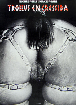
Of course the blow can come from different angles (beauty, shock, alienation, directness, physical impact) but looking at this poster from Anthon Beeke I immediately experienced the ‘slap in the face’ again.
A lot of my fellow students thought the thing horrid and filthy and I can totally understand that. This image illustrates some of the associations we make between for instance : women, horses and sexuality. I think that feeling of repulsion comes from the hidden knowledge we have about our own beastly behavior and the gender specific features that come with that. Moreover it touches upon the similarities between humans and animals.
A while ago one of my friends said she had seen two horses mate and that it had horrified her, why?, because the aggressiveness with which the stallion had moved reminded her vaguely of her ex-husband.
We can find the truth within language; do we not refer to certain men with the word ‘stud’? And do we not aim for a specific type of woman using the term broodmare?
Some displays in this exhibition made me curious, some designs were funny or even beautiful, I marveled over the poster designs from Jan Toorop and Jan Tschichold, However…; appreciating something is not the same as being hit by something. Anthon Beeke really struck, with this beautiful, raw and direct image.
This poster was made for a tragedy written by Shakespeare, I will never forget that play now, and I every time I saddle my horse for a ride I will think about Troilus and Cressida.

LUST DOES NOT MAKE ME HOT
Why is it that some works of art stay with you, and others do not?
When you go through an exhibition, an art fair or an Art book there are only very few things you remember, that stay with you, the rest ….. will be continued in this linked pdf
The Honesty of Anton Beeke: Troilus & Cressida
Wednesday, May 6, 2009


As a student at the Gerrit Rietveld Academy, I went to the Graphic Design Museum in Breda, together with my class. Their collection included pieces from a decade of graphic design. Next to some posters, you could hear interviews with the designer. Sitting down at the table next to the posters, you could see a built-in television with the images of the interview. This was also the case with the poster that took my attention, namely the poster made by Anton Beeke. He made the poster for a relatively obscure play by Shakespeare named “Troilus and Cressida”. The poster intrigued me, because it showed a recognizable human bodypart yet was still somewhat indefinable. This combination added to the mystery of the poster. Using the information table, I found out a lot of backgroundinformation about this seemingly controversial poster. For more posters link to the Affiche museum
When I was sitting at the table in Breda, I was listening to an interview with Anton Beeke. He introduced himself and I discovered that he was a graphic designer with a lot of experience. He made a wide variety of designs for posters, advertisements, books, magazines, stamps and packaging material. The specific subject of the interview were two posters hanging above the information table. Anton Beeke designed them both for the play “Troilus and Cressida”. The picture was very provocative, because it showed the backside of a naked lady who was bending over, only wearing a horse strap. “Troilus and Cressida” is one of the less famous plays by William Shakespeare. It is a sad story about the love between Troilus and Cressida during the Trojan war. Troilus saw that Cressida was behaving all too affectionately with a Greek called Diomedes. That’s when Troilus reckoned she surely was a prostitute. Anton Beeke tells during his interview that being honest is one of the most important principles for him. He saw the play as tragic and sexist and thought he should show just that on his poster. Unfortunately this point wasn’t clear for some. Especially the so called Dolle Mina’s, a feminist movement during the 1960’s, were protesting against the poster.
Links: Trojan War, Anton Beeke[image], Troilus and Cressida[image], Dolle Mina[image]
slowLinking: tagging slow design part 3
Monday, May 4, 2009
Welcome to part 3 of : tagging slow design. This is a worksheet on which all the link-topics and post-it tags collected on the “slowWall” are listed in relation to the research subjects as components of the ‘slow design project’. (researches can be downloaded as .pdf’s).
link topics.
Performance links the Morgan O’Hara research to the one on Julia Mandle. The Julia Mandle research links to the one on Richard Long on the topic street /nature & art, by slow movement to the Kunsthalle Bern exhibit and by sensibility & violence to the Psychogeography research. Psychogeography has the link topic urban life with the Karmen Franinovic research, consumption /destruction /life style with Futurisme, against and pro community with Wim Wenders, evolution of everyday life to Downshifting, and a anonimous link to Maria Blaisse. This anonimous link is not the only one linking Marie Blaisse. Link topics like art and left over, connect this research to Uta Barth. Karmen Franinovic links to Christian Nold by means of the topic mapping, and to Psychogeography by urban life, to Futurisme by life is getting faster & people are getting a social, to Julia Mandle by just stop & think and to Richard Long by the link a way to see. Richard Long links to many other researches: to Sophie Calle by self related art, to Christian Nold through a line made by walking, to Karmen Franinovic linked by the topic a way to see, to Downshifting by choosing slowness. Downshifting links back to Julia Mendle by the link topic us and them, to Psychogeography by revolution of everyday life, to Futurisme tagging the link with designed lifestyle, to Marie Blaisse by us and them, and to the Kunsthalle Bern exhibit by reflect /a closer look. The research on Futurism has some remaining links to Julia Mandle through the topic exploring / explosive / sculptural. Following links from Wim Wenders to Uta Barth is made possible by the topic notice the small things in life, to Christian Nold by moving /memories. Mapping links Christian Nold to the Ambient/Brain Eno research while that last one makes a link back to the Kunsthalle “The Half and the Whole” exhibit creating a take time to cook link.

Reading all the researches the links will surely start to make sense, as will their variety shed light on the specific nature of many of them. Some research subject however did not create any link at all, like in the case of Maison Martin Margiela. And it was 0nly after some discusion that the performance link was created between Sophie Calle and Karmen Franinovic. Uta Barth was anonimously linked to Richard Long which might have been an intuitively act
Post-it tags.
No links did not mean no tags. Time, Maison Martin Margiela for example was closely read and tagged with post-it. This created tags like memories, replica, time(less), can’t relate to it, time, physical picture of memory and the photographical tag to a picture by Mark Manders. Wim Wenders (present in our research list because of his beautifull documentary “Notebook on Cities & Clothes” about fashion designer Yohji Yamamoto) generated also many tags like sublime, I finally found time, hillbilly, surreal, the truth, place, moving. Sophie Calle tagged by the moderator with authorship, generated: life=art, stories, documenting life. Uta Barth looking was tagged: rainy day with half closed eyes, in between places, no left over, sunday. Ambient the research connected to Brian Eno tagged as big here long now was retagged as live the moment, loosing yourself, don’t think, sound. Christian Nold place-ness got tagged with keywords like biomapping, google earth, links, remapping memories. Linked to many, tagged by few. Julian Mandle pause, was tagged with pause from urban flow only. Morgan O’Hara gestures was tagged with trans, transforming, concert-art, transmission, energy of moments, reaction. Maria Blaisse architecture by border between self and not self. Futurism with fast life, life style, save time? Downshifting was tagged with life style too and change assumption. Richard Long tagged as a subject with landscape was enriched with the two tags: exploring fast and slow and perception of space, time and personal potency. Psychogeography with destruction of community, philosophy, socialism, anarchisme and urban live. Finally Karmen Franinovic subtraction, served as a hub for the tags: observe, spontaneous landscape, discover a realy nice place that never be online, easy fast, MTV generation, reflect, and observe. Some researches like Conditional Design re-mapping did not make “the slowWall” and were concequently not linked
added tags from the slow design lecture.
scale, gestures, measurements, relations, sustainability, evolving, creative activism, reveal, expanding awareness, reflect, engage, participal, deceleration, fresh connections, rhythm, probing, (im)materiality, metabolism, reflective consumption, live span, memories, community, record, tracing, (human) body, break (take a break), nothingness, inclusive, transparent, re-mapping, connection to scale
read also: >tagging slowdesign part 1
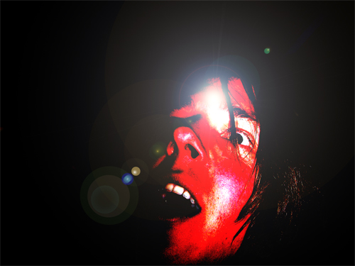
Bruce Nauman, but not on citizenship.
Wednesday, April 1, 2009
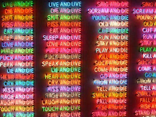
As a final post on flaneurship and neon lights in the city landscape, I chose to write about Bruce Nauman. This might seem confusing, because his works are usually displayed in a gallery or a museum, quite isolated from the busy city environment that was my starting point for the first post.
Nauman made some installations with neon light, some containing text, others consist of images only. I chose these three examples from the mid-eighties (One Hundred Live and Die, 1984, Seven Figures, 1984, Mean Clown Welcome, 1985) for the more or less brutal messages they communicate. I still don’t know what the medium neon in itself expresses. This needs a more elaborate research. I’ll try to give a short comparison between Nauman’s work and the neons in Vegas. Comparing these two types of neon signs arise questions about this romanticist (yet uncanny) idea of a flaneur who gets sucked into a dreamworld of lights in the city. The common divider between these works of Nauman and for instance the neon signs in Las Vegas is immediacy. Both types of signs are attacking the viewer, but the effects are parallel reversed to one another. Nauman plays with a system of repulsion, while in a competitive commercial context (such as Las Vegas), neon signs would rather be used to evoke attraction. Still, I think both have to do with desire.


cat.no. -naum-8
keyword: neon
unconditional brand communication
Wednesday, April 1, 2009

you should not pick up “guerilla advertising” if you don’t have at least an hour to flip through this book.
it is reporting about advertising campagnes of various kinds.
numerous firms and organisations (e.g. nike, addidas. mcdonalds, the protestant church, the united nations, amnesty international, unicef or oxfam) with different approaches such as provokation, investigation, simply advertising or social criticism are represented in this book.
the methods are new; investigation of space and the use of human habits in western society are part of the adverting strategies.
there is several opinions about the capitalistic aim of advertising itself, but in my point of view is this book dealing with a lot more than only the selling aspect of it. definately worth a glaze… or two.
cat.no. 754.5-lue-
keyword: overview
is it a sandwich? what is it?
Wednesday, April 1, 2009
“Vorm van sculptuur” is on mine opinion a sculpture about sculptress like Marenne Welten, Anne Auloos, Inge van ‘t Klooster, Mia Trompenaars , Melanie de Vroom and Marenne Welten.
It’s a collection of small books form each artist.
Based on what i am seeing from the inside and outside of these small books,
i would say that they are showing fragments, details, sketches of the works.
The most interesting picture of the work of Anne Ausloos is for me one of her paper works from 2009. The reason why this photograph is so interesting to me, is because it brings questions and the form is funny.
what does the object represent? is it solid, is it edible, is it a sandwich?
if i talk about Inge van t’ Klooster i am talking about the most not attractive works of the whole group. i am basing this sentence on my taste and not on the quality of the work. the reason why i don’t find it attractive is because the massiveness and the darkness of the work. The Virtual work that she made with Martin Riebeek called “Between you&me” is interesting to me because it’s an outside platform for digital art. I think that this is a funny way to involve people in art. You could say that it’s performence art.
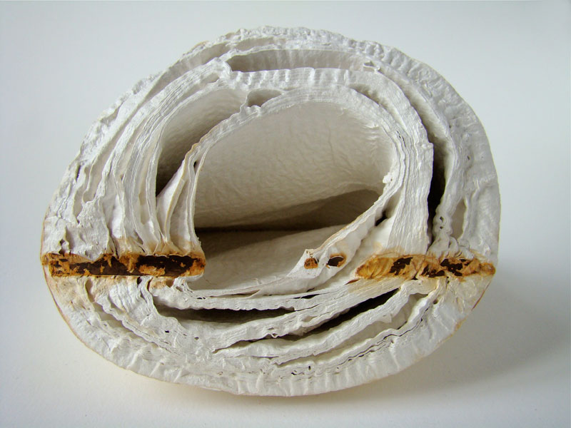
Anne Ausloos, 2009
Inge van t’ Klooster and Martin Riebeek
cat nr:726.8
keyword: best
Neon in Vegas vs Flaneurs in Paris
Thursday, March 26, 2009

In my previous post I talked about “City Signs and Lights”, about the design of a modern city landscape, attracting customers. City signs are in an ongoing competition for attention. In this post I want to focus on the interaction between the consumer (the flaneur) and the environment. I would like to shift between two cases: the architecture of The Strip in Las Vegas and the passages in Paris, in the first half of the 20th century.
The passage is a covered shopping gallery. The culture philosopher Walter Benjamin wrote about early consumer culture in Paris in his text “Passagen” (1930). He describes the citizen as a flaneur, not as someone who is exposing him/herself, but someone who is exposed to the attractive lights in the shopping gallery. The flaneur is a person who walks through the city without a specific goal. He/She gets into an ecstacy, going from one attraction to the other. The city unrolls as a landscape to the eye of the flaneur, but at the same time, locks him in. Benjamin calls this new city environment a “Fantasmagory”, the city becomes a dreamworld where different rules apply than in reality.
” If there is one place where colours are allowed to clash, it would be the Passage; a red-green comb is hardly noticed here ”
(W. Benjamin, Passagen, 1930)
I believe that Las Vegas is a great example of a modern day Fantasmagory. The city is almost entirely made out of neon signs. After the second world war, Las Vegas was growing extraordinarily fast. The consequence was a speed-up of competition along the Strip (the central road through Vegas). The actual buildings are all more or less the same: low, but a large ground level surface. This has to do with the climate and economical reasons. The outside of the building needs to stand out, both during the day and night. The result is a total mash-up of different styles, quotes, hightened symbolism, eclecticism, all in neon lights.
In the end, the building itself becomes a sign.
Vegas references:
W. Benjamin, Passagen, 1930
R. Venturi, Learning from Las vegas, 1970
Cocteau Twins, Heaven or Las Vegas, 1990
cat. no. 700.6-benj2
keyword: neon
Downtown Woah
Wednesday, March 25, 2009
There is a blatant connection between my first and second choice.
I started out with a book by Rem Koolhaas called Project On The City which is a collaboration with several students from the Harvard design academy where he holds the position of professor. This Project investigates the consequences of the unbridled urbanisation taking place all over the world. In this context the meaning of the word urbanisation go’s further than just the focus of human inhabitancy in city’s but also refers to the cancerous growth of commercial landscapes which are framed by concrete walls becoming the centre and at the same time the banks of a river of ongoing development. One of the problems stated in the book being that the design professions can not keep up and apply outdated methods to the urban landscape creating a chaotic and unpleasant maelstrom of overlapping visual and audio stimuli with which the citizen (caught up in this maelstrom) is forced to deal.
Then I found my second book. City Signs and Lights by Stephen Carr (almost completely) coincidentally dealing with the exact same problem but focusing it’s attention on the problem with -and the potential of (the name says it all) City Signs and Lights. Rarely have I seen two books that complement each other more (although not always in the most constructive manner) and the focus on the bewildering aspects but also the potential of urban public space is a connection that fascinates me deeply.
cat. nr: 754.5 carr
keyword: develope envelope
SIGN IDENTITY
Thursday, March 19, 2009
Some years ago I found in internet journey letters by a designer from Moscow, Artemiy Lebedev (www.tema.ru). There was one thing I was interested in a lot: road signs, street signs, signal lights that surround us everywhere we go, but with a national identity. So, last week I found in a library book, called 1000SIGNS, about same things, but with bigger collection of sign pictures from all over the world. I found it very positive and interesting, that, for example, toilet signs can look different and at the same time tells something special about the country or society they are coming from from. I can’t add any other comment, you have to see it.
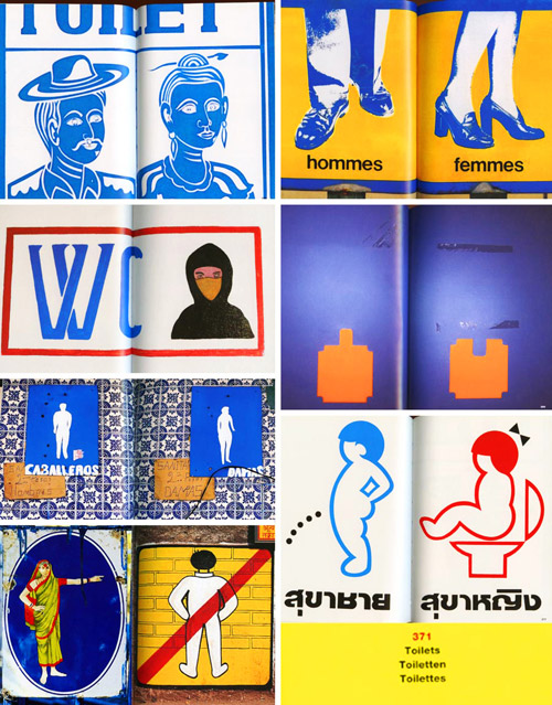
And there are also some funny signs about dogs and…
cat. nr: 754.9-mus-1
keyword: identity
B.C. Rout Fat Thing
Thursday, March 19, 2009

I browse dusty books signified by typeface and the often great level of deterioration.
Title, Title, Title, stain, Title, stain, tear and of course a nagging pain in the neck caused by the uncomfortable positioning of the head, necessary to read the titles on the afore mentioned dusty books with ugly typeface justifying their own existence by amazing amounts of crappyness meant to be intriguing.
I browse dusty books and I am very impatient and yes, very annoyed.
I have an assignment to fulfil.
I bend down to take a peek at the lower levels and find: stain, tear, Title, Title, stain, bright clear red outstanding unpretentious untitled fat thing. It was such a relief.
cat. nr: 942.9 chun 1
keyword: develope envelope
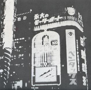
City Signs and Lights
Wednesday, March 18, 2009
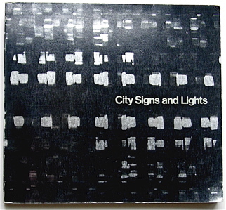
book
I picked the book City Signs and Lights (S. Carr (ed.), Boston, MIT Press 1973) from the Rietveld library. The title immediately brought up associations with Walter Benjamin´s concept of the flaneur, the prototype of the bourgeois consumerist as the socio-cultural product of the earliest department stores in Paris established around 1900. Parallel to this idea is, I believe, the Society of the Spectacle (Debord). The power to attract customers with light commercials like lamps attract bugs, by accepting the existence of Desire within the subject (Deleuze), creates a competition in the city landscape, that alters the landscape into a continuous feed of visual stimuli. This competition for attention in the urban environment leads in its turn to a new set of rules or aestethics for such commercials. This is probably the design part of the fascination: the competition within the city landscape for attention of potential customers that sets the parameters for an aesthetics of a denotation system that functions almost as a parasite on the urban environment.
(The author of City Signs and Lights doesn´t seem to mention a historical context)
The second association I had when I first saw the book, was Wong Kar-Wai´s Happy Together (1998) in which shots of city signs and lights are metaphorical for emptiness and alienation between the two main characters and their environment.
The book in itself does not provide extended written articles, but the title and images provoked associations and ideas about an exhaustive list of topics on the conditions of modern western society, semiotics in general, and the meaning of neon as a material or medium in particular.
cat. nr: 754.5-carr-1
keyword: neon
Why take a break?
Tuesday, February 17, 2009
Principally, I think I am relative slow… especially in doing my assignments… my brain is running the whole period… and I can’t close down… so I need typically too long to get to the point… to say “yes” to my idea… and the longer I think about it, the more difficulty it gets… from one element to the next… in the end thousand… once I felt in love with details and complicated schemes…
Then it is in the evening, one day before the deadline and I still have to work it out… working the night through… falling asleep in the middle of all the material… glue… scissor… cutter… ruler… pencils … waking up with a piece of paper glued on my nose or somewhere else…
Sometimes I love this nights… waking up and directly start to work and in between a short rest… a complete continued circle….
Never stop before perfection?
Self-chosen Speed
Thursday, February 12, 2009
Somebody should not ignore the beauty of products, nether do I, but an overload of the visual and mental impact of consumption is forcing me to find a way to deal with this headache, which emerges from the stress of speed. Speed is arising from measurement. So the first step was to put down my watch to give myself some freedom. But “slowness” almost doesn’t exist in my life, what means that the stress is not erasable. What is left is to find a way out of this reality into daydream spaces, where I can have the total freedom of time in a self-chosen speed or system. “Daydream spaces, such as those generated by reading a good book, are often more commanding than physical spaces. While you read, you don’t even notice people who walk through the room because you are actually in the space that’s generated by the author. … the spaces generated by music can be much larger than the one in which you are physically…” here I totally agree with James Turrell. The same goes when he says that these are the spaces that we are inhabiting most of the time, much more then the conscious awake space that is called reality.
Silence?
Thursday, January 15, 2009
Inup and his class had to form a tribe for one of the design blocks. They had to create their own outfits, according to a social handicap, chosen from real life, exegerated or immagionairy. And then they had to make a costume, a dress, a mask or a body extension to make clear what is disfunctioning. Some people choose mental illnesses as chizophrenia. Some people locked their heads up in boxes. Some people wore peculiar transparent dresses with almost nothing under it. Then they had to write something about their handicap in a book that is going around all the classes where the design teacher comes to turn the group into a tribe. Inup, what was your handicap? I asked. But he finds it hard to talk about it. How did you work as a tribe? How did you communicate with each other? What did the costume made you feel like? He wants to answer. He understands me. His face moves. His eyes are focussed. The answer is so close, but the language is a punishment. His lips are sealed.
Link: Silence?

Did you see ExperimentaDesign 2008
Monday, November 24, 2008


Did you see the ExperimentaDesign posters by KesselsKramer ! How long did it take you to find out what was going on? It was only after missing all the opening events, at which a score of great designers and artists like (Cyril Duval, Anthony Dunne, Ron Arad, Ian Anderson, Graffiti Research Lab, Mark Jenkins, Rem Koolhaas, Álvaro Siza Vieira) did their presentations, that we realized that something special was going on.
ExperimentaDesign Amsterdam 2008 opened its “Lounging Space” and Droog Event 2 “Urban Play” curated by Scott Burnham, behind the empty SMCS building, in these lost spaces “under the bridge”. “Come To My Place”, “Sunday Adventure Club” and parallel events like “Red Light Design” were all part of it.
At a cold and rainy Saturday afternoon, 6 weeks later, a small group of intimi braved the bad weather and enjoyed some inspiring presentations of an other select group of invited participants among whom, Kamiel Klaasse (NL Architects), Scott Burnham (curator Urban Play), Renny Ramakers (Droog Design) and Ji Lee (New York graphic designer).
It is all over by now. But do not worry Rietveld’s A group Foundation students did go out there to capture most of the events for you.