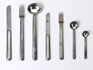
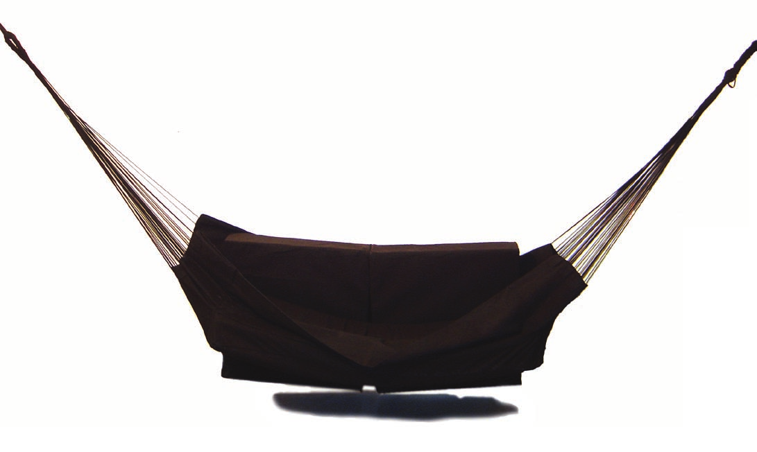
In 1906 an exhibition with the name of ‘Der gedeckte Tisch’ (The Laid Table) took place in Vienna. Artists from the Wiener Werkstätte (Vienna Workshops), including Josef Hoffmann, displayed their designs for crockery, glassware and cutlery on thematic tables. From the tablecloths to the table decoration with fresh flowers, everything was innovative. They even dyed the macaroni black and white for the occasion. Two sets of cutlery by Hoffmann, a flat design and a round one, caused a commotion. Visitors to the exhibition wondered if it was even possible to eat with them and, more importantly, was it possible to dine correctly, in the ‘English style’, with these designs? That’s why I chose this item. They were accustomed to cutlery that was more elegant and less solid-looking. Progressive contemporaries saw the spirit of the modern age in the streamlined look of the ‘round design’, with its sturdy, rounded forms, and they ordered silver sets, or silver-plated ones, from the workshops.
"product design" Category
Lucellino by Ingo Maurer
Tuesday, March 12, 2013
Two words that probably describe Maurer’s designs the best are whimsical and magical. His works always seem to have a narrative about them and a certain ability to draw you in. Facing Maurer’s designs it is easy to forget that the object you are encountering is a lamp or a lighting device / installation. The infinite imagination present in Maurer’s work is not the solely thing he should be praised for. Maybe even more the ability to create such work and still keep it as simple and minimalistic as possible, always trying to reduce the material usage to the bare necessity. What makes it possible for Maurer to create in this manner, is also the fact that he was a pioneer in applying contemporary discoveries in light technology to his designs. First with the introduction of the halogen bulb and later the LED as well.
Ingo Maurer’s work is thus characterized with a wit, humor and easiness only a light magician like him can achieve.
Ingo Maurer [born May 12 1932 in Reichenau Germany] is an industrial designer who devoted his career to light, light design and light installations.
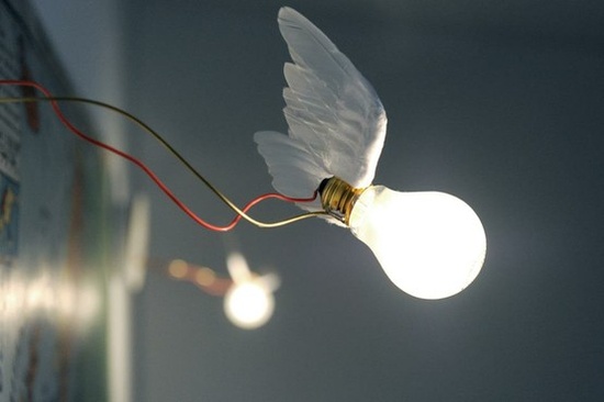
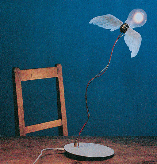
One of the examples of such wittiness is certainly his work Lucellino, the standing lamp from 1992. The usage of the material is visibly scarce, yet only a bulb, a wire, a metal stem and a pair of goose feather wings are enough to create this almost alive-like lamp creature.
Seeing Lucellino in the Stedelijk it was evident that it will be my item of choice, as I, myself, have always been inexplicably attracted to light and light emitting bodies.
What also attracted me to Lucellino was its animalistic quality of embodying a bird-like creature (hence the name – luce = light, ucellino = small bird ) which made it easy for me to connect with this object.
Its playful charm makes it more than just a lamp but rather an object that almost has an intelligence of its own.
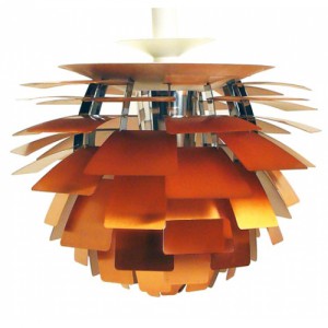
Poul Henningsen The Artichoke 1958
Sunday, March 10, 2013
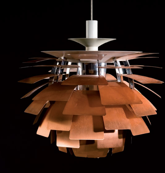
Poul Henningsens lamps were produced because he thought that the electric light bulbs cast a disturbing light. They where either too bright or the lampshades swallowed all the light because of their design in that time. He wanted a lampshade that sent light into the room with its full strength without blinding you. One of the examples is the The Artichoke which also hangs in the Stedelijk Permanent Design Show. As you can see on the picture he has composed layers of copper plates in the shape of a pine cone (I choose to say a pine cone and not artichoke but I will explain why later) so the light is reflected from the greatest ability and does not dazzle you as there is no direct light from the bulb.
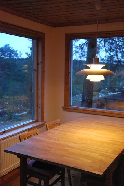
One of the reasons that I chose PH’s lamp is because I know that design from Denmark. It reminds me of my parents living room where a PH5 lamp is hanging over their dining table which is typically seen in many places of Scandinavian homes and institutions.
But what also catched me was the English translation of “Koglen” which from danish should be translated to “The Pine Cone” and not an artichoke. I found it disturbing to break the original concept because I do not associate it with being something Danish or Nordic. I can understand that the artichoke as a vegetable visually have something in common with the lamp as the leaves of the artichoke could compare to its division into the different copper plates.
But as a fact he build his design out from a pine cone and that is what makes me wonder why it is suddenly being an artichoke. Also because the copper is an obvious association to the brown color of a pine cone.
It is not because I am a bitter nationalist that finally get the chance to publish a letter to the editor about how danish design is being misunderstood but I am really surprised about the translation and I’m thinking it is the same as if the chair “The Swan” by Arne Jacobsen was translated into “The flamingo” to get people from outside Scandinavia able to identify them self with the design.
Stedelijk Design Show 2012 /Future Highlights
Tuesday, November 27, 2012
17 Rietveld's Foundation Year students visited the "Stedelijk Collection Higlights /Design" in the newly opened Stedelijk Museum. Marveling at some masterpieces of Interbellum design or surprised –a little further– by the Scandinavian design some of us know so well from our grandparents homes, we arrived at the last part of this "Depot Salon" wondering what a 2012 selection of Design could be.

Researching contemporary design we composed the "2012 Supplementary" which we present in this post. From the exhibit "Stedelijk Collection Higlights /Design" we all selected a personal best and made it the focus of the researches published as part of the project "Design-in-the-Stedelijk"
KLOK
Monday, November 26, 2012
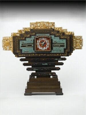
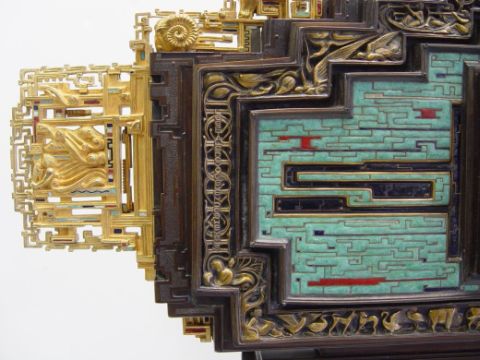
When I went to Stedelijk, I walked around design room and I was amazed from many interesting things I saw at one place and I had once again an opportunity to have a look at Gerrit Rietveld works, which I haven’t seen for a while. But by coming back to Jan Eisenloeffel’s Clock, I can honestly tell that after I left the museum, his artwork was still in my head.
The very first time I saw it, I thought “wow”, and than my friend asked me to come to see another thing, some posters, which I don’t even remember right now anymore. The funny thing is, that I think the clock chose me to make a research about it, because it was so extraordinary and unusual that I just could not get out of my head anymore.
It is very important to know some more information about the artist if you want to know more about his works, so here is some information.
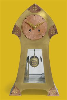
John Wigboldus (Jan) Eisenloeffel was born in Amsterdam in 1876. He was dutch goldsmith, interior designer, jewelery designer, illustrator, silversmith, ceramicist, bookbinding designer, glazier and director of academy. He was educated at the State Normal School for Tick Education in Amsterdam and taught in Russia in 1898 working with enamel and niello. He got the highest award for his clocks with enamel decoration. Anyone who had known Jan Eisenloeffel at the beginning of his career could not have suspected that the same man would make this clock 25 years later. Eisenloeffel began as a reformer committed to ridding the decorative arts of excessive embellishment, pomposity, and the use of precious materials. In practice this meant that he designed simple, honestly constructed products for daily use, including tableware, vases, and lamps in silver and copper, produced in small editions.
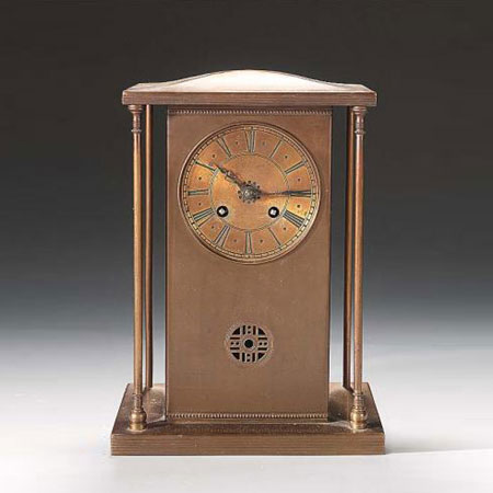
While I was collecting information about Jan Eisenloeffel and his artwork, I found a few of these early clocks designed by him. In my opinion in the beginning of his career he was designing more “clean”, and minimalistic things. Here are some pictures of the clocks he made around 1903-1905.
However, around 1908 Eisenloeffel became disenchanted with the possibilities of producing well-made, affordable items for a large public and turned almost exclusively to designing costly one-off pieces. This clock, made especially for the international exposition of modern industrial and decorative arts in Paris in 1925, is an example of this later approach. He wanted to demonstrate that craftsmanship was not a thing of the past. Whereas his tableware was conspicuous in its simplicity, this monumental clock is decorated with a complex scheme of symbols associated with time, such as the signs of the zodiac, and on either side and above the clock face the text is “Geniet den dag, left als de vogelen des hemels en als de lelien des velds”. Which means “Take therefore no thought for the morrow, live like the fowls of the air and as the lilies of the field” [Mathew 6 25-34]. The stepped construction reminds Aztec temples, and the multicolored enamel work was inspired by examples Eisenloeffel had seen in Tsarist Russia and also his inspiration came from Aztec architecture, Chinese motifs, and Celtic letters. Ironically, the dazzling decorative border of this demonstratively ornamented clock bears an engraved inscription derived from the New Testament.
I really found this clock interesting, because it is so detailed and kind of graphic style, that it is not enough to have a look for a second. I was watching this clock for a while and I realized that it asks for even more attention to see all small things and ornaments on it, so I came back even one more time just to get some more ideas and feel the stronger connection. After a while you can see there is some animals on the pattern – swan, dog, cow and a bird, as much as I could see. I am not sure if those things are connected with a clock or not, but I think the only thing which is the same for everyone, doesn’t matter you are human or animal, is time. So, perhaps Eisenloeffel wanted to express that thing, that time for everybody is the same.
Personally I prefer later Eisenloeffel’s style, because he is expressing himself or at least trying to experiment with different materials. He started to use enamel and he did it really succesfully.
Also, I realized that this clock reminds me of my grandmother’s old clock, which has almost the same form, just without ornaments. When I was spending summer in her place, every night, once in an hour I could hear the sound of the clock, for example, if it was midnight, I could hear 12 times of the clock churning, it was so annoying all the time. To get a better view how annoying that was I attached video where you can hear the clock striking eleven times.
But despite this bad experience, I like every single thing in this Eisenloeffel’s clock – color, form, pattern. It is different clock than we are normally used to see.
Look fantastic
Tuesday, November 20, 2012
The sun is the closest star to planet Earth and both the sun and the stars have been worshiped and represented by humans in various ways for centuries. In Greek mythology Helios was the God of the Sun, the charioteer who drove the Sun across the sky each day. He was a kind god and depicted with a shining aureole. His weakness was his own fire because sometimes it could burn him. Just like the sun.
In 1964 Dieter Rams, Reinhold Weiss, and Dietrich Lubbs designed the Braun Cosmolux HUV 1 sun lamp. Anodised aluminium, enameled steel and plastic combined in a streamline design that could give you an opportunity to attain a glow somewhat different to the one of Helios. With the Cosmolux HUV 1 you could sun bake at anytime without having to go outside in the sun. In western culture tanned skin was used to be associated with the sun-exposed manual labour of the lower-class but has been considered more attractive and healthier since the middle of the 20th century.
The 1960ties was also a period where package holidays to Spain and Italy with flight, transfer and accommodation included, were gaining popularity. In that perspective the Cosmolux HUV 1 could be used to maintain the tan after the holiday or maybe to tan the whole family who could not afford to go on holiday? Advertisements for sun lamps by other brands shows how the whole family including small children are happy while tanning in their home. I would have liked to see some documentation of how one looks like after using the Cosmolux HUV 1, but unfortunately I did not succeed to find any and I don’t dare to try myself.
My own experience with a similar product goes back to my childhood where the mother of one of my friends, had installed a sun bed in her bedroom. We were 3 kids, just managing to squeeze together under the lamp, each with dark goggles covering our eyes. After 20 minutes or so we would come out all looking more stained than tanned due to the squeezed positions we had been laying in. Only this one time were we allowed to use the sun bed, but I remember the mother looking very tanned for the whole winter.
The year 1964 was also the year that the movie star George Hamilton starred in the movie “Your Cheatin’ Heart”. Whether he has been using the Cosmolux HUV 1 or not is not clear – however he has until today been a representative of the very tanned look. A look that seems to fade in present times as it becomes more and more clear that extreme sunbathing has unhealthy side effects such as skin cancer.
An article published in the “International Journal of Primatology” in 2009: “Facial Skin Coloration Affects Perceived Health of Human Faces” investigate the role of overall skin colour, in determining perceptions of health in Caucasian face photographs. Arguing that redder and yellower skin now has a healthier appearance nowadays in contemporary western culture. These preferences are linked with higher levels of red oxygenated blood in the skin associated with aerobic fitness and healthy lifestyle and the extreme tanning has changed to be a symbol of not taking care of yourself.
The original function of the sunlamps was far from the George Hamilton and the western world beauty ideals. Going back to the 1890ties the Nobel Prize winning Faeroese doctor Niels Finsen was investigating what benefit the sun really gave and the effect of light on the skin. He created the first device, an ultraviolet lamp, to generate technically synthesized sunlight resulting in the treatment of patients suffering from a Lupus Vulagaris, a special type of skin tuberculosis. He founded the Finsensinstituttet 1896 at the Rigshospitalet in Copenhagen, Denmark which today hosts the department for cancer research. Somewhat ironic in the context of it’ s later development and use of UV – lamps.
So the idea of Cosmulux HUV 1 originated from a medical product and was changed in to a household product. Going through the list of Braun designs is also like going through a journey of memories of different lifestyle in the last century.
Today a Cosmulux HUV 1 is for sale on Ebay with bidding starting at US $ 149,99..
anyone?
The weird thing at my grandmas house
Wednesday, November 14, 2012
I remember when I was little, sitting at my grandmothers desk and looking at this funny looking thing.
Ingo Maurer has always been her favorite lamp designer and I really loved looking trough his collection cataloges together with my grandmother , talking about the lamps. But particular bibibi I never really understud.I just couldn‘t make up my mind rather I found it ugly or funny or what exactly the reason was why she bought this lamp in the first place.
Ingo Maurer has so many beautiful designed lamps ( http://www.ingo-maurer.com/products/ )why did she not get the „Zettelz“ lamp or the „comicExplosion“?
Writing about it now makes me start to realize how often I thought about „bibibi“ and how it is still irritating to see the lamp standing on that table. It really is weird , because normally you just get used to certain things standing around in your home ,they melt in with their surrounding and you start to not notice them anymore.
For some reason though after standing on the exact same table for over 15 years this lamp still jumps aggressively into my eyes , almost like a living pet that wants your attention when you come home and wants to say hi and play with me . So for me „bibibi“ really turned into a living bird and gives me a lot. Certainly I still can‘t say I love the design or think it looks pretty and I would never think about getting it for my own apartment. But it makes me happy every time I see it somewhere because it reminds me of my grandmother.So enough personal talk now something about the Lamp and the Designer:
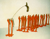
“Bibibi” is a tableligth that reminds the viewer of the appearance of a chicken. The lamp shade is stylistically the body of the bird. It is carried by plastic orange bird legs. A metal wire is extending in the height and at the end of it is a feather attached, which may be the head of the bird. Bibibibi is the tableland made ??by Ingo Maurer definitely pulls the intension of the viewer on it. Ingo Maurer himself is the son of a fisherman and grew up on the island Reichenau in Lake of Constance with four siblings. After an apprenticeship as typesetter, he studied graphic design in Munich, Germany. 1960 Maurer left Germany for the USA, where he worked in New York and San Francisco as a freelance graphic designer. In 1963, he moved back to Germany, and founded Design M, a company developing and manufacturing lamps after his own designs. The company was later renamed to „Ingo Maurer GmbH“. One of his first designs, «Bulb» (1966) has been included in the design collection of the Museum of Modern Art in 1966.
1984 he presented the low-voltage wire system YaYaHo, consisting of two horizontally fixed metal ropes and a series of adjustable lighting elements with halogen bulbs, which became an instant success. Maurer was asked to create special YaYaHo installations for the exhibition „Luminaries je pens a vous“ at Centre Georges Pompadour in Paris, the Villa Medici in Rome, and the Institute Francis d‘Architecture in Paris.
In 1989 Foundation Cartier pour l‘Art Contemporary (Cartier Foundation for Contemporary Art) in Jouy-en-Josas near Paris organized the exhibition „Ingo Maurer: Lumière Hasard Réflexion“. (Ingo Maurer: Light Chance Reflection). For this exhibition, for the first time Maurer created lighting objects and installation which were not meant for serial production.
Since 1989, his design and objects have been presented in a series of exhibitions, including the Stedelijk Museum in Amsterdam (1993). In 2002 the Vitra Design Museum organized Ingo Maurer – Light – Reaching for the Moon, a traveling exhibition with several shows in Europe and in Japan. In 2007 the Cooper Hewitt Museum Cooper-Hewitt National Design Museum in New York presented the exhibition Provoking Magic: Lighting of Ingo Maurer.
Ingo Maurer created many objects using LEDs, the first being the lighting object Bellissima Brutta in 1996. In 2001 he presented a table lamp with LEDs with the name EL.E.Dee. Since 2006, he is also experimenting with organic light-emitting diode (Organic LEDs), presenting two objects in 2006, and a table lamp as limited edition.
Beside the design of lamps for serial production, Ingo Maurer creates and plans light installation for public or private spaces. In Munich, he created light installation at Westfriedhof subway station (1998) and the renovation and lighting concept for Munich Freiheit subway station, to be opened in December 2009. For Issey Miyake he realized an installation for a fashion show in Paris (1999). In 2006 he created lighting objects and installations for the interior of the Atomium the Brussels.
Among his best-known designs are the winged bulb Lucellino (1992), Porca Miseria! (1994),[1] a suspension lamp made with porcelain shards. Since the early 1980s, Maurer works with a team of younger designers and developers.
2011, the redesign for the underground area of the U-Bahn public transport station Marienplatz in Munich, Germany, was awarded to Ingo Maurer together with Allmann Sattler Wappner, with its design placing emphasis on a lighting design that alludes to the Chinese I Ching.
http://www.ingo-maurer.com/products
Playing God
Friday, October 19, 2012
Humans are playing God by physically and metaphorically perfecting themselves. Beauty is currently at an all time climax, allowing this project to explore what lies beyond perfection.
Just being human is not good enough anymore nor has it ever been. What is very clear is that people are not satisfied with what they were naturally born with. Neither the prehistoric cave dweller nor modern man has ever considered the human body aesthetically satisfactory. It is human nature to want to be more than what we are, and from the beginning of time we have gone to extreme measures to express on the outside how we desire to be perceived. On the surface, we are physically turning into ideal dream versions of ourselves. Being born a certain way is no longer a life sentence. We can choose exactly who we want to be. What are the possibilities of this new God-like control we have over our bodies?
Scary Beautiful challenges current beauty ideals by inflicting an unexpected new beauty standard.
Right now you can truly become more than just yourself, more than human. It’s almost as if we have shifted from reality into fantasy. The sky is the limit when it comes to controlling our own image. Being online is considered a trusted version of yourself. We are behaving as if we have robotic extensions and we can now generate body parts and also have access to the technology to obtain super powers. We now have complete power over our own image and abilities. What is currently being done and where might these God-like powers potentially lead?
![]()
Download this challanging thesis: Playing God
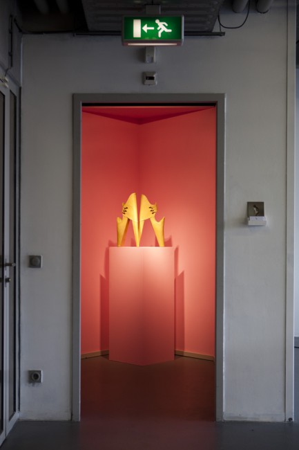
[top images of Leanie de Vyver's graduation show
from the jury rapport: The object created by Leanie expands the concept of a shoe into multiple new meanings. The beautifully made leather object is accompanied by a video registration of a girl wearing it. One observes the design forcing the wearer to develop a new way of walking, leaning forward while refinding a painfully fragile balance. The jury applauds the way

aesthetics, ergonomics and prothesis merge into an awkward choreography. The craftsmanship and strong conceptual way of designing also show in another work, a ceramic tea set in which reference is made to a building in South Africa. Leanie succeeds in translating political consciousness into form and is considered by the jury to be a meaningful future designer.
Just give us some variety and we’ll be happy
Sunday, January 29, 2012

I have a medium-large grocery list in one hand, and a shopping bag in the other. Moving through the kitchen accessories department of the Ikea store located in Utrecht, I am looking for a new, preferably cheap pizza cutter. My old one was lost in the crypt that is my room, and scissors can only do so much when it comes down to cutting my Albert Heijn pizzas.
Having found the shelf containing cheap plastic pizza cutters (they’re called Stäm), a question arises. What colour to choose? The olive green one, the scarlet version, the bright yellow edition or the rather unpleasing cyan variant? Remembering that I already happen to own a green spatula, I decide on the similarly coloured pizza cutter. While paying for my newly acquired Stäm pizza cutter, I am certain: the olive green colour will most definitely improve my quality of life to a larger degree than the cyan edition.
A seeming elementary choice. We make these rather dull choices all the time. Nonetheless, the other day I was investigating a friends kitchen supplies during a house party. In one of the drawers, I found the same green coloured Stäm pizza cutter. Soon, we were high fiving and felt closer related. After all, we have a mutual preference for a certain commodity. This anecdote can be generalised. In a nutshell: our social relations are based on the products (or, commodities) that we own. According to Karl Marx, that is. He calls this phenomenon commodity fetishism.
More relevant to this writing are the slight variations of a specific object. People like having a choice, as they have their own identity to maintain. All Ikea has to do to meet this need is presenting their Stäm pizza cutter in a variety of colours. This phenomenon has been conceptualised by the German philosopher Theodor W. Adorno. He coined the term pseudo-individualisation.
During the last two decennia, a new notion in consumption and production has emerged. Manufacturers increasingly think about sustainability when producing new designs. Artists are responding to this way of thinking as well: exhibitions about sustainability and slow design seem to have become common.
On the twenty-fourth of November I visited the “New Energy in Design and Art” exhibition at the Boymans van Beuningen in my city of birth, Rotterdam. A work that caught my eye was “The Idea of a Tree,” an award-winning project by Katherina Mischer and Tomas Traxler. Basically, it is about an autonomous machine (called “recorder one”) that produces objects using just thread, glue, paint and solar energy. Finished objects are not only functional, as they also reflect the weather conditions of the place and time where the machine has been working. Elaborates more extensively on the project.
The good thing about “The Idea of a Tree” is the fact that it actually works. Too often, sustainable projects by artists somehow feel stuck in the conceptual zone. As a person that classifies most of his own projects as “stuff that works”, I like seeing a relatively simple machine that tries to give a concise answer to the relatively complex question of sustainability.
Moreover, the project doesn’t just work in a mechanical sense. It also effectively combines concepts of consumer culture with ideas coming from the Slow Movement. Using the distinctiveness of local environment factors, objects are produced that are each unique and yet share a common theme. Examples of the objects produced can be found here.
The objects produced by “recorder one” are, as can be seen, aesthetically rather pleasing. They also come in a variety of forms, functions and colours. The seal, colours and even construction breathe the words “ecological design”. People buying these objects will probably identify themselves with some ecological responsible subculture. This is a typical trait of commodity fetishism, though this aspect doesn’t distinguish the “Idea of a Tree” project from most other slow design projects.
The unique appearance of every single object, however, does. Just like the Stäm pizza cutter mentioned in the introduction of this essay, there are concepts of pseudo-individualism to be found in the lovely stools and lamp shades produced in the “Idea of a Tree” project. The variety in thickness, length and intensity of colours found between these objects can be interpreted as the ecological responsible answer to the diverseness colours presented by the Stäm pizza cutter.
People like having to make these kind of choices. Thus, presenting the consumer with an assortment of small differences in the same product makes a great marketing tool. Take Apple, for example: ever since the dawn of the iMac, Apple has presented their products as a smorgasbord of colours and sizes. With the iPod, Apple took pseudo-individualisation to the next step: there are about five different iPods (iPod Nano, iPod Classic, and so on), each presented in a variety of colours. It made Apple one of the most successful companies in the world. The same counts for Ikea, offering rather superficial customisations to the customer. Over and over again, pseudo-individualisation has proven itself as a winning marketing tool.
Green marketing, however, has not. Despite the trend of sustainability becoming “hip”, telling people to buy a sustainably product because it’s sustainable doesn’t work. Just take a look at these links. In the end, people do not want ecological products for the greater good. People want good products that are marketed well. The “Idea of a Tree” project by Katherina Mischer and Tomas Traxler has this potential, especially if it were taken to a larger scale. The products show a clever balance between sustainability and the fulfillment of the rather superficial needs of the consumer. These superficial needs are met using local, environmental factors. It uses these factors to simulate the idea of the growth of a tree, which is – well – cool. Let it be an example for the many inspiring slow designs that are yet to come.
Make the bees work for you!
Saturday, January 28, 2012
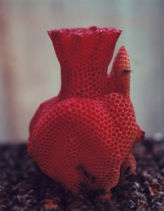
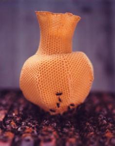
I have always been fascinated by different kinds of materials and combinations of them as there are thousands of different possibilities of the outcome. And especially in art or design works where you can feel that the material was completely ‘understood’ by it’s artist or designer. It was exactly that feeling that I got when I saw Tomas Gabdzil Libertiny’s Honeycomb Vessel #2 in the Boijmans van Beuningen Museum in Rotterdam.
The Paper Vase or the Honeycomb Vases demonstrate a new way and approach of working with materials. This means that natural processes have to be understood and investigated from all different kind of perspectives. I like this thought and I think it is a crucial one for ‘sustainable’ design. We should communicate with our environment and understand it. Therefore it is important to take advantages of the things that are already there. The Honeycomb Vases symbolize this crucial understanding. In collaboration with beekeepers he found a way to make the bees build a vase like shape. The vases are created by placing a basic beeswax mould printed with a honeycomb pattern into a beehive. The bees then start to work with that pattern. It took 40,000 honey bees that worked over a course of one week to create one vessel! Libertiny himself calls this process ‘slow prototyping’. Every vessel has a unique form and they also vary in color and smell depending on the flowers that are in season.
HAHA! Oskar de Kiefte
Saturday, January 28, 2012
When we think about design we usually consider a fragile compromise between the practical qualities and aesthetic qualities of a product. The result will lead the viewer to consider a known concept or problem from a new perspective. Experiencing contemporary design is essentially re-adjusting our view of the future. In this essay I will attempt to outline Oskar de Kiefte’s work in the light of SLOW Design and sustainability. I will also consider the role of humor in his work.
In the work of Oskar de Kiefte we are not presented with a considerate balance of aesthetics versus practicality. Instead, Oskar chooses to show us a crude example of how technical simplicity can lead to new and interesting solutions. The Wind Turbine Car is a car without compromise, without consideration for elegance but rather the result of pure technical problem-solving. The wild, exciting and adventurous shape reminds me of deep sea exploration and space travel. The cause for such boyish associations is merely the technical nature of its design. From start to finish, every aspect of the car was designed to be for optimal performance. How do you turn wind resistance into wind stimulation? You build > this<
A cleaner environment where the light will shine on
Friday, January 27, 2012
2012. – After a conversation with Eric Klarenbeek
In a time of growing public awareness of the prevailing environmental consciousness. Consumers are looking for ways to contribute to the unnecessary burden of the environment. Large companies want to connect to these developments of environmental consciousness. Often because of the shared concern for the environment, but also because it will create a new market. Inventors search for products which are environmentally conscious, beautiful, and also financially interesting. You can summarize these results as ‘sustainable design’.
An example is Google’s new computer design which shows a more efficient use of less energy than most computers. Another example is “General Electric” which is increasingly investing in the design of cleaner technologies.
This investment in “permanent design” is not only on a multinational level. People are also searching on a smaller, more individual level for the environmentally conscious design. After the exhibition “New energy in design” at the Boijmans van Beuningen in Rotterdam, I came in contact with the work of Eric Klarenbeek ‘designer of the unusual‘. After passing the Design Academy in Eindhoven, Eric Klarenbeek (Amsterdam, 1978) started his own studio in Zaandam. “His work is characterized by innovation and answers the developments on environmental consciousness in today’s society.”
IE
Tuesday, November 15, 2011
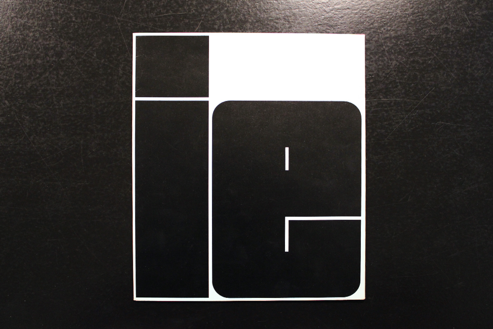
I thought for a long time about the Kho Liang Ie and his work, looking for all sorts of information, I even went to the industrial area where the Stedelijk Museum Library situated, and could not write a word. The only thing that is on the Internet is a biography, in the library all books and articles only in dutch language (sorry, but I do not know dutch).
And then I got lucky and found a booklet called ‘IE’. Read all three of the essay (which were in english!) on Kho, and than one of them caught me.
It is very rare material about Kho Liang Ie and his works, whitch did not exist in the Internet before. Now it does! It is my contribution to the online library of brilliant people.
“AVATAR green”
Friday, April 15, 2011
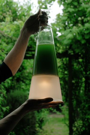
In the avatar-project (design class) I am focusing on, and working with color, color and psychology. At first I found this lamp interesting because of it’s color. I am looking and trying to translate the colours around me and therefore I reacted to the lamp.
From what I have learned about green is that it’s a calming color, pleasing to the senses. For example hospitals uses light green rooms, and that is because green is concluded after studies to have the most calming effect on the patients. But more than that green is a symbol for cycle of life in the nature, and this lamp is the evidence of why, because it is naturally created as an result of the cycle of life.
Green is an ideal color to work with in interior design, because it dominates the nature and we are so used to see it, and therefore it harmonizes with us. In this lamp, green was not an active choice from the designer, it came out of nature itself. This is what I think is beautiful with this lamp. It is like the lamp is created as a platform, for the creation itself. The dark green is a result of living algae, which requires only sunlight, CO2 (carbon dioxide), and water. When taking care of the algae, light is created, in form of tiny amounts of electricity ”breathed” out from the algae.
This is functioning not only as a lamp but in a way a reminder of the ecological system we live in, a reminder of the responsibility we have, because we are a part in it. If I as the owner of the lamp take care of the algae it will reward me with light. So the lamp has two functions according to me, a source of light, a reminder of the cycle of life. Because the light comes is created in an environmental friendly way it also reminds me of the issues of earth, but I don’t think this lamp ”forces” me to think environmental-friendly, neither puts guilt on my shoulders, for me this lamp is instead of a political piece somehow very poetical.
”Mike Thompson created the design of the Latro (Latin for thief) based on a recently proven technology whereby tiny amounts of electricity were tapped from living algae. Latro combines the energy potential of algae and the functionality of a hanging lamp. Synthesizing both nature and technology in one form, Latro is a living, breathing product. Algae require only sunlight, carbon dioxide (CO2) and water, offering a remarkably simple way of producing energy. Owners of Latro are required to treat it like a pet – feeding and caring for the algae that will reward them with light.”
Eatable fashion and so on..
Wednesday, March 2, 2011
BLESS DESIGN was founded in 1997 by Ines Kaag in Berlin, and Desiree Heiss in Paris.
In ’99 and ’04 they received the ANDAM fashion award.
They’re philosophy is creative freedom, they are busy with totally innovative fashion accessories through design to art.
The Bless creative expression takes the form through numbered editions, with a permanent research of timelessness. They’re way is to create without definite perimeter.
The two designers escape from any calibrated definition of fashion, “BLESS does not promote any style – BLESS fits every style!” they kept tight they’re initial concept and idea which was to combine creations between fashion, design, art and architecture.
The objects created by Bless result from the fascination of Desiree Heiss and Ines Kaag for recycling, the diversion of the uses and the traditional techniques.
They’re accessories turn what was supposed to be regular and unquestionable into surprising.
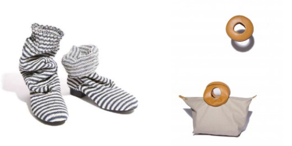
Like, for example the shoe-socks, that is a socks boot like, with a sole under, or from the collaboration with Le Pliage®, the bag that can be folded inside it’s own circular leather handles and can be worn as a bracelet.
Cup or be Cupped : Designlab project
Wednesday, January 26, 2011
The aim of this project was to get introduced with the several methods of design research. This 3 week project took place under the supervision of Sophie Krier and Cynthia Hathaway. Because of the short time span in which the course took place, the schedule was packed full of activities, making it an intense first experience.
The case of this project was all about cups. We were to become cup professionals, gain the uttermost expertise in the world of the cup.
Jaime Hayón, Artist or Designer?
Friday, January 21, 2011
Choosing an artist from the list that we had been given, I quickly googled a few names and crossed that of Jaime Hayón who, during the 90ties, had studied at a Design Academy funded by Benetton (among others in Madrid, Paris and San Diego). He there had worked “closely with the legendary image-maker and agitator Oliverio Toscani” as is explained on his web site.[1]; (You might remember this one – made a few very critical commercials for the company, also the one displaying the anorexic girl)
Thrilled, I decided to go for Hayón only to find out that there is unfortunately nothing very controversial about him. With his 37 years, living practically all over in Europe, he is quite an internationally popular designer. Or artist?
Very hard to say, since he clearly works on both sides of the road.
He graduated as an industrial designer and has – until now – designed a whole range of, and very, industrial products such as for instance a bathroom collection for ArtQuitect, all kinds of domestic furniture for b.d ediciones, Established&Sons and Moooi, lighting fixtures for Metalarte and Swarovski, vases for Gaia and Gino, ceramic objects for Bosa Ceramiche and so on and so forth.[2]
There are however those other pieces he created, often marking major break-troughs in his career, that are more likely to be linked to the Fine Arts.
