Thursday, November 12, 2009
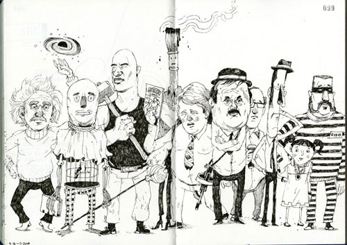
Image instead of font, relaxed instead of compulsive, everything except cats: these are the tags of the book I picked. No relation is a relation as well, and thus is this lack of relation the perfect link between the first and the second book. I found an objective way to link this post to my earlier post. This book pulled my attention in the same way it is linked to the other book: the big differences. Was the first book white, about fonts and having a sort of mysterious neurotic repeating cleanness, the second book is colorful, filled with images, hundreds of subjects and a bit of chaos. Browsing through the pages you see countless interesting illustrations, which make you want to take a closer look but also make you want to look further; are there more images like these, are there better images then these, could it become better then this? It makes you want to draw or make such images too: images from which you can see there was a lot of work in it or absolutely not much work. The amount of work is of no importance, the works are intriguing.
Rietveld Library code: ?
Thursday, November 12, 2009
Subjectively searching for a very unsubjective assignment, but still with the subjective thought in mind that it is not possible to be subjective in command, I saw a large white book. The title is not really that interesting, but the bigness of the book attracts me. It might be worth taking a look on the inside. So that is what I do. The whole book (798 pages) is filled with the same text in different sizes and fonts. If the book was on sale, I would buy it. But it is on lend, so that is what I do. It is fascinating to read the same text (‘In our house we had a cat with the grandiose name of Gonnosuke …’) over and over again. If not knowing the purpose of this book (a sort of shopping guide for fonts), you could think it was written by someone who was or high or compulsively neurotic or both.
Thursday, November 12, 2009
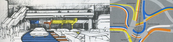
Walking through the library with a specific direction in mind (the tagword signs) my eyes crossed a book with the title ‘City Signs and Lights’. It is a book printed in the seventies and it has a silvershining cover with a lot of black ink printed over it. The book contains a study in city signs and lights. The interesting thing about this book for me is that it shows the paradox I discribed in my last post. And it contains a lot of examples where signs could get confusing.
One solution I really liked was where the writer (Stephen Carr) tried to untie a traffic knot. What he sugested was marking all the different directions by giving them their own color and repeat this in the direction signs, and give each section of the road the right colour wich lead you to the place where you wanted to be.
754.5 -carr-
Thursday, November 12, 2009
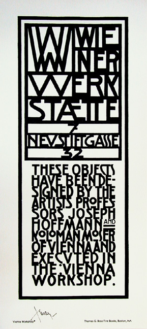
Wiener Werkstätte
The first thing I saw of the book “Wiener Werkstätte” was the cover which was a original signet of the Wiener Wrkst. from 5th avenue NYC.
It is strange, but I was looking for the book for more then three years. The publisher Taschen doesn’t sell the book anymore for quite a long time. So for me, it wasn’t coincidence that I finally found the book.
In this book you can find a described history from Wiener Wrkst. from 1897 till 1932.
The content is filled with photographs of furniture, glass works, ceramics, metal works, jewelry, fashion, architecture and graphic design.
The Wiener Werkstätte created hand works from different types of styles who were practical for the daily life.
My feeling about this book is more than positive. I am impressed by the motto from Wiener Wrkst. “The characteristic principle of the Werkstatte…is that it is better to work for ten days on one item than to produce ten items in one day.” I feel that this is exactly the problem from the nowadays mass fabrication because it doesn’t have an artistic value.
I dearly recommend to take a look in the book cause It will give you a nice esthetic feeling.
11315
Thursday, November 12, 2009
Browsing books is my favorite thing in the world. But I am not looking for an interesting read, not this time. I try to let my sub consciousness guide me. Walking past a row of books at the end I stop, touch the spine of a big tome, glaringly yellow, black border, interesting typography. My touch reveals a strange texture of the yellow paper. Or fabric maybe? The sticker on the back annoys me, how dare it break the yellow/black/angular balance of the back?
I slide the book out of it’s resting place and take a peek at the front. The same typography as the front, the same thin black letters on yellow. This time I can feel that the letters were pressed on the yellow. Hard. They appear to lie just below the surface. Intrigued I slide the book out altogether and wake up out of my book trance only to realize I am holding my choice in my hands.

725.9
Thursday, November 12, 2009
 When i was checking the books at the library, i saw a book about the topic that i’m really interested in, Soviet Architecture. I checked it and yes it was the book that i am looking for. Then i looked for other books to find some images to support my topic, i couldn’t find though. Suddenly i saw a boow, looking old and having old, dark red just jacket. Yes! It was about Russia Architecture. The best thing about it is the just jacket. It is just like Soviet public architeture or Soviet mentality. A book need to covered and there it is, nothing more ( i love “the Raven btw). One barely reads the name of the book, there is nothing on it to make you buy it (if you were in the book store). No colorful letters, no information about what it contains. One can find it, only if he/she needs it. Which is what i did. Which is why this dust jacket is a perfect match for this topic.
On the left side you see the book i choosed and on the right side there is a book from BRD – Germany (to compare)
718.8 lis 1
Wednesday, November 11, 2009

I want a big book. Not the biggest of them all.
But it should at least be heavy enough to keep reminding me it’s there when carrying it around in my bag.
I am (sort of) looking at books in the front, but have already decided to favor the ones in the back. Am I trying to look intellectually engaged or am I actually being polite to a bunch of books?
First I take out two books from each shelve as a test sample. One at about 25% of each shelve and one at 75%. This doesn’t feel like the way to go. I’d rather maintain control and make a more conscious decision.
There it is. Big and black. On the cover there’s a mouth sticking out it’s tongue and below that a picture of an iron, the kind you use on clothes. In the middle the title: SENSATION. I’m intrigued, even when I don’t make the connection right away. Maybe I did unconsciously. I allow myself only a few seconds to decide on the estimated level of enjoyment. A hard cover. Lots of big color pictures, lots of text. It passed the test.
707-8 cat 105, 12141, Thames and Hudson
Wednesday, November 11, 2009
I noticed that all the books I took off the shelf, to look at, had strong expressive images on the spine of the covers. My eye caught a blue Pinocchio that was on a black and white background, also the white title was complementing the spine of this book. The black and white background had been drawn with a pencil and the Pinocchio was well painted with either paint or fabricated on the computer. It combined the “sketch” fase together with the “endproduct”. I though it gave me a good idea about the content of this book, just by looking at its spine. When I took the book off the shelve to look at it, the cover was fabulously bright with colors. I chose this book because it was screaming so loud that it practically jumped off the shelve into my hands, so I felt I HAD to take it.
Rietveld Academy Library No. 799.4
Tuesday, November 10, 2009

Walking through the library without a specific direction in mind my eyes crossed a book with a few signs on the back. No title, only the publisher (taschen) and the editor (colors magazine). I got attracted by these signs because they pulled my eyes immediately in its direction. Like signs have to do, they tell you how fast to go, where to stop, where to turn. Going through the book it was nice to see the different signs in different languages. Even if there is an Arabic text in the sign you still now what to do.
The nice thing about signs is the paradox in it. If we all follow the signs in a strict way, we will not get anywhere. Because at one point you will come across a dead end- or a stop sign. But if no one gives anything about the signs and ignore them it will become a complete mess.
754.9 -mus-
Monday, November 9, 2009
“reading the library” is a project by tristan schmitz & namik schwarz. the aim was to “index the library” by arbitrarily reading out authors and book titles in a library corridor. the reader uses the architectural circumstances to walk through the bookshelves. each author or title leaves a hint about the literary genre and subject. “brahms” or “mozart” are connected with music, so the library must include media about music in the broadest sense.
we developped project at the ArtEZ Arnhem this year with paul gangloff.
if you want to see the whole final result of that project go here
if you are interested in the subject, her are some more links 1 2 3 4
Monday, November 9, 2009
- The first reason I chose the book New York nomadic design, was its title. Recently I visited New York and I thought that the book could complement the information about US design and art that I had gained from the recent trip. The book is the size of an average magazine, and is not too thick either. The cover has a metallic grey cover with a map of New York printed all over the cover. In addition there are four small images that are very different from each other. After a couple of introductory pages, I found that every single page contains three or four pictures with very little text. Those pages as well as on the cover show extremely different things, from a tent made on the street by homeless people to glossy slick furniture. I can appreciate the approach taken by the writer which is giving a real feel for the city.
Rietveld Academie Library No:9788425216213
Saturday, November 7, 2009
Walking in the library. Quite. All the covers of the books are staring at me. I let my finger go over them. Touching with respect. Curious, I move, from book to book.
The book, simple and unmasking nothing of the content.
The book, name and imageless.
Attracted, to the old brown colour.

My breath stops, my hearth bounces and I get a little dizzy. What kind of book does this with me?
Without knowing the content. Without showing anything of his content.
The book, different than the others.
The book, not predictable.
Attracted, to the nothingness.
Surprise me, I whisper. I caress the book. Don’t let me down.
Rietveld Academie Library No: 779.0
Friday, November 6, 2009
Even a single glance at a book cover becomes a decision, a judgment, based on certain criteria.
The book was misplaced, and it’s covers where filled with esthetically, (slightly), unappealing elements. What caught my eye was the title, or rather the implication of the subject. Even though the subject itself bears no great interest, I’ve seen other books with the same main idea which contained beautiful material purely visually.
This one did not. Instead, it contained another element that is in itself intriguing – photographs which bordered into becoming artificial and forced. Though, if the book had felt like a perfect compilation on this, I would have left it at the shelf after looking through the pages. Instead, it’s borders almost reaching something interesting / but not succeeding / was what made the decision of checking the book out, and it ending up in my backpack.
The idea of how to perfect it and make it my own
Rietveld Academie Library No: 908.1-lan
Friday, November 6, 2009
A completely blank cover surface among all the other books in the library. Just plain white with no text. No information. This alone awakens my interest. No title, no writer, no summary, no number on its back.
This book seams different. It comes on almost boring, but it still makes you wonder. Why is it like that? What’s in it? What does it say? Maybe it tells a secret which you can only get to know about if you pick the book.
The book doesn’t shine when it is on the shelf. It’s small, slender and white – very neutral. Maybe it contains something that has been hidden away waiting to be rediscovered.
If you look closer you see that it works as a box. So it hasn’t got the “normal” book feeling. When you open the box, you sense how fragile it is. Despite its abnormal appearance this book is like many others of its kind held together by tape.
Inside the box is a collection of postcards
Rietveld Academie Library No: 777.6
Thursday, November 5, 2009
Walking around the library, I laid my eyes on a book I saw last night at a friend’s house too. The book appeared to me a couple of times in my life before and I always absolutely loved it when glancing through. I knew this was my book. In a way it represents my interpretation of the world as I see it around me. The book is about being special in an ordinary way. It’s about objects just lying around at your grandparent’s house or things you see in other countries. This book represents designed, handmade and mass-produced objects. The extra ordinary yet normal stuff, from all around the world, showed in a funny absurd way.

What’s normal for one is very odd for the other, and so a lot of what’s in the book looks pretty weird to me. It makes you wonder… Are the items in my life normal?
Rietveld Academie Library No: 772.9-mus-1
Thursday, November 5, 2009
Why did I choose to write about this book? Why did I pick this one book from hundreds others? Why would you read this? Why are you reading this? Why would I write about a book if I choose it from subjective decisions in the library from the Rietveld Academy? Why is Obama president? Why did I got this assignment? Why don’t we know what this text is all about? I don’t know why. Do you know why? Why does why seems so strange to spell for me? Why am I trying to be funny? If I knew why I wouldn’t write this, or maybe I would. At least I would never use so much words to explain something thats not even clear to myself.
Rietveld Academie Library No:
Thursday, November 5, 2009
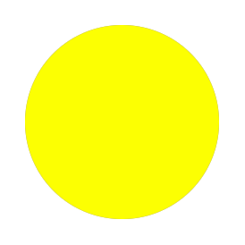
I choose a book on jewelry because jewelry often has some very nice organic shapes and colors that in a way makes them not much different from paintings. The reason I picked out this book about jewelry, instead of the others was because there is a yellow dot on the book which was the first thing that got my attention. The pictorial content of the book was more or less what I expected, when reading the title ‘Twentieth Century Jewelry’.
Rietveld Academie Library No: