Skip to Content Skip to Search Go to Top Navigation Go to Side Menu


Archive for November, 2009


TO JUDGE OR NOT TO JUDGE.


Thursday, November 5, 2009

On my way to the library I didn’t really know according to what I am going to pick a book. I was confused. But the minute I stood in front of the library I saw in the corner of my eye a small, old and weird looking book that looks a bit hand made with metal binding and a distinct old brownish color. It was just lying there, alongside the brand new and fancy art books.

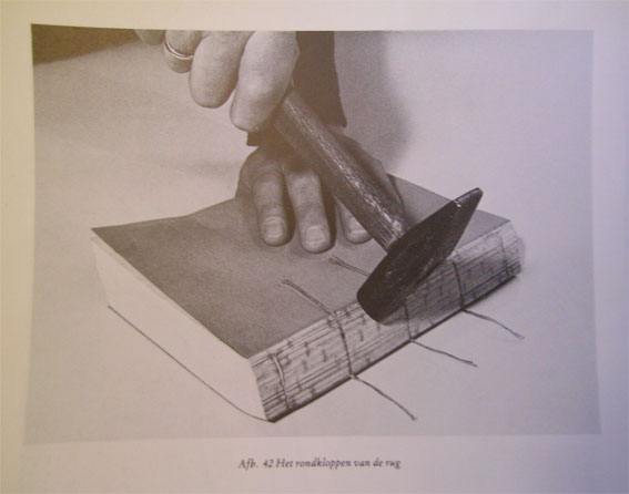
When I reached for the book I noticed that it’s even in worse shape then what I imagined, I looked at the book cover and I saw it’s a book about design and research. Then I flipped a few pages and discovered that some pages are a bit torn and with many pockets and inner plastic pages with plans of some sort.

I lent the book and started thinking – Why did I pick this book? Was it there for a reason?

I have never seen anything like it before. I am fascinated by my new discovery. Maybe we really should judge a book by its cover?

Rietveld Academie Library No: -struny- 3,- 9756

Old Times


Thursday, November 5, 2009

My first impression when I saw this book was; “it looks very boring “!

The illustrations, the cover. The cars looks like at the years 50’s.

and that was what attract me about this book.

Going back to the past.

For me it was really old faction but also classic.

It is not what we accustomed to see daily in our time.

In some way I was very curious to discover what can I expect in middle of the two covers of this book.

I discover different models of old materials, furniture, cars and airplane.

My conclusions is that not always a cover can show what’s really the content.

But… in this case it was the same inside as outside.

I was not so imprecated.

Rietveld Academie Library No: 770,6 hes 2

Anita +124 freaky looking EyEs


Thursday, November 5, 2009

It is extremely difficult to ignore a weird Lord of the Rings, elf looking girl called Anita. Specially when it stands as a single, motion and emotionless portrait in the cover of a book. Difficult to avoid once again, as it stands next to what it seems like unreadable books full of text and content. A three second glance into Anita’s freaky, albino brawless eyes and four seconds into the side cover title to highlight it as the most interesting cover in the design book shelf.

Rietveld Academie Library No: 15046

Het Boekbindboek


Thursday, November 5, 2009

I choose this book at the first sight of the cover. After a few minutes, I thought it was a must-borrow book.

1.It looks old,old fashion and serious. And the photo in the cover caught my eyes.It is diffrent from most of  books in shelves,the name of the book does not play main role in the cover, but the photo which with many interesting details.There is a old man treats a book with many sorts of tools on a workbench: a book is fixed on a strange wooden shelf by a clip,and the man is pulling a wire from that book very carefully. I am so curious that why he is punishing that poor book so seriously? It looks like doing a surgery for a book.

2.It is a dutch book,that means I tatolly can not understand the words in this book,even the meaning of the name,so I felt this a mystery book.And I like mystery things.

Rietveld Academie Library No: 757.7 kiel 1

Golden temptation


Thursday, November 5, 2009

I really wish that I had a very intelligent reason to chose this book but it is a very banal one I’m afraid.

I found this book in the graphic design section, what felt very familiar because I went to a graphic school before the Rietveld. Seeing those graphic books felt like meeting an old lover.

I picked this book because it had the word “gold” in the title and there was a golden image on the back. I cannot help it, but I am sort of addicted to the color gold. I even named myself Goldish. I feel attracted to gold like mosquitoes to a mosquito lamp.


At the left you can see my own logo. At the right is the image on the cover of the book. There are some agreements between them like the dot. I think that the recognition also made me feel attracted to it.

Rietveld Academie Library No: 754.5 cat 32

swallowing tattoos


Thursday, November 5, 2009

Off course when someone asks me to randomly pick out a book of a small library stuffed with all kind of interesting books, I cannot be random anymore. The choice I will make, will probably say something about my subconscious preferences, and is therefore a tricky thing. And if I look at the books I chose, Tribal Tattoo Design and Swallowing Helmets I wonder if it were my subconscious preferences that took those books, or if my choice is determined by the subjective classification of the library. It is both. But if I look at my subconscious (or conscious) preferences, isn’t that also determined by for instance: our culture, our history and current tendencies?

The book about Tribal Tattoos first caught my attention by its yellow cover. This reminded me about the books published by a Dutch publishing company called: ‘De Bezige Bij’. The fact that I almost took a tattoo about 2 weeks ago has also something to do with it. Why Tribal? This probably attracted me because in my opinion tribal tattoos can be a bit corny, I think that is funny, and I like funny books. The book Swallowing Helmets by David Robilliard caught my attention because of the title, which I think is nice. It is weird to swallow a helmet. Inside it has poems and illustrations, some of them remind me of David Shrigley. The image is a picture of a tattoo made or designed by David Shrigley.

Rietveld Academie Library No: 908.9 din 1 and 758 rob 1

The books unread


Thursday, November 5, 2009

I can buy a book without reading the backside. The only reason I buy it is because it appeals to me in a way. This can have to do with the cover, the title, the quality of the pages or perhaps something less obvious that I cannot quite figure out myself.

I believe I’m not the only one who has a pile of books unread at home. I am starting to realize now, why we practice this odd way of “throwing money away”.

There is no harm in letting these books fall into oblivion. What happens in between the covers of these particular books I can fill in myself. The story that develops in my head can be provoked by a specific look or feel of a book.

Hot Glass is my latest found.
It is a play, based on your “everyday” people, living their automatic lives. The little chances they get to escape into a life worth living, play an import role. Moments of sudden shock or surprise. Moments a feeling is at its strongest. Small revelations.

A book for those interested in the difference between what is real and what turns real.

Rietveld Academie Library No: 776.0 glass 1


The book which chose me


Wednesday, November 4, 2009

my choice of this book (swiss folk art) or its choice of me – followed the following sequence.

i entered the library-. 1.) i chose a book on indian road signs. this choice, however, did not feel honest- the choice of it was hasty in the midst of the others fighting for those more striking or easily appealing books, i felt that i was influenced in some way not because i wanted that book but- because i did not want someone else to have it. so; 2) i decided to make another choice this time choosing  a book that i had no affinity with un purpose-a grey dull and univiting book featuring fashion models, this choice was daunting, and felt highly ‘wrong’. 3.) i walked to another more remote section of the library and there felt stumped, lost, numb. then out of a hazey mindstate i was pulled by this book and the desire to possess it. i have still not opened it or looked inside.

Rietveld Academie Library No: eu-zwit 773.3 bau

swiss folk art

Experimenta Typografica


Wednesday, November 4, 2009

I started looking for a book on my knees, because like in the supermarket the cheapest products are on the lowest shelf, I had this crazy idea that maybe the most interesting dusty books would be down there too. (of course this completely ignores the system of the library and is more an appropriate theory in a second hand store).
First I looked at the few books that were not standing but lying between two shelves. Nothing really interesting came up, and then I noticed a little book (the books I picked were always huge or very tiny). It turned out to be about typography and it’s called “Experimenta Typografica 11”,
it is written in different languages such as Spanish, German and French. It has different kinds of paper and also a few see-through pages. It is a shame I don’t speak Spanish, German or French but maybe this is protecting me from a huge disappointment.
I’m kind of falling in love with this little book as I’m writing about it. I might steel it.

Rietveld Academie Library No: -san- 3

The colorful dark


Wednesday, November 4, 2009

Before I could set my foot into the room

my thoughts of the current day still wandering through my mind,

the first book started to scream at me,

more precisely it was a magazine.

It was smaller and lighter than a book but it did not matter for this little
rascal resting on the cupboard shelf, screaming was of no hindrance.

It was forcing my attention with its hypnotizing pink and purple colors.

I was captivated for a while.

But as our over agitated society,

it was this attraction soon diminished by attendance of other screaming books.

One even more vividly present with fancy words than the other.

All of them screaming choose me, grab me, take me with you.

And there between all these overflows of impulsions,

my eyes fell in a pool of ease and silence.

Dark as a black night.

The absorbing forces of the dark black colors where clearly sensible.

I was pulled inside, being there a fountain of colors appeared before my eyes.

Calm sound colors this time, thoroughly and logically arranged.

How great is the privilege to be in a corner of a library where no man set foot before.

Where you can disappear and meander away into other worlds for a while in the abundance of mind gushing stories.

Distracted from the swiftness of reality.

R.Hermans

757.3 -hol- 1

Alchemy and Mysticism


Wednesday, November 4, 2009

I rented two books ‘Alchemie & Mystiek’ edition 1997 and edition 2006, just to be on the safe side if one where to be better then the other one, no difference between them in the end. I randomly picked the 1997 edtion because it was laying on its back, and would have returned it had the contents not been so fascinating. Here a selection;

Macrocosmos, Ptolemaeus, Brahe, Copernicus, Sun, Moon, Lower Astronomy, Divine Bodies, Genesis, World-egg, Opus Magnum, Elementa chemicae, Adams Fall, Chaos, Ressurection, Aurora, Filosofical Tree, Sefiroth, Ab uno, Oedipus chimicus, Snake, Conjunctio Rosarium Philosophorum, Androgyn, Separatio, Trinity, Fire, Filosofical-egg, Matrix, Source, Dhristus-lapis, Blood, Microcosmos, Human form Divine, Brains and memory, Rotation, Divine geometry.

These concepts gave me associations to my childhoud, when i used to read a lot about these subjects. But these days it reminds me more of the fascination of man, trying to percieve reality trough metafysical thinking.  How he failed miserably,  but through his failing created great stories and art

905.0 roob 1

s,i,m-o books


Wednesday, November 4, 2009

There are two feelings I have with libraries. I’ll put these two feelings in words:

Feeling #1. Being in a library makes me feel intelligent. Surrounded by all this knowledge there is no other option for me.

Feeling #2. Being in a library makes me feel dumb. Surrounded by all this knowledge I was never able, in my library history, to pick out a smart, interesting and mind-opening book.

I went to the library with an optimistic feeling; I went there with the intention to find the book that’ll make my day. I spend thirty minutes (approximately) looking for the most smart, interesting and mind-opening book. After picking out thirteen (approximately) smart, interesting and mind-opening looking books, feeling #2 was once again confirmed. All the thirteen books were swindlers.

Book #13. was the worst, it was never lend before, though it stood here between the “s,i,m-o” books since 1994. (Yes indeed, for fifteen years). The book was a waste of paper. I had to lend this book; we are soul mates in a way, both library losers.

774.7 zee 1

Between denim


Wednesday, November 4, 2009

The white spot in the middle of the book immediately grabbed my attention. It’s the only element you see on the book. The rest is covered with denim. Strange actually because the book contains information about the Japanese architecture. And denim is typical ´West´. But for me strange is not that negative, I think it is quite interesting.

Actually I don’t know anything about Japanese architecture. But I was thinking about it, because the last two years I learnt a lot about the Japanese environment. I wondered if you could see the Japanese flora and fauna back into their architecture (which it does).

While flipping the pages you only see black and white photographs which show the simplicity of their architecture. It shows a lot of buildings with interesting spaces, lines and basic elements. I really recognize ‘Japan’ in it.

It’s a squared book fit in one color which I like. Not too big, not to small and it really wanted to tell me something about buildings created with natural elements of Japan.

09769
7/3.3

Shoin

Shoin

Neon pink times three


Wednesday, November 4, 2009

Searching without an objective search criterion in a library seems to contradict the way a library is organized. However, after deciding that it is exactly this intellectual approach that I need to abandon, I decide to approach the books basing my choice on feelings and preferences alone.

1. I like graphic art

2. I like vivid colors

I notice a book that is a faded neon pink. I recognize it, because I have it at home, twice. Living with my boyfriend has caused some books to be connected with a twin, and our copies of ‘Een teken aan de wand’ are standing next to each other on the shelf, looking beautiful.

Should I choose this book? Isn’t it too obvious, seeing that I know it, have read it, used it in projects and above all, that it concerns some of my favorite topics: feminism and human rights? Yes I should, neon pink looks even better times three.

754.1 Hof1

The Raven


Wednesday, November 4, 2009

While looking for a book I was in search of something with a personal link to me since this is the first time I expose myself on this blog. Finally my choice was a book called “Indiaanse Tekens en Symbolen” (Indian signs and Symbols) written by Carren Caraway. I chose this particular book for no better reason than for the fact that I have a very strong love-hate relation to Indian symbols and forms of art embracing them. I always found them fascinating and pleasing to look at. But on the other hand they inherit an enormous risk of slipping into kitsch. Especially in pieces of so-called modern art these Indian symbols are often abused to produce gaudy trash. This picture I scanned from page 200 represents the Raven. He’s the central figure in the mythology of the Haida – a tribe that lived on the North West Shore in Canada.

754.9 cara 1

A distance of 336 steps


Wednesday, November 4, 2009

This book is conceptional. Size is small. Color is white. It has no image.
It is very simple that’s why it works well when you read this book.
There is no disturbance. You can see only a few word in the middle of page.
For example ‘A distance of 86 steps‘.

Each page has different number of steps.
Minimum is 3 steps. maximum is 3252004362 steps.
I can imagine the place if I walk this steps then I can reach somewhere.
In general we don’t notice about steps before we walk somewhere.
So this book can make us become aware of the number of steps.


Catalog number : brouw4

The most literally places in Holland


Wednesday, November 4, 2009
Bibliotheek tweede kamer

Library politic department

As the title of my book already suggest, it is all about books. I choose for a book, which shows a collection of the most interesting libraries in Holland, all supported by interesting pictures of them. It is all about the silence and intellectual atmosphere that fits into the library. The reason I took this book is because it is about the industrial architecture were books need to fit in perfectly.

The title of the book is called: “/hier groeien boeken uit de grond” which means: “Books are growing out of the ground”. The photographers and designers show you how books can be part of the design of the building, which was for me the most important reason to choose for this book. When I look at the images in this book, I get the feeling of the enormous archive of all kind of letters, words, lines and story’s there are in a library, but also in the whole world.

14592


Log in
subscribe