Skip to Content Skip to Search Go to Top Navigation Go to Side Menu


Zig Zag Stoel


Sunday, September 29, 2013

c/o Pictoright Amsterdam/Stedelijk Museum Amsterdam

Ik zig/zag
een zig zelf
zittende
zichzelf zaggende
zig
zag ik zigzaggen.

Ziedaar de zigzagstoel van Gerrit Rietveld. Zag jij hem ook?

Zo zonder leuning, zonder pretentie zeer zeker van zichzelf?
Zig Zag
Een Zizag, ziedaar het woordenboek, is een bewegende lijn die plotseling van koers verandert.

Zo Spannend, de Z, ik zou hem om willen draaien om zo de Z van alle kanten te bekijken.


Zo, van ziehiertje zie daartje en zo en zo.

Zalig zon zigzag!
Zo zonder aarzeling aanwezig, een bazige Zigzag- Z-stoel.

Zigge zagge
zage
zigge zagge zo
zigge zagge zage zonder
zigge zagge
zoooooooooooo
ziezo
zie zo

Zigzag,
ziedaar zo in de verte
zaagt de zigzag door de lucht
gelijk een bliksemflits

O zigzag, kartonnen design klassieker, zonder ondersteuning zeer zitbaar.

Test, Test, test, test,
Ziedaar iepenhout, bout en messing,

Zigzag in zicht.

Met Zwaluwstaartverbinding verbonden, zo zigzaggend aan elkaar.
Zonder benen, zig zagt zij als een zwevende zwaluw gier!

Zij is zeer zeker zwevend aanwezig maar ruimte neemt zij niet!

Zo is Z een stoel, of is Z een tafel,of is Z een Z
Zoals je wilt!
Zig-zag-zo-zoals-
je wilt!

Stijvolle Z,
Zakelijke Z,
Zinderende Z,

Zwaluwstaart, Deuvel, Lij, Schroeven,
niet piepend iepen hout:
Een Z, een Zwiepende Zig Zaggende Zag ik nooit eerder Zig Zag stoel

Ongetooid, Ongekleurd,
Z, Zomaar Zie ik Z Overal!
Zie hier, Zie daar,
z, Z, Z, Z

Het Zigzagje, zegt Rietveld,
Ik noemde het altijd het Zigzagje,
Zegt Rietveld zachtjes zigzagggend.

Zigzagje, schotje in de ruimte,
Zag jij haar ook, zo met je blote oog?

In Z, om Z, tussen Z,
Zigzaggend zag ik Z in
en om en tussen

Zigge zagge
zage
zigge zagge zo
zigge zagge zage zonder
zigge zagge
zoooooooooooo
ziezo
zie zo

Een ruimte om op te zitten,
te zagen,
te zwoegen,
te zo evenaren,
Zo nog eentje, Zo dezelfde Z

Ijzeren Z, Fiber Z, Bandijzer Z,
Z, Z, Z, Z, Z.
Oneindige ruimtelijke Z

Zigzagje,
Zag je Zigzagje?
Gebruik je zintuigen,

Zag je zigzag je echt
Zigzaggen?
Zag je hét
Zigzagje?

Zag je een zig zelf

zittende
zichzelf zaggende
zig
zigzaggen?


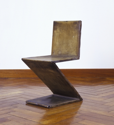
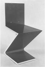
De Zigzagstoel heeft in de geschiedenis van de twintigste-eeuwse vormgeving niet voor eenzelfde doorbraak gezorgd als de rood-blauwe leunstoel1

. De Zigzagstoel wordt in de geschiedenis van de twintigste-eeuwse vormgeving veelvuldig genoemd als voorbeeld van de synthese tussen vorm, functie en constructie die door Gerrit Rietveld werd nagestreefd.
De zigzagstoel omsluit de ruimte niet, maar doorsnijdt haar met vier vlakken: rug, zitting, poot en grondvlak.2

Volgens Rietveld corresponderen de beeldende kunsten, schilderkunst, beeldhouwkunst en architectuur met de drie elementen van het zien: schilderen met kleur, beeldhouwkunst met vorm, architectuur met ruimte. De beeldhouwkunst moest zich concentreren op één zintuig: het oog. Via het oog kan de mens ruimte evenaren, aldus Gerrit Rietveld.

Rietveld citeert dichter Tagore:

“Door begrenzing, van het onbegrensde wordt de waarheid werkelijkheid”.

De Zigzagstoel was voor Rietveld een oefenterrein, een middel om nieuwe ideeën, materialen en technieken uit te proberen. De Duitse meubelontwerpers en fabrikanten Heinz (1902) en Bodo Rasch (1903-1995) hadden al eerder een stoel gemaakt met een Z-vorm, de “Geiststuhl”, maar daarin speelde de ruimtelijke werking geen rol, zoals bij Rietveld zijn Zigzagstoel.

Ida van Zijl noemt in Gerrit Rietveld, de doelstelling van Rietveld consistent, “Hij wil een deel van de onbegrensde ruimte afzonderen en op menselijke schaal brengen om die ruimte als werkelijkheid te kunnen beleven. Dat is en blijft de essentie van zijn werk, los van alle experimenten met materialen en technieken en variatie in zijn stijl”.3

Gerrit Rietveld speelde met de begrenzing tussen binnen en buiten. Kleur is voor Rietveld een middel om de begrenzing van ruimte te structureren. Vorm en kleur stimuleren een actieve waarneming die mensen uitnodigt om het werk te leren kennen.

Als literatuurwetenschapper denk ik bij het aanschouwen van de Zigzagstoel direct aan de letter Z, aan poëzie en vooral aan taal. Ik schreef een gedicht. Waarom heeft Gerrit Rietveld voor deze letter gekozen? Wat betekent Zigzag eigenlijk, waar lijkt zij op? Hoe klinkt de Z, de laatste letter van het alfabet als je de Z voortdurend gebruikt. Wat voor ruimte ontstaat er als er een stemhebbende letter Z in een ruimte wordt geplaatst? Is er zo weinig nieuws over de Zigzagstoel geschreven omdat zij niet te vangen is in beeld of taal? Omdat zij zig-zagt? Beweegt? De Z wordt een kunstwerk op zich, soms ontsnapt er kunst, in Rietveld’s woorden. De Z wordt onderdeel van de ruimte, haar voeten raken de grond, maar zij blijft toch ook een object.

Peter Vöge noemt in The Complete Rietveld Furniture de Zigzagstoel conceptueel interessant en niet zozeer interessant als sculptuur. Vöge is van mening dat de Zigzag stoel zo interessant is omdat het een dynamische kwaliteit heeft door de diagonale vorm, “Like a crouching animal about to convert watchful suspense into vigorous action”.

Voor mij is de Zigzagstoel een ruimtelijk beeld dat autonoom wordt als letter, als Z, als bewegende vorm, die je van alle kanten zou willen bekijken. De Zigzagstoel als oneindige letter, want het alfabet begint na de Z weer opnieuw bij de A tot de Z en weer opnieuw. Voor mij is de Zigzagstoel een bliksemflits en een gierzwaluw zonder poten die ongrijpbaar in de lucht blijft hangen, zonder vastigheid.
De Z- Zigzag als kunstwerk, als stoel, als experiment, als overdenking, als trillend geluid, als zin, als gedachtezigzag. Oneindig veel mogelijkheden zitten er in de Z, zie ik, want na het zien van de Zigzagstoel zie ik overal Z, Z,z, z Z.

 salie zigzag stoelen

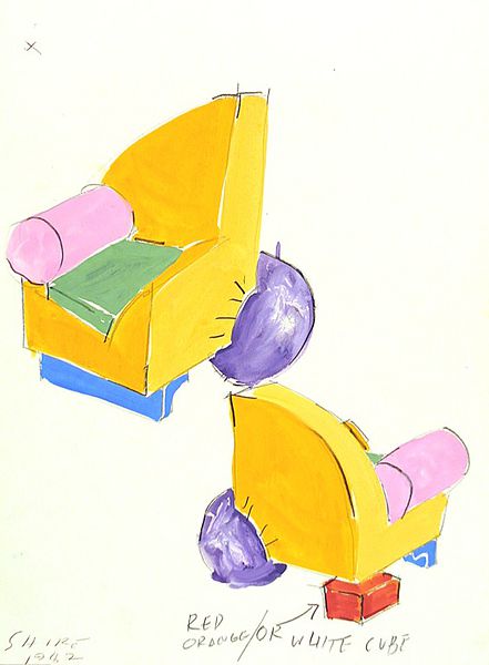
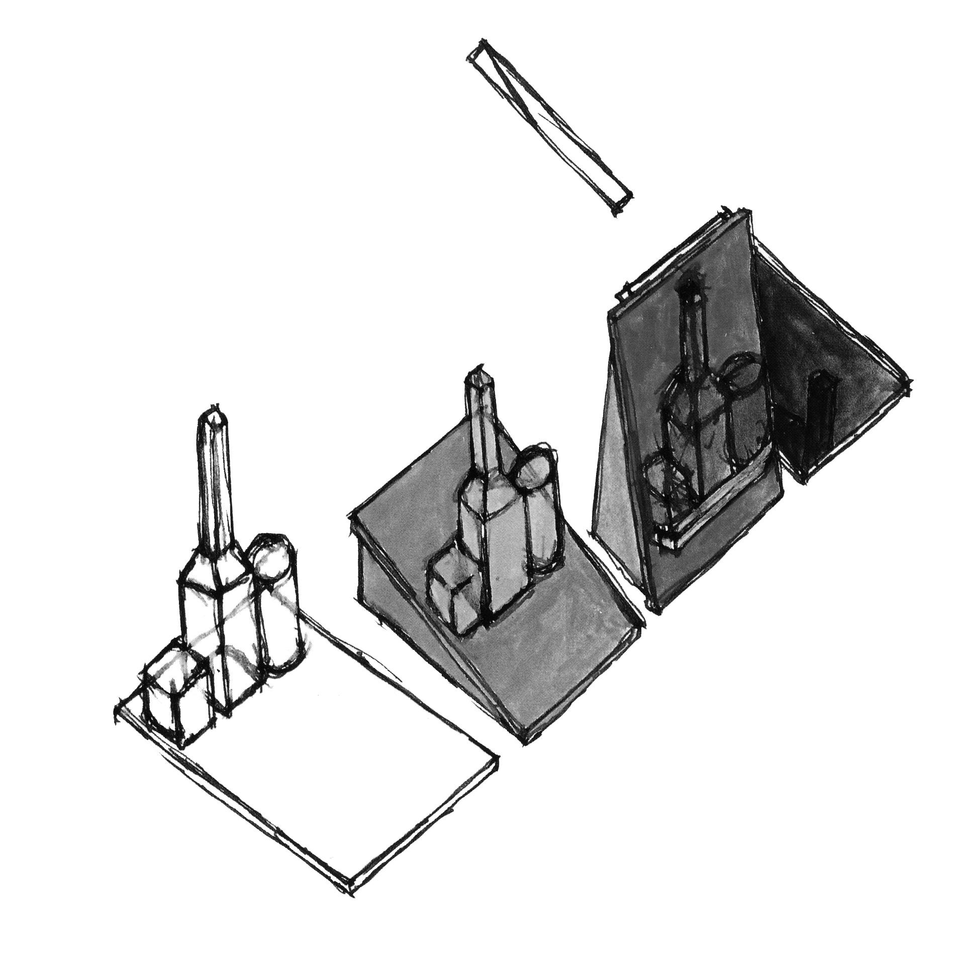
ZigZag- Salie’s tekeningen


1,2,3 page 189, Gerrit Th. Rietveld by Ida van Zijl en Marijke Küper, librairy cat. no. rie 17

Lamp Science


Saturday, September 28, 2013


Gispen’s Giso lamp (model 24)

A lamp, a simple product. A lamp only needs to give light, you have to turn on the light and after that you don’t have to touch it anymore. So a product designer is not really limited to the function of it, except the fact that it must give light. Or is this not true? Despite of all the possibilities to create a decorative lamp, Willem Hendrik Gispen made a really minimalistic lamp, the ‘Giso Lamp’ []. Only a white opal glass shade and a frosted glass above it, but that simplicity, I think, is the power of it. Willem Hendrik Gispen (1890-1981) was a dutch designer. In 1916 he began his own forge, called ‘W.H. Gispen & Co’, where he created crafted products. But in the twenties Gispen  became increasingly influenced by the design ideas of De Stijl and he switched from traditional to mechanized production. In 1926 he designed and produced the Giso lamps, it became a big success. The Giso lamp (Nr. 24) is a pendant lamp and  has a shade made of white opal glass that is 25 cm and a frosted glass disk that is 43 cm, the stem is made of nickeled metal. The opal glass ensures that the light is not really intense, but soft. The disk ensures that the light is not going up but only going down, the reason why most of all the lamps have a hood is interesting. Maybe a lamp is not only to give light, but also to give it a direction. There are a lot of Giso lamps [], but I think Nr.24 is one of the nicest, because of that disk above the shade.

This lamp is an interesting starting point to look at the vision of Gispen about de art of light. Gispen says that in the theatre the only place is where they control the light so good, that it became a real lighting art. This is because they focus on the most essential element: the light, and they are constantly occupied with the goal: lighting. If you want to make a lamp, you should be aware of the technique and also the goal: the right light on the right place. The requirements that must be set by a good lamp are  of different kind: physically, technical, economic, psychic. There are two groups that create lamps, but not with all the suspects. Architects and artist only focus on the psychic suspect, but then rarely on the main points of this suspect: colour and mood of the light. They only focus on the carrier of the light source, the lamp or ornament. The meaning of a lamp and the way to show it be interchanged. He thinks of all possibilities, an interesting way of hang up, or he creates lamps in the form of a square, instead of round, or a lamp out of wood. He thinks about everything except the fact that a lamp must be an object that light the space as good as possible. The other group is the group that only focus on the technical and economic suspect of a lamp, they want to create the best formula: the most light for the lowest costs. A lot of calculations and math, but a moderate result.

Gispen_Model24_redu

 
I will explain the different requirements.

The physic requirements: the light must be calm and not flicker, that is harmful to the eye. Also the light must not be too strong, that is also harmful for the eye. So you have to cover the light source. You can see how it is done in the Giso lamp. The shade is made of Giso-glass, the best kind of crystal glass, in minimal achievable thickness, (1mM.) covered with a layer of white glass, to a thickness of only 1/5 mM. They make the light pleasant and soft and only lose 10-15% of the light. Also the light must not be too weak. If the light is too weak it requires too much effort from the eye.

The technical requirements: the light out of a lamp can be controlled, by the use of reflectors, diffusers and light-breakers. The light can be absorbed and reflected, the way it absorbed and reflects depends on the material that is used for the reflectors, diffusers or light breakers. So you need to know about materials if you want to create a good lamp. There are also three different ways of lighting: – direct lighting. The reflector is so made that the light goes straight to one place, and is very concentrated. Examples are outdoor lighting or lights in a storefront.

-Indirect lighting: you get this light to let the light first been shined on to the ceiling. But the shadow it creates is so small that you get a surrealistic feeling, and also it is really expensive because the efficiency is only 35%.
-Half-indirect lighting: the best for general lighting. You’ll get this light if you put the lamp in a diffuser of a particular form. The light will shine in all directions . The Giso lamps are made to create this half-indirect lighting. But what you can see, the Giso lamp Nr. 24 has also a reflector above the diffuser, so the light won’t go up to the ceiling.

Economic requirements: maximum efficiency at minimum power consumption. Giso glass is perfect for this efficiency. It has a huge perseverance.

Psychic requirements: the place where a lamp hangs is of course important for how it looks like, a lamp in a living room must be different than a lamp in a party room or a storefront. As you have read there are many different requirements that a lamp must meet. They already decide what a lamp should look like, but you still can design a lamp as good as possible. For example Gispen uses soft gold bronze instead of dark bronze, so there is less contrast between the white shaves and the metal. The Giso lamp (Nr. 24) does not hang on a clumsy chain, but on a fine metal tube.

So maybe it was not true that a lamp is just a simple product. You have to be aware of all kind of different suspects if you want create a lamp, as Gispen did. But if you think it doesn’t matter at all, you can make whatever you want, without looking at all the requirements. (in my experiment I look don’t really look at the requirement, only at the atmosphere.)


Light experiment

Experiment

So now we know what Gispen thoughts were about light. I wanted to do my own light experiment. I changed my lamp into different forms, to look what will happen with the lamp and my room when I make small changes. I used my lamp in my bedroom that has a reflector above the lamp, so the light is more concentrated on the floor and less on the ceiling (like the Giso lamp number 24). I put all kind of different things under the lamp or covered it. The changes are huge, you can see it in the pictures, but it was even more in reality. If we look at the physic requirements I think Gispen would say that I made really bad lamps, because they are often too weak. Personally I like weak light, I liked the one with the white paper around the lamp, and the light concentrated on one point of my room and the rest of the room was less light. Economically it were also not really good lamps, a lot of light gets absorbed so it was not really: maximum efficiency at minimum power consumption. But my experiment was not about creating a good lamp. But about what little changes to a lamp do with the atmosphere of the room. I found out that it changes a lot to a room, but also really your mood. When found out that when the light changed, so my view at my room changed, so my mood changed. The best example was maybe the one with the color, the blue was cold and the red warm. Also the weakness of the light matters to my mood, the darker, the more I get into a mysterious almost melancholic mood. So I discovered through this whole research the impact of a lamp in a room. And that is bigger than I first thought.


Light experiment


Gesamtkunstwerk ?


Saturday, September 28, 2013

ARNE JACOBSEN (11 February 1902 – 24 march 1971) is a danish architect and designer. He was first able working as an architect, then mostly influenced by the modernist ideas. Typically, modernists reject decorative motifs, to emphasize more on materials, pure geometrical forms, function and adaptation to the industry.
Following the modernist philosophy, Jacobsen concieved buildings such as the Stelling House on Gammeltorv (left picture), or the SAS Royal Hotel (right picture), both in Copenhaguen.

old-square-gammel-torv-gammeltorv-_-6-k-c-3-b-8benhavn_700_0 OLYMPUS DIGITAL CAMERA

He went to design products because of his interest for the Gesamtkunstwerk concept. It concerned the preoccupation of building a place as a whole, every objects matter, one place (architecture, furniture’s, light…) is driven by one full concept, vision.
Jacobsen’s design products are therefore influenced by modernist ideals, but are more precisely a part of the organic modernist movement. This movement gave to Denmark and Scandinavian countries a particular place in modern design. Jacobsen played an important contribution to that.
The philosophy of organic modernism’s main concept is to emphasize on the harmony between human living and the world of nature, so that they are combined in an united, interrelated composition for a better living. Actually, it brings to modernism a humane element to its rationnalism. It’s to create clean, pure lines based on an understanding of classical furniture craftsmanship coupled with careful research into materials, proportions and the requirements of the human body.

Kokfelt House 1957 Kokfelt House

The Kokfelt House (1957) by Arne Jacobsen is a representation of what organic modernism can be in architecture.

Jacobsen uses craft and “natural” materials to build his design works. Jacobsen combines aesthetic for a better living and adaptation to industrial production (social matter); which made his works a critical and economic success in the 50’s.

The Egg

            The Egg is a chair designed in 1958 for the Radisson SAS hotel in Copenhagen. It is manufactured by Republic of Fritz Hansen.
The chair answers to the project Jacobsen was commissioned for : designing the whole hotel. He could therefore fully following his interest on the Gesamtkunstwerk concept.
The Egg is considered as a triumph concerning Jacobsen’s design : the organic form of the chair constrats with  the building’s almost exclusively vertical and horizontal surfaces. Jacobsen searched for the perfect shape by first sculpting clay in his own garage. This shape offers to the user a bit of privacy in a public space such as the hall of the hotel. It also can be used in a private place such a home to lounge. The Egg is available in a wide variety of fabric upholstery as well as leather, always combined with a star shaped base in satin polished aluminium.
By combining pure organic form, industrial adaptation, craft (strong foam inner shell underneath the upholstery technique), and conception as a part for a whole; the Egg is an excellent representation of how was design conceived in Scandinavian countries in the 50’s.


Interior of SAS Royal Hotel Interior of SAS Royal Hotel

        This piece shows a particular vision on human living. A better living combining functionnalism (research of materials), human proportions (requirements of the body) and aesthetic (part of a whole, pure forms). It allows the user to take distance from the flows going through public spaces or even in a private one; to find again a bit of intimacy. In a world where we are constantly solicitated, this chair offers with a cleaned form the possibility to manage to deal with those requests. That doesn’t mean to disconnect, but to get better relation to our environment.

         I wonder if the search for better living through the concept of Gesamtkunstwerk, which was the main preoccupation of Jacobsen, can be found in our daily lives. What happens to interior spaces when they are not conceived by professionals, but by individuals. Can we find the concept of Gesamtkunstwerk in vernacular spaces ? Do the objects, the planning of the space allow the user to enter one full vision of it ?

IS GESAMTKUNSTWERK UNCONSCIOUSLY PRESENT AROUND US ?

The Bel Air chair


Thursday, September 26, 2013

2011EN5032_jpg_l 2006AG2159_jpg_l


I think it’s pretty obvious why someone would want to write about this the iconic ‘Bel Air’ chair by Californian designer and ceramist Peter Shire. It’s simply not just another designer chair we see every day! “Quirky but sophisticated, playful but not over-the-top” was my first impression on this piece. There were also many questions that popped in my mind. The quarter circle backrest and the ball shaped “chair leg” for instance – why are they there? Why in such forms? And what about the rest of the design? It’s one of those designs that made me so curious, so now let’s get it started…
Born and raised in Los Angeles, Peter Shire’s often revealed traces of the surfing culture in his homeland through his work, always so full of colours and “cheerfulness” : I see the sharp line of the quarter circle which is in contrast with the round form of the elbow rest. The backrest is partly based on shark fins, and on the Stevens House by architect John Lautner (see below), located on the beach in Malibu.

John-Lautner-Stevens-House-78-Malibu-Colony-Rd-3_0


One thing interesting thing about Peter Shire is that, his design are very creative reinterpretations of normal forms. His work can be seen as art rather than solely functional designer objects (which he also explained in this interview). A good example would be the teapots he designed. Looking at how the teapots appear in various shapes and “movements”, I start to wonder if they are maybe 3D drawings rather than just real teapots (but can some of them really function properly as a teapot..?)


IMG_15841 7292938_1 Peter_Shire_City_Hall_Teapot_2003_630_88

Some of the teapots by Peter Shire


Now back to the Bel Air chair – of course it does function perfectly as a chair (given it has all the essential elements of a chair: seat, back, legs..), but it can also easily fall into the category of ‘art work’. Take a look at the chair again, doesn’t it look like a giant sculpture composed of geometrical shapes, or something you can find in a kids playground? 

And this is exactly the kind of playfulness and quirkiness that I like about the chair. This piece has so much to examine and look at. Everything changes when you look at it from different angles. Yet the elements come together very well, like a harmonious explosion of shapes and colours.


bel_air_peter_shire_memphisbel_air_peter_shire_memphis_facebel_air_shire_memphis_milano

AP0200_1_peter_shire_400AP0200_2_peter_shire_zoom


Now, the best part of the design has to be the bright orange plastic ball. I can totally imagine everyone looking at it twice, or more. No regular looking chair leg is found here, instead we only see this plastic ball giving a memorable twist to the piece of work, truly an uncommon but fun element to look at. It definitely brought the final result to a whole new level.

It didn’t surprise me a lot when I found out the super fun Bel Air chair was the most important contribution of Peter Shire to the Italian design group Memphis. Yes, the quite crazy and very much groundbreaking Memphis Italian group, always challenging the narrow constraints of traditional Italian furniture design. Peter Shire’s involvement in the Group came about after his ceramic work attracted the eye of Ettore Sottsass, one of the founders of Memphis. Sottsass found Shire’s ceramics “fresh, witty, and full of information for the future”. The group invited Shire to Milan to work with them.


memphis-group2011ET6775_bedin_superlamp_bulbedettoresottsasscarlton1981
The word “ordinary” just doesn’t exist in the dictionary of the Memphis…


As previously mentioned, the Memphis design held the intention to break away from the conventional and conversation sides of general retro classic Italian furniture design. So let’s recall a bit: traditional Italian furniture has been popular since renaissance periods and was used by the royalty. One can easily associate words like “classic”, “elegant”, “deluxe”, “expensive” with the style. Colours that are commonly used would be, let’s say, white, ivory, gold and brown etc.

On the contrary, the Memphis stroved to design products which were much more than just furniture—but also political statements, existential metaphors, and visual poetry. Everything. The Memphis were expert at communicating their ideas with colourful decoration and asymmetrical shapes. They have also been described as “bizarre”, “misunderstood”, “loathed”. It’s simply a collection with endless possibilities and surprise.

As for the style and works of Peter Shire, I can see that they do fit perfectly into the Memphis aesthetic.

One nice comparison with the Bel Air Chair would be the Kristall pedestal table by DE LUCCHI Michele (see below). Initially we see colourful and eye-catching components in just one table: a bright yellow top, black and white body, and four blue-gray legs. It reminds me of the first time I laid my eyes on the Bel Air chair. So unique, so eccentric, so unforgettable. Just like the Bel Air chair, the structure of table looks rather simple. Yet there are so much to look at when the graphics come as a whole: the brights colours, forms, shapes, and the very much Pop Art inspired tone…


gueridon-kristall


The Memphis just isn’t too Memphis without asymmetrical shapes. So here we see this table appears in such manner (It was in interpretation of the Apollo XI Space Mission, in case you wondered). The outwardly placed yellow top in the Kristall pedestal table gives a similar result as the bright orange plastic ball in the Bel Air Chair. They are not simply placed there to form a asymmetrical shape, I see them much more than that – the ultimate surprise and highlight of the work. Indeed, the table top and the chair leg both give a little “bizarre” and asymmetrical twist to the final look of the pieces of furniture, revolutionizing common objects, which is pretty much a very important part of the spirit and essence of the Memphis style.

Anthon Beeke plays


Thursday, September 26, 2013

This is a poster for an exhibition in the Stedelijk museum by Anthon Beeke.

Anthon Beeke-dansendemeisjes-stedelijk

It has been printed in several different colored layers which show dancing figures. Anthon Beeke designed this poster in 1995. He sought to achieve independence from the rules of typography, and from popular trends.  This unconventional move has earned him a unique place in the Dutch graphic design history.

Before I came to Gerrit Rietveld Academie I graduated in graphic design on the Media College Amsterdam. After four years I disliked graphic design so much that it made me come to Rietveld. This graphic design school is very strict and technical without much freedom. Form follows function, as they say. You learn more to become a desk top publisher. I learned about Anthon Beeke but did not really notice because it was not allowed.

But not long ago I rediscovered his work and I really started to admire the pleasure he puts in his work, Form follows fun! And I totally agree with this concept. It makes possibilities limitless. One of the reasons why I came to Rietveld is to create without boundaries, because I really felt constricted. Since he was the first to step out of these rules I decided to chose this poster. It got my attention right away, in spite of the fact that the line of sight was partly blocked by some other objects at the entrance viewpoint.

I think it is not his best poster design but I chose this object more or less because of the artists. The whole poster looks like an accidental moved photo at a party with a lot of dancing. The font that he chose adds to the dancing, it is if the letters are dancers as well. I also like the fact that it is a layered print, nowadays this look is easily Photoshopped, but he experimented with the layers and colours.

Anthonbeeke-dansendemeisjes-closeup

At the graphic design study I learned the Do’s and Dont’s which you have to obey. Of course it is good to obey these rules and if you don’t it easily becomes a bad design, but if you don’t obey and do it well it will become way more interesting then following the rules. It’s more exciting. I had to make a poster explaining typography rules this is a small part of the poster showing the Dont’s.

Don'ts typography

It’s in dutch, this is the translation:

Use more then 3 typefaces.

Align text in Block form.

Use outline on a font.

Right text alignment.

Chinese typography, line the text from top to bottom.

Obvious rules, but if you break them it could be so interesting, Anthon Beeke did this many times and he is one of the designers that could do that well.

Hollandfestival-Anthonbeeke

All the dont’s i learned are in this poster, but he did it so well that its interesting and exciting but also readable and understandable. There is a story behind this poster as well. The theme of Holland festival was avant-garde in the second world war. He used a poster of Dirk Elffers and painted it white.

Dirkelffers-weerbaredemocratie

And the Typography is copied form a letterproof of Piet Zwart. ”Pure stealing, a shame!” Anthon Beeke said. Every time he sees the poster he has to smile, because the poster says on the left side, Designgraphy: Dick Elffers, Piet Zwart, Anthon Beeke.

But what inspires me the most is that you can see in his design that he is having fun making design. In dutch graphic design it’s called grafisch vormgeven, vormgeven means form-giving, giving things form, sounds so much nicer then design. But that is really what he did, he has an assignment and looks at the possibilities (while playing) and starts giving it a form.

viewoncolour-AnthonBeeke-knitting-itsamiracle

This is for a magazine called ‘View on Colour’ which he published with his wife Lidewij Edelkoort. In this cover, about knitting, you can see something you can not think off from the start, you have to play and have fun to surprise yourself and have something to use.

James Victore says something very interesting is the book It’s a miracle about Anthon Beeke’s work.

”Anthon Beeke always kept playing. A lot of other graphic artist look more like accountants with posh watches and they don’t ask themselves what impact their design has. He plays for his own pleasure and to surprise himself. He doesn’t make work for clients, not for commissions, not for the money, its not even about the assignment or design it self – Its about him. And because its about him it’s about us. The more authentic and personal it becomes, the more impressive his designs becomes gives it more dept; it speaks to us, we can here him snigger of fun. He speaks to us because he gives himself to us. Anthon plays”(Translated from dutch version, not original quote)

I have nothing more to add or say because this quote says it all.

Bye-Anthonbeeke-nudeabc

I like Hutten


Thursday, September 26, 2013

tabel chair orange


Both parts are built by straight lines and rectangle forms. So plain and elegant it is easy to walk by. The work contains out of two separate parts that together create an object we recognize as a chair. The Table Chair is manufactured by Droog Design and can be found in different variations. The Table Chair is the exam work of  Richard Hutten when he graduated from the Design academy in Eindhoven.
It takes some time to realize how the different parts work together. My brain process what I see. What is the object and what do I think the object is? Can I try it, Please? How would a dinner party or a meeting work out when using Table Chairs? There is a feeling of being tricked. The designer  have a sharp sense of humor.

Design has always struck me as a contest in elitism, tyring-to-be-smart and commercial profit. The Table Chair’s supposed function is completely unpractical and has no intention to flirt with the viewer. Richard Hutten’s complete lack of compromise with his customers, the material and his own creative process is something I admire. I’m attracted to the Table Chair because of it’s obviousness. Still I haven’t seen anything like it before. The Table Chair is such a conceptual piece that it first makes me laugh and then gets me interested in the designers other works. It makes me see a 40 min long interview with Richard Hutten on YouTube. It makes me consider the DesignLAB program at Rietveld. It makes me visit the store that distribute Richard Hutten‘s other work. It makes me question my own sense of  value. And it makes me like his Facebook page. I like Richard Hutten.

Parkrand Building, Entrence

Parkrand building, seen from east

The Parkrand Surveillance


The ultimate Hutten experience, a journey through Amsterdam
I. Contact
I send an email to Richard Hutten Studio and ask for information about where I can find Huttens works in Amsterdam. Favorably somewhere I can experience the works in any way. While thinking about what to do next I use Huttens own method and start playing around, in Photoshop. I realize how fantastic color combinations you can find and that everybody really do look better in black and white.

II. Action
I have never been west of the Rembrandt park before. On my way to the Parkrand building I notice how the neighborhoods I pass differs to the area I live in. There is much less shops and almost no restaurants. The houses people live in have smaller windows and are not as old as the houses in the Museumkwartier. I recall a sequence in an interview with Richard Hutten where he speaks about cultural and social design. He says that is the only design that interests him. The Parkland-project is a typical example of cultural and social design to improve the reputation and well-being of the suburbs west of Amsterdam. The Parkrand building is an apartment complex where Richard Hutten designed three outdoor rooms: one room for children, one living room and one dinning room. I get to Doctor H. Colijnstraat and start looking for a way in to the outdoor rooms. I can’t get in anywhere. I try to follow a couple of construction workers but then I reach a locked door and see the surveillance cameras.

III. Capital
There is one place in Amsterdam where I know I have a chance to see Richard Hutten design products close up. The droog store near Nieuwmarkt distribute Richard Huttens design and has Richard Hutten design works on display. I recognize three. The Loo Table, a extremly small table with a stick coming up from the center, it keeps toilette paper rolls in place, 59,00 €. The Leaves, small and strong magnets put together with plastic leaves, 29,95 €. The Domoor cup, an oversized childrens cup that make passing tourists to fascinatingly mimic the drinking movement. I realize that it is a rich mans world and pay 10 €.

IV. Use
A black Domoor cup, also known as Dombo, with tea. My father laughs when he sees me. “What is that?!” I explain to him that it is my new cup. He asks me if I like it. I tell him I do.

Playing is the reason The Loo table at Droog Design

How to drink from a Dombo mug


i see, i see what you don’t see


Thursday, September 26, 2013

Walking into an environment filled up with design items is interesting and tough at the same time. It is interesting to see how the items communicate with their surroundings especially because they were never meant to stand next to each other. Of the many design pieces i liked there was only one which both attracted my attention as well as my imagination.

A piece that is part of the cubic structure collection from 1964 by Jan Slothouber and William Graatsma.

Jan Slothouber and William Graatsma - cubic structure (1964)

Because the plastic material is transparent, the colours are being mixed on the white textile. For a moment i could not recognize if the textile was dyed or not. It was a sort of visual illusion and in the meantime i asked my self why is this soft and kind material locked into a hard plastic box? Is it design or is it art?

jan slothouber

William Graatsma together with Jan Slothouber began to work for the Dutch State Mines (DSM) in the beginning of the 1950’s. Their job was to create and develop packaging, product applications, advertisements and exhibitions, thereby establishing DSM’s corporate image.

cubic constructions p139_515pxcubic constructions p205_515pxcubic constructions p203_515px

They experimented with cubic constructions, developing them for applications in exhibition design such as the 1958 World Exhibition in Brussels. They limited themselves and decided to use almost only the cube as form or starting point, thus they tried to determine the principle of cubic constructions.

cubic constructions p158-159_1000px

Jan Slothouber was opposed to individualistic movements such as the painters of Cobra, and preferred a more ‘democratic’ artistic form, whereby the cube was the universal shape that everybody could understand and use. In fact he was an architect, he believed and practiced what Louis Sullivan [x] said in an article in 1896; “form ever follows function“.

Slothouber and Graatsma went on to found the Centre for Cubic Constructions (CCC). In 1966, CCC won the Sikkens Prize (jointly with Peter Struycken [x] and Johannes Itten [x]), for their innovative contributions to art and design. Their approach to commercial exhibition design earned for Slothouber and Graatsma an exhibition in the Stedelijk Museum in 1967. Design, dimensions and experiments in colour and lettering, all in relation to the cube, were being displayed under the title ‘Four Sides: Size, Shape, Colour, Letter’ (Vierkanten: maat, vorm, kleur, letter). Three years later, they represented the Netherlands with their Cubic Constructions at the Venice Biennale in 1970 (GRA Library).

cubic constructions p408_515pxcubic constructions p409_515pxcubic constructions p407_515px

After all this success, they were known by the public as artists instead of architects or designers. This became very visible when they were asked to design the post stamps for the former PTT in 1970. The profit from selling the stamps went to a charity for children. During that time, the PTT had a lot of critique for choosing such an “avant-garde artists”. The charity was afraid that the designs were to abstract for the bigger public and the stamps would not have been sold.

ccc_postzegels_515px

After his carreer at the DSM, in 1970, Eindhoven’s Technische Hogeschool invited Jan Slothouber to set up a Faculty of Form Theory in the new architectural engineering department. Together with his students, he developed ‘new cubic constructions’ (nieuwe kubiese konstrukties).

As professor of the new faculty he gave several lectures on a regular base. In 1971 one of his public lectures was “The form of our surroundings“, where he explains that our surrounding is built up by creatures, objects and happenings, and they are visible because of their shape. Our surrounding exist, because we see, experience, think or execute it, but everybody experiences it differently, because everybody’s awareness of the surrounding is different.

Therefor we are unable to talk about it as something common, it is only an apparent similarity because we perceive these shapes the same way, but it doesn’t mean we experience them on the same way. Sensory observations like sight is measurable, but our personal emotions change the result. Our feeling can influence our perception of the surrounding and that is why our surrounding can occur differently for everybody. The emotional perception is highly underestimated in architectural design, only invisible form aspects can be experienced. But for pleasure both (visible and invisible) form aspects are important.

Furthermore he explains the importance of the usefulness in our surrounding, whereby he mentions that the architect has to distance himself from artistic ambitions. These ambitions make the livability dissimilar for every levels of society. The best thing to do is to create an understandable form language, a base for our communication with the constructed surrounding. Human perception should be the priority of design. To achieve this, we need to cooperate with science, technology and art.

The object i have chosen was a result of a series packaging whereby he experimented with different materials inside the cube. The relation between the materials and the transparent, sometimes colored, plastic cube. His research has been shown in the Stedelijk Museum and the Venice Biennale, so what is this object? Art or design? Is it important?

Slothouber has done a lot of different things in the past so it is difficult to say where this object could be categorized. His design research has been shown on art exhibitions and his designs has been criticized as too ‘avant-garde’ art. He is erasing boundaries between design, architecture and art. The object I have chosen, the object where my all research started, is not just design, architecture or an artwork. it all comes together in that piece.

Jan Slothouber was an admired teacher, although it wasn’t always clear for his students if he was totally crazy or a genius. One of his students was John Körmeling. In his work the influence of Slothouber is highly visible. They both share the similarity of outlook on the erasure of boundaries between design, architecture and art.

video of the rotating house in Tilburg by John Kormeling


everything is relative,
even cubic regularity.
many things are true
and few are certain.
form is only a means,
just like cubic construction.
important is the aim
that finds expression by it.
an idea can be made visible
by the shape of a construction.
reconstruction of the idea however
is often a difficult task.
we beg your pardon
for our cloudiness.
we hope you will discover yet
the aim of cubic constructions.

– a cubic construction compendium, 1970


A Completely New Shape


Thursday, September 26, 2013

Starting Point – Ted Noten “Chew your own Brooch”

Chew your own Brooch is a project by the Dutch designer Ted Noten, who is known for his jewellery and bag designs. It was started in the late 90‘s in the Boijmans van Beuningen Museum in Rotterdam, where visitors were asked to sculpt their own brooch with a piece of chewing gum which was afterwards cast in either gold or silver.

brooch

At first I could not see the connection between the golden shapes and the chewing gum above, still wrapped in its paper. The package was designed to resemble a regular chewing gum which seems to emphasise the close relationship between design and commerciality.

Having a concept for making own designs which is accessible to a wide range of people is a valuable thing. It enables somebody to adjust and shape a product instead of making use of a pre-designed model which may not be as suitable to an individual‘s needs but is more representing a general trend.

Even though mass-designs have their perks, people have always been striving for individuality – and they still struggle to find ways of expressing their ideas. Opportunities like Ted Noten‘s Chew your own Brooch are therefore a great enrichment to the world of design.

The beauty of this concept lies in the idea of creating completely new shapes by using everyday products. If the common purpose of an object is being put aside, new ways of applying its materiality and construction can be discovered.
To me looking at everyday objects without bias becomes more and more important since I realised that too many doors are being closed by focussing too much on what something already is instead of all the things it could be.

Taking this project as a starting point I want to investigate more on “new shapes”.


Experiment – Creating New Shapes

One way of creating a new shape is to exchange an objects material and see what it does to it‘s shape.


cup1 cup2 cup3 cup4

Ceramic to Chewinggum (aprox. 60 pieces) 

In this case what hapens is, that the reproduction does not want to stay in the original shape. The softness of the chewinggum allows the cup to collaps as time passes which leads to a unfunctional, and yet new shape.


elastic

Elastic to Polyurethanium

Something very different happens if you replace a strechy material with a solid one: the reproduction breaks into sections, creating different pieces with individual shapes. It almost seems as if by changing the material, the object has been dissected and therefore can be looked at from new angles.


plastic

Plastic to Polyurethanium

The original shape is almost not visible in the reproduction which, with its massive and clumpy look, is quite the opposite of transparency and lightness.


Another way of making new shapes it to detach the process of creation from personal intentions or standardized movements that were learned before and to use the element of chance.

This has been done by many artists and also musicians (John Cage, “Number 14” and “Indeterminacy)

Simple elements could be the use of dice or outer influences like nature or spontaneous reactions of people.


What does a new Shape bring?

Art World

There are several examples from the Art World where the replacement of an object‘s material leads to a dysfunctional reproduction. In the case of Claes Oldenburg‘s Soft Toilet creating an „anti-sculpture“ or an „anti-object“ was the aim, functionality did not play a role. Also Ted Noten changed an everyday object like a bag into something which cannot be used in the classical sense but is being used as a transmitter of a message or opinion.


Nature

Shapes constantly change in nature, everything is shifting, adapting, evolving, it is all about survival and therefore must be functional.

In colder regions of the world, animals have a different surface-to-volume ratio than animals living in a warm climate, meaning that the size of their extremities and the compactness of their body depends on external influences. Compared to a regular Fox, a Fennec has extremely big ears which enlarge his body surface in order to lose more heat. Even though both animals derive from the same family, the shapes of their bodies changed due to different needs.


New Shapes as Solutions

In the end, whether it is making a statement, forwarding a message or personal view, adapting to new circumstances or improving a present situation, it is always about a problem that requires a solution which can be found in a different shape through evolution, reflection or experimenting.


Abstract Language of Space and Light – the Metaphor of Perception in Space for Correspondence


Saturday, August 31, 2013


Melancholia_rietveld graduation show2013Ji Sun Nowh


Writing this I discovered a new aesthetic language through the “way of looking” and the combination of possibility and imagination latent in it. This tends toward the potential unknown reality. The artist has an insight to see through various worlds and this inner eye allows the artist to experience the

other world beyond reality. Melancholia03_ Jisun Nowh_redu The work created by this artist is the very gateway leading us to this place across time. Through the operation of thinking and recollecting, we are able to bring out the invisible time and space, experiences, reminiscence, and subconscious. What I have attempted to represent using a metaphoric form of visual language is the faint outlines of the invisible beings, the lingering ambiance of light, and the emotional respiration coming from the stream of subconscious, all experienced through the mutual perception of time and space.

Melancholia04_ Jisun Nowh_redu Melancholia02_ Jisun Nowh_redu
My work intends to be vacant and open rather than to express many things. This is to induce the viewers to read the work as a reflection of their own experience and sensibility. I found that architecture and art consist of the inner abstraction and the perception of light and I have experienced the process of the works in this thesis that starts from the convergence of form, line, color and sensibility and develops into sculpture, painting and building involving space and light. The combination of form and color awakens the sensibility inside this. I tried to enable a more direct visual experience and bring out the abstract forms to the real space in order to substantiate them.

The geometrical Melancholia01_ Jisun Nowh_redu forms in these works are  imaginative spaces waiting to be filled with serene experiences.
I brought this abstract language form into my work and it will be originate from the restoration of imagination through the “way of looking”. I wish it did not remain in the state of merely reflecting the inner space but rather to be continuously reborn through various interpretations by being read as different stories and experiences.

text by Jisun Nowh [graduate student department of Inter Architecture]

 
Pdf-icon Download my thesis: ”Abstract Language of Space and Light;
The metaphor of perception in space and light for correspondence
 

Ecosophical Roadmap


Friday, August 30, 2013

intro

Haeckel_Orchidae

“The drawings in Kunstformen Der Natur express Haeckel’s fascination and devotion to the study of nature. Haeckel himself described his fascination for the world he was investigating, mostly referring to his main discovery, the Radiolarius [x], a single cell organism discovered in the depth of the ocean.
“It’s hard to believe that these creatures are single cells, some are like grids, broken nets or stems, others like tiny balls, helmets or bells when others appear to us like tender houses, windmills, fantastic towers.”

These words reflect on how much the artistic impulse of Haeckel seemed to have taken over his wish to be perfectly accurate and neutral as a scientist. His drawings are projections of real observations but they are as much projections of the inner interpretation of the artist’s vision of reality. Kunstformen der Natur was a way for him to unite these two projections in a single work. He by doing so “began to see not only the outer forms but also the inner content, the nature and the history of things”. He’s been trying to see nature as a “single unfolded work of art” by trying to understand the sequences allowing the Radiolarius to be present in such a multitude of forms. By doing so he achieved an astonishing body of work that can be seen as a suspended moment in time, a witness of this wish to leave space enough for observations and fantasy in a single picture. Following Goethe’s attempt to present nature in its diversity and trying to find unity in it at the same time, Ernst Haeckel created hybrid specimens that reflected on his subjective way to create the marvelous and the poetic in order to try to decode the genesis and the evolutionary systems of nature. That lead him to coin the word “ecology” itself.”

Excerpt from “The Curious, the Marvelous and the Particular”
(thesis by Rudy Guedj can be downloaded as pdf at the end of the article)


roadmap

By exploring the potentialities of ecological worldviews, old and new, through theory and art, WHERE ARE WE GOING, WALT WHITMAN? seeked, to accelerate, accumulate, animate and activate our poetical and political understanding of the world. (Introduction of the Studium Generale 2012-2013 “Where are we going, Walt Whitman? An ecosophical roadmap for artists and other futurists”)

The visual campaign for the Studium Generale — designed in collaboration with Sophie Rogg, Olya Troitskaya and Martin Huger –all graduates from the Graphic Design department in 2013— revealed itself progressively. It was trying to both map knowledge acquired during the past lectures, and project on a fictional level thanks to a visual pollution which was growing exponentially on all the mediums we used.

billboard1

The first layer of the campaign, the map, was created before the Conference-Festival as a simple topology arranging references into a single spacial representation. Day after day, the basic map, as all the different supports we used to communicate with, was taken over by a visual infection.

DSC_0030

The creation of each of the collages has been realized as a reaction to the existing publication Kunstformen der Natur (Ernst Haeckel, 1899-1904). These bold interventions on top of the existing drawings shaped a fictional journey throughout the campaign and provided endless interpretations of the very broad topic of ecology today.

Collage_Orchidae calabi-yau-2 poster_3 Haeckel_Kunstformen_Page_065_2
< illustrations Rudy Guedj, Sophie Rogg, Olya Troitskaya and Martin Huger >

“A welcome pendant to the overload of terms and theory is the online Ecosophical Roadmap: an ongoing encyclopedic exercise accumulating (visual) footage that inspired the speakers. (Ecosophical Roadmap) I dare say this experiment is the only contribution to the Studium Generale that practices what it preaches: it actually embodies our way of interacting with the material world, mediated through technology and immaterial digits.”
From : Metropolis M (online reviews)

DSC_0110 DSC_0127
< Studium Generale poster, physical translation Roadmap >

The online roadmap was a way for us to respond to the immediate and ephemeral format of the lecture by gathering notes and other references mentioned during the discussions. It functions today as a remaining archive, an attempt to visualize the many connections that were progressively built up and to emphasize on the important role that plays serendipity in our daily use of technological medias.

text by Rudy Guedj [graduate student department of Graphic Design]

thesis


Pdf-icon Download my thesis: ”The Curious, the Marvelous and the Particular“


Brooch : Absence, Function & Contemporary Jewellery Practice


Thursday, August 29, 2013


he-jing-brooch-2013-7


My graduation work called ‘Brooch’ stems from my study in structure of brooches and daily objects. I am interested in the relationship of forms and functions in mass productions; how the form appeared because of function but not only aesthetic. I was wondering how they work and how people use or misuse them. During the research I questioned what jewelry can be and its characters, and compared jewelry with other ready-mades [x].
My practice has combined these daily objects with jewelry, focussing on the tensions between “sense and nonsense, “usefulness and uselessness”. I was observing every details of the objects, and in the mean time, I was observing my reactions to them. I saw my works as results but not answers of this process, which included remaking, testing, running, repeating and failing.
I take jewelry as a way of asking questions instead of giving answers, I hope people wear my works and question them, maybe even misuse them, or be questioned by others.


brooch8
Brooch by Jing He /photography DAN/NAD


My practice on jewelry is focused on the relationship of the human body and daily objects. I questioned what jewelry can be and its characters, observing and experiencing the function of objects, and comparing them with jewelry. The central interests in this are tensions between ‘sense and nonsense’, ‘usefulness and uselessness’. What I did was to focus first on the structure of mass produced products; how the form appeared because of the function and not he aesthetic. Then I explored how jewelry, as part of people’s daily life, resides at the edge of usefulness and uselessness/function and aesthetic, analyzing the special character and dilemma of jewelry makers. Finally I related my findings to the practice of the contemporary jewelry field.


post_card_2clean


In Chapter 1, I mainly referred to the philosophy of Laozi and Martin Heidegger: the absence and function of objects, the different structures and usages between jewelry with other practical objects.
From Heidegger’s essay ‘The Thing'[x], I found the handle of his example of the jug interesting. In my opinion, the character of the jug’s handle has similarities with jewelry. In addition, I described and questioned my own jewelry practice, and how I discovered “absence”.
In Chapter 2, I studied similarities and differences of the jug handle and jewelry. In the contemporary jewelry field, I provided examples, referred to Jacques Derrida’s idea of supplement, and questioning the meaning of jewelry.
Jewelry is not only about the creation process but also the viewing experience, thus in Chapter 3, I compared paintings from ancient China and Italy, and discovered a new way of viewing image and jewelry. I proposed the idea that jewelry is seen out of the corner of once’s eyes.
In the end, I refocused on the absence of objects, and added how people misuses daily objects, and a few pieces of art. I believe that jewelry making can originate in the idea of combining different absence parts from objects.

text by Jing He [graduate student department of Jewelery] he-jing.com


Pdf-icon Download my thesis: ”Absence, Function and Contemporary Jewellery Practice“
 

Woman of the Shreds


Thursday, August 8, 2013

My thesis “Aufarbeitung” [reprocessing] is based on a historical research on the influence of economical and political crises on fashion and clothing production from a German perspective, says Verena Michels (fashion graduate 2013). My investigation aimed at finding answers on “how can I be a pro-active designer in the current crises and turn shortcomings into innovation? This theoretical research was the starting point for my garment collection.

© PETER STIGTER  FILENAME IS DESIGNERNAME RIETVELD 2013 GRADUATES © PETERS STIGTER RIETVELD ACADEMIE 2013 EINDEXAMEN © PETER STIGTER  FILENAME IS DESIGNERNAME RIETVELD 2013 GRADUATES

photo's Peter Stigter


trummerfrauen The icon of my collection is the so called “Truemmerfrau” (woman of the shreds): former housewives who were empowered and emancipated through physical labour in post-war Germany during the years of restoration. It was a period of hardship and material-, clothes-, and food shortcomings that encouraged black market and innovation through necessity.
When comparing that situation to our current crisis, I find a paradox: the European financial crisis is characterised not by a shortcoming but by an overload of materials, clothes and food, and what we lack are values, work ethics and a definition of what defines quality in times of mass production and over-consumption.
I decided to look for the answer by researching “material”. After experimenting with dust, lint and fabric leftovers, I chose wool as my main material. It is a highly relevant material for me because of its rawness, because it comes directly from nature (sheep, alpaca, goat), protects our body, keeps us warm, and doesn’t need to be washed. I decided to use wool in a non-conventional way, and put it in a context other than knitting.

COVER Rosemarie Trockel wool painting
Rosemarie Trockel wool on canvas, Dark Threat 2 2010, Syz Collection

Inspired by the wool paintings of German artist Rosemarie Trockel who transferred wool from the female household to established art galleries, I developed a new textile. This material is flat, structured, and requires only the exact amount of yarn without waste. It can be produced at home with a household sewing machine. The simplicity of the technique allows me to share it with friends and to collaborate. This can be a relevant starting point for making production communal and local again. I see it as a contemporary translation of the post-war DIY culture and hope my idea inspires others.

Screen shot 2013-08-08 at 12.13.23 PM

photo by Lutz Bauman

My collection book is an archive of visual research, notes and ideas, documentation of material and form research. It includes two chapters of my thesis and a photo series of the end results. The photo shoot took place at KOBOR, the wool store of Koos Koopman who buys yarns from bankrupt companies or factories that produced too much, and sells it at a fair price.

text by Verena Michels [graduate student department of Fashion] : more verenamichels.tumblr.com


Pdf-icon
Download her collection book ”Treummerfrau“, [woman of the shreds]

Pdf-icon Download the thesis: ”Aufarbeitung“, [recollection]
 

Orthogonal Allegory – the reality of architectural plan drawing


Friday, July 26, 2013

In this essay not only does the plan delineate (describes) the basic ‘syntax’ of a building, but it also creates a reality on its own; through allography the plan creates an allegory. This thesis won the 2013 Rietveld Thesis award


The floorplan takes a peculiar position in architectural creation. As a notational device, it translates the conception of a built space to a graphical code. The form of an orthogonal projection of a building abolishes the illusion of space, it excludes exactly the elements that are elementary to architectural expression, “light and shade, walls and space.” Le Corbusier, Towards a New Architecture.
Scan 2
John Hejduk Still Life Museum / Museum for still lifes, could it be possible for the architect to take the natura morta of a painting and by a single transformation build it into a still life?

First and foremost architectural plans are a tool for instruction and documentation of a building process, but the graphic compression of a spatial idea creates a reality on its own. The plan equally takes part in other disciplines, painting, literature (think of Alain Robbe Grillets Jealousy), as it does in architecture.

chamberworks III-H
Daniel Libeskind, Drawing from the series Chamberworks, 1983, Chamberworks, carries in its title the notational character of the drawings, the form of their conception of space.


The planar form of representation is able to develop architectural problems independent from the construction process. It writes a text, different from that of the building, though in an indexical relation they contain each other. The factual information given by the plan creates a metaphor of the building through decisions made in its form of graphical notation, the format of drawing enables architecture to incorporate and appropriate parts of other disciplines, literature, philosophy, painting. The foundations of casual literacy are different from those of architectural, spatial literacy. In John Hejduk’s Architecs wheel the history of literature stands of the same level of elemental necessity, as that of construction materials, forms of depiction and building elements. Still, a plan is bound to an indexical relation towards reality, but it narrates a different story about the building it depicts, just as the story of the building differs from that of the plan. In its abstraction, the plan creates a Sinnbild (symbol), ideograph, allegory of the building.

DP109642
Man Ray, Dust breeding, 1920, Duchamps 'Large Glass' metaphorically turns it into a huge landscape, a pictorial setting.


The text formed from a logic of graphical signifiers, line, plane colour, typography, delineates what a building is about it a two-fold way: Syntactical, as the composition of spaces, and theoretical, as the Weltanschauung (philosophy of life), a complex synthesis of philosophical, religious, social beliefs. In that sense, the architects wheel is an archetypical plan, containing Hejduks complete vocabulary, a model for his architecture, for the narrative of basic shape, rather than a concrete building. Every plan evokes the world in which that building exists, the possibility of a space, just like every lie creates the world in which it is true. The plan formulates principles of grammar, methods of thinking and working, it integrates tectonic space and form and human experiences and conditions that comprise our existence and thus it is essentially philosophic.

dubai_masterplan2
Dubai Masterplan, “It was the precision of my memory which enabled me to demystify the imaginary quality of the dream: surreal and real became interchangeable metaphors.” Raimund Abraham, the architects dream, 1983

text by Anton Stuckardt [graduate student department of Graphic Design]


from the jury rapport: In ‘Orthogonal Allegories, the reality of architectural plan drawing’ Anton Stuckardt has tackled the difficult subject of how the three-dimensional form is two-dimensionally represented. Still Anton manages to make the subject understandable in a very intelligent way and the thesis shows that he is a sharp thinker. The jury also found it to Anton’s advantage that he took his own interest in architecture, and connected this to the field of graphic design. Overall the thesis was compact, powerful and well written with good illustrations.


Pdf-icon Download this thesis:

Orthogonal Alegory – the reality of architectural plan drawing.


Over de kunstenaar die een detective wilde zijn


Friday, July 12, 2013

The Hotel, Room 47 1981 by Sophie Calle born 1953

In L’Hotel (1981) neemt de Franse kunstenares Sophie Calle tijdelijk een baan aan als kamermeisje in een Venetiaans hotel. Ze krijgt 12 kamers toegewezen, die ze gedurende enkele weken zorgvuldig moet schoonmaken. Tijdens haar werkzaamheden documenteert ze de voorwerpen die de gasten in hun verblijf achterlaten. Ze fotografeert de bedden, die soms niet eens beslapen zijn. Ze opent de koffers, bevoelt de zijden stropdassen. Ze leest brieven, die niet aan haar gericht zijn, en maakt aantekeningen van wat ze in de badkamers aantreft. Ze documenteert alles wat de gasten in hun kamers achterlaten. Als een ware detective onderzoekt ze hun levens.
De foto’s en teksten die Calle maakte tijdens haar werkzaamheden als kamermeisje, publiceert ze later in de serie L’Hotel. Met dit werk maakt ze het publiek deelgenoot van haar voyeurisme: ze biedt de toeschouwer een intiem kijkje in het leven van de hotelgasten.

The Hotel, Room 47 1981 by Sophie Calle born 1953

both images : Sophie Calle, The Hotel, Room 47 1981, © DACS, 2004

De kunstenaars die in deze scriptie behandeld worden gedragen zich net als Calle als een detective. In hun werk nemen zij het leven onder de loep: ze verzamelen informatie, onderzoeken deze zorgvuldig en komen vervolgens tot verrassende ontdekkingen. Aan de hand van het werk van onder andere Douglas Huebler, Hans-Peter Feldmann, Arjan de Nooy en Hans Aarsman, wordt in deze scriptie ingegaan op de overeenkomsten en verschillen tussen de werkwijze van de kunstenaar en die van de detective.

text by Rosan Dekker [graduate student deartement of Graphic Design]: www.rosandekker.com


From the jury rapport : The jury found the carefully designed thesis of Rosan Dekker, which looks like a poetry booklet from the early twentieth century, very charming. Scriptie - boeken - Rosan Dekker - Detective_small But the jury was also impressed by the content of the thesis. In her thesis Rosan investigates what we can learn from the artist in the role of detective. Rosan shows in a well-written narrative that the artist should be a detective that asks the wrong questions and takes up the false leads to get the best results. The jury has found that Rosan's is the only thesis that shows good art criticism in that she is not afraid to take in a position and defend it. [thesis nominated for 2013 Rietveld theses prize]


Pdf-icon Download this thesis: Over de kunstenaar die een detective wilde zijn [dutch language]
 

I get excited by old stuff.


Wednesday, May 29, 2013


an old and very shiny little bowl to drink from.

wear a simular creation on top of your head.

a cup with a lid.

another hair accessory from horn, gold and diamonds. fancy stuff. this is a ring. with something like a lock inside. if you do not read dutch you can only emagine what it is for. it looks mechanical. porcelain parrot. no purpose.

a glass model of a big and powerful canon!

for making coffee. made from silver and bone. this is a shiny container for sugar. these are for storing liquid.

i do not know what this is. but i know i like it. someone was ment to drink from this. h 38,0cm × b 61,0cm seal ring. nice. very very old.

this is a porcelain monkey holding a snuff box.

this is for serving gravy. lots of it. this is a cup for something. another knife for food. even older than the first.

this is a tiny eg that can open. and close. finger ring. from back when diamonds where a little rougher. this is a jar with dead stuff from the ocean.


Old things are exiting because they are old. These things where made because it was possible, with the aim of perfection. carefully created with perfect skill. looking at beautiful things makes me smile. In the old days, rich people acquired these artifacts, because they could. To show off, and to create a visible distance from the people who couldn’t afford the decadent lifestyle they represented. A similar trend is still present today.  Nowadays they buy overpriced modern design or old and rare stuff, but the concept is the same. Being able to surround my self with beautiful things, of which the design has no practical function, is a privilege, that I enjoy very much. Even if it is just for the time I am hanging out in a museum, or in  a fancy place of someone else. I am fascinated by old things because they are old and rare. They come from another world. One that I can never become a part of.


violin. most likely with a crappy sound. watch. this is a glass. it is nice.

this is jewelry. for wearing. it is also a whistle this is a wooden dog. for no purpose.

9 bottles for expensive liquid. in a box that fit!

pocket watch. a whole lot of detail on 5cm. a mug. this, i think, is for storing cutlery.

old and thin container for liquid. pretty cabinet. very locked. this is where to put the salt for the table. there are 2 of them. some one had 2 of these.

birds cage. for tiny bird.

old, heavy and shiny. for tea and coffee. this container is either for soup or potatoes. it is 1 piece of a very much bigger set.

really old guns in a box that fit! put hands in these. to show you dont need to use them.

a little, old, sculpture of a grotesque monster. no purpose. fancy snuff box. made of solid gold. very old and very expensive table. could possibly contain all my belongings. one in each drawer.

items from the collection of the Rijksmuseum Amsterdam


Fashion With a Gold Tread


Wednesday, May 29, 2013

2013. We eat while we walk the dog and call our grandmother at the same time. There’s no time for sitting down. You see, time is money, and definitely not worth spending on a bench in a beautiful park doing nothing – or on repairing an unraveled sweater. It’s easier (and cheaper perhaps) just to buy a new one. But can time be measured in gold? We talk a lot about time over our worn out jackets.


Perhaps a short explanation is needed.

Seven years ago, Saskia van Drimmelen gathered a few people she knew and shipped off to Bulgaria. After eight years of designing clothes for the fashion elite in Paris, she had decided to quit her own (and at that point quite successful) brand, in search of a more fulfilling way of making clothes. In a book about Bulgarian crafts, she had found pictures of needlepoint lace unlike anything she had ever seen before – and so the treasure hunt begun. What started as a research on old fashioned and nearly forgotten techniques, became what today is known as Painted.

They call themselves a hybrid fashion collective. Many people stand behind the name Painted, but in the front seats you find Saskia together with theater director (and also Bulgaria explorer) Margreet Sweerts.
Their latest project is called Golden Joinery. Inspired by an old Japanese tradition where broken ceramics are repaired with golden paint, Saskia and Margreet invite you to repair your ragged clothes with a golden thread. They organize workshops where you can bring your beloved but broken sweater, jacket, dress or pair of jeans, and together you make it as good as – or perhaps even better than – new. And this is the frame of our conversation.


Painted is doing something different. In lack of a better name – perhaps combined with peoples need to categorize everything – Painted and their series of clothes are often referred to as slow fashion. Saskia and Margreet rather (if they really have to give it a name) call it slow clothes. Though many of the ideas behind their brand is compatible with the slow fashion thinking (like the sustainability and the anti buy and throw away mentality) Painted is still doing something different.

They work in the periphery of the fashion world, far away from catwalks, collections and trends (when they were asked to open the Amsterdam International Fashion Week, their answer was a YES with a big BUT – resulting in a room where models practised their tightrope skills, while the audience could walk around and watch).

Painted means spending time on making the clothes. Most of their garments are developed over years, and a normal procedure could be this: One starts making, lets say, a dress. Then leaves it to rest for a while, until somebody else finds the inspiration to continue. The garment grows in the hands of different people, until it’s finished. Nothing is planned or designed to the end, it becomes while it’s being made. All the contributors have something to say, and every piece is different from another.


I asked Saskia and Margreet what they thought making something by hand added to a clothing, and they answered with returning the question; What do I think making something by hand adds to a clothing? I was not capable of giving a straight answer at the time being –  and I’m not sure I am today either. But I know it adds something. Something of value, whatever that means. I know for instance that buying sweaters on a fleamarket and only afterwards realizing that it has been made by somebody’s hands, makes the scoop three times as good. This is of course a quite subjective way of thinking. Perhaps my idea of an old, gray haired and slightly chubby woman, sitting in a rocking chair knitting (I know this is the case only one out of twenty times) makes the sweater even warmer. Or maybe it’s the idea of somebody spending their time doing it that warms?

By the end of our talk, Margreet draws a scenario; If your house was burning, and you could only save what you could carry in your arms – what would it be (and now let’s look beyond computers and smartphones)? After the workshop, thinking about what I would have saved, I realize that this might be what Saskia and Margreet are trying to create in their clothes. A value that goes beyond money. Not just another really beautiful dress – but a garment with something close to affection.

I like to think that time invested in an out dying technique (let’s say a Bulgarian needlepoint lace) or in repairing an unraveled sweater makes it more worth than the machine produced alternative. I mean, time is after all money. Maybe we just haven’t learned to recognise the currency yet.

www.paintedseries.com


Epilog
After attending their workshop, and becoming a part of their secret, golden brand, Margreet and Saskia asked me to add a song to their playlist, a song about something broken or golden. Not that it really has anything to do with anything, but it’s about a broken heart and I felt like it belonged here as well.

Christopher Owens – A Broken Heart


Empty wallet – NO WASTE


Monday, May 27, 2013

“The Sea Chair”

When I first saw the Sea Chair I immediately reacted on the aesthetics – it’s imperfections, hints of craftsmanship, and it’s strange plastic molding. The plastic resembled, though not clearly, marble stone. Soon after I found out of it’s relation to the Great Pacific Patch [x].
The Great Pacific patch is a floating soup of plastic debris covering an area one and a half time the size of USA and is trapped in the currents of the North Pacific Gyre. Many organizations have tried to clean it but it has been deemed as “the worlds largest dump” – feared impossible to defeat.

The plastic debris releases chemical additives and plasticizers into the ocean and finds is way into the food we eat. The fishes and seabirds mistake the plastic for food, as you can see on the picture above showing a Laysan albatross chick (90 % of Laysan albatross chick carcasses and regurgitated stomach contents contain plastics.)

The Sea Chair is made of plastic debris collected from this garbage patch. It is part of a project with the same name lead by design duo Studio Swine, Azusa Murakami and Alexander Groves; in collaboration with Kieran Jones determined to clean this floating dump and lower the production of plastic

The overall concept is to design with sustainable systems while treating the aesthetics with the same importance. With the use of design they form the plastic waste into an aesthetically desirable object. They believe that desire is the factor for change.

The sea chair project uses craftsmanship, together with recycling and protection for the environment, as a part in the ecological cycle. Like a craftman the designer should follow the whole process of production. Studio Swine uses tools and created devices to collect and process the marine debris along the shoreline. The Nurdler is a machine, that was created while being inspired by the miners, sorting plastic from the other waste. The next step is in the Sea Press which is a furnace and hydraulic press that heats and molds the plastic into the stool.

The Nurdler

The Sea Press

The stool is just the start in Studio Swine’s environmental cause. They also want to convert fishing boats into plastic refineries, so that the fishermen would collect plastic instead of fish. They mean that this would lead to lowering the demand for new plastics and therefore also the production of new plastic. Eventually this would also mean that the fisher men could continue fishing instead of picking plastic.

The connection between chairs and the seamen comes from a tradition amongst Britain’s port towns where sailors were required to have carpentry skills for repairing wooden ships at sea and after they retire many of them would continue to make wood furniture, in this case instead of wooden chairs the fishermen would make plastic chairs.

The Sea Chair proves that Eco-design goes hand in hand with craftsmanship and collectivity. Eco-design, since the 60’s, has questioned consumerism, taking inspiration from craftsmanship before the industrial revolution when eco-design was considered a norm and goods such as furniture tended to be made locally by craftsmen using local resources. Studio Swine follows the eco-design concepts of “Do-it-yourself” and engaging the community by making the production process accessible. On their website you can access a manual and video for how to build the devices and create the stool .

Though I desire one of those sea chairs, I’m not gonna be able to make one in this short amount of time. Instead I decided to make the smallest effort in creating from recycling waste material. I was going to empty my wallet from all the “shit” I gathered when I decided to use it as my “waste” material.

So I limited my self to this source material and one tool

I intended to make jewelery or at least functional objects but I’m not a designer so it resulted in something else…


Log in
subscribe