Skip to Content Skip to Search Go to Top Navigation Go to Side Menu


We sense volume before we can articulate it


Friday, October 19, 2012


Marie De Bruyn makes monumental objects out of hand blown glass alongside video work and wooden constructions resulting in hybrid installations. Apart from the making process she is interested in integrating objects in a specific setting, creating atmospheres where the viewer can engage in a physical relation towards the objects and their surrounding space. Similar to Brancusi’s sculptural permutations – arranging and re-arranging the space in between his sculptures – the placing of an object is as important as the object itself.

Her work is about the relation between the perception of inner and outer. ‘How do we deal with our (surrounding) space? How do we position ourselves towards ourselves, the people around us, and the objects taking place in a given situation?’ The theses then discusses the function of the surrounding in the work of Dan Graham and those of body and space in the work of Richard Serra


Download thesis : We sence volume before we can articulate it [in dutch]

[images of Marie de Bruyn's graduation show


Creating destruction


Thursday, October 18, 2012

[publication of graduation essay by Caroline Lindo 2012

I wrote this thesis “Surface of Revolution” for anyone who – openly or secretly – wants radical change in our current financial and political system and I hope my words can inspire them to find out how they want to position themselves within this time of change.

A Surface of Revolution is a three dimensional surface, shaped by rotation around its axis. I chose this title because it relates to the current uproar across the world in which people are also trying to turn things upside down, and because I will use the protest tent cities and its actual surfaces as the
parameters for my concept. I recognized the fact that there is a class problem in the world and that that problem needs to be dealt with. In this thesis I will study Occupy and the tent and I’ll try to define my way of protesting. I’ll describe the many different kinds of protest I encountered during Occupy and how I am finding my own place within activism. In the end, I hope to find out what my own ethical truth is in respects to changing this class problem in society and find out if there is a way to do it that can apply to bringing down any given system. Violently, non violently, creative or destructive or a
combination of those together. In my work I am searching for this balance too, I am physically acting out the dilemmas and choices I have to make in order to find my own way of protesting.

The main question I am asking myself here is: What is the most effective and still ethically just way for me to attempt to collapse a system? My thesis is about the dilemma’s I faced in regards to protesting. There is the option to destroy, the option to create and all the shades in between. Do I have to choose, and if I feel that I do: how can I make a well weighed decision?
To make this choice I started visualizing creation and destruction, after that I made game rules to play out the different options. In this thesis I draw parallels between the inside and outside of the (“Occupy”) protest tent cities, the tent frame and the structure of the fabric. With thesis ingredients I created my own surface of revolution. A reflection of the protests around the world and my own journey through all the dilemmas I encountered there.

Download thesis by Caroline Lindo: Surface of Revolution

[images of Caroline Lindo's graduation show


link to website: http://carolindo.tk and http://carolindo.tumblr.com (same one)

Why Can’t I Use My Ignorance


Thursday, October 18, 2012

[publication of graduation essay by Elisabeth Leersen 2012


In the following text we will dive into the notion of ignorance, in order to see what this could mean for the marginal areas of design. Hence the question Why can’t I use my ignorance? This is a question I will try to resolve, by walking past different subjects. Exploring the unknown, by shifting context.

First we will conclude what ignorance means: what it means in society, and what it means for me, personally. Next we will develop questions; in order to see how ignorance relates to the primitive, and we will see how the notion of anthropology has a say in this matter.
All we learned, I will transform into an abstract notion, which may help us to link my questions directly to my own practice and my own desires. And so, in the end we will deal with storytelling, truth, flickering perspectives, and finally a way in which ignorance has found it’s place within my design process.

You must wonder, Why ignorance? This is a question I ask myself regularly.
Inside of me lies a desire to call a bluff from time to time, which I guess goes for everyone.
In order to see what would happen if I were to invent a certain knowledge, and thus would put my ignorance to a different use. How far could I take someone along in this dreamed-up universe? And, why am I attracted to this invented ignorance? These are all questions we will deal with. Some we will answer, some we will not. I invite you to take this journey with me, and see where ignorance might take us.

“There are different ways of looking out, of looking for new perspectives. Perhaps my fascination with the ancient explorers and their narrations lies not so much in narrative, but lies in their approach. It does not interest me to revisit their voyages, but to commence my own. To adopt their naive, primitive, and subjective way of seeing the world, in the new encounters they made. Making many assumptions on the way, and never finding the entire truth; or any truth for that matter.
This narrative of transition, it is a fictive journey. Finding yourself opposite an unknown phenomenon, as in the explorers’ journals: the multitude, yet incompleteness. Many truths, many ideas, and much more assumptions. Diving into different disciplines, using them all; perhaps taking pieces that were not meant for me. I’m not looking for the strength of singularities; but for humble pluralities.”

Download thesis by Elisabeth Leersen: Use Your Ignorance

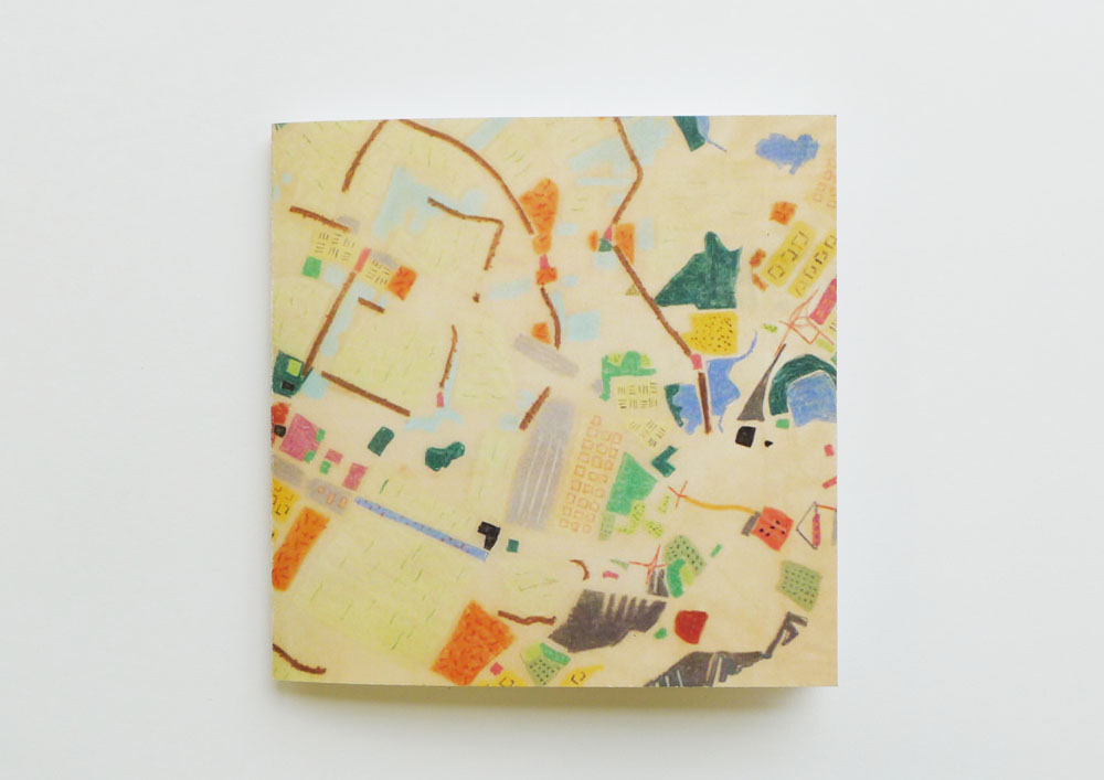
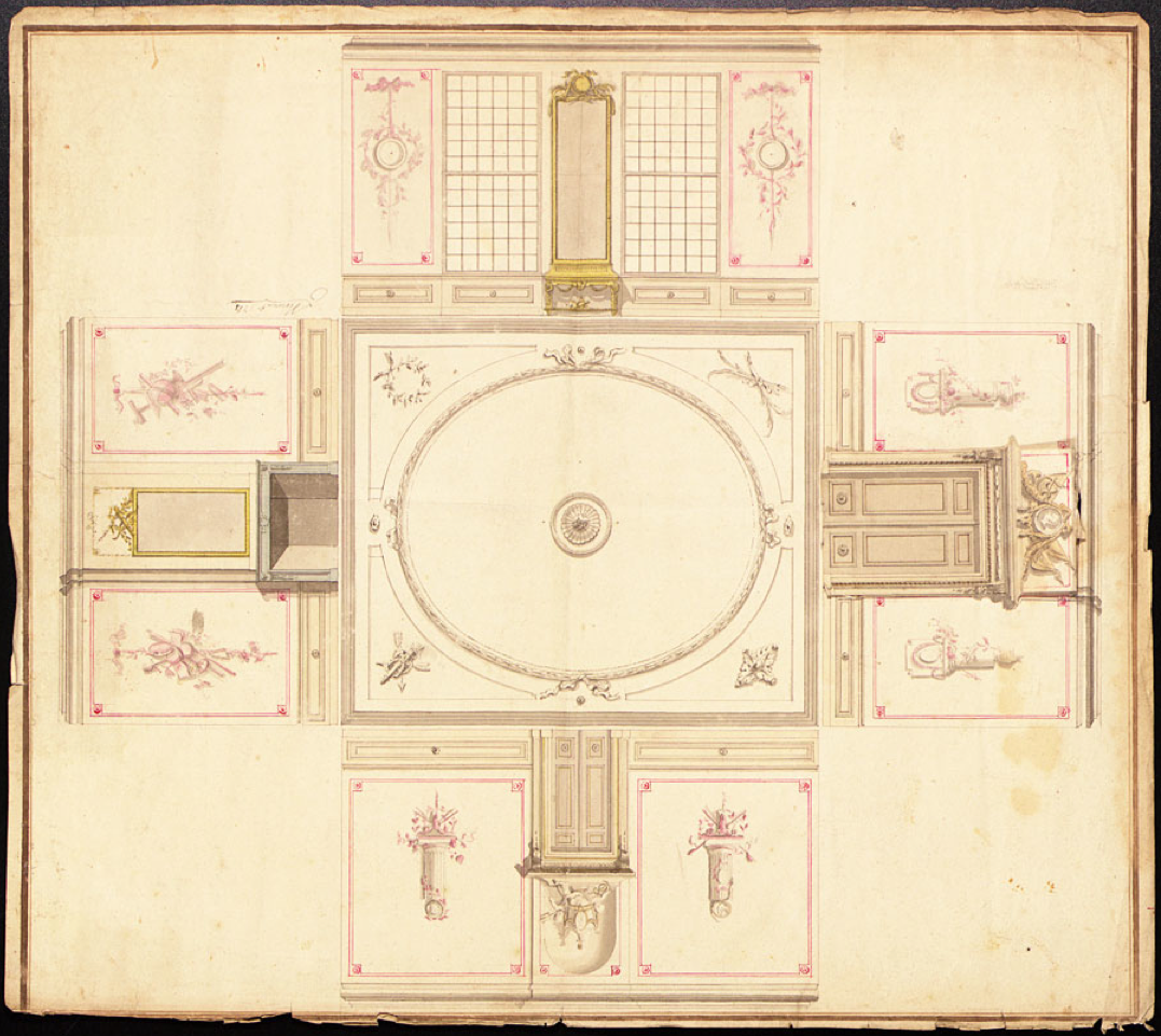
[images by August Sander /Claude Levi Strauss /Galon & Gajek]

from the jury rapport: Elisabeth Leersen from the Textile Department provided the jury with a beautifully designed thesis that was also content wise very interesting. In her thesis Elisabeth researches how ignorance can be made productive. She takes herself as a starting point and arrives at original and lively references from different disciplines and gives her own creative examples. It is a search that ends up again at Elisabeth Leersen herself. At this point the thesis would require a little more self-reflection and more precise use of language, but the thesis remains one of the best.


New [S] for Stedelijk Museum Amsterdam


Wednesday, September 12, 2012

23 /09 /2012

The visual identity of the Stedelijk Museum in Amsterdam is undergoing a radical reconsideration by Mevis & Van Deursen. Internationally renowned as one of the most inventive and acclaimed design agencies in the Netherlands, the duo had previously created the graphic identity of the museum’s Temporary Stedelijk program from 2010 to 2012. The museum’s visual re-branding will be an ongoing process, to be seen in a new logo, website design, publications, newsletter, stationery and posters, among other applications. In anticipation of the reopening of the Stedelijk Museum on September 23, the new campaign will be gradually unveiled. Wondering what typeface was used is not that crazy. It is a new ‘font’ designed by Radim Pesko called ‘Union’. A blending between ‘Helvetica’ and ‘Arial’

Chaos and Order


Tuesday, June 5, 2012


Chaos and Order is the name of Hendrik Wijdevelds endeavor to eradicate the chaos and clutter of modern city life. I use his theories and pictures as a starting point in a deeper research into chaos and order, as one of the most fundamental dichotomies in our struggle to make sense of life. In its most extreme from it can be used as a formula to describe practically everything, from the beginning of time to the heat death of the universe.


Through juxtaposed pictures and excerpts from texts [download pdf]
I try to tell a story perhaps better lived in imagination than understood.


Integrate my Building


Monday, June 4, 2012

inspired by Rem Koolhaas’ Kunsthal Rotterdam (1990).

The Rotterdam Kunsthal is one of the very first of contemporary buildings that have tried to connect themselves in direct ways to their urban surroundings. By using geographical context it attempts to strive placelessness and lack of identity.

The first sketches of the Kunsthal show a changeable space called ‘robot’ which is flexible to all kinds of exhibition concepts with its shifting walls and tribunes. However the concept of adjusting develops further in the process and in his scale models he presents building blocks with two streets cutting straight through the construction.The Actualization: a square flat box located at the edge of the museum park. The building is divided into 4 pieces by an arterial road. It contains 3 exhibition spaces. 650m², 1000m² and 1250m², an auditorium, office and cafe.

Kunsthal

In the following drawings I researched this idea of architectural integration and urban fusion.

Gerrit Rietveld Academie / Hard Rock Cafe

Spui / Vondelpark

Shared interests


Monday, June 4, 2012


In this research i collected exciting materials and information, i compared it to other data that in a certain way related with it and questioned with this his decisions and my thoughts about the project.

What appealed me to start this with this project is the difference in between the first intentions and sketches and the actual outcome. The sketches look great but not very Gerrit Rietveld, the outcome (or at least the exterior of the house) looks kind of normal and look far from what I expect from a guy like Gerrit Rietveld. Never the less i like it a lot.

SharedInterests_BvandenBerg

Atlantis is Wobo


Monday, June 4, 2012


Sayuri Chetty’s tale of the world bottle.


Get the Flash Player to see this content.


The Anti-Modern version of Villa dall’Ava


Saturday, June 2, 2012

Villa dall’ava is a villa designed for a family that wanted a house that could be seen as two separate apartments; one for the parents and one for their daughter. The Family wanted a swimming pool on the roof and a panoramic view of the surrounding and over Paris.

The design is made with cheap material such as corrugated aluminum panels combined with expensive material such as natural stone, which is also a significant of Rem Koolhaas. Which for him is a way of mocking modernism by using materials and building structures that are different of what is commonly esthetically accepted. Another way of mocking modernism is by using different building systems that can have practical disadvantages such as sloping floors or ceilings, which you can also see in the design of Villa dall’Ava.

I was inspired by the way Rem Koolhaas is known for mocking modernism. And I questioned myself why would you call the combination cheap with expensive material, and sloping floors or ceilings mocking with modernism. Aren’t sloping floors and ceiling or the use of cheap material modernistic?
I thought that the ultimate way of mocking modernism would be something that wouldn’t be modernistic. I made a non-realistic sketch of Villa dall’Ava in a way that I find is mocking modernism.  By using materials that aren’t modern.

The Villa dall’ava is part of the Treasures of the NAi (Rotterdam); You can read more about the designed by 3 architects from OMA architects in my enclosed research pdf.


The Unadapted City


Saturday, June 2, 2012

Vipcity is a research project of the Belgian bureau for urban planning T.O.P.office Luc Deleu. ‘The Unadapted City’ is a design based urbanist study. Earlier models such as Brikabrak (1998), Dinkytown (1998-99) and Octopus (1999) lead to the latest model Vipcity: an urban plan for 38,000 inhabitants.

According to T.O.P. office life on earth will become a problem because of a lack of space. While most architects and urban planners design spaces for one fixed purpose, T.O.P. office designed basic shapes that could fit for all purposes, to reduce the inefficient use of space in cities today. The basic shapes behave like a sort of skeleton, and can be filled according to the needs of the inhabitants. The only way a city can be adapted to its needs, is when its design is unadapted, still to be customized accordingly. Research lead to some rules in the arrangement of the city.

First, all needs are categorized. The facilities mentioned:
– hotel and catering – social facilities – medical facilities – distribution and Transport – education – universal and commercial services – culture and entertainment – worship – arts and crafts – sports and recreation

Next these facilities can be placed in three categories: structural, zoned and occasional.Structural facilities provide the cities structure.


The transport and distribution facilities are represented in the black oblong shape. It functions as the cities spine, along which the zones are placed (white parts in photo).The zoned facilities, shown as the small colored blocks, can develop by various, uncontrolled within a specific zone.

The facilities are shaped rectangular. This proved to be the most versatile and fitting for every function. The colors represent the different facilities.
Occasional facilities can develop everywhere by individual. By free initiatives that directly answer to a inhabitant needs.

When the needs of the inhabitants change, adjustments can be made on either zoned or occasional facilities. The space or form does not have to be adjusted, only its function, i the image represented by the change of color. Occasional facilities can easily be taken down or moved and affect the cities shape.

This research project by T.O.P. office is highly theoretical and not one of the models is executed. Nevertheless it gives fresh view the construction of the society.

Wobo : One function before another function


Thursday, May 31, 2012


stack the bottle

Can a stackable beer bottle help to make construction more sustainable? As the story goes, beer magnate Freddy Heineken came up with the idea of the World Bottle when he saw waste materials being recycled to build dwellings in the slums of the Caribbean. At his request, John Habraken designed the first stackable bottle in 1962. The ribbed glass and the depression in the bottom of each bottle reinforce the construction of the brickwork.
The bottle remains a prototype. The brewery’s marketing department is afraid the idea will harm their image. As an experiment, Habraken builds a house made out of bottles for Heineken. In 1975, the beer bottle once more surfaces as a possible building material, although critics say that far from solving the issue of recycling leftover bottles, the World Bottle would only encourage people to drink. To get the number of bottles needed to build their house, people would have to consume a substantial amount of beer first!

I found this idea really really avant-gardist and full of possibilities. I think it is a field that designers should investigate more. Not recycling materials, because it is only a reaction on the consequence of the harmfulness we have dealing with the wastes of our mass consumption society, but design the product without forget that someday it will become a waste that will take a lot of place and long process before this object will be transformed and recycled (PET recycling process for instance). What would be a world where all consumption object would be designed like this: one function before/another function after it would become a waste?

Patchwork Metropolis


Thursday, May 31, 2012


‘Patch Work Metropolis’ is a study for city expansion between Den Haag and Rotterdam in The Netherlands by Dutch architect Willem Jan Neutelings.
The initial drawing of the project contains a lot of colors which makes distinction between the places of different character in order to understand and figure out the geographical facts of the area. I was very inspired by the way of using colors and the way it looks, it reminds me of a coloring book.

My project is a book based on this idea. The image on the cover is based on that same drawing, and the content is a simple text describing the project. When you look inside of the book, you can only see white pages which have embossed lines with an instruction saying ‘Color inside of the lines’. By coloring, the text will appear.
 

Predictions from a 18th century interior


Thursday, May 31, 2012

(Hello Alaska)

The sketch for this 1763 interior by Leendert Viervant has a liftable part on one of the panels. It reveals an alternative to the dominant Rococo style of this period: The Neo Classicist style. This showed a clear desire to adapt to the client’s wishes.

Neoclassicism was a “return to purity” as a reaction to the flamboyant lifestyle of the monarchy in the 1700’s. It was the return to the classic styles & spirit from Rome and ancient Greece. Moral & rationality replaced bold ornamentation & superficiality. The promotion of science and individuality during the Enlightenment (origin 1650) had left a demand for personal freedom & equality.

In the spirit of the enlightenment & the belief that all individuals should be able to reason for themselves, Viervant leaves the choice to the client by offering alternatives to the initial designs. The awareness of the changing demands at the current time & difference in personal taste makes Viervant’s approach seem like a prediction of our modern customizable 21st century society.

“Enlightenment is mankind’s final coming of age, the emancipation of the human consciousness from an immature state of ignorance & error.”

– Emanuel Kant

15 miles into the andromeda strain


Thursday, May 31, 2012


The easier, the more, the stronger


Thursday, May 31, 2012

After visiting the treasure room of the NAi I was very inspired by a non-existing student houses from Jan Verhoeven [x]. A very strong image of a wooden model caught my attention.

For the student residence in the campus Drienerlo the architect Jan Verhoeven devised a smart structure. He designed an easy structure that gets stronger when you build more houses. This sketches of the plan from 1965 are very colorful, colored squares represent the layered houses. Mathematical drawings with different structures, some a-symmetric some not. The sketches give me the feeling of mandalas, the spiritual drawings that suppose to give you rest and peace. It reminded me also of the patterns my great-grandmother used for making embroiderys.
This all sounds very warm and cozy, but when you look at the drawings it's still a bit cold because of the straight and perfect lines and squares.
What i wanted to do was to make a booklet, make this drawings into embroidery and give this the warm feeling it reminded me of. The process of making the embroiderys give you the same peaceful feeling as making and looking at mandalas. Also the fabric is getting stronger When you stitch more layers, the same as the original idea from the student residence. In the booklet I also tried to preserve the atmosphere of the model with using the wood board and keeping the clean image. The text in the booklet are keywords that represent the essence of the project from Jan Verhoeven, but also three separate titles of the embroiderys.

Organic Architecture


Thursday, May 31, 2012

“So here I stand before you preaching organic architecture: declaring organic architecture to be the modern ideal and the teaching so much needed if we are to see the whole of life, and to now serve the whole of life, holding no ‘traditions’ essential to the great TRADITION. Nor cherishing any preconceived form fixing upon us either past, present or future, but—instead—exalting the simple laws of common sense—or of super-sense if you prefer—determining form by way of the nature of materials…”

– Frank Lloyd Wright, An Organic Architecture, 1939


INSPIRATION

As an inspiration for this publication I chose Ton Alberts and Max van Huut. They were the leading architects in organic architecture. Their NMB (now ING bank) office building was realized according to a completely new concept: organic forms instead of the straight lines that dominated the impersonal, efficiency-focused office buildings of the 1980s. The free forms encourage a creative atmosphere at work. They created people-friendly surroundings with plenty of plants, varied spaces and climate-neutral installations. The office of the ING Bank is one of the most impressive examples of the upsurge in organic architecture during this period.

DISCOVERIES

Fallingwater, one of Frank Lloyd Wright’s most widely acclaimed works, was designed in 1936 for the family of Pittsburgh department store owner Edgar J. Kaufmann. The key point for the design of the house was the waterfall over which it was build. While designing this house F.L.W. stayed true to his principles. He respected the properties of the material and he respected the harmonious relationship between the form/design and the function of the building.

THE DIFFERENT SIDE OF ORGANIC ARCHITECTURE

Antoni Gaudi’s concept of organic architecture was significantly different than the one of Frank Lloyd Wright. In his work Gaudi mimicked nature itself by creating concrete waves on the facades of the buildings , making lizards from shattered colored clay tiles,  twisting metal leafs and flowers for railings on balconies and stairs. His greatest work La Sagrada Familia (not finished) truly is the most magnificent example of Gaudi’s work. The rippling contours of the stone facade reminiscent us of sand castle, while the towers are topped with brightly-colored mosaics which look like bowls of fruit. Gaudí believed that color is life, and, knowing that he would not live to see completion of his masterpiece, left colored drawings of his vision for future architects to follow.


Log in
subscribe