Skip to Content Skip to Search Go to Top Navigation Go to Side Menu


"graphic design" Category


Made me look


Tuesday, February 2, 2010

Designing a book is not something that requires a lot more than just putting together some pieces of paper and binding them in a book cover. But in order to design a book that immediately attracts ones attention, a book that makes you look, it is necessary to re-think it to make people wonder and speculate. Something that surprises them, make them think, or reminds them of something else that they are familiar with.
Stefan Sagmeisters book “Made you look” from 2001 is a great example of a book that has been re-thought. Already by removing the plastic cover of the book you get surprised and fascinated by the simple transformation that takes place in front of your eyes. What seemed to be a sweet family dog appears to be a ferocious wolf, just by using red foil on top of a separated red and green color print. The technology is simple, the result overwhelming.

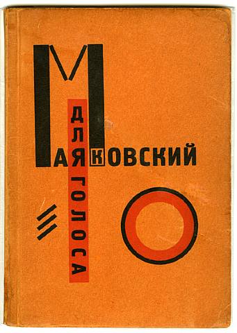
Already in 1923 El Lissitzky was thinking further than just a bunch of papers in a hard cover, when he published an interesting little book with poems of Vladimir Mayakovsky accompanied by graphics by him self, under the title “For the voice”.

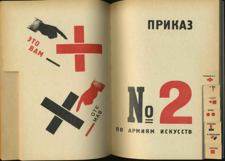
To make it easy to locate a specific poem Lissitzky made the kind of index we find in phonebooks at the edge of the pages. But where in the phonebooks you look up a name by the first letter, Lissitzky made small abstract symbols or thumbnails of the graphic that accompanied the specific poem in the book.
This way Lissitzky moves the form of the book away from the formal form and at the same time he plays with an already known design, that doesn’t make people confused but rather triggers a desire to explore. I really think that this is a great way to stimulate peoples curiosity to look in the book, which is the whole point of making one. It’s very inspiring.

sculpture in space on figure in future


Sunday, January 24, 2010

In 1913 Victory over the sun was firstly performed in Moscow. From aesthetic perspective, it was Malevich who was responsible for the costumes and decor, we may recall upon this happening as the start of Suprematism.
In 1920, this time directed by Malevich, the opera was performed again. During this period El Lissitzky made his lithographic designs for the nine figures from the opera. Instead of costumes he designed electromechanical puppets. Puppets that would be controlled by one person. Lissitzky deliberately left this concept at the stage of the lithographies, as he had made his mind up that he wasn’t going to be the one realizing the project. “You can do this”, was his vision.

In terms of fashion, there are many ways to encounter these designs. I myself encountered three major elements that can be related with contemporary fashion: technology,expression and giving emphasis to -suprematist- shapes by utilizing them in a different context.
The use of electro mechanism could have easily inspired the work of Turkish designer Hussein Chalayan. This element comes strongly back in his 2007 spring/summer collection, used as a tool to transform. The remote control dress as an interesting outcome of the same mentality.

Dutch designer duo Viktor & Rolf greatly succeed in establishing moods and characteristics through their designs. Making these -invisible- elements visible and more importantly visual. A resemblance that goes up for every figure from the opera designs by Lissitzy.

British designer Gareth Pugh touches on these elements too, though in a more abstract way. Abstract in the sense that clothing no longer hold on to the outlines of the human body, but -form wise- is completely free to go into any directions. Great representatives of these elements are Japanese fashion designers -or rather fashion sculptors- Issey Miyake, Rei kawakubo and Yohji Yamamoto.

XX- ,The Book


Saturday, January 9, 2010

XX- is based on a research-approach that focuses on the intensive examination of typography and writing in all its social, societal and aesthetic ways of application. In the 2006 ‘typography class’ at the Leipzig Academy of Visual Arts, we (Elisabeth Hinrichs, Aileen Ittner and Daniel Rother) developed our project on the visual implementation of “symbols of power” in writing systems under the conditions of a totalitarian regime. In particular, we examined the way in which the SS (Nazi SS 1925-45) presented and visually legitimated itself by means of a constructed sign . A collection of sources was created on the basis of intensive research in libraries, state archives and the Internet as well as of interviews with contemporary witnesses. This collection was the starting point and the foundation of that book XX-, The SS-Rune as a special Character on Typewriters.

In its three chapters FEMALE (FRAU), SIGN (ZEICHEN), MACHINE (MASCHINE) the book XX examines the way in which administration, communication and technology were an elementary condition of the functioning of the annihilation apparatus in the Third Reich.

The book’s content consists in visual (advertising and propaganda images, files) and textual fragments (contemporary, philosophical, sociological statements as well as statements related to cultural studies and encyclopedic entries).In it, history is interpreted, displayed and arranged. In this sophisticated way of dealing with history which makes its documents visible and discloses them for use the book XX- questions its sources and their perception. In its hybrid composition as a file as well as a book its design employs filing techniques such as a registry, catchwords, numeration and categorisation and embeds these into a book format.

The book XX- is composed as a symbiosis of a file and a book cover and thus refers to its sources: The archive and literature. Constructed solely of visual and textual fragments, it uses available literature (contemporary statements, encyclopedic entries, philosophical, sociological, political and linguistical standpoints as well as statements related to cultural studies) and images (advertising- and propaganda images of the 30s and 40s, files).

In the book, fragments are juxtaposed without them being commented in way resembling an archive. Thus, they demand an independent analysis and an autonomous evaluation of the different opinions by the reader. The selective constellation of the sources takes on the book’s structures: Their succession and compilation are fixedand thus generate a new content. The resulting hybrid presents history and questions its alleged absoluteness and unambiguousness at the same time.

The book XX- questions its sources and their perception In a sophisticated way of dealing with history that makes its documents visible and discloses them for use. Thus the closeness of the book as a medium is abrogated in favour of a new perception of historiography. History is interpreted,  displayed and arranged in a reflection of the medium.

by Elisabeth Hinrichs, Aileen Ittner, Daniel Rother

Title: XX- (The SS-Rune as a special Character on Typewriters)
Series: orange files. Studies on Grammatology # 1 [orange files. Studien zur Grammatologie]
Editors: Julia Blume, Prof. Günter Karl Bose, Institute for Book Design at the Leipzig Academy of Visual Arts [Institut für Buchkunst der Hochschule für Grafik und Buchkunst Leipzig] Leipzig 2009
324 pages, 198 images, 420 citations, hard cover, cost €49
ISBN: 978-3-932865-55-8

1000 Contemporary political posters


Monday, December 7, 2009

For this last posting I wanted to find a book wich I could connect to my other two postings. In the search system of the library I searched on the tagword ‘754.‘. Out of the hole list of search results one title popped out as ‘could be interesting’. The book was in the design category and had the title: ‘Prop Art over 1000 contemporary political posters’ . So on the cover of this book you could already find two tags of my previous posts (1000 and 754.). Political posters always try to convince you of something that the party who spread them stands for. In that way this book is also connectable to the tagwords direction and signs.

The book itself is filled with pictures of political posters, some of them in color. Most of the posters have something to do with war, or the remembrance of a war. But next to them are also posters shown about ecological movement and the women’s liberation.

754.1 -YAN-

Your body is a battleground


Monday, December 7, 2009

Thinking of women artists and graphic design leads me to the work of Barbara Kruger. It connects design, feminism, art and references also to my personal story, namely of seeing an exhibition of her work and loving it.

The work of Barbara Kruger can be qualified both as conceptual art and graphic design. She combines black and white photographs with phrases set in vivid colors, juxtaposing imagery and text. Her work addresses the complex interconnection of gender and the marketplace, and criticizes sexism and the circulation of powers within cultures.

I find her work interesting because it is interdisciplinary. She is not bothered by formal qualifications (is it design, is it art, is it politics?), but instead says that she likes to work with words and images. She wants to address her audience directly, and chooses the medium which she finds fitting. This ‘no fuss’ attitude in combination with the content of her work is inspiring.

708.4 Isa 1

The Session


Monday, November 16, 2009

The Session is an Amsterdam based thematic fanzine run by a group of artists and designers. The Session takes place for one day every second month, during which works around a specific theme are being made.

The group uses different methods and media, from drawing to research to songwriting. There are as few rules as possible in order to keep things open and uncomplicated. The members of the group are taking turns in deciding the theme to work with, members can invite guests to join a session. The member deciding for the theme of an issue is the publisher and responsible for editing, design and (re-)production. This means that every issue will look different, that every issue will be compiled with a different approach and produced in a different way, testing out formats and techniques. The Session is a flexible container for any kind of content, trusting in the spontaneous quality of its Sunday-afternoon outburst. Issues released so far are:
(1) The Banana Session (September 2007)
(2) The Colo(u)r Session (December 2007)
(3) The Weapons & Armour Session (February 2008)
(4) The Secret Session (March 2008)
(5) The Holiday Session (June 2008)
(6) The Psychedelic Session (September 2008)
(7) The Obsession (January 2009)
(8) The Amsterdam Session (May 2009)
(9) The Last Session (September 2009)

The Session are: Monica Tormell, Tomas Adolfs, Staffan Björk, Tarja Szaraniec, Matthias Kreutzer, Kalle Mattsson, Orpheu De Jong and Jens Schildt.

http://www.thesession.nl
http://www.myspace.com/thesessions

http://www.thelastsessionradio.com

reading the library


Monday, November 9, 2009

“reading the library” is a project by tristan schmitz & namik schwarz. the aim was to “index the library” by arbitrarily reading out authors and book titles in a library corridor. the reader uses the architectural circumstances to walk through the bookshelves. each author or title leaves a hint about the literary genre and subject. “brahms” or “mozart” are connected with music, so the library must include media about music in the broadest sense.

Get the Flash Player to see this content.

we developped project at the ArtEZ Arnhem this year with paul gangloff.
if you want to see the whole final result of that project go here

if you are interested in the subject, her are some more links 1 2 3 4

Game called S, M, L, XL


Wednesday, November 4, 2009

I entered the library with the intention of taking the first book that catches my eye, even it is based on pure visual, superficial attraction.
The book that I noticed first was standing right next to me and I instantly decided to take it because it brought me back to my past. It was a massive book called S, M, L, XL by architect Rem Koolhaas in collaboration  with designer Bruce Mau. I was 13 years old when I  held it in my hands for the first time and I was playing with it by choosing words and sentences from it randomly, translating them into my own language and retyping them in my big book of quotes. Today, 6 years after I played this game again and picked with my finger, with my eyes closed. The word was DISORDER.

-KOOL- 2a

De Daily Whatever


Thursday, October 29, 2009

De Daily Whatever was founded in 2006, as a free and independent newspaper. The newspaper was being produced ‘on the spot’ during the Dutch Design Week in Eindhoven. The main motivation for starting up the newspaper was to inform the public on design topics and to stimulate the local design climate by bringing exciting theory and hereby provoking debate which in return can stimulate innovation.

De Daily Whatever 2009 was edited and printed from room 9 at the Van Abbemuseum in Eindhoven. This years editors: Eric de Haas, Hugo Naber and Lucas van Hapert, www.dedailywhatever.nl

online editors: Hexaplex.

Experimental interview


Thursday, October 15, 2009

What is the connection between Experimental Jetset, Johannes Schwartz and Herman Verkerk?
Besides the fact that they are all based in Amsterdam, that they can speak Dutch, they all like to create beautiful and witty designs or images, they like to question their practice, they like to experiment and they actually teamed up together several times, another crucial connection appeared recently: the three of them are going to participate to a collective interview project…

After discovering more about their work, it became obvious that there was something interesting to investigate about their collaboration. What make several people or entities meet and work together? Are they alike or on the contrary, are they so different that they complement each other…?

For that reason, we interviewed them using the same process:

>> AN INTERVIEW IN A SUITCASE
We visited Johannes Schwartz, Experimental Jetset and Herman Verkerk, carrying with us this suitcase. Inside the suitcase, many different objects. Each interviewee was invited to open the suitcase, to browse through it and to freely react to the objects they found in it.

The results were surprising, exciting and very interesting. But when it comes to decide what brought the three of them together and where they meet… you are left free to listen to the interviews and to make up your own mind!

Experimental Jetset, Johannes Schwartz or Herman Verkerk

Why Helvetica?


Wednesday, October 14, 2009


The work of graphic designers unit Experimental Jetset is often associated with the use of a very limited amount of typefaces, mostly Helvetica. Is it an easy way out, typographically? Or is using Helvetica a tribute to modernism? Now, after using Helvetica intensively for over ten years, Experimental Jetset still finds it an intriguing typeface.

This video was embedded using the YouTuber plugin by Roy Tanck. Adobe Flash Player is required to view the video.

However, why Helvetica?…… Why_Helvetica

“Less or More” One Design Week Sofia


Sunday, May 31, 2009

Sofia Design Week was held in Sofia Bulgaria from June 5th-12th 2009.

Dima Stefanova, designer of the website of Gerrit Rietveld Academie and Sandberg/Design Institute and Henk Groenendijk, moderator of Designblog form together Icecreamdesign. As advisers they are involved from the beginning in this fist ever Bulgarian Design Week. As speakers and organizers of the “Bird’s Eye View” workshop they participate in the program.
“One Magazine” interviewed them for their latest issue

Next Identity Forum took place during a 7 day long event with lectures, workshops, exhibitions and presentations that gathers representatives of the worlds design avant-garde in product, communication, graphic and interactive design.
In search of its next identity, Sofia welcomed 17 of the most indicative in their field. Putting Sofia on the global design map for the first time.  Ji Lee, Niessen en de Vries ( the succesful traveling instalation TM-City was on display again), Peik Suyling YD+I, Frank Tjepkema “Tjep”, Marti Guixe, Erik Kessels from KesselsKramer, Lust en Ruedi Bauer were attending among many others.

FunctionalVsEngagé


Thursday, May 28, 2009

In my first post about two of the most important and influential dutch graphic designers, Wim Crouwel and Anthon Beeke (pdf), i tried to compare them by their different approach. Especially the way Beeke designed, really intrigued me.
It was provocating and controversial which made him one of the leading conceptual engaged designers.
On the other side, Wim Crouwel is known as a more functional designer, which means less conceptual.

But is it really that easy to divide and are all this categorizations correctly made?

Especially in the case of Wim Crouwel i doubt it. His design of the new alphabet was based on the begin of computer technology, in a time were blogs, facebook and internet in general didn’t exist. Coming up with a font type based on this new technology combines in a perfect way a clear, functional and computer like approach. Computer like is also the keyword for, in my opinion, a highly conceptual design.
With the awareness that this technology will change they way we communicate, document, the way we are. His style is timeless (even if it also relates to the early 70s) and applicable still nowadays.

Beeke’s Human alphabet, using the aesthetics (look at the swedish film makers Ingmar Bergman and Vilgot Sjöman) and social and political topics like sexuality, seems more related to that specific time.

So Aesthetics is next to conceptualism and functionalism a really important aspect, what makes Crouwel’s design less depend on a certain time period.

Never the less, Anthon Beeke’s radical and shocking way, even if it is not so applicable in our times anymore, was responsible for breaking through the conservatism of (Graphic design) and is so a mirror of other important political and social openings in this time period, and even if his aesthetics are not so up to date, his conceptual engagement is.

link: The Human Alphabet as a visual brand

link: Anton Beeke exhibit at Centre for Visual Arts Zeeland

Rietveld & Beatles, Identities with a content


Wednesday, May 13, 2009
Building & Identity became subject of plans to move Amsterdam’s Art & Design Academy (The Gerrit Rietveld Academie) to an other location.
Academy and building named after the same conceptual visionair Gerrit Rietveld cause an interesting concourse, in which the identity of our renown academy building is suddenly confronted with an evenly famous and internationally renown educational identity. (link to student research)

As part of a teachers and students protest against the “ad hoc” plans, celebrating the 42nd birtday of the Rietveld building, a T-shirt was designed after the famous “Beatles” T-shirt by Experimental Jetset, to emphasize this realation between content and identity. Rietveld is building and students and teachers as the Beatles still are John&Paul&Ringo&George. link

Rietveld for Rietveld
www.rietveldforrietveld.org
The goal of this website is to open the discussion on the preservation of the historical Rietveld building for the Gerrit Rietveld Academy, Amsterdam.

Read more about this and all ongoing facts and publicity  ¿GRA becomes GAK?

Who Sets The Standard!


Tuesday, May 12, 2009

Today, virtually every designer works with the same creative software, which to a large degree determines the aesthetics of design. Millions of websites make use of just a handful of basic layouts. Browsers, search engines and content management systems have the same implications for the design of the web as the offset press and the A4 format once had for printed material.

Technology has always had a great influence on design. The modernistic visual language became successful because it could be easily reproduced, not because of its idealistic principles.

The business community, brands, and media fight for the attention of the critical consumer. Design speaks a universal language and extends beyond geographic borders. Jan Tschichold can be satisfied.

The question is who was really responsible for this: celebrated superstar designers or anonymous engineers driven by ingenious marketing concepts? Successful design has become the equal of generic design. Recognition is the most successful product of our time.

Nothing Is What It Seems


Sunday, May 10, 2009

Anton Beeke’s poster for the theatrical play “Bloed van de Hongerlijders” (Blood of the starving ones) is a complex, yet at the same time striking “in your face” like work. Attempting to create an image that contains a deeper psychological meaning, Beeke executed the work while making use of different techniques. First of all there is the photograph, depicting a man in probably his early fifties. Furthermore present are yet two other photos. Where the first photo seems ordinary in the way it is presented (one recognizes a portrait that is, consistent with the convention, merely showing the face of the person depicted and partially the neck), the two other photos are peculiar. They are both cut-outs from other photos, pasted on the first picture. All the more strange it seems that also these two photos differ from each other. Although they both fit on the man’s face (from which they seem to be copies), they physically don’t match. Whereas one might assume that the right picture is a genuine copy of the original, the left photo shows spots and irregularities that could be associated with sickness. What could be going on here? Are we dealing with a Janus-like figure, perhaps a schizophrenic madman? Or was Beeke only pointing out an ambiguity with which we would be confronted with while attending the play? Presumably the answer behind these questions lies hidden within the layers of this work. Until we see it, we can only speculate. And exactly this curiosity is what a poster should revoke!

WHEN THE FACE BECOMES A MASK

What has happened to this man? Are we dealing with a Janus-like figure, perhaps a schizophrenic madman? And what could the artist’s intention be? Might Beeke have been pointing out an ambiguity with which we would be confronted with while attending the play? Presumably the answer behind these questions lies hidden within the layers of this work….read more about his poster in the linked pdf

Buckle up, and Slap me in the face..


Friday, May 8, 2009

My father once said to me that a good piece of art should slap you in the face.
Even though I disagree with him sometimes, I liked that a lot and I like to be slapped in the face.. It is not often that you are struck by something in such a manner that it stay’s in the mind and overgrows everything that mattered less.
Of course the blow can come from different angles (beauty, shock, alienation, directness, physical impact) but looking at this poster from Anthon Beeke I immediately experienced the ‘slap in the face’ again.
A lot of my fellow students thought the thing horrid and filthy and I can totally understand that. This image illustrates some of the associations we make between for instance : women, horses and sexuality. I think that feeling of repulsion comes from the hidden knowledge we have about our own beastly behavior and the gender specific features that come with that. Moreover it touches upon the similarities between humans and animals.
A while ago one of my friends said she had seen two horses mate and that it had horrified her, why?, because the aggressiveness with which the stallion had moved reminded her vaguely of her ex-husband.
We can find the truth within language; do we not refer to certain men with the word ‘stud’? And do we not aim for a specific type of woman using the term broodmare?
Some displays in this exhibition made me curious, some designs were funny or even beautiful, I marveled over the poster designs from Jan Toorop and Jan Tschichold, However…; appreciating something is not the same as being hit by something. Anthon Beeke really struck, with this beautiful, raw and direct image.
This poster was made for a tragedy written by Shakespeare, I will never forget that play now, and I every time I saddle my horse for a ride I will think about Troilus and Cressida.

LUST DOES NOT MAKE ME HOT
Why is it that some works of art stay with you, and others do not?
When you go through an exhibition, an art fair or an Art book there are only very few things you remember, that stay with you, the rest ….. will be continued in this linked pdf


Log in
subscribe