Skip to Content Skip to Search Go to Top Navigation Go to Side Menu


"architecture" Category


Designblog: Entering the 3rd Season


Tuesday, September 8, 2009

Welcome again to Designblog.

We hope you have enjoyed all our contributions and project of the last season published by the students, professors and guests of the Gerrit Rietveld Academie Foundation Year’s Design Program.

As an education project Designblog is constantly publishing new content and reinventing it’s format. Not satisfied with the option of being a publishing platform only, we do investigate all posibilities to become an engine aswell. We hope you enjoy the experiment.

Designblog is also a platform to show some of the dynamics going on in the Foundation Year’s Design Program and the many faces it can make….like:

.

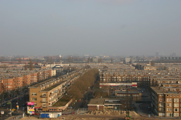
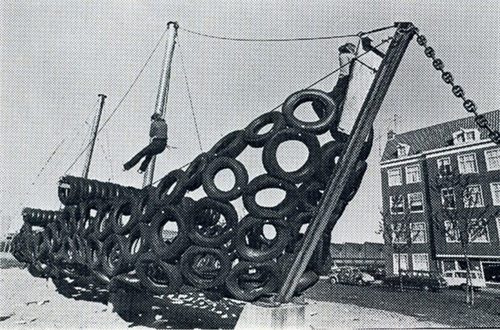
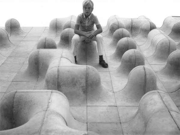
DESIGN OF SPACES/architectonical design by Carla Boomkens

A project in which the making of spaces and their expressive means are investigated.   Both real size- and scale models of spaces are ventured in this short-term research-laboratory on visual, functional and communicative qualities, according to a well specified theme.

Ranging from a tent-cabin to the built environment of a city, the very function of the constructed space offers the specific features to it, and thus the means for visual expression: defining the way a space can be specificly experienced.   By analyzing the function unforeseen connections are to be revealed, which broaden the effective visual spelling and open doors to subtle and precise visual communication.

Examples of existing spaces and/or buildings will be extensively introduced and discussed as guidelines: the knowledge and understanding of the motives of their authors challenges to reflect on the motives of one’s own expression – it both intensifies and relativates.   The visual research is valued as the most important contribution to the workshop, the results are considered as a consequence, not as a singular aim.   About technique for building: through the making of the (scale)models the fundamental principles of construction will evidence themselves – and will be coached when the work calls for it.

text by Carla Boomkens /images & models by the students

slowMe: tagging slow design part 1


Monday, May 4, 2009

Wonder where all the tagging started?……….

It was the 5th of February when we started a project moderated by Carolyn F. Strauss, designer, curator and founding director of slowLab. Together with the students of the FoundationYear’s D group she lectured and set of an investigation into slowdesign and related designers and artists. True to the principle of personal connection we started with a quick mapping of ourselves and our working process as designers and artists in relation to “slow” as a subject. Mapping to find keywords for processes and experiences that make up our conditions and inspiration for behaving and performing, to visualize that flow and determine specific tags to describe it. How do these tags symbolize slowness in our work and working process.
Ask yourself the question “slowMe”?
The results became clear instantly through a series of “slowMe” postings

read also: tagging slowdesign part 2

¿ GRA becomes GAK ?


Wednesday, April 15, 2009

¿GRA becomes GAK?, a forum for students and teachers.
Read all comments below!


GAK building is located close to the “Bos en Lommerplein” and the A10

SPACE: As the Gerrit Rietveld Academie is struggling with a capacity shortage it is seriously considering to move to an other location, Designblog wants to provides some background information about this proposed “possible” location .

SPEAK YOUR MIND: Last week after a meeting with the coordinators (chairs) of all departments and the Board of Directors, a request has gone out to speak our minds about a location to house the growing academy. As a result of pragmatic managing the Board of Directors proposed to move to the GAK building located in the Bos and Lommer district. The City of Amsterdam injects millions to upgrade the poor “Bos en Lommer” district and again The Rietveld seems a perfect candidate for their plans.

QUESTIONS: Is the stage already set or do we realy have a say?
If so, let’s asks some questions: Was it not just 5 years ago that the Academie was renovated to be the pearl in the (now in crisis) Cultural/Financial district plan “Zuid-As”? Do we want to move to an office building not better than the new one we already have and dislike? Why is there no alternative in a city that is constantly rehousing cultural institutes and academy’s in town? Do we want to live and work together in one building? What happened to “the dream”?


Architect B.Merkelbach, co-founder of “the 8 & Opbouw” movement.

GAK building: The former GAK-building (City Administration Office for Social Security) is an overwhelming building, dominating -Bos en Lommer- from the A10 Ring way. It has been nominated for a monument status.

MERKELBACH: Build by the architect B. Merkelbach at the end of the 50ties this huge office building housed 3000 office workers. It still is one of the biggest office buildings in Amsterdam. The building is empty since 2005 and gives temporary accommodation to user’s like the Rietveld (2008) and Stedelijk Museum (2009). Many plans are made for a new occupation, but none of them are realized yet. browse through these links to get an idea: old news?, Rietveld Site, Amsterdam-promosite, Monument?
“the 8” MOVEMENT: B.Merkelbach was co-founder of the architectural movement “the 8”. A movement that promoted a pragmatic functionalism and as such opposed the other movements of that time “The Amsterdam School” and “the Stijl Movement”. Merkelbach cooperated with Rietveld in the early stages of developing the Rietveld Academie until he became subject of city politics as a municipal architect. for more info link to: NAi or Arcam

The 8 is anti-KUBISTIC: With this statement they attack the Stijl group (founded in 1917 with prominent members like artist van Doesburg, Mondriaan and Gerrit Rietveld). They promoted an attitude which was against feeling and individualism and for rationalism as a means to express the needs of the society, emphasizing a more functionalist direction in architecture.

The question is, why can’t “The Rietveld”, as a leading World Wide renown Academy, not set it’s own trend again and enrich the city with a bold visionary statement in housing.

_______________________________________________________________________

To read all about this plans: newspaper articles, GRA Newsletters and the critical opposition (petition) link to:

rietveldforrietveld petition website

Volkskrant article April 30th, NRC column by Maria Barnas May 5th, ArchiNed May 14th, AT5 TV May 15h, Parool column by Ronald Hooft May 15th,  Parool.nl May 16th, EyeMagazine blog May 18th, Parool.nl June 20th,

official plan (Gerrit Rietveld Academy Newsletter/Ned) May 8th, same Newsletter/Eng version, Signing postponed until September (GRA Newsletter May 15th)

Gerrit Rietveld Website
read also the comments. Most recent comments as they are connected to this posting!

Beond shelter


Thursday, April 2, 2009

It is possible for the human being to adapt to all kinds of environments and situations, but without a stimulative environment, inhabitants easely get the feeling of lonelyness, boredom and estrangement. “Beond Shelter” is a publication published in connection with the Dutch contribution to the 1976 Venice Bienale in which Tjeerd Deelstra, Hein Reedijk and Gijs van Tuyl give a comment on –current housing– situation at that time in the Netherlands.

As a result of the construction projects of the Dutch suburbs in the 70’s, the architects no longer knew for whom they were designing. They no longer had the same importance in the final say of their projects. It was more up to the construction companies to decide the size of the projects and architects kind of forced in to massive scale buildings. Whole suburbs where competed in few years, leaving no space for inhabitants to give their own charm to the area.

If the speed of construction for new dwellings could be more critically planed and the scale reduced, it would be possible to experience a direct contact between the inhabitant and the architect, or even architecture without architects to let the neighbourhood grow organically and let it have the characteristics of the inhabitants.

cat.nr: 719.1-cat-1

keyword: freedom

Neon in Vegas vs Flaneurs in Paris


Thursday, March 26, 2009

In my previous post I talked about “City Signs and Lights”, about the design of a modern city landscape, attracting customers. City signs are in an ongoing competition for attention. In this post I want to focus on the interaction between the consumer (the flaneur) and the environment. I would like to shift between two cases: the architecture of The Strip in Las Vegas and the passages in Paris, in the first half of the 20th century.

The passage is a covered shopping gallery. The culture philosopher Walter Benjamin wrote about early consumer culture in Paris in his text “Passagen” (1930). He describes the citizen as a flaneur, not as someone who is exposing him/herself, but someone who is exposed to the attractive lights in the shopping gallery. The flaneur is a person who walks through the city without a specific goal. He/She gets into an ecstacy, going from one attraction to the other. The city unrolls as a landscape to the eye of the flaneur, but at the same time, locks him in. Benjamin calls this new city environment a “Fantasmagory”, the city becomes a dreamworld where different rules apply than in reality.

” If there is one place where colours are allowed to clash, it would be the Passage; a red-green comb is hardly noticed here ”

(W. Benjamin, Passagen, 1930)

I believe that Las Vegas is a great example of a modern day Fantasmagory. The city is almost entirely made out of neon signs. After the second world war, Las Vegas was growing extraordinarily fast. The consequence was a speed-up of competition along the Strip (the central road through Vegas). The actual buildings are all more or less the same: low, but a large ground level surface. This has to do with the climate and economical reasons. The outside of the building needs to stand out, both during the day and night. The result is a total mash-up of different styles, quotes, hightened symbolism, eclecticism, all in neon lights.

In the end, the building itself becomes a sign.

Vegas references:

W. Benjamin, Passagen, 1930

R. Venturi, Learning from Las vegas, 1970

Cocteau Twins, Heaven or Las Vegas, 1990

05-heaven-or-las-vegas

cat. no. 700.6-benj2

keyword: neon

Shelters; the joy of self- sufficiency and freedom


Thursday, March 26, 2009

In the earlier times of human kind people built their own homes, grew their own food, made their own clothes and tools. They where self sufficient and the knowledge was passed on from generation to generation. With industrialization and increasing population, this knowledge has been put aside and most of it now lost.

It´s kind of impossible and pretty utopian idea to turn back to these old living habits, especially here in the west,  but maybe we could try to find a balance in our lives between what we can make with our own hands and what still must be done by machines. So before running out to the store we could think twice and see if we really need to buy this item that we need.

The more we can create for ourselves, the greater will our individual freedom and independence be.

cat. no: 710.9-kah-2

keyword: freedom

8 reasons


Thursday, March 26, 2009

1. if you are searching for the best way to walk clumsily with a book, take this one.
2. if you want the best book for architecture of 21 century.
3. if you are searching for a book that is 4 kilos, this is the best choice in the library of the Rietveld Academie.
4. this is the best book if you want one that probably will not fit into your bag.
5. if you want to have a book that is larger than A3 format and if you open it, even larger that A2, then this is the book .
6. if you want to know everything about the architecture of 21st century, this is probably the best book for   it.
7. if you want to carry a book that makes everyone say ” wow, a big one” this is the best choice.
8. if you want to find out more about this book, the best way to do that is to go to the Rietveld library and search . .

cat. no. 715.9

keyword: best

big, bigger, biggerest


Wednesday, March 25, 2009


It was big….impressively big. That’s why.

Maybe it wasn’t fair for the other books, because this book was also on a ‘special’ place. It had a place of its own as if it was more valuable than the others.
It’s not that I’m a shallow person, but it just caught my eye because of its physical appearance.
I think the pattern on the outside was disastrous by the way.

This book is about patterns. I became really fascinated about patterns, because it seems to bet hat everything becomes a pattern as long as you repeat the shape, form, act or colour over and over again. This is also how patterns become part of our life. Interesting

…At least I thought so

cat. nr. : 701.9-sch-1

keyword: repetition

Paperback


Tuesday, March 24, 2009

In een rij boeken zal dit boek niet direct opvallen, maar toch viel mijn oog erop. Juist de bruine kaft die aan karton doet denken wekte mijn interesse. Het geeft het boek een natuurlijke uitstraling en sluit daarom goed aan op de inhoud van het boek. Ook het formaat spreekt mij aan, het ligt lekker in de hand; niet te groot maar toch een redelijk dik boek. Ik wist niet direct de betekenis van het woord ‘dwellings’ en om daar achter te komen begon ik door het boek te bladeren. Het bevat afbeeldingen van hoe mensen over de hele wereld hun eigen huizen bouwen. Het is ongelovelijk hoeveel verschillende manieren van bouwen zijn ontstaan door verschillen in klimaat en cultuur. Indrukwekkende constructies worden weergegeven in tekeningen en de teksten bij de afbeeldingen geven snel informatie zodat je er makkelijk doorheen kunt bladeren zonder perse meteen de hele tekst te lezen. Ik bleef geboeid tot ik het hele boek bladzijde voor bladzijde had door gebladerd.

cat. no. 710.9

keyword: culture

Thank you, LEGO


Sunday, March 22, 2009

You start playing with plastic cubes…
for now, they are big… easy to fix…

they get smaller… it s time to play more precisely…

they are really tiny… play really precisely…

50 years later… still playing with cubes…
but now, they are huge… really huge…

cat. nr: 710.9-cat-6

keyword: playground

EXCAVATION (part 1)


Thursday, March 19, 2009

A pyramid

A book I found interresting is about pyramid design in ancient Egypt. The quality of the designs created by the ancients can be very inspiring tough it may seem a bit qliché, the mystery around the monumental pyramids as a timeless form are still facinating.

The book is an old and worn pocketsized relic it self. Its plastic wrapping that is protecting the cover almost falls off as you open it. It contains lots of illustrations and groundplan sketches of pyramidstructures, materials used, design methods and tools.

cat. nr: 712.5

keyword: pyramid

FAST, BABY YOU HAVE TO THINK FASTER.


Monday, February 16, 2009

FAST, BABY YOU HAVE TO THINK FASTER.
Because this will not work in OUR reality.
No, I can’t think like this.
That is what she said.
My answer was: my apologies, but i simply don’t have any time left.
Would you mind?
The next one please.
GOD what a nightmare.
Where are my feelings?
No not necessary they make me run out off time,
and time is MONEY AND THAT IS WORTH A LIFE, even your life realize that.
YES MADAM. I said.
A LONG LIFE WISHED FOR THE ASIANS,
said my boss.
AND WILL BE REPEATED BY ALL THE  BOSSES IN THE WORLD TODAY.
TOP SPEED MY BELOVED FRIEND.
CAN YOU GO 2000 k/m a hour?
DOESN’T MATTER THE MACHINE CAN.
RAPID.
BLACK.
WHAT A NATION
WHAT A LIFE.
And there it went.
MY TIME
MY LIFE.
MADAM it’s o.k now.
It is different here, they name it SLOW.
I can glance at you,
only you will not be able to see me.
AND I WILL NOT BE ABLE TO TELL YOU,
THAT YOU WILL MISS THE ART IN YOU MY CHILD.

posted by Beties Sadaty

Persoonlijk


Thursday, January 22, 2009

Inspiratie halen uit iemand anders’ leefomgeving. Zoeken naar de punten die jij interessant vind en vanuit die inspiratie twee milieus samen laten komen. Een plek waar zowel jij als de ander zicht thuis voelt. Iedereen heeft zijn eigen persoonlijke ruimte binnen een groot huis en met die gedachte moesten er nieuwe omgevingen gecreëerd worden.
Bij architectuur projecten gaat het voordat je begint eigenlijk altijd om een onderzoek. Over wat voor een plek je wil ontwerpen. Is het een plek in de openbare ruimte speciaal voor jongeren of ga je iets maken voor alleen staande vrouwen.

about Tim Mathijsen


Thursday, January 15, 2009

Venicekade


Saturday, January 10, 2009

Can you imagine how great it would be to have a Rietveld’s pavilion at the Venice Architecture Biennale one day?
Well, last month group F did imagine that together with Carla Boomkens.

That special relation between the water and the land present both in Amsterdam and Venice was a starting point for their design assignment.
The projects and approaches differed a lot; from questioning the space by creating a path leading to the building to reacting on the ecological issues.
But just like the motto of this year biennale – ‘Architecture beyond the building’ all of their projects try to define space as the one measured in years, lifes and tons of melted ice, not necessarily in square meters.

posted by Marcin Przybile

The cube as a representation of a democratic art form


Wednesday, January 7, 2009

With a speech by Simon den Hartog, former director of The Gerrit Rietveld Academie, a small retrospect exhibit on the work of Jan Slothouber was openened at the “van Abbemuseum” in Eindhoven NL. An intimate group of affectionado’s and family bridged the gap of almost 50 years, when Jan Slothouber together with Willem Graatsma started his fascinating journey into the world of the cube. The Centre of Cubic Constructions represented a highlight in this extraordinary focussed research, culminating in the 1970 representation at the Venice Biennale.
Seemlessly scanning the architectoral space occupied by art and design, the exhibit –designed by Erik Slothouber and curated by Diana Franssen– clearly presented an extraordinary focussed spectrum of work

Some weeks later we revisitted this exhibit with a student research team of the FoundationYears C group. Exploring the cubic constructions we found direct relations between the work of Slothouber and the minimal art of Sol LeWitt. The choice for a simple universal and modular form makes it posible to built a grammar for an entire body of work in which all the steps in the process can become interesting in their own right. “in which even the concept can become as interesting as the final product” (Sol Lewitt, cat Sonsbeek 71).

The specific context of typedesign addressed in our workshop presented striking relation between their works and those of more contemporary designers like Radim Pesko and the Swiss designers Dimitri Bruni & Manuel Krebs of Norm

More research was conducted to explore related content or workapproach of other designers like, Bram de Does, Karl Nawrot, Na Kim (website) and Ji Lee.
This was part I of the C_group research.

All researches linked in this posting can be downloaded in A4 format and are also available as hard copy research prints at the ResearchFolders available at the academy library

Opzet geslaagd?


Monday, November 24, 2008

Voor Droog Event 2: Urban Play had architectenbureau NL Architects twee speelplaatsen ontworpen: de BoomBench en Moving Forest.
Moving Forest was een groep kleine bomen in winkelkarretjes. Eind september toen we langs de projecten van Droog Event 2 liepen waren de bomen al tussen stenen balken gezet, om ze bij elkaar te houden.
Het idee was dat voorbijgangers een karretje mee konden nemen en neer konden zetten waar ze maar wilden.
De gemeente Amsterdam vond de karretjes gevaarlijk en was bang dat ze midden op de autoweg terecht zouden komen. Helaas. Hierdoor kwam Moving Forest op mij absoluut niet geloofwaardig meer over. Het idee dat mensen hun eigen groene leefomgeving konden bepalen was ermee verdwenen en het enige wat overbleef was een dood gaand groepje bomen in ijzeren karretjes. Door de gemeente en hun ontwerpers op hun plek vastgehouden. Was het niet beter geweest ze nu weg te halen? Of het statement aan te passen?
Gelukkig had NL Architects dit zelf ook door en hebben de architecten hun project laten staan, maar achteraf de bomen verkocht voor vijf Euro per stuk. Zo voldeed het toch aan hun concept: de koper kon zelf de plaats van het groen bepalen!

Toen ik de bomen voor het eerst zag deden ze me vooral denken aan de consumenten-maatschappij en viel het dood gaan van de bomen in de ijzeren karretjes meer op dan het beweegbare van die karretjes.
Als je geïnteresseerd bent in mensen die zelf bepalen waar het groen is kijk dan vooral een keer naar de film Harold and Maude. Het is een detail, maar Maude besluit ergens in de film om een boom uit de grond te halen midden op straat, om hem mee te nemen.

De BoomBench van NL Arhitects was sowieso een geslaagd ontwerp. Hij wordt (haast) niet aangetast door vandalisme door het respect dat de meeste bezoekers er voor hebben. Hij veroorzaakt geen overlast en de enige klacht die binnen is gekomen is geloof ik dat hij niet harder kan! Hij heeft heel wat mensen geïnspireerd tot het maken van filmpjes. Check Youtube!

posting by Josje Kerkhoven


Log in
subscribe