Monday, November 9, 2009
“reading the library” is a project by tristan schmitz & namik schwarz. the aim was to “index the library” by arbitrarily reading out authors and book titles in a library corridor. the reader uses the architectural circumstances to walk through the bookshelves. each author or title leaves a hint about the literary genre and subject. “brahms” or “mozart” are connected with music, so the library must include media about music in the broadest sense.
we developped project at the ArtEZ Arnhem this year with paul gangloff.
if you want to see the whole final result of that project go here
if you are interested in the subject, her are some more links 1 2 3 4
Monday, November 9, 2009

- The first reason I chose the book New York nomadic design, was its title. Recently I visited New York and I thought that the book could complement the information about US design and art that I had gained from the recent trip. The book is the size of an average magazine, and is not too thick either. The cover has a metallic grey cover with a map of New York printed all over the cover. In addition there are four small images that are very different from each other. After a couple of introductory pages, I found that every single page contains three or four pictures with very little text. Those pages as well as on the cover show extremely different things, from a tent made on the street by homeless people to glossy slick furniture. I can appreciate the approach taken by the writer which is giving a real feel for the city.
Rietveld Academie Library No:9788425216213
Saturday, November 7, 2009
Walking in the library. Quite. All the covers of the books are staring at me. I let my finger go over them. Touching with respect. Curious, I move, from book to book.
The book, simple and unmasking nothing of the content.
The book, name and imageless.
Attracted, to the old brown colour.

My breath stops, my hearth bounces and I get a little dizzy. What kind of book does this with me?
Without knowing the content. Without showing anything of his content.
The book, different than the others.
The book, not predictable.
Attracted, to the nothingness.
Surprise me, I whisper. I caress the book. Don’t let me down.
Rietveld Academie Library No: 779.0
Friday, November 6, 2009
Even a single glance at a book cover becomes a decision, a judgment, based on certain criteria.
The book was misplaced, and it’s covers where filled with esthetically, (slightly), unappealing elements. What caught my eye was the title, or rather the implication of the subject. Even though the subject itself bears no great interest, I’ve seen other books with the same main idea which contained beautiful material purely visually.
This one did not. Instead, it contained another element that is in itself intriguing – photographs which bordered into becoming artificial and forced. Though, if the book had felt like a perfect compilation on this, I would have left it at the shelf after looking through the pages. Instead, it’s borders almost reaching something interesting / but not succeeding / was what made the decision of checking the book out, and it ending up in my backpack.
The idea of how to perfect it and make it my own
Rietveld Academie Library No: 908.1-lan
Friday, November 6, 2009
A completely blank cover surface among all the other books in the library. Just plain white with no text. No information. This alone awakens my interest. No title, no writer, no summary, no number on its back.
This book seams different. It comes on almost boring, but it still makes you wonder. Why is it like that? What’s in it? What does it say? Maybe it tells a secret which you can only get to know about if you pick the book.
The book doesn’t shine when it is on the shelf. It’s small, slender and white – very neutral. Maybe it contains something that has been hidden away waiting to be rediscovered.
If you look closer you see that it works as a box. So it hasn’t got the “normal” book feeling. When you open the box, you sense how fragile it is. Despite its abnormal appearance this book is like many others of its kind held together by tape.
Inside the box is a collection of postcards
Rietveld Academie Library No: 777.6
Thursday, November 5, 2009
Walking around the library, I laid my eyes on a book I saw last night at a friend’s house too. The book appeared to me a couple of times in my life before and I always absolutely loved it when glancing through. I knew this was my book. In a way it represents my interpretation of the world as I see it around me. The book is about being special in an ordinary way. It’s about objects just lying around at your grandparent’s house or things you see in other countries. This book represents designed, handmade and mass-produced objects. The extra ordinary yet normal stuff, from all around the world, showed in a funny absurd way.

What’s normal for one is very odd for the other, and so a lot of what’s in the book looks pretty weird to me. It makes you wonder… Are the items in my life normal?
Rietveld Academie Library No: 772.9-mus-1
Thursday, November 5, 2009
Why did I choose to write about this book? Why did I pick this one book from hundreds others? Why would you read this? Why are you reading this? Why would I write about a book if I choose it from subjective decisions in the library from the Rietveld Academy? Why is Obama president? Why did I got this assignment? Why don’t we know what this text is all about? I don’t know why. Do you know why? Why does why seems so strange to spell for me? Why am I trying to be funny? If I knew why I wouldn’t write this, or maybe I would. At least I would never use so much words to explain something thats not even clear to myself.
Rietveld Academie Library No:
Thursday, November 5, 2009
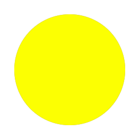
I choose a book on jewelry because jewelry often has some very nice organic shapes and colors that in a way makes them not much different from paintings. The reason I picked out this book about jewelry, instead of the others was because there is a yellow dot on the book which was the first thing that got my attention. The pictorial content of the book was more or less what I expected, when reading the title ‘Twentieth Century Jewelry’.
Rietveld Academie Library No:
Thursday, November 5, 2009
On my way to the library I didn’t really know according to what I am going to pick a book. I was confused. But the minute I stood in front of the library I saw in the corner of my eye a small, old and weird looking book that looks a bit hand made with metal binding and a distinct old brownish color. It was just lying there, alongside the brand new and fancy art books.
When I reached for the book I noticed that it’s even in worse shape then what I imagined, I looked at the book cover and I saw it’s a book about design and research. Then I flipped a few pages and discovered that some pages are a bit torn and with many pockets and inner plastic pages with plans of some sort.
I lent the book and started thinking – Why did I pick this book? Was it there for a reason?
I have never seen anything like it before. I am fascinated by my new discovery. Maybe we really should judge a book by its cover?
Rietveld Academie Library No: -struny- 3,- 9756
Thursday, November 5, 2009
My first impression when I saw this book was; “it looks very boring “!
The illustrations, the cover. The cars looks like at the years 50’s.
and that was what attract me about this book.
Going back to the past.
For me it was really old faction but also classic.
It is not what we accustomed to see daily in our time.
In some way I was very curious to discover what can I expect in middle of the two covers of this book.
I discover different models of old materials, furniture, cars and airplane.
My conclusions is that not always a cover can show what’s really the content.
But… in this case it was the same inside as outside.
I was not so imprecated.
Rietveld Academie Library No: 770,6 hes 2
Thursday, November 5, 2009
It is extremely difficult to ignore a weird Lord of the Rings, elf looking girl called Anita. Specially when it stands as a single, motion and emotionless portrait in the cover of a book. Difficult to avoid once again, as it stands next to what it seems like unreadable books full of text and content. A three second glance into Anita’s freaky, albino brawless eyes and four seconds into the side cover title to highlight it as the most interesting cover in the design book shelf.
Rietveld Academie Library No: 15046
Thursday, November 5, 2009
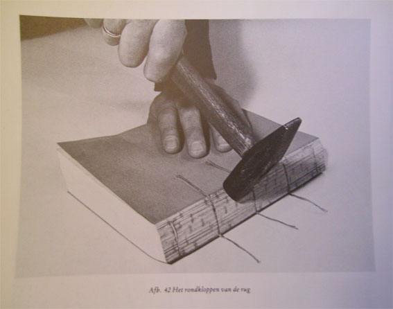
I choose this book at the first sight of the cover. After a few minutes, I thought it was a must-borrow book.
1.It looks old,old fashion and serious. And the photo in the cover caught my eyes.It is diffrent from most of books in shelves,the name of the book does not play main role in the cover, but the photo which with many interesting details.There is a old man treats a book with many sorts of tools on a workbench: a book is fixed on a strange wooden shelf by a clip,and the man is pulling a wire from that book very carefully. I am so curious that why he is punishing that poor book so seriously? It looks like doing a surgery for a book.
2.It is a dutch book,that means I tatolly can not understand the words in this book,even the meaning of the name,so I felt this a mystery book.And I like mystery things.

Rietveld Academie Library No: 757.7 kiel 1
Thursday, November 5, 2009
I really wish that I had a very intelligent reason to chose this book but it is a very banal one I’m afraid.
I found this book in the graphic design section, what felt very familiar because I went to a graphic school before the Rietveld. Seeing those graphic books felt like meeting an old lover.
I picked this book because it had the word “gold” in the title and there was a golden image on the back. I cannot help it, but I am sort of addicted to the color gold. I even named myself Goldish. I feel attracted to gold like mosquitoes to a mosquito lamp.

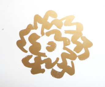
At the left you can see my own logo. At the right is the image on the cover of the book. There are some agreements between them like the dot. I think that the recognition also made me feel attracted to it.
Rietveld Academie Library No: 754.5 cat 32
Thursday, November 5, 2009
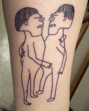
 Off course when someone asks me to randomly pick out a book of a small library stuffed with all kind of interesting books, I cannot be random anymore. The choice I will make, will probably say something about my subconscious preferences, and is therefore a tricky thing. And if I look at the books I chose, Tribal Tattoo Design and Swallowing Helmets I wonder if it were my subconscious preferences that took those books, or if my choice is determined by the subjective classification of the library. It is both. But if I look at my subconscious (or conscious) preferences, isn’t that also determined by for instance: our culture, our history and current tendencies?
The book about Tribal Tattoos first caught my attention by its yellow cover. This reminded me about the books published by a Dutch publishing company called: ‘De Bezige Bij’. The fact that I almost took a tattoo about 2 weeks ago has also something to do with it. Why Tribal? This probably attracted me because in my opinion tribal tattoos can be a bit corny, I think that is funny, and I like funny books. The book Swallowing Helmets by David Robilliard caught my attention because of the title, which I think is nice. It is weird to swallow a helmet. Inside it has poems and illustrations, some of them remind me of David Shrigley. The image is a picture of a tattoo made or designed by David Shrigley.
Rietveld Academie Library No: 908.9 din 1 and 758 rob 1
Thursday, November 5, 2009
I can buy a book without reading the backside. The only reason I buy it is because it appeals to me in a way. This can have to do with the cover, the title, the quality of the pages or perhaps something less obvious that I cannot quite figure out myself.
I believe I’m not the only one who has a pile of books unread at home. I am starting to realize now, why we practice this odd way of “throwing money away”.
There is no harm in letting these books fall into oblivion. What happens in between the covers of these particular books I can fill in myself. The story that develops in my head can be provoked by a specific look or feel of a book.
Hot Glass is my latest found.
It is a play, based on your “everyday” people, living their automatic lives. The little chances they get to escape into a life worth living, play an import role. Moments of sudden shock or surprise. Moments a feeling is at its strongest. Small revelations.
A book for those interested in the difference between what is real and what turns real.
Rietveld Academie Library No: 776.0 glass 1

Wednesday, November 4, 2009
my choice of this book (swiss folk art) or its choice of me – followed the following sequence.
i entered the library-. 1.) i chose a book on indian road signs. this choice, however, did not feel honest- the choice of it was hasty in the midst of the others fighting for those more striking or easily appealing books, i felt that i was influenced in some way not because i wanted that book but- because i did not want someone else to have it. so; 2) i decided to make another choice this time choosing a book that i had no affinity with un purpose-a grey dull and univiting book featuring fashion models, this choice was daunting, and felt highly ‘wrong’. 3.) i walked to another more remote section of the library and there felt stumped, lost, numb. then out of a hazey mindstate i was pulled by this book and the desire to possess it. i have still not opened it or looked inside.
Rietveld Academie Library No: eu-zwit 773.3 bau

Wednesday, November 4, 2009
I started looking for a book on my knees, because like in the supermarket the cheapest products are on the lowest shelf, I had this crazy idea that maybe the most interesting dusty books would be down there too. (of course this completely ignores the system of the library and is more an appropriate theory in a second hand store).
First I looked at the few books that were not standing but lying between two shelves. Nothing really interesting came up, and then I noticed a little book (the books I picked were always huge or very tiny). It turned out to be about typography and it’s called “Experimenta Typografica 11”,
it is written in different languages such as Spanish, German and French. It has different kinds of paper and also a few see-through pages. It is a shame I don’t speak Spanish, German or French but maybe this is protecting me from a huge disappointment.
I’m kind of falling in love with this little book as I’m writing about it. I might steel it.

Rietveld Academie Library No: -san- 3