Skip to Content Skip to Search Go to Top Navigation Go to Side Menu


Newton colour system


Sunday, February 2, 2014

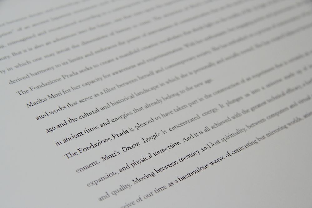
Isaac newton color system
Sir Isaac newton invented the color wheel, allthought i believe there were other color-wheels before, Isaac newton invented a few new aspects to the color wheel that were significant to our understanding of light and colors in the spectrum.

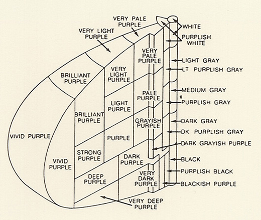
Color system picture:

wheen met kleuren

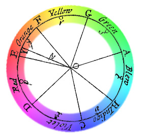
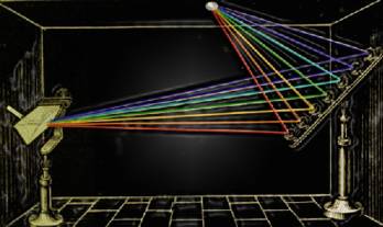
Newton made a box where daylight came in and through a prism divided in 7 colors, then he aims mirrors on this position to bring the colors back to white light again to prove his point. he figured out that al the colors have a different segment size on the spectrum. After Newton had used a prism to separate daylight and count seven individual colors, it appeared to him that, when considering color-hue, this was a closed system. By taking the violet end of the spectrum and linking it to the red start-point, he thus created a convincing circle of colors.

dark room

This happened in England 1704 and the system has the colors Red, orange, yellow, green, cyan blue, ultramarine blue, violet blue.

He also thought of colors like music, red as D orange as E f as yellow. G as green, A as blue, indigo as B and violet as C.

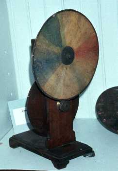
Newton created white from all colors again. From this idea he created a wheel that is used as kids toys today.
If you spin it really hard you would get white.

Color wheel:

objectcolorwheel


To start working with this system, i focused on light at first and try to experiment with light from the computer screen.

Get the Flash Player to see this content.

Get the Flash Player to see this content.

After that i focused on the music aspect. I tried to make a random song on an organ.

Then i made in after effects also a random shape that would move in a circular shape that would eventually turn into white. While i was working on it something went wrong with the audio and the tuning went up a few notes. This made it sound like an arcade game and without really much thinking a tried to do something with that but then i noticed that i was illustrating and moved on to the next step.

Here are some pictures of the movie:

film4 film2

film1 film3

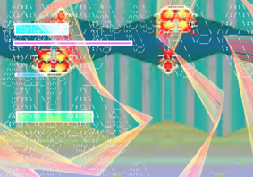
first color system on sound:

Get the Flash Player to see this content.

In the end i was not happy with the piece, its song seemed a bit too finished or a pretty song and the shape of the circular movement also didn’t really make sense to me so i started over.

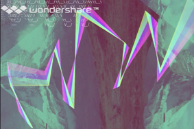
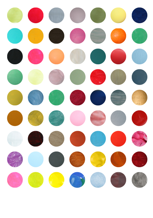
To keep it not to disconnected i recorded my voice when watching the previous made movie and try to react on it in a more primitive way. Then some notes came out, i tried to find the notes with a recorder/tuning device and timed there duration and see which color the notes have on the spectrum. Then i made a pallet and with this pallet in front of me i manually drew lines in after effects, since it’s actually a line that comes from the division of light into colors, but now interpreted trough a manually human action.

Later i reflected on why i choose for this manually drawing action and i figured it had something to do with me trying to visualize the joyful experience of newton being in this dark room with mirrors an prism and 2 way light from one end of the white light to the other end of the white light and standing in the middle of a space filled with colors mixed with the dancing happiness of finding this discovery, because if you see only the pallet spectrum image that i made then it is almost a computer like generated empty image, a data, a fact, a statistic from a to b. i choose to draw the lines vertically on the screen to give the impression that the circle of colors (and therefor light) is flat and moving in a circle which is including the space of the spectator and only documented on the computer screen.
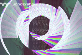
New Color System:

Get the Flash Player to see this content.

It was pretty hard to get the timing right since i don’t know the program that well and while i was making it i didn’t know what i was making since the line disappears after letting go of the mouse-click but it is then recorded on the video. i had to cope with the limitations of the program or my knowledge of the technique and see what comes out in the end without being able to undo one step because then you had to redo the whole thing which i did several times. i thought that drawing color in terms of light had an importance to the piece since a computer screen is made of light but in the end i wonder if the limitations of the program really benefited my approach so next time or maybe the next step i will avoid using a program like this and explore a more manual and direct approach.
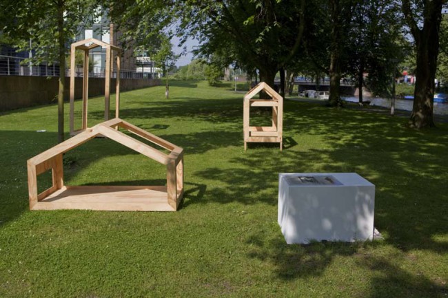
Naming Colors


Saturday, February 1, 2014

The first thing that I noticed about the image of the color system was the shape of a cake. And that was the only thing that seemed interesting about it. The second thing I got from the image: people have the urge to label everything. Why finding a thousand names for every little nuance of a color?

02isc

In the 1930s the ISCC-NBS-System was established by the Inter-Society-Color-Council in Amerika. The aim was, to create a color system that designates color for science, art and industry. The system consists of a set of blocks which is based on the color system from A. H. Munsell.

Between the years 1955 and 1976 the americans K.L. Kelly and Deane B. Judd developed the ISCC-NBS-System and reduced the color in increasingly fine blocks. For the definition of the colors they used the three parameters hue, value and chroma.

The system consists of 13 basic color categories which are further divided into more and more specific hues so that there are in the end 267 named categories.

In the example of the purple-segment you can see that Judd and Kelly used more or less subjective variables to define the color nuances: vivid purple, brilliant purple, grayish purple etc. When it comes to naming colors it is almost impossible to find the right definition that accords with everyone’s association. That might be the point, why the ISCC-NBS-System could not find enough popularity.

For the translation of the ISCC-NBS color system into my own concept, I chose as the main leading elements the shading of colors and naming them.

MG_9823_redu

As we can clearly see in the concept of the ISCC-NBS color system, naming colors is a very subjective manner. So I tried to see that as a chance for me, finding names for colors from an intuitive, very subjective point of view, knowing, that it is only the truth of my sense. I screenprinted first a color circle and chose a light purple, because it was used in the ISCC-NBS color system as an example.


Also the fact, that people have the urge to define and name everything around them, I found an interesting element to work with. So I started in my very close surrounding to take pictures of plain color objects. To each color I found one specific name that intuitionally felt right for me.

MINT GREEN

mint green

OCEAN BLUE

blog6

DISCRETE YELLOW

blog10

WARM BROWN

IMG_7787 copy

SHY VIOLET

blog5


With the chosen colors images I made a poster.

designblog

Shades Of Blue


Thursday, January 30, 2014

Ignaz Schiffermüller was an 18th century biologist who was particularly interested in butterflies. He created two colour charts, one of which was comprised of 36 shades of the colour blue, which Schiffermüller thought would make distinguishing between blues in the nature he was observing easier. This very particular motive for creating a colour chart inspired me to try and recreate something equally charming and with an equally egotistical goal. I decided to try and make forms which could be delicate and natural, but abstract at the same time, like shapes of colour, but which would pertrude from a surface and create shadows, forming “shades” of blue.
Here is a link to see the original colour chart.[x][x]

My piece is made up of only 20 pieces.

DSCN3714_redu

IMG_4158_redu

I >Am< >Here< In This Space >With< You


Monday, January 27, 2014

Have you ever had different impressions than in the past or than other people in the same space? I can give two examples;

image1_Hanna Lee

There is a place where I always pass by with my bike. Today, I decide to walk along that same space. I stroll in this space. I ramble through every corner and small alley. My feet lead me to the scenes which were always there but very new to me; an ivy-covered wall, small scribbles of children probably who lives in this neighborhoods, tiny bike tricycle lying on someone‘s front garden and windowsill-piece with nice touch. I enjoyed these scenes while walking through the same place where I pass by regularly. I always thought I knew this place very well, but today I was only started to become conscious of these new and everyday-life scenes.

My friend and I passed through the narrow alley and came to a small door. When we opened the door we were able to enter a space. It was deep and narrow. The width was not enough for us to stand side by side. The side walls are high and ceiling was open towards a nice blue sky. I could see a bird flying and hear the wind. Space was quite dark, but I felt very comfortable and fresh. But my friend had left the room already, later she explained why; she felt almost choking so left the space early.

This might be a daily experience which we encounter often, but if it occurs too often we might not put any extra attention to it. I had a curiosity for this event, and wondered why there are such differences according time and person. I am sure that many readers had the same experience like this and wondered about it.

image2_Hanna Lee

Metaphorically speaking, space is ‘vessel’ that contains food, and this food can be defined as ‘happenings (or events)’ in the space. This ‘vessel’ gains its meaning only when it is used and it meaning will be even enlightened if the ‘food’ is delicious. On the other hand, the shape of ‘vessel’ differs according to its containing food; bowl, plates or cups. Every food has is matching vessels, if it is not matched well; simply, the food loses its merits. And of course this same food in same vessel can be tasted differently to every people depending on their preference or their body conditions. This ‘taste’ can be also, metaphorically, defined as ‘spatial-experience’. I want to explore these factors that create different taste which can be said as ‘recipe’- The secret of tastes. And I presume this factors-recipe- is ‘Experience’.

I "Am" "Here" In This Space "With" You : read or download my thesis below


It appears you don’t have a PDF plugin for this browser.
No biggie… you can click here to
download the PDF file.

This essay initiated my graduation project “A Scenic Contemplation” presented at the grounds around the Rietveld academy as part of the 2013 graduation show.

650-_MG_0721_Hannalee_V

– A Korean Philosophy about window and surrounding says: “ Window is a frame that can hold scenery.
This philosophy about the window is called “borrowed scenery”. The borrowed scenery method reflects the exterior landscape into the inner spaces, forming new scenery.
This method does not destroy environment. It just borrows the environment. If you follow this philosophy you can live with a breathing landscape painting. When you borrow a landscape via the window, the architecture can breathe thought the window. The borrowed senery method make your senses soft.
I was impressed with this philosophy, especially with the attitude and the way how they treat the environment. They did not use the environment only for their own sake, but they borrowed the scenery and lived along with it.

It is a humble way to live with the environment.

text by Hanna Lee [graduate student department of inter-Architecture 2013]

Screen shot 2014-01-27 at 12.59.03 PM Download the publication ”A Scenic Contemplation“


UnDeR My Own COnstRUCtIOn OF RUIns


Monday, January 20, 2014


while wandering around the city center I become an observer….


ruin_image_5


sPACes considered to be MOnUMents turning out to be RUIns in the FRAGMents of my MeMORIes.


ruin_image_10


what I mean is a …

RUIN

– that what happens to the image from the moment of first gaze
– is in- between
– although beeing a man made it seems to be a gift of nature
– a law of nature that all things must fall into
– is to pass from perfect state into a state of imperfection
– it is a remnant of a future
– a souvenir -and souvenir as a suggested memory
– solitary presence whose reasons we understand less and less


ruin_image_15


Figuring out or misusing a building is an interesting way of defining an architecture for ourselves, and that becomes possible with ruins I am talking about.
Where is a ruin there must exist a natural force which created it. Like buildings which were here before us and lived lives of previous generations, survived repetitive demolition of past dreams of future. sometimes trying to reconstruct from old is just a human inabil- ity to adapt to the new conditions and a fear of letting go. Visually I don’t see a ruin as an old architecture not being able to keep up with the shape which it was designed for. I see it as a transition from design back into nature.

text by Denisa Kollarova [graduate student department of Graphic Design 2013] : the images above are random compositions of the folds and flaps that construct or decapitate the pages of a limited Cyclostyled publication of the essay : more Denisa Kollarova

Screen shot 2014-01-20 at 2.36.21 PM Download this thesis [44Mb]

Cyberflânerie


Tuesday, January 14, 2014

The thesis of Olya Troitskaya “Virtual walking” studies a gesture of strolling in physical and cyberspace.

It looks into the history of a “deliberate walk”, starting from the concept of the flâneur developed by Charles Baudlaire, its degradation by capitalism into the figure of the shopper, its later radical political update coming with the concept of the “dérive”, its development through a notion of “Psychogeography” with Guy Debord and Situationist International and its popularity later in 1990s in artistic and academic circles, building up psychogeographical praxis in various ways.

Physiologie_du_flaneur
Louis Adrien Huart / Physiologie du flâneur

Further the thesis draws a parallel between these historical processes happening in the real space to the ones taking place in the cyberspace.
With the development of capitalism flânerie becomes increasingly restricted. Is it possible that Cyberspace, that can be looked at as an update of a personal, bodily and architectural space, would become a more popular place for flânerie?
If in the 1990s “cyberflânerie” is associated with a free “strolling through information space, taking in the virtual architecture and remaining anonymous”(1), then in 2000s it doesn’t seemed such an intriguing activity as in the early days of the Web.

The processes happening to the internet in 2000s can be considered similar to ones happening in 19th century Paris, lead to the change of its original, playful identity.

live-rmb-city-1
Cao Fei / China Tracy, 'Live in RMB City'(2009) Video
: Courtesy of Artist and Vitamin Creative Space

Various artistic practices are being developed around a cyber stroll. Will they react to the changes happening to the figure of cyberflâneur and challenge its appropriation by capitalism, similar to Debor’s challenging capitalism’s hold over the city? (x) http://www.ceramicstoday.com/articles/051998.htm, last accessed: 06.09.2013

What is the future of the cyberflâneur? Is it possible to learn from Situationist’s example? Where to look for the “dérive” in cyberspace?

text by Olya Troitskaya [graduate student department of Graphic Design 2013] : more www.olyatroitskaya.com


Pdf-icon Download this thesis ”Virtual Walking“


The studio of Karel Martens


Wednesday, January 8, 2014


I had my worries walking around the book shelves in the art book shop San Serriffe. I didn’t know anything about art books how to look at them and how to look at the design.
I skipped though some books but didn’t find them interesting. Then I saw a cover that caught my attention. I didn’t know the artist but I was enchanted by the simplicity of the graphic black-and-white book cover with Japanese text on the side and the title ‘Full color’. The size of the book felt a bit small in my hand, handy and easy to flick through the pages.
I turned the first page and discovered a colorful photo showing a bookshelf filled up with paper rolls and used fruit boxes properly containing more papers. The photo only shows a small part of the room but on the following pages the panorama of the room which turns out to be an art studio is shown. Page by page I was guided into the head of a graphic designer’s studio.


book coverbook-shelves2


It turned out to be the head of the Dutch graphic designer Karel Martens. He is specialized in typography, working with prints and books.

After his studies at the School of Art at Arnhem in 1961, he became a freelance graphic designer.

Since 1977 he has been teaching in graphic design at his old school in Arnhem and at the Jan van Eyck Academie in Maastricht. He is now working as a supervisor at the master-program Werkplaats Typografie [x] together with Armand Mevis. This program is based on practical assignments and self-initiated projects. It also works as a meeting place for graphic designers.


The book ‘Full color’ which is showing Martens’ studio was published on the occasion of the exhibition KM, Ginza graphic gallery in Tokyo in May 2013 [published by Roma Publications].

With the information about the artist and his work I started to look deeper into the book.

The photos by Johannes Schwartz are divided into 4 parts by the graphic designer Julie Peters together with Martens himself.


book2

The first part contains photos from the artists’ studio. They seem to form a long panorama, cut up and organized so you see some parts of a room at one photo and the second part of the room at the next photo. This way of organizing the photos gives you the impression of flashbacks and even more if you already know his work.

The next part is Martens’ archive, collected in boxes from the bookshelves. Here you look directly into the boxes which contain sketches, illustrations and prints of the artist. If you look at the prints you’ll find some of the shapes recognizable. When you flick through the book you get the impression of a system of colors and shapes which are being repeated. An example of that could be the small industrial metal pieces which shapes are to found on some of Marten’s prints. It seems like the editing of the book creates some sort of pattern – just like Marten’s prints.


book2


The third part is a close up of Martens kinetic work with clocks seeing from behind. A study about composition and color, by printing a dot pattern on two glass disks and attaching the disks to the second and minute hands of a clock. The chose of photographing the clocks from behind is again a way to show the process from his work.

The last pages in the book are writings by David Senior and Martens him self. The text is in English and Japanese describing the project around the book and the work of Martens.

One thing I was wondering about was why Martens choose to have a graphic designer on this book when he himself makes books. I asked Johannes Schwartz about that and he told me that the making of this book includes a close co-operation between all 3 artists. This book does not only work as a documentation of an artist. Not only the contents of the book tells about the artist and his work but also the editing is very important.

The result is this fascinating portrait which gives you a good insight knowledge of Martens’ visual language.
If you are curious for more please check one of his other books “Karel Martens: printed matter/drukwerk, 2nd Edition” which contains a big amount of exhibitions, art works and articles he have been taking part in. This book gives you a good insight into Martens’ environment and way of working too.

Rietveld library catalog no: marte 1

cover back

2 Sheets, 1 Elastic


Thursday, December 12, 2013

During my visit to the Art book shop “San Serriffe” I didn’t know where to look because of all the attractive books.
Between all the “shouting” book-covers I saw a serie of small (A5) books bounded by elastics. Curious I grabbed a random book out of the shelf, I saw that the cover was filled with text, even the backside of the book was covered with a big (± 24 pt.) san serif font.

Weg is weg nr. 5
Letters op gebouwen
van Gerrit Rietveld

foto’s uit het archief van Gerrit Oorthuys / digitalisering Frank Oorthuys
ontwerp Klaartje van Eijk en Marianne Elbers / druk robstok ® / © 2012

The subdued radiation and technical simple way of bounding was quite nice, according to my oppinion, and made me even more curious about how the inside of the book would look like.

Besides that I am interested in typography and I want to know some more about Gerrit Rietveld since I study at an institute named after him.

After I opened the book I saw that the inside of the cover also was filled with text, and the elastic is keeping a sheet of paper in position. This sheet only contains black-and-white photos, no text and is unfoldable to an (A2) poster, demountable because of the elastic.

At that moment the question “Is this a book?” came to my mind.
It consists out of one A4 sheet of thick white paper, folded to A5 size,
one A2 poster, thin paper, also folded to A5 size and an elastic.
The elastic seems quite practical because now the book can be decomposed.

I, deffinitely, call this a book.
It is readable like a usual book, but it has a lot more opportunities, while it is a real simple system.

ROCK ‘N’ ROLL?


Monday, December 9, 2013

Frankly, when I read through the list, I could not find a book which can makes me feel interested just by the title. So I decide to walk through the library and choose.

When I came across this book, as a Chinese person, the first thing I noticed is of course the Chinese title. It is with no doubt a misleading title, I would say, because it is not really about the development of rock and roll music in China during a 40 years period as stated in the title, but about Thomas Bayrle’s own art work and exhibitions and his own trips and experiences about China.

artbook_2271_304078637

While I pick it up, the very conspicuous red and yellow cover jumped right into my eyes. It is a cartoon like cover, consist only black lines and dots with red tags and yellow people. The title of the book is placed in lower part of right half of the cover, also in red and yellow. After a second I realized this cover is a repetition of a curtain scene: as you can see, two people sitting in front of a pile of potatoes reading booklets while another man open his mouth, seems he was addressing some important issues regarding the potatoes. Which is some very typical political things during the period of Mao’s China.

This cover image is obviously not the original photo, but an art work from the artist, also one of the designers of the this book Thomas Bayrle.

IMG_20131210_155726-small

He has always been obsessed with Mao’s China. He remembers him as a young man saw photos of stadium-wide choreographed events there, where thousands of participants held up a sign on command, each sign a pixel in a giant picture. Of replicating that mass choreography in his early moving statues, including Western figures who shaved or ate ice cream collectively and mixing communist and capitalist elements in his work. He says: “irreconcilable ideological opposites thus become ever more similar and down through the years become blurred to the point of the global rock ’n’ roll today.” This volume takes viewers straight into Bayrle’s prescient globalism through bright graphic works featuring repeating soldiers, Maos, chairs and chickens.

IMG_20131210_171117-small

IMG_20131210_171246-small

IMG_20131210_171306-small

The book use a rather soft cover binding, and it does not end just at the backside of the book, but wraps all sides of the book, extend from the back all the way back to the front, then lie beneath the front cover. And pages are printed at full bleed, without text, except for the interview section. I personally think this wrap over cover is a very smart choice. Because when you get your hands on a book for the first time, you will first see the spine of the book, then move to the front cover, then move on to the opposite side of the spine and try to open the book. You already find some clues on how to do that, sort of. But what this book does is trying to hide it, so when you open the book, you will be surprised by the fully printed colorful pages. At least for me it is. Although the cover is kind of the same as the content, I would not think of that, I would easily think the cover is just for drawing attention, which is one of the most significant functions of cover.

IMG_20131210_171507-small

The papers are used differently between the fully printed graphic section and the interview section, which is black and white pictures and texts on yellow paper. This makes a very good distinguish from the graphic to the text.

MMK-ROCKNROLL_09

MMK-ROCKNROLL_10

It is quite a thick book, but there is only a tiny part with text and the rest are all images, and within this small part, there are three different languages used for the interview: German, English and Chinese. This raises the readability of the book, more people would be able to read it and willing to read it.


MMK-ROCKNROLL_03


Rietveld library catalog no: bayr 1

Wolfgang Tillmans : One’s Own Master


Monday, December 9, 2013

Wolfgang Tillmans, (born August 16th, 1968), is, perhaps, known today as one of the most renowned contemporary fine art photographers. He is known as the “documentarian of his generation”, and is much regarded among his peers and contemporaries.

If you have ever encountered Tillmans’ work, whether that might be a single photograph, a spread of his photographs published in a magazine, a book or an installation, the ‘taste’ and presence of the artist himself is inevitable.
It is clear in the presentation of his work, that Tillmans ignores the traditional separation of art exhibited in a gallery from images and ideas conveyed through other forms of publication and presentation, and more importantly is giving equal weight to both.

wolfgang-tillmans-installation-view-serpentine-gallery-london-c

In an interview with Nathan Kernan, Tillmans is reported saying:

“I guess I could have an easier life if I didn’t care so much about all the different manifestations of an image, if I didn’t care about making the prints myself or in my studio, but somehow I see that as being part of my work, and the time spent dealing with a print is also time spent with the work. I understand my work better through this process.”

What stroke me at first as surprising and unusual, was that the artist is designing a book, or better to say is containing his own work, that at first might not have had the intention of being presented in that format. That is actually quite innate to Tillmans.
Through a more dedicated research and engagement with his work I have come to realize that it is quite natural for me to grasp that he, in fact, does design end edit his books himself.

1

1

Concretely, I have found myself acquainted with three of Tillman’s books: Burg, Truth Study Centre and Neue Welt. Burg being the first of the three was published in 1998, and Neue Welt the latest, published in 2012.
All of the three, were published by German publishing house TASCHEN.
Although one might think that having such a big house as TASCHEN publishing your work would almost completely strip you of your creative role in the design of a book, Tillmans stated in an interview [link to full interview], that on the contrary, he has full creative control over the design and content of his books.

The a fore mentioned book, Burg, is a bit larger in format than the latter two, which, on the other hand, incidentally almost completely resemble each other. They were published with the gap of eight years, however if we judge purely by “outside” traits, Truth Study Center and Neue Welt are ‘fraternal’ twin sisters.

5
Unlike Burg, they are both soft-covered and their front cover is completely wrapped with a single photograph, and the author and the title are stated in the same white colored typeface, although the font size of the Truth Study Center is significantly bigger than that of Neue Welt. At the bottom center of the cover states TASCHEN, the publisher.

The spines of the books are, also, both white and use the same typeface, as that of the front cover.

The back cover is, in both cases, a different photograph than that of the front cover.

4

8
In spite of the slight differences, all of the afore mentioned books seem to share the same design principle. They either start or finish with an accompanying essay or an interview on Tillmans and his work, with the text pages being ‘interrupted’ or ‘accompanied’ with smaller scaled images of Tillmans’ work as if to kind of visually demonstrate the written content of the text, that being the case in Burg and Truth Study Center. The two mentioned, as well, end with listings of Tillmans’ biography and curriculum vitae, bibliography and words of acknowledgement and gratitude.
However, the newest of them, Neue Welt seems to have ‘cleaned out’ the ‘unnecessary’

9

information even more, as only the very last page contains publishing information.
What is, also, unique to Neue Welt is that this book has both front and back cover flaps inside which is printed the index of all of the book pages. Except for the pages with the interview, in this book there is not one single spread that does not contain photographic image, from the front to back cover.

6

7
 

Tillmans does not view books as collections/ archives of his work but as exhibition space in themselves. Neue Welt is constructed and should be viewed more as an installation of Tillmans work than a regular book. Whilst browsing through the book (Neue Welt) the white space of the paper becomes equivalent to the white walls of a gallery/ museum. Tillmans designed the book in a same manner he would curate his exhibition. All of the photographs are carefully scaled and placed, not only to be true to the artists style but to give them proper space and interrelation to bring out the best of them and to create a strong work as a whole.

IMG_7458

Interacting with the Neue Welt the holder starts to relate to it and think of it as a sort of portable exhibition.

The way it is designed, the viewer is not only challenged to engage with each singular picture or a narrative that is usually expected in photo-books, but with the connections Tillmans creates between the photographs. Having that in mind, holding his book in your hands feels almost like a privilege. The same kind of privilege one feels when one sees an exhibition of an artist’s work.

IMG_7460

Engaging with these books, for me it was very interesting to see how they become a work of art in itself, through process of design. Although, as a viewer you have the liberty to observe every single image in depth, it is in a way impossible to ignore the whole structure and rhythm of a book as a whole. The artist’s language and modus operandi is inevitable. I ascribe this to the fact that it was the artist himself who designed his books.

IMG_7462

During my studies at the Rietveld Academie, I have myself had the chance to be a designer of my own books, and it was whilst working with the photographic content of my own that I learned how differently does this content work in the medium of a book. The format and structure of a book give the content a new meaning and experience than observing it as single, or even series of photographs printed and pasted on a wall.

I am of the opinion, that it is the artist personal involvement and connection to the content, while designing it that creates this special flavor of the book and it would be interesting to see the direction in which book design would go if more and more artists were designing books on their work themselves.

More on Wolfgang Tillmans and Neue Welt:

http://tillmans.co.uk/

http://www.americansuburbx.com/2013/01/review-wolfgang-tillmans-neue-welt-new-world-2012.html


Rietveld library catalog no: til 3 and til 1

Neue Welt has unfortunately not yet been acquired by the Rietveld Library, but is author's own.

The Blind make the Blind See


Monday, December 9, 2013

When I walked along the bookshelves, trying to find the most interesting book in the entire library (which is quite a task I have to say), the first thing I noticed that I was not able to read the title on the spine of one of the books I was passing. Usually I would just pass by the book, like people pass by signs written in a language they do not understand, besides, I am not interested in books which are not worth adding the title on the spine of the book. It is almost like the designer tries to tell you already that it is not worth it.

Though the title was on the spine of this book and it was in English.

The reason why I could not read the title of the book is because the title is written in braille. Not in the way of feel-able braille but in big and small dots. The dots are printed in silver on purple, reflecting the light in the room which makes it even harder to ‘read’ or recognize the text.

So I decided half consciously, half unconsciously to take the book from the bookshelf to take a closer look at the cover. I reached out to the book and grabbed it from the shelf. Because I am right-handed the first thing of the book I see, when I pull it from between the other books, is the backside. (Provided that it was not placed upside-down or backwards on the bookshelf, which was not the case here.)

Help me, I am blind - cover[3] Help me, I am blind - cover[2] Help me, I am blind - cover


I now realize that it is a pity books are to be read from left to right. Since then the front of the book is on the left side of the cover. Because of this and the fact that the majority of the people is right-handed, you will always see the back of the book first when you get it off a bookshelf. Most books are designed with the thought that you will see the front of the book first and the back last. If you experience the book the other way around, you get answers before you even have questions, causing you not to be interested in looking any further.

So I grabbed the book from the bookshelf with my right hand. Unintentionally already reading the back of the book, which contained both the title, the writer and photographer of the book. So when I turned the book in my hands to the front it already was not a question anymore what this previously so intriguing text in dots on the front of the book meant. Though what I immediately noticed when turning the book in my hands was the nice manageability of it. It has the size of a small purse, a slightly bit smaller than A5 paper format, which makes it very hand-able.

I personally always appreciate this very much in a book. I do not like to read books which are so big you can barely hold them or so small you can not even hold the pages without covering at least a quarter of the page with your thumbs. In my opinion reading a book should be a pleasant and comfortable activity, independent of  the content being pleasant or not. Unless, of course, it was the artists specific intention for the book to be not comfortable or pleasant in its physical appearance.

Help me, I am blind - side.jpg


Another thing I noticed, when turning the book in my hands, was that the cover was filled with one big picture spread over both the front, spine and back, keeping the three connected as one. The picture slightly being out of focus suggests the view of a sunset with an object reminding me of a curtain partly covering the view. Also this raises questions, it being partly unclear about what you are seeing. You can quite clearly recognize the sunset though the object in front is raising questions as ‘what is this object?’ and ‘where are you when this object is in your view?’ The last thing I noticed before actually opening the book was that the sides of the papers were black, matching the dark design of the cover well. The black edges keeps the book together, prevent the book from splitting up in paper en cover.


two-dates

When I opened the book on the first page, I was confronted with two numbers divided by a short horizontal line. When taking a closer look I found out that those two numbers stand for the passing time in the book. The texts in the book start on 12/05/2009 and ends on 08/06/2009 covering 27 days of  the southern hemispheres autumn and the northern hemispheres spring and summer. Every single day in that month is represented in the book. First by one or more pictures than by a text. These pictures (by Heidi Specker) from Australia are given another meaning through the texts (by Theo Deutinger) from Rotterdam.

The Book is build up in such a way that you are first confronted with one or more pictures, allowing you to find your own connection with and between those pictures. All these photos cover a spread, only allowing you to take in one photo at a time. While looking through these photos there is never one clear answer to the question what connects them. Is it a subject? An abstract keyword? Or just the day those pictures were taken?

Take A Quick Look Inside

The groups of pictures are followed by the texts, which always start with the date and the title on top of each other divided by a short horizontal line. All the texts start on the right page, leaving an empty white page on the left. This empty page is very pleasant when going through the book since it allows you a deep breath after those very informative photos. The content of the text seems to be based on the photos without any further knowledge gained from the photographer. They start right from what you see and develop into a more personal description from the writers perspective.

The book ends with the photo from the cover (which turns out to be an airplane window) and the text:

‘For a moment I totally forgot why I am on this Lufthansa flight heading to Frankfurt. Or isn’t it me who is flying? Suddenly I have the feeling that I have never been to Australia at all.’ – 090608, Evidence

In this way Christoph Keller both brings back and abandons the distance between Heidi Specker, the photographer, who was there to experience Australia through making photos and Theo Deutinger, the writer, who experienced Australia through the photos and his texts.
For more information on the designer Christopher Keller have a look at this: [link]

Rietveld library catalog no: spe 1

ART, A LINK TO HISTORY


Monday, December 9, 2013


1979 was the year of victories, revolutions, delusions and cultural innovations; it was the year of the end of the Pol Pot regime in Cambodia, the year of the independence of Catalonia and Basque country, the year of Francis Ford Coppola’s „Apocalypse Now“ and the year of the invention of the IKEA Billy bookshelf.


But why do I all of a sudden care about this particular year? Was that year mentioned in the news lately? Or did something happen in that year that I have a connection to?


The year 1979 got my attention through the “Werker 2” Magazine I found in the “San Serriffe” Bookstore [x] in Amsterdam.


werker2_magazine


Werker 2 – A magazine edition designed by Marc Roig Blesa and Rogier Delfos for the exhibition „1979, A Monument to Radical Instants“ curated by Carles Guerra in 2011 in the Virrena Centre de la Imatge of Barcelona dealing with the issues of daily life in crisis of working class young men.[x]


With photographs and texts selected from secondhand publications – printed enlarged in blue-white – they show us the history of young men at work,  of unemployment and of protests. In the very special way they stage the pictures in the magazine, it becomes very obvious that photography was and is still a medium that communicates the essence of a situation.


Skimming through the pages of the magazine I get roped into the images and texts and I am interested to learn more about the historical context.


Why do these old photographs fascinate me so much that I want to know more about them? And would it be the same if I saw them in an ordinary news paper? What is the link between design / art and history?


A lot of artists or designers are dealing with these kind of questions. In our time, in which everything is well designed and life is getting faster with every new technical invention, our eyes are used to being attracted to things that look nice and are easy to get.


That is why it is getting more and more important that art and design connect with history and trigger people with unusual visual elements into getting interested in whats happening all over the world, about history and its connection to today, since a lot of people don’t even read the newspaper anymore. They don’t bother reading long articles anymore, especially if the layout is unattractive and uninviting.


Not only Marc Roig Blesa and Rogier Delfons are dealing with this issue. Other artists since the post-mordern movement, like Ai Wei Wei, El Anatsui and Allan Sekula who also appears in “Werker 2” magazine, are discussing political events with photographs and philosophical essays.


Such political photographs or artworks have there own language which is mostly stronger than just an article in a news paper, because the artists automatically point out their own view on happenings in a visual way. This brings the topics and concerns closer to the audience. It is often so, that we feel more connected to things as soon as we see that these things bring up emotions in other people to which we can relate.


werker2_magazine3


By zooming into old secondhand publications and combining text with images, the two designers Blesa and Delfos display the line between the different worker-movements during the 20th century. They take us on a journey through history in a very atmospheric manner. This intrigues me. The blue-white colours take away the old notion about the photographs and translate them into a modern design. With this simple „trick“ they show us that history from back then is still fundamental in today’s daily life.


To me, this issue of the “Werker” Magazine makes it very clear that design is very important – if you want to reach people, arouse their interest and trigger their emotions, the layout is very decisive. Don‘t just string together texts, add some pictures and that‘s it. Such a design is outdated in the present media world. But if you present your content in a form which is entertaining and at the same time visually attractive, you will not only attract attention, but also lay a bridge between a interesting topic and an interested audience. I think that Blesa and Delfos have mastered this challenge in their “Werker Magazine”[x] in a very succesful way.


werker2_magazine2

Rietveld library catalog no: magazine

Body Type


Monday, December 9, 2013

The subject I write about is a design, which is presented in the book of Anthon Beeke ”Body Type”, despite on this fact I would like to start with a small history part, following by highlighting key points of the book or would I rather say box

Let’s go back to the sixties.Wim Crouwel, who was born in 1928, is a graphic designer, who was influenced by digital developments of that time, saw an opportunity for an interesting experiment. Early computer screens rendered images in fairly large pixels, making traditional curvilinear letterforms difficult to reconstruct, and so Crouwel set out to redesign the alphabet using only horizontal lines. The ‘New Alphabet’ was published in 1967 in Kwadraat-Bladen: A series of graphic experiments (1955-1974).


Animation


One other key figure of Dutch graphic design is Anthon Beeke (1940), who found his inspiration in the spirit of 60’s, a spirit of freedom which relates to politics and besides refers to the topic of feminism. In 1969 he created an othe Kwadraat -Blad ”Beautiful girls Alphabet”, in which you can also notice presence of ideas of feminism. This publication is based on type, which is spelled with the bodies of naked women. ”Beautiful girls” was published in 1969 (it’s two years later then ”New Alphabet”) in the same series as an answer to the one of Wim Crouwel


Animation-1


Considering these two famous and important publications, (because nobody did something similar before) you can see two opposite approaches in design modernist/functional by Wim Crouwel and content based by Anthon Beeke.

Now I can boldly return to the book.

Box-side_redu


The ”Body Type” was published in August 2011 and despite that fact (in the past they have been opposites) for this publication they worked together. Two completely different, I can say loud events of Dutch graphic design, have merged into a single edition. Just like ”Beautiful girls” in the past this book is based on an alphabet with naked bodies but all text of the book is written in New Alphabet by Wim Crouwel. Also one more graphic designer Rene Knip (1963) is included in the work and designed the looks of the publication. With this I mean a book-box, which I will try to describe in details.

guukop

The box follows the tendency of square form (the tendency of Kwadraat-Bladen), front edges are white with a representation of the type ( B O D Y – T Y P E ) and lateral edges are in red with golden text in Crouwels New Alphabet. Inside this colorful box I found one more simple black interior box ,which separates a cover-box with a content of the book with the same color palette and, in my opinion, with the black line this construction attracts much more attention to itself. Besides, opening a box, I’ve noticed a red silk tape, which helps to remove the book from the box easily.

The content of the book is separated in three parts.In the first part you can find an introduction, which was written by Wim Crouwel and a text with images that is related to the publication, to the past and to the roots of the alphabets of both Crouwel and Beeke.

Baas in buik-

Crouwwel-sketches_redu

Flipping through the pages of the first part of a book you can find other examples of typography with images of another famous Dutch typographer and museum curator Sandberg (1897–1984)

Sandberg_Nu_redu


”Body Type” combined in itself works/ styles /approaches of 3 different famous Dutch graphic designers of 3 different generations,in other words this book contains an experience of key figures of graphic design. That is why this publication is not only a book but more like a monument.

The second part of “Body Type” is the alphabet itself. All letters, number of the Latin alphabet are separated from each other. Every single letter placed on a single square paper sheet on a white background. Everything is printed on a quality and a bit glossy paper. In contrast to “Beautiful girls” letters of the alphabet are spelled from not only naked women but naked black black men as well adding a new controversy. By virtue of choice of color and paper this publication looks fresh, interesting and makes us curious to explore its content.

home_bodytype_L_04 Beeke-BodyType-M

In the third part you can find a set of letters and punctuation marks, so you can tear them out and string them up to bring this alphabet to life in words and texts. There are four similar letters/punctuation marks placed on each page so you can cut it, one from another, using a dotted perforated line.

aqHZHwiuH3c


In the end I would like to add a couple of words about the name of the book.
To be honest, I was looking through a list in a library and the name “Body Type” was the first, which I paid attention too. I was trying to look for it more then 30 minutes, but I couldn’t find it. Then I tried to find another book but this name was in my mind and kept me interested. Finally the librarian of Rietveld Library told me that this book is special and it is located in a safe place and I remember that I though “I have made such a lucky choice”. I was thinking how to name the post and I have decided to save the original name.

NINETY-ONE BOOKS IN ONE


Monday, December 9, 2013

Books. They are there. Just there. As long as I can remember. Starting with Maan, Roos, Vis (Moon, Rose, Fish) and Wie heeft er op mijn hoofd gepoept? (Who shitted on my head?), learning the alphabet, learning how to read. But there is another way of looking at books. a total different kind of books. How does the book look like and why. Why is it done the way it is, why does it work this way and why did they do it.

Design.

When we were looking at the books in the library of the Gerrit Rietveld Academy, this was the book that got my attention. “Boy Politics”. It’s the color of the cover I saw at first, the grey, green color. Typical Rietveld I would say. Now when it’s lying next to me in the room, it’s almost like camouflage against the wall. Maybe this color is something we inherit from the Rietveld because the designers of the book, Anton Stuckhard and Andrea de Sergio both graduated last year at the Rietveld from the Graphic Design Department.

boypolitics 1 DSC_0407

Second thing you see: the way of binding. Screws. Good combination with the title I would say.

Boys. Strong. Screws. Politics. Connection.

On the cover there is only text, 5 narrow columns next to each other. The title is pretty clear in a simple fond. The cover is the index of the book but on the same time every number in the columns is related to another book. The front and the back cover page form the index together. Because it’s simple and clear you get immediately a lot of information. There are ninety-one numbers, relating to the other books and twelve different themes.

Science. Education. Work. Family. Hygiene. Sport. Media. Art. Sexuality. Murder. Music. Fight.

When you turn the book around there is in the right upper corner a small text.  It tells about the makers of the book, they didn’t design the book but they designed the presentation from which the book results. Marc Roig Blesa (2009, VAV, and Rogier Delfos. They work also together at the “Werker” Magazine. It’s a contextual publication about photography and labour that inquires into the possibility of formulating a contemporary representation of work [link].  While reading the small text you find out that the whole book is made out of ninety-one other books, the other books related to the numbers on the cover. The pages out of the books they choose are a visual essay analyzing the historical and still present instrumentation of the figure of the boy. All the books used are from Roig Blesa’s personal book collection, published between 1920’s and 1990’s. These books were presented at the Rietveld Library, organized in conjunction with the Marginal studies, a workshop by Marc Roig Blesa and Rogier Delfos at the Graphic Design Department. In the vitrines they presented the different books, opened on the page you see now in this one. So in a way, the design of the presentation was determent for the book. In between the different subjects there is again a thin paper with the index on it. All the books in the vitrines had a number, these numbers are the numbers related to their place in the index.

253324_584267184938477_1406346908_n

The pages are printed on a bit bigger than A3 format, but they are folded in the middle so the size of the book is kind of A4. The folding of the copied books and the folding of the A3 paper isn’t the same. It’s done that way that the left page of the first book becomes the right page of the new book, and so they form a new page with the second book. The difference between the images is very nice, they change from black-and-white into color and back again. Because it are all copies from the old books, they couldn’t choose them self which images would be color or black-and-white, but the rhythm in it is great. On the side of the pages you have a folding line and not a cut, you can open the page and see the copied book page in total. When you flip one page, you have two different books next to each other but that’s something you almost don’t recognize.

Boypolitics1Boypolitics2

The different size is what you see immediately but the subjects are the same. Also the switching between text and images makes it interesting to look at. On the top of the page there is on every page a small white line and on the bottom there is only black. Just to make sure that you see that it all are copied pages. Reading for me was a bit harder because the language of the books is various. German, English, Spanish, Dutch.

The image language in the book speaks strong, for me at least. The way the different books (Werker and this ‘catalog’) were putted together, forming a relation, made me curious how the rest looked like. Because the text that’s on the pages isn’t complete, you mainly focus on the images. As said before, a visual essay. While relating to the year the books are made and the photo’s it was for me a playful and inspiring way of trying to understand a bit of the boys history. The size, the weight, the coloring, the screws, the simple idea of only photocopies turned into a book, makes you want to hold it in your hands and really understand it.
In a way I think that the designers of the exposition were the main designers, they were the ones who provided the inside of the book and related the images. But without the strong outside it would have remained only a temporary presentation. The designers of the book found the perfect solution in translating it.

The ideas & steps behind making ‘Haphazard’.


Sunday, December 8, 2013

Analyze a book which is interesting because of its design.
So the book needs to be interesting, apart from the content. I discovered that it is almost impossible just to take a book because of adesign however interesting it may be. The content and design are often so closely connected to each other.

With this book it was different.

The first reason why I took it: the cover.

I had really no idea what the book was all about and I also didn't understand the title. No, I just took this book because of the cover. Between all these 'regular' books, there was this one book with a cover made of cardboard. Cardboard? That seems interesting to me.

René Put [x], the graphic designer of Haphazard, told me that you can not ignore the cover.

‘When you see a book, it starts with the cover.’

‘As a graphic designer, you have to deal with a lot of choices by designing a book. The content and form are in my opinion connected with each other. The content always plays a role. Which material is used by the artist? Which ideas the artist wants to tell with the book?’

cover Haphazard

The manner of binding confused me when I opened the book. The way it is bound, on the right side, gives you the idea that half of the book doesn't need to be seen. That it is a secret, hidden.

‘As a designer I’m always looking for inspiration. Once I had seen an Indian account book, this is a long flat book. The idea of having this pile of papers, folding it into a new object, fitted well with the work of Ellert. Ellert is always looking for the border between 2D and 3D objects.’

‘Someone in Den Haag bounded the book. He made four dummy’s for us. We were really content with the last one, the one as it is now.’

‘They call this a Japanese way of binding. But actually a Japanese binding is different because there are more whole in the cover. There are just two holes in this book cover. Afterwards the book is bound by hand in a system which keeps the pages all together.’

‘This is maybe a funny fact to know. The whole research for the book cover, took the most time but cost also the most money because bookbinding is a handicraft.’

binding Haphazard

I have the idea that there's a link between the paper which is chosen and the work of the artist. The artist, Ellert Haitjema, is working with natural materials and material he has found in the streets. This paper looks like recycled paper. Not glossy, it has a more natural look.

‘It’s always a search to find the right paper. Here we’ve chosen for uncoated paper. In this case it was necessary because not all the pictures were in a good quality. To compensate this problem, it’s always a good idea to use this paper because the effect of the bad quality is less. The pictures become also more an unity when they are from different sizes/qualities, all printed on the same soft paper.’

Haphardize_0034

‘This quality of this picture was not really well. That’s why I doubted to publish this one. In the end, we changed it a lot to get it how it is now. There were to many good arguments to place the photo.’


Isn't it a pity that some pictures on the middle of the page, are folded?

‘The pages are turned and that’s also why they get folded. In this example you can see why, on purpose, we’ve placed some photos in the middle of the page. By folding there will be another image then by seeing the photo on the whole page.’

Band 2 Haphazard band 1 Haphazard

‘The cover and the papers inside the book are folded. What we wanted to create when the book is lying on the table, is that the cardboard will end on the first page inside the book. By folding the book, the paper will move, by moving the paper you get a nice cutting edge.’

snede achterkant Haphazard

‘At the last moment I thought of adding something to the cutting edge, it needed to become an experience in itself for the book. We decided to add five colors of grey, so called PMS colors or Pantone colors. These five different colors are printed on the back of the papers inside the book. Now you can see a nice variation of colors in different grey tones which are an experience for the book in itself.’

grijs verloop achterkant Haphazard

‘This book needed to be an object in itself. Just as the objects which are shown within the book.’

‘The good thing about the picture on the back of the book cover is that it shows how the function of this book changed by using it to carry a plate of glass.’

‘The idea for a photo like this (on the back of the book) occurred while we were designing the book: the book needs to be shown as an object itself. This photo for the cover was a bright idea, thereby the whole book design was completed.’

achterkant Haphazard

What I wondered about, when I took this book out of all the other 'normal' books, was; how is someone making a book like this?

For instance, when you're a graphic designer, what kind of steps do you make during the process of designing such a special book. At first, I thought there was no direct link between the design and content of the book because from the design you couldn't get an idea of the content.

In the end, I know better. When you take a closer look, you see that there's a link, off course, but a subtile one. Graphic Designer René Put let me see what is all necessary by making a book. Which choices need to be taken and which ideas are behind all these steps.

‘In my opinion, you can always go back to the book when it is a good book.’


Rietveld library catalog no: hai 4

A shallow look into Intentional Stance


Sunday, December 8, 2013

Intentional Stance presents works by ten young artists who conclude their two-year working period at De Ateliers.
Intentional Stance,
published by Stichting Ateliers 63

‘De Ateliers, established 1963, is an independent postgraduate artists’ institute led by artists. New talent from the Netherlands and abroad is given the opportunity to work in a spacious studio, with the support of a grant and the critical feedback of prominent artists and critics who make studio visits weekly. A working period lasts two years.’

‘Intentional Stance’ presents works by ten young artists [Eric Bell & Kristoffer Frick, Fritz Bornstück, Mitchel Breed, François Lancien Guilberteau, Fiona Mackay, Saskia Noor van Imhoff, Emma van der Put, Laurens Stok and Amanda Wasielewski] who conclude their two-year working period at this internationally acclaimed postgraduate artists’ institute (De Ateliers 63) at the summer 2012 exhibited between 23.05. – 03.06.2012 in the exhibition curated by Bojan Šarcevic.

The publication is very much like an exhibition. The cover itself lists the names of the artists featured inside, the name of the publication, dates of the actual exhibition, the above mentioned institution and its location. All this would come across as rather informative, in my opinion, if the cover wasn’t done in only one color. Nearly the whole publication is printed on a dark blue heavy-weight paper.

When you open the book, a leaflet falls out.On the inside the publication is explained much like I just did here. There is also a floor map of the exhibition that took place in 23.05. – 03.06.2012 and short descriptions of each participating artist.

Each artist is given a spread to ‘exhibit’ his or her work. Each spread is the same dark blue as the cover with nothing printed on it except for the number and name of the artist. Instead of print on the pages themselves, each spread comes with a two-sided print the size of a poster showing the artist’s work. Needless to say these prints are another work by the artists.

The publication has a sturdy binding which, after a brief research, might be called the over sewn binding. The size of the book is roughly 34.9 cm by 27.3 cm, with these measurements it falls in between formats Quarto and Folio. It gets close to the paper size B4, as well.

What attracts me is that the publication was done in collaboration with the artists. It creates a tight relation between the content and the publication. It is not only a publication but also a piece of art. What I find interesting are the posters in between, one gets closer to the work when it is possible to hold and even replace in another context. The design creates a space of its own.

Other aspects that attracted me with this publication were the dark blue color, the size and the heavy-weight paper. All of which are personal weak spots of mine when browsing books.

The book was designed by Merel van den Berg and the artists. As far as I got with my research about van den Berg, it seems she has worked with combining posters and publications. Based on this, rather direct parallels can be drawn.

Little do I know about designing books, but to me it seems that this publication is a typical art book and, I would say, trendy with its simplicity and very careful, ‘designy’ look.

The publication is accompanied by a website, which is more or less just another version of it.


Who made the publication?

Entries: Dominic van den Boogerd in collaboration with the artists, Marlene Dumas and Simeon Cieslinski
Photography: the artists
Design: Merel van den Berg, the artists
Print: Drukkerij Raaddraaier
Website: Joel Galvez
Website photography: Gert Jan van Rooij, the artists


Rietveld library catalog no: 705.9 ate 5

Italian Elegance


Sunday, December 8, 2013

For an artist, a book can be an interesting medium to show and explain work to the audience. Graduated as a young jewellery artist, I made this year my first book whereby I experienced the importance of a book design in relation to the concept of your work: it should connect together seamlessly.
In this essay I will explore the book design of Pierluigi Cerri and his team, in relation to the work of the Japanese artist Mariko Mori.

IMG_8040

“Dream Temple” is the title of the book and of the project made by the artist.  It is about the legend of the Japanese Dream Temple, a place for meditation and for studying Buddhist Sutras. Look at this video to get an impression of her work: Mariko Mori Dream Temple.
Mariko’s work is tying the knot between dream and technology, past and present, spirit and body.
Looking at the book the first thing that strike me, was the transparent vellum that is used for the cover and when you look trough it, the slightly blurred computer drawing of the dream temple is visible. To me this creates a nice dreamlike feeling, which is in line with the title of the work.
The title is printed in a purple/ pink color on the left corner of the cover and because of the font size it feels less important than the visual image of the temple.
Remarkable is also the way the book is printed. This rectangular book is bound at the long side, what means normally that you look in the longitudinal direction; but in this case you have to look in the width. This isn’t typically Japanese, but is more common there than in Europe.

IMG_8049

When I look at the structure of the book, I can already see from the outside that the book is split in different parts. It starts with a short introduction of the concept and finishes with an explanation of the inspiration, two interviews and a catalog. In between the book is organized in 6 parts, showing the working process of the artist, from the first drawings to the final artwork. Every part is printed on different paper, with transparent vellum in between as the clear changeover. The layout is plain structured as well, like a documentation, with all the time the first page blank or provided with a Japanese inscription and the second one with images and drawings.


IMG_8041

After the introduction the book starts with pencil and watercolor drawings, where the artist is visualizing her concept. The yellowish paper where the drawings are placed in full size, creates a sketchbook feeling, also by the way how the paper feels. Some pages next to the drawings contain text. Despite of the fact that I cannot read the Japanese characters, they are visually very interesting to see and they suggest to be an inscription of the drawings. The text is placed on different places across the paper in a playful way and mainly in a straight line from the top to bottom. In my opinion, this part is the most personal one of the book. You really get the feeling if you are looking into the sketchbook of Mariko Mori.


IMG_8062 IMG_8042

The second part is like a storyboard and is combining different ideas of the Dream Temple. The digital images in color are printed on a special type of paper with a pearl shine. This gives a mysterious feeling to the images and is verging on kitsch, what you can also say of Mori’s Dream Temple itself. This part starts with full paper size digital images and continues with pages separated in two, to display the pages of a notebook and hand written notes. Visually I miss something in the layout that makes it attractive to look at, probably that’s the reason for the special type of paper to give it some shine.

Architectural drawings, printed on a thinner paper with a ribbed texture, are the next step. This paper which is often used for hand drawings and paintings, gives the construction drawings a more informal look.
The fourth part consist of more watercolor drawings and they are placed on the same paper and in the same way as in the beginning of the book.

IMG_8043 IMG_8047

Then follows a more mysterious part, with black pages of video stills centered in the middle. She is showing her vision suggesting that a contemporary meditative space can be a mesmerizing journey into the micro and macro cosmic forces of creation.
The layout in this part of the book is representing this idea, were the round images are printed on paper with a kind of glitter effect, so they look like magic planets. They blend into the infinity of the black paper; like the universe.

IMG_8048

The last part represents the final pieces in full paper size. The pictures have a strong dark – light effect to give the work a more mysterious and extraterrestrial feeling and the final built Dream Temple look like something of the future. To give more attention to the slightly dark pictures, the opposite pages are blank and white.


IMG_8051

Looking at the typography, the book is clearly separated in two different parts. The introduction and documentation in the end consist of computer printed text and is left-alined. It creates a formal and aloof image.
Different is the main part of the book, which feels more personal linked to the Japanese nationality of the artist and the subject. The Japanese characters are handwritten in pencil and also traditionally calligraphed with black ink and they are lined from the top to bottom. This typographic contrast is in line with the artist who is dealing with the past and present at the same time.

IMG_8053

Pierluigi Cerri and his team designed the book in a modern sleek and clear way, what makes it a bit impersonal. But still there are some playful elements who breaks through the formality, like the transparant vellum and the use of shiny types of paper. Looking at their other designs I see this tasteful details as well.
Despite of the use of different paper and layout, it remains rather formal for an artist book. It could be nice if the book was more representing the meditation feeling of the the Dream Temple.
This book design reminds me allot of the art and design in Italy, where I stayed for a year.
Italians are searching for a way to deal with contemporary life and the remains of their glorious past. They do that by combining a formal more classical structure, with playful elements and high quality materials.
These elements also fit well with Mariko Mori’s approach. All in all the design of the this book reflects the high quality of her Dream Temple.

Rietveld library catalog no: mor 1


Log in
subscribe