‘Holland in vorm’ geeft je een overzichtelijk beeld van Dutch Industrial Design uit de jaren 90; de periode dat Dutch design vanuit het niets, alom werd geroemd. Dutch design werd een begrip maar bleef, en is nog altijd, moeilijk te ontleden. Want, wat maakt een Dutch design nou zo Hollands? Misschien resulteert een kijkje in de keuken van de meest opvallende en succesvolle Hollandse designers tot antwoord.
Hella Jongerius startte in 1993 haar studio Jongeriuslab, waar zij zowel in eigen beheer als in opdracht van nationale en internationale bedrijven, producten ontwerpt. In de bewuste jaren 90 introduceert Jongerius ambachtelijke imperfecties en individualiteit in productiemethodes. Marcel Wanders brak door in 1996 met zijn Knotted Chair, een stoel van versterkt touw die hij (in samenwerking met de Technische Universiteit Delft) voor Droog Design ontwierp. Droog Design streeft hierin naar werk waarin het concept belangrijker is dan de vormgeving. De producten die hierbij gebruikt worden liggen niet voor de hand, zodat dit gezamenlijk een Hollandse nuchterheid kan uitstralen. En Piet Hein Eek die in een tijd van overdaad, koos voor simpele materialen en een sobere vormgeving zoals zijn boekenkast van sloophout.
Holland in vorm laat moeiteloos zien wat Dutch design nu zou uniek maakt. Uniek blijkt het Nederlandse ontwerpproces. Het delen door middel van ideeën, technologie en materialen, geeft Nederlands ontwerp zijn uiterlijke samenhang. Een uiterlijke samenhang die vaak bestaat uit eenvoud met een grappige twist.
Holland in vorm laat zien dat Dutch design de wereld heeft veroverd.
this post is part of he subjective library project "Unopened Book"

the book can be found at the Rietveld library : catalog no : 772.9-cat-25
Ever wonder what it would feel like to be able to travel through eye to eye. Eyes of people that witnessed things that you no longer have the chance/curse of seeing. Being consisted of only eyes, feeling so round that you can travel everywhere by just a simple push? Without arms, legs, a belly button, a chest… looking at things that are not yours, never will be, moments that you were not suppose to be witnessed… “Private View” offer you the experience of being the surveillance camera where there is privacy of a mind. Minds of Robertson, Russell and especially Snowdon ……
Us as viewers, we usually don’t tend to see ourselves as peeping toms when it comes to documentaries. It requires a good artist to give its viewer the feeling of witnessing something very special either there are hundreds of people in the same room or alone in the comfort of a living room. When you seek through the pages as a grown up you start to feel like Antoine Doinel sneaking through windows, not just looking but actually seeing. As this book fascinatingly documents these minds, with a combination of text and image, you will not just witness a period in art history but you will also witness your alter ego taking over.
When it comes to judging a book by its cover “Private View” is also surprising. The domestic color scheme and the carpet like texture of the cover makes you wanna grab the book. But as soon as you touch it, you realize it is just a smooth surface. This sensation gives you the hint from the beginning that the actual experience is between the pages. The browns and beige will turn into bright reds and black, as the simplicity will leave its place to complexity and heart beat. Its like when you feel that the sound of machinery is more interesting in company of elevator music. Because what makes this book special is that you –as a third person- can always add the humidity, smoke, heat, actual color equivalents of the grey scale, smells, textures from your own experiences, memories and make it yours.
“Private View” will drag you room-to-room, face-to-face, leaving carpet burns all over your skin. Key hole-to-key hole giving you the guilty pleasure of voyeurism not just domesticity and how it can differ on someone’s face, in a room, on a painting but also the actual complexity of an artists brain. View your privacy among, in between, above others.
this post is part of he subjective library project "Unopened Book"

the book can be found at the Rietveld library : catalog no : 760.3-snow-1
As an explorer of the world Christopher Columbus discovered not just America. He discovered a new world with “wild humans” and strange creatures: a world full of forms and shapes that has never be seen before by European civilization. For sure frightening and alienating on first sight.
Our world is still strange! Let’s enter a western world toilet with its citrus smell and its glossy shine, porcelain and water-tap. In the cabinet we find lots of mysterious stuff as toothbrushes, razors, ear-tabs, tampons, condoms; we actually use them quite regularly.
But how strange is that? Our hygiene is holy. There´s no joke to make about smelly armpits or unshaven legs and other areas of the body. There won´t be mercy with those who don´t use a toothbrush or deo. They slowly will become aliens, different, they become obtrusive and observed!
The book “We all laughed at Christopher Columbus” is a selection of characters made from hygiene articles. They are arranged in a lost space, in between the cabinet and our culture. Each character is unique even though it has a mass produced shape. We see a loose familiarity, a little secret and a metaphor in each of them.
We can discover our most private surroundings with fresh eyes. Not even knowing on first sight what exactly we are discovering, we enter actively a sphere where shame and fear can´t harm us any more. The hygiene items are defining own characters with own meanings. On the one hand they want to make us laugh with their bright colors and awakening associations. On the other hand, they show us their true character: not suiting us in our everyday phobia!
We carry with us the fear of becoming an outsider, an alien, observed from a distance. We enter a poppy world, as intimate as the everyday advertisements. Leading us into a wild zoo. As wild as it can be, at least in a zoo: Artificial and foreign, lost in it´s uncomplete selection. Not quite fitting into the space.
this post is part of he subjective library project "Unopened Book"

the book can be found at the Rietveld library : catalog no : 707.9-grw-1
A revolutionary figure in the fine arts avant garde of the 20th century, Florence Deborah POPOVA (1885- 1972) is nowadays also seen to be central for the emancipation of the female Eastern European Art.
Born in 1885 in Omsk, Siberia, close to the border of Kazakhstan to a Jewish-Hungarian mother and a French aristocratic father she soon discovered the human body as her source of warmth and inspiration in the unreal and remote surrounding of her homeland. At the age of six POPOVA had her first gaze at Italian and French paintings of the 16th and 17th century and they immediately took away her breath and would later form a huge influence on her process of work. After graduating in Sculptor from the Russian Academy of Arts in Moscow in 1906 she agitated the conservative local art lovers and mingled among the intellectual elite. Her new conception of the nude shattered all previous thoughts and shocked the consistently male art scene. During that period POPOVA was acquainted with personages such as Kazimir Malevich, El Lissitzky and Vladimir Tatlin who she soon despised for their “tame manners” and thereupon headed off to Paris in 1910. Once established in the most vibrant, stimulating and lustful city on the planet whose charm had been haunting the foreign artist’s souls with the vague promise of the muse’s kiss POPOVA was able to unfold all of her thoughts and skills. Liaison after liaison followed and she became an integral part of Parisian art scene. POPOVA‘s “Cycle of Butt” (1912) was heavily disputed by the critics and entered the annals of early 20th century history of art. In 1914 at the outbreak of World War I the artist broke away to the south of France to escape a possible invasion of German troops. There POPOVA bought land in Bouches-du-Rhône and subsequently founded a new art collective together with some female artists she encountered during her years in Paris. They called themselves “Les Enfants de la Terre”. The collective’s aim was freeing the body from the bonds of social uptightness and to focus on the human ass in all its variety. In the Russian year of revolution 1917 she tried to go back to her home country but was unable to do so due to the birth of her twins Dora and Lea. After the end of the war together with her children and most of the collective’s members POPOVA moved back to Paris and started all over again. The piece “Analysing the Rear Part” (1919) can bee seen as the intersection of her life as well ass her work…
This book deals with POPOVA‘s fascinating life and manifold oeuvre and tries to focus upon the influences of old masters (such as Poussin and Pontormo) on her paintings and drawings. New extracts from POPOVA‘s diary give a an insight into her inner feelings and experiences and never before shown images let one of the most mesmerizing artists of the 20th century appear ass if back to life again.
this post is part of he subjective library project "Unopened Book"

the book can be found at the Rietveld library : catalog no : -pop-1
The book Sandberg by Ad Petersen is a gate to the world of the graphic designer and director of Stedelijk museum in Amsterdam, Willem Sandberg. There is no other book that reveals so many things from his personal life and work. With his short introduction is getting our attention and keep us close to the book with our EYES OPEN.
Starting with Sandberg`s beginnings when he was experimenting with typography and the way he turned out his own handwriting with all the experience he had into a original trend which later is becoming so important, Petersen is diving deeper in Sandberg’s work. With a lot of verve he is writing about the way Sandberg was dealing with the space. So simple almost childlike but at same time so strong and with so much movement. Using only black and red ink, the strange choice for turquoise as a favorite, the specific brown paper and short writing with a rhythm of breathing, speaking and thinking in natural way, his design is standing out.
After a lot of pictures from catalogs and posters the author is introducing us another part from Sandberg`s life. His provocative role during the time of the World War Two and after, when he is becoming a director of Stedelijk Museum in Amsterdam.How after the war in such a bad conditions he manages to turn it into a new melting point for all new artists and people interested in art. The book discover how he with his forward looking made Stedelijk what it is now. One of the most influential museums for 20`s century art. The only director who was doing the designs for the catalogs and posters for almost all the expositions that took place in the museum at that time. He changed the whole look of the Stedelijk with making the library totally accessible, opening a terrace, a restaurant, bringing new, airily and simple interior and modernizing the old museum building. As a person with a lot of artists and designer friends he made a very big art collections with a lot of paintings and designs. We can easily see that he was connected to the De Stijl especially to Mondrian. He had organized so much exhibitions for him in the Stedelijk and designed so many publications, but still Sandberg was thinking that Mondrian was not understand in the way he should be, not as a wallpaper designer, nor furniture or architecture, but as someone who wants to set the painting free from the picture.
To let us understand why Sandberg was breaking the rules so often Petersen is writing about the role that Sandberg had in the War World Two when the left-handed, sickly boy who was stuttering is using the knowledge he had about typography to safe life’s and changes human destiny. That is the free expression in life that Sandberg learned home from his grandmother and mother. Using this while creating his work and the way that he lived we can see how the thoughts and the visions from the student of Academy for Fine arts, psychology and philosophy, the intellectual and person with strong social impact are coming out.
this post is part of he subjective library project "Unopened Book"

the book can be found at the Rietveld library : catalog no : -san-6
In Take Care of Yourself (2008), French conceptual artist Sophie Calle takes us, the spectators and readers back in time, browsing through archives with twenty year old photos and letters, she goes looking for relatives, friends and ex-lovers with whom she lost contact.
She openly shares her sensitivity for filling in loneliness by tracking down those she used to cherish. Intrigued by her findings, she shifts the idea of the existence of complete solitude and anonymity by investigating what nowadays keeps people busy, too busy to stay in touch with loved ones from the past.
Calle records not only her own hidden vulnerabilities but also those of others. Eagerly she tries to comprehend and researches how people function in their relationships, arbitrary household tasks, work, social life and endless attempts to realize fantasies. She cleverly visualizes this by contacting twenty people from her past that are willing to give her one week to document their private, present lives. Taking photos, films, recording voicemail messages, browsing through personal items, collecting letters, creates a different image of every single individual that Sophie follows. All the information that she collects is divided per person and sometimes unexpectedly forms new identities while she compares the knowledge that she has, knowing them from the past with the knowledge that she gathers from the present.
The contrast that occurs between the history of the individuals and their current whereabouts gives room for the viewers to construct and interpret an invisible timeline.
Questions arises why Sophie Calle and some of her back-in-the-days loved ones have grown apart. For some there appears to be an obvious explanation, for some there doesn’t seem to be a clear one. Calle genuinely reflects her own life upon those she documented and searches for answers and interpretations about how people become individual, independent and eventually form an identity. What influences one to alter its path? Why do people grow apart and accept the fact that we do? How do we look back on memories? How do we take care of ourselves and how have others?
Not only does “Take Care of Yourself” contain a lot of intimacy and interaction, it also makes us wonder what the saying: “Take Care of Yourself” actually means. While we speak out those four words, knowing that you won’t see each other any time soon, the meaning changes and makes you realize that taking care of yourself, can make you feel a little bit lonely, sometimes. Calle seeks and finds comfort in the final results she obtains, knowing that her former loved ones have been taking care of themselves.
In this book conceptual artist Sophie Calle works with the same delicacy and media as how she did in “Did You See Me?” (2007). Where she merely approached strangers back then, she this time approaches people that have become estranged from her. Her fine touch and assertive working method have an inspiring and consoling effect on every reader.
this post is part of he subjective library project "Unopened Book"

the book can be found at the Rietveld library : catalog no : -call-2
This visually rich and exciting book represents unique collection of the most recent T’s works. Some of them are even published for the first time. So the most up to date information is served for the critical reader’s mind.
T is considered to be one of the most successfully developing and promising artists of the young generation. In this visually overloaded times artist goes back to the strategies used by Pop art artists in the sixties. So there is a clear link with an art history and an attempt to rethink and reflect the art history topics from nowadays perspectives. He pays close attention to the mass production market and to the strategies used by the advertising. Furthermore, he deconstructs them and focuses on the most intriguing and topical issues. In that way T’s works become socially and culturally critical and react to the contemporary sociocultural issues. Despite that complex intellectual content the artist still makes visually intriguing art works appreciated even by the pickiest art lovers.
Carefully arranged visual information in the book show artist’s development through recent years and highlights the main motifs and themes. Colorful prints and drawings are represented alongside with the photos and video stills. In that way reader can get a broader view how artist’s approach to sometimes even closely related themes varies through different medias applied by the artist. In addition to that, book gives a glimpse to the research material accumulated by T. So reader can see how ideas developed from the starting point to the final result. In other words – gets a unique chance to peek into artist’s creative kitchen. In that way reader is not just a passive person simply turning book pages and consuming visual information but can actively follow work process, get to know research material and also think through topics which seems interesting and intriguing.
In addition to that, a comprehensive introduction is published in this book. The main attention in it is focused on T’s works in to the contemporary ideological climate, to define the context and to draw clear links with other contemporaries. Also to consider T’s art in the art historical context, to emphasize links with Pop art, other styles and influences. In that way T’s works can be discussed from many different perspectives and attain more critical view. So the reader is encouraged to actively react to the visual information published in the book not only from his/her own point of view but also to take introduction as a highlight or a starting point.
Such a precisely arranged book involves the reader into the active critical interaction where written and visual material can be treated as a trigger for further ideas, opinions and conclusions.
this post is part of he subjective library project "Unopened Book"

the book can be found at the Rietveld library : catalog no : -tee-1
The book contains a colorful set of images, as well as interviews with drag-queens, drag-kings, gender-benders and just awesome-looking people in their best.
The photos try to capture the real essence of the people in their everyday surroundings and environment. Most of the pictures are taken inside of their apartments, while they are dressing up – putting on their make-up, trying on their costumes. It also contains a series of nudes. The beauty of the photos lies in the fact that none of them are manipulated. What you see is what you get. There is no formula, no restrictions – only the apartment walls, where the pictures are taken, but which leave a great deal of freedom to the people, as the camera observes their everyday routine.
The interviews try to show how fascinating and crazy the lifestyle is that they are really living. In a very immediate and personal way, stripped of every artifice. They give us an image of true meaning of the mentality of the men/women, who like to dress up as an opposite sex member.
Most of the drags have developed several characters for themselves, throughout the years. With those different characters they are also trying out multiple lifestyles. They are also giving some advice on becoming a drag yourself (You should start with picking a name with a sexual slant to it).
The photographer captured the people from the circles he moves around in himself, which makes the images and the interviews extra intimate and open. It is truly possible to peak inside of that totally different universe. Here the photographer not only plays the role of the professional observer but is also personally involved in their lives. He succeeded on capturing all that joy and all of those sufferings. The involvement leads to extraordinary images – they are fascinating, than again touching. They show all the glitter and vanity, but there is also a great deal of vulnerability and fragility.
Photographers attitude and ethics has lead to images, which involve us but also force us to maintain a certain distance. Despite the often intimate images, which are shown, nowhere do we experience an invasion of the privacy of those portrayed. The viewer experiences respectful involvement and a bit of shock.
It is an eclectic approach, trying to show the true lifestyle of the people, whom we all have heard about, but then really know so few about. The book involves you to the magical world of people, who like to go extreme with their appearance. Doing that for just the fun of it and also for the name of entertaining. Their everyday life is all about standing out, competing with each other on different stages and situations and then again staying true to their own beliefs and dreams. It is a mixture of so many things, which lead us to a whole other level of seeing the world and the people around us.
this post is part of he subjective library project "Unopened Book"

the book can be found at the Rietveld library : catalog no : 793.6-cher-1
Serge Onnen is a contemporary Dutch visual artist living in Amsterdam, the Netherlands. He works with the concept of “99% drawings – 1% text”. In fact, the only text is the index and the blurb. His first book, or rather collection of drawings, came out as an appendix on Zingmagazine #16. The second one is called Calligraffiti or “manual for hands”. The third one is called Drawings on Geology, composed in the same way as the preceding ones: hardly any text and a collection of black and white drawings, related in some way to a central theme. The drawings for each book were obtained by requesting material around a specific theme in the last book published. The material comes from all over the world, is from all times and all types of persons.
Zware zakken (heavy bags in English) is a collection of black and white drawings, images and texts becoming visual forms, in some way or another related to the theme: heavy bags. Bags can be actually heavy, or have a heavy content. They can be relatively heavy, because they are of thin material and filled to the top or just because they are big bags. Bags can also be perceived as being physically heavy, for example when you have to climb a mountain carrying one which is in fact not so heavy at all. Bags can also just look heavy, or even just feel heavy, while in fact they are not. So the concept of “heavy” offers a great scale of interpretations and surprising ways to express this.
Bags are here in many forms and constructions, meant for a wide range of different purposes: from the grey dirt-bag to the full-print promotion shopping-bags as we know them in our throw-away society. From sleeping-bags for the girl with the sweet dreams, to body-bags leading to nightmares for the relatives of the dead soldier in it; both weighing the same amount of kilograms, but one feeling light as a feather and the other one: unbearable.
This mix of interpretations of two simple words served as starting point in the creation of new and the search for existing works of art, or at least interesting artifacts. In different cultures the same drawing can be looked at in a different way. The skinny donkey almost crawling under two overloaded big-bags for seven days a week is the only way to survive for his boss and therefore a fact of life in Pakistan, for us this same picture is disgusting. But on the other hand, if people in Pakistan knew what is in our grey dirt-bags, especially the wasted food, they would be equally disgusted.
The next issue will be “Marking”.
Please find and send drawings or of text becoming form on this subject to: Serge Onnen, Prinsengracht 653, 1016 HV Amsterdam, the Netherlands.
All rights reserved. No part of this publication may be reproduced, stored in a database or retrieval system, or published, in any form or in any way, electronically, mechanically, by print, photo print, microfilm, or and other means without prior written permission from the Publisher.
this post is part of he subjective library project "Unopened Book"

the book can be found at the Rietveld library : cataloque no : -onn-2
Experiments with Truth: An encyclopedia of the modern art.
By experimenting in diversity within styles, themes and waves, we are able to see beyond the frame within several art movements.
This encyclopedia is build up out of several factors which are based on retrospectives of “modern art” (paintings, sculptures and architecture).
Different aspects of these movements are interesting throughout time. From the past till the present we are able to calculate at least 200 different waves/movements fixated within the modern and authentic art scale.
For instance:
Avant Garde – Impressionism – Neo Impressionism – Art-Nouveau – Symbolism – Post Impressionism – Jugendstill – Fauvism – Expressionism and so on
Faking of paintings is a quite interesting theory, and we have to be carefully by finding a truly result. A lot of works can be seen as an original, but this isn’t the actual case.
The famous faker: Elmyr de Hory (A Hungarian painter and art forger that claimed to be the one that sold over thousand works to support art galleries all over the world) is one of the persons that can be seen as a truly highlighted subject throughout the history!
In this book 200 paintings are not only the fixation point of art waves and movements, but also the experimenting point of view is important throughout the works of art, because the real question will always be: are they fake or are they real?
An amount of works are categorized in a chronological alphabet, nearly fully focused on paintings, sculptures and architecture from the modern time.
Theories are also involved in the book. From Fakers like Elmyr to a painter-movement like Der Blaue Reiter.
From 1860 till the year 2012 we are still busy with theories about artists and fixation on the main essences.
In the book there is also a formulation about important collections from the artist, also published several book titles, revealing name of the author, title and date, that are categorized within the movement. Also quotes written by an artists that was connected to the mentioned wave/movement. Some quotes are written by “Situationists” like: Guy Debord and Isidore Isou. Also different manifesto’s are mentioned from for instance: Hugo Ball (Dadaist) and Luigi Russolo (Futurist).
In short: Interesting views on the visualized and textual context of the art-world!
this post is part of he subjective library project "Unopened Book"

the book can be found at the Rietveld library : catalog no : 705.8-doc-11 IV
Dialogue, Wendy, Robert, Anne" from Zara Zerny on Vimeo
about the movie: text in progress
[images Graduation Show, Zara Zerny]
The essay by Zara –as part of here graduation project– is an investigation and interest in approaching a method used in the moving image, film; the improvised conversation.
For years improvised conversations have mostly been used in independent films, which have a different focus and storyline then a traditional Hollywood movie. It is often noticeable to the viewer when a conversation is improvised; a specific atmosphere appears in which the random is made possible in a controlled environment; fiction becomes infiltrated by reality. A director works in a different way, when using an improvised conversation. Instead of following a strict storyboard the director designs a setting that allowes the actors to improvise within restricted environments.
download thesis:‘Conversations and Design in Improvised Conversation’
[publication of graduation essay by Mila Lanfermeijer 2011]
Op een lichte dag, als de zon schijnt komen we overal spontaan onze weerspiegeling tegen. In winkelruiten, glazen, lepels en de ogen van anderen. Het zijn niet alleen spiegels die ons vertellen hoe we eruit zien. De wereld bij daglicht is een omgeving van eindeloze reflectie. Omgeven door glimmende oppervlakken kunnen we niet aan onszelf ontkomen. In de scriptie ‘tussen ruimte’ word een fictieve ruimte beschreven en onderzocht waarin zich een aantal van deze reflectieve oppervlakken bevinden.
‘Tussen ruimte’ is een aanloop geweest naar het werk ‘ Vanya en Lara’ een portret van twee zussen. Niet alleen in de spiegel herkennen de zussen zichzelf maar ook in elkaar. Het beschrijven van het spiegelbeeld als ervaring gaf niet alleen inzicht in de ervaring van het kijken maar ook wat het betekend om te worden bekeken.
[images Graduation Show, Mila Lanfermeijer]
Vanya and Lara are sisters with two years between them. The girls are similar in appearance, have similar ways, movements, habits. Yet they are not more similar than they are different.
The girls become a good point of reference for the artist who has a sister herself. To what extent does my sibling other function as a mirror? Will knowing how I differ from her make me know myself? Or will our similarities tell me who I am?
The girls are filmed on several occasions. The first time without directions at their mother’s house. At one point they are asked to re-enact each other’s movements until they become synchronized. They perform a sequence of small movements; they practice and watch each other. Eventually, in turns, they are seated in front of a mirror as a life-sized image of their sister is projected over the sitter. They look at themselves and are now able to see the other at the same time.
from the jury rapport: ...., you were the only student from the Textile department that did not present your work in one of the greenhouses in the park outside our academy. Our jury members noticed you and your work anyway, partly due to the professionality with which you announced your work. You chose Textile as a startingpoint but your work was merely a thorough research of both yourself as the outside world. The relatedness was omnipresent and for every spectator there will be another interpretation. Our jury members were impressed by it’s intimacy, it’s colouredness and it’s futuristic thought. The multi-mirrors in your work are smart references to a world in which we constantly mirror ourselves to others. You have told this story beautifully and therefore the jury was pleased to nominate you.
download thesis:Tussen Ruimte /thesis van Mila Lanfermeijer
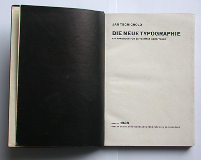
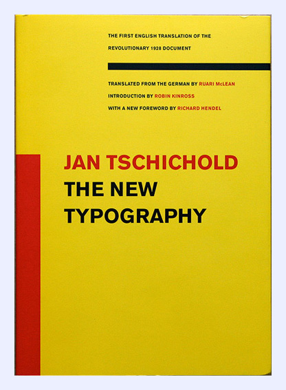
As part of the graduation program at the Gerrit Rietveld Academy, we were asked to write a thesis. I conducted a research into the early days of Modernism and Constructivism. One of the books on my list was the English translation of Die Neue Typographie, by Jan Tschichold.
This publication included an introduction by Ruari McLean, translator of the original, German version, who was also a personal friend of Jan Tschichold. On the first page of his foreword, McLean tells us that already in 1967, Tschichold asked him to translate Die Neue Typographie. McLean continues his introduction: “He planned it as a second, revised edition.” McLean states that he translated the greater part of Die Neue Typographie, incorporating all the revisions, but no publisher could be found. For the 1995 edition, McLean together with the University of California Press, made the editorial decision to translate the original text, treating it as a historical document.
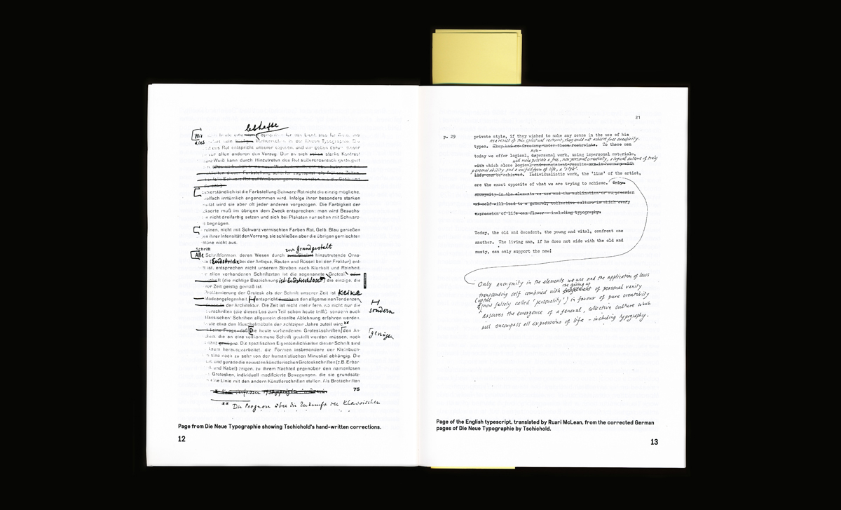
After finishing the introduction, I was curious about the revisions Tschichold made to his original text. McLean tells us in his introduction that after the death of Tschichold, in 1974, he placed the draft of his translation in the St Bride Printing Library. So, the next day I called the library. It took me some weeks, to finally get hold of the document, but these weeks gave the opportunity to research Tschichold’s personal and professional life.
Tschichold transmogrified from a traditional, German trained typographer, into a “true modern designer” (his own words), to finally reform back into his old working method, a classical and traditional approach to typography. Over time, he became his own frenetic antagonist, with Die Neue Typographie in the center.
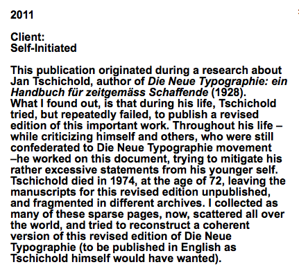
What I found out, is that Tschichold during his life, tried, but repeatedly failed, to publish a revised edition of Die Neue Typographie. Throughout his life – while criticizing himself and others, who were still confederated to Die Neue Typographie movement – he worked on this document, trying to mitigate his rather excessive statements from his younger self. This revised edition of Tschichold was now fragmented in different archives. As an archaeologist I started to recollected these sparse pages and revisions by Tschichold, and incorporated all my findings into a version, as coherent as possible.
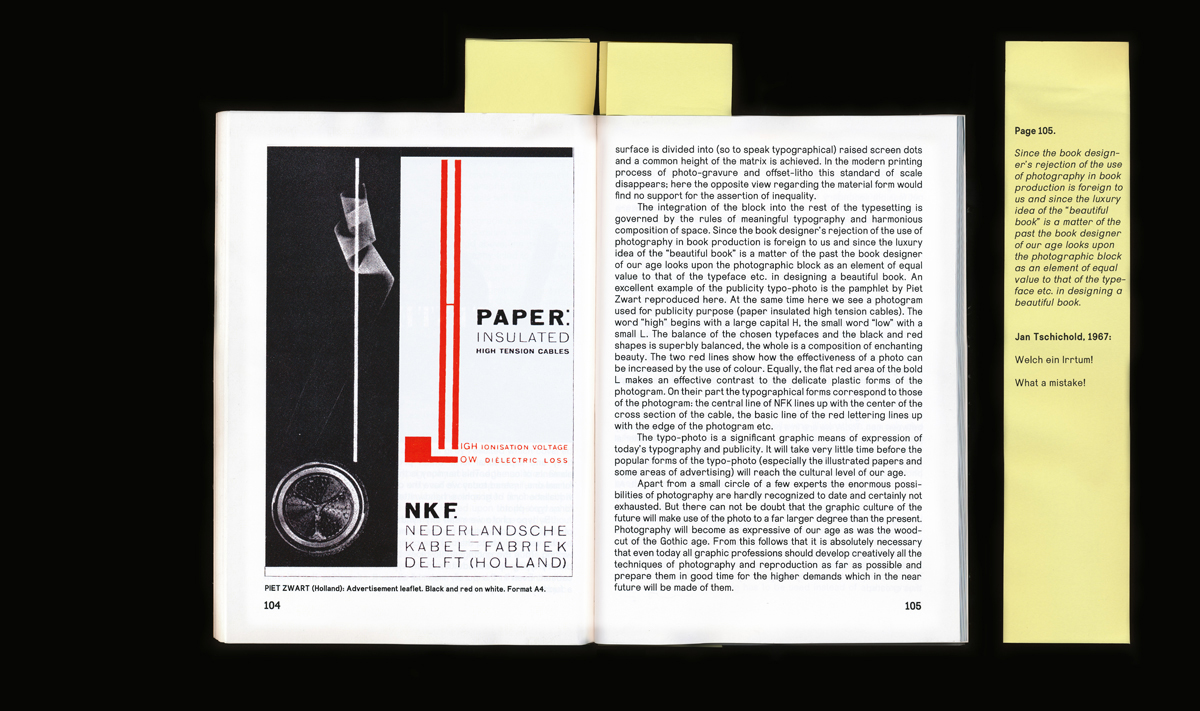
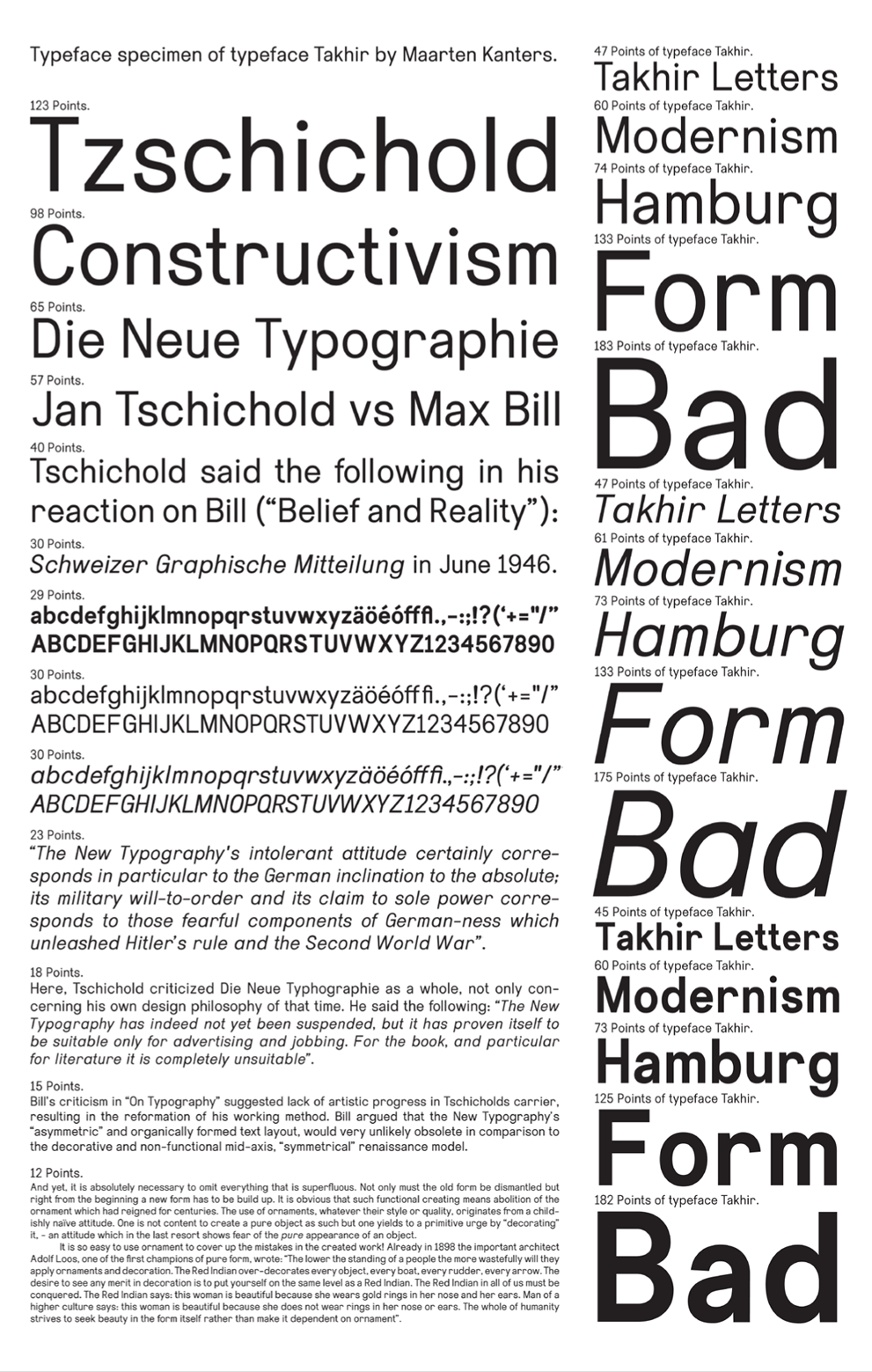
While working out the manuscripts by Tschichold, I tried to find out in what physical form, Tschichold wanted to present his revised edition. In correspondence with Piet Zwart, he speaks about presenting it in A4 format, a format he later labeled as: “devils format”. Die Neue Typographie was set in either Aurora Grotesk, or Akzidenz Grotesk. The choice of typeface, was decided by practical circumstances: no other sans serif font was available in an amount large enough, to set a whole book. I took this opportunity to design my own sans serif font, called Takhir. The shapes of Takhir were drawn, to tell a story about Modernism. But, it is too bumptious to appear, as pure, as Modernism would have wanted it to be.
This whole project resulted in the revised edition of Die Neue Typographie, containing all the revisions I collected in my research. The publication is introduced by a foreword, that I wrote as my thesis [presented as pdf at the end of this post], in which I present the historical background of Die Neue Typographie movement, and the publication by the same name. Beside all the revisions Tschichold made to his text, he made a number of personal comments, which reflected or criticized the content. The combination of these two, are really important for me, because it shows Tschichold’s difficult relationship to Die Neue Typographie. In one hand he rewrites its whole content, but he no longer agrees with its tenor. In the final publication, these personal comments are presented on errata’s, placed on the corresponding page of the content.
The whole publication is set in the typeface Takhir, which was finally created in two weights, both with Italics. Printed digitally in an edition of 50 copies 157 pages on 110 grams silk machine coated paper with a silkscreened cover, for sale at San Serriffe Bookstore [x].
text by Maarten Kanters [graduate student department of Graphic Design 2011] : more www.mrtnkntrs.nl


