Skip to Content Skip to Search Go to Top Navigation Go to Side Menu


"graphic design" Category


Disobeying for the sake of disobedience


Tuesday, November 18, 2008

Ji Lee (pleaseenjoy.com) is a Korean born New York based designer and initiator of urban interventions. He grew up in Sao Paolo and later moved to New York where he studied at Parsons school of Design. He is now working as creative director for Google, a freelance designer and a design teacher at Parsons school of design. Some of his most well known works are “the Univers Revolved”(universrevolved.com), “Abstractor”(abstractor.tv) and “the Bubble Project”. (thebubbleproject.com)

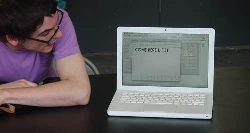
Ji lee´s contribution to Experimenta design is “the bubble project”(ABC World News). It is a project that he’s been working on since 2002. He initiated it in New York where he printed 50.000 talk-bubble stickers and placed out on top of commercial ads allover New York City, leaving it open for people of the city to fill in their own words. The project has continued to grow ever since.
The idea of the bubbles originally comes from the Situationists (Situationist International), a small assembly of artists and politicians active in the early 60´s. Their main intention was to create disobeying people. In 1968 they made bubbles and stacked them on commercials. They didn’t like the way big companies took advantage of creative people to sell their products so they turned it around and used these commercial images to support their own messages.

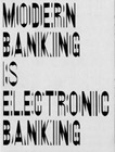
Ji Lee is questioning the way our cities are overrun with commercials and our limited possibility to express ourselves in the urban space. Many of the graffiti tags we see on the streets are also a reaction on this but most of the tags we see in the cities are also commercials for artists and crews and the conversations going on in the graffiti world are most of the time only readable for the initiated. By using the Situationists means and turning the commercials into public conversations he encourages all people to communicate their own thoughts without writing anything himself. He is basically giving the word to the people of the city.

posting by Chandra Sen

I Have Something To Hide


Tuesday, November 18, 2008

Nowadays it seems we don’t have anything to hide anymore; we all happily share our personal info on Facebook, MySpace and Hyves. You hardly realize that the government is watching your every ‘digital’ move; internet and email, through bank cards, through your cellphone, even your bonus card at the Albert Heijn supermarket is being traced.

With that in mind, 12 students from the design department of the Sandberg Institute came up with the idea of using an ancient way of communicating; via Pigeon Post. For several months the students trained their very own group of pigeons in order for them to exchange messages about their privacy project. Sara Kolster, one of the students, says that the group has had the idea of doing something with the privacy issue for some time. But when the VPRO (a dutch broadcasting organization) and Holland Doc approached them to participate in their Privacy Project, they really started brainstorming. ‘Almost everything can be traced, even letters. In the 1st and 2nd World War, pigeon post was actually used quite a lot; it is untraceable and pigeons are everywhere’. The project continued during ExperimentaDesign Amsterdam 2008 on the roof of the Post-CS building, where the pigeon house was used at night as a projection screen for showing films and documentaries on privacy issues.

Because of the fact that I didn’t get to see the event on the Post-CS Building, I decided to experience the idea of ‘Hiding from the government’ for myself. One week; my phone, internet, cards and bank cards in exchange for mail, as in letters. On a Sunday, at twelve AM I switched off my phone; peace and quiet. Monday I wrote three letters, if I want to meet friends I’d have to do that a few days in advance. I found out hand writing a letter takes a lot of time, as well as looking for my brother whom I was going to meet, but where and when exactly was that?

Tuesday I received my first answer by mail and Wednesday only got more exciting when I found three letters in my mailbox! But time is suddenly crucial if you want to get your answer out on time, since the postbox deadline is six o’clock. Thursday three letters again, including one of my grandfather, who had post pigeons back in 1936; ‘They used to shit all over the next-door-neighbor’s laundry and another man who had post pigeons too, used to throw rocks at my beautiful birds. People who have post pigeons are maniacs!’

Friday; a friend from another city just stopped by my house to drop off her letter she meant to send. We couldn’t hang out because I was just leaving to go to her city, where I got lost and accidently ended up at her address, where I’d never been but knew from the letter I sent her. What are the odds. Saturday, the last day of my experiment; I had already been tempted at the library and my working place to check my e-mail, but I pulled through and had been invisible for one week!

The Sandberg students definitely made their statement, even though the event was more of a metaphor, It makes you think and even want to experience the experiment for yourself. But after all, it is an event and not a way to live. It is understandable that in busy times we don’t mind sacrificing a little privacy in order to speed things up. That’s why afterwards the students of the Sandberg Institute don’t really feel the urge to keep using this dated method of communicating as long as their personal data whilst using technology is not being abused.

The students are still busy editing a documentary which will be shown on the Holland Doc website and in the meantime the retired pigeons are returned to the Dutch Pigeon Post Organization.

posting by Jesse Muller

Attitude, Approach and Application.


Monday, November 17, 2008

Ian Anderson, who’s the founder of the Designers Republic, was invited to come and talk for the Amsterdam Conferences at Experimenta Design, Amsterdam.
TDR is known for its anti-establishment aesthetics, while Ian Anderson’s still embracing the consumerism.
As you problably know, TDR does a lot of commercial work for huge brands such as Coca-Cola, Activision Inc and Warp Recordings. But through Ian Andersons art exhibitions, he’s “commenting” on the consumerism and the fact that the whole world is centered around a buy/consume mentality, which of course can be understood as a provocative comment against the consumerism. As he explains: “It’s more an observation and a desire to inspire people to think for themselves rather than a provocation.”
His interest in the consumerism issue, is not about getting people to think that they need things they never knew they wanted. It’s about the control. Like in one of his exhibitions called “Customized Terror”, there was a poster with the word “flesh”. This was not saying that you shouldn’t eat meat. The purpose of the message was to get people to be aware of the ramifications of their actions.

So he’s in some way stepping out of the whole discussion of right or wrong, and has placed himself as some kind of neutral player in the whole discussion concerning the consumerism issue. But of course there will always be different opinions and different ways of looking at his role he has put himself in. Although I think his role in this issue will always be understood, as some kind of contradiction to itself. The Designers Republic
posting by Daniel Norregaard

Handige jongensboek


Saturday, May 24, 2008

handigejongensboek Halverwege de middelbare school begon mijn interesse voor boeken te groeien en daarbij ook mijn verzameling boeken. Eens in de twee weken ga ik even langs bij de hilversumse kringloop winkel. Waar de boeken collecties van de gooise bejaarden heen worden gebracht. Voor bijna geen geld vind je er hele mooie en speciale boeken.

Daar vond ik het Handige Jongens boek van Jos Houweling. Het is een geweldige satire op de bestaande manier om huishoudelijke tips weer te geven. De wekelijkheid en nonsens zijn een eenheid geworden in dit boek. Deze boeken met tips liggen nog steeds in de winkel. Het is en blijft dus een actueel onderwerp, drie en dertig jaar na de eerste druk van het boek. Het boek is voor mij een verademende kijk op het leven en de denkwijze van mensen.

http://handigejongens.weebly.com / http://beeldbank.amsterdam.nl/component / http://www.xs4all.nl/~annevet/onderzoek/right_to_copy/part-1_2.htm

My key to comfort


Friday, May 23, 2008

luciferdoos Since I have been inhabiting my new apartment, matches have become an indispensable product in my daily live. Without matches I would stand underneath a cold shower every morning, would not have warm dishwater, no heating and no possibility of cooking.
An incomplete combustion of my geyser, makes that I have to disable it when I don’t use hot water. Because of this, lighting a match has became my morning ritual. Not only my geyser is dependent on the use of matches, also my gas stove and heater refuse service without the use of this inflammable wood.
This typical Swedish product is been sold all over the world and the brand wich i have at home is more then one century old. Remarkably, the matchbox still wears it’s original design which gives a beautiful scene of it’s origin.

if you like to read more on this subject of matchbox labels do read this pdf on www.protimient.com/MatchBoxLabels.pdf [translation-site]

only b/w


Thursday, May 22, 2008

black and white 10 years purple magazine

Since almost two years I have a copy of the ‘Purple ten years’ supplement that came with their fourteenth issue. I like it because of it’s rawness, sensibility and inconspicuous complexity.It doesn’t contain texts, only b/w photographs of ripped out pages of former issues of Purple. Issues that were published between my fourth and twelfth age. I’ve never seen the magazine to that time. But since then every page of ‘Purple ten years’ was flipped countless times. But still everytime I discover stomething new. Sometimes visual gags, connections between pages, people and their work or others. The page that attracted my attention while the research showed two pages three dimensional laying in space and seem to be from a photo series about Susan Cianciolo. An so far unknown name to be but her work looks highly interesting!

D group /Type Design, from Experimental to Corporate


Tuesday, April 22, 2008

Helvetica is a feature-length independent film by Gary Hewitt, about typography, graphic design and global visual culture. It looks at the proliferation of one typeface (which is celebrating its 50th birthday this year) as part of a larger conversation about the way type affects our lives. (http://www.helveticafilm.com/) Helvetica introduces type as more than common. A specialized design discipline.

helvetica movie image1helvetica movie image2

A lecture by Henk Groenendijk on experiments in type design, related to ‘developping cultural and economical progress in the 1950-’70, gave more insight in the context that proved so fertile for Helvetica’s rise to stardom.

Indiana Number-paintingLogo’s from fiftiesSandberg Experimenta TypograficaModern Banking

Time and space is a given phenomenon in education at the Rietveld Academie, where things constantly present themselves in past and contemporary creative projects. As an almost casual gesture, some 2nd year students from the graphic design department dropped by to present their recent type designs in progress.

Student type design

Finally research material was edited down to A4 sized guided tours into selected subjects. All subjects presented in this list are also available as hard copy research prints at the ResearchFolders available at the Rietveld library.

As usual we selected subjects with a direct connection to the context of the presented material in this classbloc. In this case Helvetica the Movie” and its content, was researched through subjects like the Corporate Alphabet, Wim Crouwel, Laurenz Brunner, Experimental Jetset, Norm type design and their publication “TheThing” or Letterpress.

The lecture gave a much broader perspective from which researches like de Stijl fonts, Buro Destruct, Zaph Dingbats, the Univers Font, Systemfonts, Swiss Style/Modernisme, Guy Rombout‘s AZart and Edward Fella were initiated. Widening the discussion towards the Helvetica subject by adding links to the actuality, some more subjects were added, Jonathan Barnbrook. Richard Niessen, Type Radio, Emigre‘s Zuzana Licko, Jonathan Puckey‘s Type Tool, the mysterious typebased posters of Michel Schuurman and ultimately the concept of Dead Type by Hansjakob Fehr

Dexter Sinister at Whitney Biennale


Tuesday, March 18, 2008

Dexter Sinister Emblem
Dexter Sinister (Stuart Bailey, David Reinfurt and Sarah Crowner) call their project a “Just-In-Time Workshop & Occasional Bookstore”1. Their workshop deals with the classical production scheme of publications and the different roles of designer, publisher, producer, editor, curator and distributer. The twice a year published culture (“art-design-music-language-literature-architecture”3) magazine Dot Dot Dot is an example for the redefinition of traditional ideas of publishing.

They also take part at this year Whitney Biennial in New York.
“Dexter Sinister’s proposal for the Whitney takes the form of an extended poem titled True Mirror, a composite of excerpts from writings and artworks derived from a variety of artists and authors. Loosely based on ideas of reflecting and shadowing, the manifestations of this abstract proposal remain necessarily open until the Biennial begins. Dexter Sinister will occupy a former colonel’s dressing room at New York’s uptown Armory, from which they will explore various channels of distribution alongside the rest of the show. These activities are prefaced by a typically oblique double motto: “Quality is merely the distribution aspect of Quantity” (or vice versa).”2

A reasonable but rather long interview about things can be found at www.bombsite.com.

More information about the project, contributers and their releases can be found at Dexter Sinisters True Mirror website or Whitney Biennial
posting prepared by jan (group f)

A group’s researched book-concepts


Monday, March 10, 2008

TM-City SMCS Warhol_Index TM-City SMCS

After many month we finally present the research results into 25 selected books from the “Collections Groenendijk”. During a one-hour event every student was presented with the opportunity to start-up a research into the manifest art or design concepts presented in these unique book designs. Designers Julia Born and Will Holder were presented through an interview-DVD made by the graduate program of the “Werkplaats Typografie Arnhem” for the Chaumont festival workshop 2005. Others projects, by Richard Niessen or Andy Warhol, were presented at an visit to the Stedelijk CS, where their books were displayed in context. Coralie Vogelaar (a Sandberg Master) came to visit us in person to give insight in her work and ideas and lecture on the concept behind her latest publication “Masters of Rietveld: design in the 21st Century” published recently by the Sandberg Insitute /Design [above: Niessen TM-City / Warhol Index-Book

A New Art World
Caetano de Carvalho on “A New Art World” by Richard Niessen + Ad de Jong

Research material was edited down to A4 sized guided tours into these subjects. All subjects presented in this list are also available as hard copy prints at the Research Folders at the library. The investigation focussed on the following book titles: Ed van der Elsken’s “Love Story in St Germain“, Irma Boom’s Grafisch Nederland 2005 on Color, “Start A New Art World”(published above), the acclaimed cooperation between photographer Geert van Kesteren and designer Linda van Deursen “Why Mister Why“, “Hhalo” by Julia Born and Rebecca Stephany’s “Archiving Today”project. Last 3 ladies all teaching at graphic design department.

SpoerrieThe ThingThe Thing Norm design Swiss TypeS M L XL

Daniel Spoerrie “An Anecdoted Topography of Chance“(extra info), Dieter Roth’s “Dieter Roth Band 10“, “S M L XL“by Koolhaas, Sandbergs “Experimenta Typographica“: Mens Sana in Corpore Sano and “Counterprint” by Karel Martens. “The Thing” by Norm designstudio, Andy Warhols classic 1967 “Index-Book”, Will Holder’s “Catalogue“: starring Gijs Muller, Edward Ruscha’s “Colored Peolple”, Richard Niessen’s piece de résistance TM-City.

Why Mister Why GN2005:Color

Sandberg Institute Master: Coralie Vogelaar with “The Photoshop” and “De Hedendaagse Ontwerper”, Gerald van der Kaap’s original ” HoverHover” and the monumental cooperation between Jonathan Barnbrook and Damien Hirst “I want to spend the rest of my life everywhere, with everyone, one to one, always, forever, now”.

Dot Dot Dot X Hester Permanent Food 15

Finaly some highly conceptual magazine concepts like, the 1980’s I-D magazine 2, Jop van Bennekom with Re-magazine: ‘Hester‘, Permanent Food or Stuart Bailey’s “Dot Dot Dot” magazine.

G group’s research subjects


Sunday, November 11, 2007

Poeme2_web_final 0708g-brasilia-redu

Based on the general theme “Le Corbusier and Other Stories” we investigated a variety of subjects related to the content presented at this summers Corbusier Art and Architecture exhibit at NAi, Rotterdam. Research material was edited down to A4 sized guided tours/portals into these subject matters. All subjects presented in this list were available as hard copy prints at the Research Folder Archive at the library of the academy from November 2007 until January 2013 at which date we decided to have them only available as part of the online Designblog archive:

Primitivism, Le Poème de l’Angle Droit, Corbusier’s Christmas Gift, La Chapel de Notre Dame, Amedee Ozenfant, Corbusier in Istanbul, Varese’s Poème Electronique, The Candigarth Project, Modular, Language of Organic Form, Corbusier and Politics, The Bric, Ferdinand Léger, The Brasilia Project, Sandberg’s Experimenta Typografica 11, Koolhaas/Lagos, Nature Design Zurich, Constant’s New Babylon, Rietveld’s Academies, The Chaisse Longue


Log in
subscribe