Wednesday, May 6, 2009
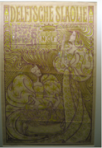

Jan Toorop was a Dutch painter and illustrator who worked between 1880 and 1928 In 1894 the Nedelandsche Slaolie Fabrieken asked him to do an advertisement poster. He came up with this: A litho in the Art Nouveau style. Very popular at the time. Made famous by Alphonse Mucha and his posters for Sarah Bernard.
If you analyze the work you can clearly see the artists hand and the customers’ wishes. This image however is published in almost every Jugendstil or Art Nouveau publication. And even became the Dutch nickname for Art Nouveau. The name’’ Slaoliestijl’’ was not only used for Graphic Design, but was also adapted in Product design.
And this is the question that troubles me most; How did a respected Symbolist painter cope with the success of his graphic work? Not acknowledged as an art form, but as a trade, at the time.
Another question that troubles me is; would it be possible nowadays, for an autonomous artist, to do advertisements without doing damage to his own work or reputation?
If you look at museums of modern art nowadays, you can see that most of them took design into their collections. This means art and design are moving towards each other. And interesting development followed with lots of discussion.
RESEARCH QUESTION: do commissions damage a autonomous artist reputation?
Wednesday, May 6, 2009
We went with school to the Graphic Design museum in Breda to the exposition ‘Who sets the standard?’. There were lots of nice things to see, and i found a book as well that was made by the Dutch designer Irma Boom that made me curious. It was laying on a table in a glass box, opened on one of the pages. Next to it you could find information on a computer touch screen about the maker and the book. This was also a very nice design, cause it worked very well and interesting to look into, very professional.
I want to know more about book design in general and i understand that this peticular book is a very remarkeble example. The ultimate book. So i’m going to investigate more about the maker Irma Boom and her designs.
 The book is made for the SHV Holdings, from origin a cole trading company, but now a days it trades in food and other fuels and chemicals.
The design and the content are about the history of thi company itself but also about the family that owned it for all these years and reflects upon generations of living and working. There are just a few of them made, as the book was meant as a jubilee gift to high executives only. There is even a limited amount made specially in Chinees as it turned out after printing many of them were in china. It has never been forsales so it is quite rare to see one. I got the opportunity to see and look into the SHV Think Book myself at a private home of a lucky owner, and I found out how amazing a book design can be.
It was a great experience to go trough this book. It is a monument for the SHV, a travel trough the time, and it is far from a dry documentation. Irma Boom got into the content of her subject and you feel this. She tells the stories of the company in a playful and inventive way, it is filled with ingenious visual and linguistic jokes, poems, repetitions and personal stories, but because Irma Boom really knows what she is doing and directs it tightly, it never gets to much or chaotic.
THE SHV THINK BOOK
Fentener van Vlissingen is a philanthropist that supports several humanistic projects. When he searched for someone to design a jubilee book, he asked Irma Boom to do it. It was a work of five years and it is a good representation of all the work and effort and love that has been putted in the company itself. Read more as the story unfolds in this linked pdf……….
Wednesday, May 6, 2009
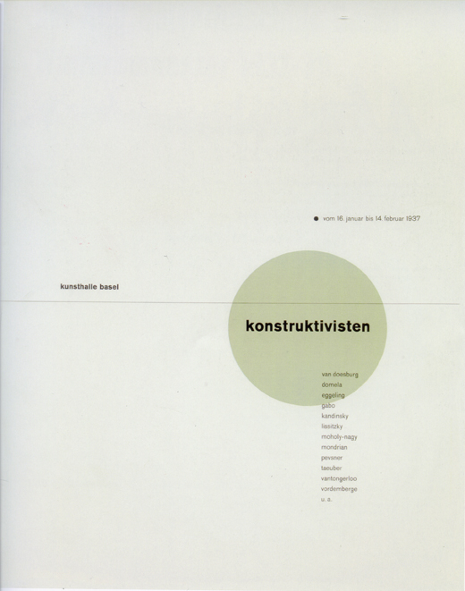
Standing in front of the works of Jan Tschichold, I felt suddenly something very familiar arising within me. An old memory dream-like of the time I studied graphics in the Academy of Fine Arts in Warsaw. As for those days, it didn’t really feel right, however now suddenly it all made sense. It occurred to me, like a missing piece of a puzzle being found, a key to connect those days to „today“. At once I could see all the rules of typography an graphic design emerge within the posters. Like hidden signs, which were not an obstacle. Rather a guideline, a common sense of beauty and harmony. I wondered, what a keen invention graphics was, to connect these powerful mediums of language and image in such an expressive way. I mostly felt attracted by his poster for „die Konstruktivisten“ (Kunsthalle Basel, 1937). I really felt for his taste of color. But mainly, for it‘s almost Zen-like minimalism and harmony. How he perfectly combined the constructivist form, the simplicity and silence. Admiring this poster I just realize how much I have to learn and how far away I am still to any perfection.


Tschichold “Konstructivisten” poster – Moholy NagyQ 1 Suprematistic painting
read more in the linked pdf “FRESH TASTE OF PEPPERMINT”
Wednesday, May 6, 2009
The work that Jan van Toorn made in 1971 for the van Abbemuseum in Eindhoven is a work that caught my interest from the start. It is very daring of a museum to use a political statement like this as an advertisement for an exhibition.
To me it is graphic design at its best. This work looks in a way very timeless but has a lot to do with the time it was created in. Not only because the valuta of the amount that is added up is in Gulden – which we do not use any more (unfortunately – have a peek at Renske’s posting!) – but more likely because he used paint to tell you which painters you can find at the van Abbemuseum at this exhibition. To me this feels very honest, true and logical. I think Jan van Toorn was ahead of time with this work.
I love how he throws all these big masters on a mathematical pile without actually making fun of it. Of course he is making fun of what all these paintings cost. Almost 40 years later the prices went sky high. But in a way that is not really what it is about, to me it feels like putting it out of context. He makes the master painters more human. To me this poster mocks with the art world without making fun of the painters.
It makes me feel like painting.
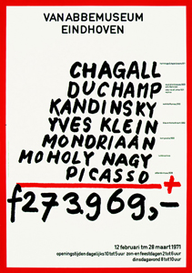
Jan van Toorn is a man of the first generation of graphic design. In 50 years he has seen al the revolutions and all the new more advanced options you have with the, let’s say, original or old-fashioned way of printing. Jan van Toorn: ‘The computer is the next phase and is of course an amazing development in the world of graphic design and for a designer to work with, but if I look at the results then I find it very disappointing.’
Van Toorn thinks that the Internet should be or become a medium with visual journalism that frees as well as enriches the reader/viewer. He thinks that a different, new use of language is important for that. I agree with him on this point. If you take blogs for instance, or the Internet in general, you can delete half of it because it is rubbish and has no content. To me it is about balance. People do not read long, dry texts on the Internet. It is about speed. It has to be fast. I think blogs such as ffffound.com are a good example for that. It is an only imagery, no text blog about design. You see a lot of beautiful, esthetic designs, and very often without content. Most of the design you forget instantly. Just nice pictures.
I think that Jan van Toorn despises the Internet because I read that Jan van Toorn is not interested in the beauty or esthetics of images at all. It is mainly and only about the content of the design. What is there to tell, to see or to communicate? As a designer he wants to be more than only the person in between the client and the receiver, he would like to be involved within the whole process.
A nice question I found in an interview with Jan van Toorn on the website of magazine de Groene Amsterdammer (in Dutch) is: Are you designers the mediators that show us reality in life?
Jan van Toorn: Yes.
And we simply have to believe that that is the truth in reality?
Jan van Toorn: Yes. Whether we do it or the church does. 30 Years ago it was the church. Today it is about the people ‘in between’ such as designers, journalists and people who make television.
Graphic design and product design may be present everywhere you go but I think it is art that can show you another truth. I think Jan van Toorn set the standard for graphic design back in the days. All we can do is get inspired.
Wednesday, May 6, 2009
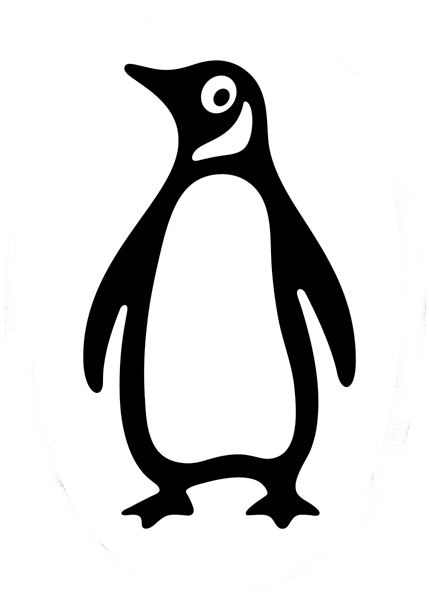
When we went to this exhibition I didn’t have any clue about who Jan Tschichold was, and I was not really having a wow experience there, until I entered the last room and found a huge penguin on the wall, standing in front of me and staring. I must admit that penguins are some of my favourite items. And therefore I choose this one to further investigation.

The nice surprise is that this particular penguin is the logo of the penguin books and I wondered how that could be, but Jan Tschichold apparently worked for the Penguin Publisher for two years, and he is the one who made the layout and the “Penguin Composition Rules” a little booklet about the typographic instructions for editors to follow in the future.
It’s fascinating that a publisher so old as the penguin publisher is, still is having this label and still is represented on the market. The story of the penguin books is interesting in many ways, and with this goes a whole history of a publisher.
to be continued with: “A 74 years old penguin“, a further research into Tschichold’s Penguin and others by design.
Wednesday, May 6, 2009
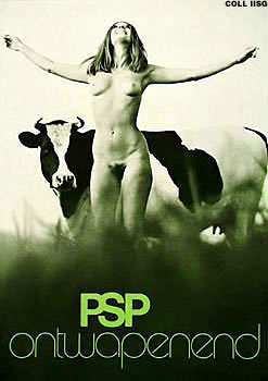

To investigate a design work, i chose the advertisement-poster „PSP ontwapenend“ designed by George Noordanus in 1971.
When i saw the poster, i liked the spirit and the freedom it shows! It has something light and joyful. At the same time it also has something humorous to me. The photograph might stand for the new freedom at that time, won from the 60‘s: the possibility to show nudity in public and even the use of it in advertisement.
Further more, the design and composition of the photograph struck me. The image shows a lot of (formal) parallels: the nudity and vulnerability of the woman and the cow and the pattern of darkness and lightness. Also the setting of the woman and the cow show parallels. And in the end, of course, the context of the slogan „PSP ontwapenend“ in connection with the image is important and interesting to find out more about it!
ANOTHER TIME-SPIRIT
The political background of the poster back then, in the seventies (it raised many controverse reactions), is already discussed so many times. So I decided to relate the poster to recent times: living today, I want to reflect on the poster in the context of today, on the combination of nudity with politics nowadays…. continues as pdf
Wednesday, May 6, 2009
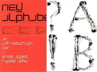
The most intriguing aspect of ‘100 years graphic design in the Netherlands’, out of all the graphics, fonts, posters and publications I saw there, was in my opinion the contrast between two different forms of an Alphabet.
These alphabets, or better Font types, were created by the dutch Graphic Designers Wim Crouwel and Anthon Beeke.
The computerlike and clean structure of Crouwel’s ‘New Alphabet’ and the unconventional and quite controversial looking letter type, made out from naked girls, of Beeke on the other side.
For me Beeke’s style visualizes the spirit of the time when this font was created. It let me think of the sexual revolution, the feministic movement and a general break out of traditional and conventional norms of these times.
But also Crouwel, with his mathmatical looking font, hits for me a certain actuality of the late 60ties and 70ties, as that was the begin of the development of the computer age.

Wim Crouwel vs Anton Beeke
for more on functional versus engagé, read part 2
Wednesday, May 6, 2009


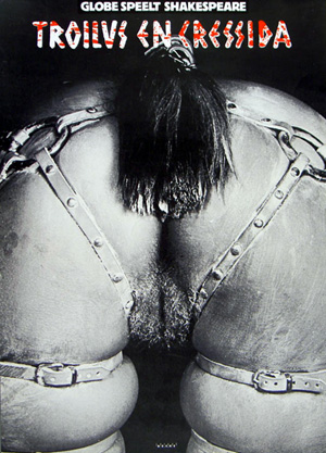
As a student at the Gerrit Rietveld Academy, I went to the Graphic Design Museum in Breda, together with my class. Their collection included pieces from a decade of graphic design. Next to some posters, you could hear interviews with the designer. Sitting down at the table next to the posters, you could see a built-in television with the images of the interview. This was also the case with the poster that took my attention, namely the poster made by Anton Beeke. He made the poster for a relatively obscure play by Shakespeare named “Troilus and Cressida”. The poster intrigued me, because it showed a recognizable human bodypart yet was still somewhat indefinable. This combination added to the mystery of the poster. Using the information table, I found out a lot of backgroundinformation about this seemingly controversial poster. For more posters link to the Affiche museum
When I was sitting at the table in Breda, I was listening to an interview with Anton Beeke. He introduced himself and I discovered that he was a graphic designer with a lot of experience. He made a wide variety of designs for posters, advertisements, books, magazines, stamps and packaging material. The specific subject of the interview were two posters hanging above the information table. Anton Beeke designed them both for the play “Troilus and Cressida”. The picture was very provocative, because it showed the backside of a naked lady who was bending over, only wearing a horse strap. “Troilus and Cressida” is one of the less famous plays by William Shakespeare. It is a sad story about the love between Troilus and Cressida during the Trojan war. Troilus saw that Cressida was behaving all too affectionately with a Greek called Diomedes. That’s when Troilus reckoned she surely was a prostitute. Anton Beeke tells during his interview that being honest is one of the most important principles for him. He saw the play as tragic and sexist and thought he should show just that on his poster. Unfortunately this point wasn’t clear for some. Especially the so called Dolle Mina’s, a feminist movement during the 1960’s, were protesting against the poster.
Links: Trojan War, Anton Beeke[image], Troilus and Cressida[image], Dolle Mina[image]
Wednesday, May 6, 2009
I didn’t know what to expect when we went to the Graphic Design museum in Breda. But when I started at the exhibition about Jan Tschichold I was happily surprised! Actually I liked almost all his work that was shown, the beautiful compositions of form and colour. The work is simple and complex at the same time.
The posters were handmade; you could see the sketches of them and little mistakes or changes in the original version.
I loved that, because it was to me more a painting than a graphic design. You could see the playing of the artist with these forms and colours.
I chose for the poster “Die Frau Ohne Namen” as my favourite one, because it is a beautiful combination of film stills, shapes, line and colour. The triangle of the hat of the woman comes back several times; you see the movement of the train, as it comes out of a tunnel, which gives also the idea of a movie, which is projected. The addition of the colour red makes the image powerful and clear. To me it is a much better film poster than you see today, considering that it is an autonomous artwork.
So shortly said a very strong and beautiful film poster!
Tschichold’s posters interest me the most of his whole oeuvre, so I made a little research about his pictorial posters which you can read in this linked pdf “Jan Tschichold and his pictorial posters“.

Tuesday, May 5, 2009

* *
To choose an item in a graphic design museum with which I felt a particular connection wasn’t the easiest thing to do. I am able to see the beauty or the richness of a composed design, but usually it doesn’t grab me like for example a painting can do. In order to do find a reason to be there, except of looking at nice images, I tried to search for a design with which I did feel that personal connection. In the end I choose an item that is as general as it is personal. Our old fashion outdated but beautifully designed Dutch guilder. The paper money that when we look at it nowadays looks more like the monopoly money we used to play with as kids. But it was no children’s game at all. It was the last design in a series of national currency. Maybe it is some sort of melancholy for a time that has past on pure patriotism. In any case I love the design that R.D.E. Oxenaar made. It is the clearness in design, the beautiful intense purple color and the nicely composed graphic elements that intrigues me when I look at it.
But how do we come from a subjective preference to a little history of Dutch banknotes design? This is what I wanted to share with you.
Out of three designers that were asked by the Bank of the Netherlands in 1965 to sketch and design a new series of banknotes, R.D.E. (Ootje) Oxenaar was picked to execute. A tumultuous journey in the world of the printing works was about to start. In the playful way that Oxenaar made his design for the Dutch guilder there seems to be a lot to discover. Did you know that…
* he did put in elements that were accessible for blind people and was the first in the world doing this?
* he hid some personal elements in the banknotes? Like his own fingerprint in the hair of Baruch Spinoza on the 1000 guilder bill and the rabbit of his girlfriend in a watermark.
* Oxenaar underlines the fact that the lighthouse on the 250 guilder bill has something of a phallus symbol, but that he mostly uses it as a symbol of safeness, as something that is watching over the dikes to protect us? A link to the 250 guilder clip on You Tube
THE NEW STANDARD
In a book about the history of Dutch banknotes design I read about the struggles and the slow development stage the design process tended to stay in. Then I read an interesting lecture of Oxenaar
that he gave at a design congress in 1987. read this all in the linked pdf
Wednesday, April 1, 2009
Mijn zoektocht mislukte De link tussen beide teksten, die eerst niet helemaal duidelijk was, heb ik wel gevonden. Omdat we in een tekst elkaar altijd iets duidelijk proberen te maken was mijn laatste boek het meest heldere boek dat ik in de kast zag staan. Het boek bevat allemaal verschillen ’dingen’, dat is bovendien ook de titel van het boek: Dingen. In dit boek zie je bijvoorbeeld een ontwerp van een beker. Eronder staat in zes verschillende talen de betekenis van de afbeelding plus de manier waarop je het woord uitspreekt. Toen ik dit boek ontdekte, kreeg de zoektocht naar mijn televisie opeens heel ander perspectief. Ook andere mensen zijn geobsedeerd door objecten, door beeld. Dus dat andere perspectief is de fascinatie voor vele mogelijkheden van communicatie.
cat.no. 772.9-cat-50
keyword: beeld
Wednesday, April 1, 2009
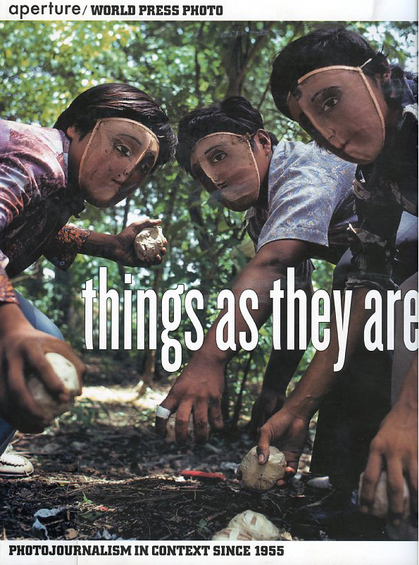
“things as they are” is a book reflecting photojournalism of the last 50 years.
it is a documentary about the development and change in this specific genre, but also very useful as an overview of of social, political and enviromental topics, concerning the media in this timeperiod.
Its definition as an artbook functions, because it is dealing with the medium photography itself, aesthetics, how they change, but also with the investigation of reality and how it is and has been shown to us.
It’s great flipping through it for the matter of inspiration, information, investigation, interest and the aestetical experience.
cat.no. 761.6-pan-
keyword: overview
Wednesday, April 1, 2009

you should not pick up “guerilla advertising” if you don’t have at least an hour to flip through this book.
it is reporting about advertising campagnes of various kinds.
numerous firms and organisations (e.g. nike, addidas. mcdonalds, the protestant church, the united nations, amnesty international, unicef or oxfam) with different approaches such as provokation, investigation, simply advertising or social criticism are represented in this book.
the methods are new; investigation of space and the use of human habits in western society are part of the adverting strategies.
there is several opinions about the capitalistic aim of advertising itself, but in my point of view is this book dealing with a lot more than only the selling aspect of it. definately worth a glaze… or two.
cat.no. 754.5-lue-
keyword: overview
Monday, March 30, 2009

The choice of projects, which are presented in this book is very various and reaches almost any kind of design. Many international designers are introduced with their latest works.
A lot of the projects are highly conceptual and touch the blurry spaces in between design and art.
I found the title “design and the elastic mind” very appealing in opposite to the cover, which is rather scary.
Therefore I posted a picture of Elio Caccavale’s project “Utility Pets”.
He is concerning himself with the various effects, that inter-species organ transplantation might have in our lives in the not-so-distant future.
The tools he invented, presented on the picture, are supposed to generate an intense contact/relationship in between the donor (in this case the pig) and the receiver.
From the upper left to the lower right:
– Smoke Eater- Toy Comunicator- Memento Service- Comforting Device
cat.no. 772.9-ant-
keyword: overview
Thursday, March 26, 2009

Excavating the library, looking for pyramids, lead me to a late 60´s representation of posters by the graphic design artist Milton Glaser. The choice for this book is solely based on the cover graphics and has no other connection to the first book selected, though it seems that the fascination for pyramids and their monumental quality are shared by many designers regardless of the time or design field.
The size of this book (A3) is in my opinion very well adapted for displaying these incredible hand drawn posters. Every page is a poster and the more you look into them the more you see.

Bob Dylan poster by Milton Glaser 1966.
cat. nr: 754.1
keyword: pyramid
Wednesday, March 25, 2009
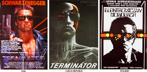
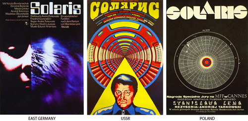
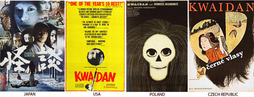
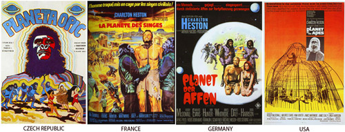
This letter I want to attach to my last message about national identity present in a street signs in different cultures. For the second time I’m using this book, which you can also take in a library. This time I’ve made a selection of posters made in different countries, but for the same movies. My thought was about the possibility of existance of different schools of postering. This posters, that you can find below, were made in the time when there were no internet for sending files with information and a designer or an artist had to improvise making a new masterpiece for the public. But this problem had made movie presentation even more interesting in different countries. Each country had added something special, non cliche. So, enjoy!
cat. nr: 754.1-keh-1
keyword: identity
Wednesday, March 25, 2009
It was big….impressively big. That’s why.
Maybe it wasn’t fair for the other books, because this book was also on a ‘special’ place. It had a place of its own as if it was more valuable than the others.
It’s not that I’m a shallow person, but it just caught my eye because of its physical appearance.
I think the pattern on the outside was disastrous by the way.
This book is about patterns. I became really fascinated about patterns, because it seems to bet hat everything becomes a pattern as long as you repeat the shape, form, act or colour over and over again. This is also how patterns become part of our life. Interesting
…At least I thought so
cat. nr. : 701.9-sch-1
keyword: repetition

