Skip to Content Skip to Search Go to Top Navigation Go to Side Menu


"interaction-design" Category


An other approach to design


Tuesday, October 30, 2012

Jürg Lehni is an independent designer, developer and artist, who got well known for his diploma project, to graduate ÉCAL in 2002, called „Hektor“.

Typical for his work is the different approach to tools, computers and technology in relation to now-a-days common design. In the last few years, all of his Projects relied on those facts. Often he collaborates with other Artists of different fields. I want to concentrate on a few projects, which really impressed me and provide you a small insight into Jürg Lehnis Work.
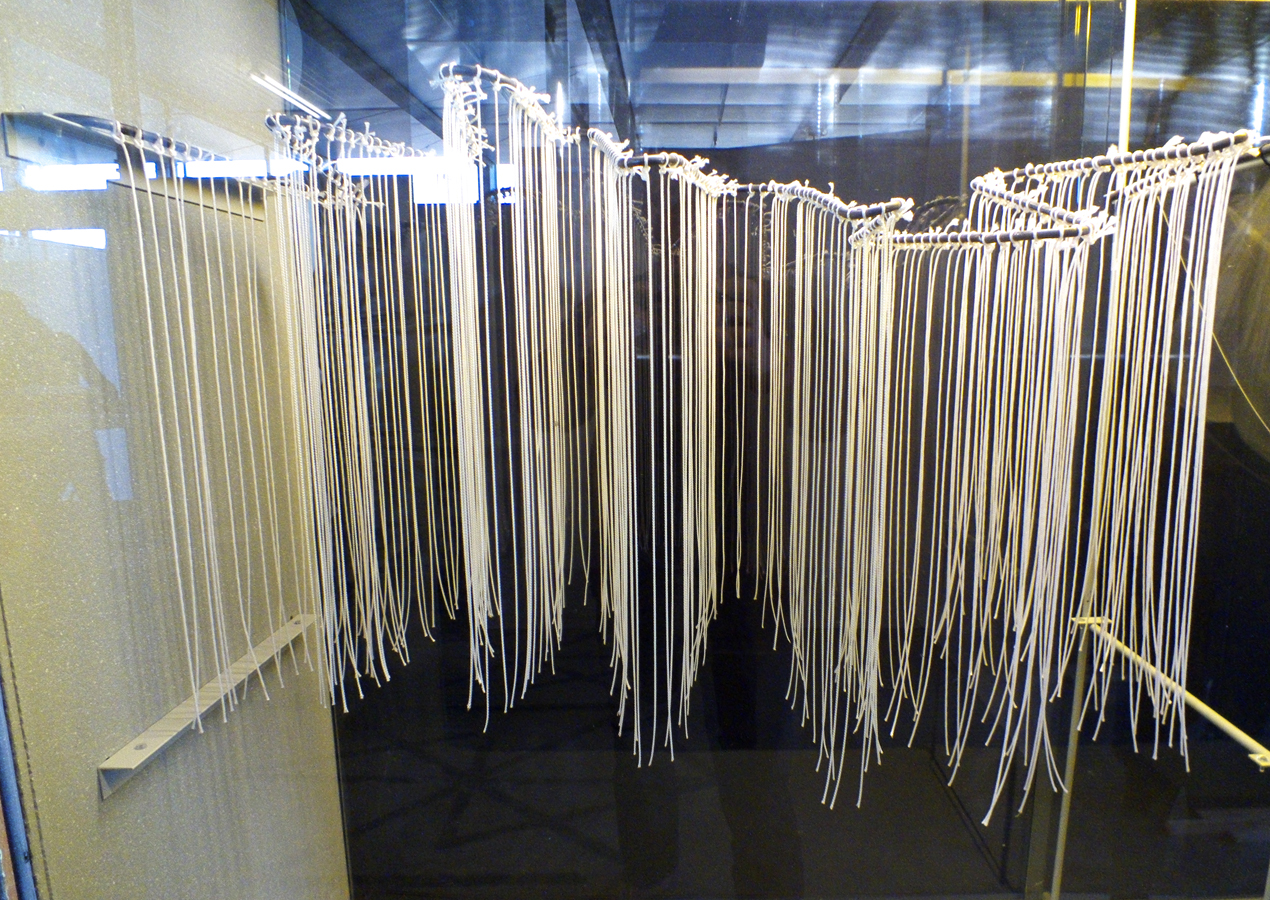
Hektor 2002

Jürg Lehni & Uli Franke
(Rita and Viktor)
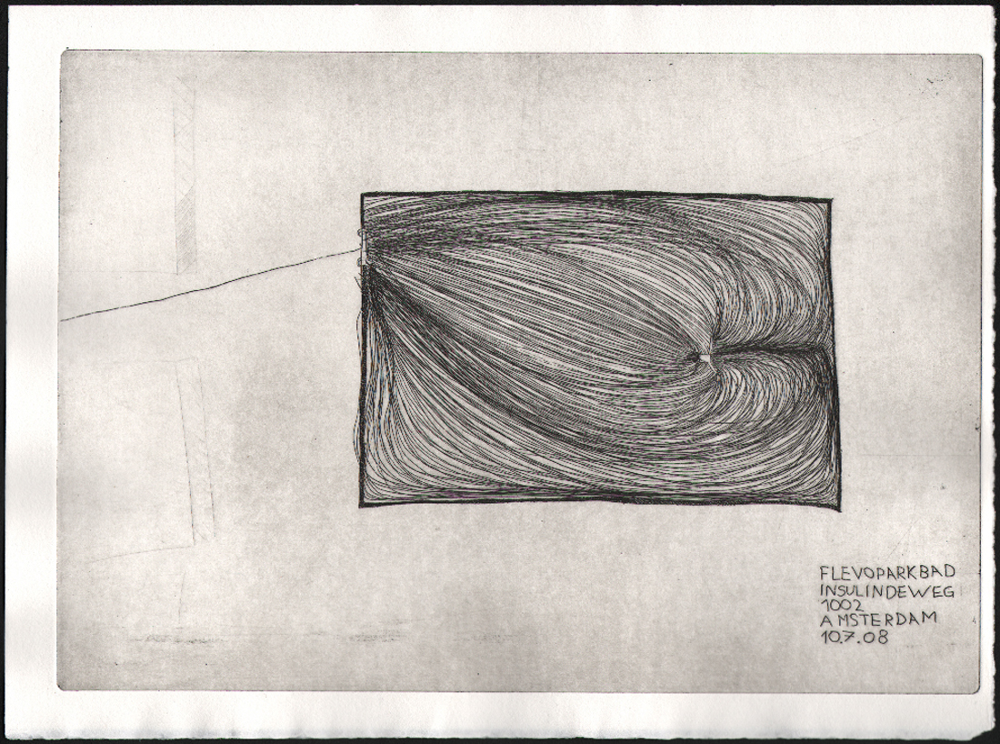
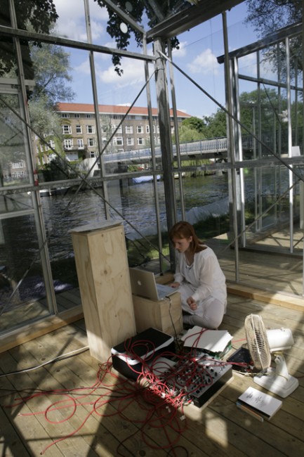
Hektor is a portable spray paint output device for Laptops, that could be compared to a common printer. The principle is quite simple. Hektor consists of two light and fragile motors, toothed belts and a normal spray can holder. The can is moved along drawing paths just like common hand drawings or old Plotters. The software to create the drawing paths is called Scriptographer, which was also developed by Jürg Lehni. It is a scripting plug-in for Adobe Illustrator.

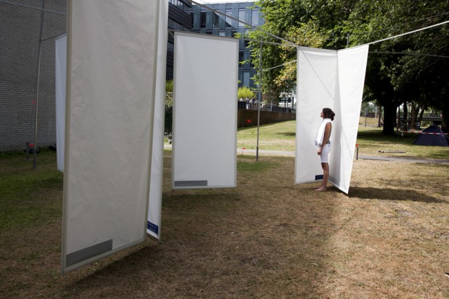
Similar to Hektor are Rita and Viktor. Both of them are as well mechanical drawing devices, guided by Scriptographer drawing paths. But Viktor is working with chalk and Rita with markers.

Hektor consists of design, high-tech programming and low tech tools. In a time were nearly everything can be perfectly done with computer programs, often even too perfect, Hektor is going back to an analogue way with a digital starting point.

Its a call to all the designers and artists to innovate new styles and ways of working and thinking. It’s a call against the now-a-days aesthetics which are predicted by computer programs and are therefore often too predictable. It is a call to the designers to not just work with common methods but experiment and by doing so innovate, achieve a wider variation and implement new methods for the everyday work.

Because of the above mentioned reasons Scriptographer and Hektor are free to use for other Artists, so that they can experiment with it as well.

With this thought I see a relation to the principal of Sol Lewitts wall drawings. Sol Lewitt states that people can carry out his wall drawings following his instructions leaving it his work of art, as long as they don’t change it on purpose. While Sol Lewitt provides the concept Leni provides the medium.

Hektor is an interaction between the user and the technology with a creative input made by a technical medium.


Emptywords 2005

Jürg Lehni & Jonathan Hares

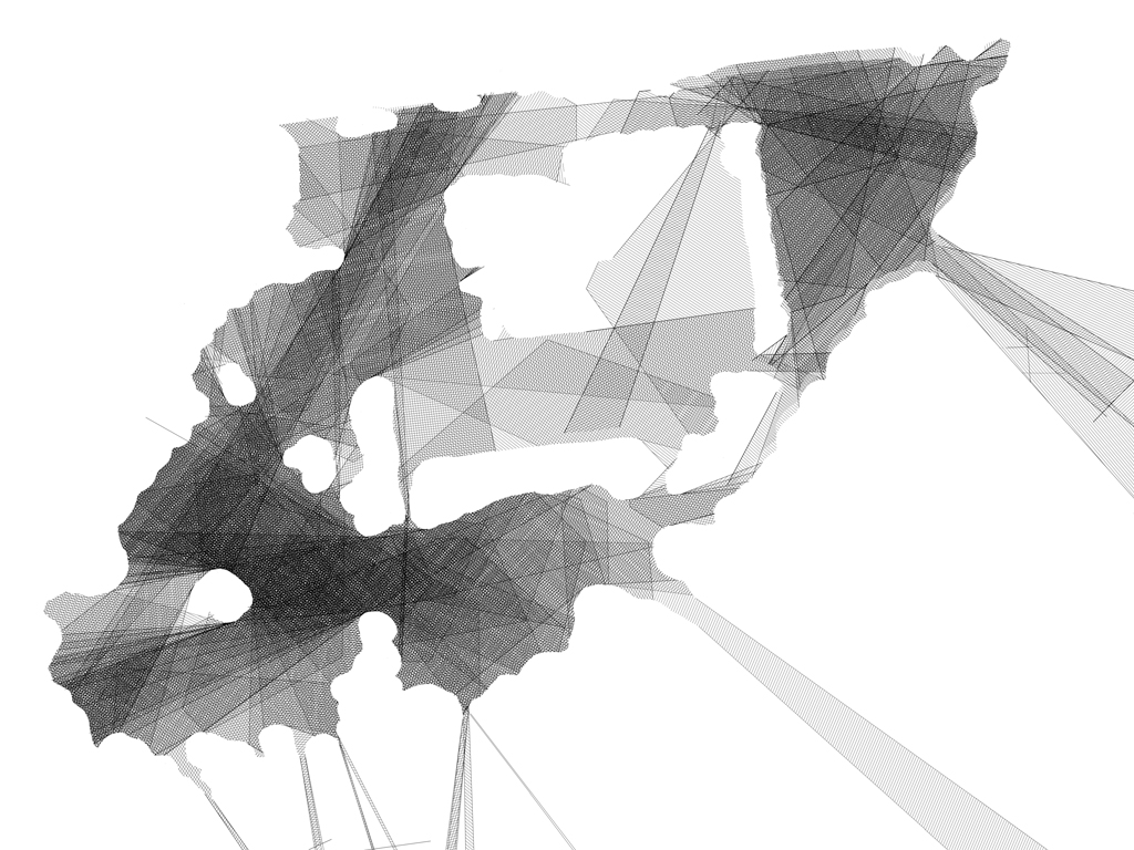
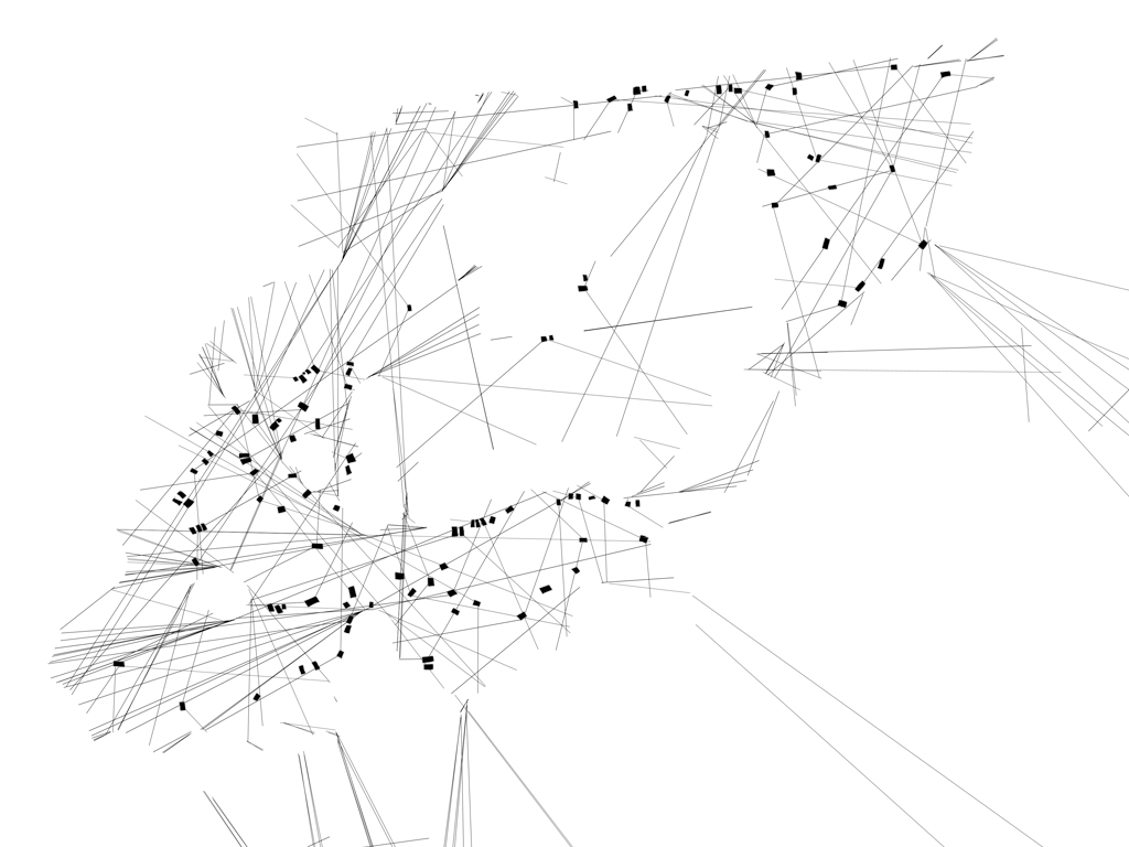
Emptywords consists of a plotter which punches holes into paper guided by an interface software. The holes are creating a font with which you can write short expressions. This tool is a medium to express short messages by the artists or the spectator.

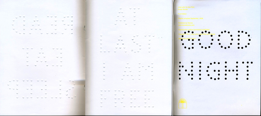
Just like Hektor Emptywords also plays and experiments with the unpredicted and oppositional aesthetics to common design.  It is playing with the nothing, in form of the holes, which are creating the font. The font is displaying ironic sentences, which adds to this work a playful, light and alternating meaning as well.
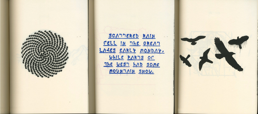
 

News 2009

Jürg Lehni & Alex Rich

News was developed while thinking of what to do with the speed i-jet printer developed by Reiner.  This mobile pen printer is able to save 30 signs, and print them by sliding the pen over a sheet of paper. Newspaper headlines  were programmed into the pen so that the spectators were able to print those ambivalent headlines per-programmed by the artists.

News shows some similaritys to the other two works too. You can see the same ironic playful thoughts behind the work. Its about doing something unexpected with simple things.


Paper.js

Jürg Lehni & Jonathan Puckey
This is the last project I want to tell you about. But i’m not going to write about it, as I want you to explore it for yourself by clicking on the title.


For me it was really hard to find a way into Lehnis work because I never really was obsessed with computer/programming art and I don’t have the knowledge to understand it that easily . When I was reading stuff about Lehni it really fascinated me, even though I had to read it a few times in a row to understand it.

It was my first “getting in touch” with that technical or programmed way of art. Now, after having had this research in the back of my head for a few weeks, I have another attitude to this theme. I think it is really interesting to cope with those digital themes in our time. Especially because I have the feeling that my generation is the last generation that can still remember how it was without cellphones, hyper fast internet and all the other inventions which have had huge impact on our society and our development.


Lehnis is playing with this theme with a charming lightness that attracts, but also animates to think. I enjoyed exploring his world and he invited me to this contemporary theme, so that I am now looking forward to see more of his work or other artists who are coping with similar themes. This Research inspired me aswell to cope more with the theme of Programming, I want to learn now how to edit things with the html code and java script, and if I am succesful with this you could perhaps see soon a headline banner for this research that I edited myself with those from Lehni provided Tools.

Multimediakunst


Thursday, January 19, 2012


Kunst, muziek en technologie smelten samen in installaties waarbij de interactie met andere elementen centraal staat.
Het geluid reageert op beweging en beeld reageert op geluid. Het begon allemaal in 1958 met de videopresentatie Poème Electronique van LeCorbusier, ook wel het eerste ‘multimedia-kunstwerk’ genoemd, met als doel te laten zien wat technologische vooruitgang de mensheid oplevert. Een klankgedicht waarin architectuur, geluid en beeld samen vloeien tot een geheel.
Vanaf dat moment ontwikkelen technieken zich verder en daarmee de mogelijkheden voor deze installaties.
Dit boek bevat een overzicht van een aantal kunstenaars die zich vanaf dat moment zijn gaan specificeren in deze ‘multimedia-kunstwerken’.


this post is part of he subjective library project "Unopened Book"
the book can be found at the Rietveld library : catalog no :

Networked Encounters Of The Nth Kind


Saturday, November 19, 2011

This thesis by Daniel de Zeeuw won the 2011 Rietveld Thesis award. The Jury rapport  said: “a very thorough research on internet and its relation to notions of conspiracy. A text in which everything is so well connected and hangs so good together that the reader starts suspecting a conspiracy. Daniel has such a complete knowledge of the field he is writing about and has such an extensive grip on the vast amount of literature he has handled that the text sometimes starts looking like a PhD dissertation“.


You could hear voices no mainstream media would ever dare to speak

With the rise of the Internet, a special realm of being has exploded and taken on enormous proportions. Between the mass-medial hermeneutic machines and the sub-medial everyday is now another world-historical playing field: below the thresholds of newspapers and television stations, but broadly distributed and encoded through visual formats nonetheless: a self-replicating and self-distributing of the General Intellect, including the infectious diseases that torture it. We are all potential witnesses and accomplices to what is going on anywhere, anytime, or so it seems. The structure of the Internet is like a conspiracy theory.

Download this thesis: Something Is Out there! Networked Encounters of the nth Kind: The Art of Conspiracy

[images Graduation Show, Daniel de Zeeuw]


from the jury rapport: Something Is Out there! Networked Encounters of the nth Kind: The Art of Conspiracy is according to the jury a very thorough research on internet and its relation to notions of conspiracy. A text in which everything is so well connected and hangs so good together that the reader starts suspecting a conspiracy. Daniel has such a complete knowledge of the field he is writing about and has such an extensive grip on the vast amount of literature he has handled that the text sometimes starts looking like a PhD dissertation.


8.000 slides; Gray Magazine #5


Thursday, September 1, 2011

In 1977, the office of Charles and Ray Eames made a short film
depicting the relative scale of the Universe in factors of ten.
The film begins with an aerial image of a man lying on a blanket; the
view is that of 1m2, then slowly zooming out to a view of 10m2,
revealing a man and woman enjoying a picnic in the park. The zoom-out
continues at a rate of one power of ten every
10 seconds, ending with a field of view of 10m24, or the size of the
observable universe. The camera then zooms back in
at a rate of a power of ten every two seconds to the picnic, and then
slows back down to its original rate into the man’s hand,
to views of negative powers of ten—10m—1, and so forth—until the
camera comes to a proton in a carbon atom at 10m—16.

The analogy of cropping to and fro in the film suggests both an
interpretative view of an archive and an insight into provenance,
panning back to view it as continuously evolving means.

Slides function as a tool for teaching and this magazine presents
itself as a series of translated lectures by eight teachers from
various fields of study within the Gerrit Rietveld Academie. 8000 of
these slides were digitally scanned and structured as originally on
the shelves, then printed collated and dispersed to the teachers as
contact sheets.

On 8th April 2009, the new interpretations were presented and
recorded. After transcribing, the lectures have been edited into a
printed report of the day.

  download Gray Magazine # 5 [this is a 44 MB document] :
For more information on this and other lecture projects based on the same archive, read Gray Magazine #5. Get your own hard copy from the Library

.

Proun


Wednesday, March 2, 2011

De gehele expositie ‘monumenten voor de toekomst, El Lissitzky’  trof mij als warrig, misschien mede door het eerst kijken van het theaterstuk, waar hij aan had meegewerkt, uitgevoerd door Amerikaanse theatermakers, lang na zijn dood.
Theater is een ding, experimenteel theater een ander en een video-regristratie van  experimenteel theater nog een stap verder van mijn bed. De bedoeling van de tentoonstelling is om te laten zien hoe dynamisch Lissitzky was, zijn werk is dat ook, vaak onaf, vol ideeën over de toekomst. Maar de meeste dynamiek die ik gevonden heb, zat in het kleinste kamertje van het Van Abbe Museum, het was ook de laatste ruimte die ik nog niet gezien had. Het was een video spel, geprojecteerd op een groot scherm met een comfortabele rode tweezitsbank er tegenover. Het was het spel ‘Proun‘ van Joost van Dongen, mede geïnspireerd op Lissitzky. je was een bal die voortstoof op een buis, je kon vooruit en draaien om de buis. onderweg waren er enkel geometrische vormen die uit de weg gegaan diende te worden, er was geen boven of onder, geen einde, enkel abstractie en zeer veel dynamiek. Wat het Van Abbe probeerde te bereiken via het werk van Lissitzky, is hen gelukt via een video game. Hier raakt de expositie aan de toekomst, en aan dynamiek, de kunst kan nog veel groeien en ontdekken in de wereld van de nieuwe media. Games, web-art, conceptuele kunst op je I-phone van alles is daar mogelijk. Jammer dat hier verder geen aandacht aan is besteed in de tentoonstelling. Het doel was immers een tentoonstelling te maken die lissitzky in deze tijd plaatst. bij het spel stond ook niet van wie het was, waarom het er was of dat het er überhaupt stond. een klein gemis

Use Designblog TravelTags


Tuesday, November 23, 2010

.

Visit all “50TravelTags”

.

from the Designblog tag-list.

.

browse mapping by Maria Micheva

It is not easy to navigate in the design world, let alone Designblog.
The 979 postings and over 2000 keywords turn it into a subjective maze. How are you going to find an entrance to amazing stories and surprising opinions. In-depth interviews and downloadable theses and research papers.
Before you know it, you turn from user to participant of a universe that sucks you in or swings you out.


browse mapping by Severin Bunse

Students from A group decided to help you along by browsing the blog for you. Becoming your guides, in a manner of speaking. Creating new tags that can serve as “Travel Tags”. [invention, ice-cold, climate, crisis, fun, erudition, rules, gravity, convention, removable, purple, symbol, social-talk, audio-zine, similarities, mode, funny-story, flexibility, women, do-it-yourself, icon, sharing, interpretation, role, masterpiece, travel, imagination, slowMe, play, peaceful-living, mystery, sexuality, reflector, 0-dimension, no-comment, theater, ideology, dress, sharing, hidden, art-of propaganda, dependency, break-up, sign, young, pulling-pushing, conditional, breakfast, porcelain, Norwegian-mythology]-tt. You can look them up in Designblog’s tag-list, under [50-TravelTags].


browse mapping by Anouk Buntsma

Browsing surely illustrates that Designblog can become a true Pandora’s box. On the TravelTag poster, which was printed on this occasion, you can see a selection of their journeys in the form of ‘browse-maps’. Visualizations of their browsing history. These visual sketches show clearly that browsing through the blog leaves a clear individual trace. No person experiences it the same way. The blog creates –by design– a colored travel experience that synchronizes with your personal taste and ambition.

TYPE CRUISER


Wednesday, July 28, 2010

The Type Cruiser / Ebay Auction is spearheaded by Simone Vollenweider & Anna Sartorius.
Within the last month they designed a new typeface which is available on Ebay till July 29th. Ebay (Typeface Cruiser HGB)
Part of the concept is that the font is meant to undergo changes throughout the auction: With each new tenderer a new special character will be introduced into the existing font such as a comma, question mark etc. Designers – that are not part of project yet – are encouraged to contribute to the exciting pool of characters by designing such a special character. The design of each new character is not subject to the existing typeface and is free of any rules or limitations.

The designers who are participating: Angelo Benedetto, Anna Lena von Helldorf, Anthony Burrill, Carolin Kurz, Daniel Gaffner, Daniel Peter, Dino dos Santos, Fanette Mellier, Jennie Winhall and Kathe Burn, Kerstin Finger, Hudson-Powell , Markus Dreßen, Martin Aleith (Pfandfinderei Berlin), Martin Sperling, Mathis Pfäffli, Node Berlin Oslo , Oliver Klimpel, Radim Pesko, René Siegfried, Silke Klinnert, Stephan Fiedler, Stephan Müller (Lineto), Thomas Ulrik Madsen, Yoann Betrandy, Mind Design & students of the Academy of Visual Arts in Leipzig.

More Informations Both, Simone and Anna, are enrolled at the Academy of Visual Arts in Leipzig/Germany and study "Systemdesign" with professor Oliver Klimpel.

Shield and Shelter


Thursday, July 15, 2010


enclosureflevoparkbath-etching

intuitive fear spaces


Architectorial anxiety.
Can I design a space that uses my experience of fear to design the perfect safe zone? How can I shape a space which gives one freedom and privacy but which is not enclosed?

Shields and Shelter is a design for the grounds of the public bath – Flevoparkbad [link] – in Amsterdam. For the Rietveld graduation exhibition 2010, I realized a 1:1 detail of my design on the lawn behind the Rietveld Academy.

Kristin_Mauer1

above : a 1:1 detail of my Flevoparkbad design on the lawn behind the Rietveld Academy.


In Shields and Shelter I applied step by step the guidelines that I have developed to achieve safe and comfortable zones using my own fear experiences. These guidelines involve architectural concepts like shielding and view, shadow and light, flexibility versus rigidity. The perfect safe zone to me is a flexible space which gives one freedom and privacy but which is not enclosed. As basis for the design drawings I used an aerial photo from Google Earth of Flevoparkbad. From each towel, I constructed lines of sight from 120° angle views. Through shading these 120° triangles a map emerges with different degrees of surveillance. The darker the area, the more views. At the darkest areas the view must be blocked. Therefore I developed shields, which can be slided along rails that follow the lines of sight. This allows the bathers to adjust their exposure to others according to their own wishes.

kristin_slide8

kristin_slide7kristin_slide16
IMG_4897

tracing the 'feel' zones and the emotion lines and reproducing them in a real situation.


From the jury rapport : Kristin Maurer’s installation outside is a whole new interpretation of space. Space can be created by shadows as well as materials. This is what struck our jury-members. Next to this the technical realization of the work is stunning and therefore our members of the jury wanted to celebrate this piece of work.


etchings at graduation show Kristin_Mauer3

ICE-etching

The etchings in the thesis, presented as part of the graduation show, are ground plans of remembered fear spaces. A scheme of lines of sight in train, Kristin Maurer, 2009 [etching]


Pdf-icon Download thesis: Architectural anxiety. the perfect safe zone
 

INFODECONDITIONALDATA


Monday, March 15, 2010

The screen sees me the whole time while I am looking at it, I am not embarrassed by it, it is neutral, invisible even, I don’t register its existence,
it is just a glowing surface.
The screen is inextricably connected to my life. It is a door that I pull shut behind me, which gives me access to a space where I can disappear. It is my gateway to information, it is my space for communication, it is a space where
I carry out my work and enjoy myself.
I entered into this connection and I am addicted to it.

For 9 months, starting in April 2009, our laptops took a portrait photo through the built in webcam and a screenshot of our desktops every 5 minutes while we were using it. We have arranged and displayed this enormous amount of imagery in the hope that both patterns and details will become visible.

INFODECODATA is part of the April 1st BasicYear Design Trip
more on Conditional Design

The infinite brain game


Thursday, March 4, 2010

The Diagonal Star puzzle is a three-dimensional geometrical assemble made by six symmetrical wooden pieces.

Whether the interest for this object is practical or artistically, the solution is originated in mathematics, and there is only one way to interlock it. Fixing the six modules in to a pair of two mirror-image halves.

An interesting point of the visual part of this object is that if you look at the side of one module it resemblance a rectangle.

But when they are all assembled the form fits into a cube

.

Using the shape and measurements from the surface of the the Diagonal Star, a new sort of  “game” can be created.

It is made out of eight interconnected paper cubes, that can be folded in what seems at infinitive ways.

It starts out as a black cube.

From this point you can fold it to a white cube.

When you divide the cube, the new cubes can be transformed into two diagonal stars, with the exact same mesurements as the diagonal star puzzle.  Therefore, either the black or white cube/star can contain the wooden puzzle.

The pleasure of the endless transformations in these new shapes can be a big inspiration for further research and design on product/interactive objects.

Conditional [Design] Painting


Tuesday, October 27, 2009

Conditional Painting is truly happening in the van Abbemuseum Eindhoven! They call it the Vitruvian Paint Machine.

As part of  “Take on me (Take me on)” /Dutch Design Week 17 to 25 Oct 2009, Luna Maurer and Edo Paulus executed a mural painting on pre determined conditions based on the proportions of the body and visitor interaction.

The act of designing is based on rules they say. So Luna and Edo, together with Roel Wouters and Jonathan Puckey, created a manifesto of explicit rules for design.

Visiting their lecture, as part of the “Take on me (Take me on)” event, they made it clear that setting strict conditions does disconnect you from subjective standards and creates awareness in the process. A beautiful time based movie of their “machines” made this crystal clear.


download this research essay: by Jules Esteves: “Conditional Drawing, Conditional Painting” questioning the practice of Conditional Design.


‘ : ’


Tuesday, September 1, 2009


Titel van dit schrift_spread_conditions Screen-shot3

left edition 1 booklet • right edition 2 booklet

What kind of object is a book? How can it be used and how can its user relate to it? Co-auteurs of ‘Titel van dit Schrift:’ (translation ‘Title of this Notebook:’) marked traces in the publication, leaving layers of reactions and transforming the previous edition.

Screen-shot1

audio dialogue fragment edition 2 booklet

[audio:https://designblog.rietveldacademie.nl/wp-content/uploads/2013/07/dialogue-fragment-Use-of-this-notebook-1.mp3]

Screen shot 2011-11-29 at 4.34.23 PM 650-Janneke-van-der-Putten_003

left edition 1 booklet present at 'Acting the Script', Graduation Show Gerrit Rietveld Academie, Amsterdam 2009.

After writing my Bachelor thesis in 2009, I am now interested in how this material can be interpreted in speech and voice. This i have investigated through several dialogues and performances. From these events, quotes and words have been selected. With the residues of the booklet, i composed a musical performance for solo voice which will be presented live at Vondelbunker, Amsterdam, within a new setting during the ASCA exhibition 28 March to April 1st 2012. Listen to my interview


Pdf-icon Download this thesis: Titel van dit Schrift [dutch language]

more: www.jannekevanderputten.nl [link]

“Less or More” One Design Week Sofia


Sunday, May 31, 2009

Sofia Design Week was held in Sofia Bulgaria from June 5th-12th 2009.

Dima Stefanova, designer of the website of Gerrit Rietveld Academie and Sandberg/Design Institute and Henk Groenendijk, moderator of Designblog form together Icecreamdesign. As advisers they are involved from the beginning in this fist ever Bulgarian Design Week. As speakers and organizers of the “Bird’s Eye View” workshop they participate in the program.
“One Magazine” interviewed them for their latest issue

Next Identity Forum took place during a 7 day long event with lectures, workshops, exhibitions and presentations that gathers representatives of the worlds design avant-garde in product, communication, graphic and interactive design.
In search of its next identity, Sofia welcomed 17 of the most indicative in their field. Putting Sofia on the global design map for the first time.  Ji Lee, Niessen en de Vries ( the succesful traveling instalation TM-City was on display again), Peik Suyling YD+I, Frank Tjepkema “Tjep”, Marti Guixe, Erik Kessels from KesselsKramer, Lust en Ruedi Bauer were attending among many others.

Buckle up, and Slap me in the face..


Friday, May 8, 2009

My father once said to me that a good piece of art should slap you in the face.
Even though I disagree with him sometimes, I liked that a lot and I like to be slapped in the face.. It is not often that you are struck by something in such a manner that it stay’s in the mind and overgrows everything that mattered less.
Of course the blow can come from different angles (beauty, shock, alienation, directness, physical impact) but looking at this poster from Anthon Beeke I immediately experienced the ‘slap in the face’ again.
A lot of my fellow students thought the thing horrid and filthy and I can totally understand that. This image illustrates some of the associations we make between for instance : women, horses and sexuality. I think that feeling of repulsion comes from the hidden knowledge we have about our own beastly behavior and the gender specific features that come with that. Moreover it touches upon the similarities between humans and animals.
A while ago one of my friends said she had seen two horses mate and that it had horrified her, why?, because the aggressiveness with which the stallion had moved reminded her vaguely of her ex-husband.
We can find the truth within language; do we not refer to certain men with the word ‘stud’? And do we not aim for a specific type of woman using the term broodmare?
Some displays in this exhibition made me curious, some designs were funny or even beautiful, I marveled over the poster designs from Jan Toorop and Jan Tschichold, However…; appreciating something is not the same as being hit by something. Anthon Beeke really struck, with this beautiful, raw and direct image.
This poster was made for a tragedy written by Shakespeare, I will never forget that play now, and I every time I saddle my horse for a ride I will think about Troilus and Cressida.

LUST DOES NOT MAKE ME HOT
Why is it that some works of art stay with you, and others do not?
When you go through an exhibition, an art fair or an Art book there are only very few things you remember, that stay with you, the rest ….. will be continued in this linked pdf

slowLinking: tagging slow design part 3


Monday, May 4, 2009

Welcome to part 3 of : tagging slow design. This is a worksheet on which all the link-topics and post-it tags collected on the “slowWall” are listed in relation to the research subjects as components of the ‘slow design project’. (researches can be downloaded as .pdf’s).

link topics.

Performance links the Morgan O’Hara research to the one on Julia Mandle. The Julia Mandle research links to the one on Richard Long on the topic street /nature & art, by slow movement to the Kunsthalle Bern exhibit and by sensibility & violence to the Psychogeography research. Psychogeography has the link topic urban life with the Karmen Franinovic research, consumption /destruction /life style with Futurisme, against and pro community with Wim Wenders, evolution of everyday life to Downshifting, and a anonimous link to Maria Blaisse. This anonimous link is not the only one linking Marie Blaisse. Link topics like art and left over, connect this research to Uta Barth. Karmen Franinovic links to Christian Nold by means of the topic mapping, and to Psychogeography by urban life, to Futurisme by life is getting faster & people are getting a social, to Julia Mandle by just stop & think and to Richard Long by the link a way to see. Richard Long links to many other researches: to Sophie Calle by self related art, to Christian Nold through a line made by walking, to Karmen Franinovic linked by the topic a way to see, to Downshifting by choosing slowness. Downshifting links back to Julia Mendle by the link topic us and them, to Psychogeography by revolution of everyday life, to Futurisme tagging the link with designed lifestyle, to Marie Blaisse by us and them, and to the Kunsthalle Bern exhibit by reflect /a closer look. The research on Futurism has some remaining links to Julia Mandle through the topic exploring / explosive / sculptural. Following links from Wim Wenders to Uta Barth is made possible by the topic notice the small things in life, to Christian Nold by moving /memories. Mapping links Christian Nold to the Ambient/Brain Eno research while that last one makes a link back to the Kunsthalle “The Half and the Whole” exhibit creating a take time to cook link.

Reading all the researches the links will surely start to make sense, as will their variety shed light on the specific nature of many of them. Some research subject however did not create any link at all, like in the case of Maison Martin Margiela. And it was 0nly after some discusion that the performance link was created between Sophie Calle and Karmen Franinovic. Uta Barth was anonimously linked to Richard Long which might have been an intuitively act

Post-it tags.

No links did not mean no tags. Time, Maison Martin Margiela for example was closely read and tagged with post-it. This created tags like memories, replica, time(less), can’t relate to it, time, physical picture of memory and the photographical tag to a picture by Mark Manders. Wim Wenders (present in our research list because of his beautifull documentary “Notebook on Cities & Clothes” about fashion designer Yohji Yamamoto) generated also many tags like sublime, I finally found time, hillbilly, surreal, the truth, place, moving. Sophie Calle tagged by the moderator with authorship, generated: life=art, stories, documenting life. Uta Barth looking was tagged: rainy day with half closed eyes, in between places, no left over, sunday. Ambient the research connected to Brian Eno tagged as big here long now was retagged as live the moment, loosing yourself, don’t think, sound. Christian Nold place-ness got tagged with keywords like biomapping, google earth, links, remapping memories. Linked to many, tagged by few. Julian Mandle pause, was tagged with pause from urban flow only. Morgan O’Hara gestures was tagged with trans, transforming, concert-art, transmission, energy of moments, reaction. Maria Blaisse architecture by border between self and not self. Futurism with fast life, life style, save time? Downshifting was tagged with life style too and change assumption. Richard Long tagged as a subject with landscape was enriched with the two tags: exploring fast and slow and perception of space, time and personal potency. Psychogeography with destruction of community, philosophy, socialism, anarchisme and urban live. Finally Karmen Franinovic subtraction, served as a hub for the tags: observe, spontaneous landscape, discover a realy nice place that never be online, easy fast, MTV generation, reflect, and observe. Some researches like Conditional Design re-mapping did not make “the slowWall” and were concequently not linked

added tags from the slow design lecture.

scale, gestures, measurements, relations, sustainability, evolving, creative activism, reveal, expanding awareness, reflect, engage, participal, deceleration, fresh connections, rhythm, probing, (im)materiality, metabolism, reflective consumption, live span, memories, community, record, tracing, (human) body, break (take a break), nothingness, inclusive, transparent, re-mapping, connection to scale

read also: >tagging slowdesign part 1

Communicatie


Wednesday, April 1, 2009

Mijn zoektocht mislukte De link tussen beide teksten, die eerst niet helemaal duidelijk was, heb ik wel gevonden. Omdat we in een tekst elkaar altijd iets duidelijk proberen te maken was mijn laatste boek het meest heldere boek dat ik in de kast zag staan. Het boek bevat allemaal verschillen ’dingen’, dat is  bovendien ook de titel van het boek: Dingen. In dit boek zie je bijvoorbeeld een ontwerp van een beker. Eronder staat in zes verschillende talen de betekenis van de afbeelding plus de manier waarop je het woord uitspreekt. Toen ik dit boek ontdekte, kreeg de zoektocht naar mijn televisie opeens heel ander perspectief. Ook andere mensen zijn geobsedeerd door objecten, door beeld. Dus dat andere perspectief is de fascinatie voor vele mogelijkheden van communicatie.

cat.no. 772.9-cat-50

keyword: beeld

Elastic minds


Monday, March 30, 2009


The choice of projects, which are presented in this book is very various and reaches almost any kind of design. Many international designers are introduced with their latest works.
A lot of the projects are highly conceptual and touch the blurry spaces in between design and art.
I found the title “design and the elastic mind” very appealing in opposite to the cover, which is rather scary.
Therefore I posted a picture of Elio Caccavale’s project “Utility Pets”.
He is concerning himself with the various effects, that inter-species organ transplantation might have in our lives in the not-so-distant future.
The tools he invented, presented on the picture, are supposed to generate an intense contact/relationship in between the donor (in this case the pig) and the receiver.
From the upper left to the lower right:

– Smoke Eater- Toy Comunicator- Memento Service- Comforting Device

cat.no. 772.9-ant-

keyword: overview


Log in
subscribe