Wednesday, March 25, 2009
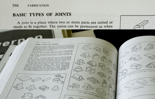
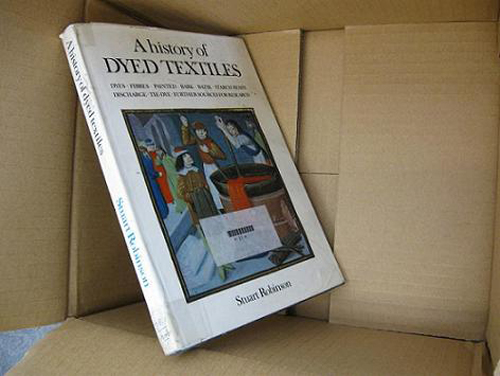
In the library I found the book: ”Jewelry – concepts and technology”.
It’s about Jewelry. It’s not a small book.
I’m not really into jewelry.
– but, oh all this nice detail. I need a closer look at that book.
What kind of system is it?
All these possibilities that I didn’t know about.
How can there be so many possibilities?
A new way of understanding. A new system to see through the working process.
Extract from the book: ”A joint is a place where two or more parts are united or made to fit together.”
– is this about silver or people?
Will I, after working with this “joint”, understand the social connections between people better?
I am looking for the answer of simple, or maybe not simple, questions.
I am looking for information about other stuff than jewelry, it has to be here in the book somewhere.
It is.
cat.nr: 777.6-unt-1
keyword: connection
Wednesday, March 25, 2009

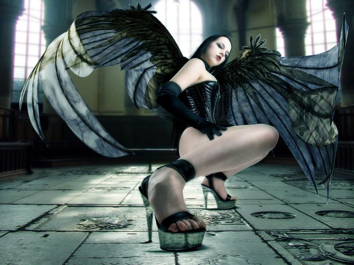
Dark glamour
The word itself, derives from the Latin gothicus, or pertaining to the Goths (gothos), a nomadic, warrior people inhabiting the forest of northern europe in the third century AD.
The Romans regarded Germanic tribes like the Goths as barbarians. Differend tribes like the Visigoths, Ostrogoths were notorious for destruction.
Looking through the book I see a lot of extreme styles, most of them are dark, rough, kinky or has something sad or agressive. By styling ourselves with clothes, make-up, or ornaments one tries to look for individuality. The rules for clothes within a subculture gives the wearer potential to carry out a certain message. With visual language like clothes we can be clear , accent, outspoken, mislead or hide. It’s a way to promote ourselves like tv-commercials do.
It has to do with make believe and believe in.
cat. nr: 708.4
keyword: visual language
Tuesday, March 24, 2009

In een rij boeken zal dit boek niet direct opvallen, maar toch viel mijn oog erop. Juist de bruine kaft die aan karton doet denken wekte mijn interesse. Het geeft het boek een natuurlijke uitstraling en sluit daarom goed aan op de inhoud van het boek. Ook het formaat spreekt mij aan, het ligt lekker in de hand; niet te groot maar toch een redelijk dik boek. Ik wist niet direct de betekenis van het woord ‘dwellings’ en om daar achter te komen begon ik door het boek te bladeren. Het bevat afbeeldingen van hoe mensen over de hele wereld hun eigen huizen bouwen. Het is ongelovelijk hoeveel verschillende manieren van bouwen zijn ontstaan door verschillen in klimaat en cultuur. Indrukwekkende constructies worden weergegeven in tekeningen en de teksten bij de afbeeldingen geven snel informatie zodat je er makkelijk doorheen kunt bladeren zonder perse meteen de hele tekst te lezen. Ik bleef geboeid tot ik het hele boek bladzijde voor bladzijde had door gebladerd.
cat. no. 710.9
keyword: culture
Tuesday, March 24, 2009
Of all the books you see here, I’ve been here the longest. That doesn’t mean I’m the most important.
Of all the books, I’ve seen the most students but that doesn’t mean they’ve read me. I’ve seen every single one of these books come and I’ve seen a lot more of them go but I’ve tried my very best to be a warm and loving leader and to be an example for the younger ones.
Throughout the years I’ve tried to be useful by being a source for research and taking part in the creation of the young artistic mind.
Wether they’ve kept me for my value or they simply forgot to get rid of me, I’ve
been here the longest
cat. nr: 778.1
keyword: wisdom
Sunday, March 22, 2009

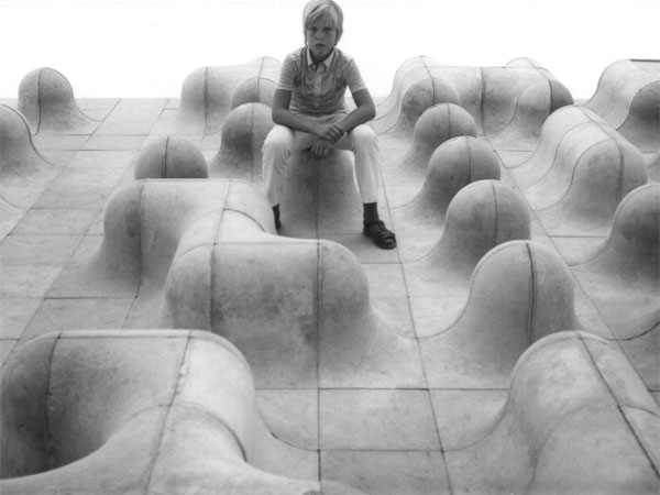
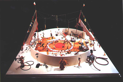
You start playing with plastic cubes…
for now, they are big… easy to fix…
they get smaller… it s time to play more precisely…
they are really tiny… play really precisely…
50 years later… still playing with cubes…
but now, they are huge… really huge…
cat. nr: 710.9-cat-6
keyword: playground
Friday, March 20, 2009
This book shows movie posters from the last 60 years. Just like rock music posters they are trying to give you an idea of the atmosphere of the movie. Most times you will already get an answer on the question: Is it an action movie? Romantic movie? Comedy? Action movies posters have a black background with a guy with a gun on it. Romantic movie posters have a white background. Horror movie posters are hysterical.
Interesting about the book is the way they ordered the book, by country. You can really see the difference between for instance east European film posters and France film posters.
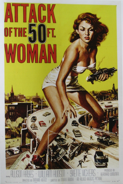
cat. nr: 754.1-PED-1
keyword: time
Thursday, March 19, 2009
I was always very into illustrations i decide to looking for some book about that. I found one called “Illustration now!” by Julius Wiedemann. I have to say that i was quite disappointed, because i can’t found a lot of nice pictures in this book. Most of them was far from my taste.
Anyway there was few artist which works i really like. I have to
distinguished here Paula Sanz Caballero, Michael Sowa, Yihsin Wu and Graham Roumieu. I would like to present to you work of the last person. Graham Roumieu is Canadian illustrator which was working with many famous newspapers(e.g. New York Times, Wall Street Journal, The Washington Post). His works made by watercolor and ink has kind of bitter-sweet atmosphere that i really like. He describe himself like that: “I’m not a particularly religious person but sometimes I wonder if what I am doing with every little absurd scenario I draw is really laying down the blue print for my afterlife. I also wonder if I should work in a better-ventilated space. Either way I am quit scares. I use that in my work too.”
cat. nr: 758.4-wie-I
keyword: illustration
Thursday, March 19, 2009
Some years ago I found in internet journey letters by a designer from Moscow, Artemiy Lebedev (www.tema.ru). There was one thing I was interested in a lot: road signs, street signs, signal lights that surround us everywhere we go, but with a national identity. So, last week I found in a library book, called 1000SIGNS, about same things, but with bigger collection of sign pictures from all over the world. I found it very positive and interesting, that, for example, toilet signs can look different and at the same time tells something special about the country or society they are coming from from. I can’t add any other comment, you have to see it.
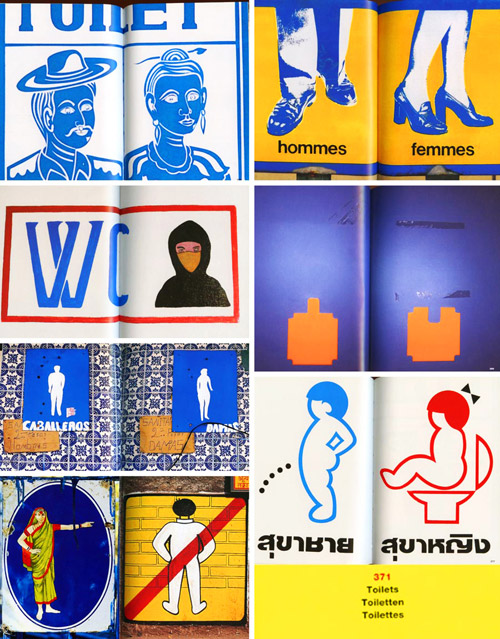
And there are also some funny signs about dogs and…
cat. nr: 754.9-mus-1
keyword: identity
Thursday, March 19, 2009
As I was walking in between the library’s narrow lines of bookshelves I quickly browsed through the titles on the shelves. A book caught my eye, I don’t know why, maybe a combination of the title and the layout and what notes of association they strike. The book that caught my attention was on the bottom shelf, in-between books about african ceramics and the art of pottery. The title Fragiles in black on a white background. I instantly felt a liking for the title “fragiles”, a poetic word that suggest vulnerable and delicate objects that has to be handled with care. As I picked up the book I noticed that it was a new book from one of my favorite publishers Gestalten Verlag.
Of course. I’ve got some of their books and always find them interesting, they cross over the borders between design, graphic design and contemporary art, in a playful and inspiring way. So sitting down and opening the book I found a collection of contemporary work in porcelain, glass and ceramics by both established and emerging design talents and artists. Gesltalten Verlag always seem to have an extraordinary eye for finding the most interesting subjects of right now. Ceramics is an area with history going back to the beginning of human kind but recently new technical developments allow designers a new approach. Collecting inspiration from the whole history of ceramics, these artist’s freely play with the language of old ceramics styles but by fully mastering that language and adopting it to new techniques they can create new unconventional objects that range from housewhare to artworks.
cat. nr:
keyword: fragile
Thursday, March 19, 2009
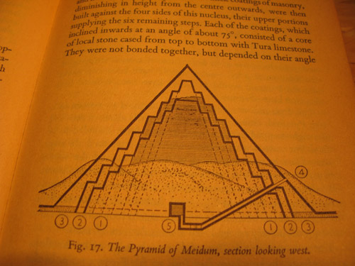
A book I found interresting is about pyramid design in ancient Egypt. The quality of the designs created by the ancients can be very inspiring tough it may seem a bit qliché, the mystery around the monumental pyramids as a timeless form are still facinating.
The book is an old and worn pocketsized relic it self. Its plastic wrapping that is protecting the cover almost falls off as you open it. It contains lots of illustrations and groundplan sketches of pyramidstructures, materials used, design methods and tools.
cat. nr: 712.5
keyword: pyramid
Thursday, March 19, 2009

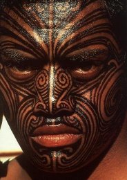
We consciously recognize ourselves and our own bodies. This gives the skin a special significance, as the final, slender layer that separates the self from the outside world. In reflecting on ourself and our world, we use for expression.
Body paint is a strong way of expressing. Used a lot in rituals which has to do with birth, death, religion, haunting etc..
There are strict rules for the forms, patterns and colours in a particular culture. There is also space for personal input. These rules gives body pain tan extra layer, value in the way it is a visual language understood by a whole group of people.
Body paint, the patterns, colours reflect the culture and the other way around. Example: In times of war, colour use and patterns change.
Nowadays body paint is seen as primitive by many people. We use make-up to decorate our selves or for expression.
But why don’t we use this potential pure, easy and strong visual language ‘body art’ anymore. I really mean patterns and colours.
What is more expressive than the personal touch?
cat. nr: 908.9
keyword: visual language
Thursday, March 19, 2009
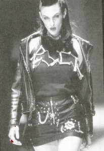
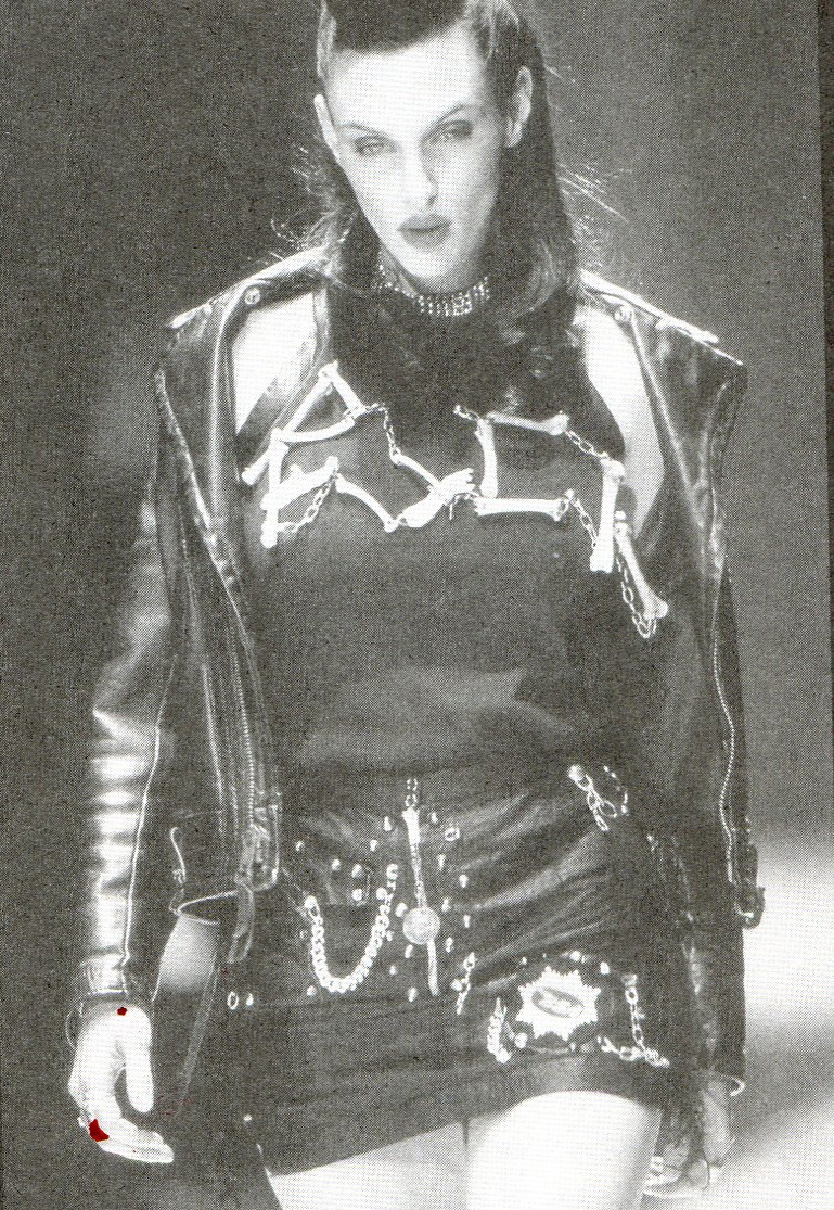
I was looking in the libriary for an interesting designbook and saw numbers of books about design. The reason I chose this book is because I think there is nothing shallow about fashiondesign. In the artworld fashion can be seen as commercial and not meaningful but I think that’s wrong. Fashion is all about meaning, at least it is to me.
Why do you choose to wear what you are wearing today?
What were you thinking this morning when you picked your yellow sweater or your black dress?
Why did you buy them?
This all has a simple answer. Individuality.
Who are you and how do you want other people to see you? How do you feel and how does that reflect by what you’re wearing on other people?
cat. nr: 14975
keyword: individuality
Thursday, March 19, 2009

I am in my mothers tummy… I am playing with myself…
I am born… i am playing with my cuddle toys…
I am 3 years old… I am playing with other children…
I am 14 years old… I am playing with boys…
I am 18 years old… I am playing with men…
I am 24 years old… I am still playing with men…
I am 32 years old… I am playing with my kids…
I am 63 years old… Am i still allowed to play?
YES, I AM…
cat. nr: -cal-2
keyword: playground
Thursday, March 19, 2009

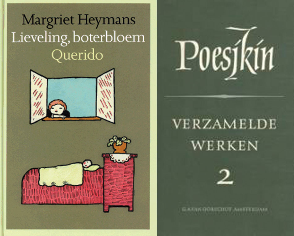
Although this is a completely black book, this book represents the best book designs of 1988.
The design of the books is simple but elegant. Just with the name of the author and the title of the book. Some designs make use of illustrations. There is not much use of different colors. Mostly, two
or three colors on one book. The designs of the books that are the most attractive to me are those with a simple choice of typeface , that represents just the basic information of the book.
For me the most attractive design of he book is the one that uses very light colors’ for illustrations. Although I already said that the most attractive books, for me, are the ones that use, just words for the design, I found this design the most fascinating in the collection of 1988 because of the simplicity of the illustrations that make the book very stylish. It’s a children’s book of Margriet Heymans “leveling, boterbloek Querido”. The book that is less attractive to me is the book of Poesjkin “verzamelde werken 3”.The reason for that is because of the use of, on my opinion, hideous use of the teletype and large font for his name. The color of the book is dark green that is used a lot in the design of books from that period. Although I like the simplicity of the design of the books from that period, this specific green is not attractive to me at all.
cat. no. 758.3
keyword: best
Thursday, March 19, 2009
Drie jaar geleden liep ik langs een winkel waar een televisie in de etalage stond, ik zocht naar het prijs kaartje; niet te koop stond erop. Laatst liep ik over een tweedehands markt daar was hij mijn televisie; geen geld bij me. Nu keek ik in de bibliotheek van school wie de gene was die het had ontwerpen, het was een raadsel. Iedereen die ik het vroeg wist wel een letter van zijn naam maar ik kwam er als nog niet achter als ik al de letters achter elkaar plaatste.
Maar gister kwam ik er na lang zoeken achter. Je hoeft dus niet meer op de Design afdeling te kijken van onze bibliotheek. Ook al ben ik nu zelf wel nieuwsgierig of hij er toch bij staat.
mijn zoektocht
my search
Thursday, March 19, 2009
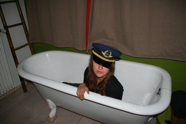
“How things don’t work”…I have to admit that title worked as cliché of love at the first sight. Coming into the section of strictly design based field and being obligated to choose one book as starting point of next one month of study didn’t completely contribute to the feeling of being excited about further choice but then this title appeared. For miracle to be even bigger it was in part of industrial design to which one I defenetly don’t feel interested in.
Passing through introduction and first paragraph gave me satisfaction of knowing that there is no possibility of wrong choice. It is about practical problems which modern technology that we are using for every day activities brings and opposite result of the image of comforts and easiness that we expect but it is not critically focused. They don’t directly attack industry for producing all this kind of gadgets… there is a solution and that is inventing, studying, understanding and improving things that are already made or left over. In first chapter discussion about convenience of bathrooms and bathtubs appears, which is quite funny on the first reading. As you think about it more closer it is actually truth. Also what might be interesting is comparison to situation of the same kind of environment that we are situated right now maybe 20-30 years after this book was written.There are some improvements but basic problems are still the same caused by politics of capitalism market…use less make more.
“Societies and the individuals making up social groups ,tend to respond in a number of different ways to each new problem.There is capitalist approach-make it bigger,the technocratic one –make it better,the “revolutionary”solution –portry the problem as an example of an exploitative system ,and pre-industrial romantic fallacy-don’t use it.maybe it will go away by itself.We propose a fifth alternative response-let’s invent a different answer.
cat. nr: 770.6 pap 2
keyword: invention
Thursday, March 19, 2009

I browse dusty books signified by typeface and the often great level of deterioration.
Title, Title, Title, stain, Title, stain, tear and of course a nagging pain in the neck caused by the uncomfortable positioning of the head, necessary to read the titles on the afore mentioned dusty books with ugly typeface justifying their own existence by amazing amounts of crappyness meant to be intriguing.
I browse dusty books and I am very impatient and yes, very annoyed.
I have an assignment to fulfil.
I bend down to take a peek at the lower levels and find: stain, tear, Title, Title, stain, bright clear red outstanding unpretentious untitled fat thing. It was such a relief.
cat. nr: 942.9 chun 1
keyword: develope envelope