Skip to Content Skip to Search Go to Top Navigation Go to Side Menu


Archive for March, 2011


Research David Keshavjee & Julien Tavelli


Sunday, March 6, 2011

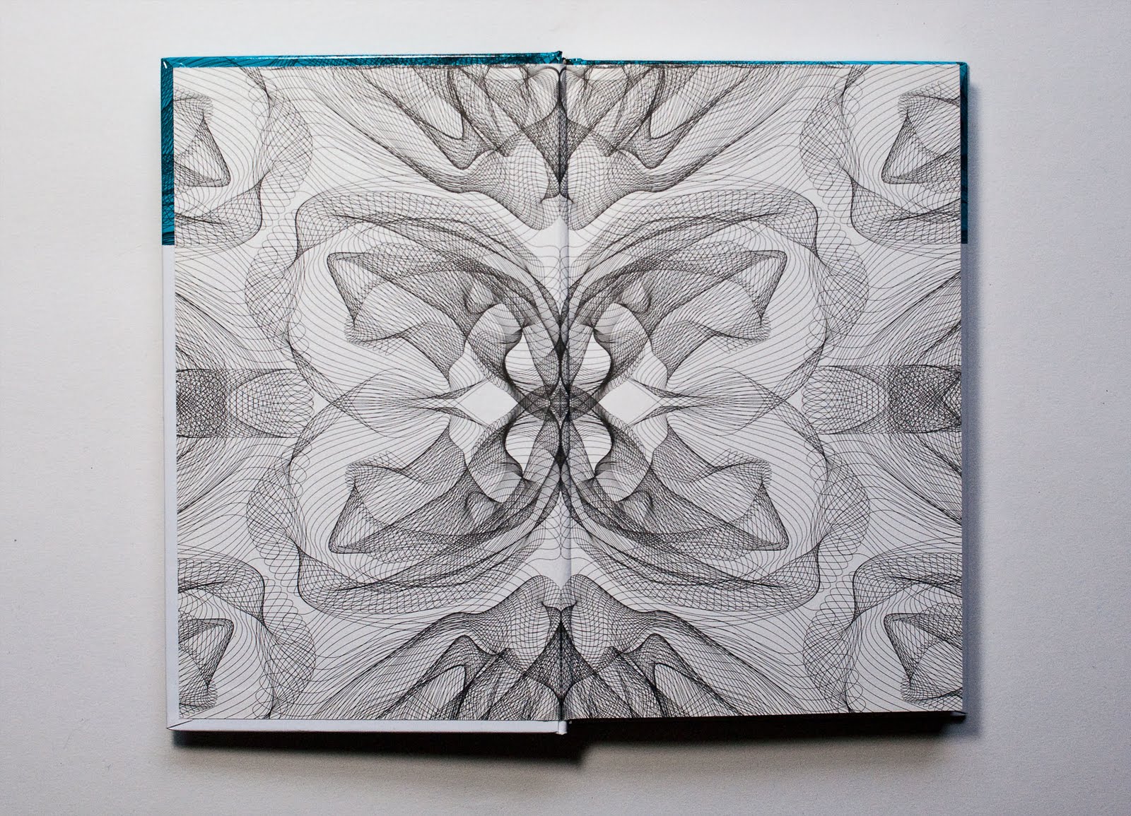
David Keshavjee (born 1985) and Julien Tavelli (born 1984) are two Swiss graphic designers/typographers, they both studied at Ecole Cantonale d’Art de Lausanne (ECAL) They where one of the winners of the Swiss Federal Design Award with their graduating project, ‘Using Tool,’ in 2009. They just made a pedagogic booklet at the Federal Office of Culture in New York, Acid Test. In collaboration with Körner Union and Tatiana Rihs they made offset cmyk experiments. Later they printed a reproduction of that handmade booklet, “Les impressions magiques“. They are part of Maximage Société Suisse, an exploration in the field of emotion and technology.

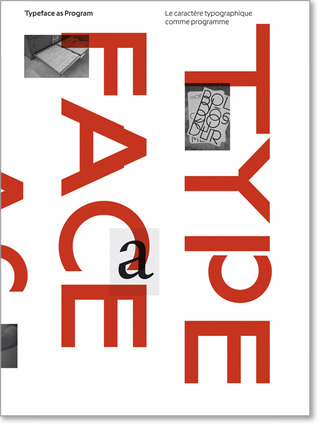
Their Using Tool project is, I think, the most interesting thing to discover about them, it explains a lot about how they work and how their poster series for music concerts where build up. The posters where published in Wallpaper and in the book ‘Typeface as Program,’ witch was published by Ecole Cantonale d’Art de Lausanne (ECAL) Especially the last one is very related to their process and what they are designing. They also explain in this book how Keshavjee and Tavelli approached their works by using half digital half manual tools during the process.

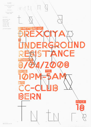
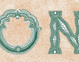
They started in their design process of the posters by first programming a script, inspired by a workshop of Frederik Berlaen on ECAL, that could automatically create a system of characters by using the already by Keshavjee and Tavelli designed ‘o’ and ‘n.’ Those two are the essence of the typeface, so with this characters the script is able to create the other characters of the alphabet. Keshavjee and Tavelli like to keep the random and uncertain factor in this system and in their font by giving the computer the control of the typeface. I think the script also helps them to design the first layer of the poster, the digital printed part, the black thin lines. When their computer created the characters they use a machine next to the computer that cut the letters out of a 2mm thin wooden plate what is still very raw then, but they do the final touch by hand. After they manufactured the wooden characters they cut pieces wood all the same size to glue the 2mm thin wooden characters on it. After they did this crucial step, they can think and work with the spacing of the letters, and build up the composition. The last step for them is to combine the background layer and the composition of the typography, the wooden characters into the final poster.

I think with the combination of manual and digital processes that are repeated at each step, from the production and application of the typography until in the composition and final print, Keshavjee and Tavelli create a refreshing and inspiring result of the raw woodcut with the smooth digital print. They work according to the principle that the means influence the form and that new forms of expression in graphic design can be created by combining different tools. These ideas are applied to the poster series as well, it’s the essence of their project. The posters are also published together with the thoughts about this series and an interview where they explain more in the book, ‘Typeface as Program.‘ There is also an interesting article on boston.com about the swiss designer thoughts of typography by Cate McQuaid.

For me they work a bit like typographic engineers I would say. They really are working with developing scripts and systems to help them approach typography in another way, not very usual and practical way, but an interesting one. You could think if you read about how controlled they work in a way, that they are probably to much controlling their work. But their prints are very open for unexpected accidents within its system, there is a lot that can go wrong, all trough this process the accidents are creating new opportunities in the creative process of their typographic experiments, that’s a good value of their work I think. They also always start projects by experiments. It could be interesting to learn and see more of the projects of David Keshavjee and Julian Tavelli, and see how they treat their project during the process of designing typography.

Letters


Sunday, March 6, 2011

Nu.


Sunday, March 6, 2011

Kijken alsof je alles voor het eerst ziet. Het laten zijn van wat er om je heen gebeurt en is. Kijken als een kind verlost de wereld van goed en kwaad, het verlost ons van de etiketten die wij geplakt hebben op alles wat we zien. Het enige probleem is dat we geen kind meer zijn en ook nooit meer zullen zijn. Hoe nu verder? Hoe te  zien zonder te plakken?

Laszlo Moholy Nagy liet mij dit ervaren, of tenminste gaf mij de kans dicht bij deze ervaring te komen. Zijn film Berliner Stilleben laat het dagelijks leven in Berlijn zien in de jaren dertig. Het was bijzonder om te zien hoe een camera, het vastleggen van je eigen dagelijkse omgeving je dwingt met andere ogen te kijken. Alles is, niets meer niets minder. Dit werk, dat geruisloos mij een wereld aanbood, zette me aan het denken over mijn eigen wereld. Waarom heb ik het gevoel dat toen, in 1931, de dingen meer ruimte kregen? En waarom denk ik dat als ik weet dat dit niet zo is? En ja, er is maar een conclusie; de wereld die ik daar in dat kleine kamertje in het grote meesterwerk van Berlage aan me voorbij zag trekken, is exact de wereld die ik nu, al schrijvende, om mij heen zie. Het zijn enkel de kinderogen die ontbreken. Moholy Nagy heeft op geniale wijze afstand genomen van zijn natuurlijke omgeving en uiteindelijk, misschien juist  door middel van de afstand,een nabijheid gecreeerd die de verklaring ondergeschikt maakt aan de ervaring. Los van dat hij dit op een zeer gevoelige en in mijn ogen briljante manier heeft gedaan, gaat het mij vooral om zijn alerte gewaarzijn. Je open stellen voor de gewone dingen en het nu de kans te geven in alle eerlijkheid zich aan je te openbaren is een kracht die, niet alleen als kunstenaar, maar ook zeker als mens je meer zal brengen dan wat ook. Moholy Nagy heeft mij op die donderdagmiddag bewust gemaakt van de dunne scheidslijn tussen afstand en nabijheid. En door middel van het tonen van zijn wereld heeft hij mij meer laten zien van de mijne dan dat ik tot nu toe zag. Voor even was ik een kind, zo open, gevoelig en nieuwsgierig. Ik heb gekeken en gezien.

Get the Flash Player to see this content.

Film Preview: Berliner Stilleben, 1931

more on Moholy-Nagy's films go to [x]

Experimental Documentary That Brings Truth Of Daily Life.


Sunday, March 6, 2011

When I walked around In the van Abbemuseum in Eindhoven I was very enthusiastic when I found a beamer projection on the wall which was playing an old movie.
The name of the movie: Man with a movie camera, was new for me, as well was the artist: Dziga Vertov.

As I stood there watching a city was shown to me. this has to be Russia I thought. But I could only guess it. As well as I could only guess to the meaning of the images: the busy street shots at one hand and at the other hand the shots of filming camera’s.
This is the reason I picked this work, because it tickled my curiosity.

The movie dates from 1929. How wonderful and fascinating to look true time and space, I thought.
At home I looked up information and watched the movie completely.
So it appeared to be that Dziga Vertov was born in Bialystok (now a days Poland) in 1896 under the name Denis Arkadevich Kaufman.

Vertov was an idealist. He wanted to show his audience the truth but at the same time let them realize that the truth in a film is manipulated. He does this by showing only shots of what is truly happening; so no theater, script or film set and involving in his movie shots of filming camera’s. With a very experimental movie as consequence.

I find the idea interesting, although it is for me completely different. I don’t mind watching complete fiction, I am more interested in how the images look.
The images in Man with a movie Camera are really impressive. The shots (frozen and moving) are photographical. The editing is in the film is musical.

This is maybe the reason why I fell in love with it. Since my eyes are always searching for photographic images (photo or video) as well as I am interested in the editing of movies.

Shot from the movie; the audience eye

for more information and complete movie: link to The Man With The Camera

http://www.brown.edu/Departments/MCM/courses/MC150-03/manovich/manovich.htm
or :

http://donamajicshow.tumblr.com/post/578155092/man-with-a-movie-camera-1929

freedom


Sunday, March 6, 2011

Being forced to see geometry everywhere and anyhow was an interesting experience at Van Abbe museum.
I feel a certain panic when I enter a museum. The urge to discover something to relate with grows bigger and bigger so then I’m obliged to think about the works surrounding me.

In my search for something familiar, I saw a black cube in one of the first rooms of this museum. I had then the curiosity to pas through a claustrophobic space to get in it. The first seconds I was feeling only disgusted by the crowded environment around me.
Proun was presented in this black cube, a black cube, that I associate with a black square so, of course, with political suppression. I was faced with a completely contrasting but yet, perfectly compact universe. As his paintings give the viewer the space feeling, there’s no wonder he is strongly relating with the 3d world as well.

Exploring Lissitzkys well defined visual language made me think more about politics in a way or another, that may be because I feel a certain irony in some of his works.
In a time when society was build on a strictly determined target of organizing and developing masses by being as productive as possible, he was trying to spread positive and gratefulness messages in a world were starving was the main problem. That’s quite ironic.

Still, it seemed to me that Lissitsky was more preoccupied with his intention of exploring and playing with geometrical forms and symbols, rather then with this political propaganda. Lissitzkys interest in so many fields of art, like design, photography, typography and architecture it’s something to admire. That may be caused by the lack of means in expressing one idea, or maybe by his wish of being as free as possible.

His universe condensed in that black cube make me think about his freedom as an artist. His freedom and his natural speed of development that was trying to run away from art propaganda and was expressed in the most simple and abstract way.

Hansje van Halem


Sunday, March 6, 2011

De computer heeft gezorgd voor drastische wijzigingen in de manier waarop lettertypes worden ontworpen en gebruikt. Het lag voor de hand dat grafische ontwerpers zouden reageren op de ontwikkelingen die hun traditionele manier van werken bedreigden. Ze ontwikkelden andere, soms ook traditionele, oplossingen voor de nieuwe weg naar de toekomst. Dit deden ze omdat ze bang waren dat mechanisatie tot een verdwijning van standaarden en gevestigde typografische regels zou leidden.

Tegenwoordig integreren veel belangrijke grafisch ontwerpers typografie, belettering en beeldproductie, waardoor ze meer opschuiven in de richting van de beeldende kunst dan in die van de vormgeving. Microsoft kwam in 1996 met het “Core fonts for the Web-project”. Microsoft wilde hiermee een standard set lettertypes gratis verspreiden. Deze lettertypes moesten goed leesbaar zijn op het sherm, verschillende stijlen bieden en ook geschikt zijn voor internationaal gebruik. Uiteindelijk zijn de volgende lettertypen hiervoor gekozen: Andale Mono, Arial, Comic Sans MS, Courier New, Georgia, Impact, Times New Roman, Trebuchet MS, Verdana en Webdings.

Dit zijn nog steeds de meest gebruikte fonts op het web. Bovengenoemde lettertypes zijn natuurlijk ontworpen om een tekst makkelijk leesbaar te maken, zodat je als lezer snel informatie kunt opnemen. Maar niet alleen handige fonts worden ontworpen. Er is namelijk ook behoefte aan sierletters, of aan letters die interesse wekken en waarnaar je aandacht getrokken wordt. Deze letters kunnen goed gebruikt worden op bijvoorbeeld posters.

Een voorbeeld van een ontwerper van sierlijke letters is Hansje van Halem. Zij is afgestudeerd aan de Rietveld Academie afdeling grafisch ontwerpen met een vorm van typografie in het jaar 2003.  Ondertussen heeft ze nog een aantal letters ontworpen, maar ze richt zich tegenwoordig vooral op het vormgeven van boeken en ontwerpen van patronen.

Sommige van haar ontworpen letters zijn ontstaan in opdrachtverband, of tijdens het tekenen van hun plek binnen een andere opdracht. Het afstudeerproject is een alfabet, opgebouwd uit een x-aantal lagen geschetste letters. Ze nam het frame van de letters van een al bestaand lettertype en tekende vervolgens deze letter daarin op de computer. Door een aantal lagen te kiezen is het mogelijk om heel precies te zijn met de dikte van de letter. Dit maakt het erg interessant, want zo kan het er telkens weer uniek uitzien door te spelen met de aantal lagen. Dit font is de enige die ze als totaal alfabet heeft ontworpen.

Verder heeft ze eigen ontworpen letters gebruikt voor posters of boeken, maar hiervoor alleen de letters getekend die ze nodig had. In deze voorbeelden komt ook meer haar algemene stijl naar voren dan bij haar afstudeerproject. Bij het zien van haar werk, is het duidelijk dat ze onder andere inspiratie bij ouderwetse technieken vind, zoals breien en kantklossen. In haar ontwerpen werkt ze niet zo zeer aan de vorm van de letter, maar meer met de invulling. Ze gebruikt bestaande letters en “tast” die vervolgens aan door middel van een systeem of regels die ze zelf bedenkt. Hansje van Halem gebruikt voornamelijk lijnen in haar werk. Dit doet ze, omdat ze op deze manier makkelijk met zwart en wit grijswaarden kan bepalen. Er is een constante spanning tussen dikte, schaal, structuur en handschrift. Door de computer is het mogelijk om met haar systemen ervoor te zorgen dat er geen onregelmatigheden ontstaan, maar juist dat vind ze erg interessant. Hierom gebruikt ze vaak kleine tekens van oneffenheden, verloop, zichtbare vermoeidheid en ontwikkeling en zorgt ervoor dat het nog een extra laag krijgt, wat de aandacht van de lezer langer vasthoudt.

Naast haar interessante afstudeerproject heeft ze onder andere ook het ontwerp gemaakt voor de Nederlandse postzegels van 44 cent en 88 cent. Bij de zegel van 88 cent heeft ze de cijfers zelf ontworpen en de tekst in het lettertype “Spectrum” erbij gezet. De ronde vormen van de achten komen terug in de kleine tekst eronder. Bij de postzegel van vierenveertig cent is het lettertype “Johnston” gebruikt. Het patroon op de achtergrond van beide zegels heeft ze ook zelf ontworpen. Deze zorgen ervoor dat de speelse, schijnbaar met de hand getekende cijfers toch een zakelijk/serieus uiterlijk hebben. Later heeft ze ook de aanpassingen gemaakt naar de nieuwe 1 en 2 zegel. Vooral de toegevoegde kleuren vallen daar in op

De letters van Hansje van Halem zijn sierlijk en interessant. Kleine krabbeltjes maken een letter gedetailleerd, maar storen de eesbaarheid niet. Soms is het zaak een moment te focussen om te ontdekken hoe de letter werkt, hoe het is opgebouwd, anderen laten duidelijk een systeem zien. In ieder geval is de concentratie en een passie voor ontwerpen in elk ontwerp terug te vinden.

Meer voorbeelden van het werk van Hansje van Halem en ook de periodieke tentoonstellingen die ze organiseerd met mede kunstenaars en

ontwerpers in haar huiskamer SCHRANK8 kun je bekijken op haar site

Limited by the ”Sun”


Sunday, March 6, 2011

Lissitzky

El Lissitzky

”The sun as the expression of old world energy is torn down from the heavens by modern man, who by virtue of his technological superiority creates his own energy source.”

In most 2 dimensional work of Lissitzky you can see clearly that he left the old world symbols and created new ones with his ability of typography and photomontage. His art is with power and purpose intending to invoke change. The work being very dynamic reflects the dynamism of a change. His very architectural forms also indicate his passion to organize, to build something new with spacial elements like volume, mass, color, space and rhythm.

For me the best representation of the dynamism of his work was reflected in the elevator of the exhibition space. It was as if I was being moved up and down by just the volume and rhythm change in a simple sound created by a crowd of people. Movement being created and represented by Lissitzky in words and colors and shapes was already quite interesting but it being in the form of a simple sound was something else for me.

”uuuuuuuuuuuuuuuuuu” first floor

”aaaaaaaaaaaaaaaaaaaaaaaaaaa” second floor

”ooooooooooooo” ground floor

Sound can be liberating as much as it can be capturing, one could also look at it as being limited in an elevator, the same as being limited in a communist country, or under a nazi regime, or being limited by the lack of technology and opportunities.

The idea at the end of the exhibition was for me equal to that at  the beginning, the part where we watched the opera “Victory Over the Sun” by Malevich  in the library. I was intrigued by the idea of choreography being shaped by the LIMITATIONS of movement caused by geometrical costumes taken from lissitzky’s 2D drawings. I found out after this exhibition that what draws me in is the limitations. They inspire me.

Every limitation requires a different dance which is waiting to be danced.

SUNrise SUNset


Sunday, March 6, 2011

Beautiful and healthy Sun.

How long I’ve been waiting for you, and finally, of course I m gonna spend all day in a museum.

I was quite disappointed; naaa half disappointed, cause of the Sun, I can t be in a bad mode.

So I went in:

Toilet.Library.Toilet.” Victory over the Sun“movie. Toilet. Wardrobe.

Coffee. Cigarette. Sun !!

The opera has made me forget my pain. I started to love that place instead.

Prokofiev, definitely, he was in my mind with his Dance of the king when I was in the first room.

Concepts expressed by words, reduced to lines, shapes, sharp, direct fired into space. I really like it.

Clear and direct. Art as propaganda, for the mass……Like design?

S#@°!t it must be really hard, if you are a designer, in a way you must be kinda psychologist, a bridge.

Tchaikovsky, Stravinsky, Rubinstejn…….Vivaldi !! the Spring from the 4th season, second floor, big sunny window.

After, that I was no longer interested in individual pieces of art. I quickly started to wander in space.

empty.full.shadow.light. The rooms themselves were art boxes containing art.

I couldn’t stop smiling. Wagner: Ride of the Valkyries. I went out.

“manuscripts don’t burn”. I got to laugh about myself

go,

over

The Sun

Essential for life on Earth.

Leegte.


Sunday, March 6, 2011

Als ik denk aan een expositie bezoeken dan krijg ik bijna een onbehagelijk gevoel van binnen. De gedachten aan zoveel verschillende werken, die elk weer een andere betekenis hebben; die elkaar doorkruisen zodra je even niet oplet; die mijn gedachten zullen openbreken zodra ik die niet aan zoveel mogelijk kanten bij mij houd. Het is bijna een soort angst als ik de grote ruimtes binnenloop en mijn blik valt op al het werk.

Ik wil geen entertainment van beelden. Ik wil een leegte. Een leegte van het hedendaagse; van de toekomst; van hetgeen de mens omschrijft. Dat is waar ik mijn rust in vind; mijn gedachten kan laten focussen op de kleine (menselijke) details waar de massa zelden de schoonheid van zal ervaren. Leven binnen mijn eigen ruimte, waar ik een stilte creëer waarnaar ik de kleinste dingen opspoor binnen het visuele om mij heen. Daar zit de adrenaline die mijn brein laat samenwerken met mijn ogen. Binnen de kunst ben in dan ook constant opzoek naar werken die een grote leegte bij mij opwekken.

El Lissitzky met zijn expositie over het theaterstuk ‘Victory of the Sun’ in Eindhoven. Ik heb mij zelden zo opgelaten gevoeld over een nieuwe ruimte binnenlopen in een expositie. Na elke doorgang zag ik werken die mijn hoofd vulde met leegte en vervolgens mijn gedachtes volledig zijn eigen weg lieten gaan. Strakke vormen; hoeken; lijnen; bijna kille afbeeldingen van een mechanische wereld van vormen die, volgens de beschrijving, op mensen gebaseerd zijn. Op afstand alleen het strakke, dynamisch-ogende uiterlijk zien om vervolgens het menselijke terug te vinden in de kleinste details; de fouten. Van veraf zo perfect, maar van dichtbij zo menselijk.

Ik weet nu wat ik wil. Ik wil die grens. Perfectie en fouten maken. En vooral die fouten laten zien.

monospaced


Saturday, March 5, 2011

Monospaced Fonts.

The horizontal space that a letter occupies in a monospaced font is the same for every letter.

Meaning that wider letters are cramped into a smaller space, and thinner letters have more white space around them, so they will all fit in the same box.

Monospacing first occurred when the typewriter was invented, because the typewriter had to use the same space for every letter, a good example can be found  in WordPad on Windows the standard font is still monospaced.

When looking at the shapes of letters it’s not hard to see that some letters need more horizontal space because they are more complicated  in their shape, compare for instance the letter ‘m’ to the ‘i’ it seems obvious that the letter ‘m’ needs more space because it has  3 vertical lines opposed to one  in the ‘i’, when these two letters need to be fitted  into the same width then the ’m’ has to be cramped  and the ‘I’ stretched, or the white space around it needs to be wider.

Is monospacing more easy and clear then variable-width fonts?

When seeing a monospaced font it immediately reminds me of old fashioned computers or typewriters, and it does not have any ‘flow’.

Most people will assume that the subject of the text corresponds with the typeface, making a text that is written monospaced  unattractive for many people. Writing monospaced does give a certain structure to a text , although I doubt if it would become more clear, because it does more justice to the personality of a letter to give it the space that it needs and deserves, then to force it into a pre-defined  space.

Using a monospaced font can serve some particular purposes, for instance when a text on a  sign needs to be changed it is easier to work with when it’s possible to predict if a sentence fits when all letters have the same width, the same goes for some type of documents and other formal writings.

Concerning monospaced fonts it seems that technological reasons are more important than readability, although in bringing across a quick message they could work well.

Monospaced fonts can be  strong when communicating short messages, but because it doesn’t ‘flow’ as nice as variable spaced fonts it can be more tiring to read long tekst written in monospace, because the words don’t become words but remain more separate letters.

What is important for readability of text is how letters form words when they are combined and here the white space in between is as crucial as the individual letter, monospaced fonts eliminate these characteristics and therefore it can take more effort to read  a long text in a monospaced font.

In a monospaced font the letters have equal space, but why would an I or J or L need the same space as letters like W and M ?

If letters get the amount of space that they need instead of the amount that a technology allows them to have they can function more strong because they keep their own

characteristics, this way words can function as words instead of a combination of letters.

Why use monospaced fonts? I found out is mainly because of technological limitations, and in some cases to make it easier to know whether a text fits into a frame, although it seems there are more reasons to not use monospaced fonts but instead variable width fonts, because the main reason of text is communication and readability and  they are stronger in variable width fonts.

Bob Vos

references:

http://www.lowing.org/fonts/

list of monospaced fonts and a description.

http://www.fontsquirrel.com/fonts/list/style/Monospaced

this website contains many examples of monospaced fonts.

http://www.quora.com/Why-is-it-important-to-have-a-monospace-font-in-a-text-editor

text explanation  about why monospaced fonts are used.

Letters


Saturday, March 5, 2011

A “simple” construction


Saturday, March 5, 2011

As a student who already was aware of which direction to choose before applying to the Rietveld my trip to the Van Abbe Museum was no eye opener on that point. Being raised by artist parents and Bauhaus principles in the country side of Denmark I found huge inspiration in the El Lissitzky exhibition well knowing that I want to become a Graphic Designer.

Most of the works of Lissitzky seemed to be constructed out of different objects and colors. Two or three dimensional there was a huge understanding of aesthetics with great influences from the Bauhaus generation. Unlike most of my fellow students who thought Lissitszky was too Russian, constructed, cold and straight eyed I saw great playfullness, movement and joy  (experiments) in the works. Me having a little knowledge in the field of printing I could see that the artist had explored what was possible at that time. I immidiately identified my self with the way I use basic html like color boxes, strokes and helvetica when working with web design. The lack of knowledge or technology is not always a limitation but can also be a huge gift which removes superfluous decoration and focuses on the main idea behind the work. The way he constructs with distinctive geometric forms in layers and makes it look quite simple, even though everything is put in the best way possible, was very impressing. I kept seeing references to cubism and futurism in his sketches which I also seem to have in my drawing. The picture underneath sums up what I have said, with a very simplified illustration that is constructed like both informative text and illustration this silkscreened illustration has references to the beginning where Lissitzky designed children books.

Do You Get It?


Saturday, March 5, 2011

It was quite hard for me to make a decision about one work of the Russian suprematist artist El Lissitzky, since this extreme emptiness and simplicity in images mostly gives me an uncomfortable feeling of being lost. On the other hand, it can also give me a feeling of structure, of organization and a somewhat mysterious clarity. So my feeling towards these means of visual language is kind of ambiguous. What is very interesting about the confrontation with abstract art, is that you either comprehend the piece (because you’ve read or heard about it or simply because you are part of the very same movement), or you don’t. If you don’t, you have to fill the empty brainspace with your own thoughts and ideas about the suggestion that is made or what is being implicated, which is most of the time impossible to guess without any information since it’s so abstract. How does a person that doesn’t know that Malevich’s Black Square is representing the party perceive the painting? And is it wrong if that person imagines that there is another meaning, just for him? I really don’t know.
I partly like how graphic elements are presented by Lissitzky and how they carry a connotation that has to be detected. They become emblems for and references to something so much more than themselves. So they turn into something completely different and in a way unworldly, but in a very modest, unpretentious way, sometimes even a tad clichéd. One of his propaganda posters in the exposition, “Beat the Whites with the Red Wedge” from 1919, is especially nice as an example. The red wedge is a symbol for the active bolshevists who are overcoming their rival, the white movement, interestingly enough represented by a white opening in a black background, which is pierced by the red triangle. I like the simple clarity of his choice, but am not a fan of the additional shapes and letters since they are too mysterious for me and disturb the beauty of the image in my eyes. Then again, it’s propaganda.

New eyes


Friday, March 4, 2011

Looking back in time, trying to remember how I’ve learned to write and read, no memories appears. At least no memories that create a clear image of the learning process.

In elementary school we learned the letters. We learned how they look like, how they sound, how to write them and connect them into words. This process took quite long time I think and it’s difficult to be described in retrospect. In these classes, we all had to study on writing the same letters, but we all created different handwriting. Some could do it beautifully, some ugly to unreadable. How a handwriting can be unreadable?

Now, reading a ‘small’ book from a ‘big’ man – Gerrit Noordzij, helps me to realize why and how I can do this today. A book written even before I was born answers the question as simple as ‘the space’ and with writing especially the ‘white space’.

In our current time we see hundreds of images every day. Some we remember for a reason, some we forget immediately. How does our human brain read those images? What helps it in this process?

The “boom” of a new ways to process images started in the second half of the 19th century, when people started creating more spaces for museums and galleries. Later on with the use of architectural deconstructions, making them fairly big and “clean”, with the only purpose to contain some of those special images for us.

The use of space is very common in modern art. In some cases we actually perceive the space as a piece of the art. For example, if a work of art is placed in surrounding A, which is empty, it will be processed in your mind differently than in surrounding B, which is full with other objects.

In modern art we refer to surrounding A as the ‘White cube’, with its square or oblong shape, white walls and a light usually coming from the ceiling. A book from Brian O’Doherty (Inside the white cube – 1976), in which he confronted the modernist obsession with the white cube arguing that every object became almost sacred inside it, making the reading of art problematic.

As surrounding B was more standard in the few centuries before that. Then the exhibition space was the salon, a dark space so filled with works that it was difficult to see the beautiful, detailed paintings.

surrounding A

surrounding B

The importance of space can be found in different forms. Also in writing it plays a crucial roll in getting the message across, in other words: reading. In his book ‘ The stroke of the pen’ Gerrit Noordzij emphasise how the space in and around letters can make or brake the word and therefore the text.This space has to be put in rhythm. He writes: “The rhythmic connection of the white shapes in the word is the condition of the rhythm of the black shapes and vice versa.”

So this rhythm can be seen only in combination of letters. If a letter and subsequently a word doesn’t have its own space in and around it, then the white cube that belongs to the letter is impaired. As a result the word becomes just like an image hanging in saloon from 18 century.

Trying to understand this theory is like learning to read and write all over again. That opens a new perception on all written letters and words, how are they made and how they come across. Always look around and you’ll might see things in a new way…

Letters


Friday, March 4, 2011

Welcome all of you born and not yet dead!


Friday, March 4, 2011

De mens speelt zijn hele leven, elke dag, misschien wel elke minuut, een andere rol. Tegenover elk persoon verhoud je je anders. We leven met masker, kostuum en aangeleerde manieren. Zonder valt niet of nauwelijks te leven.

De ene dag ben je slecht, vijandig, dan weer lief en onschuldig of je voelt je als een zak aardappels.
Als ik me voel als een aardappelzak, zorg ik er voor dat de aardappelzak omhult is door een zwierige jurk en felle lippenstick. Uiterlijk is misleidend. De meeste zullen pas denken dat je een aardappelzak bent als je een jute doek omslaat en muf ruikt.

Mensen reageren op wat ze kennen.

Heb je een goude oorbel in dan ben je crimineel, homo of gabber. Cliche's zijn makkelijk.

Bij een slecht iemand denk ik meteen aan een kauwgom kauwende man met een leren jas en een snor. Dit plaatje zit vastgeroest in mijn hoofd.


[costume for Man with Bad Intentions]

Toen ik het operastuk: De overwinning over de zon, met decors van Kasimir Malevich zag, was ik gegrepen door de vervreemdende taal en beeldtaal. Abstract. Weinig aanknopingspunten, waarin je vastgeroeste denkbeelden zou kunnen terugvinden. Ander taalgebruik, andere tonatie van de stem, abstracte kostuums.
Het karakter, de slechte man, kreeg in dit stuk een hoekig pak aan. Zonder dat het aansloot op zijn lichaam. De vorm van het pak werd eerst gemaakt. Daarna kon de slechte man zich hiertoe verhouden en aanpassen. Zijn bewegingsvrijheid hing af van het pak. In het kostuum zijn geen cliché’s gebruikt. Ook niet in het pak van de vijand, de nieuwe mens , de dikke man enz.

Dit vind ik een welkome verrassing en zelfs een opluchting. Doordat bewegingen, taalgebruik en kleding onherkenbaar blijven, dwingt het je anders te kijken, te denken en te luisteren. Niet te snel te oordelen. Het stuk is een zoektocht naar herkenningspunten in een wereld die je vreemd is. In dit stuk maak je je eigen waarheid zonder het zien van cliche's of rookwolken.

cube design


Wednesday, March 2, 2011

In the “beginning” all was dark… Paintings were hanging in dark rooms and the walls were so filled that one could barely see the landscape paintings for all the landscape paintings in the salon. Anyhow, most people were happy that they could consume the art, just like people since the ancient Vatican sculpture gardens. In 1812 the first “art-only” building was created by the English architect Sir John Soane. Finally! Here the art could be viewed for what it really was, perhaps even art selected with great taste, as Kant would have wanted it.

In the late 19 century the number of galleries and art museums were booming. Every “metropolis” had to have its own museum of art to be a metropolis. When we are approaching the mid 20 century old ways of building institutions of art, often retro romantic, were abandon for more “clean” and architectural deconstructed rooms, an early examples is the Guggenheim in New York. Exiting times.

At the Van Abbe-museum in Eindhoven you can walk around in beautiful, calm, strictly white and spiritual rooms filled with modernistic art. The worlds’ largest collection of Lissitsky paintings are finding its’ place like a perfect sized glove. Modern art for a modern room!

On the second floor an exhibition about art is presented. Or rather an exhibition of art. Or an exhibition of artworks about the modern art museum, but with new art. Or an exhibition on ehee.
When visiting this exhibition a feeling of unrest is present, an urge to maintain the “white cube” intact. The room can only be intact when art is made in respect of the cube. But what happens when people get tired of the white cube, when artist don´t agree that their works need the white cubes, when the curators finds them self unable to fill their holy rooms? Maybe the beautiful buildings of high modernism will slowly decay? Well to calm the museum directors I have taken my responsibility and re-used the modern room to create new room! Deconstructed the deconstructed. A post modern solution to keep modern. Now we all can sleep well.


Log in
subscribe