Growing up with two different cultures, Switzerland and Italy, I associate a lot of feelings with Folklore.
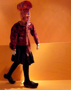
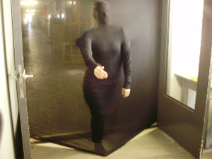
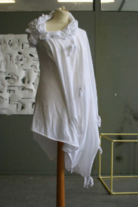
In the exhibition Gone with the wind I felt a special connection to the 7 contemporary design interpretation of the net menders. Across the room you just saw black-white dresses that looked similar. Amidst the net-landscape I caught the details. It reminded me of the feeling I had in my childhood when we went to a farmer festival of my Swiss-grandfather. I wore my traditional costume and was amazed by all the others. They looked all so perfect in it and every costume was different when I looked closer. One had more stitches or more golden knobs. They came from different cities. Every canton has their own traditional costume and also inside of the canton there are differences between the regions or daytimes. The “Kantönligeist”, as we say in Switzerland, is omnipresent.
The Farmer Festival from a little girl’s point of view
Thursday, September 10, 2009
Present, Past, Future: Tree Thieves & Pagan Customs
Thursday, September 10, 2009
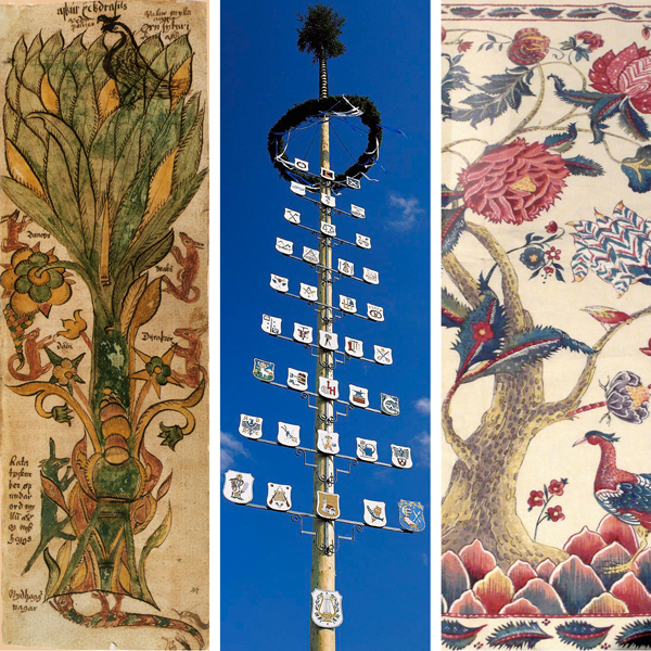
It was in the middle of the ‘Walpurgisnacht’ (the night from April 30 to May1) when a small group of German teenagers sneaked to the marketplace of a neighbouring village in Oberfranken to steal the ‘Maibaum’ which was supposed to be erected there during the festive gathering the following morning. If they succeeded the villagers would have to pay, according to this Bavarian custom, a tribute of beer and food in order to retrieve it.
It is believed that every ‘Maibaum’ has a blessing effect on its town. It is a symbol of fertility and prosperity. Although its contemporary form dates back to the 16th century its real origin is far older: Germanic tribes already worshipped holy trees long before they were christianized. Presumably these cults have their seeds in ‘Yggdrasil’, the mythologic Norse ‘World Tree’.
The Zuiderzeemuseum in Enkhuizen / Holland exhibits a modern chintz which also shows a ‘Tree of Life’. To some extend it might have the same mythologic background as the German ‘Maibaum’.
Generally the ‘Tree of Life’ is an archetype which is deeply rooted in the psyche of almost every culture. But what does it really mean to us today in our high-speed society in a more or less globalised world? And will it still have a meaning in the future?
Symbols
Thursday, September 10, 2009
The noise from the boots that hit the cold wet floor, yelling men shouting and cursing, fork lift trucks and pallets that hit the floor with a loud bang. And the ice-cold air from the freezers. This all together make you realize your in the fishing harbors of IJmuiden. Typical for this environment.
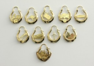
From their sixteenth age the lads in IJmuiden are ready to work in these harbors or as fishermen on sea. They get the full gear. A blue overall, yellow boots, yellow gloves, a tattoo of an anchor, ship or mermaid. And of course the golden earrings.
Atelier Ted Noten made a collection of earrings called “New identifications”. My personal connection with that work is simple. In the city IJmuiden where I was born all the men wear these earrings. These 18kt earrings will cover the costs for the funeral when fishermen die in a storm out in the open sea.
Ted Noten his series have new images/symbols from the 21st century as Ipod’s, windmills, skateboards and so on.
Bon voyage!
Wednesday, September 9, 2009
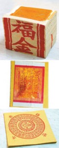
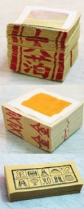
Burning paper money (also called Hell bank note or joss paper) to worship deities, honor ancestors or rest ghosts in peace is one of the most common rituals being practiced in Taiwan. The ritual is related to the belief that after the paper money is burned, it travels to the other worlds where deities, ancestors or ghosts reside.
There are different sorts of paper money, each varying from another in terms of size, pattern and purpose; however, in general it can still be divided roughly into two categories: gold and silver, which indicates the color of the square-shaped foil attached to the center of each paper money. The gold foil represents the higher rank of the deities while the silver one is therefore only used for ancestors or ghosts.
As a child, I had always been fascinated by the act of burning paper money because it somehow added more fun and interesting factors into the whole religious ceremony and summed up the whole ritual as a climax in the end.
*inspired by: Borststuk Souvenir, 2008, Robert Smit
Laagland
Wednesday, September 9, 2009
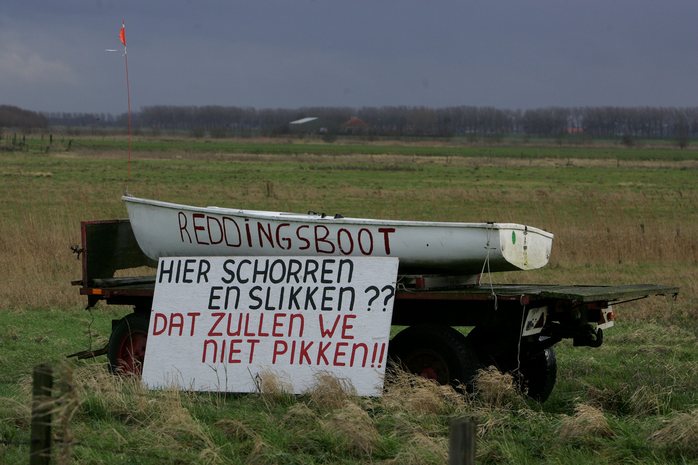
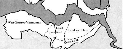
Zeeuws-Vlaanderen seems to me an independent country, located between The Netherlands and Belgium. The fortified city Hulst, surrounded by star shaped ramparts, her mill, castle and basilica represents real folklore to me. The city attracts Belgium tourists, who consider it as a Dutch city, and the Dutch tourists, who consider it as a Flemish area.
The folkloric tales about the sly fox Reynaert, who even managed to deceive the king of the animal kingdom, king Noble, are still alive. The still vividly living fable functions as decoration of traditional café’s where the same family issues are being discussed for ages.
It seems as if the idealistic way of remembering cannot escape the area through the water of the North sea and the Westerschelde, surrounding the land. This water touching land doesn’t have public transport such as trains (it only has busses which makes rounds a few times a day). Maybe this is one of the reasons why I found it to be a forgotten piece of the Netherlands. Such a isolated piece of land with hidden treasures.
Because who of those raised in the big city, have ever visited Zeeuws-Vlaanderen, whom of them have ever taken part on mussel festivals. Where breaths the Zeeuwse shore (shore of Zeeland) so that you will always cycle with the wind in your face.
Bride of God
Wednesday, September 9, 2009
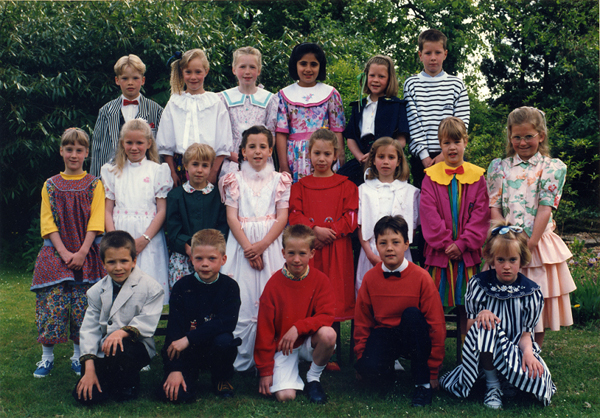
This picture was taken at my First Holy Communion in the Roman Catholic south of the Netherlands, where Catholicism has become more like tradition than religion (although one can ask whether religion is not always more like tradition than anything else).
The style of dress in this picture is quite representational of what I remember most about this ritual. Girls got dressed up in the most outrageous princess-like dresses and boys looked like forgotten side-kicks in their little monkey suits. Only later did I see that the girls were really dressed up as brides of God, and the boys, I don’t know what to make of. This cultus of female dress, as is also visible in the historic Dutch attire that is now on view at the Zuiderzee Museum exhibition “Gone with the Wind”, is a jumble of mixed messages of virginity and seductiveness, sobriety and decoration, even in children’s holy rituals.
“A soft beat from the sky”
Tuesday, September 8, 2009
The exhibition to the Zuiderzee-museum itself was preceded by a moment in which I really felt connected to my country, the Netherlands. Descending from the train, the wind and sky managed to awaken conflicting feelings regarding the Dutch folklore. A typical Dutch sky colored in dark purple gray pink, white beige and all colors in between carrying raindrops building up in the belly of the sky. Waiting to burst over the open waters of the Ijsselmeer. The smell of wooden boats and the whistling of the wind through the energetic sails with stature and strength. By pushing my sunglasses higher up and closer to the eyes, the lines separating the sky from sea became clearer. Pushed by the wind and the rain, the rhythm of the roofs covered with red tiles led to the smell of the Hema “rookworst” warming my mind. Seeing the beauty with a soberness and acceptance of circumstances, surviving in tougher times characterizes the Dutch people and at the same time bonds me to them. Looking at the way they deal for example with the weather by inventing an umbrella suitable for tougher times, I think it symbolizes the Dutch people. keyword: storm umbrella

Saci-Perere in the Low Lands
Tuesday, September 8, 2009
Last week, while visiting the Zuiderzee museum in Enkhuizen, I was sent back to my childhood years through the works of artist Caroline Fuchs (NL 1964), who amongst 54 other artists, designers and photographers were asked to create works for the exhibition “Gejaagd door de Wind” which theme was “Folklore”
Fuchs created a room full of infant dummies wearing their folkloric Queen’s day customs. When entering the room, a Brazilian folkloric character, the Saci-Perere, jumped into my mind. Not that the dummies were black or one legged, neither did they smoke pipes or wore red hats and shorts, but the somewhat magical atmosphere in the room created by the unusual styling, use of vivid colors and choice of rather scary dummies just sent me to a different time and place.
The Saci-Perere is, without doubt, the most famous character in Brazilian folklore. Apparently he chooses to live close to farms and will not cause major harm, but there is no little harm that he won’t do. He will hide children’s toys, set farm animals loose, tease dogs, and curse chicken eggs preventing them from hatching. In the kitchen, the Saci would spill salt, sour the milk, burn the bean stew, and drop flies into the soup. In short, anything that goes wrong — in the house, or outside it — may be confidently blamed on the Saci.
Besides disappearing or becoming invisible (often with only his red cap and the red glow of his pipe still showing), the Saci can transform himself into a Matitaperê or Matita Pereira, an elusive bird whose melancholic song seems to come from nowhere. One can escape a pursuing Saci by crossing a water stream: the Saci will not dare to cross, for then he will lose all his powers. Another way is to drop ropes full of knots; the Saci will then be compelled to stop and undo the knots. One can also try to appease him by leaving behind some cachaca, or some tobacco for his pipe
Designblog: Entering the 3rd Season
Tuesday, September 8, 2009
We hope you have enjoyed all our contributions and project of the last season published by the students, professors and guests of the Gerrit Rietveld Academie Foundation Year’s Design Program.
As an education project Designblog is constantly publishing new content and reinventing it’s format. Not satisfied with the option of being a publishing platform only, we do investigate all posibilities to become an engine aswell. We hope you enjoy the experiment.
Designblog is also a platform to show some of the dynamics going on in the Foundation Year’s Design Program and the many faces it can make….like:
.
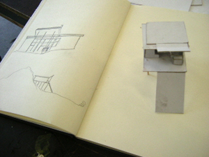
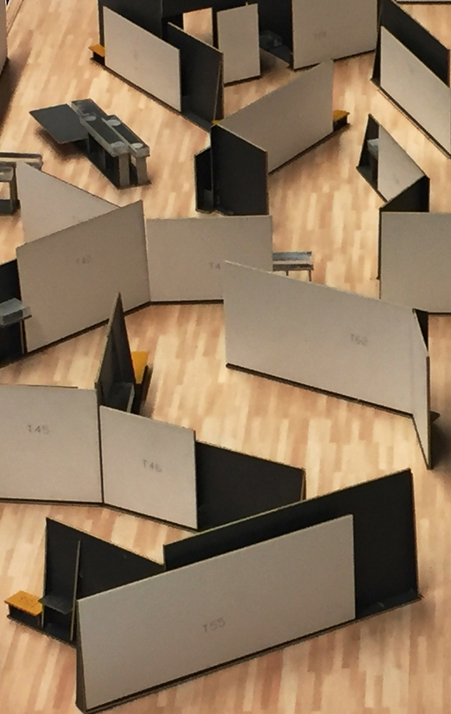
DESIGN OF SPACES/architectonical design by Carla Boomkens
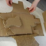
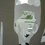
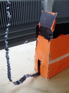
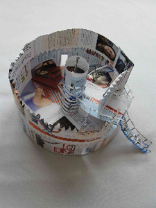
A project in which the making of spaces and their expressive means are investigated. Both real size- and scale models of spaces are ventured in this short-term research-laboratory on visual, functional and communicative qualities, according to a well specified theme.
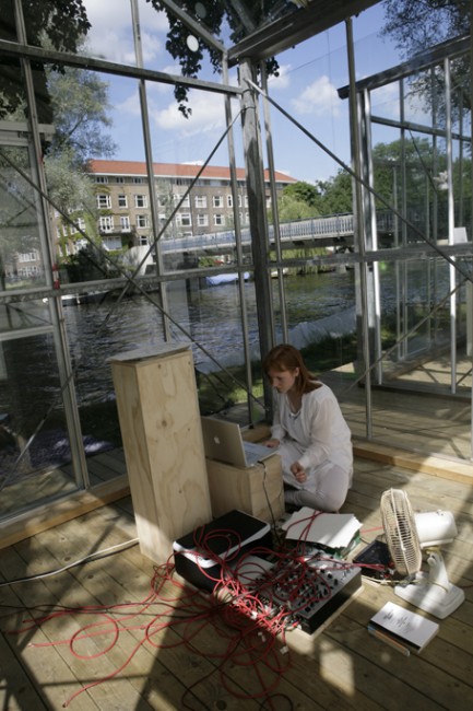
Ranging from a tent-cabin to the built environment of a city, the very function of the constructed space offers the specific features to it, and thus the means for visual expression: defining the way a space can be specificly experienced. By analyzing the function unforeseen connections are to be revealed, which broaden the effective visual spelling and open doors to subtle and precise visual communication.
Examples of existing spaces and/or buildings will be extensively introduced and discussed as guidelines: the knowledge and understanding of the motives of their authors challenges to reflect on the motives of one’s own expression – it both intensifies and relativates. The visual research is valued as the most important contribution to the workshop, the results are considered as a consequence, not as a singular aim. About technique for building: through the making of the (scale)models the fundamental principles of construction will evidence themselves – and will be coached when the work calls for it.
text by Carla Boomkens /images & models by the students
‘ : ’
Tuesday, September 1, 2009
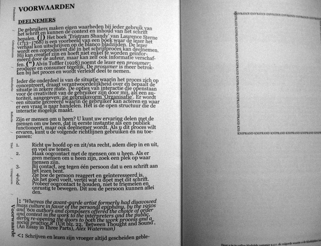
left edition 1 booklet • right edition 2 booklet
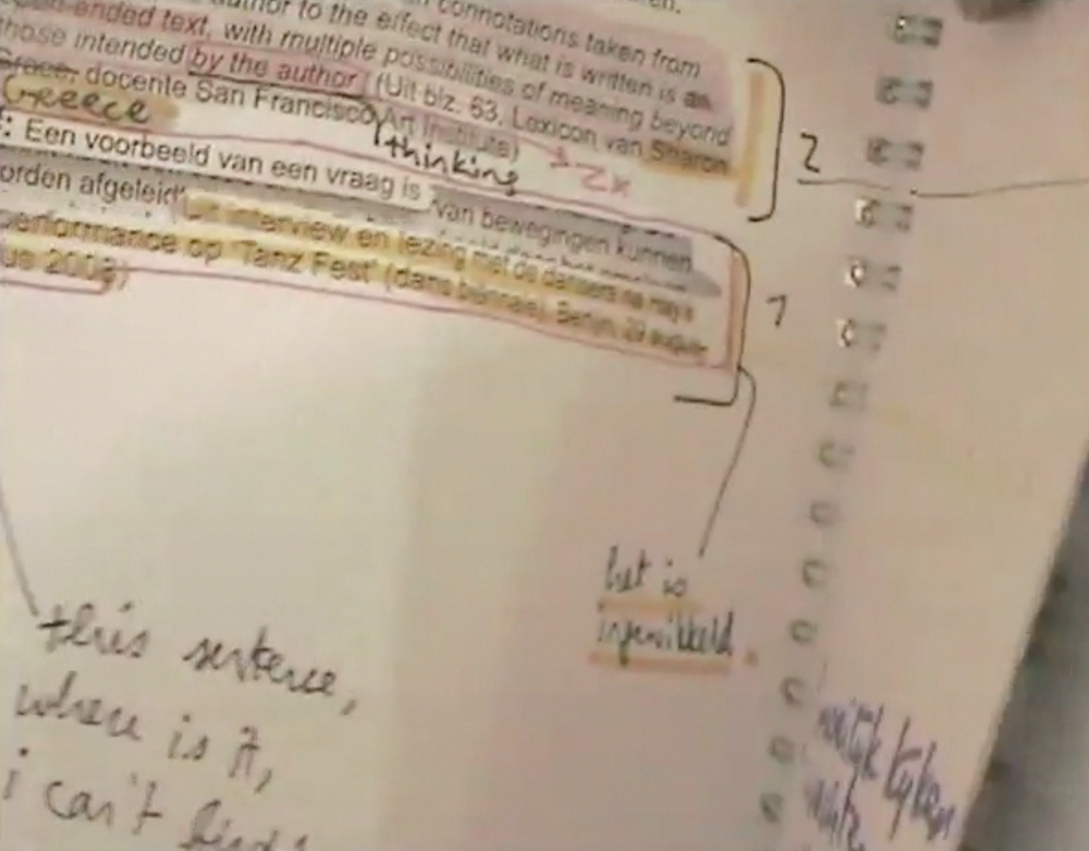
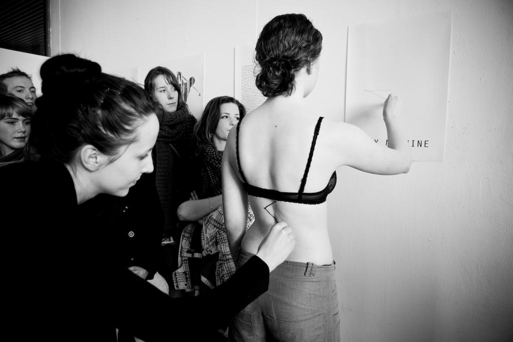
What kind of object is a book? How can it be used and how can its user relate to it? Co-auteurs of ‘Titel van dit Schrift:’ (translation ‘Title of this Notebook:’) marked traces in the publication, leaving layers of reactions and transforming the previous edition.
audio dialogue fragment edition 2 booklet
left edition 1 booklet present at 'Acting the Script', Graduation Show Gerrit Rietveld Academie, Amsterdam 2009.
After writing my Bachelor thesis in 2009, I am now interested in how this material can be interpreted in speech and voice. This i have investigated through several dialogues and performances. From these events, quotes and words have been selected. With the residues of the booklet, i composed a musical performance for solo voice which will be presented live at Vondelbunker, Amsterdam, within a new setting during the ASCA exhibition 28 March to April 1st 2012. Listen to my interview
![]()
Download this thesis: Titel van dit Schrift [dutch language]
more: www.jannekevanderputten.nl [link]
“Less or More” One Design Week Sofia
Sunday, May 31, 2009
Sofia Design Week was held in Sofia Bulgaria from June 5th-12th 2009.
Dima Stefanova, designer of the website of Gerrit Rietveld Academie and Sandberg/Design Institute and Henk Groenendijk, moderator of Designblog form together Icecreamdesign. As advisers they are involved from the beginning in this fist ever Bulgarian Design Week. As speakers and organizers of the “Bird’s Eye View” workshop they participate in the program.
“One Magazine” interviewed them for their latest issue
Next Identity Forum took place during a 7 day long event with lectures, workshops, exhibitions and presentations that gathers representatives of the worlds design avant-garde in product, communication, graphic and interactive design.
In search of its next identity, Sofia welcomed 17 of the most indicative in their field. Putting Sofia on the global design map for the first time. Ji Lee, Niessen en de Vries ( the succesful traveling instalation TM-City was on display again), Peik Suyling YD+I, Frank Tjepkema “Tjep”, Marti Guixe, Erik Kessels from KesselsKramer, Lust en Ruedi Bauer were attending among many others.
FunctionalVsEngagé
Thursday, May 28, 2009
In my first post about two of the most important and influential dutch graphic designers, Wim Crouwel and Anthon Beeke (pdf), i tried to compare them by their different approach. Especially the way Beeke designed, really intrigued me.
It was provocating and controversial which made him one of the leading conceptual engaged designers.
On the other side, Wim Crouwel is known as a more functional designer, which means less conceptual.
But is it really that easy to divide and are all this categorizations correctly made?
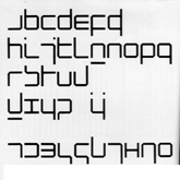
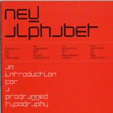
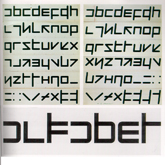
Especially in the case of Wim Crouwel i doubt it. His design of the new alphabet was based on the begin of computer technology, in a time were blogs, facebook and internet in general didn’t exist. Coming up with a font type based on this new technology combines in a perfect way a clear, functional and computer like approach. Computer like is also the keyword for, in my opinion, a highly conceptual design.
With the awareness that this technology will change they way we communicate, document, the way we are. His style is timeless (even if it also relates to the early 70s) and applicable still nowadays.
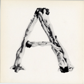
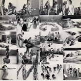
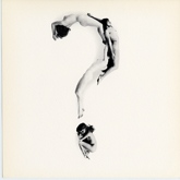
Beeke’s Human alphabet, using the aesthetics (look at the swedish film makers Ingmar Bergman and Vilgot Sjöman) and social and political topics like sexuality, seems more related to that specific time.
So Aesthetics is next to conceptualism and functionalism a really important aspect, what makes Crouwel’s design less depend on a certain time period.
Never the less, Anthon Beeke’s radical and shocking way, even if it is not so applicable in our times anymore, was responsible for breaking through the conservatism of (Graphic design) and is so a mirror of other important political and social openings in this time period, and even if his aesthetics are not so up to date, his conceptual engagement is.
link: The Human Alphabet as a visual brand
link: Anton Beeke exhibit at Centre for Visual Arts Zeeland
Who sets the standard in Hong Kong?
Monday, May 25, 2009
While visiting Hong Kong last week, I noticed the huge difference in standard between their graphic design and our graphic design. If you only look to their graphic design you will think that they are all insane lunatics. They give faces to everything, use the color pink to sell men products and combine business posters with pigs. I used this as my starting point for my research. What is the difference in standard telling us about the culture of Hong Kong? You can all read it in my weblog.
Rietveld & Beatles, Identities with a content
Wednesday, May 13, 2009
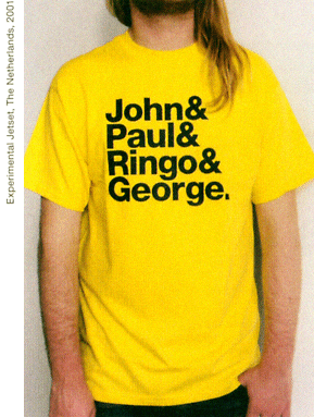
As part of a teachers and students protest against the “ad hoc” plans, celebrating the 42nd birtday of the Rietveld building, a T-shirt was designed after the famous “Beatles” T-shirt by Experimental Jetset, to emphasize this realation between content and identity. Rietveld is building and students and teachers as the Beatles still are John&Paul&Ringo&George. link
Rietveld for Rietveld
www.rietveldforrietveld.org
The goal of this website is to open the discussion on the preservation of the historical Rietveld building for the Gerrit Rietveld Academy, Amsterdam.
Read more about this and all ongoing facts and publicity ¿GRA becomes GAK?
Who Sets The Standard!
Tuesday, May 12, 2009
Today, virtually every designer works with the same creative software, which to a large degree determines the aesthetics of design. Millions of websites make use of just a handful of basic layouts. Browsers, search engines and content management systems have the same implications for the design of the web as the offset press and the A4 format once had for printed material.
Technology has always had a great influence on design. The modernistic visual language became successful because it could be easily reproduced, not because of its idealistic principles.
The business community, brands, and media fight for the attention of the critical consumer. Design speaks a universal language and extends beyond geographic borders. Jan Tschichold can be satisfied.
The question is who was really responsible for this: celebrated superstar designers or anonymous engineers driven by ingenious marketing concepts? Successful design has become the equal of generic design. Recognition is the most successful product of our time.
Nothing Is What It Seems
Sunday, May 10, 2009
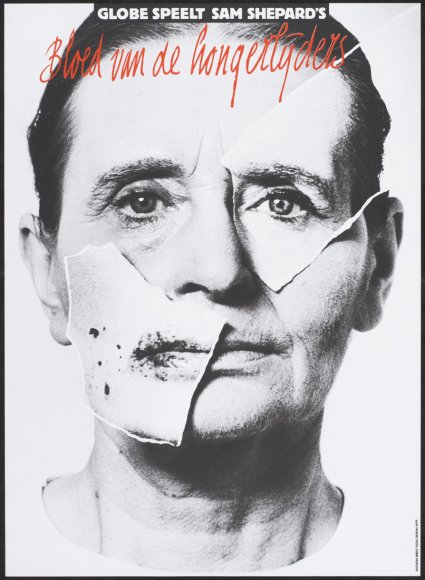
Anton Beeke’s poster for the theatrical play “Bloed van de Hongerlijders” (Blood of the starving ones) is a complex, yet at the same time striking “in your face” like work. Attempting to create an image that contains a deeper psychological meaning, Beeke executed the work while making use of different techniques. First of all there is the photograph, depicting a man in probably his early fifties. Furthermore present are yet two other photos. Where the first photo seems ordinary in the way it is presented (one recognizes a portrait that is, consistent with the convention, merely showing the face of the person depicted and partially the neck), the two other photos are peculiar. They are both cut-outs from other photos, pasted on the first picture. All the more strange it seems that also these two photos differ from each other. Although they both fit on the man’s face (from which they seem to be copies), they physically don’t match. Whereas one might assume that the right picture is a genuine copy of the original, the left photo shows spots and irregularities that could be associated with sickness. What could be going on here? Are we dealing with a Janus-like figure, perhaps a schizophrenic madman? Or was Beeke only pointing out an ambiguity with which we would be confronted with while attending the play? Presumably the answer behind these questions lies hidden within the layers of this work. Until we see it, we can only speculate. And exactly this curiosity is what a poster should revoke!
WHEN THE FACE BECOMES A MASK
What has happened to this man? Are we dealing with a Janus-like figure, perhaps a schizophrenic madman? And what could the artist’s intention be? Might Beeke have been pointing out an ambiguity with which we would be confronted with while attending the play? Presumably the answer behind these questions lies hidden within the layers of this work….read more about his poster in the linked pdf
Buckle up, and Slap me in the face..
Friday, May 8, 2009
My father once said to me that a good piece of art should slap you in the face.
Even though I disagree with him sometimes, I liked that a lot and I like to be slapped in the face.. It is not often that you are struck by something in such a manner that it stay’s in the mind and overgrows everything that mattered less.
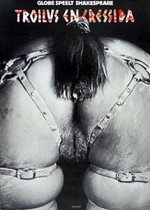
Of course the blow can come from different angles (beauty, shock, alienation, directness, physical impact) but looking at this poster from Anthon Beeke I immediately experienced the ‘slap in the face’ again.
A lot of my fellow students thought the thing horrid and filthy and I can totally understand that. This image illustrates some of the associations we make between for instance : women, horses and sexuality. I think that feeling of repulsion comes from the hidden knowledge we have about our own beastly behavior and the gender specific features that come with that. Moreover it touches upon the similarities between humans and animals.
A while ago one of my friends said she had seen two horses mate and that it had horrified her, why?, because the aggressiveness with which the stallion had moved reminded her vaguely of her ex-husband.
We can find the truth within language; do we not refer to certain men with the word ‘stud’? And do we not aim for a specific type of woman using the term broodmare?
Some displays in this exhibition made me curious, some designs were funny or even beautiful, I marveled over the poster designs from Jan Toorop and Jan Tschichold, However…; appreciating something is not the same as being hit by something. Anthon Beeke really struck, with this beautiful, raw and direct image.
This poster was made for a tragedy written by Shakespeare, I will never forget that play now, and I every time I saddle my horse for a ride I will think about Troilus and Cressida.
LUST DOES NOT MAKE ME HOT
Why is it that some works of art stay with you, and others do not?
When you go through an exhibition, an art fair or an Art book there are only very few things you remember, that stay with you, the rest ….. will be continued in this linked pdf
