Skip to Content Skip to Search Go to Top Navigation Go to Side Menu


Salad oil


Wednesday, May 6, 2009

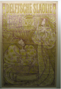
Jan Toorop was a Dutch painter and illustrator who worked between 1880 and 1928 In 1894 the Nedelandsche Slaolie Fabrieken asked him to do an advertisement poster. He came up with this: A litho in the Art Nouveau style. Very popular at the time. Made famous by Alphonse Mucha and his posters for Sarah Bernard.
If you analyze the work you can clearly see the artists hand and the customers’ wishes. This image however is published in almost every Jugendstil or Art Nouveau publication. And even became the Dutch nickname for Art Nouveau. The name’’ Slaoliestijl’’ was not only used for Graphic Design, but was also adapted in Product design.
And this is the question that troubles me most; How did a respected Symbolist painter cope with the success of his graphic work? Not acknowledged as an art form, but as a trade, at the time.
Another question that troubles me is; would it be possible nowadays, for an autonomous artist, to do advertisements without doing damage to his own work or reputation?
If you look at museums of modern art nowadays, you can see that most of them took design into their collections. This means art and design are moving towards each other. And interesting development followed with lots of discussion.

RESEARCH QUESTION: do commissions damage a autonomous artist reputation?

Irma Boom is Patient


Wednesday, May 6, 2009

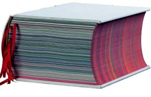
We went with school to the Graphic Design museum in Breda to the exposition ‘Who sets the standard?’. There were lots of nice things to see, and i found a book as well that was made by the Dutch designer Irma Boom that made me curious. It was laying on a table in a glass box, opened on one of the pages. Next to it you could find information on a computer touch screen about the maker and the book. This was also a very nice design, cause it worked very well and interesting to look into, very professional.
I want to know more about book design in general and i understand that this peticular book is a very remarkeble example. The ultimate book. So i’m going to investigate more about the maker Irma Boom and her designs.
The book is made for the SHV Holdings, from origin a cole trading company, but now a days it trades in food and other fuels and chemicals.

The design and the content are about the history of thi company itself but also about the family that owned it for all these years and reflects upon generations of living and working. There are just a few of them made, as the book was meant as a jubilee gift to high executives only. There is even a limited amount made specially in Chinees as it turned out after printing many of them were in china. It has never been forsales so it is quite rare to see one. I got the opportunity to see and look into the SHV Think Book myself at a private home of a lucky owner, and I found out how amazing a book design can be.

It was a great experience to go trough this book. It is a monument for the SHV, a travel trough the time, and it is far from a dry documentation. Irma Boom got into the content of her subject and you feel this. She tells the stories of the company in a playful and inventive way, it is filled with ingenious visual and linguistic jokes, poems, repetitions and personal stories, but because Irma Boom really knows what she is doing and directs it tightly, it never gets to much or chaotic.

THE SHV THINK BOOK

Fentener van Vlissingen is a philanthropist that supports several humanistic projects. When he searched for someone to design a jubilee book, he asked Irma Boom to do it. It was a work of five years and it is a good representation of all the work and effort and love that has been putted in the company itself. Read more as the story unfolds in this linked pdf……….

silent dream


Wednesday, May 6, 2009

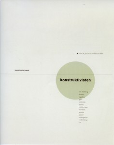
Standing in front of the works of Jan Tschichold, I felt suddenly something very familiar arising within me. An old memory dream-like of the time I studied graphics in the Academy of Fine Arts in Warsaw. As for those days, it didn’t really feel right, however now suddenly it all made sense. It occurred to me, like a missing piece of a puzzle being found, a key to connect those days to „today“. At once I could see all the rules of typography an graphic design emerge within the posters. Like hidden signs, which were not an obstacle. Rather a guideline, a common sense of beauty and harmony. I wondered, what a keen invention graphics was, to connect these powerful mediums of language and image in such an expressive way. I mostly felt attracted by his poster for „die Konstruktivisten“ (Kunsthalle Basel, 1937). I really felt for his taste of color. But mainly, for it‘s almost Zen-like minimalism and harmony. How he perfectly combined the constructivist form, the simplicity and silence. Admiring this poster I just realize how much I have to learn and how far away I am still to any perfection.


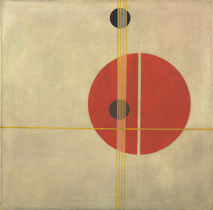
Tschichold “Konstructivisten” poster – Moholy NagyQ 1 Suprematistic painting

read more in the linked pdf “FRESH TASTE OF PEPPERMINT”

About paint and the internet


Wednesday, May 6, 2009

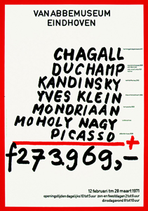
The work that Jan van Toorn made in 1971 for the van Abbemuseum in Eindhoven is a work that caught my interest from the start. It is very daring of a museum to use a political statement like this as an advertisement for an exhibition.
To me it is graphic design at its best. This work looks in a way very timeless but has a lot to do with the time it was created in. Not only because the valuta of the amount that is added up is in Gulden – which we do not use any more (unfortunately – have a peek at Renske’s posting!) – but more likely because he used paint to tell you which painters you can find at the van Abbemuseum at this exhibition. To me this feels very honest, true and logical. I think Jan van Toorn was ahead of time with this work.
I love how he throws all these big masters on a mathematical pile without actually making fun of it. Of course he is making fun of what all these paintings cost. Almost 40 years later the prices went sky high. But in a way that is not really what it is about, to me it feels like putting it out of context. He makes the master painters more human. To me this poster mocks with the art world without making fun of the painters.
It makes me feel like painting.

Jan van Toorn is a man of the first generation of graphic design. In 50 years he has seen al the revolutions and all the new more advanced options you have with the, let’s say, original or old-fashioned way of printing. Jan van Toorn: ‘The computer is the next phase and is of course an amazing development in the world of graphic design and for a designer to work with, but if I look at the results then I find it very disappointing.’

Van Toorn thinks that the Internet should be or become a medium with visual journalism that frees as well as enriches the reader/viewer. He thinks that a different, new use of language is important for that. I agree with him on this point. If you take blogs for instance, or the Internet in general, you can delete half of it because it is rubbish and has no content. To me it is about balance. People do not read long, dry texts on the Internet. It is about speed. It has to be fast. I think blogs such as ffffound.com are a good example for that. It is an only imagery, no text blog about design. You see a lot of beautiful, esthetic designs, and very often without content. Most of the design you forget instantly. Just nice pictures.

I think that Jan van Toorn despises the Internet because I read that Jan van Toorn is not interested in the beauty or esthetics of images at all. It is mainly and only about the content of the design. What is there to tell, to see or to communicate? As a designer he wants to be more than only the person in between the client and the receiver, he would like to be involved within the whole process.

A nice question I found in an interview with Jan van Toorn on the website of magazine de Groene Amsterdammer (in Dutch) is: Are you designers the mediators that show us reality in life?
Jan van Toorn: Yes.
And we simply have to believe that that is the truth in reality?
Jan van Toorn: Yes. Whether we do it or the church does. 30 Years ago it was the church. Today it is about the people ‘in between’ such as designers, journalists and people who make television.

Graphic design and product design may be present everywhere you go but I think it is art that can show you another truth. I think Jan van Toorn set the standard for graphic design back in the days. All we can do is get inspired.

In praise of the penguins


Wednesday, May 6, 2009

When we went to this exhibition I didn’t have any clue about who Jan Tschichold was, and I was not really having a wow experience there, until I entered the last room and found a huge penguin on the wall, standing in front of me and staring. I must admit that penguins are some of my favourite items. And therefore I choose this one to further investigation.

The nice surprise is that this particular penguin is the logo of the penguin books and I wondered how that could be, but Jan Tschichold apparently worked for the Penguin Publisher for two years, and he is the one who made the layout and the “Penguin Composition Rules” a little booklet about the typographic instructions for editors to follow in the future.
It’s fascinating that a publisher so old as the penguin publisher is, still is having this label and still is represented on the market. The story of the penguin books is interesting in many ways, and with this goes a whole history of a publisher.

to be continued with: “A 74 years old penguin“, a further research into Tschichold’s Penguin and others by design.

NEW FREEDOM?


Wednesday, May 6, 2009

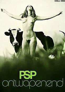
To investigate a design work, i chose the advertisement-poster „PSP ontwapenend“ designed by George Noordanus in 1971.
When i saw the poster, i liked the spirit and the freedom it shows! It has something light and joyful. At the same time it also has something humorous to me. The photograph might stand for the new freedom at that time, won from the 60‘s: the possibility to show nudity in public and even the use of it in advertisement.
Further more, the design and composition of the photograph struck me. The image shows a lot of (formal) parallels: the nudity and vulnerability of the woman and the cow and the pattern of darkness and lightness. Also the setting of the woman and the cow show parallels. And in the end, of course, the context of the slogan „PSP ontwapenend“ in connection with the image is important and interesting to find out more about it!

ANOTHER TIME-SPIRIT

The political background of the poster back then, in the seventies (it raised many controverse reactions), is already discussed so many times. So I decided to relate the poster to recent times: living today, I want to reflect on the poster in the context of today, on the combination of nudity with politics nowadays…. continues as pdf

BeekeVsCrouwel


Wednesday, May 6, 2009

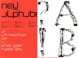
The most intriguing aspect of  ‘100 years graphic design in the Netherlands’, out of all the graphics, fonts, posters and publications I saw there, was in my opinion the contrast between two different forms of an Alphabet.
These alphabets, or better Font types, were created by the dutch Graphic Designers Wim Crouwel and Anthon Beeke.
The computerlike and clean structure of Crouwel’s ‘New Alphabet’ and the unconventional and quite controversial looking letter type, made out from naked girls, of Beeke on the other side.
For me Beeke’s style visualizes the spirit of the time when this font was created. It let me think of the sexual revolution, the feministic movement and a general break out of traditional and conventional norms of these times.
But also Crouwel, with his mathmatical looking font, hits for me a certain actuality of the late 60ties and 70ties, as that was the begin of the development of the computer age.

Wim Crouwel vs Anton Beeke

for more on functional versus engagé, read part 2

The Honesty of Anton Beeke: Troilus & Cressida


Wednesday, May 6, 2009

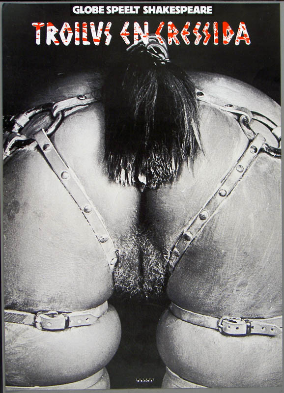
As a student at the Gerrit Rietveld Academy, I went to the Graphic Design Museum in Breda, together with my class. Their collection included pieces from a decade of graphic design. Next to some posters, you could hear interviews with the designer. Sitting down at the table next to the posters, you could see a built-in television with the images of the interview. This was also the case with the poster that took my attention, namely the poster made by Anton Beeke. He made the poster for a relatively obscure play by Shakespeare named “Troilus and Cressida”. The poster intrigued me, because it showed a recognizable human bodypart yet was still somewhat indefinable. This combination added to the mystery of the poster. Using the information table, I found out a lot of backgroundinformation about this seemingly controversial poster. For more posters link to the Affiche museum

When I was sitting at the table in Breda, I was listening to an interview with Anton Beeke. He introduced himself and I discovered that he was a graphic designer with a lot of experience. He made a wide variety of designs for posters, advertisements, books, magazines, stamps and packaging material. The specific subject of the interview were two posters hanging above the information table. Anton Beeke designed them both for the play “Troilus and Cressida”. The picture was very provocative, because it showed the backside of a naked lady who was bending over, only wearing a horse strap. “Troilus and Cressida” is one of the less famous plays by William Shakespeare. It is a sad story about the love between Troilus and Cressida during the Trojan war. Troilus saw that Cressida was behaving all too affectionately with a Greek called Diomedes. That’s when Troilus reckoned she surely was a prostitute. Anton Beeke tells during his interview that being honest is one of the most important principles for him. He saw the play as tragic and sexist and thought he should show just that on his poster. Unfortunately this point wasn’t clear for some. Especially the so called Dolle Mina’s, a feminist movement during the 1960’s, were protesting against the poster.

Links: Trojan War, Anton Beeke[image], Troilus and Cressida[image], Dolle Mina[image]

Graphic Design as an autonomous art form


Wednesday, May 6, 2009

I didn’t know what to expect when we went to the Graphic Design museum in Breda. But when I started at the exhibition about Jan Tschichold I was happily surprised! Actually I liked almost all his work that was shown, the beautiful compositions of form and colour. The work is simple and complex at the same time.
The posters were handmade; you could see the sketches of them and little mistakes or changes in the original version.
I loved that, because it was to me more a painting than a graphic design. You could see the playing of the artist with these forms and colours.
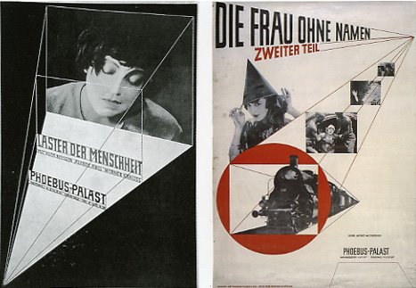
I chose for the poster “Die Frau Ohne Namen” as my favourite one, because it is a beautiful combination of film stills, shapes, line and colour. The triangle of the hat of the woman comes back several times; you see the movement of the train, as it comes out of a tunnel, which gives also the idea of a movie, which is projected. The addition of the colour red makes the image powerful and clear. To me it is a much better film poster than you see today, considering that it is an autonomous artwork.

So shortly said a very strong and beautiful film poster!

Tschichold’s posters interest me the most of his whole oeuvre, so I made a little research about his pictorial posters which you can read in this linked pdfJan Tschichold and his pictorial posters“.

Monopoly Pride


Tuesday, May 5, 2009


* *
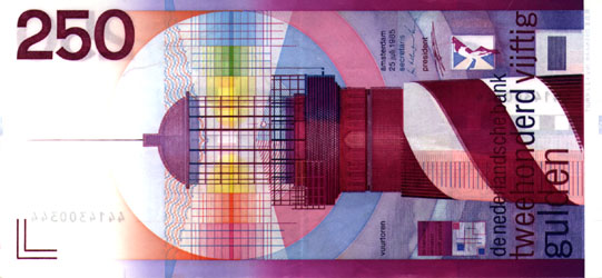
To choose an item in a graphic design museum with which I felt a particular connection wasn’t the easiest thing to do. I am able to see the beauty or the richness of a composed design, but usually it doesn’t grab me like for example a painting can do. In order to do find a reason to be there, except of looking at nice images, I tried to search for a design with which I did feel that personal connection. In the end I choose an item that is as general as it is personal. Our old fashion outdated but beautifully designed Dutch guilder. The paper money that when we look at it nowadays looks more like the monopoly money we used to play with as kids. But it was no children’s game at all. It was the last design in a series of national currency. Maybe it is some sort of melancholy for a time that has past on pure patriotism. In any case I love the design that R.D.E. Oxenaar made. It is the clearness in design, the beautiful intense purple color and the nicely composed graphic elements that intrigues me when I look at it.

But how do we come from a subjective preference to a little history of Dutch banknotes design? This is what I wanted to share with you.

Out of three designers that were asked by the Bank of the Netherlands in 1965 to sketch and design a new series of banknotes, R.D.E. (Ootje) Oxenaar was picked to execute. A tumultuous journey in the world of the printing works was about to start. In the playful way that Oxenaar made his design for the Dutch guilder there seems to be a lot to discover. Did you know that…

* he did put in elements that were accessible for blind people and was the first in the world doing this?
* he hid some personal elements in the banknotes? Like his own fingerprint in the hair of Baruch Spinoza on the 1000 guilder bill and the rabbit of his girlfriend in a watermark.
* Oxenaar underlines the fact that the lighthouse on the 250 guilder bill has something of a phallus symbol, but that he mostly uses it as a symbol of safeness, as something that is watching over the dikes to protect us? A link to the 250 guilder clip on You Tube

THE NEW STANDARD

In a book about the history of Dutch banknotes design I read about the struggles and the slow development stage the design process tended to stay in. Then I read an interesting lecture of Oxenaar
that he gave at a design congress in 1987. read this all in the linked pdf

One Super Story


Tuesday, May 5, 2009

• Even if you enjoy only one story, a daytrip to “Super Stories” in Hasselt [B] will have been a day wel spend.
Tugged away on the attick of an the old Jenever brewery museum I found such a story, on which Malin Bülow wrote this essay.

On Azart and the “linguistic relativity principle”

Have you ever pondered about why time is a line, why it is horizontal and not vertical, why future is ahead of you and history behind you?
A fundamental debate in cognitive sciences is the extent to which our language influences or constrains our perception. Benjamin Whorf quite radically argues that “we dissect nature along lines laid down by our native language”(1), meaning that language directly affects cognition, the way we think, how we look at things and experience reality. This way of thinking, referred to as the “linguistic relativity principle”, suggests that we can’t imagine things or events or anything else that does not have a corresponding word in our mental lexicon. Therefore our language influences the manner in which we understand reality and behaviors. Coming back to the initial pondering on our perception of time, the way we talk about time: “timeline”, “looking forward to tomorrow”, “ahead of time”, “behind schedule” etc, explains our cognitive reference of time being a two-dimensional horizontal line. The cognitive visualization of time is then secondary to the words describing time. One can say that our reality is trapped in words, physical letters, which forms and appearance are highly coincidental and not at all connected to the actuality they define. Quite an amount of studies on color perception (2,3), categorization (4,5) and numerical cognition (6) among others support this view.

Guy Rombouts, (1940-, Geel, Belgium) seems to make a comment on how the flatness of letters and words can create a reality and make that reality non-existing without the words, in line with what the “linguistic relativity principle” suggests. Rombouts does this by inventing a new alphabet; the Azart, a name that refers to A-Z art, but also to the French word “hasard” meaning coincidence. In Azart each letter is translated by a corresponding line, on the basis of the first letter of the word which describes the line. A is angular, B is barred, C is curve, D is deviation and Z is a zigzag line. When the lines are linked together closed forms or word-images appear. What is going on quite literally on the paper when forming Azart words, goes on in our mind when forming realities of alphabetic words. The arbitrary letters of the alphabet also obtain meaning in our mind.
Words written in Azart visually define them selves, forming isles of meanings, while words of the alphabet is defined by means of other words. These words, however, are formed by the same letters as the word they define. A circle of definitions are formed, referring again literally to the Azart circled words.

Sources:
Cassiman, B. (1989). Guy Rombouts, Narcisse Tordoir. (Dublin: Douglas Hyde Gallery)

some other links: www.hanstheys.be/ (work, movies and interviews): La Paloma part 1 & 2 : SKOR (Art in the Public Space): De Appel (exhibition): Bridge (Java Isle Amsterdam): =vorm=word=image=content= : Guy Rombouts/Azart at Rietveld Designblog researches: at the MUHKA Antwerp: one final image~story……..

you can download this research by Malin Bülow: as a pdf

slowLinking: tagging slow design part 3


Monday, May 4, 2009

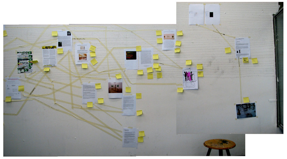
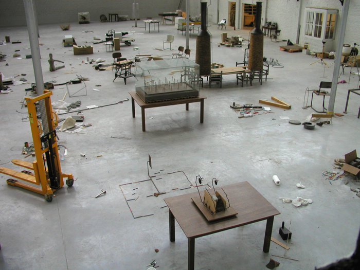
Welcome to part 3 of : tagging slow design. This is a worksheet on which all the link-topics and post-it tags collected on the “slowWall” are listed in relation to the research subjects as components of the ‘slow design project’. (researches can be downloaded as .pdf’s).

link topics.

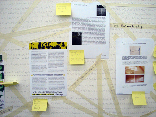
Performance links the Morgan O’Hara research to the one on Julia Mandle. The Julia Mandle research links to the one on Richard Long on the topic street /nature & art, by slow movement to the Kunsthalle Bern exhibit and by sensibility & violence to the Psychogeography research. Psychogeography has the link topic urban life with the Karmen Franinovic research, consumption /destruction /life style with Futurisme, against and pro community with Wim Wenders, evolution of everyday life to Downshifting, and a anonimous link to Maria Blaisse. This anonimous link is not the only one linking Marie Blaisse. Link topics like art and left over, connect this research to Uta Barth. Karmen Franinovic links to Christian Nold by means of the topic mapping, and to Psychogeography by urban life, to Futurisme by life is getting faster & people are getting a social, to Julia Mandle by just stop & think and to Richard Long by the link a way to see. Richard Long links to many other researches: to Sophie Calle by self related art, to Christian Nold through a line made by walking, to Karmen Franinovic linked by the topic a way to see, to Downshifting by choosing slowness. Downshifting links back to Julia Mendle by the link topic us and them, to Psychogeography by revolution of everyday life, to Futurisme tagging the link with designed lifestyle, to Marie Blaisse by us and them, and to the Kunsthalle Bern exhibit by reflect /a closer look. The research on Futurism has some remaining links to Julia Mandle through the topic exploring / explosive / sculptural. Following links from Wim Wenders to Uta Barth is made possible by the topic notice the small things in life, to Christian Nold by moving /memories. Mapping links Christian Nold to the Ambient/Brain Eno research while that last one makes a link back to the Kunsthalle “The Half and the Whole” exhibit creating a take time to cook link.
Reading all the researches the links will surely start to make sense, as will their variety shed light on the specific nature of many of them. Some research subject however did not create any link at all, like in the case of Maison Martin Margiela. And it was 0nly after some discusion that the performance link was created between Sophie Calle and Karmen Franinovic. Uta Barth was anonimously linked to Richard Long which might have been an intuitively act

Post-it tags.

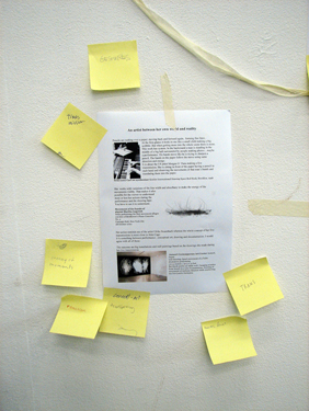
No links did not mean no tags. Time, Maison Martin Margiela for example was closely read and tagged with post-it. This created tags like memories, replica, time(less), can’t relate to it, time, physical picture of memory and the photographical tag to a picture by Mark Manders. Wim Wenders (present in our research list because of his beautifull documentary “Notebook on Cities & Clothes” about fashion designer Yohji Yamamoto) generated also many tags like sublime, I finally found time, hillbilly, surreal, the truth, place, moving. Sophie Calle tagged by the moderator with authorship, generated: life=art, stories, documenting life. Uta Barth looking was tagged: rainy day with half closed eyes, in between places, no left over, sunday. Ambient the research connected to Brian Eno tagged as big here long now was retagged as live the moment, loosing yourself, don’t think, sound. Christian Nold place-ness got tagged with keywords like biomapping, google earth, links, remapping memories. Linked to many, tagged by few. Julian Mandle pause, was tagged with pause from urban flow only. Morgan O’Hara gestures was tagged with trans, transforming, concert-art, transmission, energy of moments, reaction. Maria Blaisse architecture by border between self and not self. Futurism with fast life, life style, save time? Downshifting was tagged with life style too and change assumption. Richard Long tagged as a subject with landscape was enriched with the two tags: exploring fast and slow and perception of space, time and personal potency. Psychogeography with destruction of community, philosophy, socialism, anarchisme and urban live. Finally Karmen Franinovic subtraction, served as a hub for the tags: observe, spontaneous landscape, discover a realy nice place that never be online, easy fast, MTV generation, reflect, and observe. Some researches like Conditional Design re-mapping did not make “the slowWall” and were concequently not linked

added tags from the slow design lecture.

scale, gestures, measurements, relations, sustainability, evolving, creative activism, reveal, expanding awareness, reflect, engage, participal, deceleration, fresh connections, rhythm, probing, (im)materiality, metabolism, reflective consumption, live span, memories, community, record, tracing, (human) body, break (take a break), nothingness, inclusive, transparent, re-mapping, connection to scale

read also: >tagging slowdesign part 1
Ambient


Monday, May 4, 2009

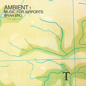
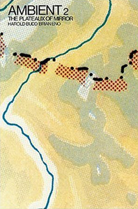
Brian Eno’s repetitive music. He is known as the creator of the so called ambient music which is a low volume music designed to modify one’s perception of a surrounding environment. That sentence is true in the fact that I stop being annoyed by all the people around me and I turn inwards. I notice my own heartbeat, the way I move through the crowd; all the little details around me seem beautiful and unique. Even the fat lady eating Febo is strangely hypnotizing.
That’s the thing about ambient music, as Brian Eno termed, it can be either “actively listened to with attention or as easily ignored, depending on the choice of the listener”. If you listen to it in your headphones then you are alone in your own world but if it’s in the background ,for instance in a restaurant, it turns into elevator music. Eno used the word “ambient” to describe music that creates an atmosphere that puts the listener into a different state of mind; having chosen the word based on the Latin term “ambire”, “to surround”.

The importance of living in the right now, in the moment, seems to increase every day. Like Brian Eno talked about in his essay for The Long Now Foundation

“Now’ is never just a moment. The Long Now is the recognition that the precise moment you’re in grows out of the past and is a seed for the future. The longer your sense of Now, the more past and future it includes.”

I think what he means is that we should all live in the moment because who knows what will happen in the next 5, 10, 20 years. The glaciers might have melted and we could all be living in boats. Well, I certainly don’t want to be that pessimistic and I usually think about the future in a positive way. But when I start to think about this type of stuff I prefer to live myself in the moment. The dinner I’m going to eat in a few minutes, I need to clean the table first and then I might go to the bathroom. I love the fact that I don’t know what is going to happen so I tend not to plan too long ahead, although I have a plane ticket back and forth Amsterdam and Reykjavík months in advance. I know that I will spend my summer in Reykjavík with my friends and family and I will probably get a work in my mothers business. I think I know those things, but they are still 3 months away. A lot of things can happen in 3 months. Making a plan gives you a false sense of security that if everything is going according to the plan then you are safe. A plan gives you also something to look forward to, then you know that you won’t be stuck doing the same thing months ahead. Living in the right now while making plans is the perfect solution, to always have something to look forward to and still enjoy what you are doing in that specific moment.

link to Big Here and Long Now
link to Brian Eno
links to Ambient Music: Music for Airports interview on this subject

Ambient is a posting by Thordis Zoega

slowWall: tagging slow design part 2


Monday, May 4, 2009

After lecturing on “slow principles in design and art” by Carolyn F. Strauss, students reflected upon their own work and process before starting a research into a variety of slow design and art related subjects. To clarify the effect slow design can have on the work in progress we invited Marie Ilse Bourlanges to present her work and share insight in her working process.

To present Slow Design a carefully selected list of research subjects was crafted. This selection presented “slowdesign” in various contexts of works and ideas (even ideologies), so that it could be recognized as a set of priciples against which ideas, processes, motives and outcomes can be interrogated. Much emphasis was put on the creation of specific keywords to accompany the students on their research. Keywords/tags that surfaced during the Slow Design Lecture and keywords/tags that were formulated at the slowLab website were added to the search subjects. These tags together with the ones created on the “slowWall” added meta data to the project


a physical process of linking and tagging with crèpetape and post-its.

Within this context adopting slow design as a working principle in our educative process, it became important to underline and make visible the relations between these student investigations. To emphasise a surfacing network between the subjects we did draw visible links between the research results, adding link topics. Additional tags could be post-it to each others research A4 to create shared keywords/tags.

Tags (trefwoorden [dutch] or entrances) are non-hierarchical keywords or terms. They make possible to search and find data. Tags create meta data. During the past years Web 2.0 applications like Youtube and Flickr added immensely by allowing users to add “free-form” tags as a tool for searching. The interesting thing is that tagging presents a system in which there is no information about the meaning or semantic of each tag. Orange might refer to fruit or color. Retagging found data even led to tag based social networks on the web. Tagging on this Designblog!

read also: tagging slowdesign part 3

wall tagging-linking methodology by Carolyn F.Strauss : slowLab

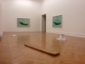
SLOW MOVEMENT OR: Half and Whole (Kunst Halle Bern)


Monday, May 4, 2009

Our modern world is dominated by speed, we’re addicted to it. We try to squeeze in as much as possible in every minute of every day. All the mintues of the day are a race against the clock. The last 150 years everything seems to get faster, our world had turned into a race of the fastest, not the fittest. Quantity has become more significant than quality.
It’s time for a new approach on the time and the experience of it. Following this philosphy a cultural revolution has begun against the notion that faster is always better. It’s not about doing everything in a snail pace, but about doing things in the right speed. With the right speed you become more aware of the world around you.
Slow movement is also a strategy artists use to explore a new world, parallel to the real one. By examining and exploring the decelerated movement, you experience a completely new place that tells a totally different story then the movement would in a regular pace. The quick movement easily misses the essence of the being. New interpretations and other information occur by applying a slow movement strategy.
Art wants to be looked at closer and deeper, and not to function as a spectacle for the consumer. By engaging more with the work, you get introduced in the inside world, which is not visible in the beginning. It’s like reading a book, as the ‘halves of it’, instead of looking at the cover, the ‘whole’.


The Kunsthalle of Bern shows an exhibition of artworks focussed on the slow movement.. Reading about the slow movement and looking at the works made me rethink about looking at art. I’m not a person who takes the time to look at art more closely. I judge by the cover, the ‘whole’ of what I see.
Last christmas I visited Paris and went to Centre Pompidou. Mindlessly I passed the diffrent works, without truly engaging. After a while I realised I had no clue what I had seen. Then I forced myself to take a closer look and a stronger connection occured to me. Your experience a higher level of commitment, when you let yourself get absorbed into the work. Most people do not reach this level, because they crossmark the artworks they saw and feel satisfied by saying “I’ve seen a real….”. Again; it’s not about quality, but about quantity.
The quest for understanding works hand in hand with a process of decelaration. There are no routine practices that could be used to save time. Why hurry through art and miss it’s essence? An artwork was build out of energy, emotions and time and it deserves to be experienced with the same care.
Slow Movement or: Half and Whole” means life before art and life after art.

by Bregje Sliepenbeek: download as pdf

slowMe: tagging slow design part 1

Monday, May 4, 2009

Wonder where all the tagging started?……….

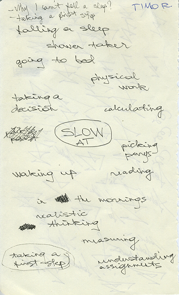
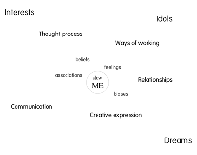
It was the 5th of February when we started a project moderated by Carolyn F. Strauss, designer, curator and founding director of slowLab. Together with the students of the FoundationYear’s D group she lectured and set of an investigation into slowdesign and related designers and artists. True to the principle of personal connection we started with a quick mapping of ourselves and our working process as designers and artists in relation to “slow” as a subject. Mapping to find keywords for processes and experiences that make up our conditions and inspiration for behaving and performing, to visualize that flow and determine specific tags to describe it. How do these tags symbolize slowness in our work and working process.
Ask yourself the question “slowMe”?
The results became clear instantly through a series of “slowMe” postings

read also: tagging slowdesign part 2

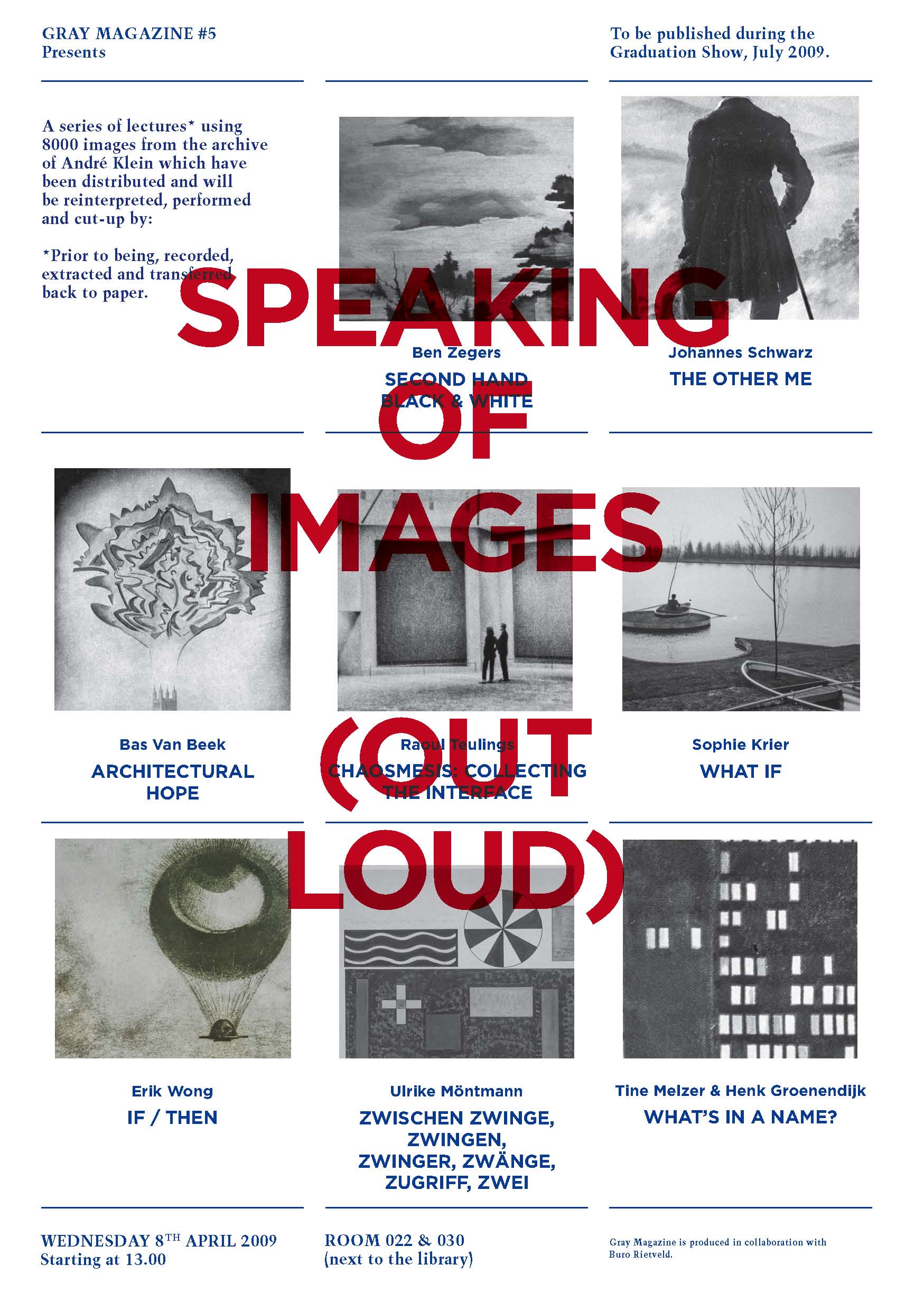
What’s In A Name: a Project for Gray Magazine


Saturday, April 18, 2009

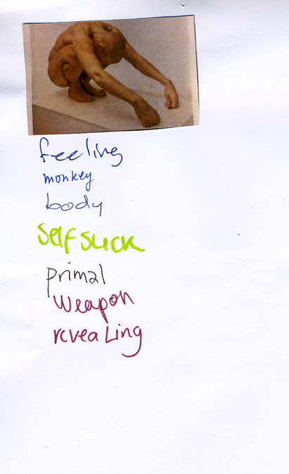
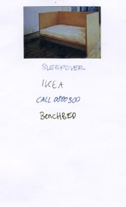
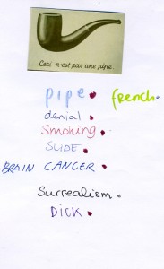
On request of Gray Magazine #5 (yearly published on the occasion of Rietveld’s final exams show) 40 students of the Foundation Year, guided by Henk Groenendijk and Tine Melzer, unleashed a two day project to create a new context for a highly varied 20.000 slide images archive. André Klein, now chair of Fine Arts and Sandberg Applied Art Dept, compiled these slides over his 25 year long career of art history teaching.

We could only guess after the motives and meanings that bound these images together in a dynamic process of ever changing contexts and wonder what new context of relation they would have in the eyes and minds of the basicyear students. The uninhibited existence of a ‘democratically’ selected 1000 reproductions, registrations and images was given new meaning through a process of retagging with subjective keywords. In the 2 day process new contexts and connections were created, processes where discovered, and results presented in a physical display of image related tag-lists and monumental alphabetical (key)word lists. I am a kid
I burn
ice
ice cube
iceberg
ice cream
Iceland
ideal
IKEA
ill
illusion
Illustration
image
imagination
immigration
imitate
imitation
immaterial
impale
imperfection
impossible
impression
in scene
incest
inconvenient
increasing
identical
India
India
Indian
industrial
industry
infinity
influence
information
ink
inner space
innocence
inquiry
insane
insect
insecure
inside
insides
installation
institute
instruction
instruments
integrate
intellectual
intense
interaction
intercourse
interest
interference
intergalactic
interior
intertwine
intimacy
intruder
invasion
invention
invisible
invitation
irresponsible
island
isolation
it
Italy
itch

Awareness surfaced about the relation between content and image and word and form and content in the contexts of our own terms. Tagging images uncovered these relations

some of the question we asked ourselves were:

The mechanisms of images and imagination on one side and the mechanisms of names and naming on the other – where do they both meet?
What is the link between what we see and how we call it?
What is the process of agreement with the other(s) to find relevant and appropriate names?
Is tagging also a kind of ‘baptizing’? Or rather an act of memory and memorizing, how things are called?
What is the level of interpretation when we have to give an image a tag?
What is the relationship between tag and image, word and view?

:
  download Gray Magazine # 5 [this is a 44 MB document] :
For more information on this and other lecture projects based on the same archive, read Gray Magazine #5. Get your own hard copy from the Library

.


Log in
subscribe