Skip to Content Skip to Search Go to Top Navigation Go to Side Menu


"Highlight" Category


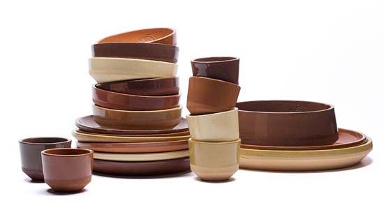
HAND MADE


Wednesday, May 22, 2013


on April 18th DesignResearch visited


“HAND MADE”


and researched the relation between craft and design

and how craft does relate to art and design….


to see all >click< for latest essay’s

by G_Group students


“Hand Made” is an exhibition organized

by museum Boymans van Beuningen,

taking crafts as its principal theme


more info

 /site Design.nl /site [Metropolis M [Dutch] /site Boymans van Beuningen

Stedelijk Design Show 2013 /Proposed Highlights


Monday, April 8, 2013

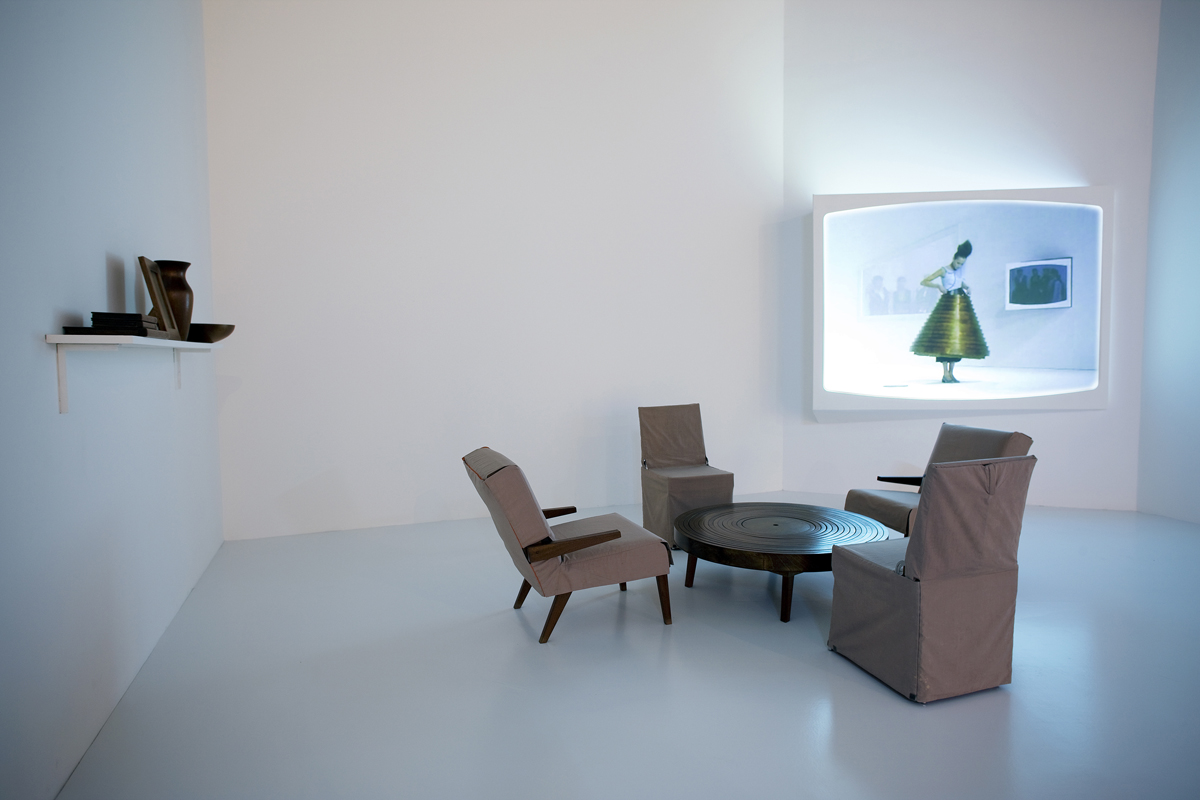
19 Rietveld Foundation Year students visited the "Stedelijk Collection Highlights /Design". Marveling at the many masterpieces, commenting on the applied or autonomous character of pieces in this highlight presentation, they arrived at the last part of this "depot salon", wondering what contemporary design would have in store for them and how it would look like. To their regret the presented selection faded out without any opinion on the latest developments in design; social engagement or neo crafts
Researching contemporary design we propose this "2013 Supplementary" as a possible continuation, an imaginary online next exhibition space.

click on images to visit the exhibit


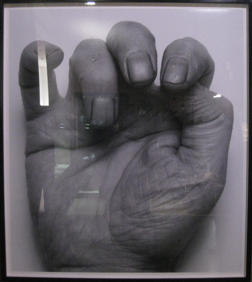
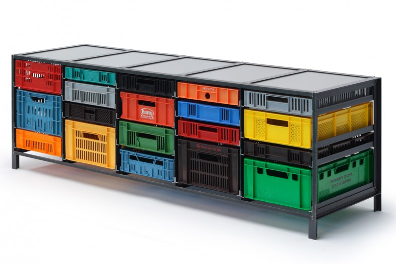
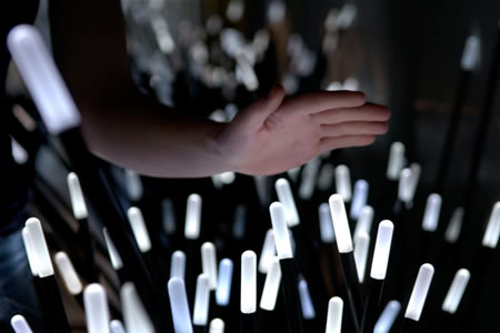
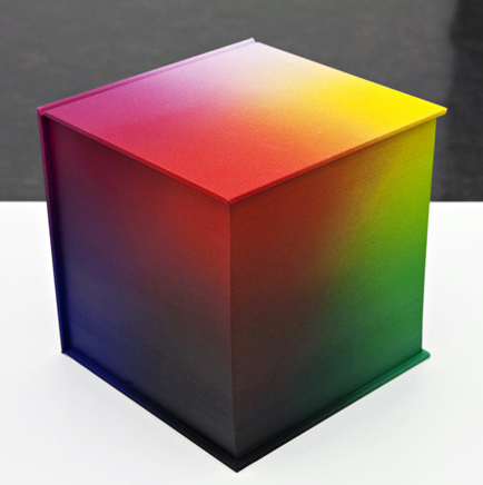
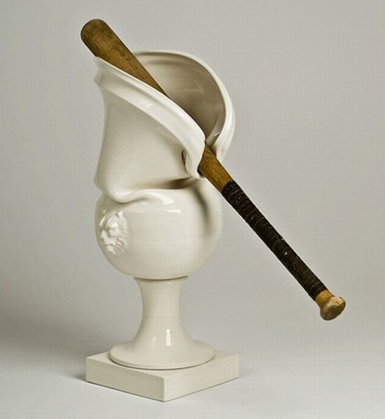
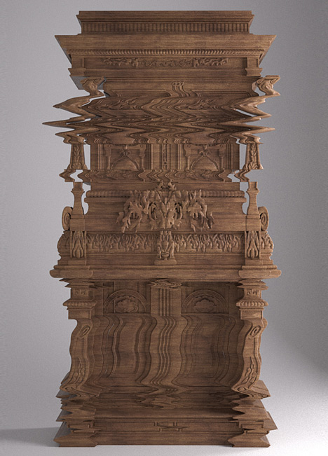
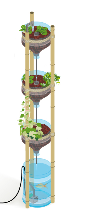
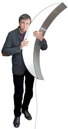
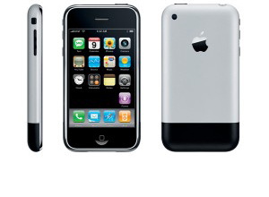
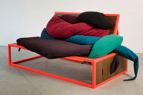
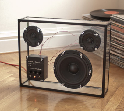
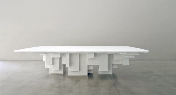
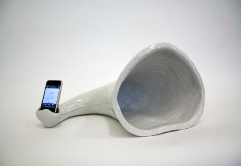
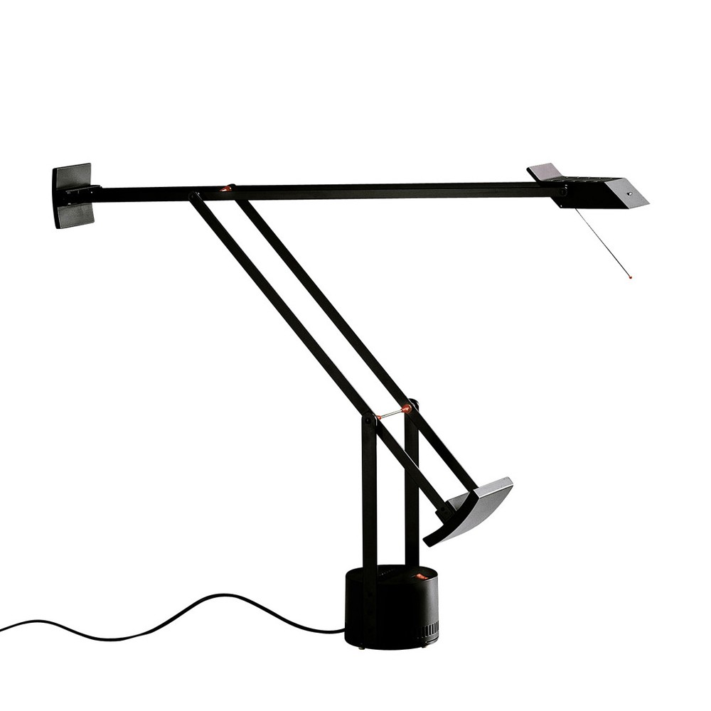
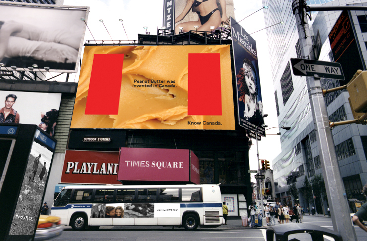
selected designers are: Mark van der Gronden /site • Daan Roosegaarde /site • Tauba Auerbach /site • James Dyson /site • Ferruccio Laviani /site • Mediamatic /site • Leonid Tishkov /site • Jonathan Ive /site • Liliana Ovalle /site • People People /site • Nucleo /site • Faltazi Lab /site • Michelle Weinberg /site


Storytelling as a craft


Thursday, March 28, 2013

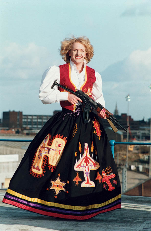
Grayson Perry is an English artist and his work is really broad. He makes vases, videos, documentaries, graphic novels and curator. He made Claire – his alter-ego – into an icon. Together with fashion students he designed incredible creations for Claire.

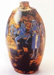
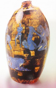
At the exhibition I saw this work: Strangely Familiar, which is a vase with pornographic images within the background images of the suburbs. Not something you immediately connect with pottery, that’s what makes it so interesting to look at. The vases itself tells a story, the vase serves as a stage, Although they have this fragile look they tell radical stories.


In England it produced strong reactions. Many critics didn’t take his work serious, it is primarily the form he choose that was shocking. Ceramics and decorations have a reverential status in England. Associated with good taste, educated public. What Grayson Perry tells us with his vases is the opposite of what we like to see as civilized or good taste. We would like to see ourselves as civilized people in Western society, but he shows us that we in essential aren’t civilized people at all.

Stedelijk catalogue

I really don’t understand that they make such a problem about the images on the vases. You have to see it in the context. I think it just makes it stronger. It seem they only focus on the vases, they threat it very narrow minded if you ask me.


(more…)

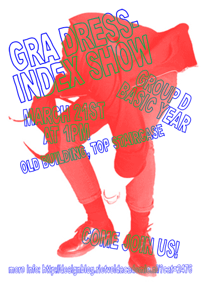
GRA DRESS-INDEX SHOW


Thursday, March 7, 2013

Get the Flash Player to see this content.

Group D of the Basic Year worked on the GRA DRESS-INDEX* project during the months of February and March 2013. Each student took ‘dress’ at the GRA as a starting point for new clothing designs. Each individual research resulted in one new outfit. These outfits were presented in the form of a fashion show at the staircase of the old GRA building (between 2nd and 3rd floor) on March 21st. It was an energetic – exciting – show, here a video synopsis of the show:

>> As one student said: People dress quite boring at the Rietveld, this is way more fun…. Why don’t we dress up like the GRA DRESS-INDEX outfits every day?

*GRA = Gerrit Rietveld Academy, Amsterdam
DRESS = Clothing in a broad sense; the way people wear, move around and behave in clothing
INDEX = List arranged usually in alphabetical order of
some specified data (as subject, or keyword)
<

a visual study of the Young-Helmholtz color theory


Thursday, November 29, 2012

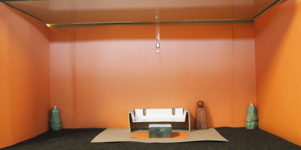
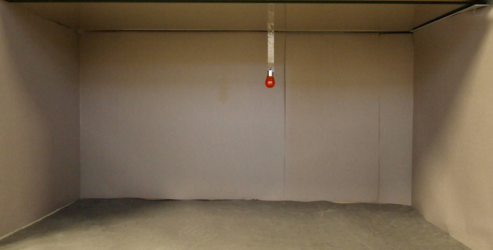
Hermann von Helmholtz was a German physician who contributed greatly to different areas of science. In 1851 he made a color system that looked like this:

This color system illustrates how color is perceived by the human eye. The system is based on a previous study made by Thomas Young in 1802, the color system has therefore been named the “Young-Helmholtz theory”. Young’s study states that there exist 3 different types of photoreceptor cells in the eyes’ retina, who are each sensitive to a certain range of light.

Helmholtz then went a step further by assigning different colors to the wave lengths that the photoreceptor cells were capable of detecting. Short wave length, Red. Middle wave length, Green. Long wave length, Violet. If a color between the primary wave lengths is seen, the different cells will react to create a mixture that will create this color. For example, if yellow is seen, both the photoreceptor cells receiving red and green will mix to create this signal. The diagram underneath illustrates this. (1 red, 2 green, 3 violet.)

Colored light is additive, which means the more color is mixed, the closer one will come to white. This is why white is centered in the Young-Helmholz color system. The lengths represent the amount of color eventually needed to get white.

All in all this color system concluded that us humans are trichromatics, which means that we have, as mentioned before, 3 different cells in our eyes that can catch different wave lengths of colored light. So if you are missing one type of these cells, you are colorblind. This information eventually led to developing a color blindness test that is still used today, called PIPIC.

Being new to painting, and especially mixing colors, I was amazed that the three cells in our eyes mix the color that you see for you (and much faster and more accurate than anyone would ever be able to do by hand!)

Hoping to maybe understand how my eyes got so good at mixing color, I wanted to visualize this unconscious mixing trick that they apparently do. I learned from my color system that the mix of colors, which happens in the eye, is a mix of three colors; red, green and violet.

The three colors are divided into wavelengths, this is how the three different cone cells absorb them. Red, short wavelength. Green, middle wave length. Violet, long wavelength.

When we look at different colored things, our cone cells do the mix and our brain sees the  color. cool.
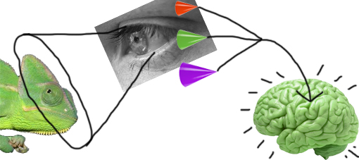


I therefore thought that I might have to put one monochrome item into focus, too boil the mixing process down to the core. I first thought I might make the cones the color of what they saw, to show how they, when mixed, visualized this color. I tried this with a cucumber and the 3rd floor of the rietveld building.
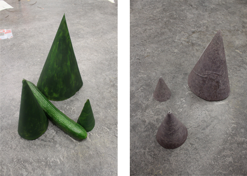


But it was simply to easy and felt repetitive showing the same color twice. colors are also such an ambiguous and individual experience, so giving the mixed color away this clearly was no fun.

I wanted to show how the eye really works on this almost incomprehensible subconscious level. The cucumber could stay, but the cones needed color!
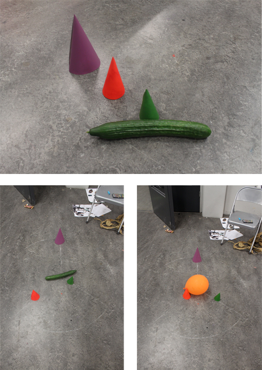


I decided to draw a chalk circle (vision is ephemeral), with the object in focus centered. From the center I drew three lines, one for each colored cone. The lines are the same length and represent the amount of that specific color needed in order to achieve the mixed color of the object in focus. The closer they are to the object centered, the more is needed.

So far so good, But a cucumber does not just lie on the floor, a balloon might, but it still seemed too random. A cucumber is found in the supermarket or in your fridge and the balloon, maybe at a kids party. But drawing chalk circles at albert heijn or amongst 30 six year old kids on a sugar high also seemed random.

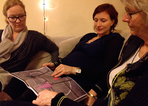
Chalk is an outdoor thing and so is color, luckily. So I went out in my surroundings and documented, with photos, the different objects i saw. I eventually made a book with all my outdoor color observations.

Click here to view it!

It starts with a green dust bin and then travels around helmholtz color system going to a yellow car and so on, until we reach another dust din, but this time blue. The circle has been completed. At the very end of the booklet we see a white cup, white being a mix of all the colors deserved a special place, so there you go white.
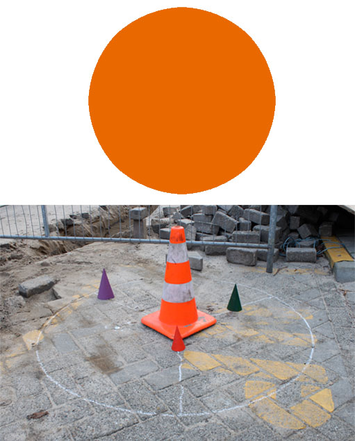


I am very glad i finally got out of my apartment and ended up working outside, because colors outside, or in public, as communication, is a big part of my color system. The colorblindness test that the Young-Helmholtz theory helped develop, makes sure pilots aren’t color blind, so they know what the light signals on the airstrip are trying to say to them. likewise this also goes on in our everyday public; traffic signals, which bin to throw the right trash in and where the best offers are in dirk. which is why i choose orange to be my screen printed color, featured as a signal cone in the book, because it communicates so nicely. thank you orange.

i brought my book home with me for the holidays, my family liked it.
Stedelijk Design Show 2012 /Future Highlights


Tuesday, November 27, 2012

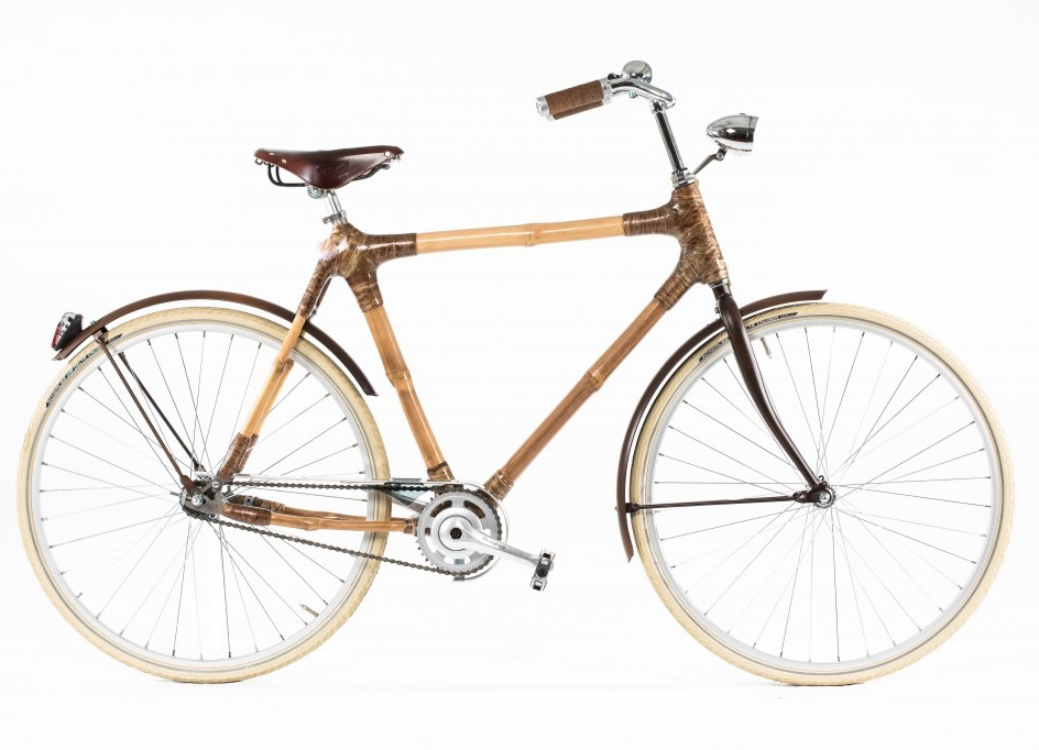
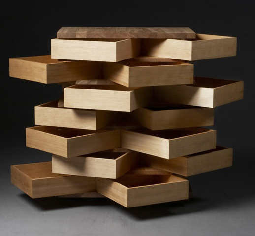
17 Rietveld's Foundation Year students visited the "Stedelijk Collection Higlights /Design" in the newly opened Stedelijk Museum. Marveling at some masterpieces of Interbellum design or surprised –a little further– by the Scandinavian design some of us know so well from our grandparents homes, we arrived at the last part of this "Depot Salon" wondering what a 2012 selection of Design could be.
Researching contemporary design we composed the "2012 Supplementary" which we present in this post. From the exhibit "Stedelijk Collection Higlights /Design" we all selected a personal best and made it the focus of the researches published as part of the project "Design-in-the-Stedelijk"


Wieki Somers invites your fantasy – Listen to your eyes.


Monday, November 26, 2012

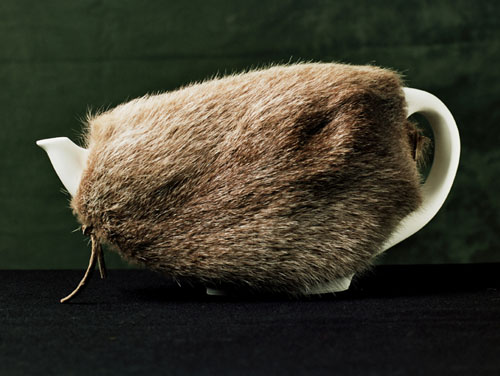
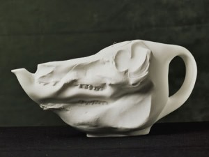
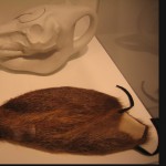
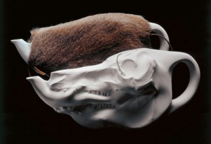
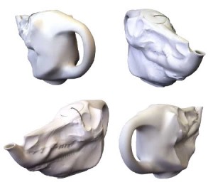
“A porcelain pig’s skull is a teapot. The tea cosy is made of rat’s fur. Imagine that bourgeois ritual moment, when tea is ready with several people already gathered around the small table. And than the furry animal skull lands. A delicious shock, a clash of contradictory thoughts. Horror and delight, celebration and menace. And while your friends silently wonder what kind of tea this might be and how it will taste, there is a moment in which the tasty and the unsavory, harm and delight, can no longer be distinguished.”


The High Tea Pot, designed by Wieki Somers in 2003, is presented in the Stedelijk Museum along with the story above. This storytelling is an important element in Somer’s design [x]. She has her own studio since 2003, and can be considered as a part of the second generation of Dutch designers who gained international reputation. Whereas the previous generation was focused mainly on the conceptual ideas, this new movement revalues the aesthetic element. Her works always contain a narrative element. She doesn’t like objects which are completely finished, to smooth, to ‘design-like’. Because, as she states; “in that case you can’t continue the story, you can’t get your fantasy going and can’t put anything of your own in it”. That is the reason why she attempts to design her products in such a way that the user can dream away. Like a story in a book can have an open ending.

She works on intuition, according to the question she wants to rise. She sees a story in her surroundings, designs a piece, and again creates a story. She makes people create their own stories. And so did I. My story started as soon as I saw this piece the first time. So therefore I have decided to make my research a visual story rather than merely factual text. I will guide you along my own associative journey.

Listen to your eyes.


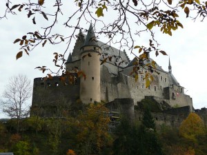
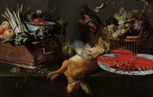
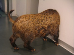
I got a memory flash of a room I’ve been in. A medieval castle in Vianden, Luxembourg. It was autumn, windy and I must have been eight years old. The smell was humid, and came from the old wet bricks through the flaked off plaster on the walls. The candlelight was dimmed, as so was the sound of the thousands of feet which once walked the tiled floor. The large robust wooden table in the middle of the room was apparently meant to display how the previous kings of this castle had their rich meals. Therefore the table had an overload of fake food. Stuffed wild game lay on the stable. Glassy eyes of swines stared lifeless. Meat of the surrounding forest took their position of being decoration seriously. Some sporadic fake apples painted in a gold cover.

A display of luxury, covered in a thin layer of grey dust, the dust of the stories happened here.


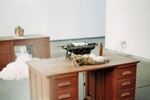
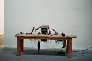
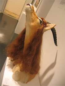
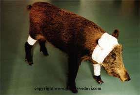
It reminded me of other displays of dead animals, especially these two pieces I saw when visiting the Verbeke Foundation in Antwerp. It shows a typing dead hare. The dead animal is turned into a machine by a human hand. Think of words as ephemeral, fragile, organic, rattail.  Wieki Somers does the same, she turns it into a pig’s skull an object of use, with a functional purpose.


When talking about dead animals, roadkills popped up in my mind. How damaged and used their bodies lie ruffled up at the side of the road. With their wet fur stuck together in the dirt they look gaunt..


Then, think of fur as a luxurious product. Think of the ‘bourgeois ritual of having high teas’. The ability to afford luxurious products. Arrogance and superiority of wealth. To place ourselves above others, above animal living, degrade them to a decorative coat.


As I got deeper into the matter, and after I had associations relating to the Hight Tea Pot itself (the material), I thought of a spherical scenery in which it could fit. Sinister, wicked, fairy-tales with a dark twist. Images from movies as the Adams family, Tim Burton’s Vincent Price, and Lemony’s Snicket appeared.


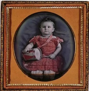
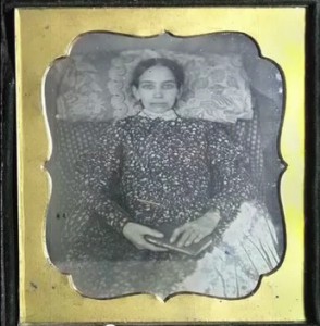
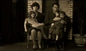
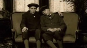
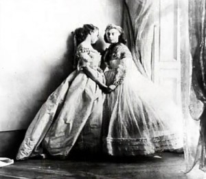
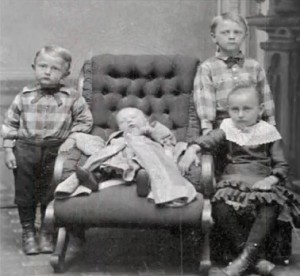
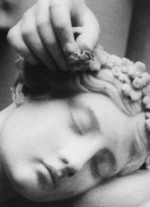
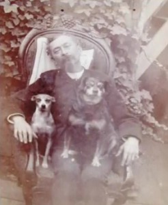
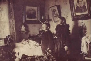
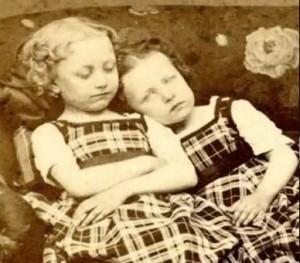
As I sunk in these atmospheres I discovered a fascination I have for this High Tea Pot. Both the materials that Wieki Somers used are ‘cold’, by that I mean the deadness of the animals. But these remaining of different animals become alive again when the hot tea is poured in the pot. Then the skull heats up, the rat fur is warm and touchable. You feel the heat from the inside, like a breathing organism. And so, I stumbled upon Victorian post-mortem photo’s. These photographs portray recently deceased people. Sometimes the person seems deep asleep, or arranged to appear more lifelike, or even together with alive family members. These photographs contain the same weird mix of death and live, cold and warmth.


As a last note I would like to conclude that the High Tea Pot is a narrative object, and creates a room around it. The invitation to make your own stories, was resulting in this path for me. And whereas the starting point for every story is the design object every time, the paths can lead up to total different stories, so therefore there exist a lot of different endings.
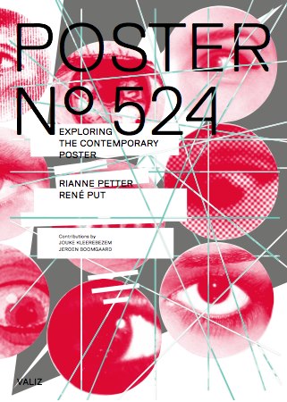
Poster No. 524 The Deconstruction of the Contemporary Poster


Sunday, November 11, 2012

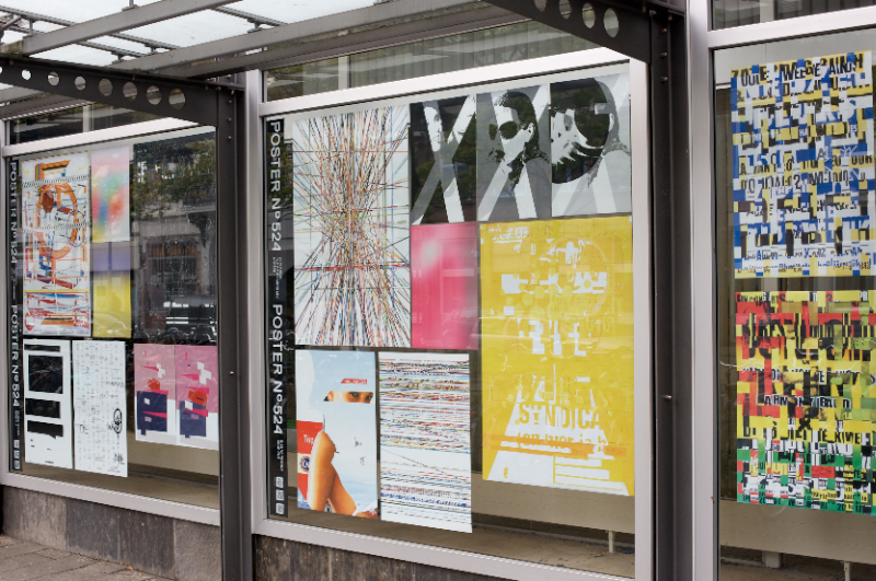
For three months, Rianne Petter and René Put (teacher at Graphic Design) collected posters hung throughout the city of Amsterdam, a total of 523 different posters. They carefully studied and deconstructed this collection according to their most important features, researched certain elements such as text, image, color and composition, isolated and then reconstructed them to create new images. Poster No.524 makes clear how a creative research process works, and is designed so that more generalized meanings about posters and visual culture are made visible. Jeroen Boomgaard and Jouke Kleerebezem’s texts both deepen and contextualize Petter and Put’s individualistic approach, while at the same time exploring the historical meaning of posters in public space (including a history of poster design since 1900) [x]

The book > Poster No. 524 < presents their researches, revealing how a creative process unfolds, how art operates in public spaces and how one goes about creating a visual identity.

Material related to the project will be on display at the Rietveld library from Monday Nov. 26th till Dec. 5th /2012. The project was developed at the Research Group Art and Public Space at the Gerrit Rietveld Academie and the book is published by Valiz. They pursued this research with the support of a grant from Fonds BKVB.

The Erratic Life of Texts Made Public


Tuesday, October 23, 2012

[publication of graduation essay by Laura Pappa 2012


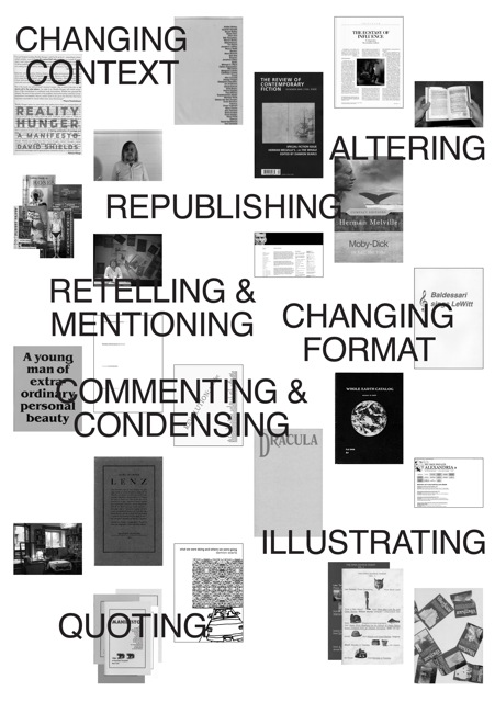
In the spotlight is a collection of books and book-related projects that are introduced through the subject of this essay: the erratic life of texts made public. This text takes a look at what happens to books after they’ve been published, and in what forms can they continue their existence. For this a narrative of sorts has been put into practice where at each step texts are subject to more and more deformation and alienation from the original content. This order defined the selection of projects to be introduced as well as the context for their analysis. This curated collection of books is subject to a close study through examining the different ways material can be treated and made use of, weighing the ups and downs of it and defining the core of these projects.
The text is divided into several different chapters titled by the act material is exposed to and under each title a handful of projects are introduced. Aside from individual critique of the selected examples, the text touches upon subjects such as publishing, authorship, appropriation, reading and books in general.
…… Alongside the disappearance of the material, somewhere between sharing and creating, uncommon types of publications and projects emerge that infuse (parts of) existing texts with new layers of information that begin interacting with the chosen content. The additions can be textual, image- or form-based where the selection of the source material can also often have a key role to play. All the models, no matter how simple or perhaps seemingly worthless, provide numerous possibilities for the creation of new publications. Through questioning and implementing the “originals” newer and better formats may emerge.
 
Download this thesis: The Erratic Life of Texts Made Public

[image thesis flyer by Laura Pappa]


from the jury rapport: “The Erratic Life of Text Made Public” by Laura Pappa of the Graphic Design department is an outstanding thesis because it is well written, has a good outline and gives original examples. The thesis describes and researches everything that can happen with a text, which takes flight from Laura Pappa’s own discipline of graphic design. The jury only found one blind spot in the thesis in that it doesn’t question what the – sometimes devastating - effect of the graphic designer him/herself can be on the text. Still it is a remarkable thesis in that it is one of the few that really shows an independent manner of thinking and a train of thought that is taken to its utter consequences.


Pharmakon, cure as well as poison


Monday, October 22, 2012

[publication of graduation essay by Marieke Berghuis 2012]

“Pharmakon: De magie van het schrift” is a thesis about the connection between the material world and the world of writing. This thesis investigates the question in two parts: the effect symbolic signs have on us as well as the effect of the manual activity of writing/drawing itself on the writer.


In Plato’s book Phaedrus, Sokrates tells a story of the Egyptian Pharaoh Thamus who is visited by the god Hermes, or Toth. Hermes is the alleged inventor of writing, and offers his invention to Thamus as a cure (‘pharmakon’) for memory. The king refuses the gift, believing writing would rather be poison (‘pharmakon’) to the memory, since memory needs to be trained. Without training their memory people will remember only by mere virtue of an external device. This story is firstly about writing, but the word ‘pharmakon’ also provides the key in this research’ conclusion. ‘Pharmakon’ means at the same time cure and poison. This ambiguity and lack of unequivocality is what renders writing, drawing or mark making, in a sense magical. In focusing on the performative act of writing or drawing, I found that artists such as On Kawara and Hanne Darboven, and writers such as Franz Kafka, Robert Walser and Walter Benjamin, created a certain beneficial rhythm for themselves by the manual, repetitive movements of painting, drawing or writing.


My research is illustrated by the personal story of me taking notes in a courtroom. Security guards removed me from the public gallery and confiscated my drawings for inspection as they posed a security problem. That was the starting point of a lengthy exchange of letters to discover the rule or regulation I had violated. Eventually, I was told that as long as the authorities knew what I was doing, could understand or read what I scribbled on the paper, there would have been no problem. My notes however, being illegible to the authorities and made without a clear-cut, understandable purpose, rendered my presence disruptive.
 
Download thesis: De Magie van Het Schrift [dutch language]

[image from graduation show and essay of Marieke Berghuis][www.mariekeberghuis.nl]


Why Can’t I Use My Ignorance


Thursday, October 18, 2012

[publication of graduation essay by Elisabeth Leersen 2012


In the following text we will dive into the notion of ignorance, in order to see what this could mean for the marginal areas of design. Hence the question Why can’t I use my ignorance? This is a question I will try to resolve, by walking past different subjects. Exploring the unknown, by shifting context.

First we will conclude what ignorance means: what it means in society, and what it means for me, personally. Next we will develop questions; in order to see how ignorance relates to the primitive, and we will see how the notion of anthropology has a say in this matter.
All we learned, I will transform into an abstract notion, which may help us to link my questions directly to my own practice and my own desires. And so, in the end we will deal with storytelling, truth, flickering perspectives, and finally a way in which ignorance has found it’s place within my design process.

You must wonder, Why ignorance? This is a question I ask myself regularly.
Inside of me lies a desire to call a bluff from time to time, which I guess goes for everyone.
In order to see what would happen if I were to invent a certain knowledge, and thus would put my ignorance to a different use. How far could I take someone along in this dreamed-up universe? And, why am I attracted to this invented ignorance? These are all questions we will deal with. Some we will answer, some we will not. I invite you to take this journey with me, and see where ignorance might take us.

“There are different ways of looking out, of looking for new perspectives. Perhaps my fascination with the ancient explorers and their narrations lies not so much in narrative, but lies in their approach. It does not interest me to revisit their voyages, but to commence my own. To adopt their naive, primitive, and subjective way of seeing the world, in the new encounters they made. Making many assumptions on the way, and never finding the entire truth; or any truth for that matter.
This narrative of transition, it is a fictive journey. Finding yourself opposite an unknown phenomenon, as in the explorers’ journals: the multitude, yet incompleteness. Many truths, many ideas, and much more assumptions. Diving into different disciplines, using them all; perhaps taking pieces that were not meant for me. I’m not looking for the strength of singularities; but for humble pluralities.”

Download thesis by Elisabeth Leersen: Use Your Ignorance

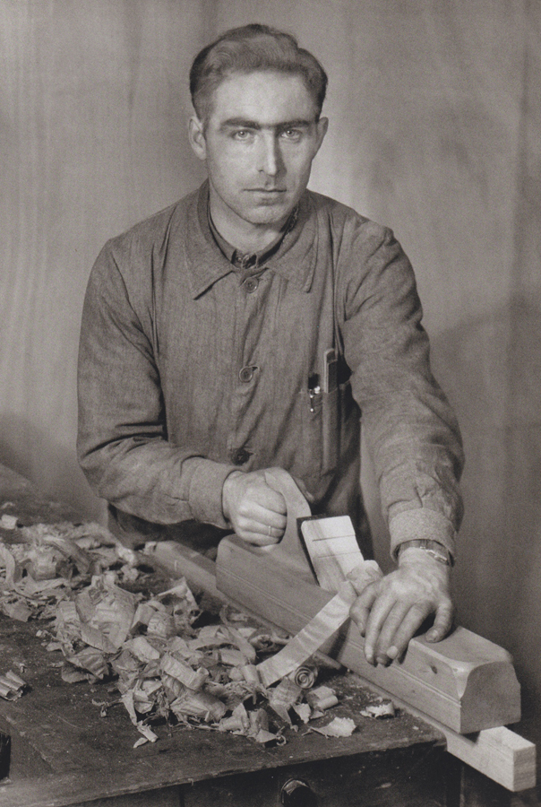
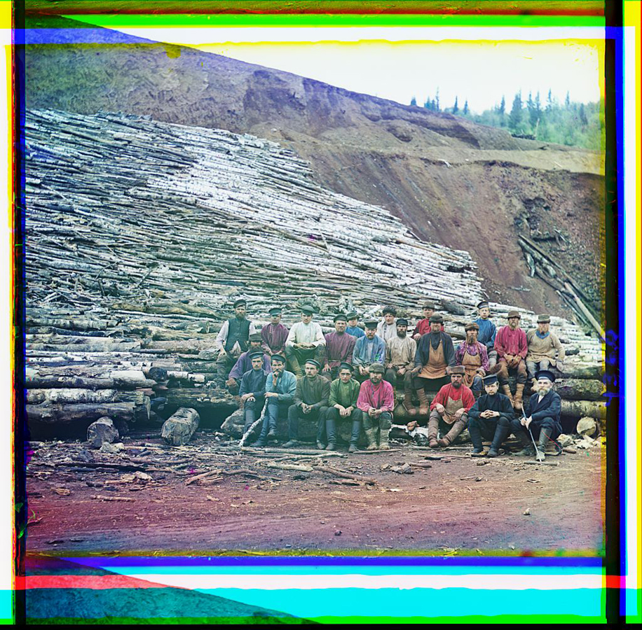
[images by August Sander /Claude Levi Strauss /Galon & Gajek]

from the jury rapport: Elisabeth Leersen from the Textile Department provided the jury with a beautifully designed thesis that was also content wise very interesting. In her thesis Elisabeth researches how ignorance can be made productive. She takes herself as a starting point and arrives at original and lively references from different disciplines and gives her own creative examples. It is a search that ends up again at Elisabeth Leersen herself. At this point the thesis would require a little more self-reflection and more precise use of language, but the thesis remains one of the best.


Chain of Connections


Monday, April 9, 2012


Sometimes it happens when you think that you do not have any relation with something, suddenly you find a chain of connections with yourself.


Richard Niessen – graphic designer working and living in Amsterdam, the Netherlands. Since 2006  he works together with his wife Esther de Vries. The main focus was – search for a relations between Richard Niessen and Gerrit Rietveld Academie. Richard Niessen graduated from the Gerrit Rietveld Academy in 1996. Esther de Vries graduated from this Academy as well in 1998. I selected some fragments from interviews where they mention the Rietveld Academie:

“The class in which I graduated, in 1996, we all started on our own. I think there was a need for a new generation. We were the first generation of creatives that were used to using computers. I think there was also an economic boom; a lot of clients wanted to work with young designers. Linda van Deursen had been teaching us and she was very influential. Ajax won the Champions League in 95 so she called us her Champions League.” 

“It’s one of the best schools,” says Niessen, “because it takes students seriously. Also, great designers teach there. A lot of art schools in Holland are more like schools, but the Rietveld is different…”

“It’s also because there are lots of interesting students,” adds Esther de Vries. “Everybody wants to go there, so they get a great selection of people to choose from. It generates a lot of talent.” 

“Students at the Rietveld are taught that they shouldn’t ever expect to earn any money,” laughs Niessen. “Most people prefer to stay poor and do exciting work. Sometimes we’re asked to work with commercial clients but it never works out because they see a piece of work and say ‘we want that’.” 

“Rietveld is a quite particular school. Rather than being taught in a certain style, you are trained to have an attitude. Students aren’t given straightforward assignments like ‘make a letterhead’ or ‘design a business card’. You are encouraged to be autonomous, to adopt a more art-like approach, to work more conceptually. Of course at the time I wanted to make letterheads, but after I left I was thankful for the training. It’s attitude that prepares you for anything, and you have plenty of time to find your own style after you graduate. Now I always start by thinking about what is the most interesting aspect of an assignment for me.”

(more…)

“1-2-3 Jewel”


Monday, March 5, 2012

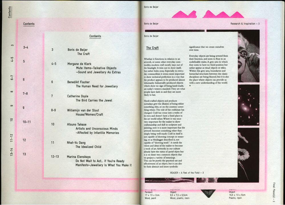
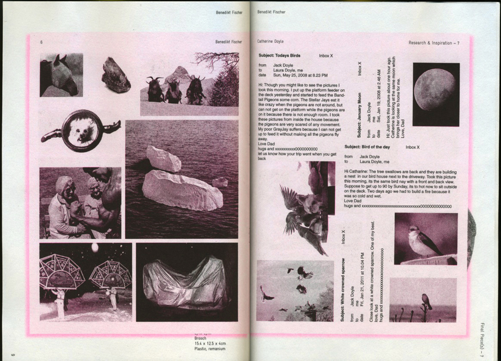
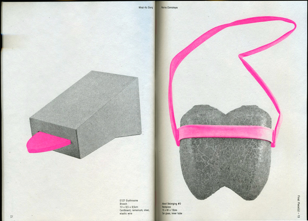
As part of the final exams and graduation show 2011, the Jewelry department of the Gerrit Rietveld Academie “Het Sieraad” published a wonderful triptych.
A successful effort to put the work of the 8 graduating students in broader perspective.

This triptych consists out of 3 layers in which the students present
1] their visual inspiration material, 2] parts of their theses in relation to the works, 3] the works itself.

The whole publication is beautifully designed by Anna Hennerdal a graduation student of Graphic Design herself. She managed in a very effective way to visualize these layers and their interrelationships. Most intriguing in this publication is the transformation of all the material through the miraculous technique of cyclo-style printing causing an unique visual interpretation.


“1-2-3 Jewel”
a feel of the field / research & inspiration / final pieces

page 2 - 3 : chapter 1 / a feel of the field / index - Boris de Beijer

page 8 - 9 : chapter 2 / research & inspiration / Benedikt Fischer - Catherine Doyle

page 12 - 13 : chapter 3 / final pieces / Nhat-Vu Dang - Marina Elenskaya

The 40 page publiation “1-2-3 Jewel” of which 200 copies were printed can be bought for € 25 at the Jewelry department or can be downloaded as pdf below.

  download thesis: 1-2-3 Jewel” [english language]


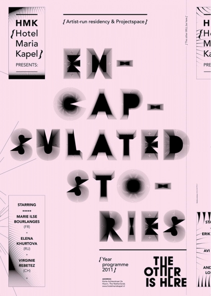
E/MERGING PATTERNS – Khurtova / Bourlanges


Thursday, March 1, 2012

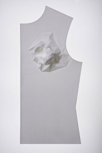
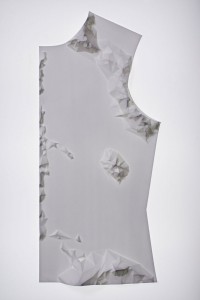
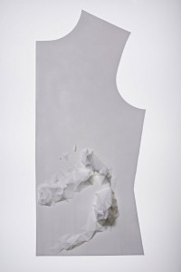
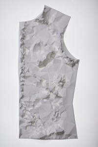
As part of the Foundation Years design-research project “New Energy in Design” based on the 2012 Boymans van Beuningen exhibit, Marie Ilse Bourlanges and Elena Khurtova were invited to present their work and research. As a sequel to an earlier presentation in the program 3 year ago [x], the development in their work over the years and the ambivalent state of design versus art presented the clear and inspiring ‘new energy’ in their work

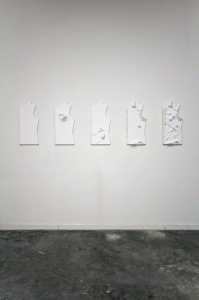
E/merging patterns, challenges the Normativity of systems: a care for order, from which one can’t withhold (social, cellular or temporal system), and provides an access to an aesthetic of cancer, ‘beyond well and ill’.

The artists study the grouping of cells that emerge as a new system within a normal ‘baseline’ system. By applying the behavior of cancer cells (uncontrolled growth and invasion) as design parameters, Khurtova and Bourlanges offer an experience of the body that begins where the usefulness of healthy bodies ends.

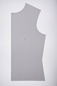
The work consists of a series of 5 bone china cast objects, and depicts a flat garment pattern, in order to give a dry representation of the body. The flat surfaces are distorted with extruded patterns, relating to different organs or inner body systems. Those patterns are generated from detailed 3D mapping of tumor growth, by the use of algorithmic software implementing uncontrolled growth parameters. The obtained structures are manufactured by CNC milling machine, in order to produce mother-molds for plaster molding and precise slip-casting.

Realized at the EKWC, this project merges the material sensitivity of ceramics and the precision of CAD/CAM technology.

5 pieces – 28 x 62 cm – Bone China (ceramics)

2011


Make the bees work for you!


Saturday, January 28, 2012

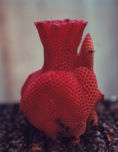
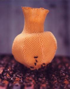
I have always been fascinated by different kinds of materials and combinations of them as there are thousands of different possibilities of the outcome. And especially in art or design works where you can feel that the material was completely ‘understood’ by it’s artist or designer. It was exactly that feeling that I got when I saw Tomas Gabdzil Libertiny’s Honeycomb Vessel #2 in the Boijmans van Beuningen Museum in Rotterdam.

The Paper Vase or the Honeycomb Vases demonstrate a new way and approach of working with materials. This means that natural processes have to be understood and investigated from all different kind of perspectives. I like this thought and I think it is a crucial one for ‘sustainable’ design. We should communicate with our environment and understand it. Therefore it is important to take advantages of the things that are already there. The Honeycomb Vases symbolize this crucial understanding. In collaboration with beekeepers he found a way to make the bees build a vase like shape. The vases are created by placing a basic beeswax mould printed with a honeycomb pattern into a beehive. The bees then start to work with that pattern. It took 40,000 honey bees that worked over a course of one week to create one vessel! Libertiny himself calls this process ‘slow prototyping’. Every vessel has a unique form and they also vary in color and smell depending on the flowers that are in season.
(more…)

Unopened Books


Wednesday, January 25, 2012


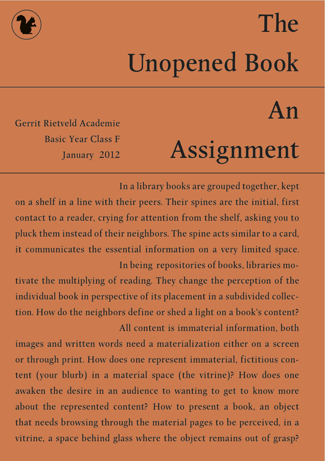
This post is part of he subjective library project “Unopened Book
An assignment initiated by Corinne Gisel and Nina Paim [graphic design]
in cooperation with Henk Groenendijk and Matthias Kreutzer [supervision]


Intro part 1 /The Assignment

unopened_book_72dpi

Assignment as presented

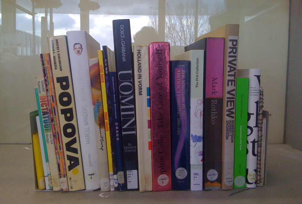
Select a book from the library collection based solely on its spine.
You will be given only a short amount of time to make a choice, you probably have to make a very spontaneous and subconscious decision. We will take your book away to make sure that it remains unopened. It will be kept together with the other unopened books in a vitrine in Rietveld Academy Building for the time of the assignment. Now rationalize your decision:
Why did you choose for this spine and not for another? What do you think this book is about?
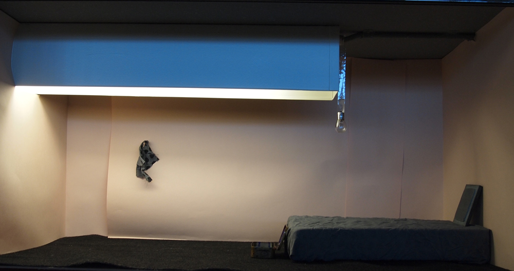
Write a Blurb on this Unopened Book and visualize that imagined content in a vitrine!

[x]

read all “Blurbs” and see all “Vitrines” imagined as part of this assignment, by selecting Unopened Books from the “Projects” Menu


Intro part 2 /The Lecture

tumblr_lzt6l4rtXK1rosrgvo1_500

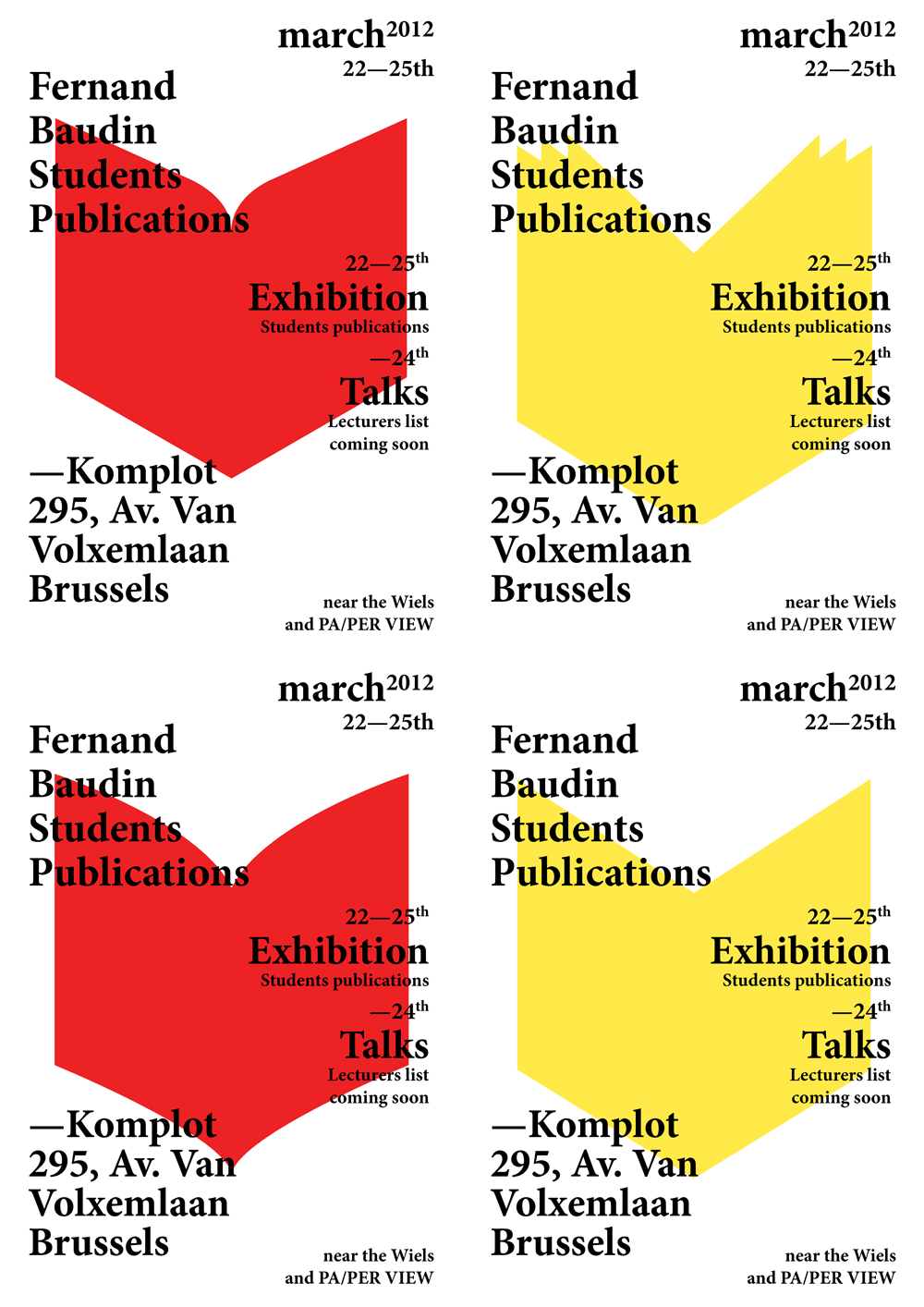
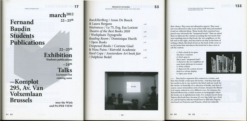
Fernand Baudin Students Publications March 2012 was the first edition of a yearly event dedicated to students publications. It was an event dedicated to editorial productions by students in Belgium and connected to the international scene. The first year was an experimental, reflective and prospective one – engaging students, teachers and ‘professionals in public discussions on the practice of making and thinking books today. It was also a moment to think about publications (book fairs, book awards, book exhibitions, etc) questioning their relevance to the realities of students’ practice today.
As part of discussions and presentations, organized during this event, Nina Paim and Corinne Gisel gave a lecture presenting their 2012 graduation project Library Talk of which “Unopened Books” was a part initiated in cooperation with the Basic year’s Design/DesignResearch program.
This lecture is integral published in the book “Fernand Baudin Students Publications/This Is Not A Most Beautiful Books Award” and can be lend in the Rietveld Library [lib no: ]. Mixing different times and spaces this publication proposes another way to document that event. It publishes elements retracing its making, explaining its structure. It makes public what happened before and during the event –the pieces and the facts– but also what happened after and is still happening while those lines are written.
 

Lecture about "Unopened Books" by Nina Paim and Corinne Gisel as part of their "Library Talk" graduation project

Lib_03002_X

“click on image above to download lecture [15 pages]


thanks to Nina Paim for permission to publish the lecture
thanks to Lorain Furter for donating a copy of the book to the library


Private View


Wednesday, January 18, 2012

Ever wonder what it would feel like to be able to travel through eye to eye. Eyes of people that witnessed things that you no longer have the chance/curse of seeing. Being consisted of only eyes, feeling so round that you can travel everywhere by just a simple push? Without arms, legs, a belly button, a chest… looking at things that are not yours, never will be, moments that you were not suppose to be witnessed… “Private View” offer you the experience of being the surveillance camera where there is privacy of a mind. Minds of Robertson, Russell and especially Snowdon ……

Us as viewers, we usually don’t tend to see ourselves as peeping toms when it comes to documentaries. It requires a good artist to give its viewer the feeling of witnessing something very special either there are hundreds of people in the same room or alone in the comfort of a living room. When you seek through the pages as a grown up you start to feel like Antoine Doinel sneaking through windows, not just looking but actually seeing. As this book fascinatingly documents these minds, with a combination of text and image, you will not just witness a period in art history but you will also witness your alter ego taking over.

When it comes to judging a book by its cover “Private View” is also surprising. The domestic color scheme and the carpet like texture of the cover makes you wanna grab the book. But as soon as you touch it, you realize it is just a smooth surface. This sensation gives you the hint from the beginning that the actual experience is between the pages. The browns and beige will turn into bright reds and black, as the simplicity will leave its place to complexity and heart beat. Its like when you feel that the sound of machinery is more interesting in company of elevator music. Because what makes this book special is that you –as a third person- can always add the humidity, smoke, heat, actual color equivalents of the grey scale, smells, textures from your own experiences, memories and make it yours.

“Private View” will drag you room-to-room, face-to-face, leaving carpet burns all over your skin. Key hole-to-key hole giving you the guilty pleasure of voyeurism not just domesticity and how it can differ on someone’s face, in a room, on a painting but also the actual complexity of an artists brain. View your privacy among, in between, above others.


this post is part of he subjective library project "Unopened Book"
the book can be found at the Rietveld library : catalog no : 760.3-snow-1


Log in
subscribe