Weldoordacht geklad en geklieder is wat er in mijn hoofd knalde toen ik dit boek uit de schappen trok.
Gewicht, omvang als dat van een saai oud wetboek. Maar uiterlijke kenmerken die speelsheid en frisse veranderlijkheid verraadden.
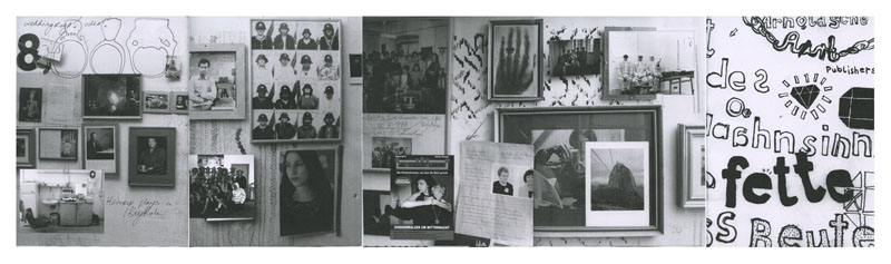
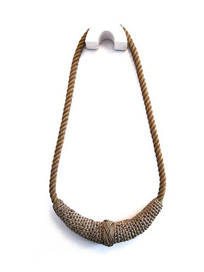
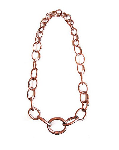
Het is een boek over sieraden, hedendaagse sieraden om precies te zijn. Allemaal ontworpen door (ex) studenten van ‘Munich Academy for Applied Art’[x]. Blad voor blad ontdek ik, dat mijn kennis over sieraden nog armer blijkt te zijn dan ik dacht. Dat, terwijl ik me verbaas over de vele opties en keuzes in materiaalgebruik, vormgeving, grootte.
Wat zijn hedendaagse ofwel autonome sieraden nou eigenlijk?
Is de term ‘Autonome sieraden’ niet wat de Engelsen een oxymoron noemen?
Een stijlfiguur zoals ‘knap lelijk’ of ‘oorverdovende stilte’?
Deze term lijkt in te gaan tegen het idee dat deze sieraden een toegepaste kunstvorm zijn. Dus daarmee, geen autonome. Wat is het verschil tussen een antieke trouwring en een neonkleurige kunststof ring in de vorm van een schedel? Misschien heeft symboliek ermee te maken, misschien het verleden. Voorheen hadden de sieraden behalve een decoratieve misschien wel meer een praktische functie.
Status, afkomst, burgerlijke stand en noem zo maar op.
Voor mij is de kunst van sieraden een toegepaste kunstvorm. Het is kunst dat op het lichaam gedragen word en heeft de functie de drager te onderscheiden van anderen, Of iets toe te voegen bij hem of haar. Iets wat hij of zij niet nodig heeft, maar wat alleen geld in verband met hem of haar.
Maar dan, een kunstwerk dat ‘ toevallig’ gerelateerd is aan het lichaam en alle eigenschappen bevat van een sieraad. Is dat kunstwerk per definitie een sieraad, dus dan ook toegepast?
Just as the academical year came to an end, at the most busy moment of the year, there was again a grand expo at Gallery Ra in Amsterdam.‘ Manon van Kouswijk, ‘Hanging Around’, The Pearl Chain Principle’
[22 Mai- 19 juin 2010].
Manon van Kouswijk has been Head of the Jewelry Department of Rietveld Academy the past three years. This exhibit was like a farewell present by her, after leaving the academy for a new chapter in her life and carreer abroad.
For all who missed that show there is still the book with the same name ‘Manon van Kouswijk, ‘Hanging Around’. And what a beautifull publication it became. With the help of graphic designers NiessenendeVries [#] and photographer Uta Eisenreich [#] a new pearl was added to her neckless of exquisite publications on her work and research process. Only 500 copies so go to the Rietveld library and have a look. The book not only gives a genuine and autonomous look on her work, it also presents her associative search into the subject of pearls and chains as a subject. An inside look into her working process as we came to know from her in former publications
. . .“Within my work I focuss on the value and meaning that everyday objects represent to us.
I am interested in actions and rituals in which these objects take part, like finding, buying, collecting, receiving and giving. In the works I visualise aspects of their function, of use and wear, and of associations that are connected with them.
The archetypical object serves as a starting point in this process; the outcome and appearance of the work is diverse and ranges from jewellery, cutlery, tableware and textiles to works in paper.
The making process I view as a way of making things visible rather than designing; I stay quite close to the objects in a sense that I work with the materials and techniques that the archetypes I start from have been made with.
The multi- disciplinary approach is essential to my practice. It results in functional designs as well as limited editions of art work, that are all derived from the same sources of inspiration. [#]
. . . “My graduation project at the Rietveld academy in 1995 was based on my interest for classical pieces of jewellery, like in this case the pearl necklace. I was intrigued by its rigid and aloof character and felt very tempted to attack it in such a way that other aspects then just its perfectness became more visible.
To achieve this I used the specific characteristics of the necklace, like the severe order of the pearls and the knots that both separate them, but also hold them in place to make a series of alterations to the piece.
One of them was a transparent bar of soap, containing a strand of pearls that slowly comes out the more the soap has been used up. The necklace is born from the soap like a pearl from a shell. [#]
quotes from Manon van Kouswijk
[#] look also for her former 2007 publication Lepidoptera Domestica
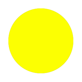
I choose a book on jewelry because jewelry often has some very nice organic shapes and colors that in a way makes them not much different from paintings. The reason I picked out this book about jewelry, instead of the others was because there is a yellow dot on the book which was the first thing that got my attention. The pictorial content of the book was more or less what I expected, when reading the title ‘Twentieth Century Jewelry’.
Ted Noten thinks these days the function of jewelry is quite not necessary in the western culture. In his opinion we have forgotten what it means. He asks himself the question; What is jewelry? And; Why do we keep it?”
He wants to make jewelry people can afford, and that’s a funny thing because his way of working is to pack things into acrylic material, so he actiully makes a distance between object and public.
And the fact that he don’t want to make art for the elite people. But – if you make jewelry that goes into the art field, it’s only the elite who can buy it.
That’s also my question; What’s the use of this ‘useless jewelry’?
The work of Lucy Sarneel interested me. Her work is precise and careful. She translates historic time to our own time. She also shows ideas which are derived from her personal daily life experiences.
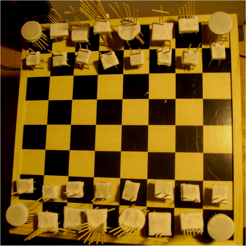
A really interesting work of Lucy Sarneel is called ‘Stoelringen’, (Chair Rings), made in 1992. This work represents different types of personalities. To each personality, she connects a different chair. She is thus showing a personality as a chair, in a ring format.
This work caught my attention, because it shows a different interest of the artist if you compare it to her other works. In the ‘Stoelringen’ work, she focused on the relation between material and personalities instead of time and personal feelings, as in most of her works.
The small size of the jewellery remembers me of traditional games, particularly the chess game.
As a response to this work, I decided to make a chair for each personality on the chess game. Each chair, its size and shape, is related to the social difference and position of the chess piece.
Myrza de Muynck is a Dutch textile artist. She’s not that known and quite invisible on the Internet.
The one and only source of information about Myrza is presented by the ‘APPALACHIAN SCHOOL’.? She was part of their second big group exhibition in the summer of 2007. As a journey to the exhibition, the artists were invited to use the ‘Appalachian Review’. This is an online publication, which invites artists to submit a portfolio of work in progress, to be exhibited.
The portfolio of Myrza contains ten pieces. Like sketches and inspiration. My approach for this research will continue this. I’ll search for the background information from the people that inspired her for this exhibition and try to interpret this in her personal work. Trying to find out this person, Myrza de Muynck.
Willemijn de Greef seems to have been interested in the subject “folklore” since she was making her end exam show at the Rietveld academy in 2006. She also seems to be inspired by fishing industry and traditional craft. In her work se is designing various types of jewellery – brooches, rings, necklaces – but her main focus seems to be on the necklaces. When you se her necklaces it is remarkable that they are all very big. – In fact some of them seems impossible to wear. But what is the reason for this size? What is the inspiration for this jewellery designer? And what does she want to say through her jewellery?
Instead of only trying to get answers to my questions through the designer her self I decided also to ask them to people that is part of my personal folklore. Hereby I chose my focus to be, on one hand, at what I can learn about the jewellery of Willemijn de Greef by interviewing people that is part of my personal folklore, and on the other hand, at what I can learn by going directly to the source.
In her latest exhibition “Kutten en Lullen”, Dinie Besems shows us a collection of oddly shaped vegetables. All shapes which in some sort resemble a penis or vagina. It’s not her intention to shock us, or make us laugh, she wants to show us these weird mutations of the fruit and vegetables we eat every day. I think this project shows a lot of how Dinie Besems works. She started as a jewelry designer, at the Rietveld. But during her career she’s not afraid to cross borders, cooperate with graphic designers and other artists, and to step away from the conventional “jewelry design”.
With a bit of humor and a lot of concept she stands out among other designers. You never know which way she is going to go, but in the end it’s always something touchable, something that relates to the human body (as in jewelry).
What I noticed is that Dinie Besems often slides over into different diciplines. But in her whole oeuvre I can detect an overall interest in the communicative values of graphic design. Magazines, posters, her website and other collaborations with well known graphic designers. So where does that come from? How does she see this crossing over and are graphic design and jewelry that far apart as I thought they were?
Lucy Sarneel (born 1961 in Maastricht) says; “In my jewellery various materials, as for instance zinc, textile, silver, gold, wood, appear. However the main metal I work in is zinc. Besides of the fact that its blue-grey color reminds me of the Dutch sea and sky it also represents the area between black and white, life and death. It refers to daily-life objects of the past like a washtub (in which my mother used to bath me when I was a toddler), a bucket or (still nowadays) a flower box.. Furthermore it associates with protection because of its use in for instance steel rooftops or rain-pipes to prevent them from rusting.
As a prominent participant in the “Gone With The Wind” exhibition held in the Zuiderzeemuseum (mrt-okt ’09), Lucy Sarneel was invited to speak about her participation in this project and one of the main themes in her work…”folklore“.
Enjoy the series of images in which it becomes apparent how the spirit of form and function can be translated into inspiring contemporary mixed media jewelery.
Zuiderzeewerken I, Halssieraad Spakenburg 2009 (zilver) / Willemijn de Greef :courtesy Marzee
At the exhibition “Gone With the Wind” I saw a series of oversized necklaces made by Willemijn De Greef. The size of these necklaces made it seem like they were made for gods and I had the association of the gods in the Norse mythology. In this mythology jewelry play an important role. For example the goddess Freja owns a necklace called Brisingamen.
As a child I was very fascinated by the tales of the Norse mythology. The stories were told to me in school and it was interesting to know that the people who lived their life’s by the rules of this religion had walked the same grounds as me.
I think it’s interesting to think of the mystical beauty jewelry represents in such an old mythology. It puts the concept of jewelry in an interesting perspective, that the fascination of it is so old, and it becomes very clear that the value of jewelry is definitely not only material
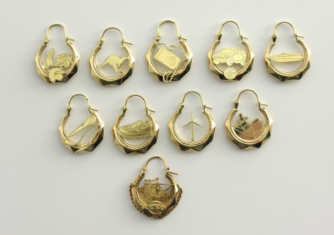
The noise from the boots that hit the cold wet floor, yelling men shouting and cursing, fork lift trucks and pallets that hit the floor with a loud bang. And the ice-cold air from the freezers. This all together make you realize your in the fishing harbors of IJmuiden. Typical for this environment.
From their sixteenth age the lads in IJmuiden are ready to work in these harbors or as fishermen on sea. They get the full gear. A blue overall, yellow boots, yellow gloves, a tattoo of an anchor, ship or mermaid. And of course the golden earrings.
Atelier Ted Noten made a collection of earrings called “New identifications”. My personal connection with that work is simple. In the city IJmuiden where I was born all the men wear these earrings. These 18kt earrings will cover the costs for the funeral when fishermen die in a storm out in the open sea.
Ted Noten his series have new images/symbols from the 21st century as Ipod’s, windmills, skateboards and so on.
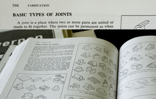
In the library I found the book: ”Jewelry – concepts and technology”.
It’s about Jewelry. It’s not a small book.
I’m not really into jewelry.
– but, oh all this nice detail. I need a closer look at that book.
What kind of system is it?
All these possibilities that I didn’t know about.
How can there be so many possibilities?
A new way of understanding. A new system to see through the working process.
Extract from the book: ”A joint is a place where two or more parts are united or made to fit together.”
– is this about silver or people?
Will I, after working with this “joint”, understand the social connections between people better?
I am looking for the answer of simple, or maybe not simple, questions.
I am looking for information about other stuff than jewelry, it has to be here in the book somewhere.
It is.
I will start with a beautifull sentence that has inspired me often. ”standing still for a moment, is actually a big step forward. So I stand still the whole day”. This sentence is a complete overview of what slowness is for me. But is this in connexion to any kind of design or art? For me in some cases this standing still adds a big layer in looking at things. By looking at objects and art for more than an hour and from the same perspective, it gives a new strength. But is there a way to make other people expierence this power of standing still. What could design/art add to this?
It was an assignment that started out with body extensions, and ended in animal imitations. The best known or most visible aspect of a certain animal was picked out and preformed by one of the students. I personally thought they did it in a very funny way without turning it in to a joke. My favourite was maybe the video where Timo Rohula tried to seduce Maria Pedersen. Timo wore the best, most flashy outfit he could get his hands on, and danced like a crazy man. All to get some female attention. Like a tropical bird flaunting his feathers.
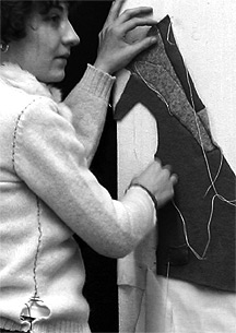
An assignment in jewelry design that was supposed to end up in an object that could roll on your body, became something else for Raz Barsatie.
The objects which could not roll on a body came to have more to do with the body, than the object she made that actually could roll on someone. When watching her objects rolling the mind directly makes a connection to the animal and human. The blue object (see photo above) makes the sound of a tiny horse, whereas the movement is more one of a rather slow, clumsy and unsteady walk of a human. It is interesting how these objects cannot roll on the body but are, instead, independent bodies themselves.
link to youtube
During ExperimentaDesign 2008, 7 jewelry designer were given a chance to work and live in the Red Light District. The project was called “Red Light Design”. RedLightDesigner Ted Noten designed red rings and sold them in the imfamous Red Light District in Amsterdam City. What caught my eye, the first time I saw Ted Noten’s display, was the way he presented his work. The rings were sold in a 24-hour vending-machine placed in a window where a former ‘working woman’ used to conduct her business.
“Be nice to a girl, buy her a ring” was his motto.
Basically he wants to add a little romance to the surrounding; the prostitutes, the men and woman that visit the area. Interesting in the way Ted presented his work is the interaction that takes place between the tourist and other people that pass this display; curiousity is aroused in almost everyone that walks by. But I started to wonder and question the work; does this designers work fullfill its purpose? Does the rings reach their intended destination? And do romance and prostitution mix? What would happen if we asked a prostitute her opinion? What would she think? So I asked a ‘lady of the night’, right around the corner to find out what she had to say.