Skip to Content Skip to Search Go to Top Navigation Go to Side Menu


"architecture" Category


The square is our cross


Sunday, November 21, 2010

With the first design lesson we started to take inspiration from the Rietveld building. I feel quite overwhelmed by the infinite possibilities that it offers, rich in detail and at the same time simple forms.

Now almost a half year has passed but I still feel like I have only just touched the surface. I could go on for years getting inspired by him, he may have already become one of my idols.

THE GARMENT

We were asked to design a garment, inspired by the building, but also a practical piece of clothing for students or/and employees of the Academy.

I thought about the transparency of the building, which Rietveld used so that the students can spread freely in the premises to work non distracted. To connect the inside with the outside was his clear intention.

So I started with a pinafore with coated fabric from which the water or paint of the working students can drip off. In the front I placed a mood-board, like a display out of transparent fabric which you can use to demonstrate your current interest (connecting inside and outside). You can put a picture inside or you show your naked body, if you`re proud off it.

A detail that I wanted to use were the white brick walls at the front of the building, which protrude 15cm from the glass. Rietvelds intended each material to have its own space. So I made two padded retangles out of a white fabric. They can be used as a pad and at the same time as a pillow on which you can rest in the meantime.

I made a second piece because I also wanted to work just with an all-optical process without any useful effect.
I took the gray vertical bars that crossed with horizontal rows of far reaching windows. I tried to create something that respects the human body with the delicateness of transparent and thin lines. Translating the skeleton of the building in a second skin.

(more…)

Stairway-Bridge


Sunday, November 21, 2010

The space that we were to make suggestions for had a feeling of both uneasy turbulence and mediocrity. The way a small triangle shaped area of grass and trees is placed on Wibautstraat next to the train tracks, and the entrance to the metro by a big road makes it useless as it is now. The slope that leads up to the train track and the many trees also increases to the dark and uninventive atmosphere. It doesn’t look, fell or act usable, appealing nor enjoyable. I do believe this location needs a green resting point, but the present one has

hollowness to it

My first feeling being there was that I got distracting by the noises from the cars and especially the train passing on a little hill next to it. Also the passage to the living area on the other side of the train tracks is just a dark and uninviting tunnel, one that I wouldn’t enter happily at nighttime.

My idea with the model is to cover the train tracks with a soft waved tunnel with stairs on top and different level of balconies. Creating a space over the train tracks, and also presenting an alternative of fast passage, which is now only directed to the tunnel under the train.

Connecting the triangle park with the living area by adding the stair-bridge the whole place will be more whole since you can walk on top it and have a broader view. I think that removing one of the disturbing sounds (that of the trains) would also make the areas next to it more appealing because of the new harmony. And you also have a usable area on the top with the the different level balconies. It will be a lighter both physically and mentally


(more…)

Thinking out of the white cube


Sunday, November 21, 2010

The Parooldriehoek is a triangular piece of land, somewhere in Amsterdam-Oost. A piece of land with little character, between the busy Wibautstraat and the train tracks. I hadn’t really ever noticed this plot, and I started to wonder why. It’s not that I never pass through that part of the city; I visit the adjacent club Trouw regularly. Maybe that’s the problem.

Every time I’m there, it’s night. And there’s not very much to see there during the day, let alone during the night. It’s a very dark and uninviting piece of land. Some even say they feel uneasy walking in the area after dark and that is where I could change something.

I was going to give the city something to be proud of, and I was going to make this little triangle memorable and comforting. I wanted not only to make the outside a part of the interior (much like Gerrit Rietveld himself used transparency whilst designing buildings) but I also wanted the surroundings to be affected positively by the presence of a new building. I wanted to make this a place people wanted to visit instead of wanting to avoid it.

With this in mind, I designed a glass library, a place that hides nothing in the dark, but shows everything. Just like the inspiring architecture of Rietveld’s academies. Two fine examples (one in Amsterdam and the other in Arnhem) of how a construction of steel and glass can give a large building a very light aesthetic. Two buildings from which the outside and inside are of great influence on each other.

(more…)

Old church Amsterdam


Saturday, November 20, 2010

Because Rietveld’s architectonical designs don’t inspire me that much. I don’t like the straight shapes he uses most of the time and the sober way of designing his buildings. So it was quite a task to pick one. So eventually I picked ‘van Slobbe House’ because it was build in a hill halfway. And because most of Rietveld’s buildings are build on flat ground I found that part interesting. And Rietveld used the fact that it was built on a hill in a very smart way as you can see on this picture. On the left image below you can almost see the building ‘float’ of the hill.

With this as a starting point, I continued with a certain aspect of Rietveld’s way of thinking; the placing of a window. This was a very important to him. He never placed a window out of the blue. He considered the surroundings sincerely and looked for the best view. And there he placed the window and considered the size of the window depending on the view. This thought interested me. So I went on with it. My first try was some sort of bus stop with different sizes of windows as you can see on the image above.

During an academical trip to Valencia Spain, I found out that I don’t have much affinity with modern architecture [x]. ‘Old’ architecture drew my attention much more. I had more affinity with that kind of architecture. And especially churches interested me because of their unique atmosphere. It felt to me that older buildings had much more of a soul. But where does that soul come from? The answer I from the windows and the old material they we’re made of. The way light falls through the stained-glass windows. Where churches are famous for of course.

(more…)

The hole in Wibautstraat


Saturday, November 20, 2010

Our assignment was to get inspired by a Rietveld building or Rietveld concept, and make a scale model for a new building in the the small triangular park at Wibautstraat, near Amstel station.
At first I and my classmates went to the spot at Wibautstraat to measure the whole area and be familiar with the surroundings.
In the beginning I was looking at the Rietveld Academy’s corners. I guess a lot of people do that, because they are quite fantastic.
I went outside looking at the academy in rainy weather, and I took some pictures of the corners of the academy.

Then I imagined that it would be dirt that surrounded the high corners of the academy building instead of the sky.
So then I got this idea, to put the whole glass building upside down, and then down in the ground, or a big triangular hole at Wibautstaat.

The corner of Rietveld Academy upside down:

Then you would still be close to nature (as Rietveld wanted it), not the same light nature, but a much more dark and deep nature. I liked that idea.
So this was my starting point.
(more…)

Wand


Saturday, November 20, 2010

We hebben de ‘Parooldriehoek’ in Amsterdam bezocht. Voor Design hadden we namelijk de opdracht gekregen de plek te verkennen om er vervolgens zelf iets voor te maken, wat wel voldoet aan de eis dat de huidige functie behouden blijft en het geïnspireerd is door één van Gerrit Rietveld’s ontwerpen. Dit hoeft niet persé één van zijn gebouwen te zijn. Wat ook belangrijk is dat de keuze van het Rietveld gebouw gebaseerd is op de manier waarop hij een relatie legt tussen het ontwerp en de omgeving.
Om de Parooldriehoek en de omgeving te verkennen hebben we bepaalde elementen, zoals de brug, opgemeten om een idee te krijgen van hoe groot het is en om de verhoudingen te kunnen begrijpen. Tevens foto’s en snelle schetsjes gemaakt.

De Parooldriehoek wordt omgeven door twee tunnels, een fietspad en een spoorbrug. Er zijn daarom uiteraard veel mensen en veel verkeerslawaai. De plek zelf ziet er, simpel omschreven, uit als een stuk gras met wat bomen. Het is fijn om er zelf heen te gaan, omdat je dan behalve de visuele omschrijving ook een bepaald gevoel bij kan krijgen.

Ik vond het mooi dat het is alsof je in een geheim, verlaten parkje terecht komt, dat omgeven is door zoveel drukte en lawaai. Dit is dan ook wat ik wilde behouden en versterken, door middel van het bouwen van een wand, maar wel één zodat de plek nog steeds toegankelijk is voor mensen (en dieren..). Om van buitenaf naar te kijken of om er ook daadwerkelijk “binnen te dringen”.
Mijn inspiratiebron is het Huis Rietveld uit 1966. Wat me hier aan op viel is de richting. Op de foto zie je dat het een soort van halve cirkel is die wijst naar het stuk open grond. Het heeft iets krachtigs en groots.

(more…)

The least construction


Saturday, November 20, 2010

The most amusing thing in Rietveld’s construction is the combination of the large window, horizontal and vertical lines.

The important factor of Rietveld, which is linking the inside and outside of large window gives not only physical visual effect, but also the feeling that it is as if the space is being expanded in the mind. That is why I thought that the space he made is not fixed, and is flexible in terms of mental and physical condition.

Therefore, the point of my work is expansion and communication of space, and minimization of boundary.

The forest (small park or also called Parool-driehoek) is the only empty space in the area and the only nature.

That is why if people make something artificial there, it should be at the least, and that it should have synergy effect to people who enjoy the only small nature and give the least damage.

That is why I have thought about de architecture. It is construction, but it is a construction with the most open form and it can have form at the least level whenever desired, and if necessary, it can have different size, which was what I wanted. It is because I have always thought that construction makes much break off.

I wanted to make a building with only windows with the most maximized form. It can be glass wall or also a frame without glass. I want to attempt a building which exists as part of the great nature, and not a building with external environment drawn inside. So, a building which exists for nature, and which exists for the people who enjoy the nature, and which has only the least function,

(more…)

Wibaustraat a place to relax


Saturday, November 20, 2010

for my Rietveld inspiration I choose for the transparency that Rietveld used in a few of his buildings. The primary reason for choosing “transparency” was because of the sunlight that is entering. The model that I made is of a structure that mostly is made out of glass and also the opposite of the forms of his buildings. Instead of the square form I gave most part of  my building a round form, because I didn’t like the square form. For me these forms are a little bit stiff.

To know what to build , I did a little bit of research by interviewing people in that neighbourhood. It turned out that people had this sort of negative tough on this area. For that I wanted to changes that sort of thinking. I want to put something that would give you a save and at the same time a relaxing feeling. Also because the places there are very crowded, I want to make it as cozy as it possible can be.

there for I made this “art park”

not just a park but something out of the

ordinary like a big sculpture. A sculpture in which you can walk. A place for family and friends also a place that will attract tourist. There is also a space where artist can exhibit and where students can demonstrate their work.

Reasons why I have chosen for this is because more should be invested in art and that this is just as important as anything else. What is also important that people will get a different picture of the area itself and that it will make you feel safe and comfortable. Everybody else can see that art is not about what an artist does, but what he wants to achieve.

In each room there will be different activities. In the round tube people can walk and have a conversation. In this round tube there will be places like a long sofa were you can just relax. A certain music will be played while laying there. In the second space you will see a blue sofa, here you can have a relaxing and romantic moment with your partner and because of the transparency of the building you have this great view of the whole area surrounding you. In the square space different exhibitions can be hold off artist and students

Because I was inspired by Rietveld there will be a statue placed of him at the front of the park. Written on a big board: ART PARK INSPIRED BY GERRIT RIETVELD.

Weightlessness


Friday, November 19, 2010

The location was given: it was a triangle shaped empty area at the Wibautstraat in Amsterdam where now only grass and trees can be found. The area is bordered by the railway, a bridge and a tunnel. They are important as the main parts of the surrounding which we had to take into consideration as well.
I chose the Rietveld-Schroder house as the starting point of my idea. The facade of the building consists of different basic geometrical elements, which seem to float freely on the surface of the building. The street side of the house has much in common with the minimalist, so-called Neo-plasticist paintings of Piet Mondrian, although the relation of the two, who influenced who, is not clear and it is very much likely that they developed their works independently.

This free variation of elements gives us the feeling that the house could be turned on any side and still remains an autonomous object.
Inspired by these characteristics I set out to develop my own construction made up by hovering elements, more sort of an installation of different objects than a habitable architectural building. The structure is supposed to give us the feeling of interchangeability rather than solidity.
(more…)

dear city of Amsterdam..,


Friday, November 19, 2010

Hereby I introduce you to my proposal for the ‘Parooldriehoek’ at the Wibautstraat in Amsterdam.  It is the result for our latest design project at the Gerrit Rietveld Academy. For this project, we had to choose a building from architect Gerrit Rietveld as our inspiration before thinking about a new construction for de Parooldriehoek.

Below, you can read about my inspiration, starting points, development process and important factors in the translation process. I will also explain how my starting points eventually converted into the final design. Hopefully you get inspired by this proposal.

starting points and inspiration
Earlier on this designblog, I had already referred to the ‘Huis Singelenberg’ of Gerrit Rietveld that I specifically admire because of it’s simplicity, and the perfect balance between open and closed. I allowed myself to get inspired by this design for my proposal.

Gerrit Rietveld is widely admired for his timeless thoughts on viewpoints and placing windows. The choice of specific viewpoints was one of my starting points for this project.

The Parooldriehoek is situated at the ‘entrance’ of Amsterdam. Therefore, this place definitely needs a construction that welcomes the visitors of Amsterdam.
I tried to focus on the view from the road that comes out of the tunnel.
The goal was that the building is the first thing you see when entering the city. A landmark that can be used as a reference point.

(more…)

my oyster


Thursday, November 18, 2010

REDESIGN THE PAROOLDRIEHOEK BY USING AN ARCHITECTURAL BUILDING, DESIGNED BY GERRIT RIETVELD, AS AN INSPIRATION FOR YOUR PLANS.

I did not consider the essence of the assignment. First I wanted to do research how I could give the space an interesting shape. I had visited the place as Carla Boomkens asked us to do. Unfortunately, I had still no clue how to design a building for this place.
Rietveld’s architecture is a typical demonstration of his logical connections, glass, primary colors, openness and reliability. A building has to invite you in. During the process I’ve chosen specific elements and used them to create my design. Also I found inspiration in contemporary art. The work ‘The World is my Oyster’ by Job Koelewijn was my driving force behind the design for the top section, which mostly determined the shape of the building.

"The World is my Oyster", Job Koelewijn

I started making models out of cardboard, and waited till the last moment to make the floor plan. This gave me the freedom to design a building that corresponded to my wish, and not to the restrictions of the environment.

I used certain principals/elements which I used to dictate my first models, glass for example. I wanted to incorporate the vegetation on the exterior as much as possible to the interior of the building, both to create an open space and to directly link the outside world with that on the inside. This didn’t work out, because of the shape of the building. Later I discovered the building was not correctly positioned towards the slope.

With the other model I’ve made, I put more emphasis on (for me a more fascinating aspect of Gerrit Rietveld’s work) interior, especially on the connections. The most famous chair from him, despite the cliché, it has a brilliant connection.  I took that connection for the support of my building. Unfortunately this didn’t work out either, because the supports became more a decoration than a functional addition. In the final model I’ve kept this idea but translated it into my own connection.

I’ve created three models in SketchUp. I used the three main issues as starting points for my digital designs: the involvement of vegetation, the work of Job Koelewijn and the translated connection of the famous Rietveldchair. I made a digital design that corresponds to the environment: a railway 8 meters in height surrounding architecture, the streets, and a green field with trees. Actually, this helped me a lot to see how the buildings reacts on its environment, and vice versa. I really believe that people should not make environment their own (that is to say destroy it by trying to mold it into something other then what it is), but take the environment as an advantage to enforce the power of the building the building.

(more…)

Living like Rietveld


Wednesday, November 17, 2010

“Transform the empty triangle next to the wibautstraat, inspired on one of Gerrit Rietveld buildings”, was the assignment. So the first thing to do was getting inspired by one of Rietveld buildings.

When I heard about the living room above the Vreebug cinema, I was immediately intrigued. Not about the way it was build, or about the way it looked. It was about the way Rietveld lived. With a whole family in one room, divided by curtains in the night. It was the simplicity and sobriety witch was the heart of Rietvelds findings. When he was asked in 1929 to design the Cinema, he created his own house above it.

An other very important element of Rietvelds works, witch also was one of the most  substantial things of the living space above the Vreeburg Cinema was the view over the city (Utrecht).
So I decided to make something with a certain sobriety and the centre of the idea had to be the view. I also wanted to do something with the sudden shapes, stops and parts sticking out. First I had made a triangle by witch I lifted up the whole area for 10 mtr. Real sharp edged and rigid. I wanted it to be an uplifted public garden with stairs in the grass. I did something with the nostalgic feeling

of bath tubs,  the ones you always see between the cows. Getting a little bit of country into the city.

I also made sudden stairs as I call them. Stairs that stop and don’t bring you anywhere, a kind off maze.

(more…)

Gerrit Rietveld Inspired Winter Park


Wednesday, November 17, 2010

The basis for this project was to design an architectural structure to be placed on a bare piece of land on the Wibautstraat. The piece of land is unique, not only because of its shape, but also because of its proximity to the metro lines, because it includes a hill, and because it is flanked by two bridges, one a major highway to and from the city. The project was to take all of these elements and create a scale model for something that could be placed on this plot. In my case, inspiration came from two different sources. As part of the project, we were required to choose one or two of the buildings designed by Gerrit Rietveld. The second part of my inspiration was to give the structure purpose and thus give me a better idea of the shape it should take.

When we started this project, I immediately thought of a park, due to what is already there: grass, trees and such. However, Amsterdam already has many and lovely outdoor parks and another one is perhaps not necessary. However, there is still no winter park here, nor in most cities, I think. So my plan became to create a sort of building that would function as a winter park, with protection from the elements, but also giving as much of an impression as possible of being outside. The most obvious reference for such a project is the old palaces and winter gardens in London in the 1800s. The other great aspect of those winter and pleasure gardens was that they were really places to meet and to be seen, another aspect I wanted to incorporate. Some of the larger issues with this situation – that the space is not so large, and also that there is so much happening around the surrounding area – would make it difficult to create any sort of intimacy within.

(more…)

Wibautstraat


Wednesday, November 17, 2010

Come up with a solution for a specific place at the Wibautstraat, Amsterdam.
In the current situation it exists out of a field of grass with some threes en shrubs on it. It has no specific function.

I started with a book full of inspiration. I chose to pick the home of handicapped, the mgr. Verriet Institute to base the project up on. The mgr. Verriet Institute is designed by Gerrit Rietveld and you can find it in Curacao, Willemsstad.
In the tropical climate of Curacao, Rietveld had the opportunity to let himself go and create his ultimate architecture, not closed but open space!
In fact the building exists mostly out of a floor with a roof on small round columns. At the garden side there are no walls but panels that do not go all the way to the roof, so the room above is open.


Here you see a picture of the building and a picture of the model of the building, the building is not build completely as the idea was, because there was not enough money.

On the picture I saw it felt like a hallway around a garden and the garden was like an extra room, only with a roof of tree crowns.
I get the feeling of inside while you are outside (the opposite of Rietveld thoughts). This really inspired me, so I took it as a starting point. (more…)

Rietveld App


Sunday, October 31, 2010

The Rietveld Architecture iPhone application, which people can download via http://itunes.com/apps/rietveld, the App (free, version 1.2, developped by Vincent Verweij ©2010) will help you find all the Rietveld buildings and houses in the Netherlands that still exist.

The Centraal Museum has launched the Rietveld collection online. Visitors of the website will find more than 8000 objects by Gerrit Rietveld (1888-1964) kept by the Centraal Museum. The objects in question consist of mostly 8000 archive items and almost 300 museum objects, most of which furniture. Many people are familiar with the red-blue chair and the Rietveld Schröder House, but Rietveld designed many more pieces of furniture and houses. The website collectie.rietveldjaar.nl provides a complete overview of Rietveld’s entire oeuvre. It is quite unique that such a large part of a designer’s work has been retrieved.
The online Rietveld collection http://collectie.rietveldjaar.nl/ consists of almost 300 museum objects from the collection of the Centraal Museum and approximately 8000 archive items. The latter are owned by the Foundation Rietveld Schröder Archive and have been held by the Centraal Museum since 1985. The Rietveld Schröder Archive is the archive which was kept up to date by Truus Schröder at the Rietveld Schröder House in Utrecht. It consists of huge architectural drawings to personal scribbles on business cards.

Rietveld versus Calatrava


Saturday, October 30, 2010

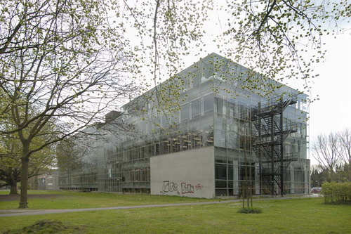
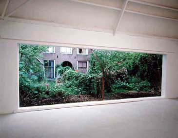
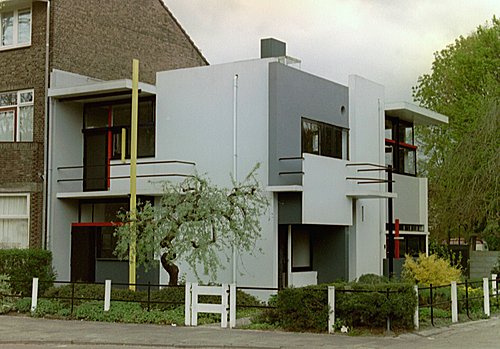
Exploring Valencia (Spain) as a prologue to Manifesta8, most students of the Basic Year visited "The City of Arts & Sciences" designed by Santiago Calatrava. As inhabitants of The Gerrit Rietveld Academie designed by, and named after Gerrit Rietveld himself, a comparison became inevitable. What follows are their comments and images.

[comment by Alexandra Karpilovski]

Calatrava feels like something not for you and not for me, but for someone whom we do not see. It makes me feel small, but also nothing.
It makes me think of a monument over the times that has passed, something sculptural and grand and made to impress but fails in that and becomes something static and untouchable. That a buildng that takes up so much space is mostly used to see and not to be touched.
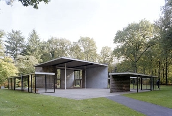
The difference between Calatrava and Rietveld is like comparing two different worlds. For me Rietveld represents a calm structure, everything fits effortless and live in symbiosis with each other, the whole mind behind the building is put into place, on the exact spot where they should be, the body of the houses is on the inside, while Calatrava on the other hand just goes manic and drags different forms into space, just to make it look interesting.
Calatrava makes me feel that someone is trying to say something, but of course I don´t understand, it is to big for me.

[comment by Michael Hautmulle]
Both Calatrava and Rietveld are known for the details in their work, and it shows in both their work. The way in which they both apply it is very different however, where Rietveld has designed beautiful buildings, they are beautifull because of their practicality, so that every detail is constructed to make the use of the building more clear and make the life and function of the occupant more clear. Calatrava has a very different approach, he uses details purely on an esthetic basis, his building may not be very practical, I do not say whether or not they are beautiful, that is an individual matter, but every centimeter has been specifically designed to create the image that he desires. Again I do not wish to say much on the matter of esthetics, but I do believe that the most beautiful design is that which serves a purpose, not for idle beauty but as an object, or building, that fulfills its purpose well. That is the most beautiful of all.

[comment by Titia Hoogendoorn]

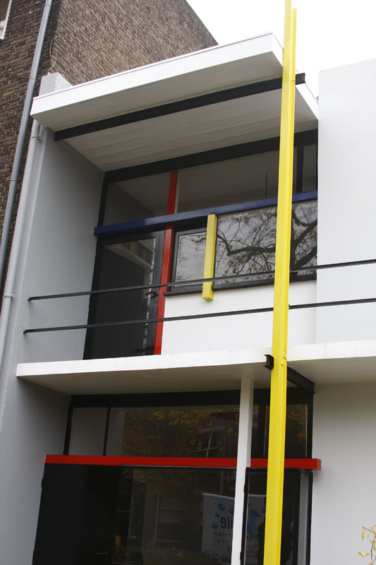
While Calatrava’s architecture could be seen as a sculpture and sometimes almost as decoration for the surroundings, Rietveld’s buildings are anti-decorative and more an expression of architecture. They both include the environment in their works. One by fitting in (Calatrava) and the other by adding (Rietveld). The shapes and colours of Calatrava's buildings are flowing along with nature (blue and white/sea and air) in comparison to Rietveld who devides space accentuated by primary colours. The architectonic skeleton of his buildings coincide with the construction while the skeletons of Calatrava seem an effort to make them visible on the outside.

[comment by Anna Kinderman]


Inspired by organic beings Calatrava forms futuristic, abstract entities, which he covers with diverse details and additional figures. Many details are purely visual and omit practical ulterior motives. However, he is limiting to discreet colors like white, blue and azure. Inspirations: torso, bull ribs, foliage, wings. His buildings are more like sculptures than functional buildings.
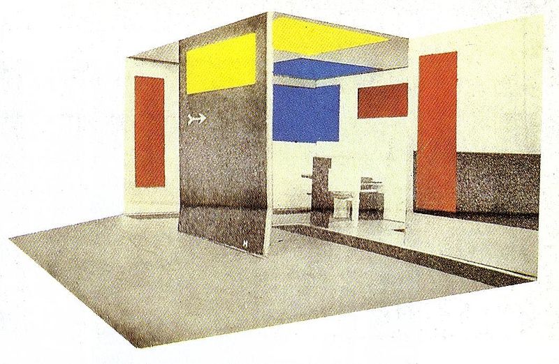
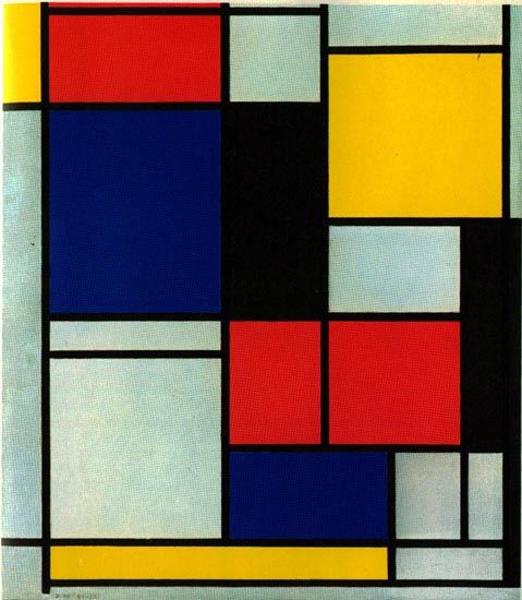
In contrast Rietveld is interested in function. He was inspired directly by the materials and dealt with the use of the building. With the reduction of coloring to the primary
colors like red, yellow, blue, black and grey he wanted to emphasize the different layers/planes. His strict geometry and minimalistic tendency distinguishes him from Calatrava like black from white.

[comment by Lovie Peoples]

Rietveld and Calatrava are two totally different architectures to me, both in the way their buildings look and the feeling they mediate.


Calatravas buildings are like sculpture houses and bridges. Fixed artworks that was created to demonstrate what he wishes to show. His imaginations illustrated on the ground in a space. To me it doesn’t leave that much to my imagination you are in his world. Either you like it or you don’t.
Rietveld houses have an obvious presence, melting in to their environment instead of creating an environment totally in them self. Which makes them a part of it and lifts them up. They make a dialoged to the space around it and invite me to feel at ease with my own thoughts and feelings in them. A meeting point in what he has left as a building and the person in them. An open dialogue with the viewer.

[comment by Molnar Tamas]

The two architects represent opposite design philosophies and approaches to man and its created environment. While Rietveld takes man and its size as starting point and adjust details to this, Calatrava creates vast spaces and buildings to impress the viewer, making man’s size unimportant. The Spanish exaggerated “machosim” meets the cool and minimalist Dutch world. Experience vs. functionality.

However, both of them are lacking in cosiness, Rietveld’s sharp edges and grey colours are rather cold and not welcoming. Calatrava uses the huge size of his buildings to alienate the spectators, making them feel being in a church or at some futuristic place. His typical white colour also contributes to the sacred, church-like sensation, where one should feel devotion and its own littleness. The usage of forms is also different. Rietveld introduces forms derived from the cube, the “box”, making and industrial and artificial look. Calatrava prefers the organic shapes, however, those are clearly computer generated “natural” forms put in order which finally results in the experience of an artificial environment just like in the case of Rietveld.

[comment by Pieter Tensen]

Calatrava designs buildings you can hardly call buildings. They are more like sculptures you can visit.  This is something you really notice from the outside and is a major point where Calatrava confronts Rietveld in his designs. Rietveld cared about the outside of a building too, how it looks, but it appears obvious in that way.

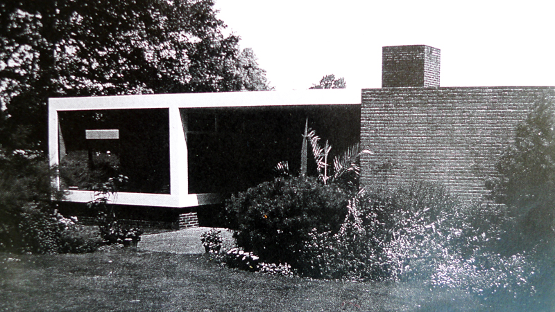
In Rietveld’s buildings everything is build up out of 90 degrees corners. This was his main trademark. Natural shapes and the human body, on the other hand, inspires Calatrava. They have one major thing in comment. They both care a lot about details. Although the buildings they designed we’re big and impressive sometimes, the eye for detail is very specific for both.

[comment by Stefan Voets]

“Rietveld adored light and bright spaces without too much detail. This is why most of his buildings are made of primary colours and forms (squares, rectangles). According to Rietveld, a building has to be functional too (functionality is extremely present in his architecture). Calatrava’s work is differently shaped, because of the massive surfaces and the lesser subtility. The material is heavy-looking.”

Growth


Saturday, October 30, 2010

[comment by Joost van Loon]

Get the Flash Player to see this content.

It was an impossible but nice fantasy. Gerrit Rietveld and Santiago Calatrava were strolling side by side between the Hemisfèric and the Palau de les Arts. Looking at The City of Arts and Sciences. Gerrit Rietveld, hands on his back, gazed up at the highest peaks of the Palau and nodded his head.
“So.” Calatrava opened up the conversation. “ What do you think of my building?”
“It’s big.” Rietveld replied.”
“I know.” said Santiago puzzled. “But it grew naturally , almost like an independent living organism.”
“Really?”  Rietveld was lost in thoughts for a moment. “A smaller building can also be grand and then the people inside will do the growing.”
Calatrava looked at Rietveld in shock, but Rietveld didn’t noticed and continued. “Maybe you could add some colors?”
Now Santiago stopped walking, too perplexed to carry on.
The man that should be in heaven wandered on alone. Looking at the buildings he mused to himself . “Yes, some red and blue would be nice.”


Log in
subscribe