Skip to Content Skip to Search Go to Top Navigation Go to Side Menu


"architecture" Category


Wobo : One function before another function


Thursday, May 31, 2012


stack the bottle

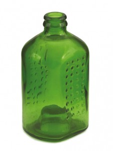
Can a stackable beer bottle help to make construction more sustainable? As the story goes, beer magnate Freddy Heineken came up with the idea of the World Bottle when he saw waste materials being recycled to build dwellings in the slums of the Caribbean. At his request, John Habraken designed the first stackable bottle in 1962. The ribbed glass and the depression in the bottom of each bottle reinforce the construction of the brickwork.
The bottle remains a prototype. The brewery’s marketing department is afraid the idea will harm their image. As an experiment, Habraken builds a house made out of bottles for Heineken. In 1975, the beer bottle once more surfaces as a possible building material, although critics say that far from solving the issue of recycling leftover bottles, the World Bottle would only encourage people to drink. To get the number of bottles needed to build their house, people would have to consume a substantial amount of beer first!

I found this idea really really avant-gardist and full of possibilities. I think it is a field that designers should investigate more. Not recycling materials, because it is only a reaction on the consequence of the harmfulness we have dealing with the wastes of our mass consumption society, but design the product without forget that someday it will become a waste that will take a lot of place and long process before this object will be transformed and recycled (PET recycling process for instance). What would be a world where all consumption object would be designed like this: one function before/another function after it would become a waste?

Patchwork Metropolis


Thursday, May 31, 2012


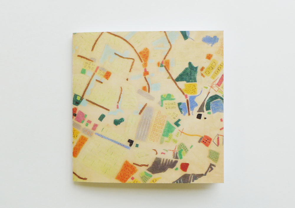
‘Patch Work Metropolis’ is a study for city expansion between Den Haag and Rotterdam in The Netherlands by Dutch architect Willem Jan Neutelings.
The initial drawing of the project contains a lot of colors which makes distinction between the places of different character in order to understand and figure out the geographical facts of the area. I was very inspired by the way of using colors and the way it looks, it reminds me of a coloring book.

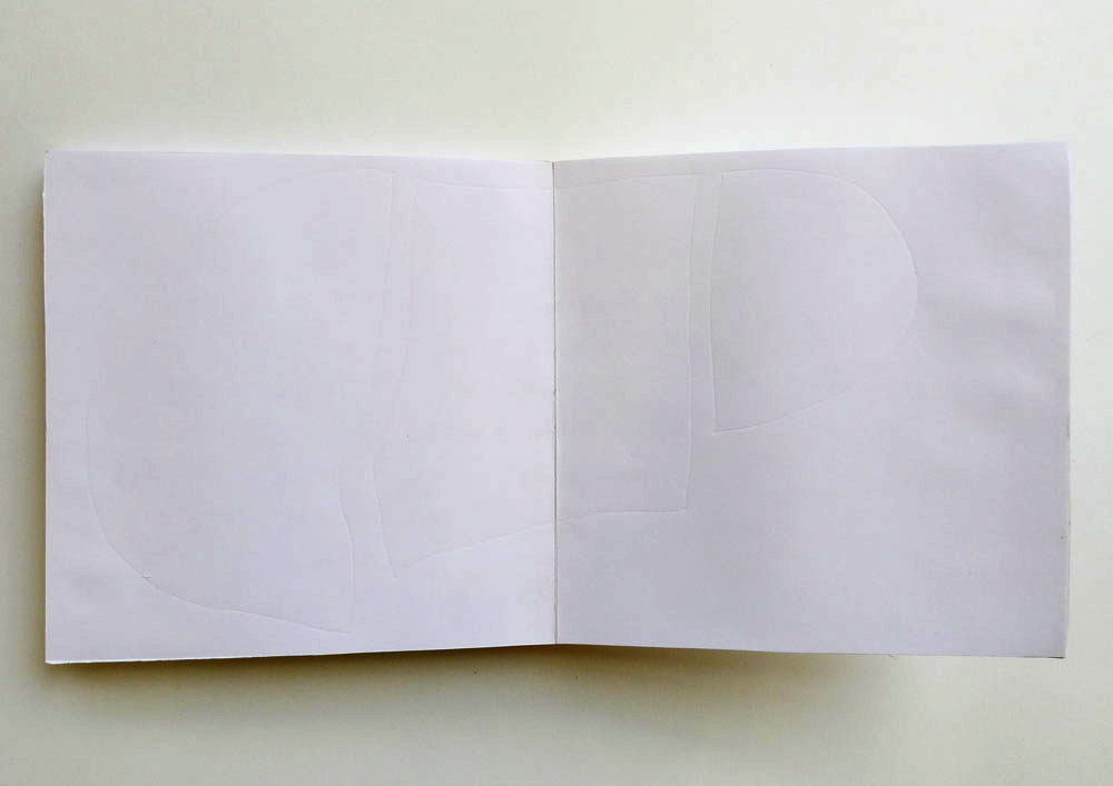
My project is a book based on this idea. The image on the cover is based on that same drawing, and the content is a simple text describing the project. When you look inside of the book, you can only see white pages which have embossed lines with an instruction saying ‘Color inside of the lines’. By coloring, the text will appear.
 

Predictions from a 18th century interior


Thursday, May 31, 2012

(Hello Alaska)

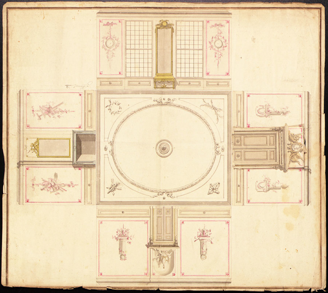
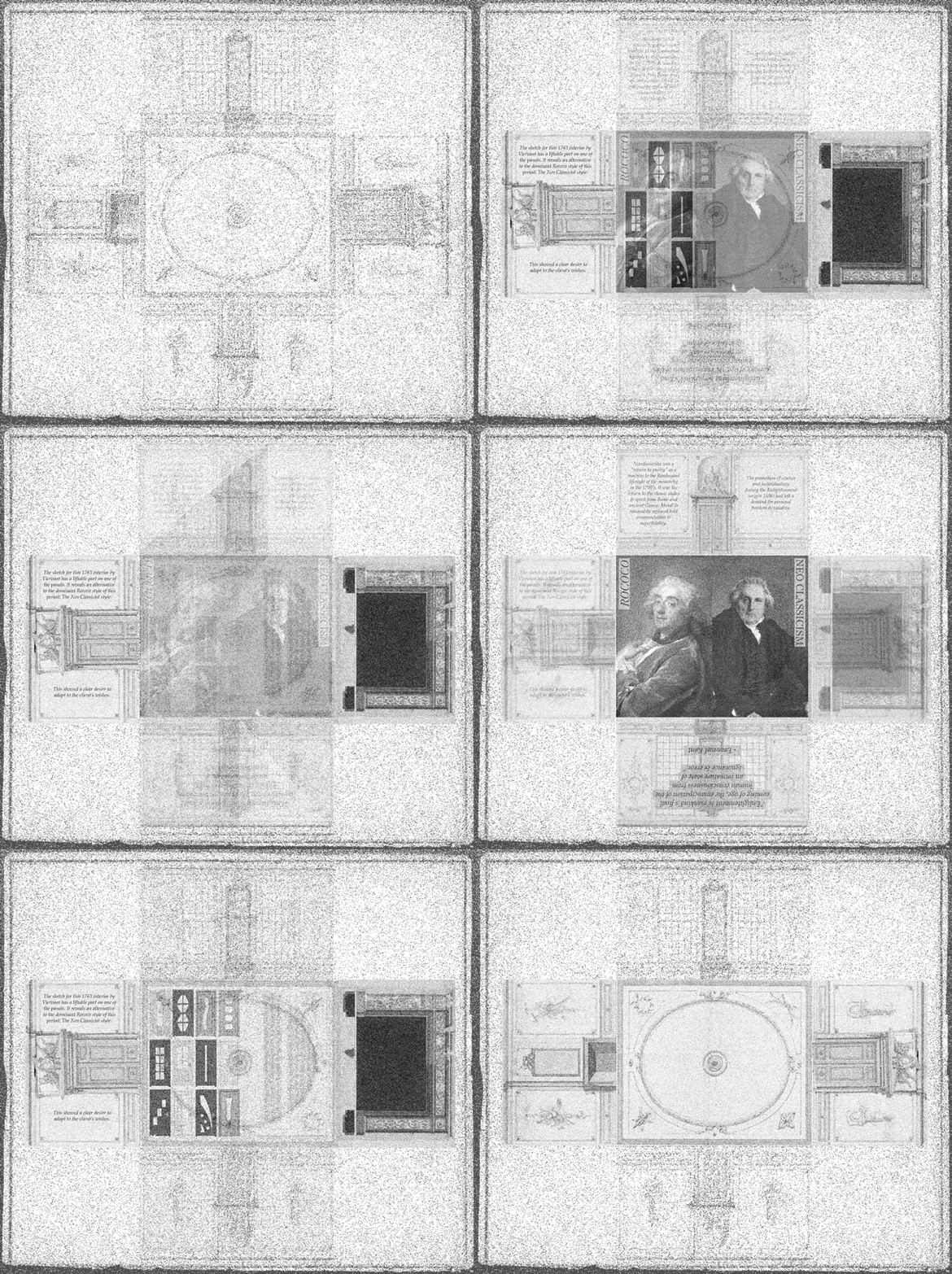
The sketch for this 1763 interior by Leendert Viervant has a liftable part on one of the panels. It reveals an alternative to the dominant Rococo style of this period: The Neo Classicist style. This showed a clear desire to adapt to the client’s wishes.

Neoclassicism was a “return to purity” as a reaction to the flamboyant lifestyle of the monarchy in the 1700’s. It was the return to the classic styles & spirit from Rome and ancient Greece. Moral & rationality replaced bold ornamentation & superficiality. The promotion of science and individuality during the Enlightenment (origin 1650) had left a demand for personal freedom & equality.

In the spirit of the enlightenment & the belief that all individuals should be able to reason for themselves, Viervant leaves the choice to the client by offering alternatives to the initial designs. The awareness of the changing demands at the current time & difference in personal taste makes Viervant’s approach seem like a prediction of our modern customizable 21st century society.

“Enlightenment is mankind’s final coming of age, the emancipation of the human consciousness from an immature state of ignorance & error.”

– Emanuel Kant

The easier, the more, the stronger


Thursday, May 31, 2012

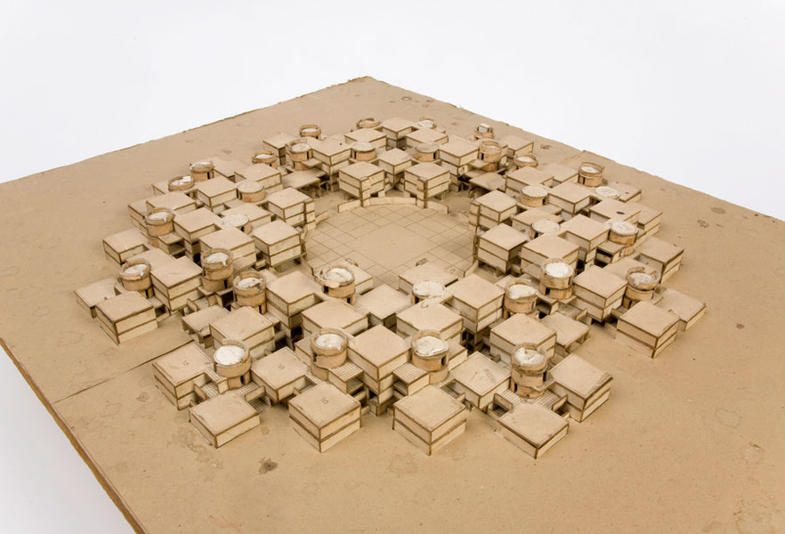
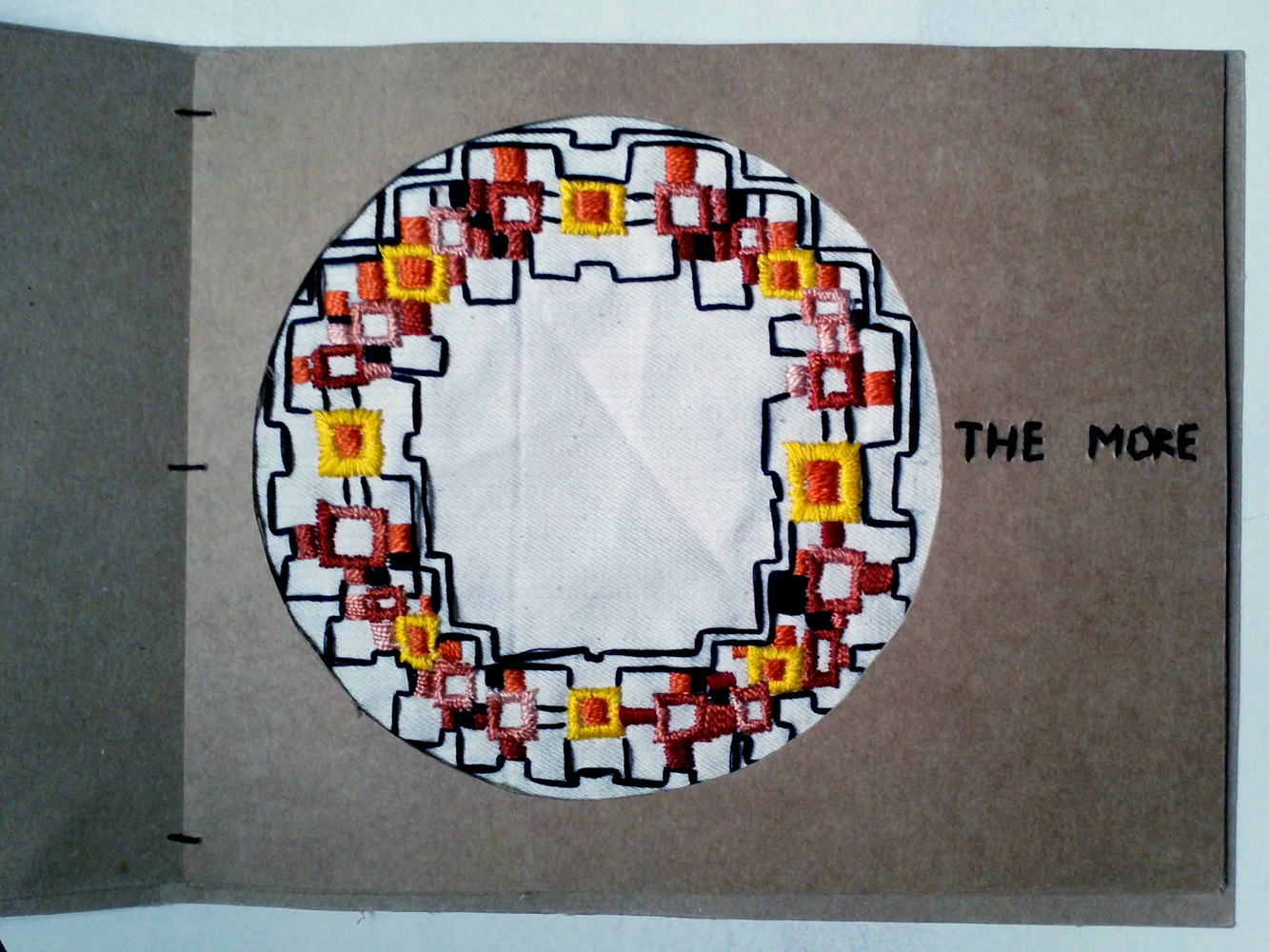
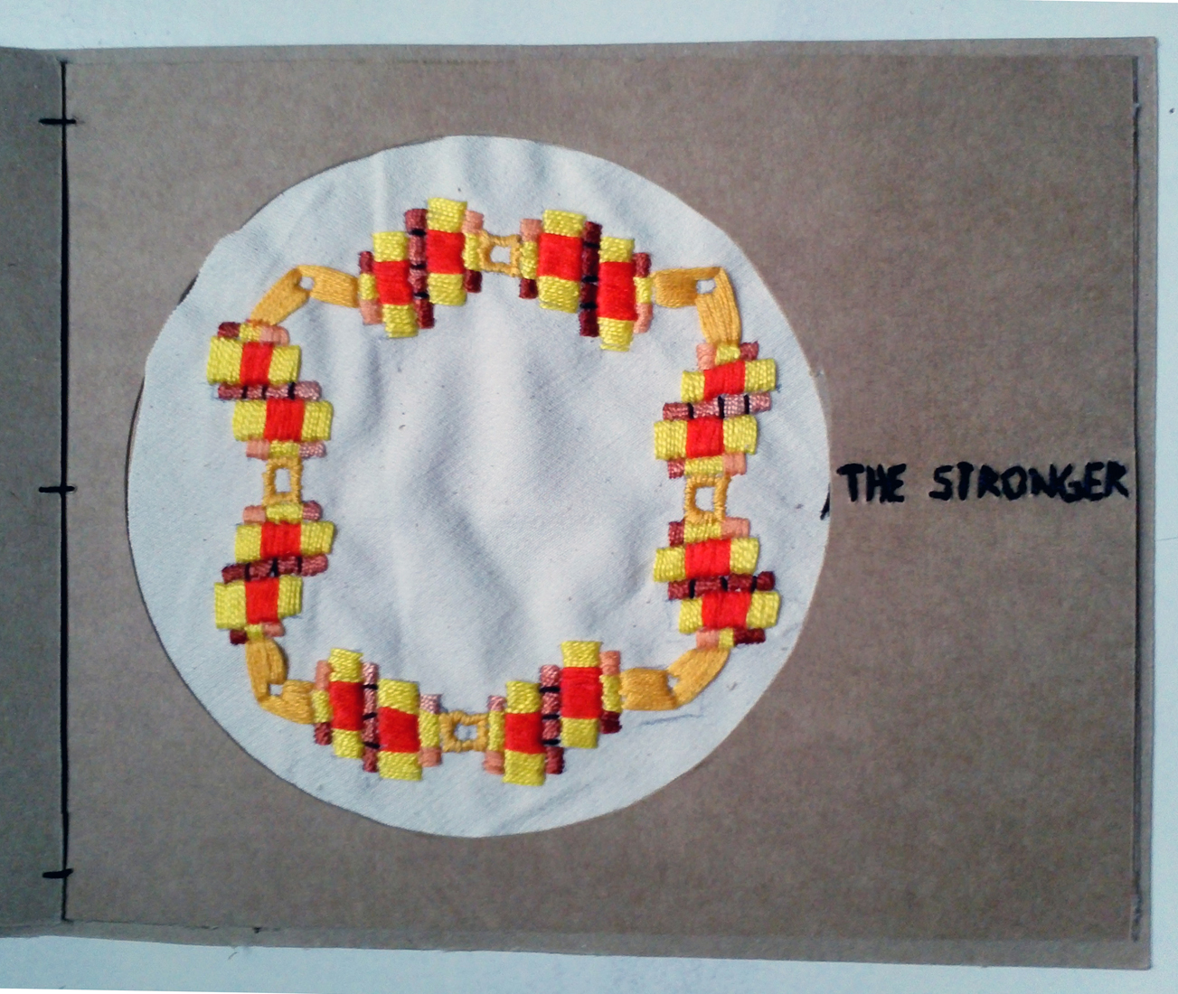
After visiting the treasure room of the NAi I was very inspired by a non-existing student houses from Jan Verhoeven [x]. A very strong image of a wooden model caught my attention.

For the student residence in the campus Drienerlo the architect Jan Verhoeven devised a smart structure. He designed an easy structure that gets stronger when you build more houses. This sketches of the plan from 1965 are very colorful, colored squares represent the layered houses. Mathematical drawings with different structures, some a-symmetric some not. The sketches give me the feeling of mandalas, the spiritual drawings that suppose to give you rest and peace. It reminded me also of the patterns my great-grandmother used for making embroiderys.
This all sounds very warm and cozy, but when you look at the drawings it's still a bit cold because of the straight and perfect lines and squares.
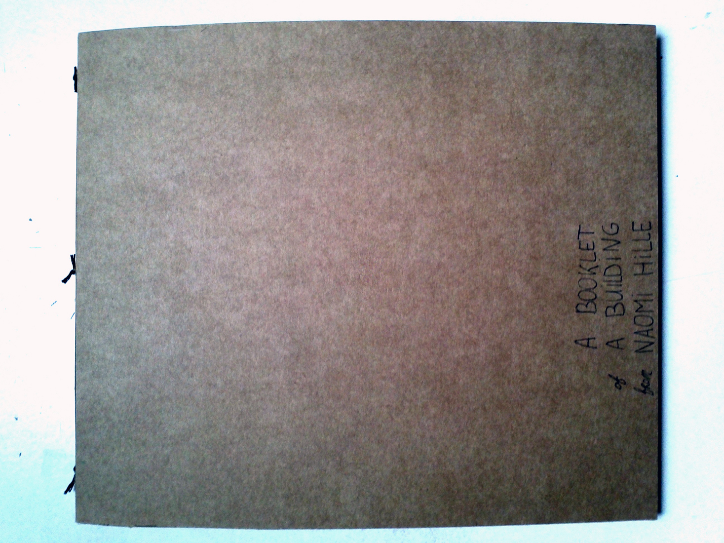
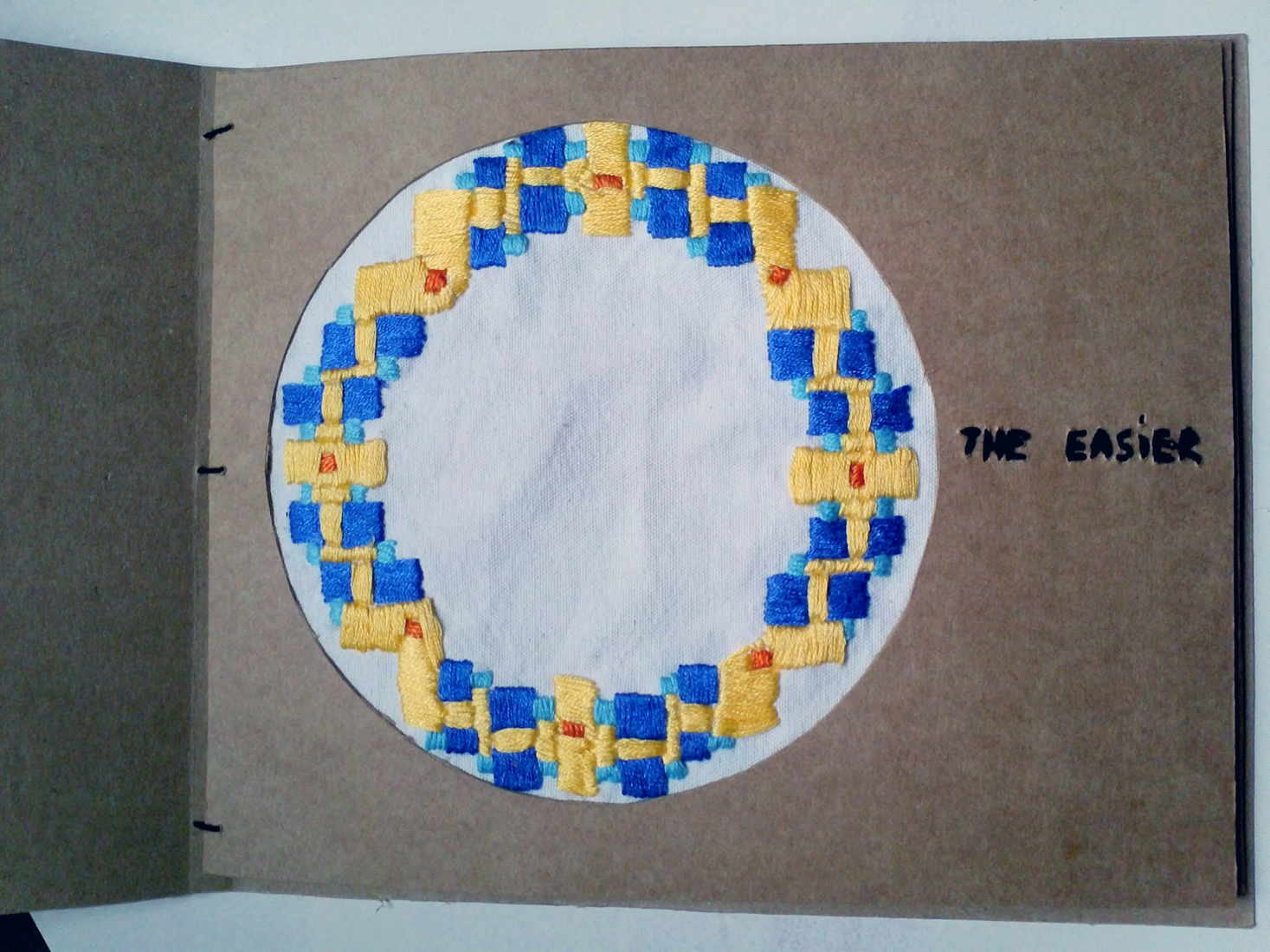
What i wanted to do was to make a booklet, make this drawings into embroidery and give this the warm feeling it reminded me of. The process of making the embroiderys give you the same peaceful feeling as making and looking at mandalas. Also the fabric is getting stronger When you stitch more layers, the same as the original idea from the student residence. In the booklet I also tried to preserve the atmosphere of the model with using the wood board and keeping the clean image. The text in the booklet are keywords that represent the essence of the project from Jan Verhoeven, but also three separate titles of the embroiderys.

Organic Architecture


Thursday, May 31, 2012

“So here I stand before you preaching organic architecture: declaring organic architecture to be the modern ideal and the teaching so much needed if we are to see the whole of life, and to now serve the whole of life, holding no ‘traditions’ essential to the great TRADITION. Nor cherishing any preconceived form fixing upon us either past, present or future, but—instead—exalting the simple laws of common sense—or of super-sense if you prefer—determining form by way of the nature of materials…”

– Frank Lloyd Wright, An Organic Architecture, 1939


INSPIRATION

As an inspiration for this publication I chose Ton Alberts and Max van Huut. They were the leading architects in organic architecture. Their NMB (now ING bank) office building was realized according to a completely new concept: organic forms instead of the straight lines that dominated the impersonal, efficiency-focused office buildings of the 1980s. The free forms encourage a creative atmosphere at work. They created people-friendly surroundings with plenty of plants, varied spaces and climate-neutral installations. The office of the ING Bank is one of the most impressive examples of the upsurge in organic architecture during this period.

DISCOVERIES

Fallingwater, one of Frank Lloyd Wright’s most widely acclaimed works, was designed in 1936 for the family of Pittsburgh department store owner Edgar J. Kaufmann. The key point for the design of the house was the waterfall over which it was build. While designing this house F.L.W. stayed true to his principles. He respected the properties of the material and he respected the harmonious relationship between the form/design and the function of the building.

THE DIFFERENT SIDE OF ORGANIC ARCHITECTURE

Antoni Gaudi’s concept of organic architecture was significantly different than the one of Frank Lloyd Wright. In his work Gaudi mimicked nature itself by creating concrete waves on the facades of the buildings , making lizards from shattered colored clay tiles,  twisting metal leafs and flowers for railings on balconies and stairs. His greatest work La Sagrada Familia (not finished) truly is the most magnificent example of Gaudi’s work. The rippling contours of the stone facade reminiscent us of sand castle, while the towers are topped with brightly-colored mosaics which look like bowls of fruit. Gaudí believed that color is life, and, knowing that he would not live to see completion of his masterpiece, left colored drawings of his vision for future architects to follow.

Rijksmuseum Amsterdam


Thursday, May 31, 2012


(I did some research )?

After seeing wonderful sketches of the famous design for the Rijksmuseum by Dutch architect Pierre Cuypers’, I made a pop-up of the building as a form of a pop-up. click on the image to view the result!

In 1875 architect Petrus Josephus Hubertus Pierre Cuypers won the design-contest for the Rijksmuseum. Before this time he designed little more than a hundred churches, for witch about seventy got realized. Besides that me made designs for monasteries, chapels and did renovations of old churches.

Cuypers was the first Dutch architect who, in his time, used Gothic construction-techniques and put them into practice. Before he made use of the Gothic shapes in a decorative way, until he completely switched to a Neo-Gothic style.

The Gothic revival was a reaction on the cold and strict forms of the Classicism. This came from a nostalgic, romantic interest for the Middle Ages.

Cuypers’ design for the Rijksmuseum featured Renaissance-style arches, neo-Gothic windows and Medieval towers. The function of the building is not clear. From the outside you would not guess it is a museum. However, Cuypers build an ode to Dutch history by combining styles and thereby gives an public lesson in Dutch history.

The design got a lot of critique from the public, the Protestant majority could not cope with the ‘to Catholic’ result. They considered it also to be ‘to Medieval’.

I think it’s a remarkable building, build with a great eye for detail.

During my research I found out that the recent construction work, which started in 2003, is not only focused on modernizing the facilities but as well to bring long gone elements of Cuypers original design back into the building. Like for instance, in the front-hall they remade the mosaics on the floor. The Rijksmuseum hired a specialized Italian company to get the job done. The mosaics are series about the cycle of life, cycle of the year and the cycle of seasons. I’m looking forward to see the work in its final state.

Hey Hole!


Thursday, May 31, 2012


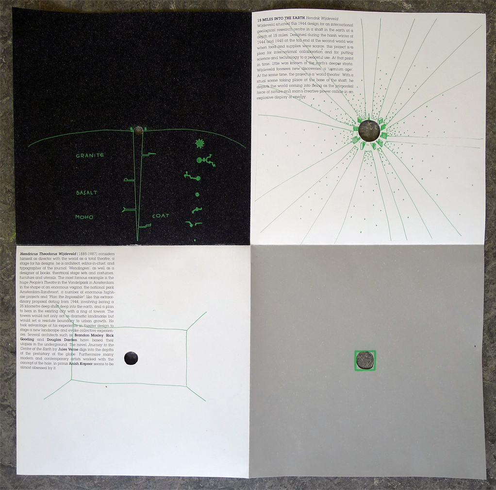
The project I singled out from the NAI treasure collection is called 15 MILES INTO THE EARTH by Hendrik Wijdeveld.

Wijdeveld situated his 1944 design for an international geological research centre in a shaft in the earth at a depth of 15 miles. Designed during the harsh winter of 1944 and 1945 at the tail end of the Second World War when food and supplies were scarce, this project is a plea for international collaboration and for putting science and technology to a peaceful use. At that point in time, little was known of the earth’s deeper strata. Wijdeveld foresaw new discoveries, an ‘uranium age’. At the same time, the project is a ‘world theater’. With a ritual scene taking place at the base of the shaft, he depicts the world coming into being as the primordial force of nature and man’s creative power collide in an explosive display of energy.

Hendricus Theodorus Wijdeveld (1885-1987) considers himself as director with the world as a total theatre, a stage for his designs: he is architect, editor-in-chief, and typographer of the journal ‘Wendingen’, as well as a designer of books, theatrical stage sets and costumes, furniture and utensils. The most famous example is the huge People’s Theatre in the Vondelpark in Amsterdam in the shape of an enormous vagina, the national park Amsterdam-Zandvoort, a number of enormous high-rise projects and “Plan the Impossible”, like this extraordinary proposal dating from 1944, involving boring a 25 kilometre deep shaft deep into the earth, and a plan to hem in the existing city with a ring of towers. The towers would not only act as dramatic landmarks but would set a resolute boundary to urban growth. He took advantage of his experience in theater design to stage a new landscape and evoke collective experiences.
Several architects such as Brandon Mosley, Rick Gooding and Douglas Darden have based their utopias in the underground. The novel Journey to the Centre of the Earth by Jules Verne digs into the depths of the prehistory of the globe. Furthermore many modern and contemporary artists worked with the concept of the hole, in primis Anish Kapoor seems to be almost obsessed by it.

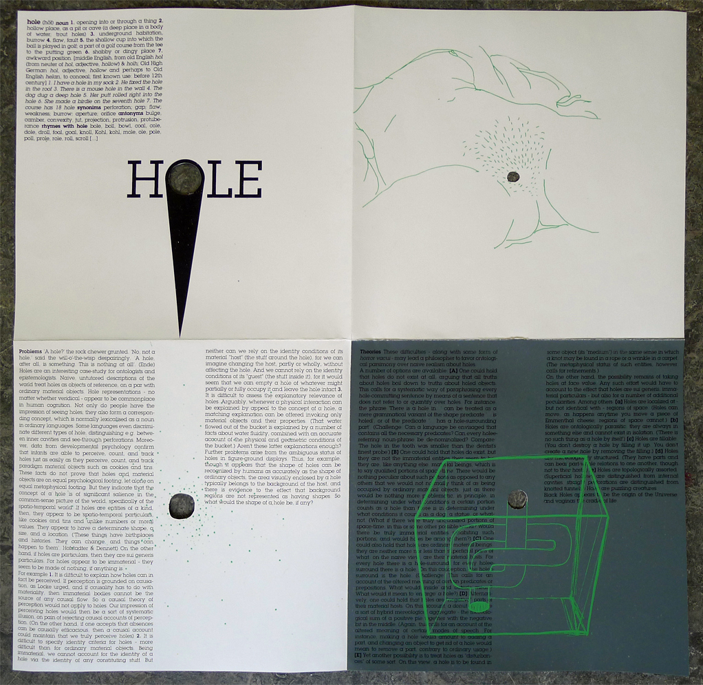
hole (hõ?) noun 1. opening into or through a thing 2. hollow place, as a pit or cave (a deep place in a body of water; trout holes) 3. underground habitation, burrow 4. flaw, fault 5. the shallow cup into which the ball is played in golf; a part of a golf course from the tee to the putting green 6. shabby or dingy place 7. awkward position. [middle English, from old English hol (from neuter of hol, adjective, hollow) & holh; Old High German hol, adjective, hollow and perhaps to Old English helan, to conceal; first known use: before 12th century] 1. I have a hole in my sock 2. He fixed the hole in the roof 3. There is a mouse hole in the wall 4. The dog dug a deep hole 5. Her putt rolled right into the hole 6. She made a birdie on the seventh hole 7. The course has 18 hole synonims perforation; gap; flaw; weakness; burrow; aperture; orifice antonyms bulge, camber, convexity, jut, projection, protrusion, protuberance rhymes with hole bole, boll, bowl, coal, cole, dole, droll, foal, goal, knoll, Kohl, kohl, mole, ole, pole, poll, prole, role, roll, scroll […]

‘A hole?’ the rock chewer grunted. ‘No, not a hole,’ said the will-o’-the-wisp despairingly. ‘A hole, after all, is something. This is nothing at all’. (Ende)

Holes are an interesting case-study for ontologists and epistemologists. Naive, untutored descriptions of the world treat holes as objects of reference, on a par with ordinary material objects. Hole representations – no matter whether veridical – appear to be commonplace in human cognition. Not only do people have the impression of seeing holes; they also form a corresponding concept, which is normally lexicalised as a noun in ordinary languages. Some languages even discriminate different types of hole, distinguishing e.g. between inner cavities and see-through perforations. Moreover, data from developmental psychology confirm that infants are able to perceive, count, and track holes just as easily as they perceive, count, and track paradigm material objects such as cookies and tins. These facts do not prove that holes and material objects are on equal psychological footing, let alone on equal metaphysical footing. But they indicate that the concept of a hole is of significant salience in the common-sense picture of the world, specifically of the spatio-temporal world. If holes are entities of a kind, then, they appear to be spatio-temporal particulars, like cookies and tins and unlike numbers or moral values. They appear to have a determinate shape, a size, and a location. (‘These things have birthplaces and histories. They can change, and things can happen to them’, Hofstadter & Dennett) On the other hand, if holes are particulars, then they are sui generis particulars. For holes appear to be immaterial – they seem to be made of nothing, if anything is.
For example: 1. It is difficult to explain how holes can in fact be perceived. If perception is grounded on causation, as Locke urged, and if causality has to do with materiality, then immaterial bodies cannot be the source of any causal flow. So a causal theory of perception would not apply to holes. Our impression of perceiving holes would then be a sort of systematic illusion, on pain of rejecting causal accounts of perception. (On the other hand, if one accepts that absences can be causally efficacious, then a causal account could maintain that we truly perceive holes) 2. It is difficult to specify identity criteria for holes – more difficult than for ordinary material objects. Being immaterial, we cannot account for the identity of a hole via the identity of any constituting stuff. But neither can we rely on the identity conditions of its material “host” (the stuff around the hole), for we can imagine changing the host, partly or wholly, without affecting the hole. And we cannot rely on the identity conditions of its “guest” (the stuff inside it), for it would seem that we can empty a hole of whatever might partially or fully occupy it and leave the hole intact.3. It is difficult to assess the explanatory relevance of holes. Arguably, whenever a physical interaction can be explained by appeal to the concept of a hole, a matching explanation can be offered invoking only material objects and their properties. (That water flowed out of the bucket is explained by a number of facts about water fluidity, combined with an accurate account of the physical and geometric conditions of the bucket.) Aren’t these latter explanations enough? Further problems arise from the ambiguous status of holes in figure-ground displays. Thus, for example, though it appears that the shape of holes can be recognized by humans as accurately as the shape of ordinary objects, the area visually enclosed by a hole typically belongs to the background of the host, and there is evidence to the effect that background regions are not represented as having shapes. So what would the shape of a hole be, if any?

These difficulties – along with some form of horror vacui – may lead a philosopher to favor ontological parsimony over naive realism about holes.
A number of options are available: [A] One could hold that holes do not exist at all, arguing that all truths about holes boil down to truths about holed objects. This calls for a systematic way of paraphrasing every hole-committing sentence by means of a sentence that does not refer to or quantify over holes. For instance, the phrase ‘There is a hole in…’ can be treated as a mere grammatical variant of the shape predicate ‘… is holed’, or of the predicate ‘… has a hole-surrounding part’. (Challenge: Can a language be envisaged that contains all the necessary predicates? Can every hole-referring noun-phrase be de-nominalized? Compare: ‘The hole in the tooth was smaller than the dentist’s finest probe’) [B] One could hold that holes do exist, but they are not the immaterial entities they seem to be: they are, like anything else, material beings, which is to say qualified portions of space-time. There would be nothing peculiar about such portions as opposed to any others that we would not normally think of as being occupied by ordinary material objects, just as there would be nothing more problematic, in principle, in determining under what conditions a certain portion counts as a hole than there is in determining under what conditions it counts as a dog, a statue, or whatnot. (What if there were truly unqualified portions of space-time, in this or some other possible world? Would there be truly immaterial entities inhabiting such portions, and would holes be among them?) [C] One could also hold that holes are ordinary material beings: they are neither more nor less than superficial parts of what, on the naive view, are their material hosts. For every hole there is a hole-surround; for every hole-surround there is a hole. On this conception, the hole-surround is the hole. (Challenge: This calls for an account of the altered meaning of certain predicates or prepositions. What would ‘inside’ and ‘outside’ mean? What would it mean to ‘enlarge’ a hole?) [D] Alternatively, one could hold that holes are “negative” parts of their material hosts. On this account, a donut would be a sort of hybrid mereological aggregate – the mereological sum of a positive pie together with the negative bit in the middle. (Again, this calls for an account of the altered meaning of certain modes of speech. For instance, making a hole would amount to adding a part, and changing an object to get rid of a hole would mean to remove a part, contrary to ordinary usage.) [E] Yet another possibility is to treat holes as “disturbances” of some sort. On this view, a hole is to be found in some object (its “medium”) in the same sense in which a knot may be found in a rope or a wrinkle in a carpet. (The metaphysical status of such entities, however, calls for refinements.)
On the other hand, the possibility remains of taking holes at face value. Any such effort would have to account to the effect that holes are sui generis, immaterial particulars – but also for a number of additional peculiarities. Among others: [a] Holes are localized at – but not identical with – regions of space. (Holes can move, as happens anytime you move a piece of Emmenthal cheese; regions of space cannot.) [b] Holes are ontologically parasitic: they are always in something else and cannot exist in isolation. (‘There is no such thing as a hole by itself’) [c] Holes are fillable. (You don’t destroy a hole by filling it up. You don’t create a new hole by removing the filling.) [d] Holes are mereologically structured. (They have parts and can bear part-whole relations to one another, though not to their hosts.) [e] Holes are topologically assorted. (Superficial hollows are distinguished from internal cavities; straight perforations are distinguished from knotted tunnels.) Holes are puzzling creatures.
Black Holes appear to be the origin of the Universe, and vaginas the cradle of life.
 

>Studio Makkink & Bey<


Tuesday, February 28, 2012


Jurgen bey one of the founder of Makkink and Bey Design studio,graduated from Design Academy Eindhoven and now the director of Sandberg Institute, starts designing from how a person thinks, feels and works. From there he goes and scales up things.

He starts from humans and thats where i feel connected with him and his designs. He works very intuitional. It is not about organizing things and creating solutions. Every disorganization has a specific organization, and the specifics are what interests him.He thinks we should be more specific on what we organize.

It is not about mapping everything and understanding everything and then designing it, for him its about following an intuition and questioning why things are the way they are and let that lead to somewhere where he has not been before.

According to him wanting to think or create something new is bizarre for everything or solution we can possibly dream of does already exist in the world around us. The language is already familiar, When we see things we already recognize. So it is about knowing that language and translating it our way.

Jurgen Bey is aware of the different areas he can dive in to as a designer. He is interested in the context of his designs where usually most designers avoid.

Designing a space so to say instead of the building itself is what Jurgen Bey is interested in. As soon as he touches a space with his things, he owns the space, as he says.

For him its always about being in a specific situation. He designs for specific situations instead of abstract.

Jurgen Bey emphasizes on model world because you have the liberty to do things you want in a model world without being distracted by the questions of reality. It is important to live isolated for a while. You could reach places you haven’t reached before and you become special when you get back to reality. You face the questions of reality when you reach the level you know why you do these things.

He thinks of dutch design as a historical driven design where the craftsmanship matters and is valued. He is fascinated by the future driven design like in the 50s, or now in China where he feels the progress. Its interesting to be completely free from the history and that you are allowed to think completely ahead.

Now designers are interested in making their own machines which can result in factories becoming smaller. You can get products made on demand. For Jurgen Bey its very interesting to watch how the industry will change and the effects it will have on the people and the city.

The whole discipline is growing so fast. The change is fast.  He sees the whole discipline as a sort of olympics where you can choose your own discipline and focus. You cannot do everything well, He does not believe in multidisciplinary  designers.

Industrial design is not about the product but more about how things are made. How the factory would look like how would you go to the factory, how would you work there.

Jurgen Bey creates designs that provokes thinking and discussion.

Jurgen Bey considers himself to be a product designer but i really see him on the line between art and design. This is also where i would like to be, somewhere on the line. Playing with the context and the reality.For me it is not about creating beautiful products that people would like to buy for their houses. It is also not about making money but more about the social context my designs will have in the society. How will they change or adapt to people? It is not something to be planned, but more like a progress that is waiting to be unfolded.

Considering Jurgen Beys description of dutch design, ironically i see myself as a dutch designer even though i am not dutch. I value the history and the craftsmanship. I value the individuality of pieces and am not much into mass production. I don’t think that design is for everybody. I am sure not everybody would like my designs and that is ok. It should be only for the ones who would cherish them.

John Körmeling


Saturday, January 28, 2012


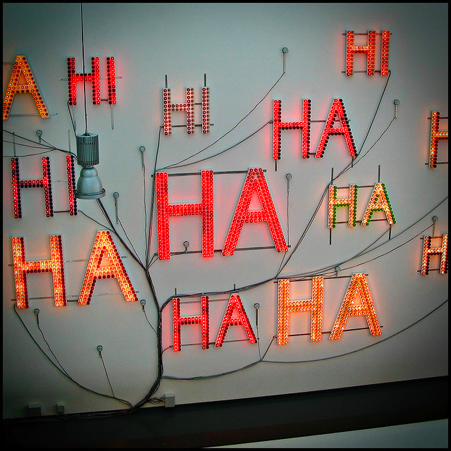
John Körmeling's "Hi Hi Ha Ha" (1992), Van Abbemuseum, Eindhoven, 2006.

(more…)

Invisible Expression


Friday, January 27, 2012

Why do we build walls, roofs, doors? The same reason we build fires, run air conditioners, blow fans, humidifiers and de-humidifiers: to define and bend the atmosphere to our will. Once it is contained within walls, we change our atmosphere to the conditions we find to be the most pleasing, the most conducive to our continued growth & existence. In a cold place, the walls protect us from certain death at the hands of the wind & the freezing air. But what does the house do but capture the frozen air all around & tame it, domesticate it, as one would a wild animal, with constant care & attention? Human survival nearly everywhere on earth depends on this task.

Keeping air is like keeping the sea–it is all flow and energy, and everything we do to one part of it affects it all, creates a wave of reaction, for air resembles water in its motion: its currents and waves are wind, its warmth and chill move atom by atom up or down, each molecule making way for another as the others make way for it. How do we learn to use the qualities of this substance to our advantage, instead of treating it as something that happens to be there, an inconvenience, a battle to be fought with radiators and air conditioners? We know that this void is no void but a thin liquid in which we swim. Inside and outside, this air-thing called “climate” has finally found a place in the modern imagination, something that has its own identity, something that changes, that must be “saved”, and now that we recognize it, it is necessary to take it into consideration as we continue to build, as we continue to exist and grow.
 
Philippe Rahm is in some sense an activist for the interior climate, for finding an integrated way to use and not waste the nature of air and to revolutionize the way that we would constrain and encourage its flow with architecture. His focus is not the efficiency of the building for ‘the greater good’, however; he redefines how interior space is conceptualized in order to create a new language of architecture, one that can be equally bent to the need of function, efficiency and art.


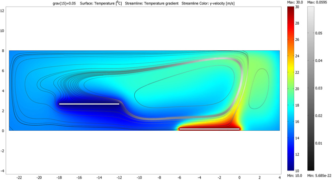
His “Digestible Gulf Stream”, a series of projects begun as an installation for the 2008 Venice Architecture Biennale, is a prime example of this language in use. As opposed to heating or cooling the different spaces in the structure to the optimal temperature for their use (warmer in the bathroom and living room, cooler in the stairways and bedroom), he uses the principles of thermodynamics to create a convection current that is perpetually cycling, aided by the structure of the space and two radiators that are set at a difference of 16 degrees Celsius. The function of the different areas of the house is thus prescribed by their place in this current as much as by their trappings.  This is not a new idea, of course, but what is new (at least to this writer) iis the sense that there is a continuity, instead of merely a radiating outward of heat, from cold to warm, or vice versa.

This cyclic flow of air and energy implies an efficiency that is currently being used in sustainable architecture (as well as many traditional types of architecture that are not reliant on central heating and cooling), but with the sun as the warming influence and the shaded area to the north of a building as the cooling influence. The Earthship design concept has been around since the 1970s, and other practices in sustainable architecture and living–using recycled and recyclable materials and determining the form of the building by how to best use the natural forces available in the area, among many others–have been being implemented for millennia. In the industrialized world, however, these considerations have mostly only used as guiding architectural forces by the “hippie” community, but in a very practical way they speak to the same concerns and techniques that Mr. Rahm uses to an expressive end. They both assert the necessity of involving the atmosphere that we capture in our houses in the architecture, involving the living with the rules and patterns of the natural world instead of attempting to deny or fight them.

The concept that nature is a force opposite to the interests of humankind is, to all modern sensibilities, a very dated idea. It is an idea brought on by the industrial revolution, colonialism, an us-vs.-them mentality, one that as the world progresses past fossil fuels, past the ‘civilized man civilizing the savage’, past the need to explore (read: conquer) the unknown and remake it in our own image, we find of less and less value. To see the world as irrevocably “other” is to assume that we are not connected to it, that it is in some sense infinite, & time and technology have taught us that the world is a much smaller place than we think. We must throw our lot in with the trees and the fishes & all the other peoples of the world, because we are all connected and it will be a delicate balance that we strike, if we can strike it at all.

This emphatic need is being recognized in modern architecture and design, characterized by the so-called “green” movements of Slow Design (in the image of Carlo Petrini’s Slow Food movement) and sustainable architecture. Again, though, much of this design is based on a desire to make something that works in the best way, the most efficiently or the most cleanly. Philippe Rahm, although first an architect, is among those who recognize this need as an opportunity to create a new and subtle artistic medium, the chance to bend the very air around us to the task of expressing the human experience.
 

Unknown – Interior spaces essay.


Thursday, January 19, 2012

New revised edition of essays about spaces distributed inside of the cities and outside of these, inside of the ‘’close’’ and outside of this last. Reaching a new kind of environment trough different assignments and lectures related with the real world of now, breaking the based bubble attached to the ‘’what‘’ should be your space in the last 50 years. A generation is changing the screen of a real house trying to figure out this in a really different kind of space so far from your surface and so close to your rational and ‘’developed’’ imagination in the front of your screen. [x]

Complicated, frustrating, stressing, confusing, reaching a harmony between the conceptual and the real, is how it was the beginning of what you had been reading and looking or not yet. The conceptual taking a piece of a real world and its necessities, becoming it in a messy text inside of our minds and after a tiny text in a paper or whatever. Our text is changing its purpose taking the shape of some streets and places so far from these, big yellow tracks and intense white light at night enclosure by a skull net, are inside of these places, where our co-workers begin to work depending in several times on your behavior, critical point of view and other really important things. So there should be a certain point in all this last statement where this book take advantage and begin to compile simple and clear pictures and diagrams of the whole process of creation of a new space, adding certain text to make more understandable just for some people. ’’Interactive’’ is the right word to describe our commercial approach.

An essay and nothing more should be added. We just tried to create a recreation of your world and visualize it in our way. Beforehand or not we apologize about the mistakes that just you can find inside of this essay. But we are afraid to can do nothing by the moment because this is just a reproduction of your world.


this post is part of he subjective library project "Unopened Book"
the book can be found at the Rietveld library : catalog no : 774.7-c

Ludwig Mies van der Rohe


Tuesday, November 29, 2011


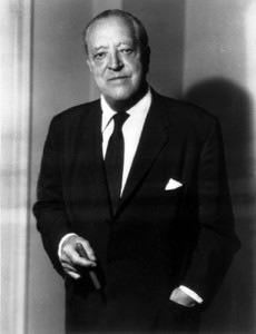
Ludwig Mies van der Rohe (March 27, 1886 – August 17, 1969) is considered as one of the most influential German architects of the 20th century. Most of his work was in the design and construction of commercial and industrial buildings. From his work on the German Pavilion in Barcelona to the Tugendhat House in Brno, the Seagram Building in New York to the Farnsworth House in Illinois. Van der Rohe defined an architectural vocabulary for the modern world in the terms that are clear and honest. Mies’ modernist thinking was influenced by many of the design and art movements of the day. In particular, the layering of functional sub-spaces within an overall space and the distinct articulation of parts as expressed by Gerrit Rietveld appealed to Mies.

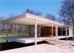
The Farnsworth House, one of three designed by Mies van der Rohe “Wohnhäuser (dwelling house)” is in Chicago, USA. The basic idea in designing this window house was a philosophy of “less is more.”

The interior shows its transparent environment. It was all traditional – waived space-defining elements, such as separate rooms, doors, paintings on the wall, etc… It is named after Dr. Edith Farnsworth, in 1946 when Van der Rohe gave them the order to design a weekend house.


Generaly:


The Farnsworth House creates an universal transparency, which enables it to embrace the nature in its wholeness. At the same time the buildings owner called it a “Transparency as like a x-ray” in which the only privacy can be found in the intimate nucleus (bathroom). Almost seamlessly, the daylight brings all of his reflections of nature into the interior of the living space, but the days will return to the night, so one can feel at one with the surrounding environment. He is forced to a “transparent” way of life, unlike the similar designs of Richard Neutra, Phillip Johnson and Albert Frey, in which there is an abundance of materials, never solely glass. The only thing preventing the light entering the house is the silk curtain, which gives the illusion of a luminous crystal at night.

The glass construction enables one swell and fall loose transfer. A conservatory outside, level with the living area, and another little terrace further in, and the overhang of the roof and floor plate, give the feeling of a floating house. The design, based on a strict grid, contrasts the organic forms of nature. The building is decorated in very neutral colors, a white steel structure, with pure silk curtains, the limestone floor lets the colors of nature come into play. The main idea behind the building was to make the building appear inferior to the natural surroundings.


Construction:


The construction is based on a self-supporting steel frame, where the level design is laid out and the relevant horizontal components are raising the ground level by 1.58m.The majority of the facade is glazed, fixed and fastened to the supporting I-beams over the angle. Nowadays single glazing is no longer deemed sufficient enough for insulation. The building is able to use the condensed water for heating. Nevertheless, it serves as a prototype for many facades which are in use today. Single space-defining element is the closed-off area, which includes a kitchen, two bathrooms, a technical side room and a fireplace. From this core zone extends a wall to ceiling, which includes the installation of pipes. The other wall has been stressed in so its non-structural function does not touch each ceiling. The space is divided into four sections by using spatially varying quality.

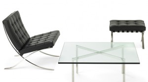
All of Mies van der Rohe’s furniture is now made according to his designs and specifications. He uses the same materials he used in his architecture; steel and glass. They still work by his mottos: “God is in the details” and “Less is more”. In perfect balance of proportion, function and detail lies timeless natural beauty.


Barcelona Chair    No. 7 – reflective finish • No. 8 – mirror finish


Source list:

http://nl.wikipedia.org/wiki/Ludwig_Mies_van_der_Rohe

http://www.furnituredesign24.com/gerrit-rietveld.aspx

http://www.knoll.com/products/downloads/MiesBrochure.pdf

http://www.dhm.de/lemo/html/biografien/MiesvanderRoheLudwig/index.html


pictures:

http://www.google.nl/

http://www.google.de/

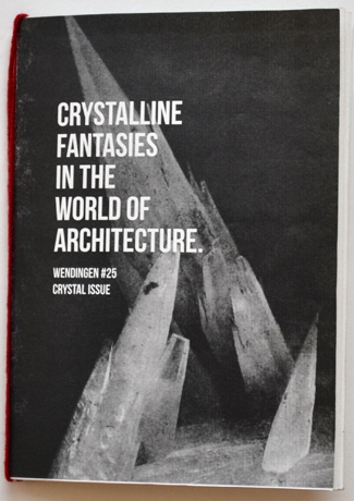
Wendingen Crystal Issue


Monday, November 28, 2011

click the image to download this issue as pdf
Crystalline Fantasies in the World of Architecture is a co-production of
Lotte van der Hoef & Ralph Dennis

De Stijl


Friday, November 25, 2011

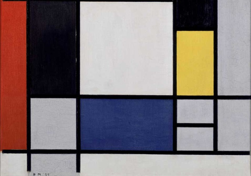
Dutch periodical founded by Theo Van Doesburg in 1917 and published in Leiden until 1932; the name was also applied from the 1920s to a distinctive movement and to the group of artists associated with it. The periodical’s subtitle, Maandblad voor de beeldende vakken (Monthly Journal of the Expressive Professions), indicates the range of artists to which it was appealing, and van Doesburg’s intention was that it be a platform for all those who were concerned with a new art: painters, sculptors, architects, urban planners, typographers, interior designers etc.

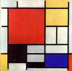
Proponents of De Stijl sought to express a new utopian ideal of spiritual harmony and order. They advocated pure abstraction and universality by a reduction to the essentials of form and colour; they simplified visual compositions to the vertical and horizontal directions, and used only primary colours along with black and white.

.

Piet Mondrian, Composition with Yellow, Red, Black, Blue and Grey

.

(more…)

Paintings in Wendingen magazine


Friday, November 25, 2011

In my research project I became very interested in some paintings that I found in one of the Wendingen magazine I researched. It was very strange to see some issues about Pyke Koch or Klimt because Wendingen was a monthly publication aimed at architecture and interior design. I am wondering why the chief editor who was the architect H. Th. Wijdeveld decided to publish some issues about paintings in this magazine which appeared from 1918 to 1932!

After the First World War in Europe it was a difficult and depressing period. For the young hoping for careers in architecture, painting, sculpture or interior design the prospects were bleak, with preference inevitably going to older and more experienced exponents with establish reputations, the fact of being young meant a disadvantage. Even the older generation with a record of solid achievement reaching back perhaps to the days before the Great War found it hard to make ends meet in the drab years of the Depression and anyone fortunate enough to be in safe and congenial employment took care to hold on to his position at any cost. It was quite hard for painters to alone sell of their works and many artists started to paint decorative elements screens for interior decorators or to design china or textiles. It presented good opportunities to earn some money. On top of all that, a new movement – Art deco started to come in use.

Art Deco took place in various subjects including architecture.

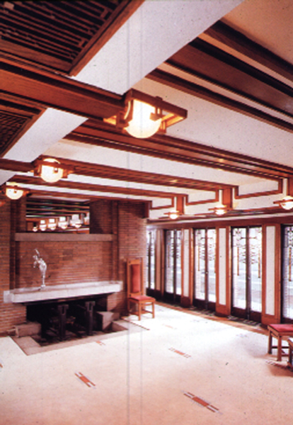
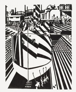
Frank Lloyd Wright was at  the end of the nineteenth and beginning of the twentieth century the American architect credited with the invention of the skyscraper. Wright was instrumental in fashioning a specific American Tradition of modern decoration upon which American Art Deco was built. This is particularly true of the horizontal style of domestic architecture. The best example is ,,The Robie House’’.  Inside of the building you can find a lot of decorative elements. On the wall you can see long, black stripe, on the windows arty stain glass, which bright designs. All these Art Deco elements were influence by a number of other art movements. For instance, Edward Wadsworth was one of the main figures in the Vorticism movement. If you look at “The Robie House” walls and ,,Liverpool shipping’’ you can see that Wright using the same concept of a vortex as Edward.

 Liverpool shipping

You can find the same examples with Art Deco style and Expressionism(forms derived from nature are distorted or exaggerated and colors are intensified for emotive or expressive purposes), Futurism (forms derived chiefly from Cubism were used to represent rapid movements and dynamic motion; showing hostility to traditional forms of expression), Cubism (the reduction of natural forms to their geometrical equivalents).

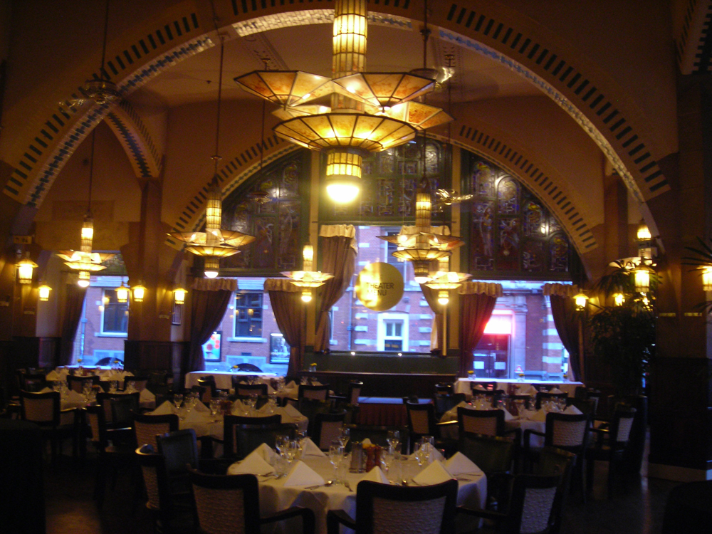
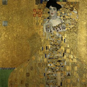
In Amsterdam you can find Art Deco style in Architecture too. One of the most famous building is ,, American Hotel’’. It was built in 1900. In American Hotel there are many features which are typical of the Art Deco style period, such as the stained-glass windows. Also you can see some paintings which are placed inside. The café American has beautiful interior which reminded me some of Klimt works. Ornaments on furniture (especially on chairs) and colour palette are quite similar like The Café American.

Moreover, one of the Dutch artist- Pyke Koch was interested not just in painting and drawing but in interior design too. He created and also made interior designer for the van Dam van Isselt house in Utrecht. Pyke Koch painted on the marble table, garden doors and painted dolphins on the floor.

Wendingen magazine was published in 1918 almost in the same period when Art Deco movement started. I think this style was very important in a lot of art fields and it was relevant with architecture and interior design. It can be a reason why in Wendingen magazine you can find some information about artists who was the most concentrate in paintings.


Rietveld knew his lines


Thursday, November 24, 2011

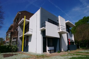
Two years ago I was building a model of a chair. After I have stared in 50 minutes of a detail of two black straight lines at the chairs back, my friend asked me: ”Julia what is it about your lines? There is only a difference of one centimeter?” I didn´t know what my problem was, but I knew this centimeter was a critical part if my chair would communicate or not. When I visited Rietveld Schröder house I got reminded of the situation with my friend. Every centimeter of the house was dynamic. The Schröder house with its characteristic bright colors and construction touched me. I could relate to myself in the aesthetic expression, but what do I have in common with the way Rietveld was working with the Schröder House?


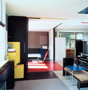
Mrs. Schröder let Gerrit Rietveld design a house for her and her children. Rietveld and Schröder worked with the original idea together but Rietveld decided about the color and form. Mrs. Schröder wanted to have the interior with an open space that was customized for her everyday activity. Rietveld created a house that combined this everyday life with a playfulness. The house is made like a coordinate system of flat surfaces and straight lines. He used geometry och mathematics as a tool and trusted his feeling when he created the form. Gerrit Rietveld could feel if a form was working or not. He was only using geometry and mathematics as a tool. He was thinking in three-dimensional terms and sketched in 3D. His first model was made of solid wood which gives character to the building. The second model was made of cardboard, glass and matchsticks which is different from clay that usually is used as model material.


He worked asymmetrical when he composed volume of the different surfaces. One rule he used was that the lines should not be perpendicular or parallel with each other. This is associated with his feeling of three-dimensional forms. He could feel when the planes have the right position.


He worked playful with the surfaces. When he was working with overlapping he always let one line continue in front or behind the other one. I believe that if  a corner had been formed it had been a static expression. Some surfaces were slotted in the facade so it visually looks like they go into the wall. He built volume by letting the flat surfaces be slotted into each other. The Schröder House has multi intersections for the structure, but the main reason for that solution is aesthetic.
For Rietveld it was more important to create volume with space, then the material with which it is built. He said “The reality which architecture can create is space” (The work of G. Rietveld architect; Theodore M. Brown; A.W.Bruna & Zoon, 1958).


He was influenced by De Stijl’s paintings in the way he choose to paint details in bright red, blue and yellow. The facade was painted in white but with blocks of three different shades of grey to make the surfaces fold back into each other. He decide to have black lintels to make them reflect as little as possible and make them become one with the windows. From a light view the window’s reflect black and in that way he made a stronger connection with the interior and exterior space. The colors is important in my personal impression of the Schröder house. I like that he works with color at the same way as with a three-dimensional surface. He gave me the feeling that he was sculpturing more than painting when he arranged the color on the surfaces.


I got emotionally touched by the Rietveld Schröder House because Rietveld did not work with that house in a traditional way. He was feeling the forms. Just like me when I was working on my chair. I knew something was wrong. I am sure that Rietveld has been staring at a lot of angels and compared a 132 cm long beam with a 135 cm long one, when he was designing the Schröder house. Just like Rietveld I prefer to sketch three-dimensional and I´m thinking a lot about how different form relates to the space and to it self. I think Rietveld shows in the Schröder House that architecture can both work as an art aswell as a design object to which you can react and feel touched, but which is at the same time a functional home. That Rietveld used the elementary forms and had the ability to keep their independence in the new wholeness is what makes this house special to me.


Verder dan Faust..


Thursday, November 24, 2011

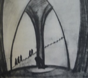
Ik zit in het archief van de rijksacademie en blader door de Wendingen issues. Opeens stuit ik op een uitgave gewijd aan de internationale theatertentoonstelling in het Stedelijk Museum Amsterdam [x]. Mijn oog viel op een afbeelding van een decortekening van Goethe’s Faust ( domscene I) getekend door Kurt Gutzeit. Een architect afkomstig uit Duitsland, lid van de Deutsche Werkbund  Een groep van kunstenaars en architecten. die in 1907 in München werd opgericht. De oprichters van deze werkbund streefden naar verbetering van het kunstnijverheidsonderwijs en kwaliteitsverhoging van de gebruiksartikelen. Ook namen ze een hele open houding aan tegenover de machine. Ze wilden een hechtere band smeden tussen kunstenaars en industrie. Dit verklaard de connectie tussen Kurt Gutzeit en de Wendingen. Ik ben altijd geïnteresseerd geweest in theater,  het is een op zich zelfstaande kunstvorm. En hier wil ik uiteraard meer over weten.

complete research (more…)


Log in
subscribe