Thursday, March 26, 2009
This whole century fashion has been very influenced by the arts. This is because of co-operations from the fashion- and artscene which started already in the beginning of the 20th century.
In the 80’s fashion was brought to the next level, there was an economic growth which brought the attitude of the individualism. On the other hand this pushed the rhythm of change which meant the originality was less interesting because of the many copies and this ended the modernity. The post modern esthetics blew the galleries and museums away with its welfare.
Everything was said and done, from now on creations were nothing more then reproductions. The convervatism who denied the value of progress and ideology, focussed on the main values. This means they re-appreciated the art of painting now-a-days and from the crinoline.
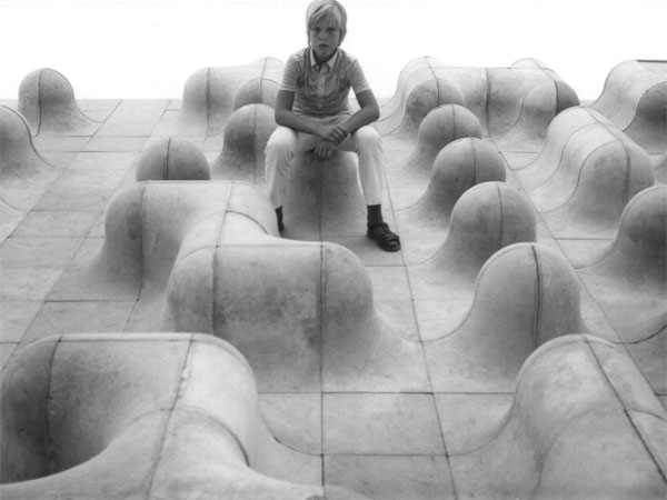
Today again we are very much into individuality, which forces us to be more and more personal with ourselves. The will to keep your unique individual self is actually a statement which connects you to a certain group. You want to be seen for your specific, different individual personality and want to be recognised for this. And because you are not the only one you suit in a certain group that thinks in the same way as you do so you still fit in a box. Off course every person is different, but actually how unique and individual are we…..?
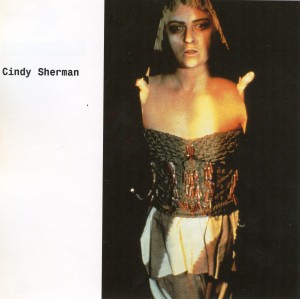
Catalog nr: 11297
keyword: individuality
Thursday, March 26, 2009

Hij staat er niet bij, wel zijn er heel veel boeken over Japans Design. Ik keek in alle boeken. In alle verschillende boeken stonden goeie overzichten van wat er allemaal uit Japan komt. Het begon meestal bij traditionele Japanse kunst wat langzaam overloopt in design. Het is een overgang van mensen die eerst voor zichzelf iets maakte wat later veranderd in mensen die allemaal onder één naam product maken. In het boek Japans Design zie je deze overgang heel goed weergegeven. Het is super om te zien hoe veel er wel niet in Japan wordt geproduceerd. Japan is zover weg en we hebben hier zoveel uit dat land en dat is wat mij fascineert.
cat.no. 772.5-spa-1
keyword: beeld
Thursday, March 26, 2009
It expresses alternative .It is graphic design it does say many things but it’s a chaos .Other levels of thoughts ,the same point of discussion .No solution,just view to a protocol of becoming machinery that doesn’t want one.
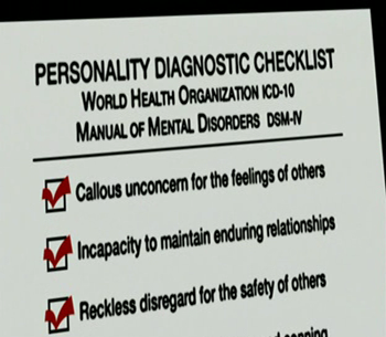
From philosophy to corporate identity…Corporation is considered as a person in eyes of law. Lets use psychiatry to make simple conclusion based on analytic view of behavior of this already established individual in society.
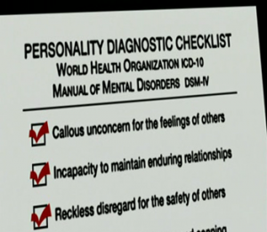

High ambition.Although there are some basic rules of behavior that you have to embrace.
Smile means –fake
devastation-chance
offer – manipulation
improvement – tactic
wealth – private property
choice – marketing
necessity – money
770.6 vos 1
keyword: invention
Wednesday, March 25, 2009
There is a blatant connection between my first and second choice.
I started out with a book by Rem Koolhaas called Project On The City which is a collaboration with several students from the Harvard design academy where he holds the position of professor. This Project investigates the consequences of the unbridled urbanisation taking place all over the world. In this context the meaning of the word urbanisation go’s further than just the focus of human inhabitancy in city’s but also refers to the cancerous growth of commercial landscapes which are framed by concrete walls becoming the centre and at the same time the banks of a river of ongoing development. One of the problems stated in the book being that the design professions can not keep up and apply outdated methods to the urban landscape creating a chaotic and unpleasant maelstrom of overlapping visual and audio stimuli with which the citizen (caught up in this maelstrom) is forced to deal.
Then I found my second book. City Signs and Lights by Stephen Carr (almost completely) coincidentally dealing with the exact same problem but focusing it’s attention on the problem with -and the potential of (the name says it all) City Signs and Lights. Rarely have I seen two books that complement each other more (although not always in the most constructive manner) and the focus on the bewildering aspects but also the potential of urban public space is a connection that fascinates me deeply.
cat. nr: 754.5 carr
keyword: develope envelope
Wednesday, March 25, 2009
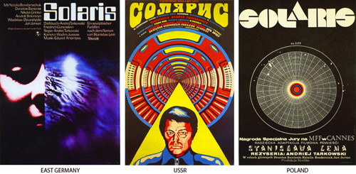
This letter I want to attach to my last message about national identity present in a street signs in different cultures. For the second time I’m using this book, which you can also take in a library. This time I’ve made a selection of posters made in different countries, but for the same movies. My thought was about the possibility of existance of different schools of postering. This posters, that you can find below, were made in the time when there were no internet for sending files with information and a designer or an artist had to improvise making a new masterpiece for the public. But this problem had made movie presentation even more interesting in different countries. Each country had added something special, non cliche. So, enjoy!
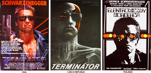
cat. nr: 754.1-keh-1
keyword: identity
Wednesday, March 25, 2009
It was big….impressively big. That’s why.
Maybe it wasn’t fair for the other books, because this book was also on a ‘special’ place. It had a place of its own as if it was more valuable than the others.
It’s not that I’m a shallow person, but it just caught my eye because of its physical appearance.
I think the pattern on the outside was disastrous by the way.
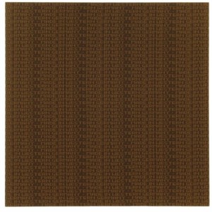
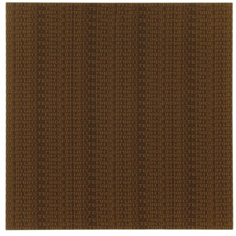
This book is about patterns. I became really fascinated about patterns, because it seems to bet hat everything becomes a pattern as long as you repeat the shape, form, act or colour over and over again. This is also how patterns become part of our life. Interesting
…At least I thought so
cat. nr. : 701.9-sch-1
keyword: repetition
Wednesday, March 25, 2009
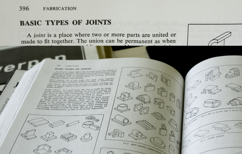
In the library I found the book: ”Jewelry – concepts and technology”.
It’s about Jewelry. It’s not a small book.
I’m not really into jewelry.
– but, oh all this nice detail. I need a closer look at that book.
What kind of system is it?
All these possibilities that I didn’t know about.
How can there be so many possibilities?
A new way of understanding. A new system to see through the working process.
Extract from the book: ”A joint is a place where two or more parts are united or made to fit together.”
– is this about silver or people?
Will I, after working with this “joint”, understand the social connections between people better?
I am looking for the answer of simple, or maybe not simple, questions.
I am looking for information about other stuff than jewelry, it has to be here in the book somewhere.
It is.
cat.nr: 777.6-unt-1
keyword: connection
Wednesday, March 25, 2009

Dark glamour
The word itself, derives from the Latin gothicus, or pertaining to the Goths (gothos), a nomadic, warrior people inhabiting the forest of northern europe in the third century AD.
The Romans regarded Germanic tribes like the Goths as barbarians. Differend tribes like the Visigoths, Ostrogoths were notorious for destruction.
Looking through the book I see a lot of extreme styles, most of them are dark, rough, kinky or has something sad or agressive. By styling ourselves with clothes, make-up, or ornaments one tries to look for individuality. The rules for clothes within a subculture gives the wearer potential to carry out a certain message. With visual language like clothes we can be clear , accent, outspoken, mislead or hide. It’s a way to promote ourselves like tv-commercials do.
It has to do with make believe and believe in.
cat. nr: 708.4
keyword: visual language
Tuesday, March 24, 2009

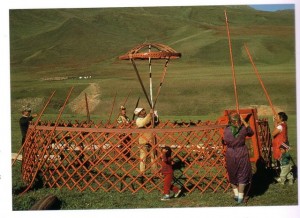
In een rij boeken zal dit boek niet direct opvallen, maar toch viel mijn oog erop. Juist de bruine kaft die aan karton doet denken wekte mijn interesse. Het geeft het boek een natuurlijke uitstraling en sluit daarom goed aan op de inhoud van het boek. Ook het formaat spreekt mij aan, het ligt lekker in de hand; niet te groot maar toch een redelijk dik boek. Ik wist niet direct de betekenis van het woord ‘dwellings’ en om daar achter te komen begon ik door het boek te bladeren. Het bevat afbeeldingen van hoe mensen over de hele wereld hun eigen huizen bouwen. Het is ongelovelijk hoeveel verschillende manieren van bouwen zijn ontstaan door verschillen in klimaat en cultuur. Indrukwekkende constructies worden weergegeven in tekeningen en de teksten bij de afbeeldingen geven snel informatie zodat je er makkelijk doorheen kunt bladeren zonder perse meteen de hele tekst te lezen. Ik bleef geboeid tot ik het hele boek bladzijde voor bladzijde had door gebladerd.
cat. no. 710.9
keyword: culture
Tuesday, March 24, 2009
Of all the books you see here, I’ve been here the longest. That doesn’t mean I’m the most important.
Of all the books, I’ve seen the most students but that doesn’t mean they’ve read me. I’ve seen every single one of these books come and I’ve seen a lot more of them go but I’ve tried my very best to be a warm and loving leader and to be an example for the younger ones.
Throughout the years I’ve tried to be useful by being a source for research and taking part in the creation of the young artistic mind.
Wether they’ve kept me for my value or they simply forgot to get rid of me, I’ve
been here the longest
cat. nr: 778.1
keyword: wisdom
Sunday, March 22, 2009

You start playing with plastic cubes…
for now, they are big… easy to fix…
they get smaller… it s time to play more precisely…
they are really tiny… play really precisely…
50 years later… still playing with cubes…
but now, they are huge… really huge…
cat. nr: 710.9-cat-6
keyword: playground
Friday, March 20, 2009
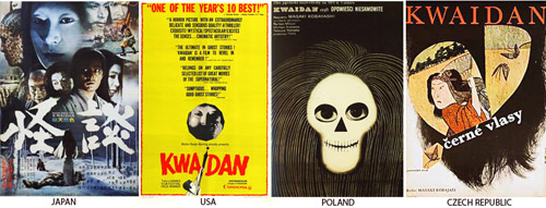
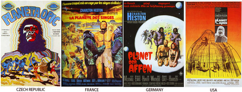
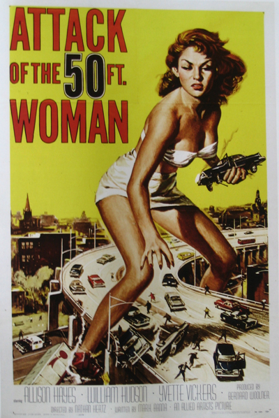
This book shows movie posters from the last 60 years. Just like rock music posters they are trying to give you an idea of the atmosphere of the movie. Most times you will already get an answer on the question: Is it an action movie? Romantic movie? Comedy? Action movies posters have a black background with a guy with a gun on it. Romantic movie posters have a white background. Horror movie posters are hysterical.
Interesting about the book is the way they ordered the book, by country. You can really see the difference between for instance east European film posters and France film posters.
cat. nr: 754.1-PED-1
keyword: time
Thursday, March 19, 2009
I was always very into illustrations i decide to looking for some book about that. I found one called “Illustration now!” by Julius Wiedemann. I have to say that i was quite disappointed, because i can’t found a lot of nice pictures in this book. Most of them was far from my taste.
Anyway there was few artist which works i really like. I have to
distinguished here Paula Sanz Caballero, Michael Sowa, Yihsin Wu and Graham Roumieu. I would like to present to you work of the last person. Graham Roumieu is Canadian illustrator which was working with many famous newspapers(e.g. New York Times, Wall Street Journal, The Washington Post). His works made by watercolor and ink has kind of bitter-sweet atmosphere that i really like. He describe himself like that: “I’m not a particularly religious person but sometimes I wonder if what I am doing with every little absurd scenario I draw is really laying down the blue print for my afterlife. I also wonder if I should work in a better-ventilated space. Either way I am quit scares. I use that in my work too.”
cat. nr: 758.4-wie-I
keyword: illustration
Thursday, March 19, 2009
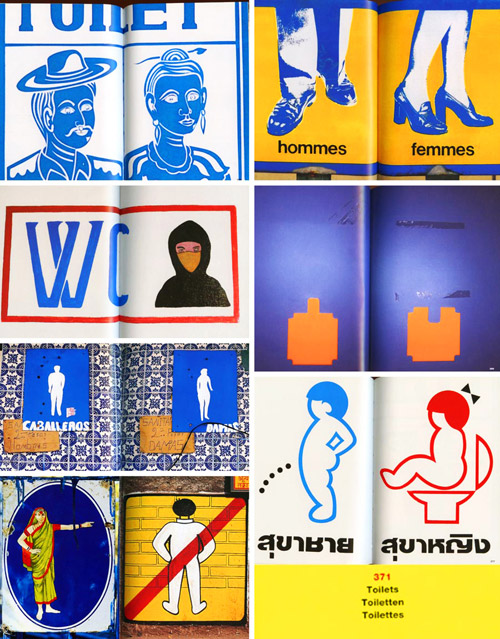
Some years ago I found in internet journey letters by a designer from Moscow, Artemiy Lebedev (www.tema.ru). There was one thing I was interested in a lot: road signs, street signs, signal lights that surround us everywhere we go, but with a national identity. So, last week I found in a library book, called 1000SIGNS, about same things, but with bigger collection of sign pictures from all over the world. I found it very positive and interesting, that, for example, toilet signs can look different and at the same time tells something special about the country or society they are coming from from. I can’t add any other comment, you have to see it.
And there are also some funny signs about dogs and…
cat. nr: 754.9-mus-1
keyword: identity
Thursday, March 19, 2009
As I was walking in between the library’s narrow lines of bookshelves I quickly browsed through the titles on the shelves. A book caught my eye, I don’t know why, maybe a combination of the title and the layout and what notes of association they strike. The book that caught my attention was on the bottom shelf, in-between books about african ceramics and the art of pottery. The title Fragiles in black on a white background. I instantly felt a liking for the title “fragiles”, a poetic word that suggest vulnerable and delicate objects that has to be handled with care. As I picked up the book I noticed that it was a new book from one of my favorite publishers Gestalten Verlag.
Of course. I’ve got some of their books and always find them interesting, they cross over the borders between design, graphic design and contemporary art, in a playful and inspiring way. So sitting down and opening the book I found a collection of contemporary work in porcelain, glass and ceramics by both established and emerging design talents and artists. Gesltalten Verlag always seem to have an extraordinary eye for finding the most interesting subjects of right now. Ceramics is an area with history going back to the beginning of human kind but recently new technical developments allow designers a new approach. Collecting inspiration from the whole history of ceramics, these artist’s freely play with the language of old ceramics styles but by fully mastering that language and adopting it to new techniques they can create new unconventional objects that range from housewhare to artworks.
cat. nr:
keyword: fragile
Thursday, March 19, 2009
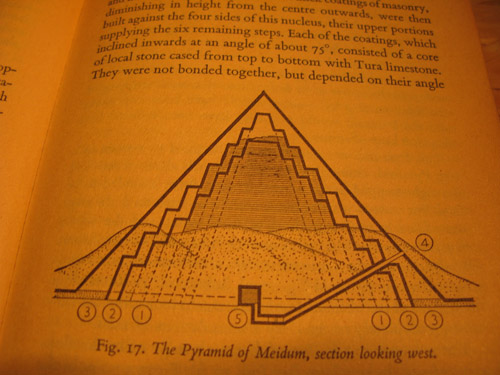
A book I found interresting is about pyramid design in ancient Egypt. The quality of the designs created by the ancients can be very inspiring tough it may seem a bit qliché, the mystery around the monumental pyramids as a timeless form are still facinating.
The book is an old and worn pocketsized relic it self. Its plastic wrapping that is protecting the cover almost falls off as you open it. It contains lots of illustrations and groundplan sketches of pyramidstructures, materials used, design methods and tools.
cat. nr: 712.5
keyword: pyramid
Thursday, March 19, 2009

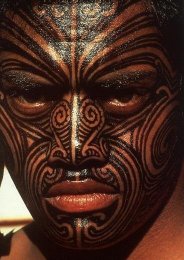
We consciously recognize ourselves and our own bodies. This gives the skin a special significance, as the final, slender layer that separates the self from the outside world. In reflecting on ourself and our world, we use for expression.
Body paint is a strong way of expressing. Used a lot in rituals which has to do with birth, death, religion, haunting etc..
There are strict rules for the forms, patterns and colours in a particular culture. There is also space for personal input. These rules gives body pain tan extra layer, value in the way it is a visual language understood by a whole group of people.
Body paint, the patterns, colours reflect the culture and the other way around. Example: In times of war, colour use and patterns change.
Nowadays body paint is seen as primitive by many people. We use make-up to decorate our selves or for expression.
But why don’t we use this potential pure, easy and strong visual language ‘body art’ anymore. I really mean patterns and colours.
What is more expressive than the personal touch?
cat. nr: 908.9
keyword: visual language


