Skip to Content Skip to Search Go to Top Navigation Go to Side Menu


"book design" Category


Suprematistisch verhaal over twee vierkanten in zes constructies.


Thursday, February 4, 2010

[cover] "Two Squares" / Dedication page / [page.4], from Lissitzky's "Two Squares"

Dit verhaal (1920) behoort tot de proun-serie van lissitzky.
Ik vind het een van zijn beste werken. Simpel en toch heel sterk.
In eerste instantie wist ik helemaal niet dat dit een kaft van een boek was. Een kinderboek nog wel. Over een rood en een zwart vierkant die de wereld gaan redden met behulp van een cirkel. Ze bundelen hun krachten samen om zo de chaos te vernietigen en een nieuwe orde te vestigen.

[page.4] Don’t read, get paper, rods, blocks, set them out, paint them, build.

De tekst op pagina 4 maakt duidelijk dat Lissitzky met zijn verhaal kinderen en volwassenen lezers aanspoorde tot activiteit. Zijn intentie was het verhaal tot leven te laten komen in een schouwspel. Je zou het dan ook niet alleen op een (typo)grafisch twee dimensionele kunnen zien, maar ook op een architecturale drie dimensionele manier kunnen bekijken.

[page.5] Here are the two squares / [page.6] They fly on to the Earth from far away and / [page.7] And see a black storm.

[page.8] Crash – and everything flies apart / [page.9] And on the black was established Red Clearly / [page.10] This is the end – let’s go on.
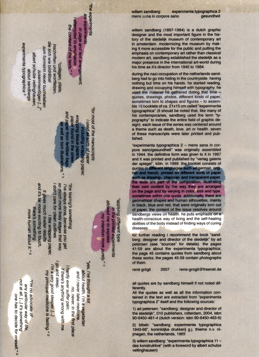
The words move within the fields of force of the figures as they act: these are squares’, zoals hij zelf zegt. De plaatsing van de woorden en het gebruik van de letters vertegenwoordigde een totaal nieuwe benadering. Het verhaal wordt dan ook over het algemeen aanvaard als een van de eerste voorbeelden van de Nieuwe Typografie.

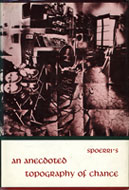
Het werk werd voor het eerst gepubliceerd in 1922 en bestaat uit 10 pagina’s. Lissitzky maakte zelfs een speciale editie voor ons beroemde vaderlandse tijdschrift De Stijl ( in “De Stijl” 5e Jaargang 10/11). Enkele uitgaven hiervan zijn nog op te vragen bij het magazijn van de openbare bibliotheek (De Stijl : [maandblad voor de beeldende vakken], maar de editie waar ik het over heb is daar helaas niet meer in de collectie. Wel de volledige facsimile herdruk met het gehele in het Nederlands vertaalde “van tWee kWAdrAten in 6 konstrukties” in deel II. Ook kun je de volledige originele versie nog vinden in het boek “El Lissitzky”, wat door zijn vrouw Sophie Lissitzky-Küppers is geschreven.

De Stijl facsimile (red. Theo van Doesburg ; ed. by Ad Petersen1968) [page 5,6,7,8,9, 10+page 4]
El Lissitzky by Sophie Lissitzky-Küppers [top 3 pages, original print 22 x 28 cm]

Unique Book


Sunday, December 6, 2009

I entered the library with a goal to find a unique book, and I did.

But what is unique ? Isn’t it pretentious ?

A funny thing happened, I picked a unique book about one of the least unique subjects that I know. Shoe obsession, which is really almost every average woman’s obsession.

The book is a miniature with more than 500 pages of text and images with at least one image of some kind of shoe per page.

Pretty unique.

But what is unique ?

I came to a conclusion that :

Unique Is Not So Unique.

Unique Shoe

(Unique Shoe)

12178 / 908.3 o’kee 1

Nothing to understand


Saturday, November 14, 2009

Walking in the library. Looking for something who is nothing, at the same time. All the covers of the books are staring at me, they are all something. Then I find…

This book, black.

This book, German language.

Attracted, white lines on the cover.

The lines going to the nothingness of the black. I want to walk in the cover to see and feel the nothingness around me. Like standing somewhere on a field in the middle off the night.

This book, I can’t read because the language.

This book, with a very disturbing content.

Attracted, understand what I dont understand.

Let me know, I whisper. Let me know…

Rietveld Library code: 774.4

Irma Boom is Patient


Wednesday, May 6, 2009

We went with school to the Graphic Design museum in Breda to the exposition ‘Who sets the standard?’. There were lots of nice things to see, and i found a book as well that was made by the Dutch designer Irma Boom that made me curious. It was laying on a table in a glass box, opened on one of the pages. Next to it you could find information on a computer touch screen about the maker and the book. This was also a very nice design, cause it worked very well and interesting to look into, very professional.
I want to know more about book design in general and i understand that this peticular book is a very remarkeble example. The ultimate book. So i’m going to investigate more about the maker Irma Boom and her designs.
The book is made for the SHV Holdings, from origin a cole trading company, but now a days it trades in food and other fuels and chemicals.

The design and the content are about the history of thi company itself but also about the family that owned it for all these years and reflects upon generations of living and working. There are just a few of them made, as the book was meant as a jubilee gift to high executives only. There is even a limited amount made specially in Chinees as it turned out after printing many of them were in china. It has never been forsales so it is quite rare to see one. I got the opportunity to see and look into the SHV Think Book myself at a private home of a lucky owner, and I found out how amazing a book design can be.

It was a great experience to go trough this book. It is a monument for the SHV, a travel trough the time, and it is far from a dry documentation. Irma Boom got into the content of her subject and you feel this. She tells the stories of the company in a playful and inventive way, it is filled with ingenious visual and linguistic jokes, poems, repetitions and personal stories, but because Irma Boom really knows what she is doing and directs it tightly, it never gets to much or chaotic.

THE SHV THINK BOOK

Fentener van Vlissingen is a philanthropist that supports several humanistic projects. When he searched for someone to design a jubilee book, he asked Irma Boom to do it. It was a work of five years and it is a good representation of all the work and effort and love that has been putted in the company itself. Read more as the story unfolds in this linked pdf……….

In praise of the penguins


Wednesday, May 6, 2009

When we went to this exhibition I didn’t have any clue about who Jan Tschichold was, and I was not really having a wow experience there, until I entered the last room and found a huge penguin on the wall, standing in front of me and staring. I must admit that penguins are some of my favourite items. And therefore I choose this one to further investigation.

The nice surprise is that this particular penguin is the logo of the penguin books and I wondered how that could be, but Jan Tschichold apparently worked for the Penguin Publisher for two years, and he is the one who made the layout and the “Penguin Composition Rules” a little booklet about the typographic instructions for editors to follow in the future.
It’s fascinating that a publisher so old as the penguin publisher is, still is having this label and still is represented on the market. The story of the penguin books is interesting in many ways, and with this goes a whole history of a publisher.

to be continued with: “A 74 years old penguin“, a further research into Tschichold’s Penguin and others by design.

Fascinatie


Thursday, March 26, 2009


Hij staat er niet bij, wel zijn er heel veel boeken over Japans Design. Ik keek in alle boeken. In alle verschillende boeken stonden goeie overzichten van wat er allemaal uit Japan komt. Het begon meestal bij traditionele Japanse kunst wat langzaam overloopt in design. Het is een overgang van mensen die eerst voor zichzelf iets maakte wat later veranderd in mensen die allemaal onder één naam product maken. In het boek Japans Design zie je deze overgang heel goed weergegeven. Het is super om te zien hoe veel er wel niet in Japan wordt geproduceerd. Japan is zover weg en we hebben hier zoveel uit dat land en dat is wat mij fascineert.

cat.no. 772.5-spa-1

keyword: beeld

NATIONAL IDENTITY IN FILM POSTERS


Wednesday, March 25, 2009

This letter I want to attach to my last message about national identity present in a street signs in different cultures. For the second time I’m using this book, which you can also take in a library. This time I’ve made a selection of posters made in different countries, but for the same movies. My thought was about the possibility of existance of different schools of postering. This posters, that you can find below, were made in the time when there were no internet for sending files with information and a designer or an artist had to improvise making a new masterpiece for the public. But this problem had made movie presentation even more interesting in different countries. Each country had added something special, non cliche. So, enjoy!


cat. nr: 754.1-keh-1

keyword: identity

Illustrations


Thursday, March 19, 2009

I was always very into illustrations i decide to looking for some book about that. I found one called “Illustration now!” by Julius Wiedemann. I have to say that i was quite disappointed, because i can’t found a lot of nice pictures in this book. Most of them was far from my taste.
Anyway there was few artist which works i really like. I have to
distinguished here Paula Sanz Caballero, Michael Sowa, Yihsin Wu and Graham Roumieu. I would like to present to you work of the last person. Graham Roumieu is  Canadian illustrator which was working with many famous newspapers(e.g. New York Times, Wall Street Journal, The Washington Post). His works made by watercolor and ink has kind of bitter-sweet atmosphere that i really like. He describe himself like that: “I’m not a particularly religious person but sometimes I wonder if what I am doing with every little absurd scenario I draw is really laying down the blue print for my afterlife. I also wonder if I should work in a better-ventilated space. Either way I am quit scares. I use that in my work too.”

cat. nr: 758.4-wie-I

keyword: illustration

Objectiefied Bits


Friday, January 30, 2009

Maybe you find it puzzling that this posting about Helvetica and Wim Crouwel starts with an image of Paul Elliman’s “Bits” Alphabet.

Extremes can sometimes meet when you least expect it, and this fascinates me. It became apparent again during the investigation by the FoundationYear C group, into Gary Hustwitt’s Movie “Helvetica” and our consequently visit to the Wim Crouwel exhibit last month at the “van Abbemuseum”.

left: Bits by Paul Elliman, right: Objectified by Build (click images for blog info)

“Bits” was developed by Paul Elliman in the mid 90ties and published in the 15th (Cities) issue of Fuse’s conceptual Font Box. quote: “Language moves between us and the world on patterns of repetition and variation, and a mimetic example of this might be something like an alphabet”
Later, in 2004, it was included in the Cooper-Hewitt Design Triennial N.Y. which made “concept type” part of the established design world.

Gary Hustwitt’s new documentary “Objectified” takes design, and as a matter of fact “Bits” too, one step further by making it popular in the same way as he did with “Helvetica”.

Modernist thinking, or even constructivist-, lays at the base of the “Helvetica” concept and the work of Wim Crouwel, as this first movie on typography has him stated. As a true Dutch graphic design icon Wim Crouwel illustrated this through work, presented at the library exhibition of the van Abbemuseum, celebrating his 70th birthday. A small but beautiful display of catalogues and posters made for both this and the Stedelijk Museum in Amsterdam.


pages by Crouwel versus pages by Jan van Toorn from publication “Het Debat”

Extremes met in person when Crouwel and Jan van Toorn celebrated their life long controversy with a recurrence of their famous 1970 debate. Functionalism versus engagement. Jan van Toorn succeeded Crouwel as a designer at this museum under the directorate of Jean Leering to manifest in an inspiring cooperation what that leads to in terms of exhibition concepts and graphic design (“Museum in Motion” at the library). Jean Leering also closely work together with Jan Slothouber (read part 1 of C group’s research) at the TU-Delft where the published several internal essay’s on the philosophical and social consequences of design.


80/20/100 © Nijhof&Lee booksellers – Laurenz Brunner, final exam poster

More research was conducted to explore related content or work approach of other designers like, Laurenz Brunner’s “Akkurat”, his successful contemporary remake of Helvetica, Experimental Jetset convicted users of Helvetica, the cooperation “8020100” between Vivid Gallery in Rotterdam and Nijhof&Lee Bookstore in Amsterdam. Context was created by turning the focus on Adriaan Frutiger, designer of Helvetica’s conscientious alternative “Univers”. To further explore the relation to language and image we further focused our investigating efforts on the visual legacy of Charles & Ray Eames, the “El Hema” exhibition/store and Massin‘s timeless publication “Letter and Image“.

With the inclusion of Belgian artist Guy Rombouts the full circle of our focus on type design was completed. The investigation into his visual language concept “AZart” will be presented soon in a separated part 3 C_group posting. This was part II of the C_group research
All researches linked in this posting can be downloaded in A4 format and are also available as hard copy research prints at the ResearchFolders available at the academy library

lines


Friday, January 30, 2009

how would it be to echo somebody?
how would it be to be echoed?
how does it feel, to be allowed to echo somebody?
how sensitive are you to get a good connection to his/her mind or presentation?
hoe does it feel to be echoed by somebody else?
is he/she sensible enough with your thoughts?
should everything be open, or is it better to hold something behind?
are there any rules or lines which should be followed?
i mean… is it really necessary to be always soft and sensible or what would change it, if you would cross the line?
about yourself, it is an easy question, i think you know your inner mine very well?
but how much do you know about the lines of the others?
or how easily can we meet in the middle of that line?

link: Osilloscope

Mysteries and Accusations


Thursday, January 15, 2009

After asking my friend about her experiences in her new design class, I’m just as confused as she was when she attended the class last week. Even now, she seems a bit lost when talking about it. She was talking about having to work with strangers, disagreements, posing, shyness, copy-machines and silhouettes. Although these words might seem a bit random, they’ve all got to do with making a booklet, with writings about their experiences in the design class. This is going to be published and I must admit; it sounds an awful lot like what we’re doing the coming three weeks on the designblog!

link: http://www.museums-vledder.nl/eng/index2.html

Where’s the goddamn book?’


Saturday, January 10, 2009

Charlie hasn’t been very lucky at finding the information she needs to write for the Rietveld’s DesignBlog. Before, she wrote something about Typography artist Bram de Does. She told me all about her search to find the information she needed, which was all in one book ‘The Kaba Ornament’. Totally fixated on that one book, she searched the Gerrit Rietveld library, the Rijksacademie Library and even the Amsterdam Public Library, to find nothing but a video on de Does. Now Charlie has to write something for the blog again, which involves a handmade book from Rietveld students. But this book too proved hard to find.

Five days before the deadline of the Bram de Does piece, she found the publisher of the book, who shared a number of useful anecdotes with her. Let’s hope she’ll be successful in finding the handmade book as well.

link to ilovetypography.com

posted by Jesse Muller

A group’s researched book-concepts


Monday, March 10, 2008

TM-City SMCS Warhol_Index TM-City SMCS

After many month we finally present the research results into 25 selected books from the “Collections Groenendijk”. During a one-hour event every student was presented with the opportunity to start-up a research into the manifest art or design concepts presented in these unique book designs. Designers Julia Born and Will Holder were presented through an interview-DVD made by the graduate program of the “Werkplaats Typografie Arnhem” for the Chaumont festival workshop 2005. Others projects, by Richard Niessen or Andy Warhol, were presented at an visit to the Stedelijk CS, where their books were displayed in context. Coralie Vogelaar (a Sandberg Master) came to visit us in person to give insight in her work and ideas and lecture on the concept behind her latest publication “Masters of Rietveld: design in the 21st Century” published recently by the Sandberg Insitute /Design [above: Niessen TM-City / Warhol Index-Book

A New Art World
Caetano de Carvalho on “A New Art World” by Richard Niessen + Ad de Jong

Research material was edited down to A4 sized guided tours into these subjects. All subjects presented in this list are also available as hard copy prints at the Research Folders at the library. The investigation focussed on the following book titles: Ed van der Elsken’s “Love Story in St Germain“, Irma Boom’s Grafisch Nederland 2005 on Color, “Start A New Art World”(published above), the acclaimed cooperation between photographer Geert van Kesteren and designer Linda van Deursen “Why Mister Why“, “Hhalo” by Julia Born and Rebecca Stephany’s “Archiving Today”project. Last 3 ladies all teaching at graphic design department.

SpoerrieThe ThingThe Thing Norm design Swiss TypeS M L XL

Daniel Spoerrie “An Anecdoted Topography of Chance“(extra info), Dieter Roth’s “Dieter Roth Band 10“, “S M L XL“by Koolhaas, Sandbergs “Experimenta Typographica“: Mens Sana in Corpore Sano and “Counterprint” by Karel Martens. “The Thing” by Norm designstudio, Andy Warhols classic 1967 “Index-Book”, Will Holder’s “Catalogue“: starring Gijs Muller, Edward Ruscha’s “Colored Peolple”, Richard Niessen’s piece de résistance TM-City.

Why Mister Why GN2005:Color

Sandberg Institute Master: Coralie Vogelaar with “The Photoshop” and “De Hedendaagse Ontwerper”, Gerald van der Kaap’s original ” HoverHover” and the monumental cooperation between Jonathan Barnbrook and Damien Hirst “I want to spend the rest of my life everywhere, with everyone, one to one, always, forever, now”.

Dot Dot Dot X Hester Permanent Food 15

Finaly some highly conceptual magazine concepts like, the 1980’s I-D magazine 2, Jop van Bennekom with Re-magazine: ‘Hester‘, Permanent Food or Stuart Bailey’s “Dot Dot Dot” magazine.


Log in
subscribe