Skip to Content Skip to Search Go to Top Navigation Go to Side Menu


"art" Category


Enjoy


Thursday, February 12, 2009

“Slow” for me is enjoying life in the way I like it myself.
The slowest thing that I did, which I can remember, is to make an artwork.

Sometimes it takes months or years to finish it.
The process of being an artist is also slow for me, but I am enjoying this process a lot. The most unique part of an artwork is that not everyone can understand the meaning and feeling of it. During my research I have found sentences from Robert Hughes that made me very curious:

What we need more of art: art that holds time as a vase holds water; art that grows out of modes of perception and making whose skill and doggedness make you think and feel; art that isn’t merely sensational, that doesn’t get its message across in ten seconds, that isn’t falsely iconic, that hooks onto something deep-running in our natures”.
It makes an artist very special making this kind of art.

Self-chosen Speed


Thursday, February 12, 2009

Somebody should not ignore the beauty of products, nether do I, but an overload of the visual and mental impact of consumption is forcing me to find a way to deal with this headache, which emerges from the stress of speed. Speed is arising from measurement. So the first step was to put down my watch to give myself some freedom. But “slowness” almost doesn’t exist in my life, what means that the stress is not erasable. What is left is to find a way out of this reality into daydream spaces, where I can have the total freedom of time in a self-chosen speed or system. “Daydream spaces, such as those generated by reading a good book, are often more commanding than physical spaces. While you read, you don’t even notice people who walk through the room because you are actually in the space that’s generated by the author. … the spaces generated by music can be much larger than the one in which you are physically…” here I totally agree with James Turrell. The same goes when he says that these are the spaces that we are inhabiting most of the time, much more then the conscious awake space that is called reality.

E-Magazine


Monday, February 2, 2009

read it online

read it in print

Objectiefied Bits


Friday, January 30, 2009

Maybe you find it puzzling that this posting about Helvetica and Wim Crouwel starts with an image of Paul Elliman’s “Bits” Alphabet.

Extremes can sometimes meet when you least expect it, and this fascinates me. It became apparent again during the investigation by the FoundationYear C group, into Gary Hustwitt’s Movie “Helvetica” and our consequently visit to the Wim Crouwel exhibit last month at the “van Abbemuseum”.

left: Bits by Paul Elliman, right: Objectified by Build (click images for blog info)

“Bits” was developed by Paul Elliman in the mid 90ties and published in the 15th (Cities) issue of Fuse’s conceptual Font Box. quote: “Language moves between us and the world on patterns of repetition and variation, and a mimetic example of this might be something like an alphabet”
Later, in 2004, it was included in the Cooper-Hewitt Design Triennial N.Y. which made “concept type” part of the established design world.

Gary Hustwitt’s new documentary “Objectified” takes design, and as a matter of fact “Bits” too, one step further by making it popular in the same way as he did with “Helvetica”.

Modernist thinking, or even constructivist-, lays at the base of the “Helvetica” concept and the work of Wim Crouwel, as this first movie on typography has him stated. As a true Dutch graphic design icon Wim Crouwel illustrated this through work, presented at the library exhibition of the van Abbemuseum, celebrating his 70th birthday. A small but beautiful display of catalogues and posters made for both this and the Stedelijk Museum in Amsterdam.


pages by Crouwel versus pages by Jan van Toorn from publication “Het Debat”

Extremes met in person when Crouwel and Jan van Toorn celebrated their life long controversy with a recurrence of their famous 1970 debate. Functionalism versus engagement. Jan van Toorn succeeded Crouwel as a designer at this museum under the directorate of Jean Leering to manifest in an inspiring cooperation what that leads to in terms of exhibition concepts and graphic design (“Museum in Motion” at the library). Jean Leering also closely work together with Jan Slothouber (read part 1 of C group’s research) at the TU-Delft where the published several internal essay’s on the philosophical and social consequences of design.


80/20/100 © Nijhof&Lee booksellers – Laurenz Brunner, final exam poster

More research was conducted to explore related content or work approach of other designers like, Laurenz Brunner’s “Akkurat”, his successful contemporary remake of Helvetica, Experimental Jetset convicted users of Helvetica, the cooperation “8020100” between Vivid Gallery in Rotterdam and Nijhof&Lee Bookstore in Amsterdam. Context was created by turning the focus on Adriaan Frutiger, designer of Helvetica’s conscientious alternative “Univers”. To further explore the relation to language and image we further focused our investigating efforts on the visual legacy of Charles & Ray Eames, the “El Hema” exhibition/store and Massin‘s timeless publication “Letter and Image“.

With the inclusion of Belgian artist Guy Rombouts the full circle of our focus on type design was completed. The investigation into his visual language concept “AZart” will be presented soon in a separated part 3 C_group posting. This was part II of the C_group research
All researches linked in this posting can be downloaded in A4 format and are also available as hard copy research prints at the ResearchFolders available at the academy library

Voice of The Gerrit Rietveld Academy


Thursday, January 29, 2009

Echo,

v. reverberate; repeat a sound; transmit immediately each character received by a computer back to the course as to serve as a confirmation of receipt (Computers)

n. repetition of a sound produced by the reflection of sound waves from a solid surface; (Computers) user input printed to the screen so the user can read it; (Slang) person who reflects on another person; person who imitates another

As I walked trough the hallways of the Rietveld I see everything developing,
objects, drawings, performances, everything is moving and growing.

although the strange thing is that everything looks a bit a like,
exchanged words, moves, thoughts connected, reflected and formed,
into one echo that belongs to the voice of the Rietveld academy

conjoining bodies


Thursday, January 22, 2009

Here the assignment “make a connection” became the inpiration for some reasearch on how to change two bodies into one. How to become a siamese twin. It is interesting to see the new shapes the bodies make, recognizable but totally new.  This project posts questions like; what would fashion look like if the human body was formed differently and how much can fashion form our appearance. It is interesting to think about what effect clothes that conjoin two people would have on our behavior and relationships.

The cube as a representation of a democratic art form


Wednesday, January 7, 2009

With a speech by Simon den Hartog, former director of The Gerrit Rietveld Academie, a small retrospect exhibit on the work of Jan Slothouber was openened at the “van Abbemuseum” in Eindhoven NL. An intimate group of affectionado’s and family bridged the gap of almost 50 years, when Jan Slothouber together with Willem Graatsma started his fascinating journey into the world of the cube. The Centre of Cubic Constructions represented a highlight in this extraordinary focussed research, culminating in the 1970 representation at the Venice Biennale.
Seemlessly scanning the architectoral space occupied by art and design, the exhibit –designed by Erik Slothouber and curated by Diana Franssen– clearly presented an extraordinary focussed spectrum of work

Some weeks later we revisitted this exhibit with a student research team of the FoundationYears C group. Exploring the cubic constructions we found direct relations between the work of Slothouber and the minimal art of Sol LeWitt. The choice for a simple universal and modular form makes it posible to built a grammar for an entire body of work in which all the steps in the process can become interesting in their own right. “in which even the concept can become as interesting as the final product” (Sol Lewitt, cat Sonsbeek 71).

The specific context of typedesign addressed in our workshop presented striking relation between their works and those of more contemporary designers like Radim Pesko and the Swiss designers Dimitri Bruni & Manuel Krebs of Norm

More research was conducted to explore related content or workapproach of other designers like, Bram de Does, Karl Nawrot, Na Kim (website) and Ji Lee.
This was part I of the C_group research.

All researches linked in this posting can be downloaded in A4 format and are also available as hard copy research prints at the ResearchFolders available at the academy library

Het lijkt ergens op!


Wednesday, December 3, 2008

domain du nouveau monde aslijnen-op-raakvlakken

by Ben Zegers : "Au Bout du Monde" and "Aslijnen op Kopvlakken

Heb je Ben Zegers wel eens in het echt gezien?
Ben is een beeldend kunstenaar. Je vind hem vaak op het bordes van de academie. Daar waar de rokers en de niet rokers elkaar treffen en waar nog tijd is voor snelle maar wel essentiele communicatie. Ben kan goed luisteren en kijken en ziet de kleine dingen zonder het grote uit het oog te verliezen. Hij ziet verbanden en wacht af om ze later dan weer zichtbaar te maken, ze te verbeelden. Hij vertelt een verhaal met een zaag en een klomp. Als het verhaal klaar is is de klomp nog steeds niet helemaal doorgezaagd. Het is alsof het antwoord een vraag oproept in plaats van anders om.

Nog deze zomer opende hij het basisjaar met de presentatie van een nieuw rooster. Een rooster dat niet de feitelijkheid van het jaarrooster, maar de subjectiviteit van de studietijd verbeeld. Een weg in tijd en ruimte, gefaseerd opgebouwd in kleur en vorm. Resultaat een inspirerend en aanmoedigend gebaar naar de studenten, over dat alles anders kan en toch vertrouwd blijft.

Inmiddels is Ben Zegers geroepen tot de functie van Directeur Onderwijs van de Gerrit Rietveld Academie. Gerrit is Rietveld, maar nog veel meer een jongens naam, zo hollands als een klomp.
Aslijnen op kopvlakken“, dat zoveel betekent als ‘het middelpunt bepalen’, was de meest recente groeps tentoonstelling waaraan Ben Zegers meewerkte. Hou het in de gaten!
Heb je z’n werk wel eens in het echt gezien?

image 1: Caldic Collection, Wassenaar /image 2:”No Go Go Area” 2002 tent. Witte de With, Rotterdam /image 3 “lettre á mon père” 1999 Archive Kunsthal, Rotterdam /image 4: “ceci n’est pas une architecture” collection exhibit  De Paviljoens Almere

Discovery of a new pop artist


Sunday, November 30, 2008

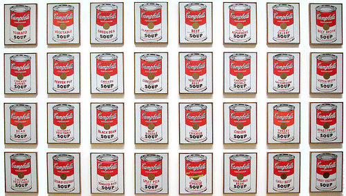
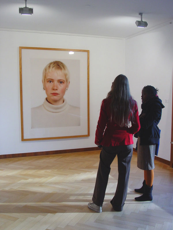
Cyril Duval is a french artist based in Tokyo. His work is like a modern day collage sampling various other artist’s work. His pieces basically consist of nearly exact copies of excisting work. For instance he recreated some of Damiem Hurst’s type aquarium, or Bart Simpson for the Colette shop. Cyril Duval collaborates with and continues to work with some personalities, Like Sarah [from Colette], Bernhard Willhelm and Terence Koh.
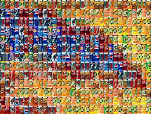
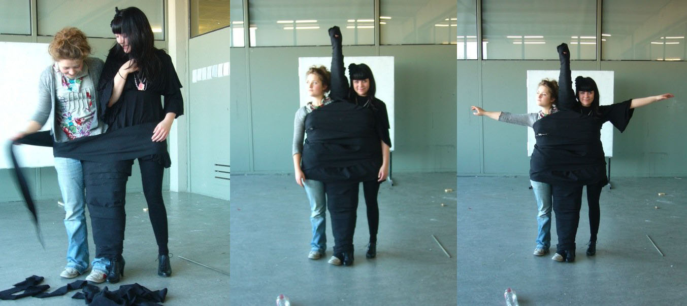
He creates artwork from logos or visual identities of big international companies. Cyril Duval plays with the whole concept of marketing in different collages – for example transforming a Louis Vuitton bag into a costume. The Item/Idem project by Cyril Duval is all about that.

The lecture he gave in Amsterdam for the design week was extraordinary because he didn’t give a simple lecture of his work but transformed it into a show. After reading some articles and interviews about/with him, I discovered that Cyril Duval is an amazing artiste. His manner to think about the development of his work is very interesting. He’s very sensible about sophistication of design and marketing which are surrounding us all. He asks himself about art and how to show it in a new way to push the view on art. Still studying the past to create a new fragment of art.

interview:

T: Why did you chose to go work in Japan ?

C: In Japan it’s more easy to export world wide, because you have this sens of bring it art to life. To propage of design, because in Japan the people have the sens of community and live together. And after 6 months in Japan I took some characters of this country, a form of interiority a things very specific to Japan basicly.

T: After Freedesigndom, do you have other projects ?

C: Yes, of courses, at the moment I work on a new project – interior design for a night club (Le baron de Paris), which is now opening in Tokyo.

T: Talk to me more about “Tokion” and the idea of that magazine

C: Tokion, is a glocal magazine ( glocal is a concept which means the mix of global and local). Who the Tokyo culture is inside the world and who the world is coming back to Tokyo, that exange of information. His bleeding of culture.

T: I read on the internet that you’ve worked with Bernard Willhelm!?

C: Yes, I worked with him, I created and designed, the concept store the first one on the world of Bernard Willhelm. His it a conceptual rechearched inspired by japaness homeless house. because for me Japeness homeless house is sophisticed and also design.

Cyril Duval is a recognised artist, with a lot of imagination and he poses serious questions about art and especially design. He is invested and have a lot of projects. I think that Cyril Duval will keep surprising us and I invite you to follow him and learn more about him on the links below.

posting by Talal Al Akkad

De waarde van Hebe.


Saturday, May 24, 2008

Hebe“Hij overhandigt mij een schilderijtje, met kitscherig goud lijstje, een donker groen kartonnen frame met daar in een zwart-wit prent van Hebe. Niet dat ik van goud hou, wel heb ik vroeger al erg veel interesse gehad in de Griekse mythologie. Hij vertelt mij over Hebe, de godin van de jeugd, en begint uit te leggen waar zij voor staat, als dochter van Zeus en Hera. Hebe had als betekenis de bloei van de natuur in de lente. Maar toen zij langzaam haar betrekking tot de natuur verloor als natuurgodin werd haar de taak opgedragen de goden nektar te schenken, die hun onsterfelijkheid en eeuwige jeugd verzorgde. Uiteindelijk trouwt ze met Herakles, wie zij twee zonen schonk.

Ik ben verwonderd en hang het lijstje boven ons bed, gecentreerd tussen onze hoofdkussens. Pas later, die week, vond het haar functie. Ons huis bestaat uit een grote ruimte, met gelijke muren en een oppervlakte van ruim 35 vierkante meter. Dit heeft tot gevolg dat de scheiding tussen de slaapkamer en de woonkamer moeilijk zichtbaar is. Nu, met Hebe boven ons bed, zijn er onzichtbare lijnen ontstaan, een ware metafoor, een onzichtbare muur. Het schilderijtje heeft onze woonkamer doen ontwaken.”

B group /encounters with the autonomy of design


Monday, March 24, 2008

When two exhibitions present a clear insight in the autonomy of modern designing, DesignResearch has to examen what it is all about and who is involved.
This occasion was presented by the “Joyride Expo” organized by Platform 21 and “At Random: Networks and Crossovers” curated by the Paviljoens Almere.

frank tjepkemaX-XL chair at Joyride
(l>r: at studio Tjep > cuddling the XXL-chair > visiting JoyRide Expo)

The participation of the Dutch product- and interactive design avant garde presented an unique opportunity to experience the freedom in which design concepts can be developped. This became clear at the opening event of the Joyride Expo, when designers transformed remote control toycars into their ultimate joyride dream

skycatcher at random reader
(l>r: Skycatcher by Maurer & Puckey > Expo & Reader designed by Lust)

When visiting Almere (only a 20 minute train-ride), Luna Maurer presented insights into the philosophy behind here work “Graybloc“. One of her other works “Floor design” –an ongoing and ongrowing work in progress– covers the floors with mappings of the organisations consultative structure, as such visualizing the Paviljoen’s network. We could be present to witness her weekly upgrade.
Studio >Tjep< was visited in a later stage as part of a students investigations. We enjoyed an informal presentation of some projectbooks, focussing on his proposal for the restyling of the IKEA restaurant.

Soap Box ResearchBertjan Pot Research part1

Research material was edited down to A4 sized guided tours into selected subjects. All subjects presented in this list are also available as hard copy research prints at the ResearchFolders at the Rietveld library.

Related to Joyride the investigation focussed on the following subjects and people: Bertjan Pot (furniture design), Strange Attractors (interactive design), Marijn van der Poll (product design), Moniek van Heist (fashion design), Dinie Besems, Pieke Bergmans (product design), Frank Tjepkema /Tjep (interior/product design) the general subjects of >Concept Cars<, >Soapbox Racing<, “Craddle to Craddle” McDounough/Braungart (industrial design) the Nature Design exhibit in Zürich and its publication by Lars Müller, Droog Design, Bruce Mau’s “massive change” (communication design) and as added subjects Sophie Krier (Design Lab) and the artist Panamarenko.

related to the ongoing At Random: Networks and Crossovers exhibit, the investigation focussed on: Jeanne van Heeswijk (artist), Lust (graphic design), Nathalie Bruys (geluidskunstenaar), Luna Maurer (interaction design), the At Random reader by Lust design, and the related subjects SKOR and OPEN magazine #13

Dexter Sinister at Whitney Biennale


Tuesday, March 18, 2008

Dexter Sinister Emblem
Dexter Sinister (Stuart Bailey, David Reinfurt and Sarah Crowner) call their project a “Just-In-Time Workshop & Occasional Bookstore”1. Their workshop deals with the classical production scheme of publications and the different roles of designer, publisher, producer, editor, curator and distributer. The twice a year published culture (“art-design-music-language-literature-architecture”3) magazine Dot Dot Dot is an example for the redefinition of traditional ideas of publishing.

They also take part at this year Whitney Biennial in New York.
“Dexter Sinister’s proposal for the Whitney takes the form of an extended poem titled True Mirror, a composite of excerpts from writings and artworks derived from a variety of artists and authors. Loosely based on ideas of reflecting and shadowing, the manifestations of this abstract proposal remain necessarily open until the Biennial begins. Dexter Sinister will occupy a former colonel’s dressing room at New York’s uptown Armory, from which they will explore various channels of distribution alongside the rest of the show. These activities are prefaced by a typically oblique double motto: “Quality is merely the distribution aspect of Quantity” (or vice versa).”2

A reasonable but rather long interview about things can be found at www.bombsite.com.

More information about the project, contributers and their releases can be found at Dexter Sinisters True Mirror website or Whitney Biennial
posting prepared by jan (group f)

Design Trip to Insel Hombroich


Sunday, December 2, 2007

0708_Hombroich4

Thomas Ruff at Haus Esters Haus lange

The Design Trip to Germany took us to Insel Hombroich in Neuss Germany. On the way we stopped at the Museums Haus Esters and Haus Lange, Mies van der Rohe’s first building experiments (1929) with -non supportive- brick housing. The buildings were clearly designed to look from inside out as we experienced while exploring the art and photography filled interiors. Especially the bathroom on the second floor gave us a sweet glimps in the past.

0708_haus_esters"Rietveld at Insel Hombroich"
"Venician Glass: crafts at insel Hombroich""Haus Esters Haus Lange Mies van der Rohe"

Top left > 1 Haus Esters • 2 Rietveld at Insel Hombroich • 3 Mies van de Rohe, Haus Esters Haus Lange • 4 Venician glass craft >< art in insel Hombroich

During a beautifull autumn day, we entered the magical Erwin Heerich‘s Pavilions followed by red and yellow leaves . Nowhere can daylight be experienced like this, looking at the art and craft as it realy is and was meant to be. The unique melting of architecture, art and craft can be enjoyed only at a few other places like..

Calder, Yves Klein, Buddha, China or Schwitters and Bart vd Leck, the sheer power of it made us enjoy this humbling moment.

G group’s research subjects


Sunday, November 11, 2007

Poeme2_web_final 0708g-brasilia-redu

Based on the general theme “Le Corbusier and Other Stories” we investigated a variety of subjects related to the content presented at this summers Corbusier Art and Architecture exhibit at NAi, Rotterdam. Research material was edited down to A4 sized guided tours/portals into these subject matters. All subjects presented in this list were available as hard copy prints at the Research Folder Archive at the library of the academy from November 2007 until January 2013 at which date we decided to have them only available as part of the online Designblog archive:

Primitivism, Le Poème de l’Angle Droit, Corbusier’s Christmas Gift, La Chapel de Notre Dame, Amedee Ozenfant, Corbusier in Istanbul, Varese’s Poème Electronique, The Candigarth Project, Modular, Language of Organic Form, Corbusier and Politics, The Bric, Ferdinand Léger, The Brasilia Project, Sandberg’s Experimenta Typografica 11, Koolhaas/Lagos, Nature Design Zurich, Constant’s New Babylon, Rietveld’s Academies, The Chaisse Longue

Nov 1st 2007 : Design Researches Available for all Foundation Year Students. > Hard Copy / Soft Copy


Saturday, November 10, 2007

Design Researches available for everybody.

Poeme2_web_final Hard copy prints of all researches from 2005 – 2009 are on file in the Library folders Vol#1-12. You can study them anytime during opening hours [Openingstijden: maandag t/m vrijdag van 11.00 tot 17.00 uur]. For example you could check out this beautiful research on Amedee Ozenfant in the context of “Le Corbusier Art and Architecture”. for more see X

Fransje Killaars Soft copies are available on line as jpeg’s or pdfs. You can download these pdfs and enjoy the content and its hyperlinked guided tour. Here is an example of such a tour into the work of “Fransje Killaars”. see for more X

Screen shot 2013-06-30 at 11.02.08 PM


Log in
subscribe