Skip to Content Skip to Search Go to Top Navigation Go to Side Menu


Experimenta, manifesta, documenta


Tuesday, November 18, 2008

Three events that sound alike. This was the first thing that came to my mind as I entered the COME TO MY PLACE exhibition at the Westerhuis gallery.

Come to my place. In short; a project involving 8 designers / groups from different parts of the world. They were asked to create a sense of home in small living spaces, using their designs and products from their own country. Each participant had a space to fill.

The idea behind Come to my Place is todays global culture; how does it affect the insides of our homes? Local traditions are not a big influence anymore. International designers give us the supplys we need to give our home a “personal” touch these days. However there are still small details in houses around the world from which you can tell where you are… I think the designers wanted to fill these spaces with a balance between local and global designs.

I was attracted by the installation in the room of Miguel Vieira Baptista titled; ‘my kitchen in amsterdam for 45 days’.
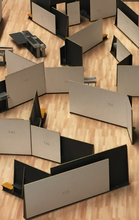
Coming from Portugal, his theme was a kitchen filled with “traditional Portugese tablewear” and modern designs. His concept was that visitors of the gallery could actually sit down and use the kitchen there, which i think is not a very realistic idea in a gallery. About the design itself, I found out that the objects i liked the most were not his work but just objects selected by him, like the black stools and the tiles by Viuva Lamego (see photos). The “3d cube tiles” are a original, simple and useable product that I would like to have in my kitchen. Its funny that a normal thing as kitchen tiles can become modern by just a small change.

posting by Boaz Mout.                                      for more photo’s of the event

Swing Lantern


Tuesday, November 18, 2008

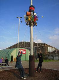
I went to “Swing Lantern

When I went first time with my friend, there was nobody. We began to play Swing Lantern (that handles were high for me, but I managed). We had finished it, we were seeing it. Then, two persons came to Swing Lantern, they began to play it. I took a photograph. One of them spoke to us “If you want, I take a photograph for you playing Swing Lantern”. We were taken photograph. There was wide place, it was easy for us to find it. It was high, and colorful.
When I went there second time, a family played it. They had three little children, they changed to play for one child. In ordinary designers week (it was held in Tokyo every year), we couldn’t play with product. It was problem. But in this project, we can play, and we can make a memory with the products. It is a good experience and important thing.

I thought about “swing” and “lantern”. It reminded me of Japanese hu-rin. It is a bell which make sounds when the wind blows. Japanese hu-rin made of glass. We use it outside during summer. It was very small, the size is about 7cm. When we listen to the hu-rin’s sound, we feel cool and happy. During summer night, I open the window, while I listen to the hu-rin’s sound, I use to read books. “Swing Lantern” make us experience and remember. I’d like to make things like swing lantern. I’d like to make people have memory through my art project.

Similar project (Lantern), Japanese Windbells (Hu-rin)

posting by Juri Suzuki

I Have Something To Hide


Tuesday, November 18, 2008

Nowadays it seems we don’t have anything to hide anymore; we all happily share our personal info on Facebook, MySpace and Hyves. You hardly realize that the government is watching your every ‘digital’ move; internet and email, through bank cards, through your cellphone, even your bonus card at the Albert Heijn supermarket is being traced.
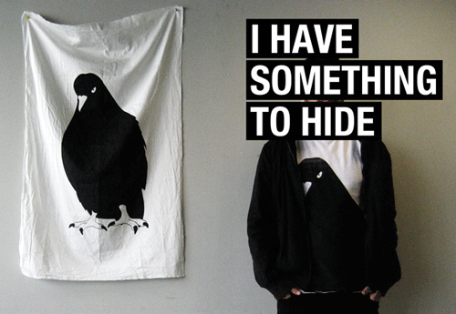
With that in mind, 12 students from the design department of the Sandberg Institute came up with the idea of using an ancient way of communicating; via Pigeon Post. For several months the students trained their very own group of pigeons in order for them to exchange messages about their privacy project. Sara Kolster, one of the students, says that the group has had the idea of doing something with the privacy issue for some time. But when the VPRO (a dutch broadcasting organization) and Holland Doc approached them to participate in their Privacy Project, they really started brainstorming. ‘Almost everything can be traced, even letters. In the 1st and 2nd World War, pigeon post was actually used quite a lot; it is untraceable and pigeons are everywhere’. The project continued during ExperimentaDesign Amsterdam 2008 on the roof of the Post-CS building, where the pigeon house was used at night as a projection screen for showing films and documentaries on privacy issues.
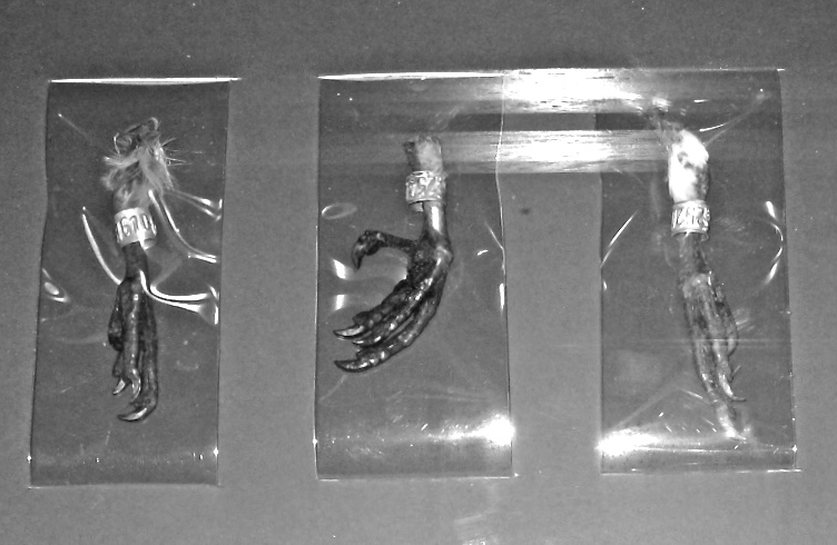
Because of the fact that I didn’t get to see the event on the Post-CS Building, I decided to experience the idea of ‘Hiding from the government’ for myself. One week; my phone, internet, cards and bank cards in exchange for mail, as in letters. On a Sunday, at twelve AM I switched off my phone; peace and quiet. Monday I wrote three letters, if I want to meet friends I’d have to do that a few days in advance. I found out hand writing a letter takes a lot of time, as well as looking for my brother whom I was going to meet, but where and when exactly was that?

Tuesday I received my first answer by mail and Wednesday only got more exciting when I found three letters in my mailbox! But time is suddenly crucial if you want to get your answer out on time, since the postbox deadline is six o’clock. Thursday three letters again, including one of my grandfather, who had post pigeons back in 1936; ‘They used to shit all over the next-door-neighbor’s laundry and another man who had post pigeons too, used to throw rocks at my beautiful birds. People who have post pigeons are maniacs!’

Friday; a friend from another city just stopped by my house to drop off her letter she meant to send. We couldn’t hang out because I was just leaving to go to her city, where I got lost and accidently ended up at her address, where I’d never been but knew from the letter I sent her. What are the odds. Saturday, the last day of my experiment; I had already been tempted at the library and my working place to check my e-mail, but I pulled through and had been invisible for one week!

The Sandberg students definitely made their statement, even though the event was more of a metaphor, It makes you think and even want to experience the experiment for yourself. But after all, it is an event and not a way to live. It is understandable that in busy times we don’t mind sacrificing a little privacy in order to speed things up. That’s why afterwards the students of the Sandberg Institute don’t really feel the urge to keep using this dated method of communicating as long as their personal data whilst using technology is not being abused.

The students are still busy editing a documentary which will be shown on the Holland Doc website and in the meantime the retired pigeons are returned to the Dutch Pigeon Post Organization.

posting by Jesse Muller

Attitude, Approach and Application.


Monday, November 17, 2008

Ian Anderson, who’s the founder of the Designers Republic, was invited to come and talk for the Amsterdam Conferences at Experimenta Design, Amsterdam.
TDR is known for its anti-establishment aesthetics, while Ian Anderson’s still embracing the consumerism.
As you problably know, TDR does a lot of commercial work for huge brands such as Coca-Cola, Activision Inc and Warp Recordings. But through Ian Andersons art exhibitions, he’s “commenting” on the consumerism and the fact that the whole world is centered around a buy/consume mentality, which of course can be understood as a provocative comment against the consumerism. As he explains: “It’s more an observation and a desire to inspire people to think for themselves rather than a provocation.”
His interest in the consumerism issue, is not about getting people to think that they need things they never knew they wanted. It’s about the control. Like in one of his exhibitions called “Customized Terror”, there was a poster with the word “flesh”. This was not saying that you shouldn’t eat meat. The purpose of the message was to get people to be aware of the ramifications of their actions.

So he’s in some way stepping out of the whole discussion of right or wrong, and has placed himself as some kind of neutral player in the whole discussion concerning the consumerism issue. But of course there will always be different opinions and different ways of looking at his role he has put himself in. Although I think his role in this issue will always be understood, as some kind of contradiction to itself. The Designers Republic
posting by Daniel Norregaard

Hotel experimenta: maak het je eigen


Monday, November 17, 2008

Volgens de Oude Grieken kan de mens alleen in een polis, een stad, een volwaardig leven leiden en zijn streven naar het goede leven verwezenlijken. En nu, eeuwen later, zijn we op het punt gekomen waarbij meer dan de helft van de wereldbevolking in de stad woont. Zijn al deze (nieuwe) stadsbewoners nu beter af? In een context van een veelheid aan keuzemogelijkheden die het aanbiedt en de constante risico’s die op de loer liggen proberen de inwoners zich de stad eigen te maken. Het is hun natuurlijke omgeving geworden, een landschap dat we zelf gecreëerd hebben en continu aan het vormgeven zijn. Dat is het onderwerp van Experimentadesign 2008.

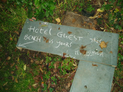
Het is zondagmiddag en ik kom met het pontje aan in Amsterdam Noord. Ik ben op zoek naar Hotel Experimenta van Jan Konings. Voor een huis met een grote tuin met een hoog hek eromheen wappert een experimentadesign vlag. Als je goed kijkt zie je een klein lichtblauw gebouw in de tuin staan. Door de tuin loop ik naar het hotel. Ik voel me er ongemakkelijk bij, dit is iemands private ruimte. Het hotel is leeg. Ik kijk door de ramen, om te ontdekken dat er niet veel meer staat dan een bed. En dat heeft een reden. De hotelgasten moeten de faciliteiten die een ‘normaal’ hotel aanbiedt, zelf zoeken in de omgeving. Bij het café-restaurant om de hoek, de wasserette een paar straten verderop, en niet te vergeten, bij de inwoners van dit stukje stad.

In een interview met Jan Konings vertelde hij me dat hij al langer bezig is met hotels. Aanleiding is de Nederlandse wetgeving, het is verboden om in de openbare ruimte te slapen. Als kunstenaar kan hij mensen de mogelijkheid geven om op bijzondere openbare plaatsen te overnachten. Een van de projecten is Hotel Experimenta. Om een goed leven te leiden in de stad maakt de stedeling keuzes. In een stad leven betekent in delen van de stad leven. Ieder creëert zijn eigen stad. Net als de stedelingen die zich de stad eigen maken, creëren de gasten een eigen omgeving voor zichzelf rondom het hotel.

Ik woon in Amsterdam, maar in dit stuk kom ik nooit. Als ik naar de pont loop, terug naar ‘mijn’ stad, passeer ik de boombench van NLarchitects, het is ook onderdeel van experimentadesign. Een groep jongens met scooters speelt muziek af op de muziekinstallatie in de bank. Een heel ander gezicht dan het verborgen, nu verlaten hotel. De boombench is heel direct, makkelijk te begrijpen en toegankelijk. Hotel Experimenta is veel minder toegankelijk, het vraagt iets terug. Het vraagt om na te denken over de verschillende lagen van het werk. Het hotel staat er, maar het is aan de bezoeker om het in te vullen, ‘er iets van de maken’. Dit geeft de bezoeker vele mogelijkheden. De stedelingen, de hotelgasten en de bezoekers hebben een ding gemeen: ze worden uitgedaagd om zich de stad, de omgeving of het werk eigen te maken.

Op onderstaande link is een filmpje te zien dat ik tijdens mijn bezoek aan Hotel Experimenta gemaakt heb:

This video was embedded using the YouTuber plugin by Roy Tanck. Adobe Flash Player is required to view the video.

posting by Susan Kooi

Street-art for Nerds


Monday, November 17, 2008

The Graffiti Research Lab, is a New York based art group with a technical twist. The GRL was founded in 2005 at Eyebeam Openlab where Evan Roth and James Powderly were both doing fellowships when they met and teamed up. Both of the founders have strong technological backgrounds  so it came as no surprise that they would use those skills in their creations.
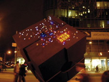
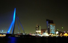
The team works on new technological ways for people to express themselves through graffiti. Their best known products include the LED throwies which are little LED lightbulbs with a magnet that can be thrown  on to any metallic surface to either decorate or get a message accross and the Laser tag which involved using a prjocetor and a technology they developed with Theodore Watson , where  they had made a program that imitated the leaking patterns of real graffiti and were able to paint on big houses with a laser. The Laser tag had no long term effects so it was not hard to get a permit for making it when they first did it in Rotterdam and has since been recreated in various ways and always attracted an active, interested crowd.

Theodore Watson, who programmed the Laser tag I found especially interesting. He is a british artist with a very strong focus on technology and programing and is currently residing in Amsterdam.
Watson has a BA in Fine Arts and Design and Technology from Parsons and has had his work displayed at various high profile museums and art fairs such as the MoMa, Tate Modern, Sundance and so on and so forth.

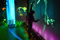
Most recently Watson has been working with children, he designed with visual and motion graphics designer Emily Gobeille, an interactive forest program for children, called Funky forest. The project was premiered in 2007 at the Cinekid festival in Amsterdam. The installation lives and moves with the visitors, by pressing your body against the forest creates a new tree in your shape with different characteristics, by diverting streams of water flowing on the floor different parts if the forest grow, if a tree doesn’t get water it dies. The health of the trees in the forest controls the inhabiting creatures. The installation shows children how nature works in delicate ecosystems.

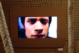
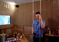
My favorite work by Watson is his work for a Michel Gondry exhibition. Watson made interactive installations around Michel’s new film at the time, The science of sleep. He made a cardboard covered, kitchen like room with built in screens and paper covered interactive cameras. In one part of the room you could stand facing a screen and pull strings to control the face of Gael García Bernal, in another you could move a camera and see parts of the room with strange effects. A special room with big windows that displayed scenes from the film as fake reality with moving lights and finally a video-piano. The piano had videos and sounds recorded and displayed them when the piano was played. http://muonics.net/
posting by Sunna Sigurmarsdottir

Designblog entering it’s second year!


Saturday, November 15, 2008

thanks for reading and enjoy the new show.

As an education project Designblog is constantly changing and developping its content.

E group : textile, medium or subject


Sunday, June 1, 2008

janineweefselJaninetatoo Janine Tielen presents herself and her projects in a special guest meeting with the students. (TXT department)

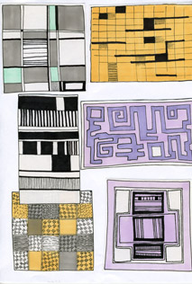
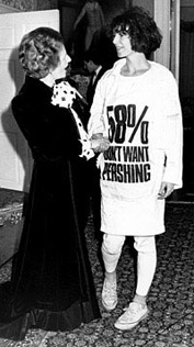
Textile can be used as a medium for direct communication. That was the basic theme for a cooperative project between the FoundationYears E-Group and the department of Textile TXT. A workshop at Platform 21 and a visite to the Vlisco exhibit at the “Volkenkundig Museum” in Leiden presented a rich and colorfull context for gathering insights and practise skills. more in …… (posting 127)

Boris-Bauhaus sketches Katherine Hamnett and Margaret Tatcher Vlisco fabric detail

Research subjects were related to the various subjects of this project and edited down to A4 sized guided tours into selected subjects. All subjects linked in this posting are also available as hard copy research prints at the ResearchFolders available at the Rietveld library.

On the subject of Text and Textile :Katharine Hamnet (fashion designer), Harmen Liemburg (designer illustrator), Roy Villevoye (artist), Janiene Tielen textile designer). On the subject of Platforms 21 “Cooking and Constructing” the participants; Frank Visser (stylist) from SAP: Daniera ter Haar (colorist), Christoph Brach (product designer), Shane Waltener and publicist Debra Solomon. Related to the Textile department; Erik Wong (graphic designer, Heleen Klopper (textile designer), Joke Robaard (artist), loop.ph (design & research)loop.ph, Petra Blaisse (designer), Fransje Killaars (artist), Scholten and Baijings (designers) and Vlisco (Holland), Batik (Indonesia), Bauhaus Textile, Sonia Delaunay (artist/designer) and Viktor Vaserely (Artist)

F group presents design from the core of their homes


Monday, May 26, 2008

After visiting “deBazel”, a monumental building in the center of Amsterdam holding the new city archieves, we became intrigued by the architectonic philosophies behind the construction of this colossal building. Build around 1923 it was soon called “the Temple” a common reference to its general shape. In actual fact that name was not so far from the original theosophical philosophy architect de Bazel used for the total design concept of this building. He saw not just each house, but each room as a reflection of the cosmos, every part of which must be in harmony with every other.“ (K.P.C. de Bazel – designer to the elite, written by Yvonne Brentjens). This reflects in the buildings structure aswell as the interior and artifact he designed for it. De Bazel

deBazel art deco vaultde borobudur

Enjoying a tour through the building, we started to become fascinated by the way this concept was connected to the original use as a bank office and the details in which the theosophic ideal –that everything grows from within (wall colors become lighter as they are farther from the center)– reflects the rigid bank’s hiearchy.

How does this reflects on our own living surroundings. What object represents a “centre” in our own house, who designed it and how do we reflect upon it. 21 students of the foundation Year’s F group try to answer these questions through the small postings you can read below:

more in ...... (posting 214)

From where this neckless?


Saturday, May 24, 2008

neckless

Tribal Asia.
In search for precious, body decorative objects in tribal villages of Asia.
Gesture language in communication with local craftsmen.
Looking for…,changing for…buying for…
Roughness/ Heaviness/ Roots.

Mountains.
And their hardly approachable slopes.
In need for strong ropes to keep you safe, to survive on your way of reaching peak.
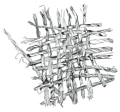
The beauty of joining little threads into one strong rope.
Precision/ Color/ Pattern.

Electric store.
Materials research in building stores. Especially in electric field.
Rubber tubes, when heated connect cables and ropes.
Silver like,bendable material.
Connecting/ Material behavior/ New ways of use.

And then…

+++D.I.Y+++

The best contemporary jewellery gallery in town!
Ropes/Ropes/Ropes

Handige jongensboek


Saturday, May 24, 2008

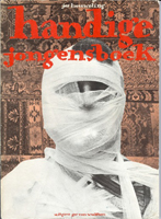
handigejongensboek Halverwege de middelbare school begon mijn interesse voor boeken te groeien en daarbij ook mijn verzameling boeken. Eens in de twee weken ga ik even langs bij de hilversumse kringloop winkel. Waar de boeken collecties van de gooise bejaarden heen worden gebracht. Voor bijna geen geld vind je er hele mooie en speciale boeken.

Daar vond ik het Handige Jongens boek van Jos Houweling. Het is een geweldige satire op de bestaande manier om huishoudelijke tips weer te geven. De wekelijkheid en nonsens zijn een eenheid geworden in dit boek. Deze boeken met tips liggen nog steeds in de winkel. Het is en blijft dus een actueel onderwerp, drie en dertig jaar na de eerste druk van het boek. Het boek is voor mij een verademende kijk op het leven en de denkwijze van mensen.

http://handigejongens.weebly.com / http://beeldbank.amsterdam.nl/component / http://www.xs4all.nl/~annevet/onderzoek/right_to_copy/part-1_2.htm

ORIGINES OF MEANINGS


Saturday, May 24, 2008

oxforddictionaryA simple search for the meaning of a word in a (oxford) dictionary might satisfy some with explanations, translations and also exemplary sentences using a specific word.
Looking back though, to the Oxford English Dictionary- its history reveals the origins of this collection.
Contribution was made by varied amateurs of the English language.
Starting from bright author to simple people and even one insane person who in a vicious attack on himself cut off his penis and lived with it (without it) for 18 years.
They have voluntarily collected words and gave them explanations proving them with sentences from books, newspapers, magazines etc.
Those people have influenced our understanding of words and their meanings, but the list is still open for more of us to interfere.

http://www.bbc.co.uk/legacies/myths_legends/england/berkshire/article_1.shtml / http://oed.com/readers / http://www.thecriticaltimes.net / http://www.amazon.com/Professor-Madman-Insanity-English-Dictionary/

Rietveld had a son and he designed a chair


Saturday, May 24, 2008

wimrietveldThis chair came with my roommate. It is the object in my home upon which people compliment me the most and every time they do I have to tell them it is not mine. We call it the ‘Rietveld’ even though it is not designed by Gerrit, but by Wim Rietveld (1924-1985). For Dutch design company Gispen he designed furniture for ‘the ordinary interior’. The Nederland Architectuurinstituut (NAI) keeps the historic archive of Gispen.
The chair is named ‘fauteuil 1407’. In 1954, Wim Rietveld received a golden medal for this design at the 10th Trienalle in Milan. On designws.com, a designblog of Rotterdam Gallery VIVID, you can find more information on Wim Rietveld and Dutch design.

Belgian drama


Saturday, May 24, 2008

ashtrayI present as an object from my daily life, this stupid ashtray shaped like lungs. Actually I don’t smoke and I never use this item but i’m really attached to it, even though I have it only for a short time. I got it as a part of my furnished accomodation when I moved in amsterdam, september 2007. It really reflects my state of mind about life and serious problems. Taking big matters with humour is definitely my behaviour in protecting myself from it and I think it is also typically a belgian thing to laugh about dramatic events and make them absurd. As I’m really attached to my country, this object helps me to stay “belgian” in daily life.

I would say! Amazing how a “stupid” design joke can tell that much…

http://www.humours.net/blague-belge/blague-belge.htm / http://www.notobacco.org/

De waarde van Hebe.


Saturday, May 24, 2008

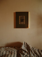
Hebe“Hij overhandigt mij een schilderijtje, met kitscherig goud lijstje, een donker groen kartonnen frame met daar in een zwart-wit prent van Hebe. Niet dat ik van goud hou, wel heb ik vroeger al erg veel interesse gehad in de Griekse mythologie. Hij vertelt mij over Hebe, de godin van de jeugd, en begint uit te leggen waar zij voor staat, als dochter van Zeus en Hera. Hebe had als betekenis de bloei van de natuur in de lente. Maar toen zij langzaam haar betrekking tot de natuur verloor als natuurgodin werd haar de taak opgedragen de goden nektar te schenken, die hun onsterfelijkheid en eeuwige jeugd verzorgde. Uiteindelijk trouwt ze met Herakles, wie zij twee zonen schonk.

Ik ben verwonderd en hang het lijstje boven ons bed, gecentreerd tussen onze hoofdkussens. Pas later, die week, vond het haar functie. Ons huis bestaat uit een grote ruimte, met gelijke muren en een oppervlakte van ruim 35 vierkante meter. Dit heeft tot gevolg dat de scheiding tussen de slaapkamer en de woonkamer moeilijk zichtbaar is. Nu, met Hebe boven ons bed, zijn er onzichtbare lijnen ontstaan, een ware metafoor, een onzichtbare muur. Het schilderijtje heeft onze woonkamer doen ontwaken.”

The Royal Bread Cutter


Saturday, May 24, 2008

breadcutter“Use me, use me!” The tool screamed at me, when I first saw it in the second hand shop. I thought it was a French device for cutting cheese or meat and, although I never missed a cheese or meat cutter before, I convinced myself that I couldn’t do without it. Later I found out that it’s a Danish bread cutter, designed by the royal Raadvad, which celebrates it’s 250th anniversary this year. The company holds three main pillars: functionality, quality and design, and they are all represented in my “brødskærere”.
Although I have never cut anything with it yet, it still holds the longing for being used. And it is this longing that I like so much.

For information about the history of Raadvad: (For people who don’t speak Danish, you can translate this site with the following website
For the logo’s of other royal brands

1984 Portable Cassette Player


Friday, May 23, 2008

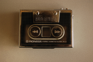
cassettewalkman The object I’ve chosen to do research about is my pioneer stereo cassette player pk-3, or more clear, my old school 1984 Walkman. What drew my attention is that it has a chic design, but somehow also a retro 80’s look. Especially because of the silver colored straight framing combined with the raster. This raster has been used plenty of times for the cover artwork of 80’s records (For example Blondie’s Eat to the Beat). Basically I like this object because of the nostalgic value. If I would go on a long ride to somewhere with my dad, he would just give me this walkman and I would be quiet.

The slick design appeared to me when I was way older.

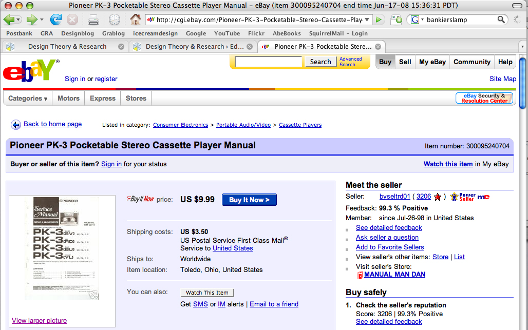
http://cgi.ebay.com/Pioneer-PK-3-Pocketable-Stereo-Cassette-Player-Manual_W0QQitemZ300095240704QQihZ020QQcategoryZ15053QQssPageNameZWDVWQQrdZ1QQcmdZViewItem


Log in
subscribe