Skip to Content Skip to Search Go to Top Navigation Go to Side Menu


My key to comfort


Friday, May 23, 2008

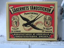
luciferdoos Since I have been inhabiting my new apartment, matches have become an indispensable product in my daily live. Without matches I would stand underneath a cold shower every morning, would not have warm dishwater, no heating and no possibility of cooking.
An incomplete combustion of my geyser, makes that I have to disable it when I don’t use hot water. Because of this, lighting a match has became my morning ritual. Not only my geyser is dependent on the use of matches, also my gas stove and heater refuse service without the use of this inflammable wood.
This typical Swedish product is been sold all over the world and the brand wich i have at home is more then one century old. Remarkably, the matchbox still wears it’s original design which gives a beautiful scene of it’s origin.

if you like to read more on this subject of matchbox labels do read this pdf on www.protimient.com/MatchBoxLabels.pdf [translation-site]

An age of fast fashion and a future of dog bones


Thursday, May 22, 2008

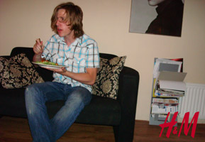
JonneH_H-MHere he sitting with a tasteless pasta with melted cheese and watching MTV’s Real World to fuel himself and prepare mentaly for his journey to pick up a fancy girl in the 100 decibel Paradisco. With a body full of fast energy he install friends from Hennes & Mauritz. Mobile supplies that protect him from outside world and give him a illusion of good confidence. Shells that is massproduced by the third world. Sweat, blood and low payment in third world and the furious western mainstreamer can ones again upgrade his closet.
The former friends has now become parasites that won’t let him free himself from vanity. Here is a view from one of the many consumers of Hennes & Mauritz, but he now starts to wonder how the view is from the designers and producers side to us?
Article by Sarah Raper Larennaudie, TIME Magazine (english)
Article by Pia Gripenberg, Dagen Nyheter (swedish) – [to translate]

Nature at Home


Thursday, May 22, 2008

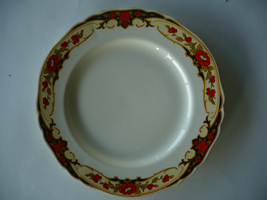
porseleinebordThe Alfred Meakin plates I own, are like most of my belongings, second hand. I got these plates because the over organic and curly pattern looked beautiful and at the same time so fake and corny to me. I always enjoy this friction in things I own

These plates, like most Meakins are inspired, by nature not just in its patterns but also in the shape. They were not made anymore after 1937 and still, all modern Meakin plates, and also most porcelain, are in a nature theme. I find it interesting that throughout history one thing has not changed and that is the urge to recreate nature, even out of something as lifeless as porcelain, while at the same time bending real nature to our desires. Creating things that have a beauty like nature and that are at the same time cold and fake. This friction that works both ways is what really grabs me.
http://www.terhitolvanen.com/html/woodland12.html
http://nl.youtube.com/watch?v=XL1aCkKR0h4

Territoriumdrang? Nesteldrang? Claim je eigen domein!


Thursday, May 22, 2008

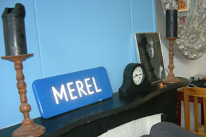
merelthuis Acht jaar geleden kreeg ik van mijn toenmalige vriendje een straatnaambord met mijn naam erop gestolen uit Lunet, een wijk in Heemskerk, een gemeente in Noord-Holland. Sindsdien is mijn Merel straatnaambord overal met mij mee naar toe verhuisd en nog steeds neemt het een prominente plaats in binnen mijn huis. Niet vanwege de emotionele waarde, maar omdat het voor mij doet wat een straatnaambord hoort te doen. Het geeft aan waar men zich op het moment bevindt. Met het bord baken ik mijn territorium af, hier woon ik, dit is mijn huis. Mijn straatnaambord functioneert op deze manier als mobiel markeer object. Het kan een ruimte tijdelijk in mijn eigen domein doen veranderen.

Territoriumdrang / Nesteldrang / Claim je eigen domein

only b/w


Thursday, May 22, 2008

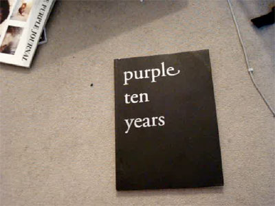
black and white 10 years purple magazine

Since almost two years I have a copy of the ‘Purple ten years’ supplement that came with their fourteenth issue. I like it because of it’s rawness, sensibility and inconspicuous complexity.It doesn’t contain texts, only b/w photographs of ripped out pages of former issues of Purple. Issues that were published between my fourth and twelfth age. I’ve never seen the magazine to that time. But since then every page of ‘Purple ten years’ was flipped countless times. But still everytime I discover stomething new. Sometimes visual gags, connections between pages, people and their work or others. The page that attracted my attention while the research showed two pages three dimensional laying in space and seem to be from a photo series about Susan Cianciolo. An so far unknown name to be but her work looks highly interesting!

Onbekende objecten en prikkelende puzzels


Thursday, May 22, 2008

marokaanse-lipstick poster_Tanya Keppel Hesselink

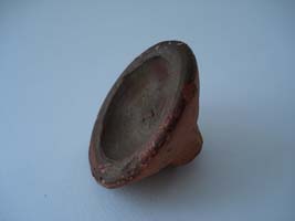
Toen ik dit aardewerken object van mijn ouders kreeg, wist ik niet wat het was en vond het daarom bijzonder. De handgemaakte, simpele vorm en het kleurverschil tussen de binnen- en buitenkant, spraken tot mijn verbeelding. Het voorwerp straalt geschiedenis en cultuur uit en suggereert een zeker gebruik, maar wat voor geschiedenis, cultuur en gebruik, was mij onbekend.
Dit soort mysterieuze aspecten vind ik altijd fascinerend, omdat het de ruimte geeft voor eigen interpretatie, terwijl het toch, zoals een puzzel, een ‘juist’ antwoord veronderstelt. Vanuit dezelfde gedachtegang heb ik eerder dit jaar een poster gemaakt over een voor mij onbekend object.
Het voorwerp dat ik voor deze opdracht heb gekozen, bleek overigens een traditionele Marokkaanse lipstick te zijn die was gekocht op een tijdelijke souk in het Tropenmuseum. Als de kleurstof aan de binnenkant vochtig wordt, geeft het een mooie roodbruine kleur af. Puzzel opgelost!

Macintosh vs The Rest


Thursday, May 22, 2008

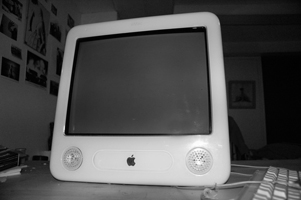
eMac I grew up in a family where, coming to computers, Macintosh was the only option. When I moved to Amsterdam I bought my first computer, an eMac. It functioned, for at least four years, as the center of my house. In a more abstract way, because of all the things he allowed me to do, but also in a more literal sense, because of his enormous size.
When I started the Rietveld Academy I decided I needed a laptop. A Macbook entered the house, but I felt I couldn’t say goodbye to my old eMac. So despite his size, I decided to keep him as a sound system.
Sometimes I wonder how it is possible I grew so attached to my eMac. Is it his form? Is it the world of associations that can be found in the design of this computer made by Jonathan Ive From eggs and eyes to old timers and single-engine airplanes; From record players, hairdryers, pocket calculators and televisions from the sixties to Braun and Dieter Rams.
See a glimpse of the myth in this movie of the introduction of the first Macintosh in 1984

Dominick Rosati: Extracting cork and essence of design


Thursday, May 22, 2008

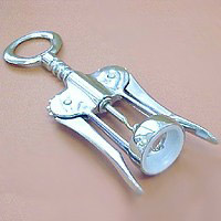
corkscrewPossibly the first time I ever regarded an object as a piece of design was the first time I laid eyes upon my parent’s corkscrew. The object of this childhood admiration was – and still is – the classic double lever corkscrew. In fact it’s such a classic you probably have one laying in your kitchen as well. Though corkscrews have been around since the 18th century, it wasn’t until Italian designer Dominick Rosati patented his “cork extractor” that we would come to associate this object with the human figure, the object became pretty on itself and as a functional kitchen appliance more enjoyable and easy to use. An evergreen in design if ever there was one.

Rosati´s patent: http://z.about.com/d/inventors/1/0/h/B/corkscrew4.gif
History of the double lever corkscrew: http://www.bullworks.net/virtual/double/double.htm

Trash?


Thursday, May 22, 2008

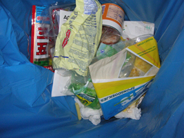
trashfotoLooking at trash as a designed object has been an interesting opportunity for me to reflect upon the house in which I rented one of the 30 students rooms years ago. It was built for junkies. It is cheap, ugly and has only functional aspects. It is absolutely unpersonal.

I returned to an object that shows both: the reason the houses were built for and at least a few personal things of the people who are living there now. Trash shows a lot about characters and personalities.

Because I used my trashy house many times for my own art projects, I was wondering how deep other artists involve themselves and there art in the world of trash.

I found a lot of different artworks. But here is a link for a website where you can find many different artworks made out of trash, founded objects and recycled materials.
Second a link to have a look at clothes made from recycled materials, too.

some more interesting links: robertpennekamp’s trash art project / Rauschenberg sues artist for selling his trash / Trash vs Design / top 5 chairs made from trash

The only thing that is mine in my kitchen


Thursday, May 22, 2008

rendurLiving in a new country rent apartment which is filled with things that are not mine, I started really looking at the things that where really my own. I did not have a home on my own before and did not have kitchen objects at all.

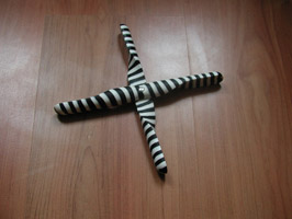
My really nicely designed propeller trivet was my first kitchen object. Fore me it is a symbol of me growing up and having to buy these things that I never thought of. They where just always there in my mothers kitchen.

Cork trivet / jakobwagner / scandenavian design / tips for moving overseas

I weigh it, you price it, I buy it, I design it


Thursday, May 22, 2008

Ah-bonuskaart
I have a bonuskaart like you have. Is it me? This keychain. I am what I eat, buy..and design? Let’s not talk about the design yet. So, is it me? No, I am related to Albert since I was born. In a way I am Albert. This bonuskaart, a tool for cheaper personal applied nourishment. A bloodline basically, blue from origin. Talking in this familiar way, makes me think that Albert needs my information to give me better offers. Offcourse, why are a lot of people afraid of this? You are not being tricked less or more, then you would when you lived from your mothers blood a long time ago. Since we can walk, talk and eat, we can also weigh price and buy it ourselves. I can even design my own bonuskaart now. You can!
The original design is probably made by Mark Balvers but I am not so certain about this. Ask him! www.balversdesignburo.nl

“Functionality can take a form of beauty”


Thursday, May 22, 2008

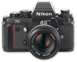
nikon camera Photo_Malthe Stigaard I have several cameras in my collection. I guess the Nikon F3 is the camera I use when I know what I want to shoot. I never use it just for snapshots. It is too heavy to carry around with me and it is too much work processing the images if I don’t specifically want to use the benefits of shooting on film. I mostly use it for shooting people and for street photography.

I never push the button except if I get that feeling in my stomach, which tells me that this will be a good picture. I guess it’s the preciseness and the functionality of the camera that makes it my favorite. And I like the fact that the basic design of this camera, like most cameras, comes from functionality and not from making something which has good looks. Still I keep it proudly presented on my shelf as a decorative object when I don’t use it. So I guess “Functionality can take a form of beauty” as is a motto of it’s designer Giorgetto Giugiaro…

interview with Giugiaro / http://www.media.italdesign.it/

D group /Type Design, from Experimental to Corporate


Tuesday, April 22, 2008

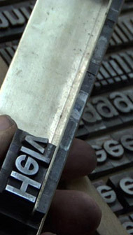
Helvetica is a feature-length independent film by Gary Hewitt, about typography, graphic design and global visual culture. It looks at the proliferation of one typeface (which is celebrating its 50th birthday this year) as part of a larger conversation about the way type affects our lives. (http://www.helveticafilm.com/) Helvetica introduces type as more than common. A specialized design discipline.

helvetica movie image1helvetica movie image2

A lecture by Henk Groenendijk on experiments in type design, related to ‘developping cultural and economical progress in the 1950-’70, gave more insight in the context that proved so fertile for Helvetica’s rise to stardom.

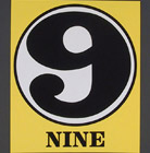
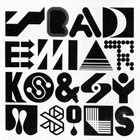
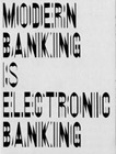
Indiana Number-paintingLogo’s from fiftiesSandberg Experimenta TypograficaModern Banking

Time and space is a given phenomenon in education at the Rietveld Academie, where things constantly present themselves in past and contemporary creative projects. As an almost casual gesture, some 2nd year students from the graphic design department dropped by to present their recent type designs in progress.

Student type design

Finally research material was edited down to A4 sized guided tours into selected subjects. All subjects presented in this list are also available as hard copy research prints at the ResearchFolders available at the Rietveld library.

As usual we selected subjects with a direct connection to the context of the presented material in this classbloc. In this case Helvetica the Movie” and its content, was researched through subjects like the Corporate Alphabet, Wim Crouwel, Laurenz Brunner, Experimental Jetset, Norm type design and their publication “TheThing” or Letterpress.

The lecture gave a much broader perspective from which researches like de Stijl fonts, Buro Destruct, Zaph Dingbats, the Univers Font, Systemfonts, Swiss Style/Modernisme, Guy Rombout‘s AZart and Edward Fella were initiated. Widening the discussion towards the Helvetica subject by adding links to the actuality, some more subjects were added, Jonathan Barnbrook. Richard Niessen, Type Radio, Emigre‘s Zuzana Licko, Jonathan Puckey‘s Type Tool, the mysterious typebased posters of Michel Schuurman and ultimately the concept of Dead Type by Hansjakob Fehr

Benno Premsela says: Show Yourself!


Tuesday, April 8, 2008

When you drive through the Vijzelstraat, you might have glanced in amazement at the huge block-size buiding that you pass between Keizers- and Herengracht. This building is called “De Bazel” named after the architekt K.P.C. de Bazel. It was built between 1919 and 1926 and served as headquarters of the Dutch Trading Company. Since a year it houses the new City Archive (Gemeente Archief). If you go inside you can walk through this amazing building and enjoy the detailed interior design and visit exhibits organized in the huge bank vault in the basement. more …. (posting 299)

Benno Premsela [poster by Anton Beeke

as a hommage to Premsela in the year of his death]

At this moment –until April 26th– The Gemeente Archive presents an exhibit on one of the prominent dutch designers of the 2nd half of the 20th century. Benno Premsela [1920-1997]. He was active in interiour-, and exhibition design as well as the design of shopwindows (Bijenkorf) and several interiour products. He also designed stages for the Dutch Ballet. As designer, advisor and organiser he manifrested himself in the foreground aswell as the background of the design community. Premsela was not someone to hide his private- from his professional life, which was most prominent in his manifest role in the homo emancipation movement.

The Premsela Institute is –in good dutch tradition– named after him. This institute promotes design national as wel as international. Platform 21 is is closely connected to this Institute

Gerrit Rietveld as a kick-off


Monday, April 7, 2008

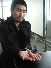
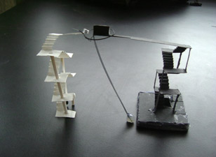
sangyong_portraitSangyon_maquette2

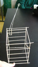
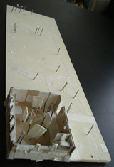
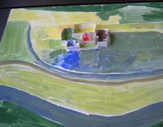
Our Design Program consists of 7 different classes. All focusing on an aspect of the design spectrum. In one of these 4-week classes Carla Boomkens creates a laboratory in which the students get access to the visual language of shapes in large format/scale, through small-scale researches on the essentials of spaces and what they can express: spatial-/architectonic design. (links to: Allan Wexler, Eero Saarinen, Zaha Hadid, Paul Gehry, Rudi Riciotti

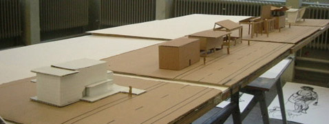
maquettes_display
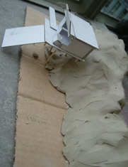
All projects have a start at the buildings of Gerrit Rietveld (1888 – 1964), the architect of the main-building of this academy. Sometimes the academy-building itself is taken as a research-location, in other cases a building is selected by the student out of his whole body of built works. In doing so, the student studies and gets acquainted with his approach to spaces and his choices to making them fit for particular needs and functions, in relation to it’s environment. (links to: Luis Barragán, Peter Callesen,

Elmer_maquetteMartino_maquetteDagmar_maquette

Departing from ‘the lessons we can learn from Gerrit’, which the student can easily use as a hand-grip in learning technique and working method, the student can freely develop her/his own expression of sculptural quality, choreography and a personal research for exciting spaces. As you can see, we work in scale-models. The student is asked to develop an authentic visual language in this field as well. (links to bookshops Architectura & Natura [dangerous grounds] or publisher Lars Muller

Julia_maquette-interiourCecilia_maquette

The assignments may appear similar to each group/project, but they never deal with the same subject – this guarantees a fresh start for each session with a new group. (link to: Gerrit Rietveld, Barbara Visser [Maison Grégoire or Transformation House])

posting prepared by Carla Boomkens

C group /Original, Copy or Look-Alike


Wednesday, March 26, 2008

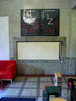
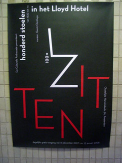
Lloyd Hotel Lobby Gielijn poster Zitten

With this typical Gielijn Escher poster a wonderfull collection of 100 chairs was announced. As part of the Lloyd Hotel’s Cultural Embassy program a joint exhibitions was presented of several private chair-collections. This exhibit went beyond its boundries into the intimicy of the hotels floors, rooms and hallways, highlighting their own corporate furniture collection. Gerrit Oorthuys took the initiative of this exhibit and generously showed us around.

Coinciding with the Foundation Year’s January Project Theme “Dull”, we set out to research the origin of a few selected chairs to find out their relation to the motto: original, copy or look-alike. Erik Slothouber (participating in the exhibition with his own designs) lectured on the 2 Rietveld Academies in Amsterdam and Arnhem illustrating the complexity of the choosen motto.

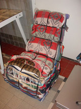
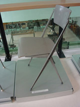
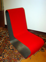
Tejo Remy Rietveld PYR Ramin Visch

(l>r: Tejo Remy/reclaiming design, Willem Rietveld’s/PYR, Ramin Visch/Eli2006)

Research material was edited down to A4 sized guided tours into selected subjects. All subjects presented in this list are also available as hard copy research prints at the ResearchFolders available at the Rietveld library.

As the two collections represent old and modern classic chairs, it gave us the opportunity to carefully select an interesting designers scala spanning the whole of twentieth century furniture design. Starting with Thonet and architect/interiour designers Mackintosh and De Bazel. Bauhaus professor architect and artist Max Bill was highlighted next to Gerrit Rietveld and the renowned interier shop Metz&Co, through which his furniture icons were often first sold. Erik Slothouber’s lecture connected the early to the late Rietveld and simultaneously presented a link to the architect/designers duo Slothouber & Graatsma. Including the company Rietveld by Rietveld constructed the ideal moebius loop in the “original versus copy” motto.

Including Charles and Ray Eames felt like a must as is Vitra for its museum’s chair collection and chair manufacturing. Don’t forget we were talking about originals versus copies versus look-alikes. The Revolt chair –present in many classrooms of our academy– introduced dutch designer Friso Kramer. Lloyds furniture collection containes many modern designer from which we selected, Tejo Remy, Piet Hein Eek, Jasper Morrisson, Hella Jongerius and Ineke Hans. Finally we added some intriguing subject we coul not resist like: an African stool, poet and craftsman Frits Swart, the poster designer Gielijn Escher and a story about the “zitzak” van Audrey Lai Ng that never saw the daylight.

B group /encounters with the autonomy of design


Monday, March 24, 2008

When two exhibitions present a clear insight in the autonomy of modern designing, DesignResearch has to examen what it is all about and who is involved.
This occasion was presented by the “Joyride Expo” organized by Platform 21 and “At Random: Networks and Crossovers” curated by the Paviljoens Almere.
frank tjepkemaX-XL chair at Joyride
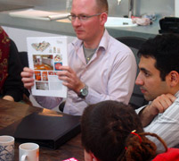
(l>r: at studio Tjep > cuddling the XXL-chair > visiting JoyRide Expo)

The participation of the Dutch product- and interactive design avant garde presented an unique opportunity to experience the freedom in which design concepts can be developped. This became clear at the opening event of the Joyride Expo, when designers transformed remote control toycars into their ultimate joyride dream
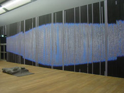
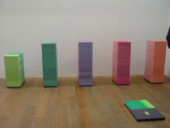
skycatcher at random reader
(l>r: Skycatcher by Maurer & Puckey > Expo & Reader designed by Lust)

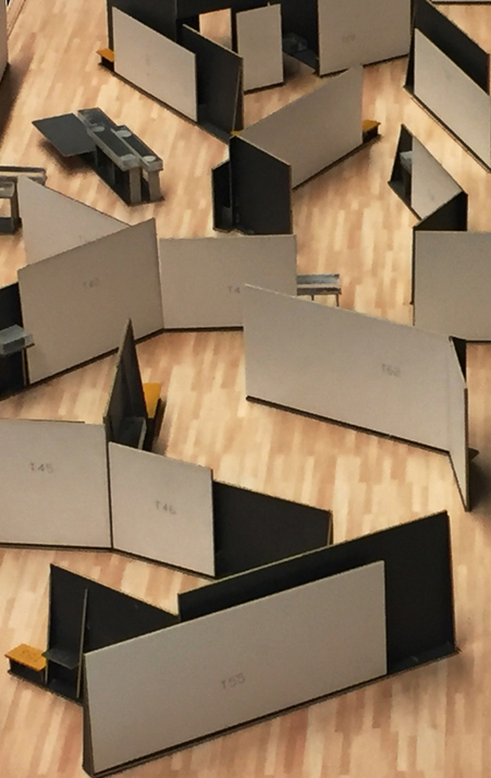
When visiting Almere (only a 20 minute train-ride), Luna Maurer presented insights into the philosophy behind here work “Graybloc“. One of her other works “Floor design” –an ongoing and ongrowing work in progress– covers the floors with mappings of the organisations consultative structure, as such visualizing the Paviljoen’s network. We could be present to witness her weekly upgrade.
Studio >Tjep< was visited in a later stage as part of a students investigations. We enjoyed an informal presentation of some projectbooks, focussing on his proposal for the restyling of the IKEA restaurant.
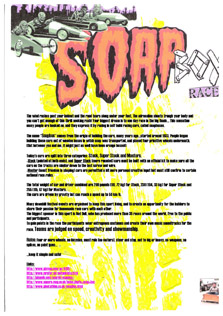
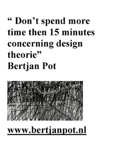
Soap Box ResearchBertjan Pot Research part1

Research material was edited down to A4 sized guided tours into selected subjects. All subjects presented in this list are also available as hard copy research prints at the ResearchFolders at the Rietveld library.

Related to Joyride the investigation focussed on the following subjects and people: Bertjan Pot (furniture design), Strange Attractors (interactive design), Marijn van der Poll (product design), Moniek van Heist (fashion design), Dinie Besems, Pieke Bergmans (product design), Frank Tjepkema /Tjep (interior/product design) the general subjects of >Concept Cars<, >Soapbox Racing<, “Craddle to Craddle” McDounough/Braungart (industrial design) the Nature Design exhibit in Zürich and its publication by Lars Müller, Droog Design, Bruce Mau’s “massive change” (communication design) and as added subjects Sophie Krier (Design Lab) and the artist Panamarenko.

related to the ongoing At Random: Networks and Crossovers exhibit, the investigation focussed on: Jeanne van Heeswijk (artist), Lust (graphic design), Nathalie Bruys (geluidskunstenaar), Luna Maurer (interaction design), the At Random reader by Lust design, and the related subjects SKOR and OPEN magazine #13

Log in
subscribe